> For the complete documentation index, see [llms.txt](https://docs.avonnicomponents.com/llms.txt). Markdown versions of documentation pages are available by appending `.md` to page URLs; this page is available as [Markdown](https://docs.avonnicomponents.com/flow/flow-components/rating.md).

# Rating

<figure><img src="/files/rhsCd5IlYPdOIOaEp4X0" alt="" width="375"><figcaption></figcaption></figure>

The Rating component lets users select a numeric value within a configurable range, displayed as interactive icons (stars by default). It supports required, read-only, and disabled states and exposes the selected value as a flow output variable.

***

## Overview

Use the Rating component in surveys, feedback flows, or anywhere you need a user to score something. The selected value is automatically available after the screen — wire an **On Change** interaction to respond in real time, or read the output variable in a subsequent flow step.

> **Example:** A customer satisfaction survey flow asks users to rate their support experience. After the screen, use the **Value** output variable in a Decision element: ratings below 3 trigger an escalation path, while 4–5 trigger a thank-you message.

***

## Configuration

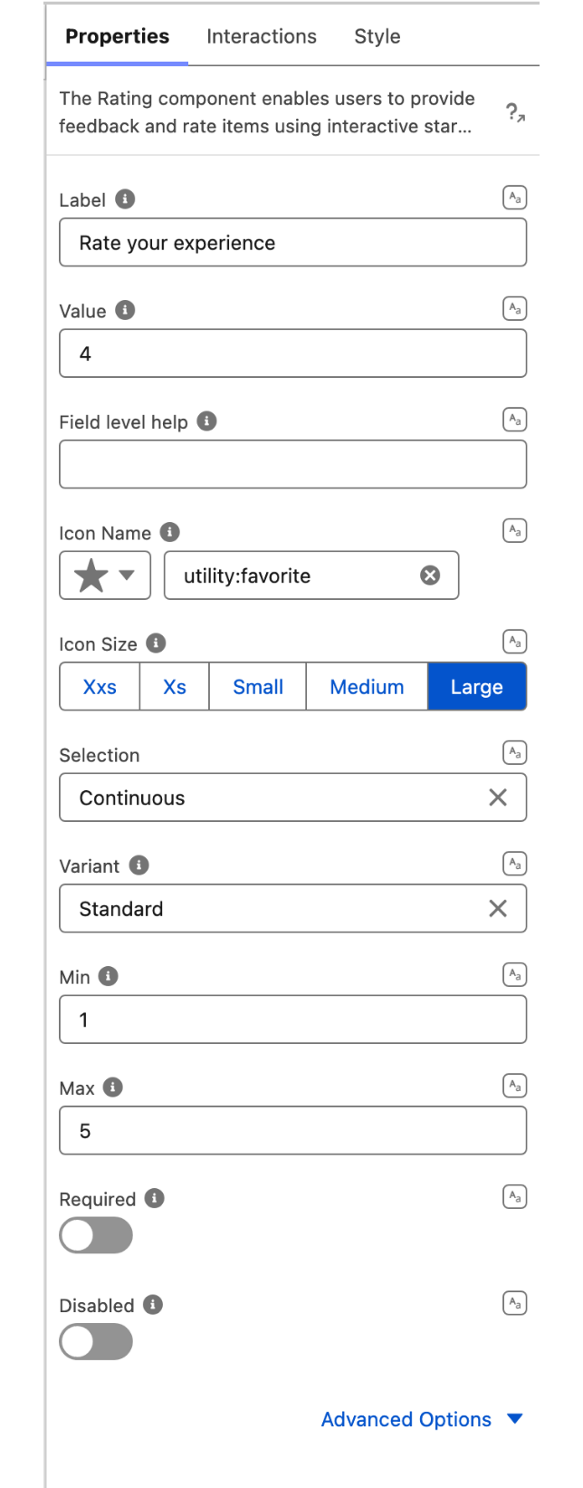
To configure it, click the component on the Flow screen. The Edit Rating Component panel opens on the right with three tabs: Properties, Interactions, and Style. The sections below mirror the Properties tab.

### Properties

| Setting              | What It Does                                                                                                                                                                 |
| -------------------- | ---------------------------------------------------------------------------------------------------------------------------------------------------------------------------- |
| **Label**            | Text displayed above the rating input to describe what is being rated (e.g., "Rate your experience").                                                                        |
| **Value**            | The initial (pre-selected) rating value. Connect to a Salesforce field, a flow variable, or use a Query to aggregate a score (e.g., average rating across multiple records). |
| **Field Level Help** | An info icon tooltip displayed next to the label to guide users.                                                                                                             |
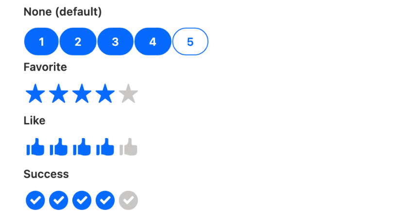
| **Icon Name**        | The Lightning Design System icon used for each rating symbol. Default: stars (`utility:favorite`). Can be changed to hearts, thumbs-up, or any utility icon.                 |
| **Icon Size**        | Size of the rating icons: X-Small, Small, Medium, or **Large** (default).                                                                                                    |
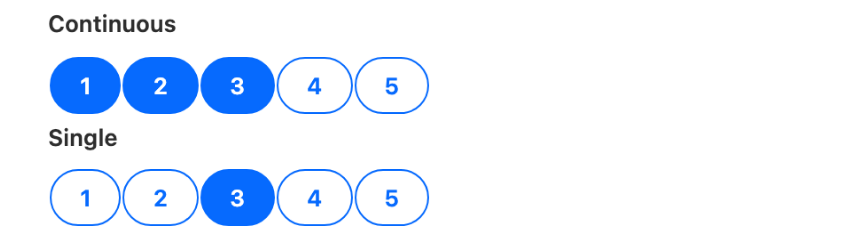
| **Selection**        | **Continuous** (default) — users can select any decimal value. **Single** — restricts selection to whole numbers only.                                                       |
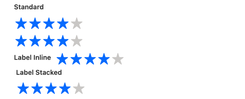
| **Variant**          | Controls how the label is displayed: **Standard** (label above), **Label Hidden**, **Label Inline** (label to the left), or **Label Stacked** (floating label).              |
| **Minimum**          | The lowest selectable rating value. Connect to a field or set a query for a dynamic minimum.                                                                                 |
| **Maximum**          | The highest selectable rating value (determines the total number of icons shown). Connect to a field or set a query for a dynamic maximum.                                   |
| **Required**         | When enabled, the user must provide a rating before the flow can advance.                                                                                                    |
| **Disabled**         | When enabled, the rating is visible but cannot be changed by the user.                                                                                                       |
| **Read Only**        | When enabled, displays the current value without allowing interaction.                                                                                                       |

### Advanced Options

| Setting          | What It Does                                                   |
| ---------------- | -------------------------------------------------------------- |
| **Value Hidden** | When enabled, hides the numeric value shown next to the icons. |

***

## Interactions

[Interactions](/flow/component-builder/interactions-panel.md) define what happens when users interact with the Rating. Configure them from the **Interactions** tab of the Edit Rating panel.

### Change

Fires when the user selects or changes the rating value. Use this to respond in real time — for example, show a toast message, navigate to a different screen, or trigger a confetti animation based on the selected score.

***

## Styling

The **Style** tab gives you fine-grained control over the Rating's appearance. Configure it from the **Style** tab of the Edit Rating panel.

{% tabs %}
{% tab title="Margin" %}
Controls outer spacing.

* **Top:** Space above the component.
* **Right:** Space to the right of the component.
* **Bottom:** Space below the component.
* **Left:** Space to the left of the component.
  {% endtab %}

{% tab title="Padding" %}
Controls inner spacing.

* **Top:** Inner space above the content.
* **Right:** Inner space to the right of the content.
* **Bottom:** Inner space below the content.
* **Left:** Inner space to the left of the content.
  {% endtab %}

{% tab title="Border" %}
Customizes the border.

* **Color:** Border color.
* **Size:** Border width.
* **Style:** Border style (solid, dashed, etc.).
* **Radius:** Corner rounding of the border.
  {% endtab %}

{% tab title="Background" %}
Sets the background.

* **Color:** Background color.
* **Linear Gradient:** Background gradient.
  {% endtab %}

{% tab title="Size" %}
Controls dimensions.

* **Width / Height:** Component dimensions.
* **Min / Max Width / Height:** Size constraints.
* **Overflow:** How content behaves when it exceeds the component bounds.
  {% endtab %}

{% tab title="Flow Dialog" %}
Adjusts display when opened as a modal dialog inside a Flow screen.

* **Width:** Dialog width.
* **Height:** Dialog height.
* **Background Color:** Dialog background color.
  {% endtab %}

{% tab title="Label" %}
Styles the rating label text.

* **Color:** Label text color.
* **Font Size:** Label font size.
* **Font Style:** Label font style (normal, italic, etc.).
* **Font Weight:** Label font weight (normal, bold, etc.).
  {% endtab %}

{% tab title="Value" %}
Styles the numeric value displayed next to the icons.

* **Color:** Value text color.
* **Font Size:** Value font size.
* **Font Style:** Value font style (normal, italic, etc.).
* **Font Weight:** Value font weight (normal, bold, etc.).
  {% endtab %}

{% tab title="Button" %}
Styles the clickable icon buttons.

* **Background Color:** Default button background.
* **Background Color Hover:** Background when hovered.
* **Background Color Selected:** Background when selected.
* **Background Color Disabled:** Background when disabled.
* **Background Color Disabled Selected:** Background when disabled and selected.
* **Text Color:** Default icon color.
* **Text Color Hover:** Icon color when hovered.
* **Text Color Selected:** Icon color when selected.
* **Text Color Disabled:** Icon color when disabled.
* **Text Color Disabled Selected:** Icon color when disabled and selected.
  {% endtab %}

{% tab title="Button Border" %}
Styles the border around each icon button.

* **Color:** Default border color.
* **Color Hover:** Border color when hovered.
* **Color Selected:** Border color when selected.
* **Color Disabled:** Border color when disabled.
* **Color Disabled Selected:** Border color when disabled and selected.
* **Size:** Border width.
* **Style:** Border style (solid, dashed, etc.).
* **Radius:** Corner rounding of the button border.
  {% endtab %}

{% tab title="Icon" %}
Styles the icon graphic inside each button.

* **Color:** Default icon foreground color.
* **Color Hover:** Icon color when hovered.
* **Color Selected:** Icon color when selected.
* **Color Disabled:** Icon color when disabled.
* **Color Disabled Selected:** Icon color when disabled and selected.
  {% endtab %}
  {% endtabs %}

## Output Variables

The Rating exposes output variables you can reference in your flow after the screen. To use them, select the screen element in Flow Builder, then the Rating component, and pick the output variable you need.

### Selected Value

| Output variable | Type    | What it returns                                                                                                                                             |
| --------------- | ------- | ----------------------------------------------------------------------------------------------------------------------------------------------------------- |
| **Value**       | Integer | The numeric rating the user selected (e.g., `4` out of 5). This is automatically available after the screen — no interaction setup is needed to capture it. |

***

## Using the Rating Results

Once users have given their ratings, you can use that data within your flow:

* **Store It:** Save the rating to a Salesforce record to track customer satisfaction, lead scores, etc.
* **Make Decisions:** Use the rating to determine the next steps — a high rating leads to a thank-you message, while a low rating triggers a follow-up survey or escalation.


---

# Agent Instructions
This documentation is published with GitBook. GitBook is the documentation platform designed so that both humans and AI agents can read, navigate, and reason over technical content effectively. Learn more at gitbook.com.

## Querying This Documentation
If you need additional information that is not directly available in this page, you can query the documentation dynamically by asking a question.

Perform an HTTP GET request on the current page URL with the `ask` query parameter, and the optional `goal` query parameter:

```
GET https://docs.avonnicomponents.com/flow/flow-components/rating.md?ask=<question>&goal=<endgoal>
```

`ask` is the immediate question: it should be specific, self-contained, and written in natural language.
`goal` is optional and describes the broader end goal you are ultimately trying to accomplish on behalf of the user. GitBook uses it to tailor the answer towards what is most useful for that goal.

The response will contain a direct answer to the question and relevant excerpts and sources from the documentation.

Use this mechanism when the answer is not explicitly present in the current page, you need clarification or additional context, or you want to retrieve related documentation sections.