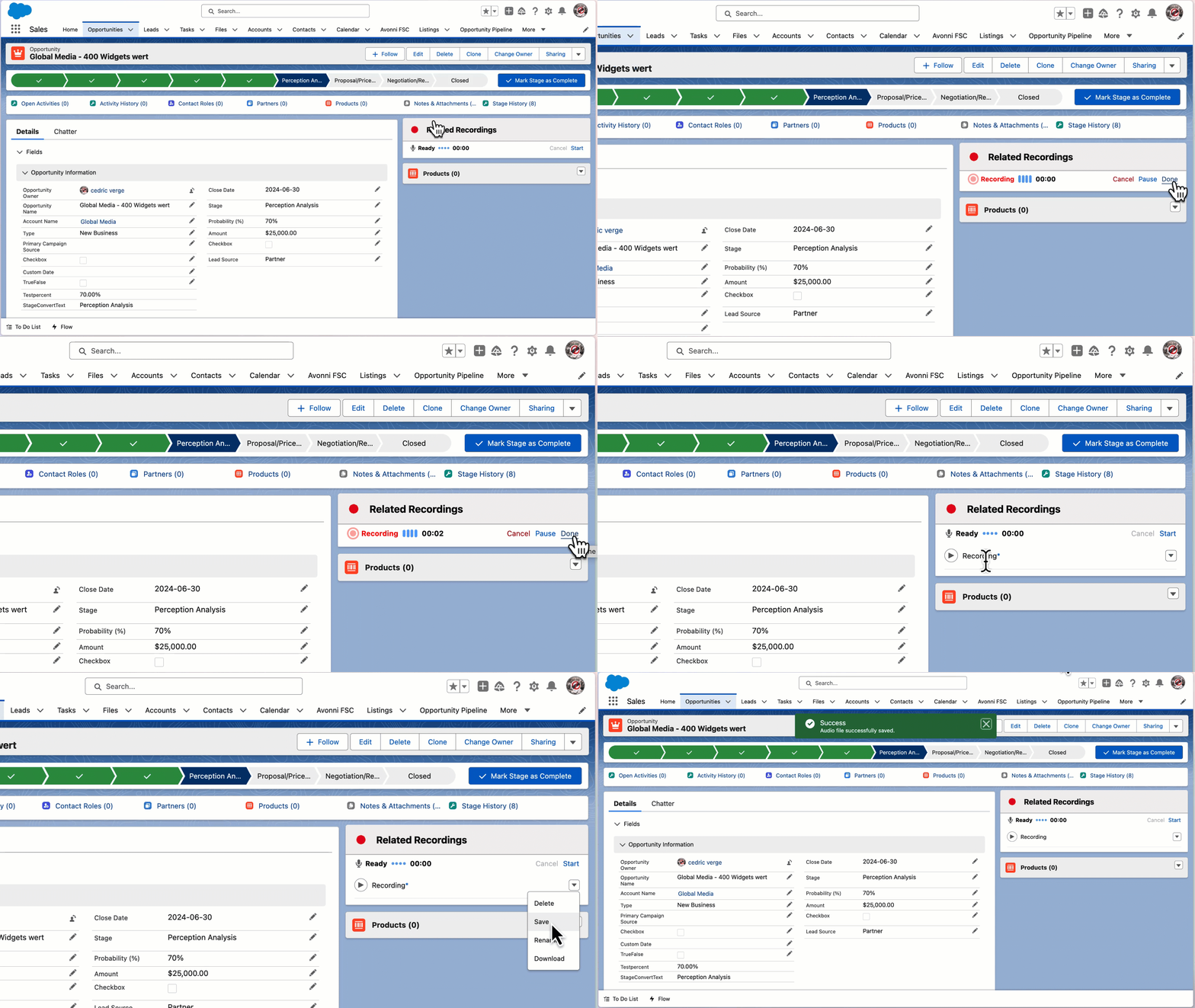
> For the complete documentation index, see [llms.txt](https://docs.avonnicomponents.com/llms.txt). Markdown versions of documentation pages are available by appending `.md` to page URLs; this page is available as [Markdown](https://docs.avonnicomponents.com/flow/flow-components/microphone.md).
# Microphone
The Avonni Microphone seamlessly captures voice notes, interviews, or other audio recordings and automatically attaches them to relevant Salesforce records
The Avonni Microphone component captures audio recordings within a Salesforce Flow screen and optionally saves them as files attached to Salesforce records. Use it for voice notes, field observations, customer conversations, or any use case where audio capture adds value.
{% hint style="warning" %}
The Avonni Microphone component utilizes Lightning Web Security. [Ensure this setting is enabled](https://developer.salesforce.com/docs/platform/lwc/guide/security-lwsec-enable.html) within your Salesforce org for proper functionality.
{% endhint %}
### Supported platforms and limitations
**Applies to Avonni Flow Screen Components 2026.08 release — Microphone component.** This matrix only covers hosts validated for this release.
| Host | Status |
| ------------------------------------------------------------------------ | ------------------------------ |
| Salesforce Lightning Experience on a supported desktop browser | Supported |
| Salesforce mobile app | Not supported for this release |
| Field Service Mobile | Not supported for this release |
| Other embedded hosts and browsers or webviews without media-capture APIs | Not supported |
#### Prerequisites
Lightning Web Security must be enabled in the org. Recording uses the browser media-capture API, `getUserMedia`.
Use a microphone-equipped device and a secure HTTPS context. Grant microphone permission in the relevant browser or webview. Device and MDM policies must also allow microphone access.
#### Failure behavior and recovery
Recording cannot start when permission is denied or blocked. It also cannot start without a microphone, when `getUserMedia` is unavailable, or in an insecure context.
1. Verify that Lightning Web Security is enabled.
2. Allow microphone access and confirm device or MDM policy permits it.
3. Retry in a supported and validated host.
***
## Tutorials
| Name | Description | Illustration |
| --------------------------------------------------------------------------------------------------------------------------------------------------------------------------- | ---------------------------------------------------------- | ---------------------------------------------------------------------------------------------------------------------------------------------------------------------------------------------------------------------------------------- |
| [**Save the Microphone recording file as an attached on a record**](/flow/tutorials/components/microphone/save-the-microphone-recording-file-as-an-attached-on-a-record.md) | Learn to streamline audio recording storage in Salesforce. | .png?alt=media) |
***
## Overview
### Use Case Examples
* **Customer Support:** Capture detailed voice notes or customer conversations and attach them to case records.
* **Sales Enablement:** Record product demos or sales pitches for training and internal sharing.
* **Field Service:** Allow technicians to record on-site observations and link them to work orders.
***
## Configuration
To configure it, click the component on the Flow screen. The Edit Microphone Component panel opens on the right with three tabs: Properties, Interactions, and Style. The sections below mirror the Properties tab.
### Properties
* **Save as Content Document** — when enabled, the recorded audio can be saved as a Salesforce ContentDocument (file).
* **Auto Save Content Document** — when enabled (together with **Save as Content Document**), the recording is automatically saved as a ContentDocument without requiring additional user action.
* **Document Title** — sets the title for the ContentDocument. Defaults to `Untitled`. Use static text or dynamically populate this field using flow variables.
* **Content Document Linked Entity ID** — the Salesforce record ID to which the ContentDocument is attached. Essential for associating the recording with specific cases, opportunities, or other objects.
* **Allow Multiple Recordings** — when enabled, users can make several recordings in a single session. Each recording is saved as a separate ContentDocument.
* **Show Visualizer** — displays a visual audio waveform during recording, providing a more engaging user experience. Defaults to off.
### Labels
Customize the text displayed on each button or status label in the recording interface:
* **Ready Label** — text shown when the recorder is idle and ready.
* **Recording Label** — text shown while recording is in progress.
* **Paused Button Label**, **Cancel Button Label**, **Start Button Label**, **Done Button Label**, **Save Button Label**, **Delete Button Label**, **New Button Label**, **Rename Button Label**, **Pause Button Label**, **Resume Button Label**, **Download Button Label**.
***
## Interactions
[Interactions](/flow/component-builder/interactions-panel.md) define what happens when users interact with the Microphone. Configure them from the **Interactions** tab of the Edit Microphone panel.
### Save As Button Click
Fires when the user clicks the Save As button to manually save a recording. This interaction is relevant when **Auto Save Content Document** is disabled.
## Styling
The **Style** tab gives you fine-grained control over the Microphone's appearance. Configure it from the **Style** tab of the Edit Microphone panel.
{% tabs %}
{% tab title="Margin" %}
Controls outer spacing.
* **Top:** Space above the component.
* **Right:** Space to the right of the component.
* **Bottom:** Space below the component.
* **Left:** Space to the left of the component.
{% endtab %}
{% tab title="Padding" %}
Controls inner spacing.
* **Top:** Inner space at the top.
* **Right:** Inner space on the right.
* **Bottom:** Inner space at the bottom.
* **Left:** Inner space on the left.
{% endtab %}
{% tab title="Size" %}
Controls dimensions.
* **Width / Height:** Fixed dimensions of the component.
* **Min / Max Width / Height:** Dimension constraints.
* **Overflow:** How content that exceeds the boundaries is handled.
{% endtab %}
{% tab title="Border" %}
Customizes the border.
* **Color:** Border color.
* **Size:** Border thickness.
* **Style:** Border style (solid, dashed, etc.).
* **Radius:** Corner rounding.
{% endtab %}
{% tab title="Background" %}
Sets the background.
* **Color:** Solid background color.
* **Linear Gradient:** Gradient background.
{% endtab %}
{% tab title="Flow Dialog" %}
Adjusts display when opened as a modal dialog inside a Flow screen.
* **Width / Height:** Dimensions of the dialog.
* **Background Color:** Dialog background color.
{% endtab %}
{% tab title="Record Icon" %}
Styles the microphone icon shown when the recorder is ready.
* **Record Icon Color:** Color of the record icon.
{% endtab %}
{% tab title="Cancel Button" %}
Styles the Cancel button in the recording interface.
* **Background Color:** Default background color.
* **Background Color Active:** Background color when pressed.
* **Background Color Hover:** Background color on hover.
* **Text Color:** Default text color.
* **Text Color Active:** Text color when pressed.
* **Text Color Hover:** Text color on hover.
* **Border Color:** Default border color.
* **Border Color Active:** Border color when pressed.
* **Border Color Hover:** Border color on hover.
* **Border Size:** Border thickness.
* **Border Radius:** Corner rounding.
* **Block Start:** Top spacing inside the button.
* **Block End:** Bottom spacing inside the button.
{% endtab %}
{% tab title="Done Button" %}
Styles the Done button in the recording interface.
* **Background Color:** Default background color.
* **Background Color Active:** Background color when pressed.
* **Background Color Hover:** Background color on hover.
* **Text Color:** Default text color.
* **Text Color Active:** Text color when pressed.
* **Text Color Hover:** Text color on hover.
* **Border Color:** Default border color.
* **Border Color Active:** Border color when pressed.
* **Border Color Hover:** Border color on hover.
* **Border Size:** Border thickness.
* **Border Radius:** Corner rounding.
* **Block Start:** Top spacing inside the button.
* **Block End:** Bottom spacing inside the button.
{% endtab %}
{% tab title="Download Button" %}
Styles the Download button in the recording interface.
* **Background Color:** Default background color.
* **Background Color Active:** Background color when pressed.
* **Background Color Hover:** Background color on hover.
* **Text Color:** Default text color.
* **Text Color Active:** Text color when pressed.
* **Text Color Hover:** Text color on hover.
* **Border Color:** Default border color.
* **Border Color Active:** Border color when pressed.
* **Border Color Hover:** Border color on hover.
* **Border Size:** Border thickness.
* **Border Radius:** Corner rounding.
* **Block Start:** Top spacing inside the button.
* **Block End:** Bottom spacing inside the button.
{% endtab %}
{% tab title="New Button" %}
Styles the New button used to start an additional recording.
* **Background Color:** Default background color.
* **Background Color Active:** Background color when pressed.
* **Background Color Hover:** Background color on hover.
* **Text Color:** Default text color.
* **Text Color Active:** Text color when pressed.
* **Text Color Hover:** Text color on hover.
* **Border Color:** Default border color.
* **Border Color Active:** Border color when pressed.
* **Border Color Hover:** Border color on hover.
* **Border Size:** Border thickness.
* **Border Radius:** Corner rounding.
* **Block Start:** Top spacing inside the button.
* **Block End:** Bottom spacing inside the button.
{% endtab %}
{% tab title="Rename Button" %}
Styles the Rename button in the recording interface.
* **Background Color:** Default background color.
* **Background Color Active:** Background color when pressed.
* **Background Color Hover:** Background color on hover.
* **Text Color:** Default text color.
* **Text Color Active:** Text color when pressed.
* **Text Color Hover:** Text color on hover.
* **Border Color:** Default border color.
* **Border Color Active:** Border color when pressed.
* **Border Color Hover:** Border color on hover.
* **Border Size:** Border thickness.
* **Border Radius:** Corner rounding.
* **Block Start:** Top spacing inside the button.
* **Block End:** Bottom spacing inside the button.
{% endtab %}
{% tab title="Resume Button" %}
Styles the Resume button in the recording interface.
* **Background Color:** Default background color.
* **Background Color Active:** Background color when pressed.
* **Background Color Hover:** Background color on hover.
* **Text Color:** Default text color.
* **Text Color Active:** Text color when pressed.
* **Text Color Hover:** Text color on hover.
* **Border Color:** Default border color.
* **Border Color Active:** Border color when pressed.
* **Border Color Hover:** Border color on hover.
* **Border Size:** Border thickness.
* **Border Radius:** Corner rounding.
* **Block Start:** Top spacing inside the button.
* **Block End:** Bottom spacing inside the button.
{% endtab %}
{% tab title="Pause Button" %}
Styles the Pause button in the recording interface.
* **Background Color:** Default background color.
* **Background Color Active:** Background color when pressed.
* **Background Color Hover:** Background color on hover.
* **Text Color:** Default text color.
* **Text Color Active:** Text color when pressed.
* **Text Color Hover:** Text color on hover.
* **Border Color:** Default border color.
* **Border Color Active:** Border color when pressed.
* **Border Color Hover:** Border color on hover.
* **Border Size:** Border thickness.
* **Border Radius:** Corner rounding.
* **Block Start:** Top spacing inside the button.
* **Block End:** Bottom spacing inside the button.
{% endtab %}
{% tab title="Save Button" %}
Styles the Save button in the recording interface.
* **Background Color:** Default background color.
* **Background Color Active:** Background color when pressed.
* **Background Color Hover:** Background color on hover.
* **Text Color:** Default text color.
* **Text Color Active:** Text color when pressed.
* **Text Color Hover:** Text color on hover.
* **Border Color:** Default border color.
* **Border Color Active:** Border color when pressed.
* **Border Color Hover:** Border color on hover.
* **Border Size:** Border thickness.
* **Border Radius:** Corner rounding.
* **Block Start:** Top spacing inside the button.
* **Block End:** Bottom spacing inside the button.
{% endtab %}
{% tab title="Start Button" %}
Styles the Start button that initiates a recording.
* **Background Color:** Default background color.
* **Background Color Active:** Background color when pressed.
* **Background Color Hover:** Background color on hover.
* **Text Color:** Default text color.
* **Text Color Active:** Text color when pressed.
* **Text Color Hover:** Text color on hover.
* **Border Color:** Default border color.
* **Border Color Active:** Border color when pressed.
* **Border Color Hover:** Border color on hover.
* **Border Size:** Border thickness.
* **Border Radius:** Corner rounding.
* **Block Start:** Top spacing inside the button.
* **Block End:** Bottom spacing inside the button.
{% endtab %}
{% tab title="Ready Label" %}
Styles the status label displayed when the recorder is idle.
* **Color:** Text color.
* **Font Size:** Label font size.
* **Font Weight:** Label font weight.
* **Font Family:** Label font family.
{% endtab %}
{% tab title="Paused Label" %}
Styles the status label displayed while recording is paused.
* **Color:** Text color.
* **Font Size:** Label font size.
* **Font Weight:** Label font weight.
* **Font Family:** Label font family.
{% endtab %}
{% tab title="Recording Label" %}
Styles the status label displayed while recording is in progress.
* **Color:** Text color.
* **Font Size:** Label font size.
* **Font Weight:** Label font weight.
* **Font Family:** Label font family.
{% endtab %}
{% tab title="Timer Label" %}
Styles the elapsed-time label shown during recording.
* **Color:** Text color.
* **Font Size:** Label font size.
* **Font Weight:** Label font weight.
* **Font Family:** Label font family.
{% endtab %}
{% tab title="Visualizer" %}
Styles the audio waveform visualizer shown during recording.
* **Color:** Waveform color.
{% endtab %}
{% tab title="Multiple Recordings Border Bottom" %}
Styles the divider line between recordings in multiple-recording mode.
* **Color:** Border color.
* **Size:** Border thickness.
* **Style:** Border style (solid, dashed, etc.).
{% endtab %}
{% tab title="Multiple Recordings Label" %}
Styles the label identifying each recording entry in multiple-recording mode.
* **Color:** Text color.
* **Font Size:** Label font size.
* **Font Weight:** Label font weight.
* **Font Family:** Label font family.
{% endtab %}
{% tab title="Multiple Recordings Button Menu" %}
Styles the overflow menu button on each recording row in multiple-recording mode.
* **Background Color:** Default background color.
* **Background Color Active:** Background color when pressed.
* **Background Color Hover:** Background color on hover.
* **Icon Color:** Default icon color.
* **Icon Color Active:** Icon color when pressed.
* **Icon Color Hover:** Icon color on hover.
* **Border Color:** Default border color.
* **Border Color Active:** Border color when pressed.
* **Border Color Hover:** Border color on hover.
* **Border Size:** Border thickness.
* **Border Radius:** Corner rounding.
{% endtab %}
{% tab title="Multiple Recordings Play Button Icon" %}
Styles the play icon button on each recording row in multiple-recording mode.
* **Background Color:** Default background color.
* **Background Color Active:** Background color when pressed.
* **Background Color Hover:** Background color on hover.
* **Icon Color:** Default icon color.
* **Icon Color Active:** Icon color when pressed.
* **Icon Color Hover:** Icon color on hover.
* **Border Color:** Default border color.
* **Border Color Active:** Border color when pressed.
* **Border Color Hover:** Border color on hover.
* **Border Size:** Border thickness.
* **Border Radius:** Corner rounding.
{% endtab %}
{% tab title="Multiple Recordings Stop Button Icon" %}
Styles the stop icon button on each recording row in multiple-recording mode.
* **Background Color:** Default background color.
* **Background Color Active:** Background color when pressed.
* **Background Color Hover:** Background color on hover.
* **Icon Color:** Default icon color.
* **Icon Color Active:** Icon color when pressed.
* **Icon Color Hover:** Icon color on hover.
* **Border Color:** Default border color.
* **Border Color Active:** Border color when pressed.
* **Border Color Hover:** Border color on hover.
* **Border Size:** Border thickness.
* **Border Radius:** Corner rounding.
{% endtab %}
{% endtabs %}
## Output Variables
The Microphone exposes these output variables you can reference in your flow after the screen. To use them, select the screen element in Flow Builder, then the Microphone component, and pick the output variable you need.
### Recording Results
| Output variable | Type | What it returns |
| -------------------- | --------------- | -------------------------------------------------------------------------------------------------------------------------------------------------------------------------------------------------------------------------------------------------------------- |
| **Value Collection** | Text Collection | The audio recordings captured during the session. Each entry in the collection represents one recording. When **Allow Multiple Recordings** is disabled only one entry is present; when it is enabled the collection grows with each recording the user saves. |
> **Example:** After a field technician records two on-site observations, store **Value Collection** in a flow variable and pass it to a subsequent Create Records element to attach both audio files to the related work order.
### Flow Interaction Output Variables
Like all interactive Flow components, the Microphone exposes generic output slots (Variable 1–10) that an [Open Flow Dialog](/flow/component-builder/interactions-panel/open-flow-dialog.md) or [Open Flow Panel](/flow/component-builder/interactions-panel/open-flow-panel.md) interaction can fill with values from a launched flow. See [Flow Interaction Output Variables](/flow/component-builder/interactions-panel/flow-interaction-output-variables.md).
---
# Agent Instructions
This documentation is published with GitBook. GitBook is the documentation platform designed so that both humans and AI agents can read, navigate, and reason over technical content effectively. Learn more at gitbook.com.
## Querying This Documentation
If you need additional information that is not directly available in this page, you can query the documentation dynamically by asking a question.
Perform an HTTP GET request on the current page URL with the `ask` query parameter, and the optional `goal` query parameter:
```
GET https://docs.avonnicomponents.com/flow/flow-components/microphone.md?ask=&goal=
```
`ask` is the immediate question: it should be specific, self-contained, and written in natural language.
`goal` is optional and describes the broader end goal you are ultimately trying to accomplish on behalf of the user. GitBook uses it to tailor the answer towards what is most useful for that goal.
The response will contain a direct answer to the question and relevant excerpts and sources from the documentation.
Use this mechanism when the answer is not explicitly present in the current page, you need clarification or additional context, or you want to retrieve related documentation sections.