> For the complete documentation index, see [llms.txt](https://docs.avonnicomponents.com/llms.txt). Markdown versions of documentation pages are available by appending `.md` to page URLs; this page is available as [Markdown](https://docs.avonnicomponents.com/flow/flow-components/hero-banner.md).
# Hero Banner
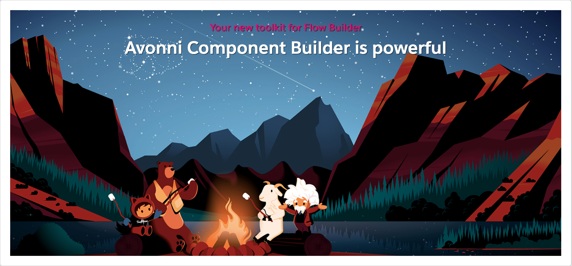
The Hero Banner enables the creation of visually engaging hero banners with customizable images/videos, text, calls to action, and responsive design.
***
## Overview
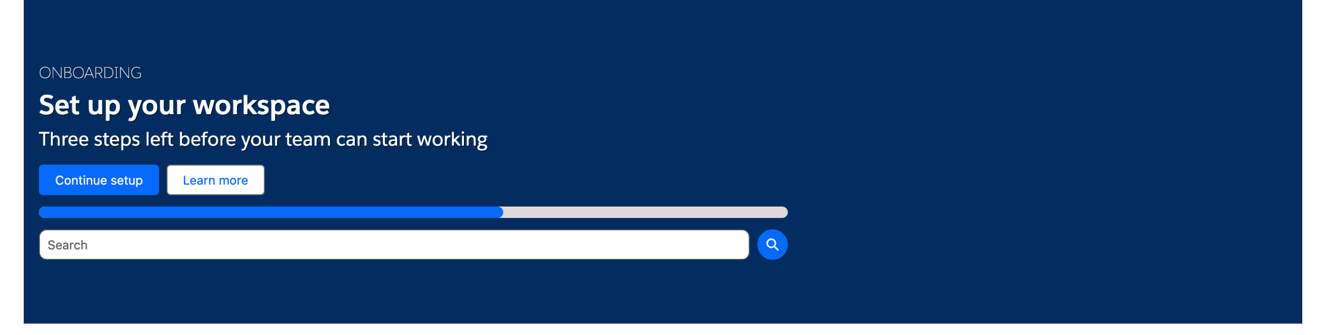
The Hero Banner displays a full-width promotional banner with a background image, title, caption, subtitle, and optional primary and secondary call-to-action buttons. Use it to set the visual tone at the top of a flow screen, highlight a campaign message, or provide quick navigation to key actions.
## Configuration
To configure it, click the component on the Flow screen. The Edit Hero Banner Component panel opens on the right with three tabs: Properties, Interactions, and Style. The sections below mirror the Properties tab.
### Properties
**Caption** — shorter text displayed above the title.
**Title** — the main headline text displayed in the banner. Enter it directly or map it to a flow variable.
**Subtitle** — additional text displayed below the title.
**Content** — rich text body content shown in the banner.
**Background Image** — URL for the background image displayed behind the banner content.
### Primary Button
Add a primary call-to-action button to the banner.
| Setting | What It Controls |
| ----------------- | ------------------------------------------------------------------------------------------------------ |
| **Label** | Text displayed on the button |
| **Variant** | Visual style — Base, Neutral, Brand, Brand Outline, Destructive, Destructive Text, Inverse, or Success |
| **Icon Name** | Lightning icon shown on the button |
| **Icon Position** | Left or Right of the label (requires **Icon Name**) |
| **Icon Size** | Size of the icon (requires **Icon Name**) |
### Secondary Button
Add a secondary call-to-action button to the banner. Configured the same way as the Primary Button.
### Layout
Control the dimensions and text alignment of the banner content.
| Setting | What It Controls |
| -------------------------------- | ----------------------------------------------------------------------------------------- |
| **Max Hero Width (px)** | Maximum width of the banner container |
| **Hero Height (px)** | Height of the banner in pixels (default: 400) |
| **Content Width (%)** | Width of the text content area inside the banner (0 to 100%). Default: 100 |
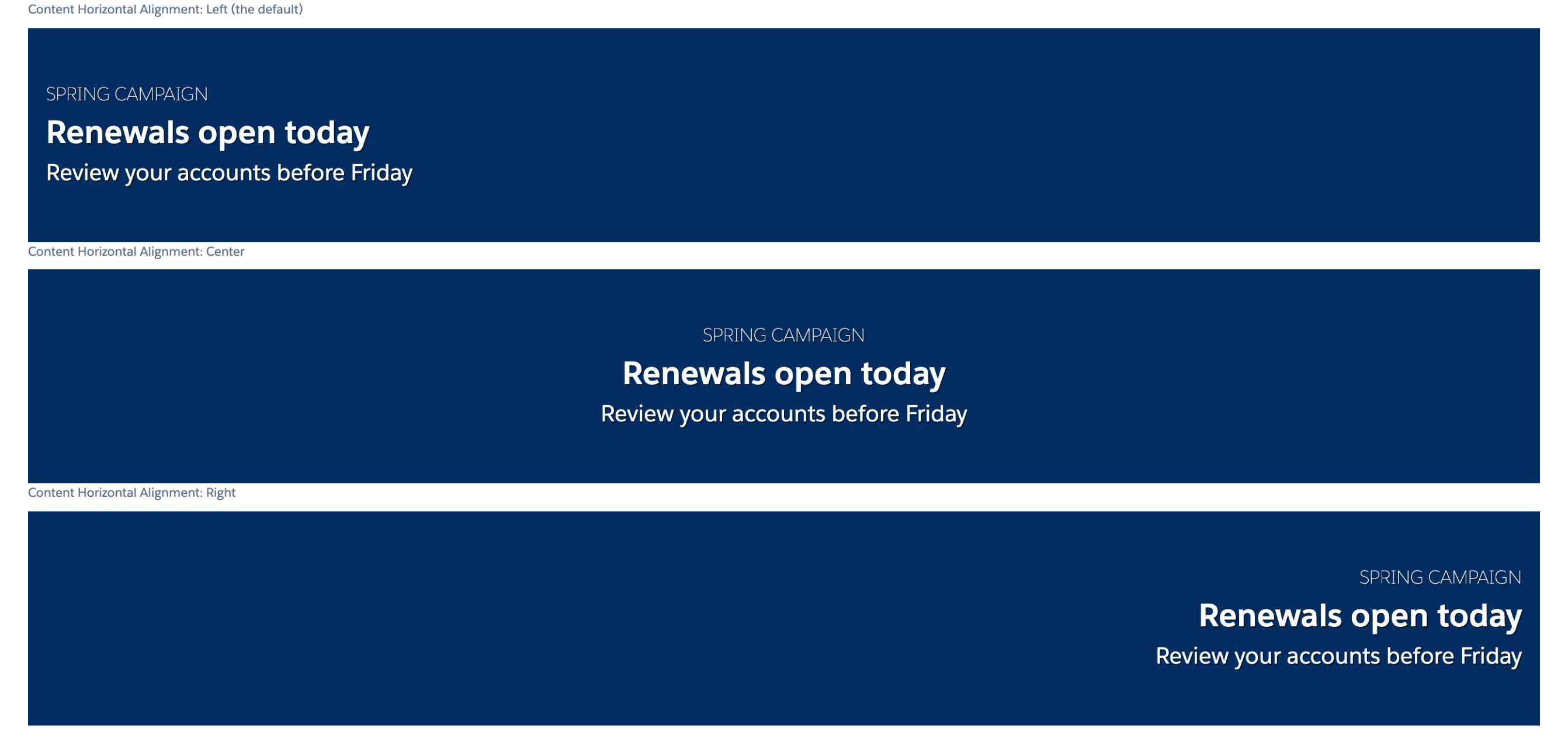
| **Content Horizontal Alignment** | Aligns title, caption, and description horizontally: Left (the default), Center, or Right |
| **Content Vertical Alignment** | Aligns title, caption, and description vertically: Top, Center (the default), or Bottom |
> **Example:** Set **Content Horizontal Alignment** to Center to create a centered hero message over a full-width background image. **Content Vertical Alignment** is already Center by default.
### Search
Add a search input to the banner. Users can type a search term and the **On Search** interaction fires with the entered value.
| Setting | What It Controls |
| ---------------- | -------------------------------------------------- |
| **Show Search** | Toggles the search input on or off |
| **Search Value** | Pre-populate the search field with a default value |
### Progress Bar
Add a progress bar to the banner footer to show completion status.
| Setting | What It Controls |
| ---------------------- | --------------------------------------------------------------------------------------------- |
| **Show Progress Bar** | Toggles the progress bar on or off |
| **Progress Bar Value** | The current progress value, as a text expression or variable (requires **Show Progress Bar**) |
### Advanced Options
The **Alternative Text** field inside both the Primary Button and Secondary Button groups provides assistive text for screen readers when the button uses only an icon.
## Interactions
[Interactions](/flow/component-builder/interactions-panel.md) define what happens when users interact with the Hero Banner. Configure them from the **Interactions** tab of the Edit Hero Banner panel.
### Primary Button Click
Fires when the user clicks the primary button. Use this to navigate to a screen, open a modal, or trigger a flow action.
### Search
Fires when the user submits a search query by pressing Enter or clicking the search button. Use this to filter results or navigate to a search results screen.
### Secondary Button Click
Fires when the user clicks the secondary button. Use this to navigate to a different screen or trigger a secondary action.
## Styling
The **Style** tab gives you fine-grained control over the Hero Banner's appearance. Configure it from the **Style** tab of the Edit Hero Banner panel.
{% tabs %}
{% tab title="Margin" %}
Controls the *outer* spacing around the component, creating space between it and other elements on the screen.
* **Top / Right / Bottom / Left:** Adjust the space on each side of the component.
{% endtab %}
{% tab title="Padding" %}
Controls the *inner* spacing between the component's content and its border.
* **Top / Right / Bottom / Left:** Adjust the inner spacing on each side.
{% endtab %}
{% tab title="Border" %}
Customizes the border surrounding the component.
* **Color:** Set the border color.
* **Size:** Adjust the border thickness.
* **Style:** Choose a border style (e.g. solid, dashed, dotted).
* **Radius:** Control the roundness of the corners.
{% endtab %}
{% tab title="Flow Dialog" %}
Styles the modal dialog opened by an Open Flow Dialog interaction.
* **Header Background / Header Border Color / Header Border Size:** Style the dialog header.
* **Header Label Color / Header Label Font Size / Header Label Font Weight:** Control the dialog header label typography.
* **Footer Background / Footer Border Color / Footer Border Size:** Style the dialog footer.
{% endtab %}
{% tab title="Banner" %}
Styles the banner background shown when no image source is present.
* **Background Color:** Set the banner background color.
{% endtab %}
{% tab title="Title" %}
Styles the title text.
* **Color:** Set the title text color.
* **Font Size / Font Weight / Font Family:** Control the title typography.
* **Shadow Color:** Apply a shadow to the title.
{% endtab %}
{% tab title="Caption" %}
Styles the caption text.
* **Color:** Set the caption text color.
* **Font Size / Font Weight / Font Family:** Control the caption typography.
* **Shadow Color:** Apply a shadow to the caption.
{% endtab %}
{% tab title="Subtitle" %}
Styles the subtitle text.
* **Color:** Set the subtitle text color.
* **Font Size / Font Weight / Font Family:** Control the subtitle typography.
* **Shadow Color:** Apply a shadow to the subtitle.
{% endtab %}
{% tab title="Progress Bar" %}
Styles a progress bar shown in the banner.
* **Color / Completed Color:** Set the bar track and fill colors.
{% endtab %}
{% tab title="Primary Button" %}
Styles the primary call-to-action button across its default, active, and hover states. The available properties depend on the button variant (set per variant).
* **Background Color / Background Color Active / Background Color Hover:** Set the button background in each state.
* **Text Color / Text Color Active / Text Color Hover:** Set the button text in each state.
* **Border Color / Border Color Active / Border Color Hover:** Set the button border in each state.
* **Border Size / Border Style / Border Radius / Line Height:** Customize the button border and line height (Base variant).
* **Block Start / Block End / Inline Start / Inline End:** Adjust the spacing around the button.
{% endtab %}
{% tab title="Secondary Button" %}
Styles the secondary button across its default, active, and hover states. The available properties depend on the button variant (set per variant).
* **Background Color / Background Color Active / Background Color Hover:** Set the button background in each state.
* **Text Color / Text Color Active / Text Color Hover:** Set the button text in each state.
* **Border Color / Border Color Active / Border Color Hover:** Set the button border in each state.
* **Border Size / Border Style / Border Radius / Line Height:** Customize the button border and line height (Base variant).
* **Block Start / Block End / Inline Start / Inline End:** Adjust the spacing around the button.
{% endtab %}
{% endtabs %}
## Output Variables
The Hero Banner exposes these output variables you can reference in your flow after the screen. To use them, select the screen element in Flow Builder, then the Hero Banner component, and pick the output variable you need.
### Button Clicks
| Output variable | Type | What it returns |
| ---------------------------- | ------- | -------------------------------------------------------------------------------- |
| **Primary Button Clicked** | Boolean | `true` when the user clicked the primary call-to-action button on this screen. |
| **Secondary Button Clicked** | Boolean | `true` when the user clicked the secondary call-to-action button on this screen. |
> **Example:** After the screen, add a Decision element that branches on **Primary Button Clicked** to navigate users who clicked "Get Started" to an onboarding screen, and users who clicked "Learn More" to an info screen.
### Search
| Output variable | Type | What it returns |
| ------------------------- | ------- | ------------------------------------------------------------------------------------------- |
| **Search Button Clicked** | Boolean | `true` when the user submitted a search query via the banner's search input on this screen. |
> **Example:** After the screen, check **Search Button Clicked** in a Decision element and use the **Search Value** input variable (set in the component's Properties) to pass the entered term to a subsequent Get Records element.
### Flow Interaction Output Variables
Like all interactive Flow components, the Hero Banner exposes generic output slots (Variable 1–10) that an [Open Flow Dialog](/flow/component-builder/interactions-panel/open-flow-dialog.md) or [Open Flow Panel](/flow/component-builder/interactions-panel/open-flow-panel.md) interaction can fill with values from a launched flow. See [Flow Interaction Output Variables](/flow/component-builder/interactions-panel/flow-interaction-output-variables.md).
---
# Agent Instructions
This documentation is published with GitBook. GitBook is the documentation platform designed so that both humans and AI agents can read, navigate, and reason over technical content effectively. Learn more at gitbook.com.
## Querying This Documentation
If you need additional information that is not directly available in this page, you can query the documentation dynamically by asking a question.
Perform an HTTP GET request on the current page URL with the `ask` query parameter, and the optional `goal` query parameter:
```
GET https://docs.avonnicomponents.com/flow/flow-components/hero-banner.md?ask=&goal=
```
`ask` is the immediate question: it should be specific, self-contained, and written in natural language.
`goal` is optional and describes the broader end goal you are ultimately trying to accomplish on behalf of the user. GitBook uses it to tailor the answer towards what is most useful for that goal.
The response will contain a direct answer to the question and relevant excerpts and sources from the documentation.
Use this mechanism when the answer is not explicitly present in the current page, you need clarification or additional context, or you want to retrieve related documentation sections.