> For the complete documentation index, see [llms.txt](https://docs.avonnicomponents.com/llms.txt). Markdown versions of documentation pages are available by appending `.md` to page URLs; this page is available as [Markdown](https://docs.avonnicomponents.com/flow/tutorials/tips-and-tricks.md).

# Tips and Tricks

The component pages tell you what every setting does. This section is the other half: short techniques that come up in almost every flow, and the handful of things about Avonni components inside Flow Builder that are worth knowing before you meet them.

***

## Where you configure an Avonni component

An Avonni component does not use Flow Builder's standard attribute list. Each one ships its own editor, so selecting the component on the screen and clicking **Open Component Builder** is the only way to reach its settings.

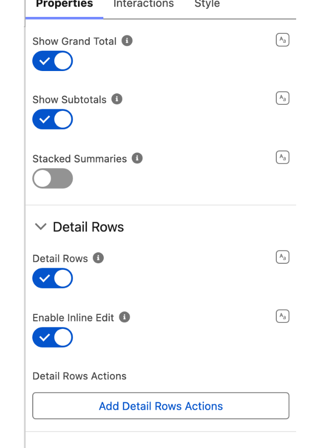
That editor always opens on a **Properties** tab. It adds **Interactions** when the component can react to the user, and **Style** when the component has anything to style. Which tabs you get therefore depends on the component: the Timer has all three, the Text Area has Properties and Style, and the Delay Interaction, which draws nothing on the screen, has Properties and Interactions.

<figure><img src="https://27923732-files.gitbook.io/~/files/v0/b/gitbook-x-prod.appspot.com/o/spaces%2F1FUd4apB9YHgCEMUFbVb%2Fuploads%2FTO5JSmJA4TKKeqoClb5s%2Ftips-editor-tabs.png?alt=media" alt="" width="320"><figcaption><p>The Pivot Table's editor, which has all three tabs.</p></figcaption></figure>

Inside it, any attribute can be typed in directly, mapped to a flow resource, or built as an expression. The [**Properties Panel**](/flow/component-builder/properties-panel.md) page covers that switch, and [**Create a variable and use it in a component property**](/flow/tutorials/tips-and-tricks/create-a-variable-and-use-it-in-a-component-property.md) walks through the mapped case.

### "No preview is available for this component" is normal

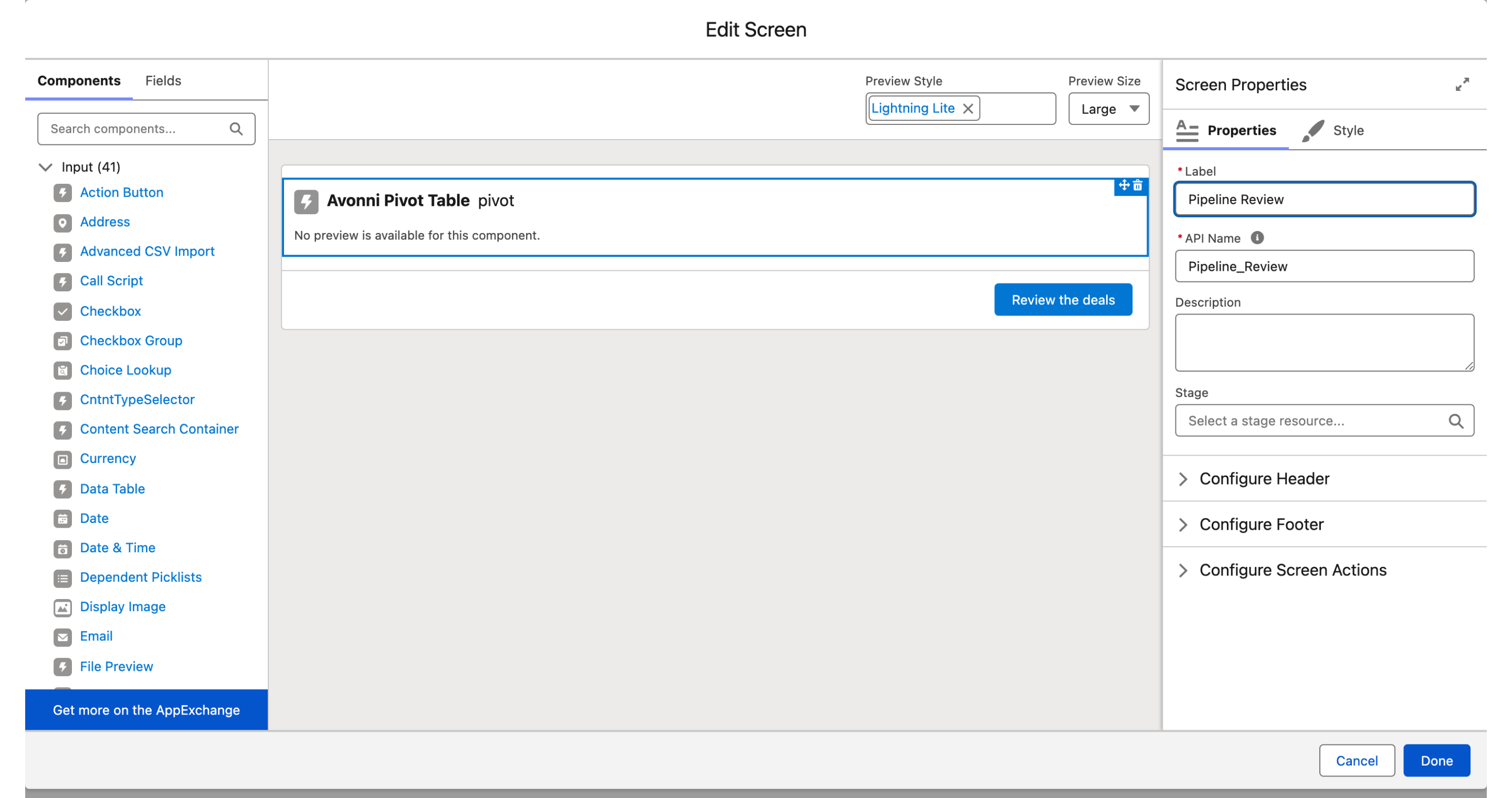
On the screen editor, an Avonni component shows that sentence instead of a rendering. Nothing is wrong: Flow Builder cannot draw the component at design time. To see it, run or debug the flow.

<figure><img src="https://27923732-files.gitbook.io/~/files/v0/b/gitbook-x-prod.appspot.com/o/spaces%2F1FUd4apB9YHgCEMUFbVb%2Fuploads%2FNNf1vkhNnjIEQmu0oSvi%2Ftips-screen-editor.png?alt=media" alt=""><figcaption><p>The screen editor. The component shows its label and its API Name, and the right panel holds the screen's own settings until you select a component.</p></figcaption></figure>

***

## The API Name is the handle for everything that follows

Look at the component on the screen editor: it shows its label and, next to it, its **API Name**. In the figure above, the Pivot Table's API Name is `pivot`.

That name is how the rest of the flow reaches the component. After the screen, a component's outputs are read as `{!apiName.outputName}`, so a Data Table called `dataTable` gives you `{!dataTable.selectedRows}`. Rename the component and every reference has to be updated by hand, so it is worth naming it for what it holds before you start wiring anything to it.

### Some outputs are read-only, others go both ways

This is the distinction that saves the most time. On the Data Table, twelve attributes are **output only**: they are produced by the component and cannot be set. **Number of Records**, **Clicked Row Action Name**, **Clicked Header Action Name**, **Button Save Clicked** and **Button Cancel Clicked** are among them.

The selection attributes are different. **Selected Rows**, **First Selected Row**, **Selected Rows Key Field Value**, **Number of Selected Rows** and **Edited Rows** are ordinary attributes, which means they work in both directions: set one to pre-select rows when the screen opens, and read the same one afterwards to find out what the user chose.

{% hint style="info" %}
These are the component's own outputs. They are not the same thing as [**Flow Interaction Output Variables**](/flow/component-builder/interactions-panel/flow-interaction-output-variables.md), which carry values back from a flow launched by an Open Flow Dialog or Open Flow Panel interaction.
{% endhint %}

***

## The same setting has two names

A setting is labelled one way in the component editor and another way in the flow, and both are correct: the editor names it for the group it sits in, the flow names it so it stays unique among all the component's attributes. Knowing this saves a search that would otherwise come up empty.

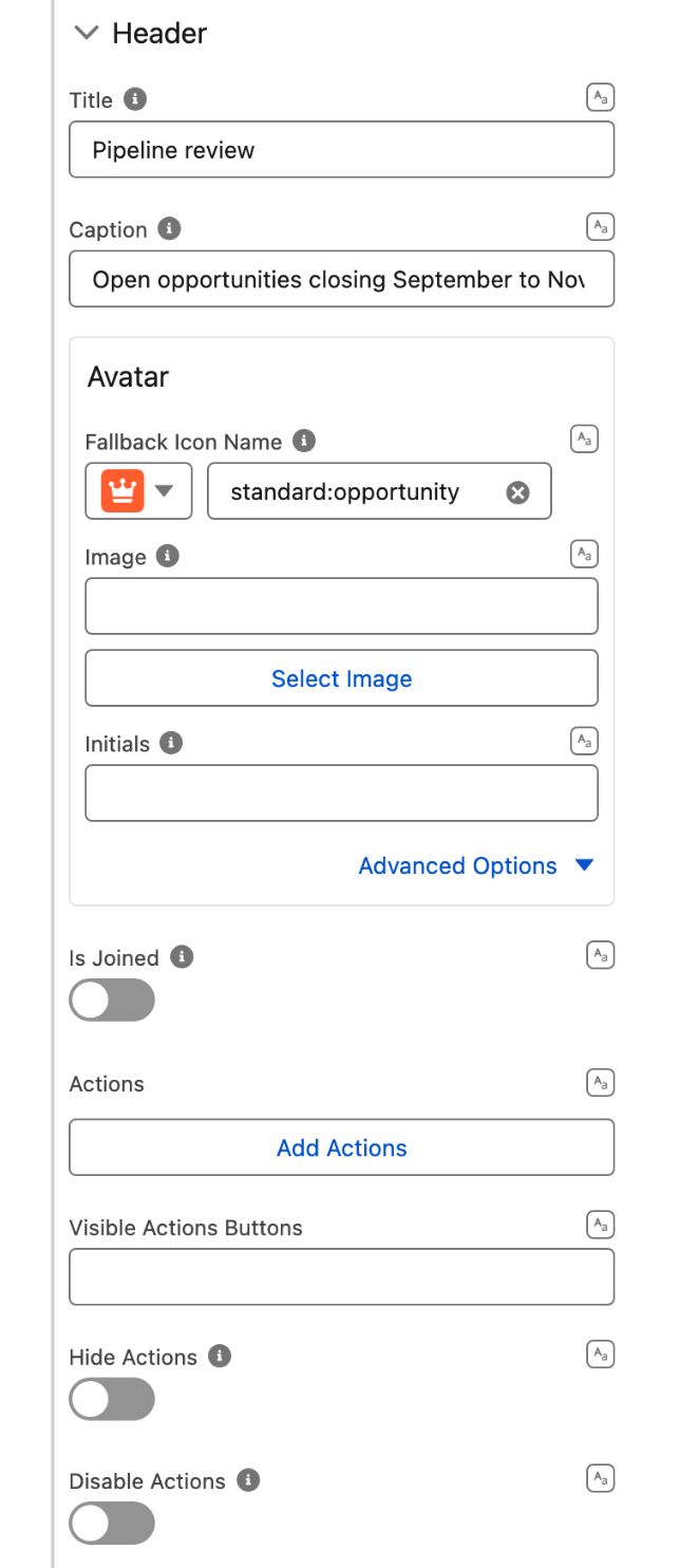
The Header group is where you meet it first:

| In the component editor     | In the flow                      |
| --------------------------- | -------------------------------- |
| **Avatar**                  | `Header Avatar`                  |
| **Actions**                 | `Header Actions`                 |
| **Visible Actions Buttons** | `Visible Header Actions Buttons` |
| **Hide Actions**            | `Hide Header Actions`            |
| **Disable Actions**         | `Disable Header Actions`         |
| **Is Joined**               | `Header Is Joined`               |

<figure><img src="https://27923732-files.gitbook.io/~/files/v0/b/gitbook-x-prod.appspot.com/o/spaces%2F1FUd4apB9YHgCEMUFbVb%2Fuploads%2FThHMachJiiJV2lu5fYBM%2Ftips-header-two-names.png?alt=media" alt="" width="320"><figcaption><p>The Header group, here on the Pivot Table. Every Avonni data component shares this group, so the same pairs apply to the Data Table, the Timeline and the Tree Grid.</p></figcaption></figure>

So when you are looking for a setting in the flow's resource picker and cannot find it, try the name with its group in front.

***

## Before you ship

### Map anything that matters to a flow variable

Salesforce destroys and rebuilds a screen's components whenever the user navigates, or whenever a visibility rule turns off and on again. Flow variables survive that. Anything held only inside the component, such as visual selection, scroll position or sort order, does not.

This is the single most common source of "the component lost my selection" reports, and it is platform behaviour rather than a defect. [**Component Lifecycle in Flow**](/flow/help/component-lifecycle-in-flow.md) explains what survives and what does not, and what to do about it.

### Replace the standard footer rather than losing it

Hiding the flow's standard header and footer is a screen setting, not a component one: it lives under **Configure Header** and **Configure Footer** in the screen's own properties, visible in the figure above. If you hide the footer, remember to give the user something else to move with, usually a Button wired to a flow navigation interaction. [**Hide Standard Header and Footer in a flow**](/flow/tutorials/tips-and-tricks/hide-standard-header-and-footer-in-a-flow.md) has the steps.

### Copy a component's settings instead of rebuilding it

A configured component can be copied and pasted, within the same flow or into another one. See [**Copy / Paste component settings**](/flow/component-builder/layout-and-customization/copy-paste-component-settings.md).

***

## In this section

<table data-view="cards"><thead><tr><th></th><th data-hidden data-card-target data-type="content-ref"></th></tr></thead><tbody><tr><td><strong>How to pass your current RecordID in your screen flow</strong></td><td><a href="/flow/tutorials/tips-and-tricks/how-to-pass-your-current-recordid-in-your-screen-flow.md">How to pass your current RecordID in your screen flow</a></td></tr><tr><td><strong>Create a variable and use it in a component property</strong></td><td><a href="/flow/tutorials/tips-and-tricks/create-a-variable-and-use-it-in-a-component-property.md">Create a variable and use it in a component property</a></td></tr><tr><td><strong>Create a link to the record using the href attribute</strong></td><td><a href="/flow/tutorials/tips-and-tricks/create-a-link-to-the-record-using-the-href-attribute.md">Create a link to the record using the href attribute</a></td></tr><tr><td><strong>Hide Standard Header and Footer in a flow</strong></td><td><a href="/flow/tutorials/tips-and-tricks/hide-standard-header-and-footer-in-a-flow.md">Hide Standard Header and Footer in a flow</a></td></tr><tr><td><strong>Copy / Paste component settings</strong></td><td><a href="/flow/component-builder/layout-and-customization/copy-paste-component-settings.md">Copy / Paste component settings</a></td></tr><tr><td><strong>Data Table tips and tricks</strong></td><td><a href="/flow/tutorials/components/data-table/tips-and-tricks.md">Tips and Tricks</a></td></tr></tbody></table>


---

# Agent Instructions
This documentation is published with GitBook. GitBook is the documentation platform designed so that both humans and AI agents can read, navigate, and reason over technical content effectively. Learn more at gitbook.com.

## Querying This Documentation
If you need additional information that is not directly available in this page, you can query the documentation dynamically by asking a question.

Perform an HTTP GET request on the current page URL with the `ask` query parameter, and the optional `goal` query parameter:

```
GET https://docs.avonnicomponents.com/flow/tutorials/tips-and-tricks.md?ask=<question>&goal=<endgoal>
```

`ask` is the immediate question: it should be specific, self-contained, and written in natural language.
`goal` is optional and describes the broader end goal you are ultimately trying to accomplish on behalf of the user. GitBook uses it to tailor the answer towards what is most useful for that goal.

The response will contain a direct answer to the question and relevant excerpts and sources from the documentation.

Use this mechanism when the answer is not explicitly present in the current page, you need clarification or additional context, or you want to retrieve related documentation sections.