> For the complete documentation index, see [llms.txt](https://docs.avonnicomponents.com/llms.txt). Markdown versions of documentation pages are available by appending `.md` to page URLs; this page is available as [Markdown](https://docs.avonnicomponents.com/flow/flow-components/image.md).
# Image
The image component allows you to add an image to your screen flow
***
## Overview
The Image component displays an image from a URL or Salesforce Content Document. It supports sizing, positioning, cropping, a comparison slider (before/after), and magnifier zoom effects. Use it to show product photos, maps, diagrams, or any visual content in a flow screen.
## Configuration
To configure it, click the component on the Flow screen. The Edit Image Component panel opens on the right with two tabs: Properties and Style. The sections below mirror the Properties tab.
### Properties
**Image Source** — the URL or Content Document ID of the image to display.
**Width** — set a fixed width for the image.
**Height** — set a fixed height for the image.
**Position** — horizontal alignment of the image within its container: Left, Center, or Right.
### Crop
Configure how the image is cropped or fitted inside its container.
| Setting | What It Controls |
| ------------------- | --------------------------------------------------------------------------------------------------------------- |
| **Crop Size** | Aspect ratio of the crop area — 16x9, 4x3, 1x1, or None |
| **Crop Fit** | How the image fills the crop area — Cover (fills and clips), Contain (fits entirely), Fill (stretches), or None |
| **Crop Position X** | Horizontal anchor point of the image within the crop area (in percent) |
| **Crop Position Y** | Vertical anchor point of the image within the crop area (in percent) |
### Compare Image
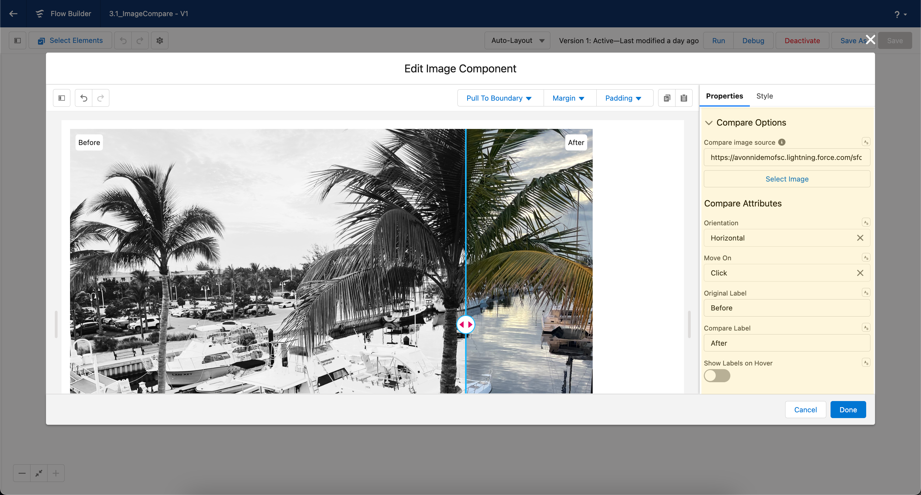
The Compare Images feature lets users drag a slider to reveal or conceal a second image overlaid on the first — ideal for before/after comparisons.
| Setting | What It Controls |
| ------------------------ | ----------------------------------------------------------------------- |
| **Source** | URL or Content Document ID of the second (comparison) image |
| **Orientation** | Direction of the slider — Horizontal (left/right) or Vertical (up/down) |
| **Move On** | Interaction to move the slider — Click (drag) or Hover (follows cursor) |
| **Original Label** | Label for the first (original) image — e.g., "Before" |
| **Compare Label** | Label for the second (compare) image — e.g., "After" |
| **Show Labels on Hover** | When enabled, image labels only appear when the user hovers |
{% hint style="info" %}
**Tips:**
* Ensure both images have the same dimensions for a smooth user experience.
* Use the feature thoughtfully. While it's great for comparisons, overusing it can detract from the user experience.
* Test on different devices to ensure responsiveness and usability, especially using the hover feature on mobile devices.
{% endhint %}
### Magnifier
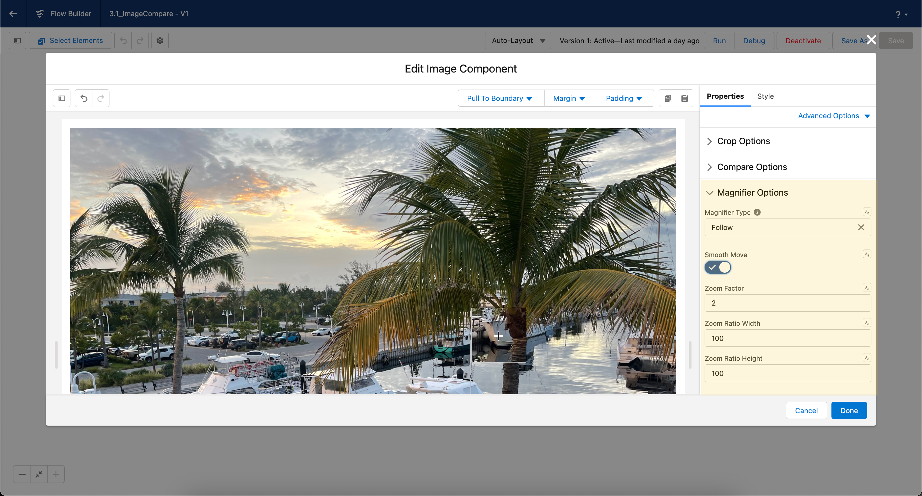
The Magnifier adds a zoom effect to the image so users can inspect fine details.
| Setting | What It Controls |
| --------------------- | -------------------------------------------------------------------------------------------------------------------------------------- |
| **Magnifier Type** | Style of magnification — Inner (within the frame), Standard (enlarges beyond the frame), or Follow (follows the cursor) |
| **Position** | Position of the magnified image relative to the main image — Auto, Top, Right, Bottom, or Left. Requires **Magnifier Type** = Standard |
| **Horizontal Offset** | Horizontal offset of the magnified image relative to the main image. Requires **Magnifier Type** = Standard |
| **Vertical Offset** | Vertical offset of the magnified image relative to the main image. Requires **Magnifier Type** = Standard |
| **Smooth Move** | Enables a smooth transition when moving the magnifier |
| **Zoom Factor** | Magnification level — higher values zoom in more (default: 2) |
| **Zoom Ratio Width** | Width ratio of the zoomed image. Requires **Magnifier Type** = Standard or Follow |
| **Zoom Ratio Height** | Height ratio of the zoomed image. Requires **Magnifier Type** = Standard or Follow |
{% hint style="info" %}
**Tips:**
* For optimal results, use high-resolution images to prevent pixelation upon zooming.
* Test the Magnifier Feature across different devices and screen sizes to ensure the zoom behaves as expected.
* Keep the user experience in mind. Too high a zoom factor might become disorienting, so choose values that enhance clarity without compromising usability.
{% endhint %}
### Advanced Options
The following settings appear under **Advanced Options** within their respective groups:
**Static Images** — when enabled, the image retains its fixed dimensions and is no longer responsive.
**Fluid Grow** — similar to Fluid, but allows the image to scale beyond its native width.
**Thumbnail** — adds a thumbnail-style border around the image.
**Lazy Loading** — controls when offscreen images load. **Auto** loads immediately; **Lazy** defers loading until the image is near the viewport.
**Alternative Text** — alternative text used to describe the image for screen readers.
**Alternative Text** (Compare Image) — the value set for the `alt` attribute on the comparison image.
## Styling
The **Style** tab gives you control over the Image's spacing, size, corners, and the appearance of its interactive overlays. Configure it from the **Style** tab of the Edit panel.
{% tabs %}
{% tab title="Margin" %}
Controls the *outer* spacing around the image, creating space between it and other elements on the screen.
* **Top / Right / Bottom / Left:** Adjust the space on each side.
{% endtab %}
{% tab title="Padding" %}
Controls the *inner* spacing between the image and its border.
* **Top / Right / Bottom / Left:** Adjust the inner spacing on each side.
{% endtab %}
{% tab title="Size" %}
Controls the image's dimensions.
* **Width / Height:** Set fixed dimensions for the image.
* **Min Width / Max Width / Min Height / Max Height:** Constrain the size within bounds.
* **Overflow:** Control how content that exceeds the bounds is handled.
{% endtab %}
{% tab title="Border" %}
Customizes the corners of the image.
* **Radius:** Control the roundness of the corners.
{% endtab %}
{% tab title="Compare Slider" %}
Styles the before/after compare slider overlay.
* **Color:** Set the slider divider color.
* **Handle Background Color:** Set the drag handle's background.
* **Arrows Color:** Set the color of the handle arrows.
* **Label Background Color / Border Color / Border Size / Border Style / Border Radius:** Style the compare labels.
{% endtab %}
{% tab title="Magnifier Border" %}
Styles the border of the magnifier (zoom) overlay.
* **Color:** Set the magnifier border color.
* **Size:** Adjust the border thickness.
* **Style:** Choose a border style (e.g. solid, dashed, dotted).
* **Radius:** Control the roundness of the corners.
{% endtab %}
{% endtabs %}
---
# Agent Instructions
This documentation is published with GitBook. GitBook is the documentation platform designed so that both humans and AI agents can read, navigate, and reason over technical content effectively. Learn more at gitbook.com.
## Querying This Documentation
If you need additional information that is not directly available in this page, you can query the documentation dynamically by asking a question.
Perform an HTTP GET request on the current page URL with the `ask` query parameter, and the optional `goal` query parameter:
```
GET https://docs.avonnicomponents.com/flow/flow-components/image.md?ask=&goal=
```
`ask` is the immediate question: it should be specific, self-contained, and written in natural language.
`goal` is optional and describes the broader end goal you are ultimately trying to accomplish on behalf of the user. GitBook uses it to tailor the answer towards what is most useful for that goal.
The response will contain a direct answer to the question and relevant excerpts and sources from the documentation.
Use this mechanism when the answer is not explicitly present in the current page, you need clarification or additional context, or you want to retrieve related documentation sections.
.avif?alt=media)