LogoLogo
HomepageYouTube ChannelInstall from the AppExchange
  • Home
  • Dynamic Components
  • Flow Components
  • Experience Components
  • Projects
  • 👋Welcome
  • Getting Started
    • Product Tour
    • Quickstart Guide
    • Learn the Basics
    • Installation & Licenses management
    • Flow vs. Dynamic Components
    • Integrating with Experience Cloud
  • Tutorials
    • Videos
    • Projects Tutorials
    • Components Tutorials
      • Alert
        • Create a custom branding alert
        • Create an error alert dismissible
      • Avatar
        • Create an avatar with actions
        • Create an avatar with details
      • Avatar Group
        • Display a list of contacts related to an account
        • Display a list of sharing users related to the record
      • Barcode
        • Generating and Displaying Barcodes for Product Codes
      • Biometrics
        • 101 Tutorial
      • Button
        • Customizing Flow Navigation Buttons
        • How to Add a "Cancel and Close" Button
        • How to Open Flows from Buttons
      • Button Groups
        • Identifying Clicked Buttons
      • Button Menu
        • How to change dynamically Avonni Button Menu Icons
      • Calendar
        • Calendar 101 Tutorial
        • How to Connect Multiple Data Sources to the Avonni Calendar
        • How to Customize Time Spans
        • How to Customize the Right-Click Menu
        • How to Add an Edit Action to Events
        • How to Add a New Event Button to the Avonni Calendar Header
        • How to Create Events by Dragging in the Avonni Calendar
        • How to Reschedule Events with Drag and Drop
        • How to Color-Code Calendar Entries in the Avonni Calendar
        • Using a variable Data Source
        • Using a Query Data Source
      • Carousel
        • Build a Related Products Carousel
      • Combobox
        • Implement Dependent Picklists in Comboboxes
        • How to Dynamically Enable/Disable Dependent Picklists
        • Using Multi-Select Comboboxes with Reactive Formulas
      • CSV Parser
        • 101 Tutorial
      • Data Table
        • Adding Filters
        • How to add Images onthe Data Table
        • Creating Row Actions
        • Displaying a Record as a QR Code
        • Displaying Record Name field as a link
        • Learn the Basics
        • Making a field editable
        • Setting Up Data Export
        • Tips and Tricks
          • Activate infinite scrolling
          • Creating an action from a button or a link
          • Customizing the Badge Color using a formula
          • How to Grayscale Header Actions Dynamically in Avonni Data Table
          • How to Conditionally Color Cells
          • Enabling auto-refresh on the Data Table when pressing a button
          • Handling formula text field
          • How to set column visibity
          • Passing multiple record IDs to another flow
          • Data Table Editor
      • Date Picker
        • Display a date picker with Marked Dates from a Get Records
      • Date Time Picker
        • How to create Collection Variables for StartDateTime and EndDateTime
        • How to Block Out Times
      • Delay Interaction
        • Creating a Confetti Celebration on the Final Screen
        • Launch a flow dialog without a screen
      • Dual Listbox
        • Display contacts with custom icons
        • Accounts list group by industry
      • Expandable Section
        • How to add components into an expandable section
      • Header
        • Building Engaging Card Headers
        • Crafting a Profile Header
        • Adding Action Buttons to Headers
        • Adding a Background Image to Your Header
      • Input Pen
        • Add the custom Toolbar
        • How to Store Input Pen Drawings as Attachments in Salesforce
      • Kanban
        • 📹Introduction
      • List
        • Create a grid list with images
        • Create a sortable list
        • How to Reorder Items and Update Records
        • Vertical List with Actions
      • Navigation
      • Map
        • Customize the Map Marker
        • Visualizing Account Information on a Map
      • Metric
        • 📹Introduction
      • Microphone
        • Save the Microphone recording file as an attached on a record
      • Progress Indicator
        • Creating a Universal Dynamic Progress Step Collection
        • How to Change the Appearance of Your Progress Indicator using a variable
        • Error Handling
      • QR Code
        • Generate a QR Code from a record field
      • Record Detail
        • Using the Record Detail with Reactive Screens
      • Scoped Notification
        • Display message based on a value
      • Text Area
        • TextArea issue with max length when clicking on the next button
      • Tree
        • Build a Tree View with Dynamic Record Details
      • Timeline
        • Assigning multiple source collection to the Timeline
        • Customizing Date Format in the Timeline Component using Luxon
        • Create a horizontal activity timeline
        • Display Tasks
        • Perform actions on selected tasks
      • Vertical Visual Picker
        • Adding sub-items
        • Display a list of online contacts
    • Interactions
      • Enabling auto-refresh for queries after the Flow Dialog ends
      • Creating a Confetti Celebration on the final screen
      • How to create an interaction to navigate to an object
      • How to create an interaction to a record page
      • How to create an interaction to open another flow
      • How to pass an Input Variable from One Flow to Another
      • How to setup an Open Flow Panel interaction
    • Reactive Query Tutorials
      • How to make Data Tables Reactive
      • Build a reactive Data Table Using Dependent Picklists
      • Building a Dynamic Metrics Dashboard with the Data Table
      • How to build a reactive 'Quarterly Opportunity Tracker' component
      • How to Create a Combobox-Filtered Data Table
      • Create a Dynamically Linked Account-Contact View
      • Troubleshooting
    • Tips and Tricks
      • Copy / Paste a component settings
      • Create a link to the record using the href attribute
      • Create a variable and use it in a component property
      • Data Table
      • Hide Standard Header and Footer in a flow
      • How to pass your current RecordID in your screen flow
    • Platform Events
      • Configuration tutorial
  • Flow Components
    • Explore All Components
    • Alert
    • Audio Player
    • Avatar
    • Avatar Group
    • Barcode
    • Barcode Scanner
    • Biometrics
    • Blockquote
    • Button
    • Button Group
    • Button Icon
    • Button Menu
    • Calendar
    • Carousel
    • Chart
    • Chip Container
    • Combobox
    • Color Picker
    • CSV Parser
    • Date Picker
    • Data Table
    • Date Time Picker
    • Delay Interaction
    • Document Scanner
    • Dual Listbox
    • Expandable Section
    • Formatted Address
    • Formatted Name
    • Formatted Value
    • Header
    • Hero Banner
    • Icon Picker
    • Image
    • Input Choice Set
    • Input Choice Set Grid
    • Input Counter
    • Input Date Range
    • Input Pen
    • Illustration
    • Interaction service
    • Kanban
    • List
    • Map
    • Metric
    • Microphone
    • Navigation
    • NFC Scanner
    • Pill Container
    • Progress Bar
    • Progress Circle
    • Progress Indicator
    • Progress Popover
    • QR Code
    • Rating
    • Record Detail
    • Scoped Notification
    • Separator
    • Slider
    • Tabs
    • Text Area
    • Timeline
    • Tree
    • User Location
    • Vertical Visual Picker
    • Visual Picker
    • Visual Picker Link
    • Video Player
    • Welcome Mat
  • Component Builder
    • Overview
    • Properties Pane
    • Interactions Pane
      • Copy Records
      • Download
      • Export To
      • Fire Confetti
      • Flow Navigation
      • Navigate
      • Show Toast
      • Open Alert Modal
      • Open Confirm
      • Open Flow Dialog
      • Open Flow Panel
      • Update Records
      • Refresh Query
      • Refresh All Queries
      • Open Quick Action
    • Style Pane
    • Component Templates
    • Layout and Customization
      • Alignment controls
      • Copy / Paste component settings
      • Margin / Padding
      • Pull To Boundary
      • Undo / Redo
  • Data Sources
    • Understanding Data Sources
    • Manual
    • Variable
    • Query
    • Query VS Variable
    • Picklist
  • Actions
    • Overview
    • Data Manipulation and Transformation
      • Convert Lead
      • Create file
      • Split Text to Text Collection
      • SObject Collection Math
      • SObject Collection Join
      • Get Record from SObject Collection
      • SObject Collection to Activity Timeline Items
      • SObject Collection to Calendar Marked Date Collection
      • SObject Collection to Scheduler Events
      • SObject Collection to Text Collection
    • Data Conversion and Formatting
      • Text Collection Get Value
      • Get Value from String Collection
      • Number Collection Get Value
      • Join Text Collection
      • Format Text in SObject Collection
      • Format Text Collection
      • Text Collection to Combobox Options
      • Text Collection to Dual Listbox Options
      • Text Collection to Progress Indicator Steps
    • UI & Navigation
      • New Avatar Action Collection
      • New Button Menu Item Collection
      • New Carousel Item Collection
      • New Combobox Option Collection
      • New Dual Listbox Option Collection
      • New Header Action Collection
      • New Header Avatar Action Collection
      • New List Action Collection
      • New Navigation Item Collection
      • New Progress Indicator Step Collection
      • New Progress Popover Step Collection
      • New Slider Custom Label Collection
  • Help
    • Performance Guide
    • How do I contact support?
    • How do I report Bugs?
    • Troubleshooting
    • Release Process
  • Miscellaneous
    • Live use cases examples
    • Release Notes
    • Salesforce Flow Limit
    • Security
Powered by GitBook
On this page
  • Configuring the Visual Picker
  • Data Source
  • Data Mappings
  • Changing the Properties
  • Selecting Radio or Checkbox type
  • Selection Range Customization
  • Setting a Ratio
  • Choosing a Variant
  • Adding Interactions
  • Accessing the selected value
  • Styling
  • Layout and Spacing
  • Text and Typography
  • Visual Elements
  • Examples

Was this helpful?

  1. Flow Components

Visual Picker

The Avonni Visual Picker transforms the selection process into an interactive and visually appealing user experience

Last updated 1 month ago

Was this helpful?

LogoLogo

Company

  • About Us
  • Pricing

Policies

  • Privacy Policy
  • Terms of Service

Configuring the Visual Picker

The initial step in setting up the Visual Picker is determining how you want to retrieve and display your data.

Data Source

The "Data Source Configuration" step in setting up the Visual Picker is where you tell the Visual Picker where to get its information from within Salesforce.

Data Source Type
Use Case
When to Use

For a predefined set of items that don’t require dynamic updates.

Ideal for static content or rapid setup with specific items.

Dynamically displaying items based on variable collections in Salesforce.

Suitable when list content reflects changing data from Salesforce records.

Displaying a list of options defined in a Salesforce picklist.

Best for presenting a list of predefined options for selection.

Fetching data based on a specific query, pulling various records or data points.

Ideal for complex data retrieval or when sourcing. Using a 'Get Records' collection is not necessary with this method, as the query itself is powerful enough to simplify your flow

Images can not be added to picklist value items.

Data Mappings

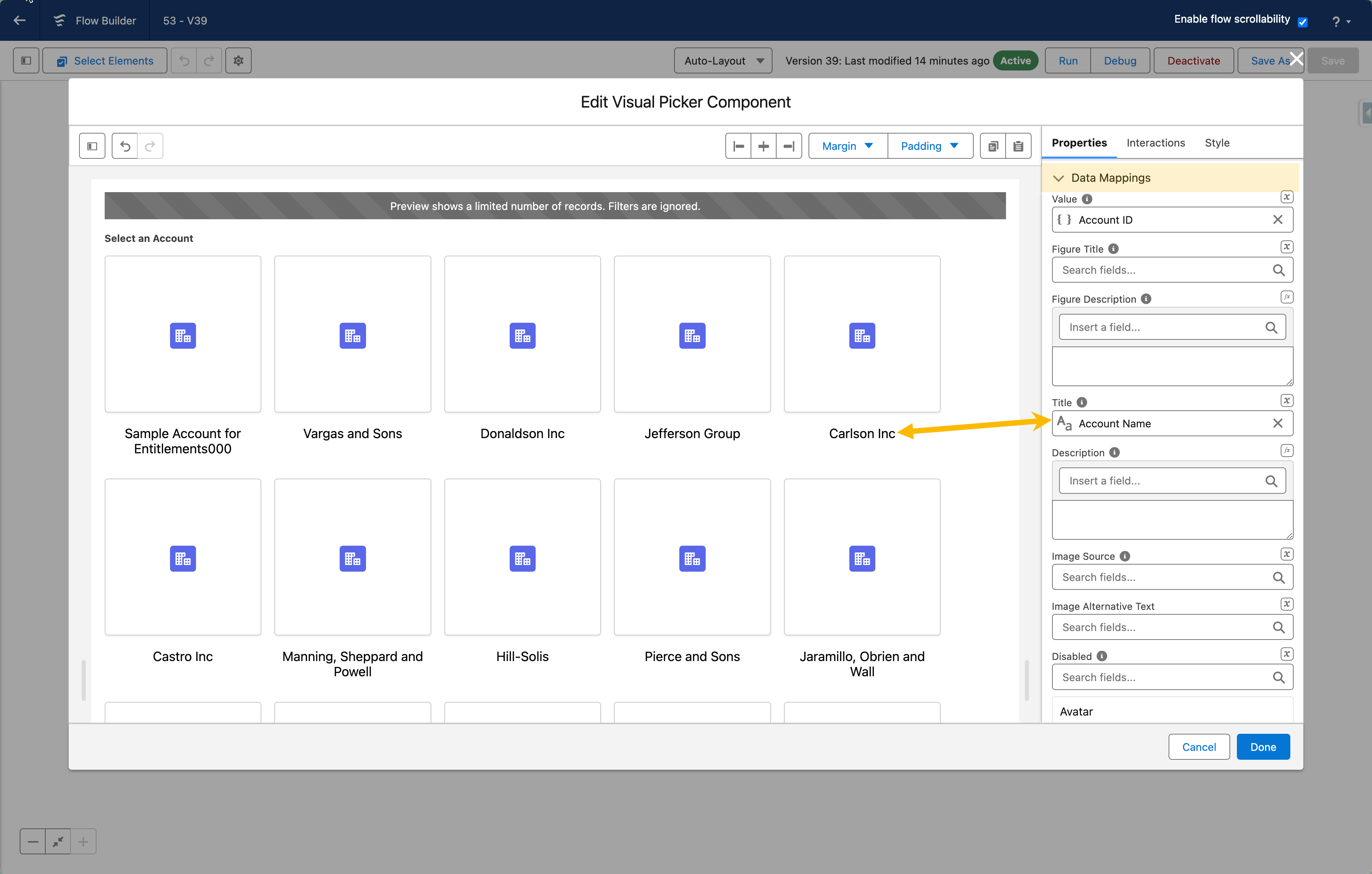
When using a dynamic data source for your Visual Picker, you must configure the Data Mappings section to tell the component how to create picker items from your data.

Think of it like a translator: Data Mappings ensure the correct information from your Salesforce data.

Why are Data Mappings Important?

Without data mapping, the Visual Picker wouldn't know which part of your data to use. This could result in the Visual Picker showing incorrect or irrelevant information.

How Do Data Mappings Work?

In the Data Mappings section, you'll establish the connection between your Salesforce data fields and the corresponding List attributes. By selecting which field maps to which attribute (for example, the "Account Name" field to the "Title" attribute), you ensure each item accurately displays the correct information from your Salesforce data.


Changing the Properties

Selecting Radio or Checkbox type

The type attribute allows you to define how the input selection should behave. To allow users to select more than one option, use checkboxes instead of radio buttons.

Selection Range Customization

The Visual Picker components now include a 'Selection Range Customization' feature, enhancing your control over item selection. This feature allows you to define minimum and maximum selection limits, particularly useful when utilizing the Checkbox Type.

By setting these parameters, you can precisely manage the number of options a user can select, ensuring adherence to your specified range and enhancing the accuracy of data collection or user input.

Setting a Ratio

You can access various ratio values to decide how to dispose of your items.

Choosing a Variant

The Variant attribute lets you decide the appearance of an item when selected.

Adding Interactions

Interactions define what happens when users interact with the visual picker component. A list of interactions is available.

Here are the available interactions for the visual picker component:

  • On Change: The event fired when the slider value changed.


Accessing the selected value

You can reference the attribute to use the selected value from the Vertical Visual Picker in your flow. This attribute holds the currently selected item(s) from the picker.

Example:

  1. In your flow: After the Vertical Visual Picker component in your flow, add a Display Text component.

  2. Configure the Display Text component: In the 'Value' field of the Display Text component, use the formula {!Visual_Picker.value} (replace "Visual_Picker" with the actual API name of your Visual Picker component).

  3. Run the flow: When you make a selection in the Vertical Visual Picker, the Display Text component will show the selected value(s).

Key Points:

  • Data Type: The value attribute's data type depends on your Visual Picker's configuration:

    • Single Selection (Radio buttons): The value will be a single value (e.g., the ID or label of the selected item).

    • Multiple Selection (Checkboxes): The value will be a list of values (e.g., an array of IDs or labels of the selected items).

  • valueCollection and valueCollectionSerialized:

    • valueCollection: When selected, the value attribute will give you a list of the selected items' values. This is helpful if you need to use those values in other parts of your flow.

    • valueCollectionSerialized: When this is selected, the value attribute will give you a text version of the list of selected items, formatted like this: ["Banking","Biotechnology","Chemicals"]. This format is helpful if you need to store or send the selected data in a specific way.

  • Further Processing: You can use the retrieved value in subsequent flow elements for further processing, decision-making, or data updates


Styling

The Styles panel lets you customize the look and feel of your Visual Picker to match your design preferences. Here are the key styling options you can adjust:

Layout and Spacing

  • Margin: Control the space around the Visual Picker.

  • Size: Choose the overall size (small, medium, or large) to fit your content best.

Text and Typography

  • Header: Adjust the color, font size, style, and weight of the label text.

  • Figure Title & Description: Customize the appearance of the figure title and description text.

  • Title & Description: Customize the appearance of the main title and description text, including an option to limit the number of lines displayed for the description (line clamp).

  • Tag: Control the font, border, and line height of any tags within the Visual Picker.

Visual Elements

  • Avatar: Choose how to align avatars within the picker (top, center, bottom).

  • Background: Set the background colors for normal, hover, and selected states.

  • Border: Customize the appearance of the border surrounding the Visual Picker items.

By experimenting with these options, you can create a Visual Picker that perfectly complements your application's design and enhances user experience.

Examples

Manual
Variable
Picklist
Query
Non coverable vs Coverable variant
Example of displaying the accessing value on a text element.