> For the complete documentation index, see [llms.txt](https://docs.avonnicomponents.com/llms.txt). Markdown versions of documentation pages are available by appending `.md` to page URLs; this page is available as [Markdown](https://docs.avonnicomponents.com/flow/flow-components/tree.md).
# Tree
The Avonni Tree presents hierarchical data in a user-friendly, expandable/collapsible tree for easy navigation.
## Overview
The Tree displays hierarchical data as an expandable and collapsible tree structure. Use it to browse org charts, account hierarchies, category trees, or any parent-child dataset — with optional multi-select so users can pick items for subsequent flow steps.
***
## Tutorials
| Name | Description | Illustration |
| ------------------------------------------------------------------------------------------------------------------------------------- | -------------------------------------------------------------------------- | -------------------------------------------------------------------------------------------------------------------------------------------------------------------------------------------------------------------------- |
| [**Build a Tree View with Dynamic Record Details**](/flow/tutorials/components/tree/build-a-tree-view-with-dynamic-record-details.md) | Interactive tree shows account details, dynamically updating on selection. | .png?alt=media) |
***
## Configuration
To configure it, click the component on the Flow screen. The **Edit Tree Component** panel opens on the right with three tabs: Properties, Interactions, and Style. The sections below mirror the Properties tab.
### Data Source
The **Data Source** setting determines where the tree items come from.
| Data Source | Best For | When to Use |
| ---------------------------------------------------------------- | ------------------------------------ | ---------------------------------------------------------- |
| [**Manual**](/flow/component-builder/data-sources/manual.md) | Fixed, pre-defined items | Static trees that never change |
| [**Picklist**](/flow/component-builder/data-sources/picklist.md) | A Salesforce picklist field's values | Presenting a predefined set of options |
| [**Query**](/flow/component-builder/data-sources/query.md) | Live Salesforce records | Complex data retrieval without a separate Get Records step |
### Data Mapping
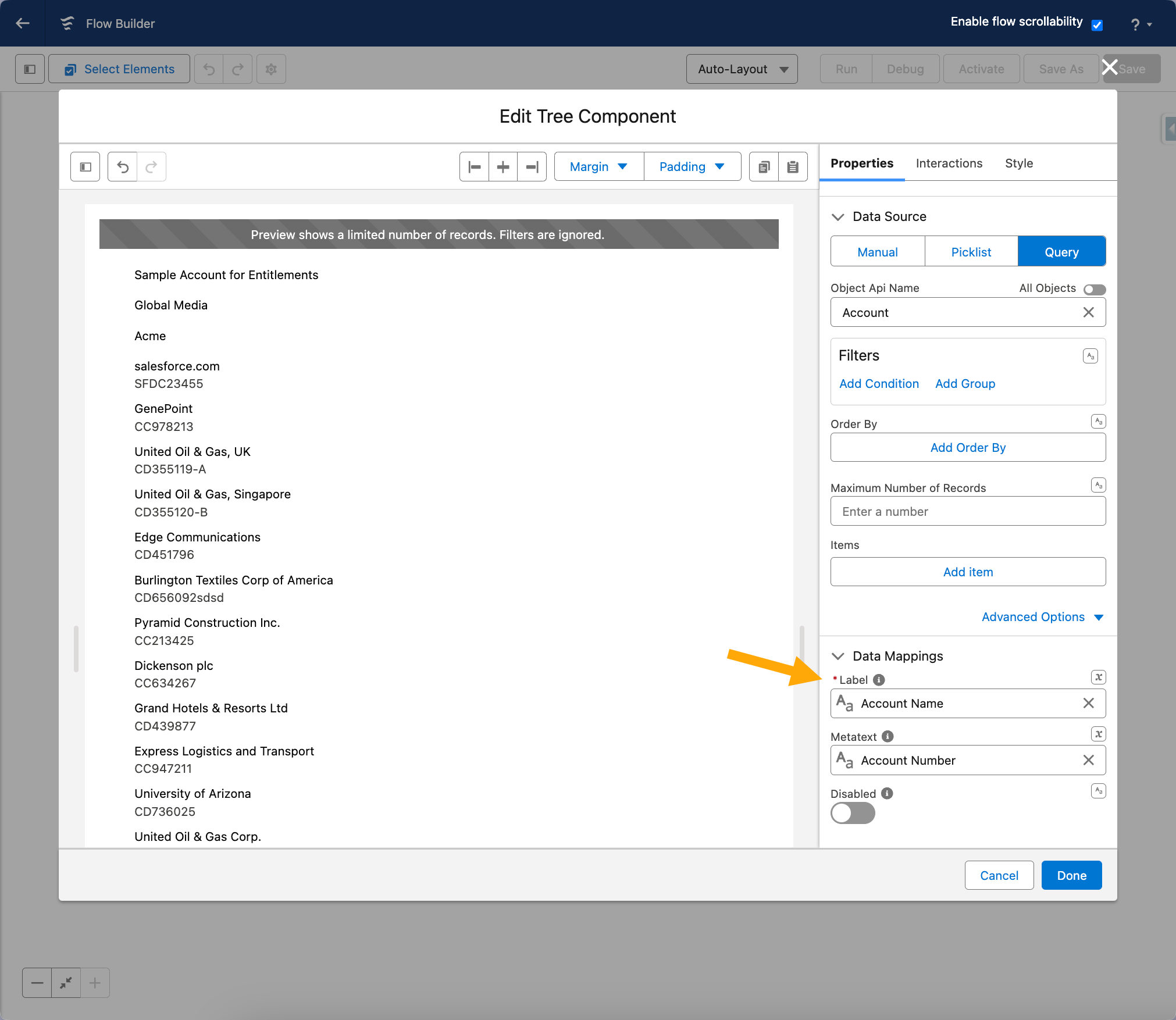
When using Query or Picklist, configure **Data Mappings** to tell the Tree which Salesforce fields map to which parts of each item. This is how the component knows what to show as the node label and how to build the parent-child hierarchy.
**Key mapping fields:**
* **Parent Item Label** — the field used as the name for root items (e.g., "Account Name").
* **Metatext** — additional information displayed next to an item.
**Adding child items (related records):**
You can also display items related to the main items in your tree.
1. Click the **Add Item** button.
2. Choose the child object (e.g., "Contact" to show contacts related to each Account).
3. Select the relationship field that connects the child to the parent (e.g., "AccountId").
4. Map the data — tell the Tree how to display the child items.
How to add items on your tree
### Properties
Where these settings live: the Properties tab of the Edit Tree panel.
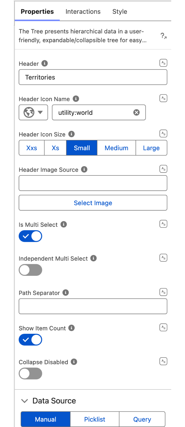
**Header** sets the text displayed as the tree heading.
**Header Icon Name** adds a Lightning Design System icon to the left of the header.
**Header Icon Size** sets the size of the header icon. Requires **Header Icon Name** to be set. Options: XX-Small, X-Small, Small *(default)*, Medium, Large.
**Header Image Source** adds an image to the left of the header. If provided, it takes priority over the header icon.
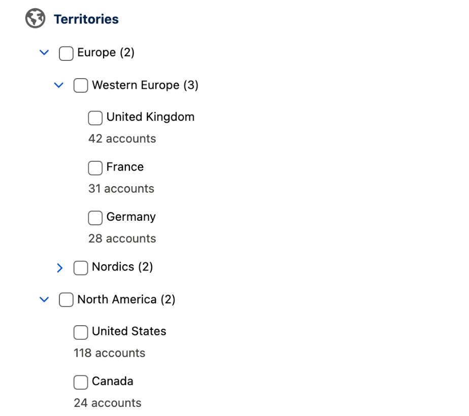
**Is Multi Select** enables multiple item selection and displays a checkbox next to each node.
**Independent Multi Select** makes parent and child nodes selectable independently — selecting a parent does not automatically select its children, and vice versa. Requires **Is Multi Select** to be enabled.
**Path Separator** sets the string inserted between ancestors in the **Selected Item Paths** output. Defaults to `" > "`.
**Show Item Count** displays the number of child nodes in parentheses next to each parent node label.
**Collapse Disabled** keeps all branches expanded and prevents users from collapsing them.
Is Multi Select puts a checkbox on every node and Show Item Count adds the child count in parentheses.
## Interactions
[Interactions](/flow/component-builder/interactions-panel.md) define what happens when users interact with the Tree. Configure them from the **Interactions** tab of the Edit Tree panel.
### Item Click
Fires when the user clicks any tree node. Use this to navigate to a detail screen, pre-fill a form, or drive conditional logic based on the clicked item. The clicked node is available as the `clickedItem`, `clickedItemName`, and `clickedItemSObjectApiName` output variables after the screen.
***
## Styling
The **Style** tab gives you fine-grained control over the Tree's appearance. Configure it from the **Style** tab of the Edit Tree panel.
{% tabs %}
{% tab title="Margin" %}
Controls outer spacing.
* **Top:** Space above the component.
* **Right:** Space to the right of the component.
* **Bottom:** Space below the component.
* **Left:** Space to the left of the component.
{% endtab %}
{% tab title="Padding" %}
Controls inner spacing.
* **Top:** Inner space at the top.
* **Right:** Inner space on the right.
* **Bottom:** Inner space at the bottom.
* **Left:** Inner space on the left.
{% endtab %}
{% tab title="Size" %}
Controls dimensions.
* **Width / Height:** Fixed dimensions of the component.
* **Min / Max Width / Height:** Constraints on how small or large the component can grow.
* **Overflow:** How content behaves when it exceeds the component's bounds.
{% endtab %}
{% tab title="Flow Dialog" %}
Adjusts display when opened as a modal dialog inside a Flow screen.
* **Width:** Width of the dialog.
* **Height:** Height of the dialog.
* **Background Color:** Background color of the dialog.
{% endtab %}
{% tab title="Header" %}
Styles the optional header above the tree.
* **Color:** Text color of the header.
* **Font Size:** Size of the header text.
* **Font Style:** Style of the header text (e.g., italic).
* **Font Weight:** Weight of the header text (e.g., bold).
{% endtab %}
{% tab title="Header Image" %}
Styles the image displayed in the header.
* **Object Fit:** How the image is sized within its container.
* **Height:** Height of the header image.
* **Width:** Width of the header image.
{% endtab %}
{% tab title="Item" %}
Styles individual tree nodes.
* **Header Background Color:** Background color of the item header row.
* **Header Background Color Hover:** Background color of the item header on hover.
* **Header Text Color:** Text color of the item header.
* **Header Text Color Disabled:** Text color of the item header when disabled.
* **Header Link Color:** Color of links in the item header.
* **Header Link Color Hover:** Color of links in the item header on hover.
* **Header Font Size:** Font size of the item header text.
* **Header Font Style:** Font style of the item header text.
* **Header Font Weight:** Font weight of the item header text.
* **Metatext Text Color:** Color of the metatext below the item label.
* **Metatext Disabled Text Color:** Color of the metatext when the item is disabled.
* **Metatext Line Clamp:** Maximum number of lines shown for the metatext.
* **Background Color Hover:** Background color of the item row on hover.
* **Background Color Selected:** Background color of the item row when selected.
* **Shadow Selected:** Shadow applied to the item when selected.
* **Block Start:** Spacing above the item header content.
* **Block End:** Spacing below the item header content.
* **Inline Start:** Spacing before the item header content.
* **Inline End:** Spacing after the item header content.
{% endtab %}
{% endtabs %}
## Output Variables
The Tree exposes these output variables you can reference in your flow after the screen. To use them, select the screen element in Flow Builder, then the Tree component, and pick the output variable you need.
### Item Click
Available after a user clicks any tree node (fires the **Item Click** interaction).
| Output variable | Type | What it returns |
| --------------------------------- | ---------------- | ---------------------------------------------------------------------------------------------------- |
| **Clicked Item** | Record (SObject) | The record behind the tree node the user clicked. |
| **Clicked Item Name** | Text (String) | The name (key) of the clicked node. |
| **Clicked Item SObject Api Name** | Text (String) | The API name of the Salesforce object associated with the clicked node (e.g., `Account`, `Contact`). |
> **Example:** A user clicks an Account node in an org-chart tree. Use **Clicked Item** to pre-fill an Account edit form on the next screen, and **Clicked Item SObject Api Name** to drive a decision element that routes to different screens depending on whether the clicked node is an Account or a Contact.
### Item Selection
Available when **Is Multi Select** is enabled and a user selects one or more nodes.
| Output variable | Type | What it returns |
| ----------------------- | ----------------- | ------------------------------------------------------------------------------------------------------------------------------------------------------------------------------------------------------------------------------------------------------------------------------------------------------- |
| **Selected Items** | Record Collection | All currently selected nodes as a collection of records. |
| **Selected Item Names** | Text Collection | The names (keys) of all currently selected nodes. |
| **Selected Item Paths** | Text Collection | The full ancestor path of each selected node, from root to node, joined by the configured separator (default `" > "`) — e.g. `Europe > Western Europe > United Kingdom`. Because the path reflects each node's position in the tree, duplicate names under different parents resolve to distinct paths. |
> **Example:** A user checks several product category nodes in a multi-select tree. Pass **Selected Items** to a downstream Create Records step to associate the chosen categories with a new opportunity.
### Others
| Output variable | Type | What it returns |
| ------------------- | ------- | ------------------------------------------------------- |
| **Number of Items** | Integer | The total number of nodes currently loaded in the tree. |
### Flow Interaction Output Variables
Like all interactive Flow components, the Tree exposes generic output slots (Variable 1–10) that an [Open Flow Dialog](/flow/component-builder/interactions-panel/open-flow-dialog.md) or [Open Flow Panel](/flow/component-builder/interactions-panel/open-flow-panel.md) interaction can fill with values from a launched flow. See [Flow Interaction Output Variables](/flow/component-builder/interactions-panel/flow-interaction-output-variables.md).
---
# Agent Instructions
This documentation is published with GitBook. GitBook is the documentation platform designed so that both humans and AI agents can read, navigate, and reason over technical content effectively. Learn more at gitbook.com.
## Querying This Documentation
If you need additional information that is not directly available in this page, you can query the documentation dynamically by asking a question.
Perform an HTTP GET request on the current page URL with the `ask` query parameter, and the optional `goal` query parameter:
```
GET https://docs.avonnicomponents.com/flow/flow-components/tree.md?ask=&goal=
```
`ask` is the immediate question: it should be specific, self-contained, and written in natural language.
`goal` is optional and describes the broader end goal you are ultimately trying to accomplish on behalf of the user. GitBook uses it to tailor the answer towards what is most useful for that goal.
The response will contain a direct answer to the question and relevant excerpts and sources from the documentation.
Use this mechanism when the answer is not explicitly present in the current page, you need clarification or additional context, or you want to retrieve related documentation sections.
.avif?alt=media)
.gif?alt=media)