> For the complete documentation index, see [llms.txt](https://docs.avonnicomponents.com/llms.txt). Markdown versions of documentation pages are available by appending `.md` to page URLs; this page is available as [Markdown](https://docs.avonnicomponents.com/flow/flow-components/chip-container.md).
# Chip Container
The Avonni Chip Container provides a visual way to organize and display interactive chips (tags or labels).
## Overview
The Avonni Chip Container displays a collection of chips (pill-shaped tags) inside a Flow screen. It supports drag-to-reorder, collapsible display, single-line layout, and optional avatars — making it ideal for showing selected items, tags, or categories that users can interact with.
***
## Configuration
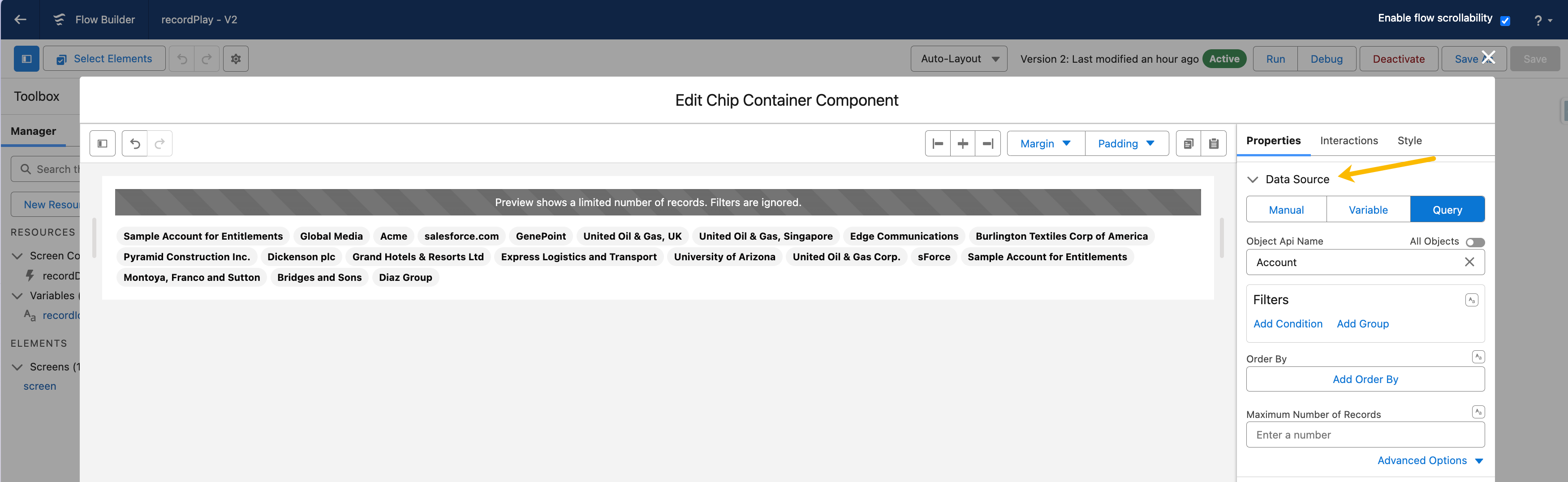
To configure it, click the component on the Flow screen. The **Edit Chip Container Component** panel opens on the right with three tabs: Properties, Interactions, and Style. The sections below mirror the Properties tab.
### Data Source
The **Data Source** determines where the chips come from.
| Data Source | Use Case | When to Use |
| ---------------------------------------------------------------- | ------------------------------------------------- | ------------------------------------------------------------------------ |
| [**Manual**](/flow/component-builder/data-sources/manual.md) | Static or predefined chips. | Fixed lists that don't change, like a set of category tags. |
| [**Variable**](/flow/component-builder/data-sources/variable.md) | Chips from a Salesforce Flow collection variable. | When chip data comes from a Get Records collection or earlier flow step. |
| [**Query**](/flow/component-builder/data-sources/query.md) | Chips fetched directly via a SOQL query. | Large datasets or complex data retrieval from multiple sources. |
### Data Mapping
When using Variable or Query, configure **Data Mappings** to tell the Chip Container which field to use as each chip's label.
### Properties
**Single Line** forces all chips to appear on one line, creating a compact, horizontally scrollable display.
**Is Collapsible** makes the chip list expandable and collapsible — useful when space is limited or you want to group multiple Chip Containers on one screen.
**Is Expanded** controls the initial state when **Is Collapsible** is enabled. Requires **Is Collapsible** to be enabled.
**Sortable** allows users to reorder chips by dragging and dropping them (or using the spacebar). When enabled, wire the **On Reorder** interaction to capture the new order.
**Alternative Text** provides an accessible description of the chip container for screen readers — useful when the container needs context beyond the visible UI.
## Interactions
[Interactions](/flow/component-builder/interactions-panel.md) define what happens when users interact with the Chip Container. Configure them from the **Interactions** tab of the Edit Chip Container panel.
### Reorder
Fires when the user drags chips into a new sequence. Requires **Sortable** to be enabled. Use this to capture the updated order via the **Items**, **Items Serialized**, **Items SObject**, and **Items String Collection** output variables.
***
## Styling
The **Style** tab gives you fine-grained control over the Chip Container's appearance. Configure it from the **Style** tab of the Edit Chip Container panel.
{% tabs %}
{% tab title="Margin" %}
Controls the *outer* spacing around the chip container, creating space between it and other elements on the screen.
* **Top / Right / Bottom / Left:** Adjust the space on each side.
{% endtab %}
{% tab title="Padding" %}
Controls the *inner* spacing between the chips and the container border.
* **Top / Right / Bottom / Left:** Adjust the inner spacing on each side.
{% endtab %}
{% tab title="Size" %}
Controls the chip container's dimensions.
* **Width / Height:** Set fixed dimensions for the container.
* **Min Width / Max Width / Min Height / Max Height:** Constrain the size within bounds.
* **Overflow:** Control how content that exceeds the bounds is handled.
{% endtab %}
{% tab title="Flow Dialog" %}
Adjusts display when the chip container is opened as a modal dialog inside a Flow screen.
* **Width:** Dialog width.
* **Height:** Dialog height.
* **Background Color:** Dialog background color.
{% endtab %}
{% tab title="Spacing" %}
Fine-tunes the spacing around the container and individual chips.
* **Chip Container Block Start / Block End / Inline Start / Inline End:** Adjust the spacing around the container.
* **Chip Block Start / Block End / Inline Start / Inline End:** Adjust the spacing around each chip.
{% endtab %}
{% tab title="Chip Container" %}
Styles the overall container that holds the chips.
* **Background:** Set the container background color.
* **Border Color / Size / Style / Radius:** Style the container border.
{% endtab %}
{% tab title="Chip" %}
Styles the individual chips.
* **Label Font Size / Font Style / Font Weight:** Control the chip label typography.
* **Border Size / Style / Radius:** Style the chip border.
* **Line Height:** Set the chip line height.
{% endtab %}
{% tab title="Avatar Chip" %}
Styles the avatar shown inside a chip. Initials colors and font weights are set per state (default, hover).
* **Border Color / Size / Style:** Style the avatar border.
* **Initials Font Color / Font Weight:** Style the avatar initials.
* **Icon Background / Foreground Color:** Set the fallback icon colors.
* **Image Object Fit:** Control how the avatar image fits.
{% endtab %}
{% tab title="Chip Variant Colors" %}
Sets the colors for each chip variant. The same four properties are set per variant (Base, Brand, Error, Info, Inverse, Alt Inverse, Offline, Success, Warning).
* **Background:** Set the chip background color.
* **Text Color:** Set the chip text color.
* **Outline Text Color:** Set the text color for the outlined chip style.
* **Border Color:** Set the chip border color.
{% endtab %}
{% endtabs %}
***
## Output Variables
The Chip Container exposes these output variables you can reference in your flow after the screen. To use them, select the screen element in Flow Builder, then the Chip Container component, and pick the output variable you need.
### Reorder
Updated when the user drags chips into a new sequence (requires **Sortable** to be enabled).
| Output variable | Type | What it returns |
| --------------------------- | ------------------------------- | --------------------------------------------------------------------------------------------------------------------------------------------------------------------------------------------- |
| **Items** | Collection of ChipContainerItem | The reordered chips as a typed Apex collection, preserving all chip properties. |
| **Items Serialized** | Text (String) | The reordered chips as a JSON string — useful for storing or passing the order to an Apex action. |
| **Items SObject** | Record Collection | The reordered chips as a generic SObject collection — use this when you need to feed the result into a standard Flow record variable. Only populated for the Query and Variable data sources. |
| **Items String Collection** | Text Collection | The name (key) of each chip in the new order — a lightweight list for branching or looping logic. |
> **Example:** A user reorders priority tags on a case-triage screen. Wire **On Reorder** → **Set Flow Variable** using **Items String Collection** to store the new order, then pass it to an Apex action that saves the ranked tags to a custom field.
### Others
| Output variable | Type | What it returns |
| ------------------- | ------- | --------------------------------------------------------------- |
| **Number of Items** | Integer | The total number of chips currently displayed in the container. |
### Flow Interaction Output Variables
Like all interactive Flow components, the Chip Container exposes generic output slots (Variable 1–10) that an [Open Flow Dialog](/flow/component-builder/interactions-panel/open-flow-dialog.md) or [Open Flow Panel](/flow/component-builder/interactions-panel/open-flow-panel.md) interaction can fill with values from a launched flow. See [Flow Interaction Output Variables](/flow/component-builder/interactions-panel/flow-interaction-output-variables.md).
---
# Agent Instructions
This documentation is published with GitBook. GitBook is the documentation platform designed so that both humans and AI agents can read, navigate, and reason over technical content effectively. Learn more at gitbook.com.
## Querying This Documentation
If you need additional information that is not directly available in this page, you can query the documentation dynamically by asking a question.
Perform an HTTP GET request on the current page URL with the `ask` query parameter, and the optional `goal` query parameter:
```
GET https://docs.avonnicomponents.com/flow/flow-components/chip-container.md?ask=&goal=
```
`ask` is the immediate question: it should be specific, self-contained, and written in natural language.
`goal` is optional and describes the broader end goal you are ultimately trying to accomplish on behalf of the user. GitBook uses it to tailor the answer towards what is most useful for that goal.
The response will contain a direct answer to the question and relevant excerpts and sources from the documentation.
Use this mechanism when the answer is not explicitly present in the current page, you need clarification or additional context, or you want to retrieve related documentation sections.
.avif?alt=media)
.gif?alt=media)