> For the complete documentation index, see [llms.txt](https://docs.avonnicomponents.com/llms.txt). Markdown versions of documentation pages are available by appending `.md` to page URLs; this page is available as [Markdown](https://docs.avonnicomponents.com/flow/flow-components/slider.md).
# Slider
The Slider component provides a draggable handle on a track for selecting values within a specified range.
## Overview
The Slider lets users select one or more numeric values by dragging a handle along a track. It supports horizontal and vertical orientations, configurable min/max and step, multiple value selection (range mode), and flexible unit formatting including currency, percent, decimal, and custom labels.
***
## Configuration
To configure it, click the component on the Flow screen. The Edit Slider Component panel opens on the right with three tabs: Properties, Interactions, and Style. The sections below mirror the Properties tab.
### Properties
| Setting | What It Does |
| ------------------- | ------------------------------------------------------------------------------------------------------------------------ |
| **Label** | Text displayed above the slider to describe what is being selected. |
| **Type** | Orientation of the slider: **Horizontal** (default) or **Vertical**. |
| **Variant** | Controls how the label appears: **Standard** (label above, default) or **Label Hidden** (label not shown). |
| **Size** | Width of the slider track: X-Small, Small, Medium, Large, or **Responsive** (default, fills available space). |
| **Multiple Values** | When enabled, the slider shows two handles and selects a range between them instead of a single value. |
| **Value** | The initial value. Available when **Multiple Values** is off. Set directly or map to a flow variable. |
| **Value** | A collection of initial values (one per handle). Available when **Multiple Values** is on. |
| **Step** | The increment between allowed values (default: 1). For example, a step of 5 means the slider snaps to 0, 5, 10, 15, etc. |
| **Minimum** | The lowest selectable value (default: 0). |
| **Maximum** | The highest selectable value (default: 100). |
| **Disabled** | When enabled, the slider is visible but cannot be dragged. |
### Advanced Options
| Setting | What It Does |
| ----------------------- | ---------------------------------------------------------------------------------------------------------------------------------- |
| **Hide Min/Max Values** | When enabled, removes the minimum and maximum value labels from below the track. |
| **Hide Track** | When enabled, hides the track line, showing only the thumb(s). |
| **Show Pin** | When enabled, displays a tooltip showing the current value when the user hovers over or drags a thumb. |
| **Show Tick Marks** | When enabled, displays tick marks at each step interval along the track. |
| **Tick Mark Style** | Shape of the tick marks: **Inner Tick** (default), **Tick**, or **Dot**. Requires **Show Tick Marks** to be enabled. |
| **Disable Swap** | When enabled, prevents the two slider thumbs from passing through each other in range mode. Requires **Multiple Values** to be on. |
| **Minimum Distance** | The minimum gap required between the two thumbs when **Disable Swap** is on. Requires **Disable Swap** to be enabled. |
{% hint style="info" %}
**Custom Label Styling**
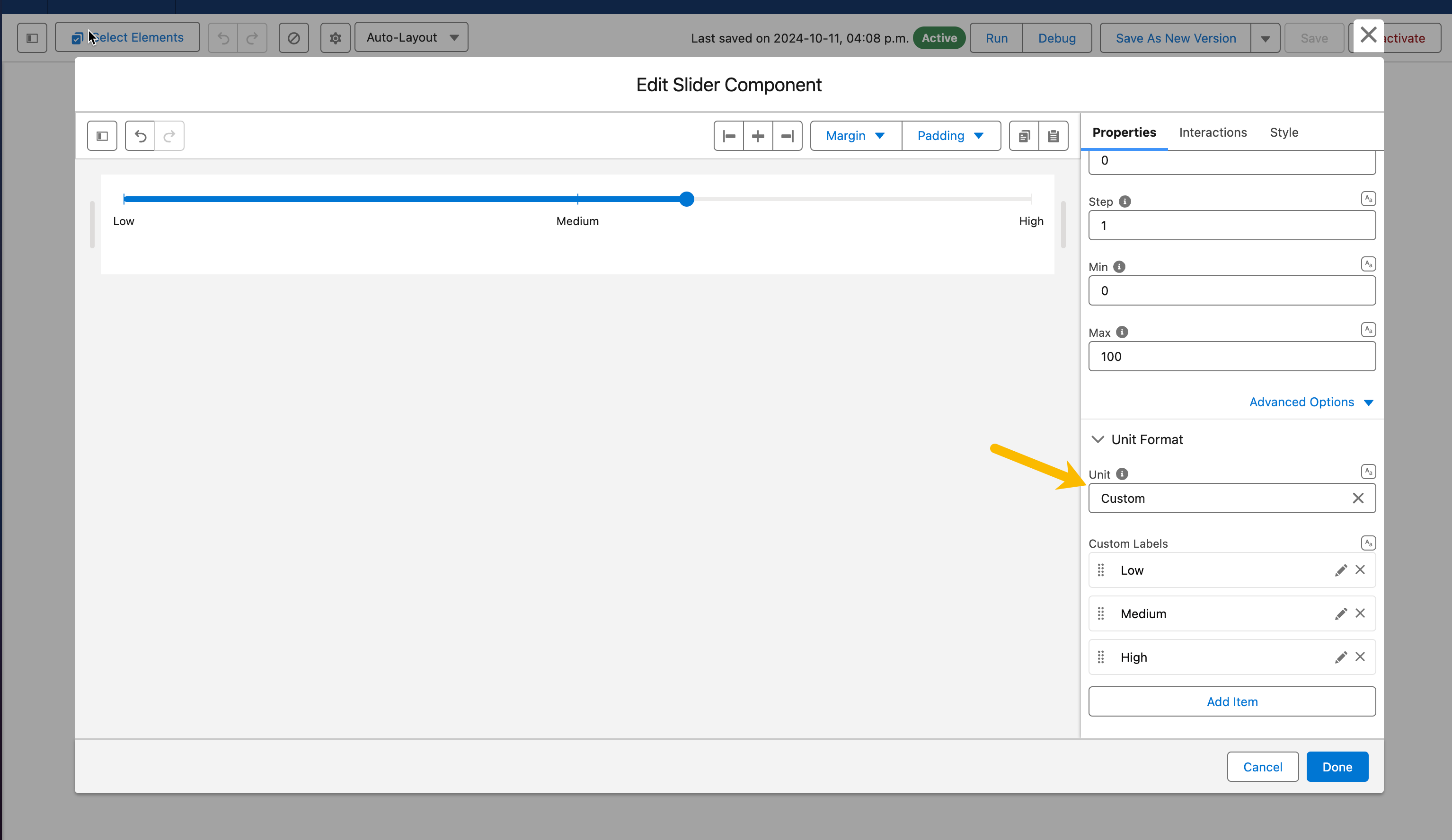
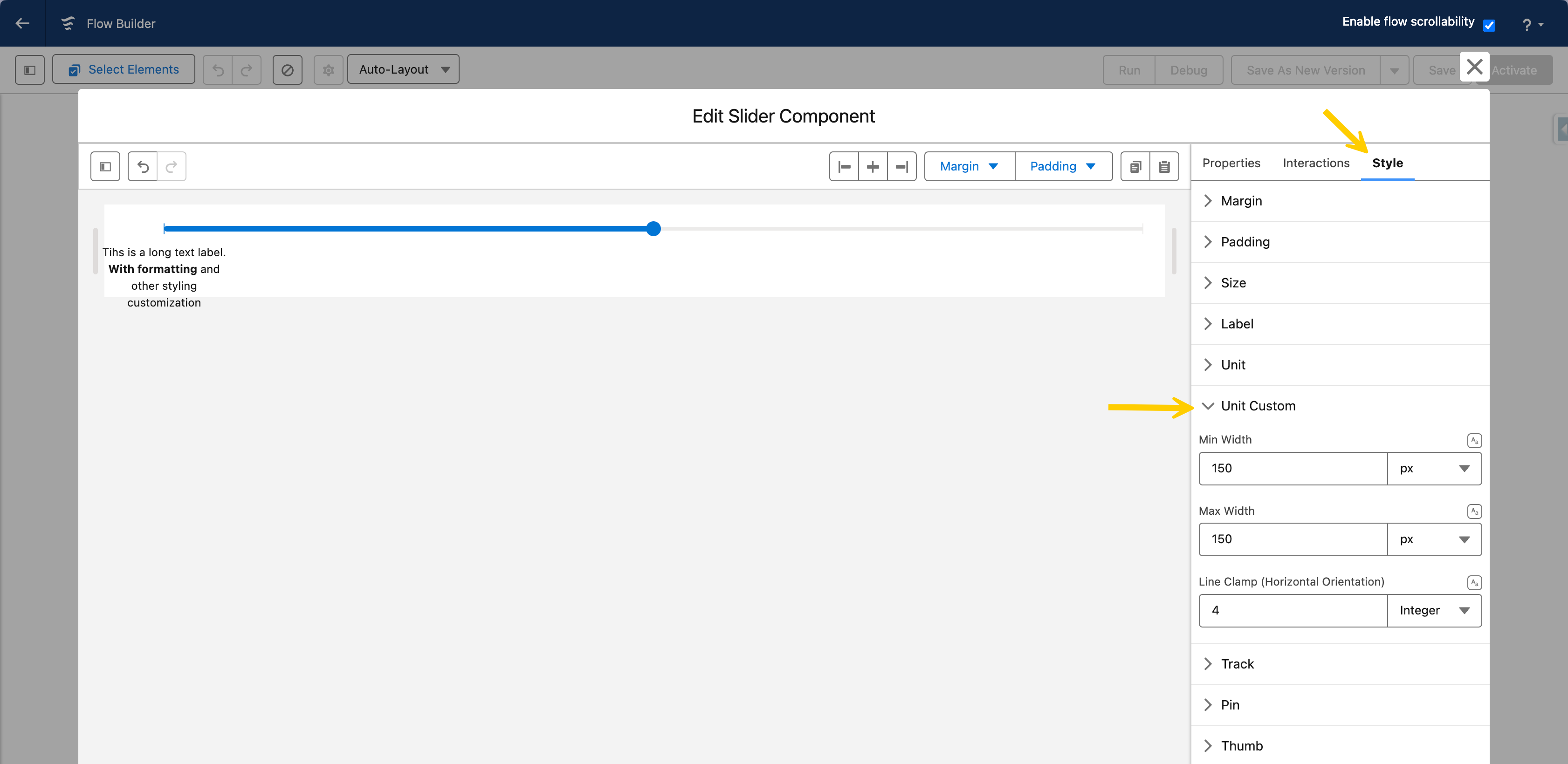
Styling options for custom labels are available in the styling panel, where you can adjust `minWidth`, `maxWidth`, and `line clamp`. This allows you to control the visual presentation and ensure that labels, even long ones, are displayed correctly.
{% endhint %}
### Unit Format
The **Unit Format** group controls how values are displayed on and beside the slider.
| Setting | What It Does |
| ------------------- | -------------------------------------------------------------------------------------------------------------------------------------------------------------------- |
| **Unit** | How values are formatted: **Decimal** (default), **Currency**, **Percent**, or **Custom** (define your own labels for specific values). |
| **Unit Attributes** | Additional formatting options depending on the selected unit — currency code, decimal/fraction digit counts, and custom label definitions (label + value per entry). |
***
## Interactions
[Interactions](/flow/component-builder/interactions-panel.md) define what happens when users interact with the Slider. Configure them from the **Interactions** tab of the Edit Slider panel.
### Change
Fires when the user moves the slider thumb and releases it. Use this to store the selected value in a flow variable or drive conditional logic based on the new selection.
***
## Styling
The **Style** tab gives you fine-grained control over each part of the slider. Configure it from the **Style** tab of the Edit Slider panel.
{% tabs %}
{% tab title="Margin" %}
Controls the *outer* spacing around the slider, creating space between it and other elements on the screen.
* **Top / Right / Bottom / Left:** Adjust the space on each side of the slider.
{% endtab %}
{% tab title="Padding" %}
Controls the *inner* spacing between the slider's content and its border.
* **Top / Right / Bottom / Left:** Adjust the inner spacing on each side.
{% endtab %}
{% tab title="Size" %}
Controls the slider's dimensions.
* **Width / Height:** Set fixed dimensions for the slider.
* **Min Width / Max Width / Min Height / Max Height:** Constrain the size within bounds.
* **Overflow:** Control how content that exceeds the bounds is handled.
{% endtab %}
{% tab title="Border" %}
Customizes the border surrounding the slider.
* **Color:** Set the border color.
* **Size:** Adjust the border thickness.
* **Style:** Choose a border style (e.g. solid, dashed, dotted).
* **Radius:** Control the roundness of the corners.
{% endtab %}
{% tab title="Flow Dialog" %}
Adjusts display when opened as a modal dialog inside a Flow screen.
* **Width:** Dialog width.
* **Height:** Dialog height.
* **Background Color:** Dialog background color.
{% endtab %}
{% tab title="Label" %}
Styles the label text shown above the slider.
* **Color:** Set the label color.
* **Font Size / Font Style / Font Weight:** Control the label typography.
{% endtab %}
{% tab title="Unit" %}
Styles the unit text displayed with the value.
* **Color:** Set the unit text color.
* **Font Size / Font Style / Font Weight:** Control the unit typography.
{% endtab %}
{% tab title="Unit Custom" %}
Controls the sizing of a custom unit label.
* **Min Width / Max Width:** Constrain the width of the custom unit.
* **Line Clamp (Horizontal Orientation):** Limit the custom unit to a maximum number of lines.
{% endtab %}
{% tab title="Track" %}
Styles the slider track (the line the thumb moves along). **Color** and **Background Color** support gradients.
* **Color / Background Color:** Set the filled and unfilled track colors.
* **Height:** Set the track thickness.
* **Radius:** Control the roundness of the track corners.
{% endtab %}
{% tab title="Pin" %}
Styles the value tooltip pin (visible when **Show Pin** is enabled).
* **Color / Background Color:** Set the pin text and background colors.
* **Radius:** Control the roundness of the pin corners.
{% endtab %}
{% tab title="Thumb" %}
Styles the draggable handle.
* **Color / Color Active / Color Hover:** Set the thumb color in each state.
* **Width:** Set the thumb size.
* **Radius:** Control the roundness of the thumb corners.
{% endtab %}
{% tab title="Tick Mark" %}
Styles the tick marks along the track.
* **Color:** Set the tick mark color.
{% endtab %}
{% endtabs %}
## Output Variables
The Slider exposes these output variables you can reference in your flow after the screen. To use them, select the screen element in Flow Builder, then the Slider component, and pick the output variable you need.
### Value Selection
| Output variable | Type | What it returns |
| -------------------- | ----------------- | -------------------------------------------------------------------------------------------------------------------------------------------------------------------------------- |
| **Value Collection** | Number Collection | The list of values currently selected by the slider thumbs. Contains one number in single-value mode and two numbers (low and high) in range mode (**Multiple Values** enabled). |
> **Example:** After the user sets a price range with a range slider, store **Value Collection** in a flow variable and pass the two bounds to a query that filters products by price.
### Flow Interaction Output Variables
Like all interactive Flow components, the Slider exposes generic output slots (Variable 1–10) that an [Open Flow Dialog](/flow/component-builder/interactions-panel/open-flow-dialog.md) or [Open Flow Panel](/flow/component-builder/interactions-panel/open-flow-panel.md) interaction can fill with values from a launched flow. See [Flow Interaction Output Variables](/flow/component-builder/interactions-panel/flow-interaction-output-variables.md).
---
# Agent Instructions
This documentation is published with GitBook. GitBook is the documentation platform designed so that both humans and AI agents can read, navigate, and reason over technical content effectively. Learn more at gitbook.com.
## Querying This Documentation
If you need additional information that is not directly available in this page, you can query the documentation dynamically by asking a question.
Perform an HTTP GET request on the current page URL with the `ask` query parameter, and the optional `goal` query parameter:
```
GET https://docs.avonnicomponents.com/flow/flow-components/slider.md?ask=&goal=
```
`ask` is the immediate question: it should be specific, self-contained, and written in natural language.
`goal` is optional and describes the broader end goal you are ultimately trying to accomplish on behalf of the user. GitBook uses it to tailor the answer towards what is most useful for that goal.
The response will contain a direct answer to the question and relevant excerpts and sources from the documentation.
Use this mechanism when the answer is not explicitly present in the current page, you need clarification or additional context, or you want to retrieve related documentation sections.
.avif?alt=media)



 {% endhint %}
### Unit Format
The **Unit Format** group controls how values are displayed on and beside the slider.
| Setting | What It Does |
| ------------------- | -------------------------------------------------------------------------------------------------------------------------------------------------------------------- |
| **Unit** | How values are formatted: **Decimal** (default), **Currency**, **Percent**, or **Custom** (define your own labels for specific values). |
| **Unit Attributes** | Additional formatting options depending on the selected unit — currency code, decimal/fraction digit counts, and custom label definitions (label + value per entry). |
{% endhint %}
### Unit Format
The **Unit Format** group controls how values are displayed on and beside the slider.
| Setting | What It Does |
| ------------------- | -------------------------------------------------------------------------------------------------------------------------------------------------------------------- |
| **Unit** | How values are formatted: **Decimal** (default), **Currency**, **Percent**, or **Custom** (define your own labels for specific values). |
| **Unit Attributes** | Additional formatting options depending on the selected unit — currency code, decimal/fraction digit counts, and custom label definitions (label + value per entry). |