> For the complete documentation index, see [llms.txt](https://docs.avonnicomponents.com/llms.txt). Markdown versions of documentation pages are available by appending `.md` to page URLs; this page is available as [Markdown](https://docs.avonnicomponents.com/dynamic-components/components/record-picker.md).
# Record Picker
The Avonni Record Picker component lets users search and select a record from a specified Salesforce object. Use it on forms, workflows, or any interface that requires a quick record lookup.
## Overview
The Record Picker renders a search input that queries a Salesforce object as the user types and presents matching records as suggestions. It supports configuring which fields are shown in suggestions, which fields are searched, filtering results by field values, and controlling whether the field is required, disabled, or read-only.
### Use Cases
* **Case Form:** Select a related Account or Contact for case assignment.
* **Opportunity Page:** Pick a parent Account or Campaign for context.
* **Custom Object Form:** Choose linked records (e.g., Project Manager for a Project\_\_c).
* **Service Workflow:** Assign technicians or assets from searchable lists.
* **Event Management:** Select venues or sponsors from custom objects.
* **Data Entry:** Streamline record linking in Dynamic Component forms.
## Configuration
To configure the Record Picker, select it on the canvas. The **Edit Record Picker** panel opens on the right with three tabs: **Properties**, **Interactions**, and **Style**. The sections below mirror the Properties tab.
### Properties
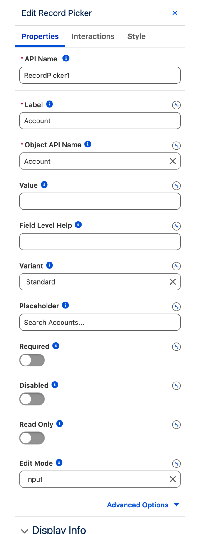
The Properties tab of the Edit Record Picker panel.
| Setting | What it does |
| -------------------------- | -------------------------------------------------------------------------------------------------------------------------------------------------------------------------- |
| **Label** | The text label displayed above or beside the input. Required. |
| **Object API Name** | The API name of the Salesforce object to search (for example `Account`, `Contact`, `My_Object__c`). Required. |
| **Value** | Pre-populates the picker with a record ID. Bind it to a variable to pass a selected record ID to other components or actions. |
| **Field Level Help** | Optional help text displayed next to the label to guide the user. |
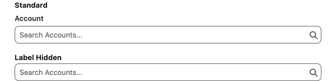
| **Variant** | How the label is rendered. **Standard** (default) places the label above the input; **Label Hidden** removes it from view while keeping it accessible. |
| **Placeholder** | Hint text shown inside the input when it is empty, to prompt the user for a valid entry. |
| **Required** | When enabled, the user must select a record before the form can be submitted. |
| **Disabled** | When enabled, the input is disabled and users cannot interact with it. |
| **Read Only** | When enabled, the input is read-only and cannot be edited. |
| **Edit Mode** | How the field is edited when not read-only. **Input** (default) renders the standard input field; **Inline** renders inline-edit mode. Requires: **Read Only** = disabled. |
| **Message When Bad Input** | Custom error message displayed when an invalid entry is detected. Found under **Advanced** settings. |
The Standard and Label Hidden variants of the same picker.
### Display Info
This section controls which fields appear in the record suggestion list as the user types.
**Primary Field** — The first field displayed in each suggestion row. Defaults to the object's name field if not set.
**Additional Field** — One extra field to show alongside the primary field in suggestions.
### Search Info
This section controls how search terms are matched and which fields are queried.
**Mode** — Determines how the search term is matched. **Contains** (default) matches anywhere in the field value. **Starts With** matches only from the beginning.
**Primary Field** — The main field used to query search terms. Only Text and Formula (Text) fields are supported.
**Additional Field** — One additional field used to query search terms. Only Text and Formula (Text) fields are supported.
### Filter
Use **Filter** to restrict which records the picker offers. A condition is built the same way as on a Query data source: pick a field, choose an operator, and give it a value.
**Field**: the API name of the field to filter on.
**Operator**: the comparison applied to that field.
**Value**: the value the field is compared against.
**Logical Operator**: combines several conditions with `AND` or `OR`. Conditions can be nested to build longer expressions.
For the full list of operators and examples of grouping conditions, see [Query](/dynamic-components/component-builder/data-sources/query.md).
{% hint style="info" %}
#### Lookup filters set in Salesforce are not applied
If the field you are representing has a lookup filter defined in Salesforce Setup, the Record Picker does not apply it. The picker searches the object set in **Object API Name**, so a filter defined on a field is not part of what it queries.
When you need those criteria enforced in the picker, re-create them here in **Filter**.
{% endhint %}
### Set Component Visibility
All components support conditional visibility — see [Component Visibility](/dynamic-components/core-concepts/component-visibility.md).
## Interactions
[Interactions](/dynamic-components/component-builder/interactions.md) define what happens when users interact with the Record Picker. Configure them from the **Interactions** tab of the Edit Record Picker panel.
### Change
Fires when the user selects or clears a record. Use the **value** output to get the selected record ID, or the **valueSObject** output to access the full record, to drive downstream actions such as navigating to a record page, updating a related field, or showing a toast message.
## Output Variables
The Record Picker exposes an output variable you can reference elsewhere on the page after the user selects a record.
### Record Selection
When the user picks a record from the suggestion list, this variable updates with the full record data.
| Output variable | Type | What it returns |
| ----------------- | ---------------- | --------------------------------------------- |
| **Value SObject** | Record (SObject) | The full Salesforce record the user selected. |
> **Example:** When a user picks an Account in a Record Picker on a case form, use **Value SObject** to display the Account's phone number or industry in a text component beside the picker.
## Styling
Configure the Record Picker's appearance from the **Style** tab of the Edit Record Picker panel.
{% tabs %}
{% tab title="Margin" %}
Controls the *outer* spacing around the component.
* **Top / Right / Bottom / Left:** Adjust the space on each side.
{% endtab %}
{% tab title="Padding" %}
Controls the *inner* spacing between the component's content and its border.
* **Top / Right / Bottom / Left:** Adjust the inner spacing on each side.
{% endtab %}
{% tab title="Size" %}
Controls the component's dimensions.
* **Width / Height:** Set fixed dimensions.
* **Min Width / Max Width / Min Height / Max Height:** Constrain the size within bounds.
* **Overflow:** Control how content that exceeds the bounds is handled.
{% endtab %}
{% tab title="Border" %}
Customizes the border surrounding the component.
* **Color / Size / Style / Radius:** Set the border color, thickness, style, and corner rounding.
{% endtab %}
{% tab title="Label" %}
Styles the field label.
* **Text Color / Font Size / Font Style / Font Weight:** Set the label color and typography.
{% endtab %}
{% endtabs %}
---
# Agent Instructions
This documentation is published with GitBook. GitBook is the documentation platform designed so that both humans and AI agents can read, navigate, and reason over technical content effectively. Learn more at gitbook.com.
## Querying This Documentation
If you need additional information that is not directly available in this page, you can query the documentation dynamically by asking a question.
Perform an HTTP GET request on the current page URL with the `ask` query parameter, and the optional `goal` query parameter:
```
GET https://docs.avonnicomponents.com/dynamic-components/components/record-picker.md?ask=&goal=
```
`ask` is the immediate question: it should be specific, self-contained, and written in natural language.
`goal` is optional and describes the broader end goal you are ultimately trying to accomplish on behalf of the user. GitBook uses it to tailor the answer towards what is most useful for that goal.
The response will contain a direct answer to the question and relevant excerpts and sources from the documentation.
Use this mechanism when the answer is not explicitly present in the current page, you need clarification or additional context, or you want to retrieve related documentation sections.