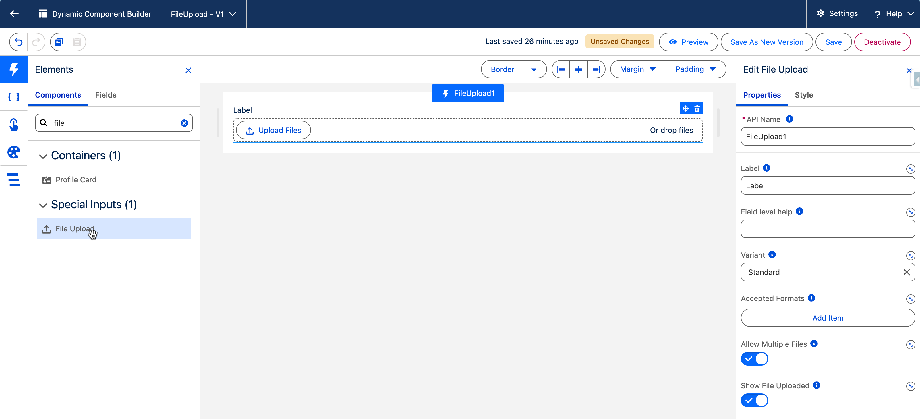
> For the complete documentation index, see [llms.txt](https://docs.avonnicomponents.com/llms.txt). Markdown versions of documentation pages are available by appending `.md` to page URLs; this page is available as [Markdown](https://docs.avonnicomponents.com/dynamic-components/components/file-upload.md).
# File Upload
The Avonni File Upload component lets users upload one or more files directly from within your Dynamic Component. Uploaded files are saved as Salesforce Files and can be automatically linked to a specified record.
## Overview
The File Upload component provides a user-friendly interface for attaching documents, images, or any other file types to Salesforce records — no custom code required. You can restrict acceptable formats, control whether multiple files are allowed, and customize file naming with prefixes or suffixes.
**Common use cases**
* Attaching proposals or contracts to Opportunity records.
* Uploading supporting documentation for Case records.
* Adding images or specification sheets to Product records.
* Submitting assignments or completed forms with attachments in a custom workflow.
* Allowing users to upload profile pictures or identification documents.
## Configuration
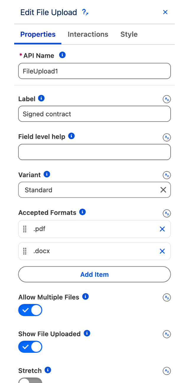
To configure the File Upload, select it on the canvas. The **Edit File Upload** panel opens on the right. The sections below mirror the Properties tab.
The Properties tab, from Label through to File Name Suffix.
### Properties
#### Label
The text label displayed for the file uploader.
The label with its help icon, and the drop zone with the Upload Files button.
#### Field level help
Help text detailing the purpose and function of the file uploader. It appears next to the label, typically as a tooltip icon, and can provide additional instructions such as accepted formats or size limits.
#### Variant
Changes the appearance and positioning of the **Label** relative to the uploader control.
| Option | Description |
| ---------------------- | ----------------------------------------- |
| **Standard** (default) | Label appears above the uploader. |
| **Label Hidden** | Label is hidden. |
| **Label Inline** | Label appears to the left. |
| **Label Stacked** | Label appears above with stacked styling. |
The four variants, each over the same uploader.
#### Accepted Formats
A list of file extensions that users are allowed to upload (e.g., `.pdf`, `.jpg`, `.png`). Include the leading dot for each entry. Leave empty to allow all file types.
#### Allow Multiple Files
Specifies whether a user can upload more than one file simultaneously. When disabled, only a single file can be uploaded per interaction.
#### Show File Uploaded
If enabled, the uploader displays a list of files that have been successfully uploaded.
#### Stretch
If enabled, the file uploader takes the entire available width of its container.
#### Required
If enabled, the user must upload at least one file before the form can be submitted.
#### Disabled
If enabled, the uploader is disabled and users cannot interact with it.
#### Related Record Id
The record ID of the record that the uploaded file will be associated with. Bind this to a dynamic value — for example, `$Component.recordId` to link uploaded files to the current record page, or a Variable that holds the target record ID.
#### File Name Prefix
Text added to the beginning of the original filename when the file is saved in Salesforce. For example, a prefix of `Contract_` applied to `Details.pdf` produces `Contract_Details.pdf`.
#### File Name Suffix
Text added to the end of the original filename (before the extension) when the file is saved. For example, a suffix of `_Final` applied to `Report.docx` produces `Report_Final.docx`.
{% hint style="warning" %}
**Key Considerations**
* **Salesforce File Storage Limits:** Be mindful of your org's overall file storage limits.
* **User Permissions:** Users need appropriate permissions to create `ContentDocument` (Files) and `ContentDocumentLink` records to associate files with records.
* **File Size Limits:** Salesforce imposes limits on the size of individual files.
* **Security:** Ensure that the ability to upload and link files is appropriate for the users and the context of the page.
* **Naming Conventions:** Use prefixes/suffixes thoughtfully if you need standardized file naming.
{% endhint %}
### Set Component Visibility
All components support conditional visibility — see [Component Visibility](/dynamic-components/core-concepts/component-visibility.md).
## Interactions
[Interactions](/dynamic-components/component-builder/interactions.md) define what happens when users interact with the File Upload. Configure them from the **Interactions** tab of the Edit File Upload panel.
### Change
Fires when a user uploads a file. The **contentDocumentIds** output variable is populated with the IDs of all successfully uploaded files, which you can use to drive downstream logic such as linking files to a record, refreshing a related list, or navigating to another page.
## Output Variables
The File Upload exposes this output variable you can reference elsewhere on the page after the user uploads a file.
### File Upload
When a user successfully uploads one or more files, this variable is populated with the resulting Salesforce record IDs.
| Output variable | Type | What it returns |
| ------------------------ | --------------- | ---------------------------------------------------------------------- |
| **Content Document Ids** | Text Collection | The IDs of the ContentDocument records created for each uploaded file. |
> **Example:** After a user attaches a signed contract, use **Content Document Ids** to pass the file ID to a custom action that links it to the related Opportunity record.
## Styling
Configure the File Upload's appearance from the **Style** tab of the Edit File Upload panel.
{% tabs %}
{% tab title="Margin" %}
Controls the *outer* spacing around the component.
* **Top / Right / Bottom / Left:** Adjust the space on each side.
{% endtab %}
{% tab title="Padding" %}
Controls the *inner* spacing between the component's content and its border.
* **Top / Right / Bottom / Left:** Adjust the inner spacing on each side.
{% endtab %}
{% tab title="Size" %}
Controls the component's dimensions.
* **Width / Height:** Set fixed dimensions.
* **Min Width / Max Width / Min Height / Max Height:** Constrain the size within bounds.
* **Overflow:** Control how content that exceeds the bounds is handled.
{% endtab %}
{% tab title="Border" %}
Customizes the border surrounding the component.
* **Color / Size / Style / Radius:** Set the border color, thickness, style, and corner rounding.
{% endtab %}
{% tab title="Label" %}
Styles the component's main label.
* **Color / Font Size / Font Style / Font Weight:** Set the label color and typography.
{% endtab %}
{% tab title="File" %}
Styles the uploaded-file name text and the list divider.
* **File Name:** Color / Font Size / Font Style / Font Weight.
* **File List Border Bottom:** Color / Size / Style.
{% endtab %}
{% endtabs %}
---
# Agent Instructions
This documentation is published with GitBook. GitBook is the documentation platform designed so that both humans and AI agents can read, navigate, and reason over technical content effectively. Learn more at gitbook.com.
## Querying This Documentation
If you need additional information that is not directly available in this page, you can query the documentation dynamically by asking a question.
Perform an HTTP GET request on the current page URL with the `ask` query parameter, and the optional `goal` query parameter:
```
GET https://docs.avonnicomponents.com/dynamic-components/components/file-upload.md?ask=&goal=
```
`ask` is the immediate question: it should be specific, self-contained, and written in natural language.
`goal` is optional and describes the broader end goal you are ultimately trying to accomplish on behalf of the user. GitBook uses it to tailor the answer towards what is most useful for that goal.
The response will contain a direct answer to the question and relevant excerpts and sources from the documentation.
Use this mechanism when the answer is not explicitly present in the current page, you need clarification or additional context, or you want to retrieve related documentation sections.