> For the complete documentation index, see [llms.txt](https://docs.avonnicomponents.com/llms.txt). Markdown versions of documentation pages are available by appending `.md` to page URLs; this page is available as [Markdown](https://docs.avonnicomponents.com/dynamic-components/components/button.md).

# Button

The Avonni Button component is an interactive control used to trigger actions such as navigation, form submission, or custom events. Use it whenever you need a clickable element that runs flow logic, with full control over its style, icon, and behavior.

## Overview

A button is the simplest way to let users take action in your component. It supports multiple visual variants, an optional icon (either a Lightning Design System icon or a custom uploaded image), flexible icon positioning and sizing, full-width stretching, a disabled state, and a hover tooltip for accessibility.

You define what happens on click from the **Interactions** tab, where Avonni offers a wide range of built-in behaviors:

* **Navigation & User Feedback:**
  * **Flow Navigation:** Control the flow of your screens, seamlessly guiding users between screens.
  * **Show Toast:** Provide non-intrusive feedback to users with toast messages.
  * **Navigate:** Link to various pages within Salesforce or external websites.
* **Data Interaction:**
  * **Download:** Allow users to download files associated with records.
  * **Export To:** Enable users to export data to Excel or CSV formats.
  * **Update Records:** Automatically save changes made.
  * **Copy Records:** Allow users to copy data from data table records.
* **User Engagement & Flow Control:**
  * **Open Alert Modal:** Display important messages requiring user acknowledgment.
  * **Open Confirm:** Prevent accidental actions with user confirmation prompts.
  * **Open Flow Dialog:** Launch predefined Salesforce flows.
  * **Open Flow Panel:** Slide in a panel to display another flow.
  * **Fire Confetti:** Celebrate user actions with a confetti animation.
* **Data Refresh:**
  * **Refresh Query:** Update data displayed in Avonni components.
  * **Refresh All Queries:** Update all data from query data sources.
* **Quick Actions:**
  * **Open Quick Action:** Quickly access standard or custom Salesforce actions.

## Configuration

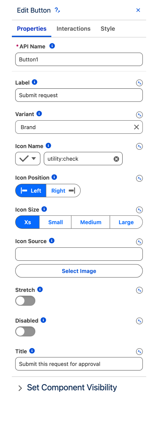
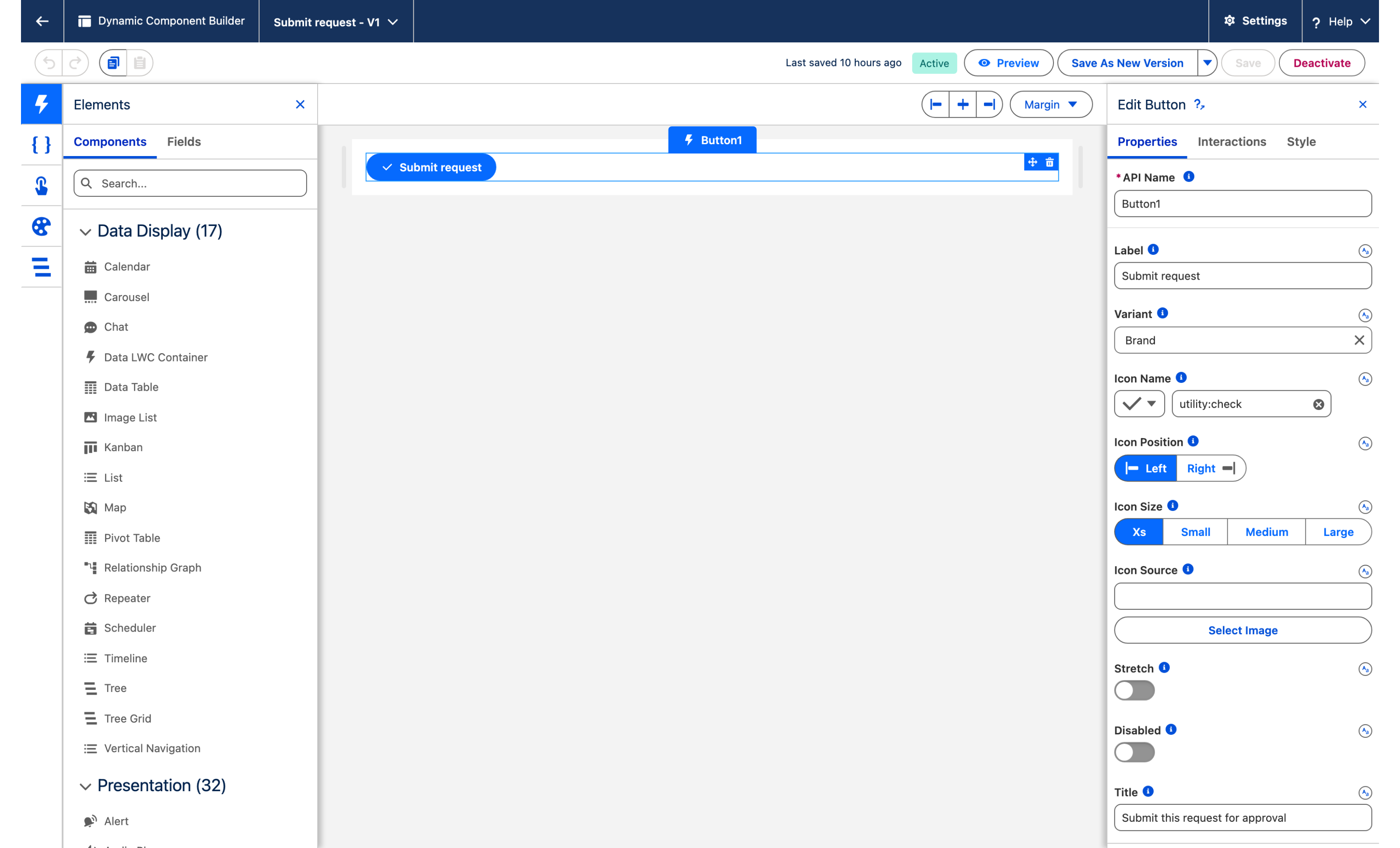
To configure the Button, select it on the canvas. The **Edit Button** panel opens on the right with three tabs: **Properties**, **Interactions**, and **Style**. The sections below mirror the Properties tab.

### Properties

#### Label

The text displayed inside the button. It should clearly communicate the button's purpose and what action will occur when the user clicks it.

* **Best Practices:**
  * Use concise and action-oriented labels (e.g., "Save," "Submit," "Cancel," "Learn More").
  * Avoid generic labels like "Click Here."
  * Ensure the label accurately reflects the button's function.

#### Variant

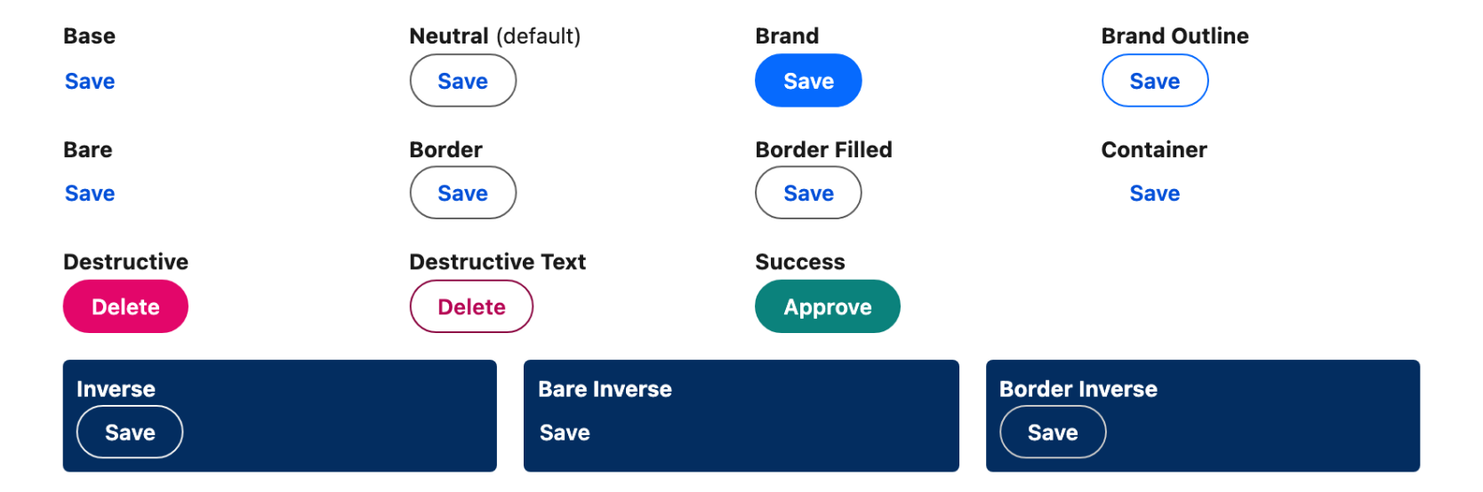
The **Variant** setting changes the appearance of the button — its color, background, and border. Choose the style that aligns with your design and the button's intended purpose. Available variants are **Bare**, **Bare Inverse**, **Base**, **Border**, **Border Filled**, **Border Inverse**, **Brand**, **Brand Outline**, **Container**, **Destructive**, **Destructive Text**, **Inverse**, **Neutral** (default), and **Success**.

#### Icon Name

Add a Lightning Design System icon to reinforce the action or make the button more visually appealing. Choose any icon from the SLDS icon library.

#### Icon Position

Place the icon to the **Left** (default) or **Right** of the label.

Requires: **Icon Name** to be set.

#### Icon Size

Adjust the size of the icon to match your design needs: **Xs** (default), **Small**, **Medium**, or **Large**.

#### Icon Source

Instead of an SLDS icon, use a custom image as the button icon by providing an image URL or uploading a file. Accepted formats are `.apng`, `.avif`, `.gif`, `.jpg`, `.jpeg`, `.png`, `.svg`, and `.webp`.

#### Stretch

When enabled, the button takes the entire available width of its container.

#### Disabled

When enabled, the button is disabled and users cannot interact with it.

#### Title

The text displayed when hovering over the button, providing an accessible tooltip.

### Set Component Visibility

All components support conditional visibility — see [Component Visibility](/dynamic-components/core-concepts/component-visibility.md).

## Interactions

[Interactions](/dynamic-components/component-builder/interactions.md) define what happens when users interact with the Button. Configure them from the **Interactions** tab of the Edit Button panel.

### Click

Fires when a user clicks the button (ignored when the button is disabled). Use it to chain any of the built-in behaviors listed in the Overview — navigate, show a toast, update records, launch a flow, and more.

## Styling

Fine-tune the Button's appearance from the **Style** tab of the Edit Button panel. The **Spacing**, **Text**, **Background**, and **Border** color options are set per variant (Base, Bare, Bare Inverse, Border, Border Filled, Border Inverse, Brand, Brand Outline, Container, Destructive, Destructive Text, Inverse, Neutral, Success), so each variant exposes its own hooks.

{% tabs %}
{% tab title="Margin" %}
Controls the *outer* spacing around the button.

* **Top / Right / Bottom / Left:** Adjust the space on each side.
  {% endtab %}

{% tab title="Horizontal Alignment" %}
Aligns the button within its container.

* **Horizontal Alignment:** Position the button to the left, center, or right.
  {% endtab %}

{% tab title="Spacing" %}
Controls the *inner* spacing of the button (set per variant).

* **Block Start / Block End:** Adjust the top and bottom padding.
* **Inline Start / Inline End:** Adjust the leading and trailing padding.
  {% endtab %}

{% tab title="Text" %}
Styles the button label.

* **Line Height:** Set the label's line height.
* **Font Family / Font Size / Font Style / Font Weight:** Control the typography.
* **Horizontal Alignment:** Align the label within the button.
* **Color / Color Active / Color Hover:** Set the label color for the default, active, and hover states (set per variant).
  {% endtab %}

{% tab title="Background" %}
Sets the button background (set per variant).

* **Color / Color Active / Color Hover:** Set the background color for the default, active, and hover states.
  {% endtab %}

{% tab title="Border" %}
Customizes the border.

* **Size:** Adjust the border thickness.
* **Style:** Choose a border style.
* **Radius:** Control the roundness of the corners.
* **Color / Color Active / Color Hover:** Set the border color for the default, active, and hover states (set per variant).
  {% endtab %}

{% tab title="Box Shadow" %}
Adds a shadow to the button.

* **Shadow:** Set the button's shadow.
* **Shadow Focus:** Set the shadow shown when the button is focused.
  {% endtab %}

{% tab title="Image" %}
Styles a custom image icon (when **Icon Source** is used).

* **Border Size / Border Style / Border Color:** Customize the image border.
* **Radius:** Control the roundness of the image corners.
* **Object Fit:** Set how the image fills its area.
  {% endtab %}
  {% endtabs %}

## Output Variables

The Button exposes one output variable you can reference elsewhere on the page after the user interacts with it.

### Button Click

Updates when a user clicks the button.

| Output variable | Type    | What it returns                                                                                                      |
| --------------- | ------- | -------------------------------------------------------------------------------------------------------------------- |
| **Clicked**     | Boolean | `true` when the button has been clicked. Use it to conditionally show another component or trigger downstream logic. |

> **Example:** After a user clicks a "Submit" button, use **Clicked** in a visibility condition on a confirmation message component to reveal it on the same page.


---

# Agent Instructions
This documentation is published with GitBook. GitBook is the documentation platform designed so that both humans and AI agents can read, navigate, and reason over technical content effectively. Learn more at gitbook.com.

## Querying This Documentation
If you need additional information that is not directly available in this page, you can query the documentation dynamically by asking a question.

Perform an HTTP GET request on the current page URL with the `ask` query parameter, and the optional `goal` query parameter:

```
GET https://docs.avonnicomponents.com/dynamic-components/components/button.md?ask=<question>&goal=<endgoal>
```

`ask` is the immediate question: it should be specific, self-contained, and written in natural language.
`goal` is optional and describes the broader end goal you are ultimately trying to accomplish on behalf of the user. GitBook uses it to tailor the answer towards what is most useful for that goal.

The response will contain a direct answer to the question and relevant excerpts and sources from the documentation.

Use this mechanism when the answer is not explicitly present in the current page, you need clarification or additional context, or you want to retrieve related documentation sections.