> For the complete documentation index, see [llms.txt](https://docs.avonnicomponents.com/llms.txt). Markdown versions of documentation pages are available by appending `.md` to page URLs; this page is available as [Markdown](https://docs.avonnicomponents.com/dynamic-components/components/formatted-value.md).

# Formatted Value

The Formatted Value component displays a single value with type-aware formatting — text, rich text, number, date/time, badge, email, phone, URL, lookup, or time — alongside an optional label and help text. Use it wherever you need to render a field value with consistent, configurable presentation.

## Overview

The component is available in the Component Builder under two presets:

* **Formatted Value** — starts with a **Label** and a text **Value**, ready for standard label-value display.
* **Icon Text** — starts with the label hidden, a text value, and a small icon to the left of the value, useful for compact icon-and-text pairs.

Both presets use the same underlying component and share the same configuration panel. The only difference is in their initial attribute values.

## Configuration

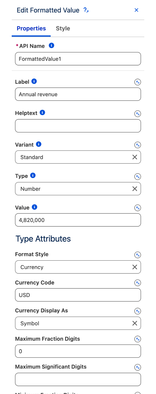
To configure the Formatted Value, select it on the canvas. The configuration panel opens on the right. The sections below mirror the panel from top to bottom.

### Properties

#### Label

Enter the text label shown above (or beside) the value. Leave it empty to show only the value.

#### Helptext

Add a short tooltip that appears next to the label to give users more context. Requires: **Label** to be set.

#### Variant

Controls the position of the label relative to the value. Requires: **Label** to be set.

| Option                 | Description                                                      |
| ---------------------- | ---------------------------------------------------------------- |
| **Standard** (default) | Label sits above the value.                                      |
| **Label Hidden**       | Label is hidden — useful for icon-text presets or tight layouts. |
| **Label Inline**       | Label appears to the left of the value on the same line.         |
| **Label Stacked**      | Label starts above the value and animates upward on focus.       |
| **Label Spread**       | Label and value are pushed to opposite ends of the container.    |

#### Type

Determines how the value is formatted and which **Value** field is shown. Defaults to **Text**.

| Type          | Description                                                                                             |
| ------------- | ------------------------------------------------------------------------------------------------------- |
| **Text**      | Plain text. Optionally auto-links URLs with **Linkify**.                                                |
| **Rich Text** | HTML-formatted text. Optionally disable auto-linking with **Disable Linkify**.                          |
| **Number**    | Numeric value with configurable format style, precision, and currency options.                          |
| **Date**      | Accepts a date value; configure day, weekday, month, year, and era display.                             |
| **Date Time** | Accepts a date/time value; configure all date parts plus hour, minute, second, and 12-hour format.      |
| **Time**      | Displays a time string.                                                                                 |
| **Badge**     | Renders the value as a colored badge. Configure the badge **Variant** and optionally add an **Avatar**. |
| **Email**     | Renders a mailto link. Optionally set a display **Label** and hide the default email icon.              |
| **Phone**     | Renders a tel link.                                                                                     |
| **URL**       | Renders a hyperlink. Configure the display **Label**, **Target**, and **Tooltip**.                      |
| **Lookup**    | Renders a Salesforce record link.                                                                       |

#### Value

The value to display. The field shown depends on the selected **Type**:

* **Text, Rich Text, Badge, Email, Phone, URL, Lookup, Time** — a text field.
* **Number** — a number field. In query mode, configure an **Object**, **Field**, and **Aggregate Function** (Sum, Count, Avg, Min, Max), with an optional filter expression and **Treat Blank Value as Zero** toggle.
* **Date** — a date picker.
* **Date Time** — a date/time picker.

#### Type Attributes

Additional formatting options that appear when the selected **Type** supports them:

**Date / Date Time**

* **Day** — Numeric (default) or 2-Digit.
* **Weekday** — Narrow, Short, or Long (hidden by default).
* **Month** — Defaults to Long; also 2-Digit, Narrow, or Short.
* **Year** — Numeric (default) or 2-Digit.
* **Era** — Narrow, Short, or Long (hidden by default).
* **Hour**, **Minute**, **Second** — Numeric or 2-Digit (date-time only).
* **Hour 12** — Toggle 12-hour display (date-time only).

**Number**

* **Format Style** — Decimal (default), Currency, Percent, or Percent Fixed.
* **Currency Code** — ISO code such as USD or CAD. Requires **Format Style** = Currency.
* **Currency Display As** — Symbol (default), Code, or Name. Requires **Format Style** = Currency.
* **Minimum / Maximum Fraction Digits**, **Minimum / Maximum Significant Digits**, **Minimum Integer Digits** — precision controls.

**Text**

* **Linkify** — Automatically converts URLs in plain text to clickable links.

**Rich Text**

* **Disable Linkify** — Prevents automatic link detection in HTML content.

**Email**

* **Label** — Display text shown instead of the raw email address.
* **Hide Icon** — Hides the default email icon.

**URL**

* **Label** — Display text shown instead of the raw URL.
* **Target** — Where the link opens: Self (default), Blank, Parent, or Top.
* **Tooltip** — Hover tooltip text.

**Badge**

* **Variant** — Badge color: Base (default), Brand, Inverse, Alt Inverse, Success, Info, Error, Warning, or Offline.
* **Avatar** — Optional avatar displayed alongside the badge value. Configure its **Variant** (Circle or Square), **Initials**, **Icon Name**, **Icon Size**, **Image**, and **Position** (Left or Right).

### Label Icon

Optionally attach an icon to the label. Expand this section to configure:

* **Icon Name** — Any Salesforce icon (e.g., `utility:info`).
* **Icon Position** — Left (default) or Right.
* **Icon Size** — X-Small, Small (default), Medium, or Large.

{% hint style="info" %}
The **Icon Text** preset pre-configures the **Value Icon** section with a small icon to the left of the value. The **Label Icon** section is independent and decorates the label text instead.
{% endhint %}

### Value Icon

Optionally attach an icon to the displayed value. Expand this section to configure:

* **Icon Name** — Any Salesforce icon.
* **Icon Position** — Left (default) or Right.
* **Icon Size** — X-Small, Small (default), Medium, or Large.

### Set Component Visibility

All components support conditional visibility — see [Component Visibility](/dynamic-components/core-concepts/component-visibility.md).

## Styling

The **Style** tab gives you fine-grained control over the Formatted Value's appearance. Configure it from the **Style** tab of the configuration panel.

{% tabs %}
{% tab title="Margin" %}
Controls the *outer* spacing around the component, creating space between it and other elements on the page.

* **Top / Right / Bottom / Left:** Adjust the space on each side.
  {% endtab %}

{% tab title="Padding" %}
Controls the *inner* spacing between the component's border and its content.

* **Top / Right / Bottom / Left:** Adjust the inner spacing on each side.
  {% endtab %}

{% tab title="Border" %}
Customizes the border surrounding the component.

* **Color:** Set the border color.
* **Size:** Adjust the border thickness.
* **Style:** Choose a border style (e.g. solid, dashed, dotted).
* **Radius:** Control the roundness of the corners.
  {% endtab %}

{% tab title="Text Alignment" %}
Aligns the content horizontally within the component.

* **Text Alignment:** Set the horizontal alignment of the value and label.
  {% endtab %}

{% tab title="Spacing" %}
Fine-tunes the inner spacing around the value independently on each side.

* **Top / Bottom / Left / Right:** Adjust each spacing edge.
  {% endtab %}

{% tab title="Container" %}
Sets the component's container fill.

* **Background Color:** Set the background color.
  {% endtab %}

{% tab title="Label" %}
Styles the label text.

* **Color:** Set the label color.
* **Font Size / Font Style / Font Weight:** Control the label typography.
  {% endtab %}

{% tab title="Value" %}
Styles the displayed value text.

* **Color:** Set the value color.
* **Font Size / Font Style / Font Weight:** Control the value typography.
  {% endtab %}
  {% endtabs %}

\- \*\*Value\*\* — Customize the value color, font size, font style, and font weight.


---

# Agent Instructions
This documentation is published with GitBook. GitBook is the documentation platform designed so that both humans and AI agents can read, navigate, and reason over technical content effectively. Learn more at gitbook.com.

## Querying This Documentation
If you need additional information that is not directly available in this page, you can query the documentation dynamically by asking a question.

Perform an HTTP GET request on the current page URL with the `ask` query parameter, and the optional `goal` query parameter:

```
GET https://docs.avonnicomponents.com/dynamic-components/components/formatted-value.md?ask=<question>&goal=<endgoal>
```

`ask` is the immediate question: it should be specific, self-contained, and written in natural language.
`goal` is optional and describes the broader end goal you are ultimately trying to accomplish on behalf of the user. GitBook uses it to tailor the answer towards what is most useful for that goal.

The response will contain a direct answer to the question and relevant excerpts and sources from the documentation.

Use this mechanism when the answer is not explicitly present in the current page, you need clarification or additional context, or you want to retrieve related documentation sections.
