> For the complete documentation index, see [llms.txt](https://docs.avonnicomponents.com/llms.txt). Markdown versions of documentation pages are available by appending `.md` to page URLs; this page is available as [Markdown](https://docs.avonnicomponents.com/dynamic-components/components/relationship-graph.md).
# Relationship Graph
The Avonni Relationship Graph component displays a relationship graph with a root header and one or more groups of related items. Use it to visualize connections and hierarchical relationships — such as account hierarchies, org charts, or project structures — directly on your Lightning Pages.
## Overview
The Relationship Graph renders hierarchical data as an interactive, expandable tree. Each node in the graph corresponds to a record; nodes can be collapsed or expanded, and can carry labels, avatars, fields, and inline actions. The graph supports both a vertical and a horizontal layout to suit different page designs.
### Use Cases
* Visualizing Account Hierarchies with related Contacts and Opportunities.
* Displaying Organizational Charts (e.g., User hierarchies based on the `ManagerId` field).
* Mapping Product Structures (e.g., Product Bundles and their components).
* Showing Case Dependencies or related Knowledge Articles.
* Visualizing complex project structures with parent/child tasks.
{% hint style="info" %}
**See it in a real project**
[Account map in one tag](https://docs.avonnicomponents.com/projects/use-cases/record-pages/account-map-in-one-tag): An account tree with its contacts and its open deals.
{% endhint %}
## Configuration
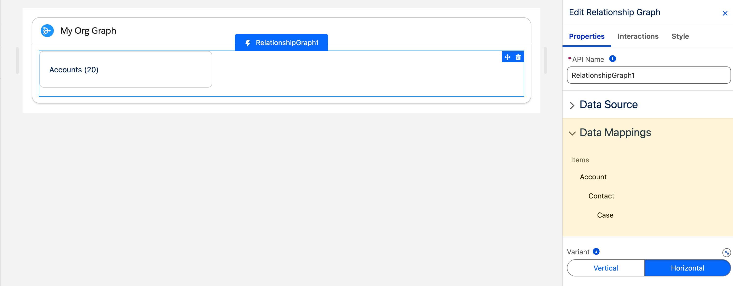
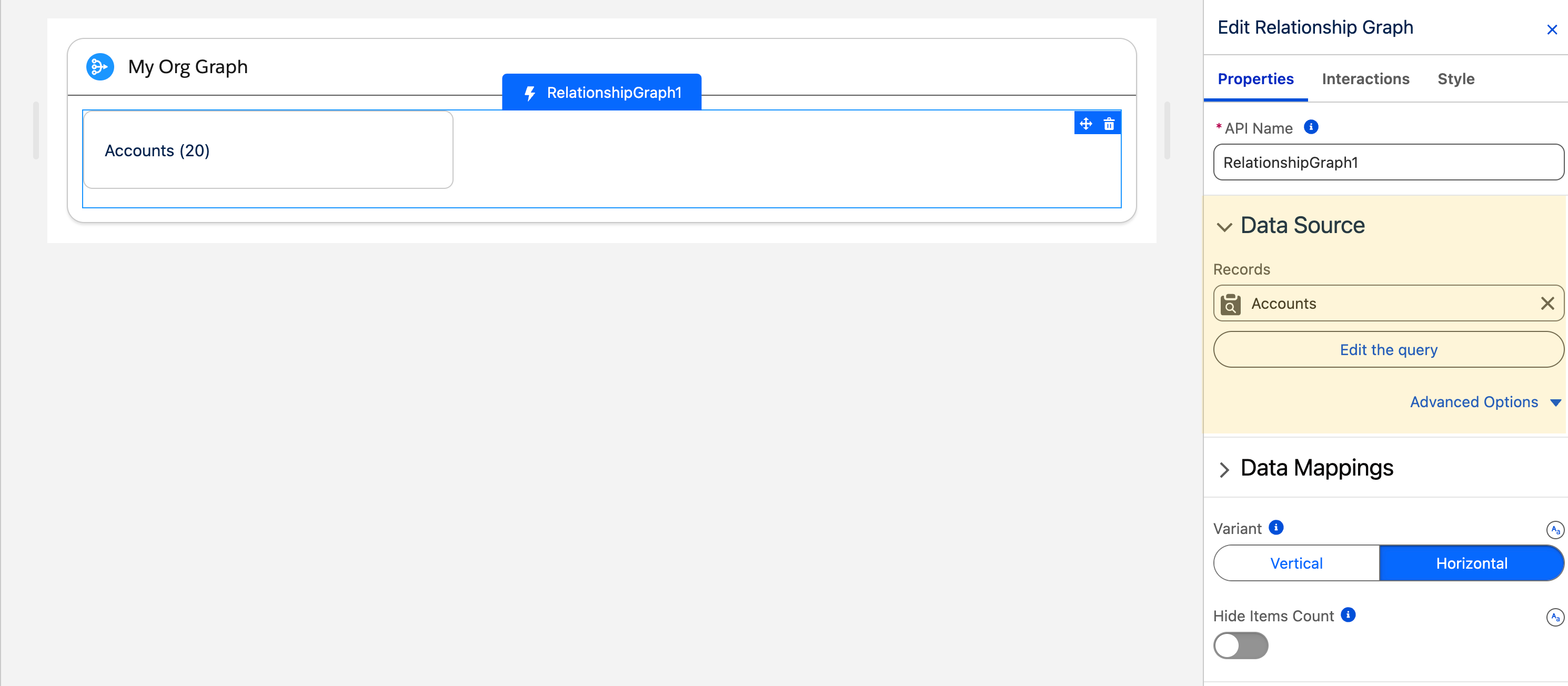
To configure the Relationship Graph, select it on the canvas. The **Edit Relationship Graph** panel opens on the right with three tabs: **Properties**, **Interactions**, and **Style**. The sections below mirror the Properties tab.
### Data Source
The Relationship Graph requires hierarchical data. Connect it to data using the **Avonni Nested Query Data Source**, which lets you define a parent object query and add child relationship levels (with optional further nesting).
{% stepper %}
{% step %}
### Select Data Source
In the Properties panel, set the **Data Source** to `Avonni Nested Query Data Source`.
{% endstep %}
{% step %}
### Configure Nested Query
Click **Create Query** or **Edit Query**.
* **Parent Object Query:** Define the query for your top-level records (e.g., Object: `Account`). Add filters if needed.
* **Add Child Object(s):** Within the Nested Query builder, add child relationships.
* Select the Child Object (e.g., `Contact`).
* Specify the **Relationship Field** on the *child* object that links it to the *parent* (e.g., `AccountId` on Contact).
* **Add Further Nesting (Optional):** Add another level (e.g., add `Case` as a child of `Contact`, using the `ContactId` relationship field).
* **Multiple Parent Objects (Optional):** Add multiple independent parent queries to display different starting hierarchies in the same graph.
* **Save Query:** Save your Nested Query definition.
{% endstep %}
{% endstepper %}
### Data Mapping
The Data Mappings section defines how each level of your Nested Query is displayed on the graph nodes.
{% stepper %}
{% step %}
### Access Data Mappings
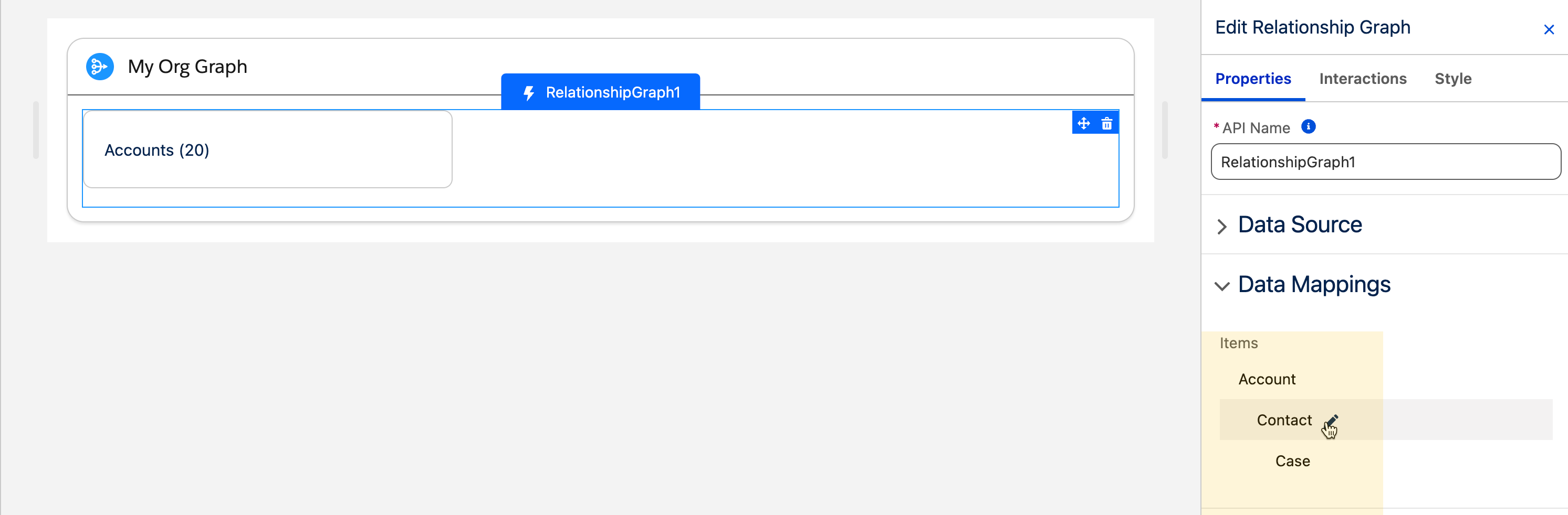
In the Properties panel, find the **Data Mappings** section.
{% endstep %}
{% step %}
### Select Item Level
You will see sections corresponding to each level defined in your Nested Query (e.g., "Account Item," "Contact Item," "Case Item"). Select the level you want to configure.
{% endstep %}
{% step %}
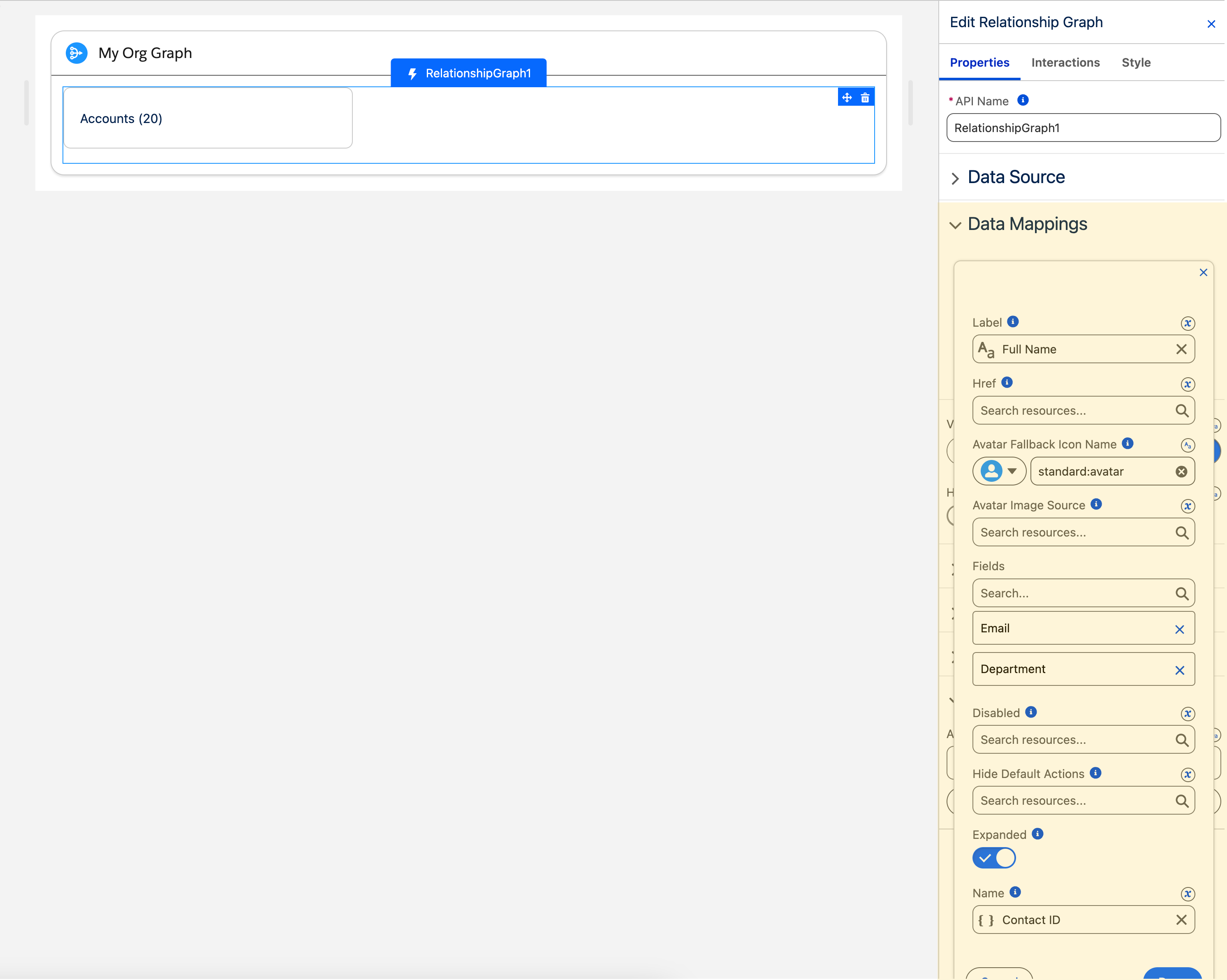
### Map Attributes for Each Level
For the selected item level (e.g., Account):
* **Label:** Select the field from the query results that should be the primary display text for the node (e.g., `Account.Name`).
* **Icon Name (Optional):** Select a field containing an SLDS icon name, or enter a static icon name (e.g., `standard:account`) to display an icon on the node.
* **Additional Fields (Optional):** Add other fields from the query to display as secondary information on the node.
* **Expanded (Optional — for parent nodes):** Set whether this level's nodes are expanded by default when the graph loads.
{% endstep %}
{% step %}
### Repeat Mappings
Repeat the previous step for each item level (e.g., configure mappings for Contacts, then for Cases).
{% endstep %}
{% endstepper %}
### Content
#### Variant
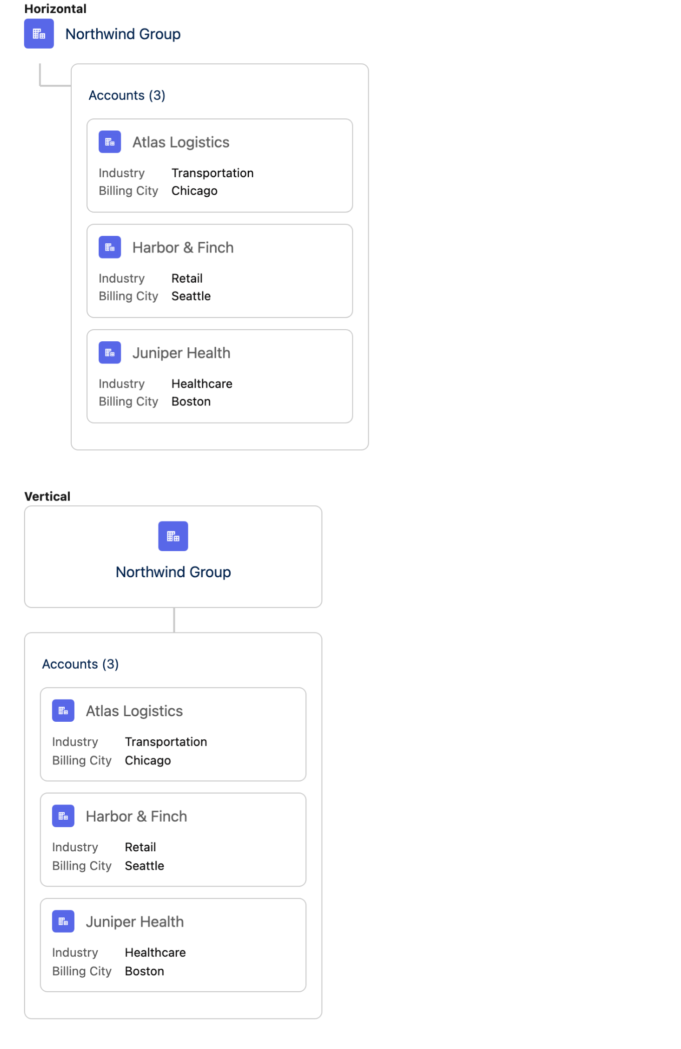
The **Variant** setting controls the overall layout direction of the graph. **Horizontal** (default) lays out the hierarchy from left to right. **Vertical** stacks the hierarchy from top to bottom.
The same graph laid out horizontally and vertically.
#### Hide Items Count
When enabled, the count of child items displayed next to each group header is hidden.
### Header
Customize the root header displayed at the top of the graph.
| Setting | Description |
| ----------- | ------------------------------------------------------------------------------------------------------------------------------------------------------------------------------------------------------- |
| **Label** | The primary text shown in the root header (e.g., the name of the top-level record). |
| **URL** | A web address the header label links to. |
| **Target** | Controls where the URL opens. **Self** (default) opens in the current tab; **Blank** opens a new tab; **Parent** targets the parent frame; **Top** targets the full window. Requires **URL** to be set. |
| **Avatar** | An avatar shown in the root header. Set an **Icon Name** (SLDS icon) or an **Image Source** (URL of an image file). |
| **Actions** | Buttons displayed under the root header. Each action has a **Label**, a unique **Name** (required), an optional **Icon Name**, and can be **Disabled**. |
### Collapsible Icon
Customize the icons used for the expand/collapse controls on group nodes.
| Setting | Description |
| ------------------- | --------------------------------------------------------------------- |
| **Open Icon Name** | The SLDS icon shown on an expanded group node to allow collapsing it. |
| **Close Icon Name** | The SLDS icon shown on a collapsed group node to allow expanding it. |
### Group Actions
Define default actions that appear on every group (parent node) in the graph.
Each group action has a **Label**, a unique **Name**, an optional **Icon Name**, and can be **Disabled**.
The **Position** setting controls where group actions appear relative to the group header: **Top** (default) or **Bottom**.
### Item Actions
Define default actions that appear on every individual item (leaf node) in the graph.
Each item action has a **Label**, a unique **Name**, an optional **Icon Name**, and can be **Disabled**.
### Set Component Visibility
All components support conditional visibility — see [Component Visibility](/dynamic-components/core-concepts/component-visibility.md).
## Interactions
[Interactions](/dynamic-components/component-builder/interactions.md) define what happens when users interact with the Relationship Graph. Configure them from the **Interactions** tab of the Edit Relationship Graph panel.
### Item Click
Fires when a user clicks a graph node. Use this to navigate to the clicked record's page or trigger flow logic based on the selected node.
### Item Action Click
Fires when a user clicks an action button on an individual item node. Use the **targetName** output to identify which action was clicked and branch your flow logic accordingly.
### Group Action Click
Fires when a user clicks an action button on a group header. Use the **targetName** output to identify which group action was clicked and respond accordingly.
### Header Action Click
Fires when a user clicks an action button in the root header. Use the **targetName** output to identify which header action was clicked and branch your flow logic accordingly.
## Output Variables
The Relationship Graph exposes these output variables to the interaction that the user's click triggers. They are cleared once that interaction finishes, so read them inside the interaction rather than expecting them to persist elsewhere on the page.
### Item Click
When a user clicks a graph node, these variables update with the clicked node's data.
| Output variable | Type | What it returns |
| --------------------------------- | ---------------- | ------------------------------------------------------------------------------------------------------------------------------------------------------------------------------------- |
| **Clicked Item** | Object | The full data object of the clicked node — its name, label, and avatar (icon, initials, image source). |
| **Clicked Item Name** | Text (String) | The unique name of the clicked graph node. |
| **Clicked Item sObject** | Record (SObject) | The Salesforce record associated with the clicked node. The Relationship Graph is always query backed, so this is populated whenever the node came from the Nested Query data source. |
| **Clicked Item sObject API Name** | Text (String) | The API name of the sObject type associated with the clicked node. |
> **Example:** When a user clicks a Contact node in an org chart, use **Clicked Item sObject** to display that Contact's details in a record-detail component beside the graph.
### Item Action Click
When a user clicks an action button on an item node, these variables update.
| Output variable | Type | What it returns |
| ------------------------------------- | ------------- | -------------------------------------------------------------------------------- |
| **Clicked Item Action - Action Name** | Text (String) | The name of the item action button the user clicked. |
| **Clicked Item Action Item** | Object | The data object of the item node the action was clicked on — its name and label. |
| **Clicked Item Action - Item Name** | Text (String) | The name of the item node the action was clicked on. |
> **Example:** Use **Clicked Item Action - Action Name** to branch logic — for example, navigate to a record page when the "View" action is clicked.
### Group Action Click
When a user clicks an action button on a group (parent) node, these variables update.
| Output variable | Type | What it returns |
| ---------------------------------- | ------------- | --------------------------------------------------------------------------------- |
| **Clicked Group Action Name** | Text (String) | The name of the group action button the user clicked. |
| **Clicked Group Action Item** | Object | The data object of the group node the action was clicked on — its name and label. |
| **Clicked Group Action Item Name** | Text (String) | The name of the group node the action was clicked on. |
### Header Action Click
| Output variable | Type | What it returns |
| ------------------------------ | ------------- | ------------------------------------------------------ |
| **Clicked Header Action Name** | Text (String) | The name of the header action button the user clicked. |
## Styling
Configure the Relationship Graph's appearance from the **Style** tab of the Edit Relationship Graph panel.
{% tabs %}
{% tab title="Margin" %}
Controls the *outer* spacing around the component.
* **Top / Right / Bottom / Left:** Adjust the space on each side.
{% endtab %}
{% tab title="Padding" %}
Controls the *inner* spacing between the component's content and its border.
* **Top / Right / Bottom / Left:** Adjust the inner spacing on each side.
{% endtab %}
{% tab title="Size" %}
Controls the component's dimensions.
* **Width / Height:** Set fixed dimensions.
* **Min Width / Max Width / Min Height / Max Height:** Constrain the size within bounds.
* **Overflow:** Control how content that exceeds the bounds is handled.
{% endtab %}
{% tab title="Border" %}
Customizes the border surrounding the component.
* **Color / Size / Style / Radius:** Set the border color, thickness, style, and corner rounding.
{% endtab %}
{% tab title="Graph Line" %}
Styles the connector lines between nodes.
* **Color:** Set the default line color.
* **Selected Color:** Set the color of lines in the selected path.
{% endtab %}
{% tab title="Item" %}
Styles the graph items.
* **Indicator Color:** Set the color of the item indicator.
{% endtab %}
{% endtabs %}
---
# Agent Instructions
This documentation is published with GitBook. GitBook is the documentation platform designed so that both humans and AI agents can read, navigate, and reason over technical content effectively. Learn more at gitbook.com.
## Querying This Documentation
If you need additional information that is not directly available in this page, you can query the documentation dynamically by asking a question.
Perform an HTTP GET request on the current page URL with the `ask` query parameter, and the optional `goal` query parameter:
```
GET https://docs.avonnicomponents.com/dynamic-components/components/relationship-graph.md?ask=&goal=
```
`ask` is the immediate question: it should be specific, self-contained, and written in natural language.
`goal` is optional and describes the broader end goal you are ultimately trying to accomplish on behalf of the user. GitBook uses it to tailor the answer towards what is most useful for that goal.
The response will contain a direct answer to the question and relevant excerpts and sources from the documentation.
Use this mechanism when the answer is not explicitly present in the current page, you need clarification or additional context, or you want to retrieve related documentation sections.
.png?alt=media)