> For the complete documentation index, see [llms.txt](https://docs.avonnicomponents.com/llms.txt). Markdown versions of documentation pages are available by appending `.md` to page URLs; this page is available as [Markdown](https://docs.avonnicomponents.com/dynamic-components/components/timeline.md).
# Timeline
The Avonni Activity Timeline component displays a chronological list of activities and events as a visual timeline. Use it to give users an at-a-glance view of a record's history or upcoming milestones, with support for vertical and horizontal layouts, grouping, sorting, per-item actions, filtering, and search.
## Overview
Connect the Activity Timeline to your data, map fields to item attributes, then fine-tune the layout and display options. The sections below follow the configuration panel from top to bottom.
{% hint style="info" %}
**See it in a real project**
[Contact Life Events](https://docs.avonnicomponents.com/projects/use-cases/record-pages/contact-life-events): A life events history on the Contact record.
{% endhint %}
## Configuration
To configure the Activity Timeline, select it on the canvas. The **Edit Activity Timeline** panel opens on the right with three tabs: **Properties**, **Interactions**, and **Style**. The sections below mirror the Properties tab.
### Data Source
Before your timeline can display any information, you must tell it where to get the data. The Avonni Activity Timeline supports three data source types:
Manual
Enter data directly into the component configuration.
Variable
This is useful for data that changes based on user interactions or other component logic.
Query
This is the most common option for displaying Salesforce records.
### Data Mapping
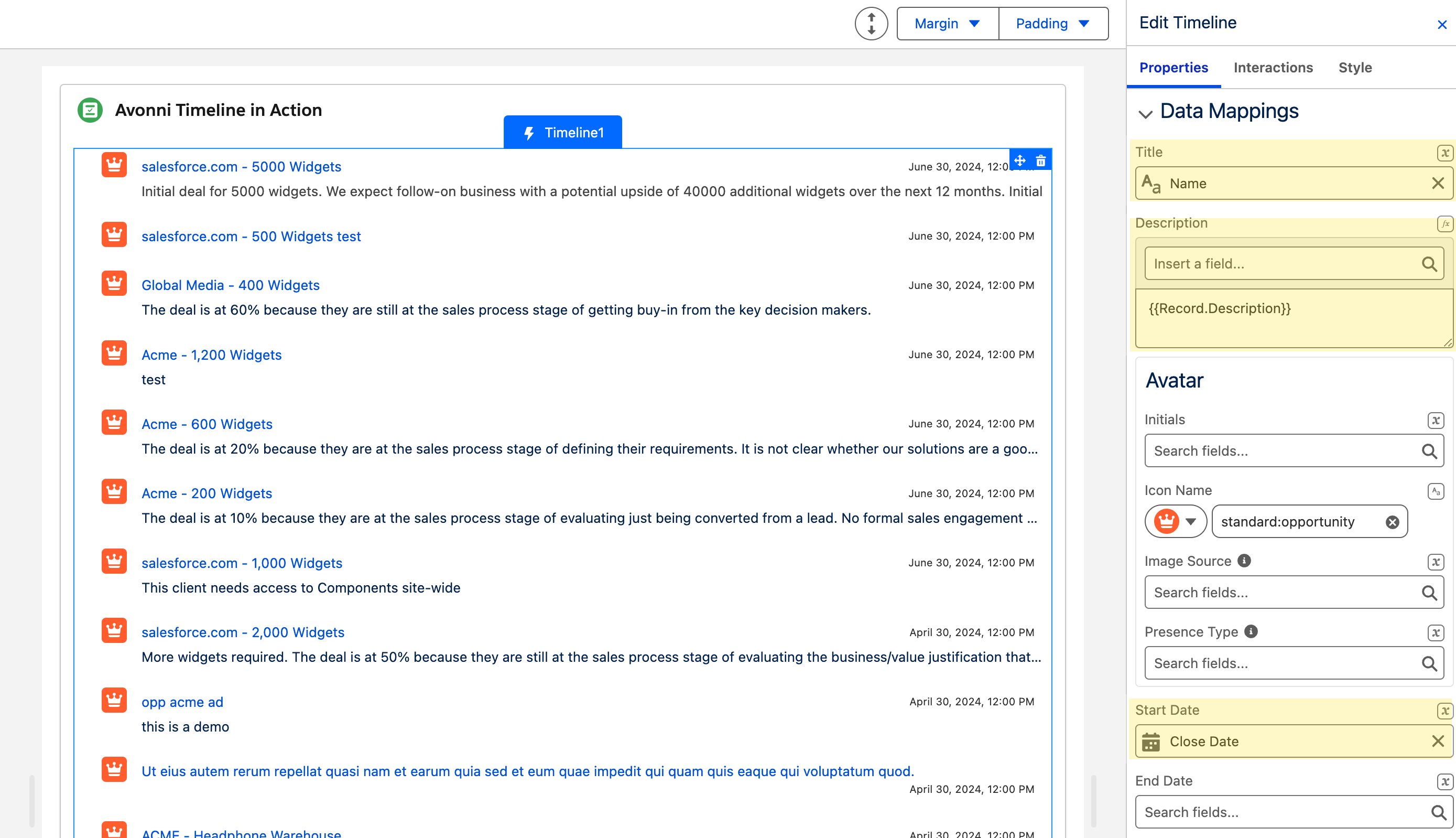
When using a Query or Variable data source, you need to map fields from your data source to the timeline item attributes. These mappings act as instructions that tell the component which fields contain the title, description, dates, avatar, and other item details.
**Example (Opportunities):**
If your data source retrieves `Opportunity` records with fields like `Name`, `Description__c`, and `CloseDate`, you would map:
* **Title:** `Name`
* **Description:** `Description__c`
* **Start Date:** `CloseDate`
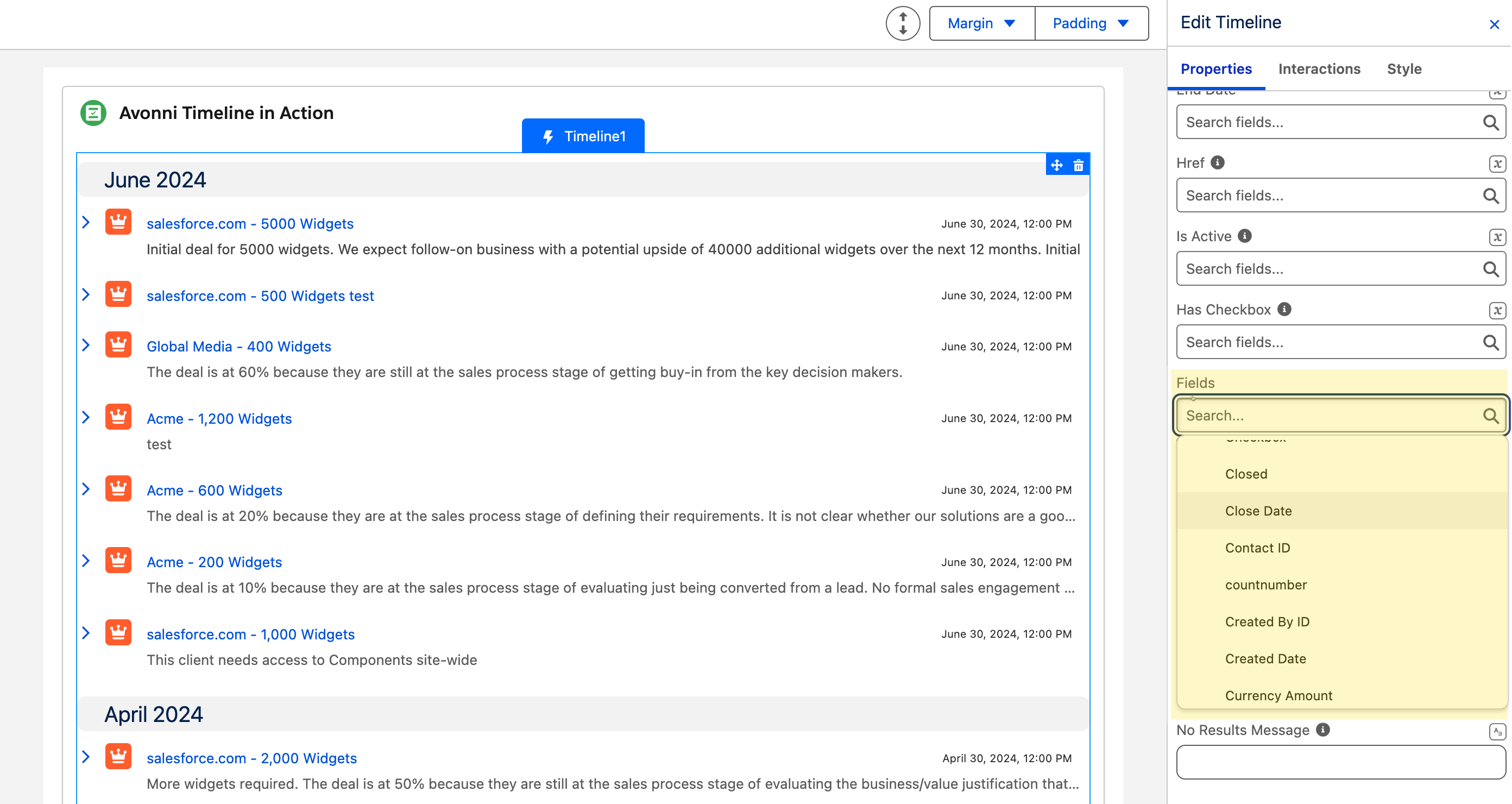
**Filter Fields**
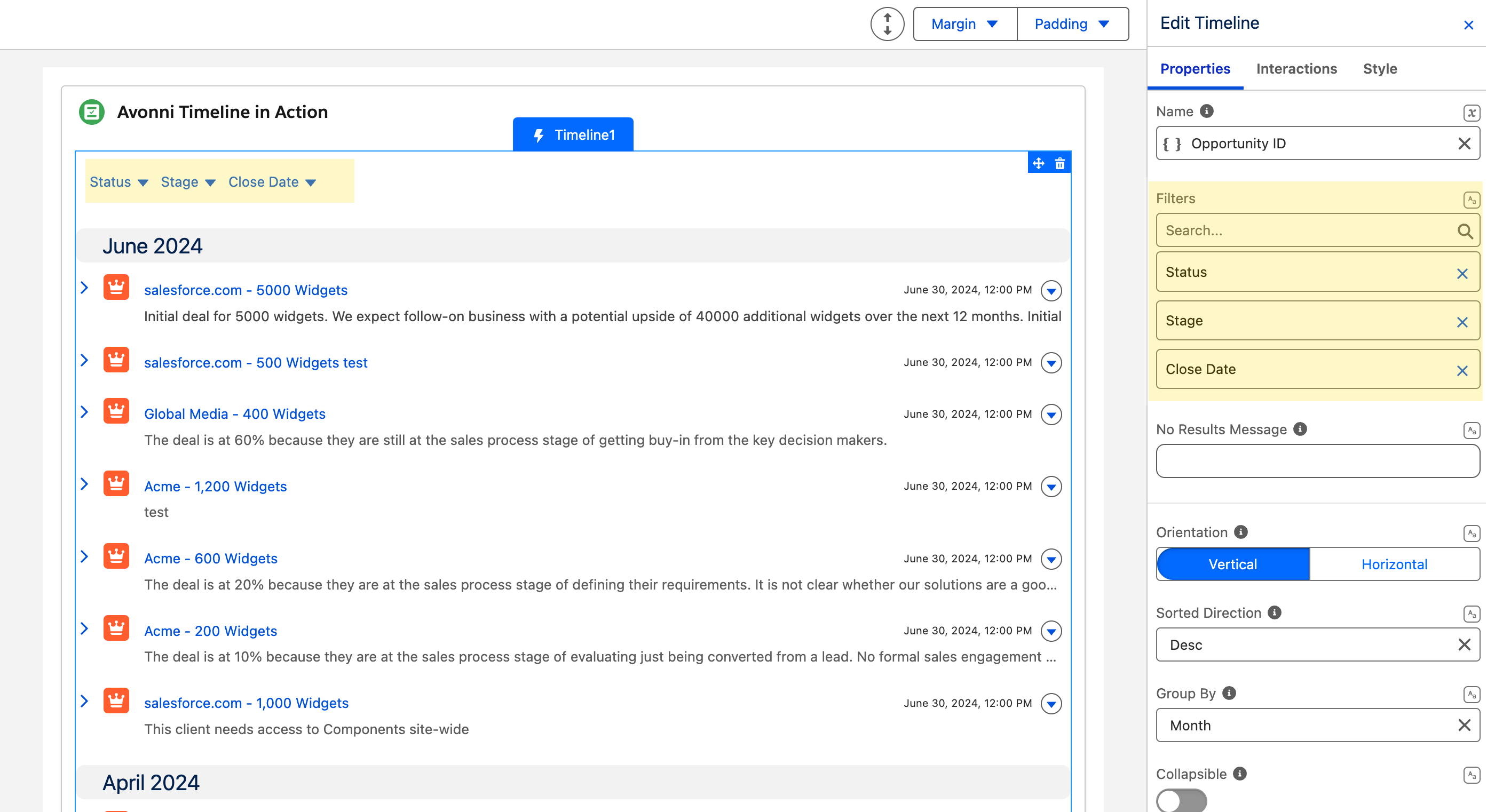
In the Data Mappings section, select which fields are available to end-users as filters. Only the fields you select here will appear in the filter menu.
**Search Fields**
By default, the search covers all searchable fields you map in the Data Mappings section. Use **Search Fields** to limit the search to specific mapped fields.
### Content
#### Orientation
Choose how items are arranged. **Vertical** (default) stacks events top to bottom, which is ideal for emphasizing chronological order. **Horizontal** displays events left to right across a timeline bar, suited for showing events over an extended period.
| Orientation | Description | Illustration |
| -------------- | ------------------------------------------------------------------------------------------------- | --------------------------------------------------------------------------------------------------------------------------------------------------------------------------------------------------------------------------------- |
| **Vertical** | Events are stacked vertically. Good for emphasizing chronological order or when space is limited. |  |
| **Horizontal** | Events are displayed from left to right. Ideal for showcasing events over a more extended period. |  |
#### Sorted Direction
Controls the order of items in a vertical timeline. Choose **Asc** to display oldest events first, or **Desc** (default) to show the most recent events at the top. Requires: **Orientation** = `Vertical`.
#### Group By
Groups items by a time period. Choose **Day**, **Week**, **Month**, or **Year** to create visual sections within the timeline, making it easier to navigate large event sets. Requires: **Orientation** = `Vertical`.
#### Collapsible
When grouping is enabled, makes each group section collapsible and shows a collapse control. Requires: **Group By** to be set.
#### Closed
When grouping is enabled, sets all group sections to collapsed by default when the timeline loads. Requires: **Group By** to be set.
#### Disable Upcoming Group
When grouping is enabled, prevents future-dated items from being placed in a dedicated upcoming section. Requires: **Group By** to be set.
#### Date Intervals
Specifies the number of days to display across the horizontal timeline. Requires: **Orientation** = `Horizontal`.
#### Hide Vertical Bar
When enabled, the vertical connecting bar between items is not displayed. Requires: **Orientation** = `Vertical`.
#### Items Clickable
When enabled, items are displayed as clickable. Configure what happens on click using the **On Item Click** interaction in the Interactions tab.
#### Highlight On Click
When enabled, the last clicked item remains visually highlighted. If an interaction that opens a panel is configured on item click, the last clicked item is highlighted automatically regardless of this setting. Requires: **Orientation** = `Vertical`.
#### Item Icon Size
Controls the size of the icon displayed for each item in vertical orientation. Options: **Xx-Small**, **X-Small**, **Small** (default), **Medium**, **Large**. Requires: **Orientation** = `Vertical`.
### Header
The Header section controls the appearance and content displayed above the timeline.
| Setting | Description |
| --------------------------- | ----------------------------------------------------------------------------------------------------------------------------------------------------- |
| **Title** | Main title displayed in the header (e.g., "Project Timeline", "Opportunity History"). |
| **Caption** | A shorter description or subtitle displayed above the title, providing additional context. |
| **Avatar** | Display an avatar in the header. Set an **Image**, a **Fallback Icon Name**, or **Initials**. Adjust **Size** and **Variant** under Advanced Options. |
| **Help Text** | Add help text content to the header to give users extra guidance about the timeline. |
| **Is Joined** | When enabled, removes bottom rounding and shadow from the header so it sits flush against another component placed directly below. |
| **Actions** | Add buttons to the header to provide overall actions for the timeline. Configure behavior from the **On Header Action Click** interaction. |
| **Visible Actions Buttons** | Number of header action buttons shown inline before remaining actions collapse into an overflow menu. |
| **Hide Actions** | When enabled, hides all header action buttons. |
| **Disable Actions** | When enabled, disables all header action buttons. |
### Item Date Format
Controls how each item's date is displayed. Choose a **Format** type:
* **Standard** — uses the platform's default date/time display.
* **Relative** — shows how long ago or until the event (e.g., "3 days ago").
* **Preset** (default: `DATE_MED`) — select from a list of Luxon preset formats such as `Date Medium (Oct 14, 1983)` or `Date/Time Full`. Requires: **Format** = `Preset`.
* **Custom** (default: `LLLL dd, yyyy, t`) — enter a Luxon format string for full control. Escape literal text with single quotes. Requires: **Format** = `Custom`.
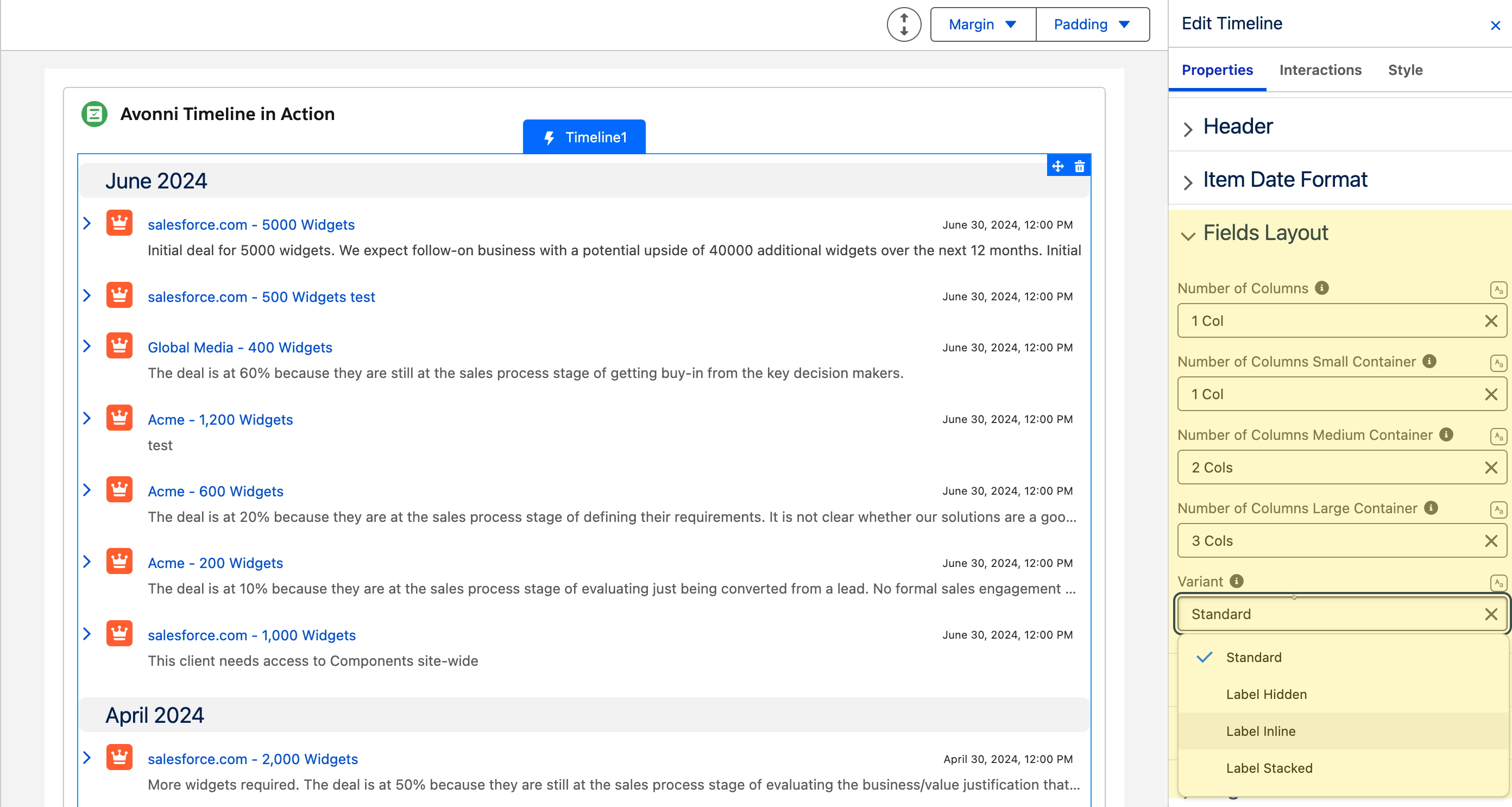
### Fields Layout
Use the Fields Layout section to control how additional fields are arranged within each timeline item.
| Setting | Description |
| -------------------------------------- | ---------------------------------------------------------------------------------------------------------------------- |
| **Number of Columns** | Columns in the smallest container (below 480 px). Also acts as the fallback for all sizes. Default: 1. |
| **Number of Columns Small Container** | Columns for containers wider than 480 px. Default: 1. |
| **Number of Columns Medium Container** | Columns for containers wider than 768 px. Default: 2. |
| **Number of Columns Large Container** | Columns for containers wider than 1024 px. Default: 3. |
| **Variant** | Visual style for field labels. Options: **Standard** (default), **Label Hidden**, **Label Inline**, **Label Stacked**. |
### Filter
The **Filter** section controls how the filter menu is presented to end-users. Filter fields are enabled in the Data Mappings section.
| Setting | Description |
| ------------------------------- | ------------------------------------------------------------------------------------------------------------------------------------------------------------------------------------------ |
| **Display As Popover** | When enabled, the filter menu is displayed as a floating popover instead of inline. |
| **Use Record Picklist Values** | When enabled and filtering a picklist field, filter options are derived from the values present in the current records rather than the full defined picklist. |
| **Use Cascading Filter Values** | When enabled, applying one filter dynamically narrows the available options in other filters to only show values matching the current selection. Overrides **Use Record Picklist Values**. |
#### Filter Operators
Each filter in the menu carries a mode selector — tooltipped **Filter mode** — that sets how its value is matched. There is nothing to configure in the builder: the operators on offer follow the field's type, and users pick one as they filter.
* **Text, picklist, multi-select picklist and lookup filters** — **Equals** (default), **Not Equals**, **Empty**, **Not Empty**.
* **Number, currency, percent, date, date/time and time filters** — **Between** (default), **Not Between**, **Equals**, **Not Equals**, **Less Than**, **Less or Equal**, **Greater Than**, **Greater or Equal**, **Empty**, **Not Empty**.
* **Checkbox filters** — no **Filter mode** selector; they always match on equality.
Selecting **Empty** or **Not Empty** hides the value input, since neither operator takes a value.
### Search
Enable a search bar to let users filter timeline items by text.
| Setting | Description |
| --------------- | --------------------------------------------------------------------------------------------------------------------- |
| **Show Search** | When enabled, a search bar appears above the timeline. |
| **Placeholder** | Placeholder text shown in the search bar (default: `Search`). Requires: **Show Search**. |
| **Position** | Alignment of the search bar. Options: **Left** (default), **Right**, **Center**, **Fill**. Requires: **Show Search**. |
### No Results Message
Controls what the timeline displays when the data source returns no records.
| Setting | Description |
| --------------------------- | ---------------------------------------------------- |
| **No Results Message** | The message to display when no records are returned. |
| **Hide No Results Image** | When enabled, the no results illustration is hidden. |
| **Hide No Results Message** | When enabled, the no results message text is hidden. |
### Pagination
The Pagination section is available for vertical timelines only. Requires: **Orientation** = `Vertical`.
| Setting | Description |
| --------------------- | ------------------------------------------------------------------------------------------------------------------------------------------------------------- |
| **Max Visible Items** | When pagination is enabled, sets the number of items per page. When pagination is disabled, sets the maximum number of items shown before the list collapses. |
| **Show Pagination** | When enabled, pagination controls appear at the bottom of the timeline. |
When **Show Pagination** is on, you can customize pagination button icons and labels (First, Last, Next, Previous) to adapt to different languages or align with your application's style.
{% hint style="info" %}
**Items loading.** With **Pagination** off, the Timeline shows **Max Visible Items** before a **Show More** button appears — or, if you set a fixed **Height** (Size style), it switches to **infinite scroll** (loading the next batch as you reach the bottom). With **Pagination** on, it pages by **Max Visible Items** with pagination controls.
{% endhint %}
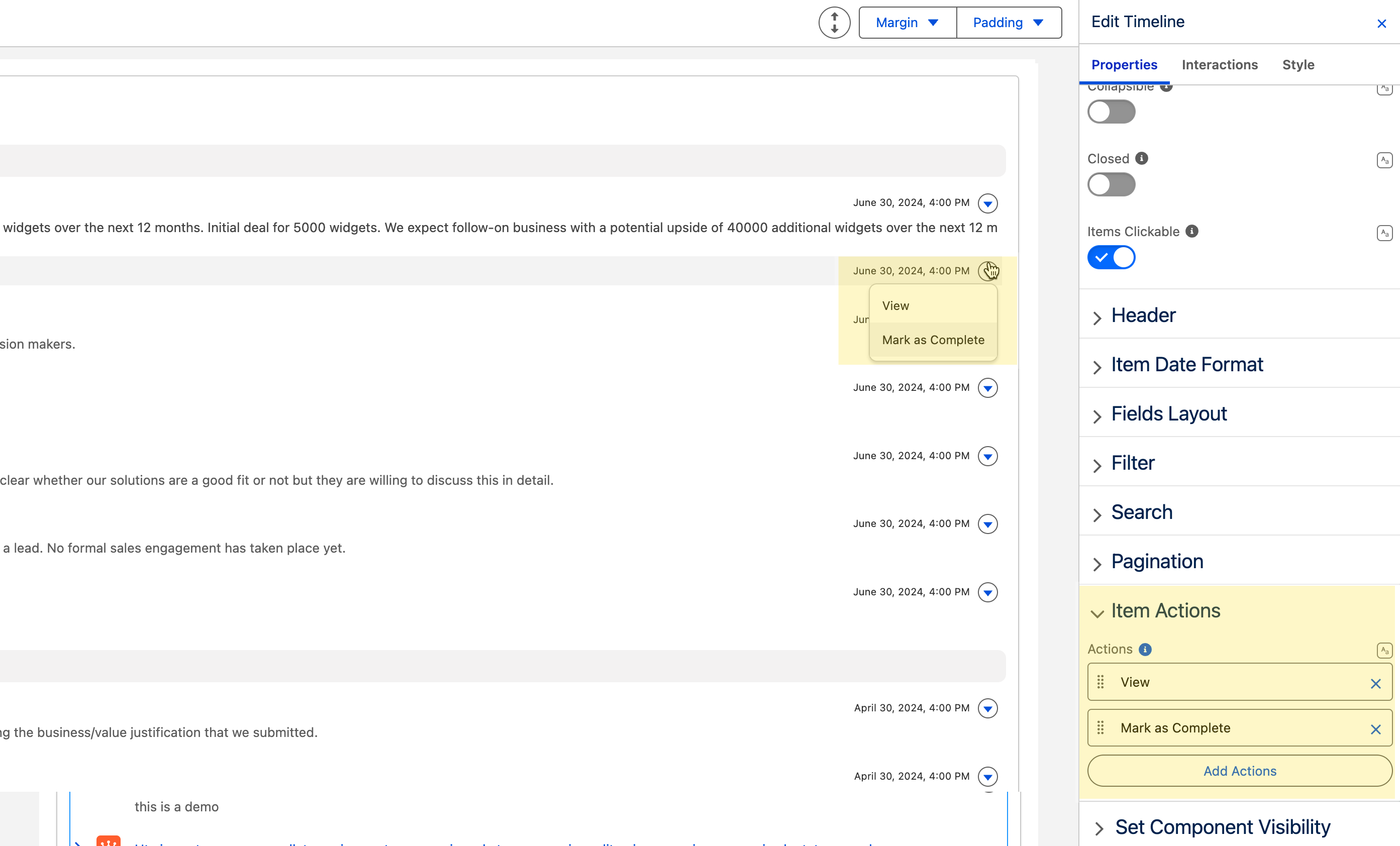
### Item Actions
Add interactive buttons to each timeline item. Actions appear in the top-right corner of each item and are only supported for vertical orientation.
For each action, configure:
* **Label** — the button text.
* **Name** — a unique identifier used to identify which action was clicked in interactions.
* **Icon Name** — an optional Lightning Design System icon displayed on the button.
Connect item action behavior from the **On Item Action Click** interaction in the Interactions tab.
### Set Component Visibility
All components support conditional visibility — see [Component Visibility](/dynamic-components/core-concepts/component-visibility.md).
## Interactions
[Interactions](/dynamic-components/component-builder/interactions.md) define what happens when users interact with the Activity Timeline. Configure them from the **Interactions** tab of the Edit Activity Timeline panel.
### Item Click
Fires when a user clicks a timeline item. Requires **Items Clickable** to be enabled. Use this to navigate to a record detail page, open a flow dialog, or trigger any other flow logic tied to the selected item.
### Item Action Click
Fires when a user clicks an action button on a timeline item. Set **Target Name** to the item action you want to react to.
### Header Action Click
Fires when a user clicks one of the header action buttons. Set **Target Name** to the header action you want to react to.
## Output Variables
The Activity Timeline exposes these output variables you can reference elsewhere on the page after the user interacts with it.
### Item Click
When a user clicks a timeline item, these variables update with the clicked item's data.
| Output variable | Type | What it returns |
| ------------------------ | ---------------- | -------------------------------------------------------------------------------------------------------------- |
| **Clicked Item** | Object | The timeline item the user clicked — its title, description, date, avatar, name, and other item attributes. |
| **Clicked Item sObject** | Record (SObject) | The full Salesforce record associated with the clicked item. Requires a **Query** or **Variable** data source. |
> **Example:** When a user clicks an Opportunity item on the timeline, use **Clicked Item sObject** to populate a record-detail component beside the timeline with that Opportunity's fields.
### Item Action Click
When a user clicks an action button on a timeline item, these variables identify which item and action were involved.
| Output variable | Type | What it returns |
| -------------------------------------- | ---------------- | -------------------------------------------------------------------------------------------------------------------------- |
| **Clicked Item Action - Action Name** | Text (String) | The `name` of the item action button the user clicked. Use this to branch flow logic by action. |
| **Clicked Item Action - Item** | Object | The timeline item whose action button was clicked — same attributes as a clicked item. |
| **Clicked Item Action - Item sObject** | Record (SObject) | The Salesforce record associated with the item whose action was clicked. Requires a **Query** or **Variable** data source. |
> **Example:** Add "Edit" and "Delete" item actions. When a user clicks one, check **Clicked Item Action - Action Name** to decide whether to open an edit form or confirm a deletion.
### Header Action Click
| Output variable | Type | What it returns |
| -------------------------------- | ------------- | ------------------------------------------------------------------------------------------------- |
| **Clicked Header Action - Name** | Text (String) | The `name` of the header action button the user clicked. Use this to branch flow logic by action. |
### Item Selection
When items are selectable, these variables track the current selection.
| Output variable | Type | What it returns |
| -------------------------- | ------------------------------ | ---------------------------------------------------------------------------------------------------------- |
| **Selected Item Names** | Text Collection | The `name` values of all currently selected timeline items. |
| **Selected Items** | Object | The full data objects for all currently selected timeline items. |
| **Selected Items sObject** | Record Collection (SObject\[]) | The Salesforce records for all currently selected items. Requires a **Query** or **Variable** data source. |
### Others
| Output variable | Type | What it returns |
| ------------------- | ------ | -------------------------------------------------------------- |
| **Number of Items** | Number | The total number of items currently displayed in the timeline. |
## Styling
Configure the Activity Timeline's appearance from the **Style** tab of the Edit Activity Timeline panel.
{% tabs %}
{% tab title="Margin" %}
Controls the *outer* spacing around the component.
* **Top / Right / Bottom / Left:** Adjust the space on each side.
{% endtab %}
{% tab title="Padding" %}
Controls the *inner* spacing between the component's content and its border.
* **Top / Right / Bottom / Left:** Adjust the inner spacing on each side.
{% endtab %}
{% tab title="Size" %}
Controls the component's dimensions.
* **Width / Height:** Set fixed dimensions.
* **Min Width / Max Width / Min Height / Max Height:** Constrain the size within bounds.
* **Overflow:** Control how content that exceeds the bounds is handled.
{% endtab %}
{% tab title="Border" %}
Customizes the border surrounding the component.
* **Color / Size / Style / Radius:** Set the border color, thickness, style, and corner rounding.
{% endtab %}
{% tab title="Header" %}
Styles the header background and spacing.
* **Background Color:** Set the header background color.
* **Padding Top / Right / Bottom / Left:** Adjust the inner spacing of the header.
* **Margin Bottom:** Set the space below the header.
{% endtab %}
{% tab title="Item" %}
Styles the timeline items, their body, and their fields block.
* **Item:** Line Color for the vertical timeline line, Line Clamp to limit item text, and Icon Background Color.
* **Body:** Background Color Hover / Background Color Highlight for the item body.
* **Fields:** Background Color / Border Color / Border Size / Border Style / Border Radius, plus Spacing Inline / Spacing Block.
{% endtab %}
{% tab title="Pagination Buttons" %}
Customizes the pagination buttons.
* **Background Color / Text/Icon Color / Color Border:** Set the colors for the default, active, hover, and disabled states.
* **Border Size / Border Style:** Control the button border.
* **Active Button** variants: set the same colors for the currently active page button.
{% endtab %}
{% tab title="Footer" %}
Styles the footer bar.
* **Background Color:** Set the footer background.
* **Border Color / Border Size / Border Style / Border Radius:** Customize the footer border.
{% endtab %}
{% tab title="Show More Button" %}
Customizes the "Show More" button (when load-more is used).
* **Background Color / Text Color / Border Color:** Set the colors for the default, active, and hover states.
* **Border Size / Border Radius:** Control the button border.
* **Block Start / Block End / Inline Start / Inline End:** Set the spacing around the button.
{% endtab %}
{% endtabs %}
---
# Agent Instructions
This documentation is published with GitBook. GitBook is the documentation platform designed so that both humans and AI agents can read, navigate, and reason over technical content effectively. Learn more at gitbook.com.
## Querying This Documentation
If you need additional information that is not directly available in this page, you can query the documentation by asking a question.
Perform an HTTP GET request on the following URL with the `ask` and `goal` query parameters:
```
GET https://docs.avonnicomponents.com/dynamic-components/components/timeline.md?ask=&goal=
```
`ask` is the immediate question: it should be specific, self-contained, and written in natural language.
`goal` is what the user is ultimately trying to achieve, the reason they need the answer. Sharing it helps GitBook give you a better, more relevant answer. A goal is most helpful when it describes the outcome the user wants rather than restating the question. For example, with `ask=how do I create an API token`, a goal like `automate deployments from our CI pipeline` lets GitBook tailor the answer to that use case.
The response will contain a direct answer to the question and relevant excerpts and sources from the documentation.
Use this mechanism when the answer is not explicitly present in the current page, you need clarification or additional context, or you want to retrieve related documentation sections.