> For the complete documentation index, see [llms.txt](https://docs.avonnicomponents.com/llms.txt). Markdown versions of documentation pages are available by appending `.md` to page URLs; this page is available as [Markdown](https://docs.avonnicomponents.com/dynamic-components/components/checkbox-button.md).
# Checkbox Button
The Avonni Checkbox Button component lets users toggle a true/false value using a button-style control instead of a traditional checkbox. Use it when you want a boolean choice to feel like a clear, tappable action.
## Overview
The Checkbox Button captures a single boolean value — on or off, true or false — through a button-style interface. It supports a label, a default checked state, a required state with a custom message, validation feedback for invalid input, and a disabled state for when the choice shouldn't be editable.
This makes it a good fit for opt-ins, confirmations, and any setting that maps to a simple yes/no answer presented as a button rather than a checkbox.
## Configuration
To configure the Checkbox Button, select it on the canvas. The **Edit Checkbox Button** panel opens on the right. The sections below mirror the configuration panel.
### Properties
#### Label
The **Label** names what the user is toggling. The button itself is an icon: a plus sign when off and a checkmark when on, so the label is not drawn on it. It is the accessible name screen readers announce, and it is what identifies the component in validation messages. You can type a static value or bind it to a variable, formula, or record field so it updates dynamically.
The Checkbox Button unchecked, checked and disabled
#### Checked
**Checked** sets the initial state of the button. Enable it to have the button start in the toggled-on (true) state; leave it off to start in the toggled-off (false) state. You can also bind this to a variable so the starting state reflects existing data.
#### Required
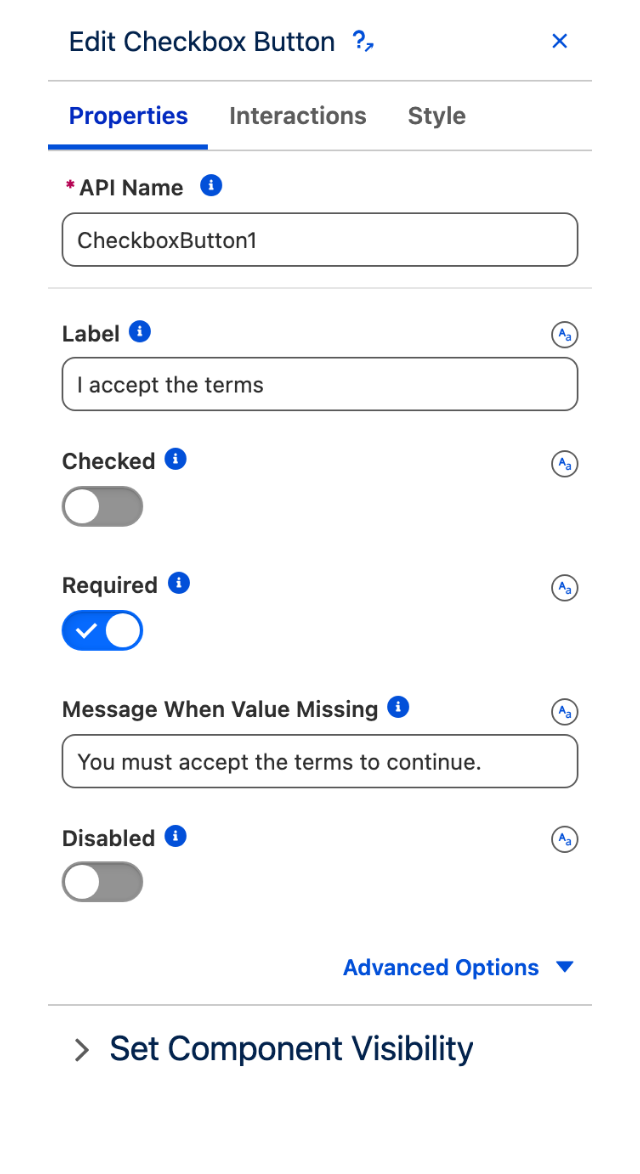
Enable **Required** to force the user to toggle the button on before the component is considered valid — useful for mandatory acknowledgements such as accepting terms.
#### Message When Value Missing
The **Message When Value Missing** is the validation text shown when **Required** is enabled but the button hasn't been checked. Use it to tell the user exactly what they need to confirm. Requires **Required** to be enabled.
#### Disabled
Enable **Disabled** to prevent users from changing the button's state. The current value is still displayed but cannot be toggled — useful when the choice is locked or depends on conditions elsewhere on the page.
#### Message When Bad Input
The **Message When Bad Input** is the validation text shown when the entered value fails validation. Use it to explain why the input wasn't accepted. Available under advanced options.
The Checkbox Button Properties tab, with Required enabled
### Set Component Visibility
All components support conditional visibility — see [Component Visibility](/dynamic-components/core-concepts/component-visibility.md).
## Interactions
[Interactions](/dynamic-components/component-builder/interactions.md) define what happens when users interact with the Checkbox Button. Configure them from the **Interactions** tab of the Edit Checkbox Button panel.
### Change
Fires when the user toggles the checkbox button. Use this to update a variable, trigger navigation, or react to the new checked state elsewhere on the page.
## Styling
Configure the Checkbox Button's appearance from the **Style** tab of the Edit Checkbox Button panel.
{% tabs %}
{% tab title="Margin" %}
Controls the *outer* spacing around the component.
* **Top / Right / Bottom / Left:** Adjust the space on each side.
{% endtab %}
{% tab title="Padding" %}
Controls the *inner* spacing between the button content and its edges.
* **Top / Right / Bottom / Left:** Adjust the space on each side.
{% endtab %}
{% tab title="Size" %}
Sets the dimensions of the component.
* **Width / Height:** Set the component's size.
* **Overflow:** Choose how content that exceeds the size is handled.
* **Min Width / Max Width / Min Height / Max Height:** Constrain the dimensions.
* **Overflow X / Overflow Y:** Control overflow per axis.
{% endtab %}
{% tab title="Border" %}
Customizes the border around the component.
* **Color:** Set the border color.
* **Size:** Adjust the border thickness.
* **Style:** Choose a border style.
* **Radius:** Control the roundness of the corners.
{% endtab %}
{% tab title="Horizontal Alignment" %}
Sets how the component is aligned horizontally.
* **Horizontal Alignment:** Align the component left, center, or right.
{% endtab %}
{% endtabs %}
## Troubleshooting Common Issues
* **Button Won't Toggle:** Check whether **Disabled** is enabled — a disabled button displays its value but can't be changed.
* **Validation Won't Pass:** If **Required** is on, the user must check the button; confirm your **Message When Value Missing** explains this clearly.
* **Wrong Starting State:** Review the **Checked** setting (or the variable bound to it) — that's what determines the initial on/off state.
* **Label Not Updating:** If the **Label** is bound to a variable or formula, verify the binding resolves; test with a static value first.
* **Validation Message Not Showing:** Make sure the relevant message (**Message When Value Missing** or **Message When Bad Input**) is filled in; an empty message suppresses the feedback text.
* **Change Not Firing:** Confirm the **Change** interaction is configured on the Interactions tab and that the button isn't disabled.
---
# Agent Instructions
This documentation is published with GitBook. GitBook is the documentation platform designed so that both humans and AI agents can read, navigate, and reason over technical content effectively. Learn more at gitbook.com.
## Querying This Documentation
If you need additional information that is not directly available in this page, you can query the documentation dynamically by asking a question.
Perform an HTTP GET request on the current page URL with the `ask` query parameter, and the optional `goal` query parameter:
```
GET https://docs.avonnicomponents.com/dynamic-components/components/checkbox-button.md?ask=&goal=
```
`ask` is the immediate question: it should be specific, self-contained, and written in natural language.
`goal` is optional and describes the broader end goal you are ultimately trying to accomplish on behalf of the user. GitBook uses it to tailor the answer towards what is most useful for that goal.
The response will contain a direct answer to the question and relevant excerpts and sources from the documentation.
Use this mechanism when the answer is not explicitly present in the current page, you need clarification or additional context, or you want to retrieve related documentation sections.