# Progress Indicator

## Overview

The Progress Indicator component shows where a record (or a user) stands inside a multi-step process. It supports six visual types — Horizontal, Vertical, Bar, Circle, Path, and Vertical Navigation — so you can pick the right look for the page and the screen size.

You can drive it from a Salesforce field (typically a picklist like Opportunity `StageName` or Case `Status`), a Query, or manually defined steps. Steps can be clickable and linked to Interactions, allowing users to advance the process directly from the component.

***

## Quick Start: Visualize Opportunity Stages on the Record Page

This walkthrough builds a Path-style progress indicator that shows the current Opportunity stage, marks completed stages as green, and lets users advance the stage with a click.

{% stepper %}
{% step %}

#### **Add the Progress Indicator to the Canvas**

* From the **Component Library** (left sidebar), drag the **Progress Indicator** component onto the Canvas.
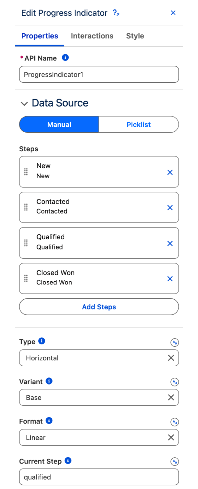
* In the Properties Panel (right), set **Type** to `Path`.

*Why: The Path type is the closest visual match to Salesforce's native Sales Path and the one users are most familiar with on Opportunities.*&#x20;
{% endstep %}

{% step %}

#### **Connect the steps to the Opportunity Stage picklist**

* In the **Steps** section of the Properties Panel, set the data source to **Picklist**.
* **Object:** `Opportunity`
* **Field API Name:** `StageName`
* **Record Type:** Select the appropriate record type if your org uses them.

*Why: This pulls the live picklist values directly from Salesforce — when admins change the stages in Setup, the component updates automatically.*
{% endstep %}

{% step %}

#### **Set the current step to the record's stage**

* In the **Current Step** field, enter `{!$Record.StageName}`.

*Why: This binds the indicator's active step to the record being viewed, so it shows the right stage on every Opportunity.*&#x20;
{% endstep %}

{% step %}

#### **Make the steps clickable**

* Check **Enable click for each steps**.
* Open the **Interactions** tab.
* On the **Step Click** trigger, add an action: **Update Record**.
  * **Object:** `Opportunity`
  * **Record ID:** `{!$Record.Id}`
  * **Field:** `StageName` = `{!Last Clicked Step Value}`

*Why: Clicking a stage updates the Opportunity record to that stage. Last Clicked Step Value contains the picklist value of the step the user clicked.*
{% endstep %}

{% step %}

#### **Save and Activate**

* Click **Save** in the top right.
* Click **Activate** and add the component to the Opportunity Lightning Record Page [using the Lightning App Builder](/dynamic-components/core-concepts/publishing-your-dynamic-components.md).&#x20;
  {% endstep %}
  {% endstepper %}

***

## Configuration

The Progress Indicator has three main configuration areas: the **Type** and visual settings, the **Steps** (the data source), and the **Interactions** that wire clicks to Salesforce actions.

### Type

The Type setting is the first decision and controls everything else — many other settings only appear once you've picked a Type.

| Type                    | What it looks like                                                                            | Best for                                                                                                          |
| ----------------------- | --------------------------------------------------------------------------------------------- | ----------------------------------------------------------------------------------------------------------------- |
| **Horizontal**          | A row of step indicators connected by a line, labels above or below each dot.                 | Default desktop pattern. Works for 3–6 short-labeled steps.                                                       |
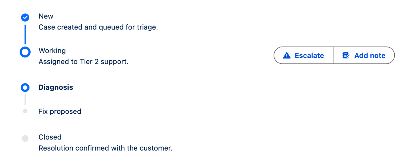
| **Vertical**            | A vertical column of steps with content and optional sub-steps and actions next to each step. | Long step lists, mobile, anywhere with limited horizontal space, processes that need supporting content per step. |
| **Bar**                 | A single horizontal progress bar with a percentage.                                           | Simple completion meters where step names don't matter.                                                           |
| **Circle**              | A circular progress ring with a percentage in the middle.                                     | Compact KPI tiles, "% complete" indicators.                                                                       |
| **Path**                | The Salesforce Sales Path style — chevron-shaped steps.                                       | Opportunity stages, Case statuses, anything that mirrors native Salesforce Path.                                  |
| **Vertical Navigation** | A vertical list styled like a navigation menu, each step clickable.                           | Wizard-style left-rail navigation, multi-page forms.                                                              |

### General Settings

These appear in the Properties Panel for all (or most) Types. Some settings are only available for specific Types — noted in each row.

| Setting                         | Available for                                   | Description                                                                                                                | Options / Default                                |
| ------------------------------- | ----------------------------------------------- | -------------------------------------------------------------------------------------------------------------------------- | ------------------------------------------------ |
| **Variant**                     | Horizontal, Vertical, Vertical Navigation       | Visual style of the step indicators. `Shaded` adds a light gray border around each step dot.                               | `Base` (default), `Shaded`                       |
| **Format**                      | Horizontal, Vertical, Path                      | Controls progression behavior. `Linear` requires steps to be completed in order. `Non Linear` lets users jump to any step. | `Linear` (default), `Non Linear`                 |
| **Current Step**                | All                                             | The value of the step that is currently active. Must match the `value` of one of the configured steps.                     | Any text value, typically `{!$Record.FieldName}` |
| **Completed Steps**             | Horizontal, Vertical, Path                      | Array of step values that are marked as complete (shown in green or with a checkmark).                                     | List of step values                              |
| **Error Steps**                 | Horizontal, Vertical, Path                      | Array of step values that are marked as in error (shown with the error icon).                                              | List of step values                              |
| **Show Step Number**            | Horizontal, Vertical                            | Replaces the dot with the step's number when no icon is set.                                                               | On / Off (default: off)                          |
| **Show Step Label**             | Horizontal, Bar                                 | Displays step labels below the indicator.                                                                                  | On / Off (default: off)                          |
| **Step Label Position**         | Horizontal                                      | Where step labels appear relative to the indicator.                                                                        | `Top`, `Bottom` (default)                        |
| **Hide Bar Value**              | Bar                                             | Hides the percentage display on the progress bar.                                                                          | On / Off (default: off)                          |
| **Mark as Complete**            | All                                             | Marks every step as complete. Useful for showing "process finished" state.                                                 | On / Off (default: off)                          |
| **Has Error**                   | Horizontal, Vertical, Path                      | Marks the current step as in error and displays the error icon.                                                            | On / Off (default: off)                          |
| **Enable click for each steps** | Horizontal, Vertical, Path, Vertical Navigation | Makes each step clickable. Required for the Step Click interaction to fire.                                                | On / Off (default: off)                          |
| **Alternative Text**            | All                                             | Accessibility text describing the indicator for screen readers.                                                            | Free text                                        |

### Step Icon Settings

Available for Horizontal and Vertical types. Configure how step indicators render.

| Setting                            | Description                                                                                                              | Options / Default                    |
| ---------------------------------- | ------------------------------------------------------------------------------------------------------------------------ | ------------------------------------ |
| **Icon Alignment** (Vertical only) | Aligns the left icon and actions to the top instead of the middle of the step. Useful when steps have multiline content. | `Center` (default), `Top`            |
| **Icon Size**                      | Size of the step indicator. At `Medium` or `Large`, steps without an icon display their step number instead of a dot.    | `Small` (default), `Medium`, `Large` |
| **Error Icon Name**                | The SLDS icon shown on steps marked as error.                                                                            | Default: `utility:error`             |
| **Error Image Source**             | URL of a custom error image to use instead of the icon.                                                                  | File URL                             |
| **Hide Error Icon**                | Hides the error icon entirely.                                                                                           | On / Off (default: off)              |

### Current Step Icon

Available for Horizontal and Vertical types. Lets you replace the current step's dot with a custom icon or image.

| Setting          | Description                                                                    |
| ---------------- | ------------------------------------------------------------------------------ |
| **Icon Name**    | SLDS icon name to display on the active step (for example, `utility:checkin`). |
| **Image Source** | URL of an image to display on the active step instead of an icon.              |

### Steps (Data Source)

Each step represents one stop in the process. You can populate steps three ways:

| Source              | When to use                                                                                               | How to configure                                                                  |
| ------------------- | --------------------------------------------------------------------------------------------------------- | --------------------------------------------------------------------------------- |
| **Picklist**        | When steps map to a Salesforce picklist field (Opportunity `StageName`, Case `Status`, custom picklists). | Pick the Object and Field API Name. The component reads the picklist values live. |
| **Query (SObject)** | When steps are records (for example, Approval Process Steps, custom configuration objects).               | Configure a Query and map record fields to step properties.                       |
| **Manual**          | When the steps are static and never change.                                                               | Add steps one by one in the Steps editor.                                         |

**Step Properties**

Each step (regardless of source) supports these properties:

| Property      | Description                                                                                                                                                               |
| ------------- | ------------------------------------------------------------------------------------------------------------------------------------------------------------------------- |
| **Label**     | The text displayed for the step (for example, "Qualification").                                                                                                           |
| **Value**     | The internal identifier used in `Current Step`, `Completed Steps`, and `Error Steps`. Must be unique. For picklist sources, this is automatically the picklist API value. |
| **Disabled**  | Greys out the step and prevents clicks.                                                                                                                                   |
| **Hidden**    | Removes the step from the indicator.                                                                                                                                      |
| **Content**   | Rich text shown next to or below the step (Vertical and Path types).                                                                                                      |
| **Icon Name** | SLDS icon to display on this step's indicator.                                                                                                                            |

**Vertical Type — Sub Steps and Actions**

The Vertical type adds two more configurable areas per step.

**Sub Steps** — nested steps shown beneath a parent step. Each sub-step has its own label, value, disabled, hidden, and actions.

**Actions** — buttons displayed on the right side of a step. Used for things like "Edit", "View Details", or "Send Notification". Each action has:

| Action Property           | Description                                                        |
| ------------------------- | ------------------------------------------------------------------ |
| **Label**                 | Text shown on the action button.                                   |
| **Name**                  | Unique identifier passed to the **Step Action Click** interaction. |
| **Icon Name**             | SLDS icon for the button.                                          |
| **Disabled** / **Hidden** | Standard visibility controls.                                      |

Per-step settings on the Vertical type also include **Visible Action Buttons** (how many to show before collapsing to a menu), **Hide Actions**, and **Disable Actions**.

***

## Interactions

[**Interactions**](/dynamic-components/component-builder/interactions.md) connect the component's events to Salesforce actions. The Progress Indicator exposes two triggers.

| Trigger               | Fires When                                                                | Available For                                   |
| --------------------- | ------------------------------------------------------------------------- | ----------------------------------------------- |
| **Step Click**        | A user clicks a step (requires **Enable click for each steps** to be on). | Horizontal, Vertical, Path, Vertical Navigation |
| **Step Action Click** | A user clicks an action button on a Vertical-type step.                   | Vertical only                                   |

### Step Click — Output Variables

When a step is clicked, the following output variables are available to use in any action:

| Output Variable                 | Type    | Contains                                                                              |
| ------------------------------- | ------- | ------------------------------------------------------------------------------------- |
| **Last Clicked Step Value**     | Text    | The `value` of the clicked step (the picklist API value, or the manual step's value). |
| **Last Clicked Step Label**     | Text    | The `label` shown to the user.                                                        |
| **Last Clicked Step Icon Name** | Text    | The icon configured on the step.                                                      |
| **Last Clicked Step Disabled**  | Boolean | Whether the clicked step was disabled.                                                |
| **Last Clicked Step Hidden**    | Boolean | Whether the clicked step was hidden.                                                  |
| **Last Clicked Step Content**   | Text    | The content text of the clicked step.                                                 |

### Step Action Click — Output Variables

| Output Variable                            | Type | Contains                                          |
| ------------------------------------------ | ---- | ------------------------------------------------- |
| **Last Clicked Step Action — Action Name** | Text | The `name` of the action button that was clicked. |
| **Last Clicked Step Action — Step Value**  | Text | The `value` of the step the action belongs to.    |
| **Last Clicked Step Action — Step Label**  | Text | The `label` of the step.                          |

### Common Action: Update the Record's Stage on Click

The pattern from the Quick Start, written out in full:

1. Configure the indicator to **Enable click for each steps**.
2. Open the **Interactions** tab.
3. On the **Step Click** trigger, add an **Update Record** action.
4. Map fields:
   * **Object:** `Opportunity` (or your target object)
   * **Record ID:** `{!$Record.Id}`
   * **StageName:** `{!Last Clicked Step Value}`
5. Optionally chain a **Refresh Record Page** action so the change is visible immediately.

### Common Action: Run a Flow from a Step Action

For Vertical types where each step has an "Edit" or "Reopen" button:

1. On the Vertical step, add an **Action** with **Name** = `editStep`.
2. On the **Step Action Click** trigger, add **Execute Flow**.
3. In the Flow input mapping, pass `{!Last Clicked Step Action — Action Name}` and `{!Last Clicked Step Action — Step Value}` so the Flow knows which step and which action.
4. Inside the Flow, branch on the action name to handle each case.

***

## Mobile Configuration

The six Types behave very differently on small screens. Picking the right Type for mobile is the most important decision — the rest is fine-tuning.

### Type Behavior on Mobile

| Type                    | Mobile behavior                                                                                                           | Recommended?                                                      |
| ----------------------- | ------------------------------------------------------------------------------------------------------------------------- | ----------------------------------------------------------------- |
| **Vertical**            | Renders as a vertical list — perfect fit for narrow screens.                                                              | ✅ Best choice for any process with more than 3–4 steps.           |
| **Vertical Navigation** | Renders as a vertical menu list.                                                                                          | ✅ Best for wizard-style mobile flows.                             |
| **Bar**                 | Scales to container width, stays compact.                                                                                 | ✅ Always fine on mobile.                                          |
| **Circle**              | Stays compact, scales nothing.                                                                                            | ✅ Always fine on mobile.                                          |
| **Horizontal**          | Steps stay on one line. The component scrolls horizontally if steps don't fit, but step labels become cramped or get cut. | ⚠️ Only acceptable with 3 or fewer steps and short labels.        |
| **Path**                | Same as Horizontal — chevrons stay on one line and overflow with horizontal scroll.                                       | ⚠️ Acceptable for 3–4 short stages, otherwise switch to Vertical. |

### Required Settings for a Mobile-Friendly Indicator

| Setting                              | Value                                                 | Why                                                                         |
| ------------------------------------ | ----------------------------------------------------- | --------------------------------------------------------------------------- |
| **Type**                             | `Vertical`, `Vertical Navigation`, `Bar`, or `Circle` | Horizontal and Path overflow on phones. Vertical types stack down the page. |
| **Show Step Label** (Horizontal/Bar) | Off, or use very short labels                         | Labels under each step squish together below 480px.                         |
| **Icon Size** (Horizontal/Vertical)  | `Small`                                               | Medium and Large icons take up disproportionate space on phones.            |
| **Step labels**                      | Keep under 12 characters                              | Long labels wrap awkwardly or get truncated on narrow viewports.            |

### The Standard Mobile Pattern

For any process with more than four steps that needs to work on mobile:

1. Set **Type** to `Vertical`.
2. Set **Variant** to `Base` (Shaded adds visual weight that doesn't help on mobile).
3. Set **Icon Alignment** to `Top` if your steps have multiline content (descriptions or sub-steps).
4. Set **Icon Size** to `Small`.
5. Use the step **Content** field to add context — Vertical layout has the room, Horizontal does not.
6. If you need actions per step, use **Visible Action Buttons** = `1` so only the primary action shows; the rest collapse into a menu.

### Responsive Pattern: Different Type per Device

To use the Path type on desktop and switch to Vertical on mobile, place two Progress Indicator components inside a Columns layout and toggle their visibility per device:

1. Add a **Columns** component with two columns, each set to **Size = `12`** for All devices.
2. Drop the Path indicator in column 1 and the Vertical indicator in column 2.
3. Use a **Conditional Visibility** rule on each:
   * Path indicator: show when device width ≥ 768px.
   * Vertical indicator: show when device width < 768px.

Both indicators read from the same data source, so the user sees the right one on each device.

{% hint style="info" %}
Breakpoints in Avonni are based on **container width**, not screen width. A Progress Indicator inside a narrow Lightning Page region hits the mobile breakpoint earlier than one in a full-width region.
{% endhint %}

***

### Examples

#### Case Lifecycle on a Service Console

A Vertical indicator showing Case Status with sub-steps for the support process.

{% stepper %}
{% step %}

#### **Configure the indicator**

* **Type:** `Vertical`
* **Format:** `Non Linear` (support cases sometimes go backwards)
* Set **Steps** source to **Picklist**: Object = `Case`, Field = `Status`.
* **Current Step:** `{!$Record.Status}`
  {% endstep %}

{% step %}

#### **Add per-step actions**

* On the "Working" step, add an action with **Label** = `Escalate`, **Name** = `escalate`, **Icon Name** = `utility:warning`.
* On the "Escalated" step, add an action with **Label** = `De-escalate`, **Name** = `deescalate`, **Icon Name** = `utility:undo`.
  {% endstep %}

{% step %}

#### **Wire actions to a Flow**

* In **Interactions**, on the **Step Action Click** trigger, add **Execute Flow** = `Case_Escalation_Flow`.
* Pass `{!Last Clicked Step Action — Action Name}` and `{!$Record.Id}` to the Flow.
  {% endstep %}
  {% endstepper %}

#### Onboarding Wizard with Vertical Navigation

A multi-step user onboarding flow using Vertical Navigation as a left-rail menu.

{% stepper %}
{% step %}

#### **Build the steps**

* **Type:** `Vertical Navigation`
* Steps (Manual): `welcome`, `profile`, `team`, `preferences`, `done`.
* **Current Step:** `{!OnboardingStage}` (a variable on the record or component).
* Check **Enable click for each steps**.
  {% endstep %}

{% step %}

#### **Show the right content for each step**

* Place a **Container** next to the navigation indicator.
* Use Conditional Visibility on the Container's children — each one visible only when `OnboardingStage` matches its step value.
  {% endstep %}

{% step %}

#### **Update the variable on click**

On the **Step Click** trigger, add **Update Variable**: `OnboardingStage` = `{!Last Clicked Step Value}`.
{% endstep %}
{% endstepper %}

***

## Troubleshooting

| Problem                                                          | Cause                                                                                                                                                    | Fix                                                                                                                                                              |
| ---------------------------------------------------------------- | -------------------------------------------------------------------------------------------------------------------------------------------------------- | ---------------------------------------------------------------------------------------------------------------------------------------------------------------- |
| The indicator is empty — no steps appear                         | The Steps data source isn't configured, or the Picklist field returns no values for the user's record type.                                              | Open the Steps section and verify the source. For Picklist sources, confirm the user has a matching Record Type and that the picklist has values.                |
| Current Step doesn't highlight any step                          | The **Current Step** value doesn't match any step's `value`. Picklist API names are case-sensitive.                                                      | In Debug, log `{!$Record.StageName}` and compare it character-for-character with the step values. For picklists, use the API name (`Closed Won`), not the label. |
| Clicking a step does nothing                                     | **Enable click for each steps** is off, or no Interaction is configured on the Step Click trigger.                                                       | Turn on Enable click for each steps and add at least one action on the Step Click trigger.                                                                       |
| Step Click fires but the record doesn't update                   | The Update Record action is missing the Record ID, or the field mapping uses Last Clicked Step Label instead of Last Clicked Step Value.                 | Confirm `{!$Record.Id}` is set as the Record ID and use **Last Clicked Step Value** for picklist field updates — not the Label.                                  |
| Step Action Click trigger doesn't fire                           | The component Type is not Vertical (actions only exist on Vertical), or the action's Name is empty.                                                      | Switch Type to Vertical and make sure each action has a unique Name.                                                                                             |
| Variant or Format settings are missing from the panel            | These settings are Type-dependent. Variant only shows for Horizontal/Vertical/Vertical Navigation. Format only shows for Horizontal/Vertical/Path.       | Change Type if you need a setting that's hidden, or rely on the defaults for the current Type.                                                                   |
| Steps appear in the wrong order                                  | For Picklist sources: the picklist sort order isn't set or doesn't match the desired display order. For Manual sources: steps were dragged out of order. | Set the Picklist Sort Order in the Properties Panel, or reorder steps manually in the Steps editor.                                                              |
| The error icon doesn't appear on a step in the Error Steps array | Either **Hide Error Icon** is on, or the step's value in the array doesn't match.                                                                        | Turn off Hide Error Icon and verify the value matches the step's API value exactly.                                                                              |
| Horizontal indicator overflows or scrolls horizontally on mobile | Too many steps for the available width — Horizontal type stays on one line and scrolls when it can't fit.                                                | Switch the Type to `Vertical` for mobile, or reduce step labels and keep the count under 4.                                                                      |
| Mark as Complete is on but steps don't show as completed         | Mark as Complete is overridden by an explicit Current Step that points to an earlier step.                                                               | Either remove the Current Step value or set it to the last step's value.                                                                                         |
| Sub Steps configured but don't appear                            | Sub Steps are only supported on the Vertical type.                                                                                                       | Switch Type to Vertical, or move the sub-step content into the step's Content field.                                                                             |


---

# Agent Instructions: Querying This Documentation

If you need additional information that is not directly available in this page, you can query the documentation dynamically by asking a question.

Perform an HTTP GET request on the current page URL with the `ask` query parameter:

```
GET https://docs.avonnicomponents.com/dynamic-components/components/progress-indicator.md?ask=<question>
```

The question should be specific, self-contained, and written in natural language.
The response will contain a direct answer to the question and relevant excerpts and sources from the documentation.

Use this mechanism when the answer is not explicitly present in the current page, you need clarification or additional context, or you want to retrieve related documentation sections.