> For the complete documentation index, see [llms.txt](https://docs.avonnicomponents.com/llms.txt). Markdown versions of documentation pages are available by appending `.md` to page URLs; this page is available as [Markdown](https://docs.avonnicomponents.com/dynamic-components/components/flow.md).
# Flow
The Avonni Flow component embeds and runs a Salesforce Screen Flow directly within the layout of your Dynamic Component, enabling guided processes, interactive forms, and data exchange — all inline on your Lightning page.
## Overview
The Avonni Flow Component seamlessly embeds and runs a Salesforce Screen Flow directly within the layout of your Avonni Dynamic Component. This acts as a container, allowing you to integrate guided processes, interactive forms, and dynamic user experiences—all powered by Flow logic and automation—directly into your visually built custom Lightning Page UIs.
### Key Features
* **Inline Screen Flow Execution**: Run Screen Flows as an integral part of your Dynamic Component's layout.
* **Data Integration**: Pass data from your Dynamic Component *into* the Flow using Input Variables.
* **Retrieve Flow Results**: Capture data *from* the Flow and return it to your Dynamic Component using Output Variables.
* **Control Flow Behavior**: Define what happens when the embedded Flow finishes.
{% hint style="warning" %}
**Launching vs. Embedding**
While interactions like "[Open Flow Dialog](/dynamic-components/component-builder/interactions/open-flow-dialog.md)" or "[Open Flow Panel](/dynamic-components/component-builder/interactions/open-flow-panel.md)" launch a Screen Flow in a *separate modal or side panel* (usually triggered by a user action, such as a button click), the **Avonni Flow Component** embeds the Screen Flow *directly within the component's current layout area*. It's visible and active as part of the page structure (if its visibility conditions are met).
{% endhint %}
***
## Configuration
To configure the Flow, select it on the canvas. The **Edit Flow** panel opens on the right. The sections below mirror the configuration panel from top to bottom.
### Properties
#### Flow API Name
Select the API name of the Salesforce **Screen Flow** you want to embed and run.
#### Finish Behavior
Defines what happens automatically when the embedded Screen Flow reaches its finish point.
* **None**: The Flow runs once. After finishing, it typically remains on its last screen or in a finished state.
* **Restart** (Default): After the Flow finishes, it automatically restarts from the beginning. This is useful for cyclical data entry or kiosk-like scenarios.
#### Input Variables
Requires: **Flow API Name** to be set.
Pass data from your Dynamic Component — such as the current record ID, user selections, or variable values — into the input variables of your selected Screen Flow.
Click **Add Input Variable** to add an entry. Each entry has the following fields:
* **Name**: Select the API name of an input variable defined within your Screen Flow and marked as "Available for Input".
* **Value**: Use the resource selector to choose the value from your Dynamic Component to pass to this Flow input variable. This can be a static value, a Global Variable (e.g. `@recordId`), a Variable/Constant/Formula resource, or an attribute from another component on the canvas.
* **Type**: The data type of the input variable. Options: Custom, Text, Number, Boolean, Date, Date/Time, Salesforce Object. Default: **Text**.
* **Object API Name**: The Salesforce object API name when the Type is set to **Salesforce Object** (e.g. `Account`, `Contact`). Requires: **Type** = `Salesforce Object`.
* **Allow Multiple Values (collection)**: If enabled, indicates that the value is an ordered list.
{% hint style="warning" %}
If the input variable isn't correctly set up in your Flow, you won't see its name available for selection here.
{% endhint %}
{% hint style="warning" %}
#### Input Variables are read once when the Flow starts
The embedded Screen Flow consumes its input variables only at flow startup. If you bind an input variable to a reactive value — for example `{!Calendar.value}`, `{!MyDataTable.firstSelectedRow.Id}`, or any Variable that changes during the user's session — the Flow will receive that value the first time it launches, but subsequent changes to that source will not propagate into the running Flow screen.
This is a Salesforce platform behavior (the underlying `lightning-flow` component does not reactively rebind inputs on a running screen), not specific to Avonni.
If you need the Flow to react to live changes from your Dynamic Component, you have two options:
Set Finish Behaviour to Restart — each new run will pick up the latest input values. Useful when the user submits, the flow restarts, and the next entry should reflect a fresh selection.
Build the form natively with Dynamic Components instead of embedding a Flow — use Input, Combobox, and a Button wired to a Save Record action. All values stay fully reactive, with no flow start/restart cycle
{% endhint %}
#### Output Variables
Requires: **Flow API Name** to be set.
Capture values from your Screen Flow's output variables (those marked "Available for Output") and store them in Variable resources within your Dynamic Component.
Click **Add Output Variable** to add an entry. Each entry has the following fields:
* **API Name**: Select the API name of an output variable defined within your Screen Flow and marked as "Available for Output".
* **Resource Name**: Select a Variable resource from your Dynamic Component where the value returned by the Flow output variable will be stored.
### Set Component Visibility
All components support conditional visibility — see [Component Visibility](/dynamic-components/core-concepts/component-visibility.md).
***
## Adding the Flow Component
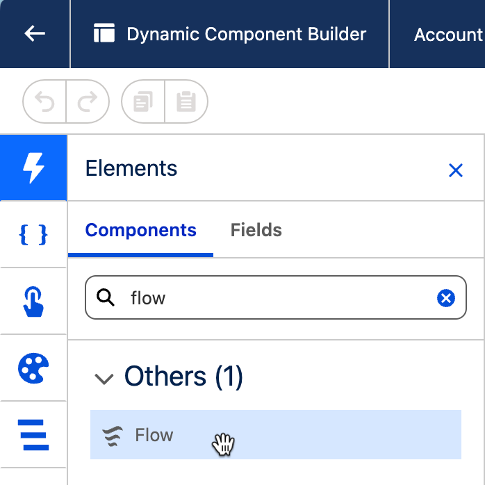
**Drag and Drop**: From the Component Library (left panel), find the "Flow" component and drag it onto your canvas where you want the Screen Flow to appear.
## Use Cases
* Embedding dynamic questionnaires or surveys directly on a record or app page.
* Displaying guided mini-wizards or checklists as part of a larger custom UI.
* Creating interactive forms for data entry or updates that leverage Flow logic, directly within a section of your page.
* Showing conditional UI elements or messages driven by complex Flow logic inline.
* Providing a compact, guided way to initiate a process related to displayed data.
***
## Example: Embedding a "Quick Update Task" Flow on a Case Page
{% stepper %}
{% step %}
### Create Screen Flow: Build a Flow named `Quick_Update_Task_Flow` that:
* Takes `inputCaseId` (Text, Available for Input) and `inputTaskSubject` (Text, Available for Input) as input.
* Has a screen to modify the task subject or add comments optionally.
* Updates or creates a Task related to `inputCaseId` with the subject.
* Activate the Flow.
{% endstep %}
{% step %}
### Create Dynamic Component: Set Target Object API Name to `Case`.
Set [Target Page Object](/dynamic-components/core-concepts/target-page-object.md) to `Case`.
{% endstep %}
{% step %}
### Add Flow Component
* Flow API Name: `Quick_Update_Task_Flow`
* Input Variables:
* Map 1: Name: `inputCaseId`, Value: `@recordId` (or `$Component.record.Id`)
* Map 2: Name: `inputTaskSubject`, Value: (e.g., a Constant resource like `{!DefaultTaskSubject}` or another variable)
* Finish Behaviour: `Restart` (so user can add another quick task if needed).
{% endstep %}
{% step %}
### Add other components around it as needed
{% endstep %}
{% step %}
### Place on Case Record Page: Add this Dynamic Component to a Case record page
{% endstep %}
{% endstepper %}
**Result**: The "Quick Update Task" Flow will be embedded directly on the Case page, preloaded with the Case ID, allowing users to quickly add or update tasks for that Case.
{% hint style="warning" %}
**Key Considerations**
* **Screen Flows Only**: This component is designed to run **Screen Flows**. Autolaunched Flows should be triggered via the "Execute Flow" interaction.
* **Flow UI is Separate**: The visual design of Flow screens (elements, layout, and any Avonni Components *for Flows* used *within* those screens) is managed in Salesforce Flow Builder. The Flow Component here hosts it.
* **Flow Limits**: The embedded Flow is still subject to standard Salesforce Flow limits and governor limits.
* **Context**: Remember that the Flow runs within the context provided by the Dynamic Component, especially regarding input variables.
* **Loading Time of the Embedded Flow:** Be aware that the time it takes for the embedded Screen Flow *to appear and become interactive is dependent on Salesforce's Flow rendering engine and the specific Flow's complexity (e.g., the number of elements and* initial data queries *within* the Flow). While your surrounding Avonni Dynamic Component and the overall Lightning Page will load quickly, a very complex embedded Flow might take a moment to initialize *within its designated area*. This primarily affects the Flow's own startup time and should not degrade the performance of other components on the page.
* **Input Variables are snapshotted at startup**: Reactive bindings (like another component's selected value) are read when the Flow launches and won't update mid-run. See the Input Variables section above for the two workarounds
{% endhint %}
***
## Interactions
[Interactions](/dynamic-components/component-builder/interactions.md) define what happens when users interact with the Flow. Configure them from the **Interactions** tab of the Edit Flow panel.
### Started
Fires when the embedded Flow begins running. Use this to trigger side effects at flow launch — for example, to log that a process started or to update a status indicator on the page.
### Finished
Fires when the embedded Flow reaches its finish point. Use this to react to the flow's completion — for example, to refresh a data table, navigate to a new page, or display a confirmation message.
### Paused
Fires when the user pauses the embedded Flow (available for flows that support pausing). Use this to acknowledge the pause or save any intermediate state in your Dynamic Component.
### Error
Fires if the embedded Flow encounters an error during execution. By default, an error toast is shown automatically; adding a **ShowToastEvent** interaction overrides that default toast with your own message.
## Output Variables
The Flow exposes these output variables you can reference elsewhere on the page after the embedded flow changes state.
### Flow Status
These variables update each time the flow's execution state changes — at launch, on each screen transition, at finish, on pause, and on error.
| Output variable | Type | What it returns |
| --------------- | ------------- | -------------------------------------------------------------------------------------------------------- |
| **Status** | Text (String) | The current execution state of the flow: `STARTED`, `PAUSED`, `FINISHED`, or `ERROR`. |
| **Title** | Text (String) | The label of the embedded flow as defined in Salesforce Flow Builder. |
| **Help Text** | Text (String) | The help text defined on the embedded flow. |
| **GUID** | Text (String) | The unique identifier for the current flow interview (run instance). Resets each time the flow restarts. |
> **Example:** Bind a text component's value to **Status** to show a live "Completed" badge when the flow finishes, or use it in a visibility condition to reveal a confirmation section only after `FINISHED`.
### Flow Stages
Updates as the flow advances through its defined stages.
| Output variable | Type | What it returns |
| ----------------- | ------ | ------------------------------------------------------------------------------------------------------ |
| **Current Stage** | Object | The active flow stage. Contains `label` (the stage's display label) and `name` (the stage's API name). |
## Styling
Configure the Flow's appearance from the **Style** tab of the Edit Flow panel.
{% tabs %}
{% tab title="Margin" %}
Controls the *outer* spacing around the component.
* **Top / Right / Bottom / Left:** Adjust the space on each side.
{% endtab %}
{% tab title="Padding" %}
Controls the *inner* spacing between the component's content and its border.
* **Top / Right / Bottom / Left:** Adjust the inner spacing on each side.
{% endtab %}
{% tab title="Size" %}
Controls the component's dimensions.
* **Width / Height:** Set fixed dimensions.
* **Min Width / Max Width / Min Height / Max Height:** Constrain the size within bounds.
* **Overflow:** Control how content that exceeds the bounds is handled.
{% endtab %}
{% tab title="Border" %}
Customizes the border surrounding the component.
* **Color / Size / Style / Radius:** Set the border color, thickness, style, and corner rounding.
{% endtab %}
{% endtabs %}
---
# Agent Instructions
This documentation is published with GitBook. GitBook is the documentation platform designed so that both humans and AI agents can read, navigate, and reason over technical content effectively. Learn more at gitbook.com.
## Querying This Documentation
If you need additional information that is not directly available in this page, you can query the documentation dynamically by asking a question.
Perform an HTTP GET request on the current page URL with the `ask` query parameter, and the optional `goal` query parameter:
```
GET https://docs.avonnicomponents.com/dynamic-components/components/flow.md?ask=&goal=
```
`ask` is the immediate question: it should be specific, self-contained, and written in natural language.
`goal` is optional and describes the broader end goal you are ultimately trying to accomplish on behalf of the user. GitBook uses it to tailor the answer towards what is most useful for that goal.
The response will contain a direct answer to the question and relevant excerpts and sources from the documentation.
Use this mechanism when the answer is not explicitly present in the current page, you need clarification or additional context, or you want to retrieve related documentation sections.