> For the complete documentation index, see [llms.txt](https://docs.avonnicomponents.com/llms.txt). Markdown versions of documentation pages are available by appending `.md` to page URLs; this page is available as [Markdown](https://docs.avonnicomponents.com/dynamic-components/components/date-picker.md).

# Date Picker

The Avonni Date Picker displays an interactive calendar that lets users select a single date, multiple dates, or a date interval. Use it whenever you need a visual date-selection control embedded directly on a page — without requiring a separate input field.

## Overview

The Date Picker renders one or more calendar months side by side. You can restrict which dates are selectable using minimum and maximum bounds, discrete disabled dates, or disabled intervals. You can also annotate the calendar with colored markers and labeled badges on specific days. Week display options — first day of the week and an optional week-number column — adapt the calendar to regional preferences.

## Configuration

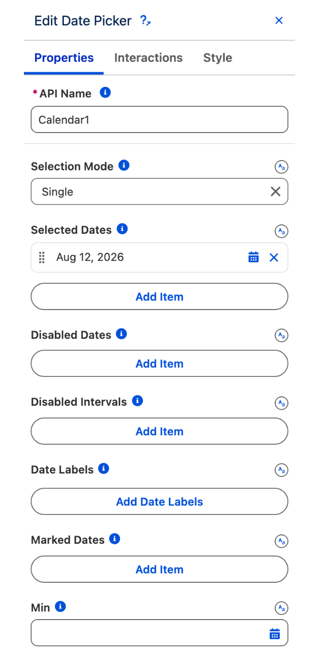
To configure the Date Picker, select it on the canvas. The **Edit Date Picker** panel opens on the right. The sections below mirror the configuration panel from top to bottom.

### Properties

#### Selection Mode

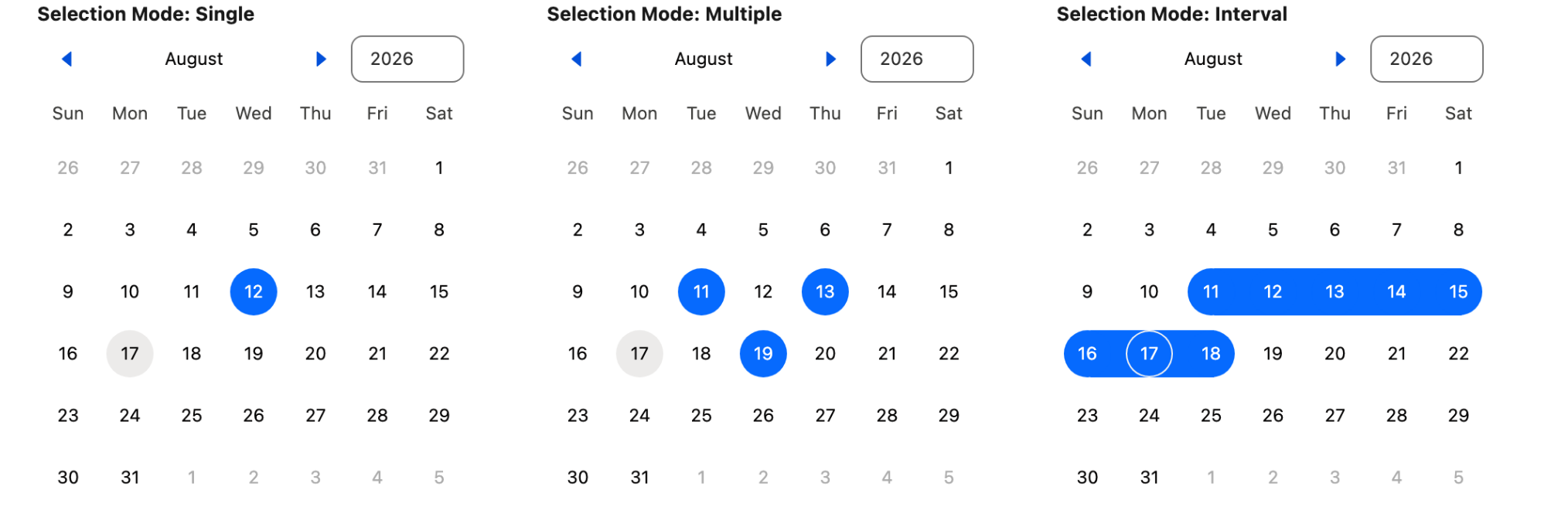
Controls how many dates a user can select at once. Choose from:

* **Single** (default) — the user selects one date at a time; picking a new date replaces the previous selection.
* **Multiple** — the user can select any number of individual dates.
* **Interval** — the user selects a start date and an end date, and the entire range is highlighted.

#### Selected Dates

An array of pre-selected dates shown as selected when the calendar loads. Each entry is a date value. Use this to restore a previous selection or to seed the calendar with a default value.

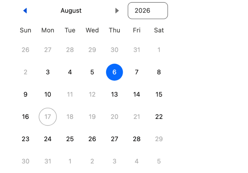
#### Disabled Dates

Individual dates that the user cannot select. Add one entry per date that should be unavailable. The calendar renders these dates as greyed out.

#### Disabled Intervals

Date ranges during which no date can be selected. Each interval has a **Start** date and an **End** date. Dates that fall within any disabled interval are rendered as unavailable.

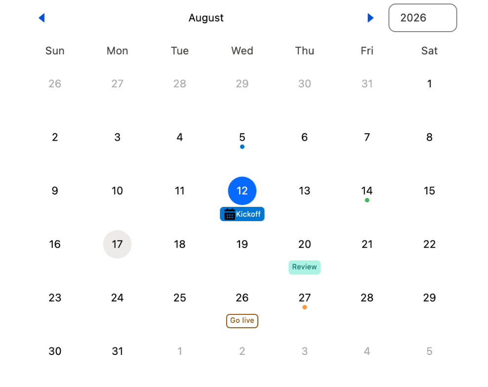
#### Date Labels

Decorative badges that appear on specific calendar days. Each label entry has the following settings:

| Setting           | Description                                                                                                                  |
| ----------------- | ---------------------------------------------------------------------------------------------------------------------------- |
| **Date**          | The calendar day on which the label appears.                                                                                 |
| **Label**         | The text displayed in the badge.                                                                                             |
| **Variant**       | Badge color theme: `base` (default), `brand`, `success`, `warning`, `error`, `info`, `inverse`, `alt-inverse`, or `offline`. |
| **Icon Name**     | An optional Lightning Design System icon shown inside the badge.                                                             |
| **Icon Position** | Position of the icon relative to the label text: **Left** or **Right**.                                                      |
| **Icon Variant**  | Tint applied to the icon: `inverse`, `success`, `warning`, or `error`.                                                       |
| **Outline**       | If enabled, the badge is rendered with a border outline instead of a filled background.                                      |

#### Marked Dates

Visual indicators (colored dots) placed on specific days to draw attention without adding a text label. Each entry has a **Date** and a **Color**.

#### Min

The earliest date the calendar allows. Dates before this value are rendered as unavailable.

#### Max

The latest date the calendar allows. Dates after this value are rendered as unavailable.

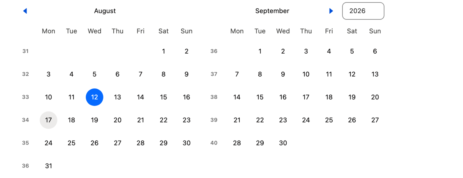
#### Week Start Day

The day displayed as the first column of every week. Defaults to the user's locale setting. Options: **Default**, **Sunday**, **Monday**, **Tuesday**, **Wednesday**, **Thursday**, **Friday**, **Saturday**.

#### Number of Months

How many calendar months are displayed side by side at once. Default is 1.

#### Display Week Number Column

If enabled, an additional column showing the ISO week number appears on the left side of each calendar row.

#### Hide Navigation

If enabled, the month-and-year navigation header is hidden. Use this when the calendar should show a fixed month that the user cannot navigate away from.

#### Disabled

If enabled, the entire calendar is rendered in a disabled state and the user cannot interact with it.

### Set Component Visibility

All components support conditional visibility — see [Component Visibility](/dynamic-components/core-concepts/component-visibility.md).

## Interactions

[Interactions](/dynamic-components/component-builder/interactions.md) define what happens when users interact with the Date Picker. Configure them from the **Interactions** tab of the Edit Date Picker panel.

### Change

Fires whenever the user selects or deselects a date, completing a date interval, or changes their selection. Use the **value** and **valueCollection** output variables to pass the new selection to other components, store it in a variable, or trigger downstream flow logic.

## Output Variables

The Date Picker exposes these output variables you can reference elsewhere on the page after the user interacts with it.

### Date Selection

When a user selects or changes a date, this variable updates with the current selection.

| Output variable    | Type | What it returns                                                                                                                                                                            |
| ------------------ | ---- | ------------------------------------------------------------------------------------------------------------------------------------------------------------------------------------------ |
| **Selected Value** | Date | The selected date as an ISO8601 date string. When multiple dates can be selected, this returns the first one. Use it to bind the user's selection to a date property on another component. |

> **Example:** In interval mode, bind **Selected Value** to a filter component's start-date field so the report automatically scopes to dates on or after the user's chosen day.


---

# Agent Instructions
This documentation is published with GitBook. GitBook is the documentation platform designed so that both humans and AI agents can read, navigate, and reason over technical content effectively. Learn more at gitbook.com.

## Querying This Documentation
If you need additional information that is not directly available in this page, you can query the documentation dynamically by asking a question.

Perform an HTTP GET request on the current page URL with the `ask` query parameter, and the optional `goal` query parameter:

```
GET https://docs.avonnicomponents.com/dynamic-components/components/date-picker.md?ask=<question>&goal=<endgoal>
```

`ask` is the immediate question: it should be specific, self-contained, and written in natural language.
`goal` is optional and describes the broader end goal you are ultimately trying to accomplish on behalf of the user. GitBook uses it to tailor the answer towards what is most useful for that goal.

The response will contain a direct answer to the question and relevant excerpts and sources from the documentation.

Use this mechanism when the answer is not explicitly present in the current page, you need clarification or additional context, or you want to retrieve related documentation sections.