> For the complete documentation index, see [llms.txt](https://docs.avonnicomponents.com/llms.txt). Markdown versions of documentation pages are available by appending `.md` to page URLs; this page is available as [Markdown](https://docs.avonnicomponents.com/dynamic-components/components/chip-container.md).

# Chip Container

The Avonni Chip Container displays a set of chips — pill-like items — that can optionally be constrained to a single line, collapsed and expanded, or reordered by drag-and-drop.

## Overview

Use the Chip Container when you need to display a compact collection of labeled items (such as tags, categories, or statuses) and want control over how they wrap, collapse, or can be rearranged by users.

## Configuration

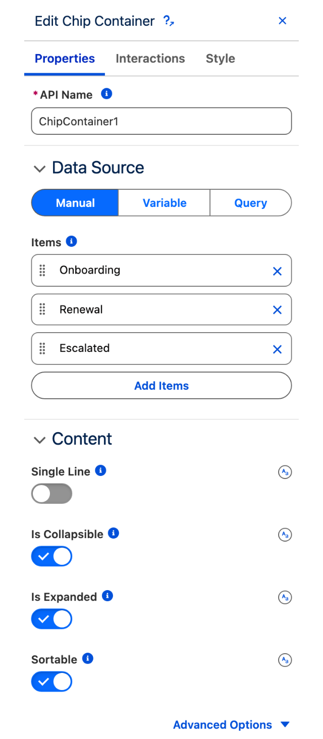
To configure the Chip Container, select it on the canvas. The **Edit Chip Container** panel opens on the right with three tabs: **Properties**, **Interactions**, and **Style**. The sections below mirror the Properties tab.

### Data Source

Before the Chip Container can display chips, you must connect it to a data source. Choose the option that matches where your chip data lives:

<table data-view="cards"><thead><tr><th></th><th></th><th data-hidden data-card-target data-type="content-ref"></th></tr></thead><tbody><tr><td><strong>Manual</strong></td><td>Enter data directly into the component configuration.</td><td></td></tr><tr><td><strong>Variable</strong></td><td>This is useful for data that changes based on user interactions or other component logic.</td><td></td></tr><tr><td><strong>Query</strong></td><td>This is the most common option for displaying Salesforce records.</td><td></td></tr></tbody></table>

<figure><img src="https://2532358799-files.gitbook.io/~/files/v0/b/gitbook-x-prod.appspot.com/o/spaces%2FODPvvv7Cx9Z9RECLn3oV%2Fuploads%2FjG4NR2QPf5V1k2LcnDw9%2Fchip-container-builder-properties.png?alt=media" alt="The Properties tab of the Edit Chip Container panel, showing the Manual, Variable and Query data source switch above the Items list and the Content settings" width="320"><figcaption><p>The Properties tab: the data source switch, the <strong>Items</strong> list for a manual source, then the Content settings.</p></figcaption></figure>

Whichever source you choose, every chip carries the same set of attributes. With a **Manual** source you set them one chip at a time in the **Items** list; with **Variable** or **Query** you map a record field to each of them in **Data Mappings**.

| Attribute                             | What it sets                                                                                                          |
| ------------------------------------- | --------------------------------------------------------------------------------------------------------------------- |
| **Label**                             | The text shown on the chip.                                                                                           |
| **Name**                              | The chip's identifier, used when you read the reordered list back. In **Data Mappings** this is the **Key Field**.    |
| **Variant**                           | The chip's color: Base (default), Brand, Success, Warning, Error, Info, Inverse, Alt-Inverse or Offline.              |
| **Outline**                           | Draws the chip as an outline instead of a filled shape.                                                               |
| **Background Color** / **Text Color** | Override the variant's colors on that chip.                                                                           |
| **Hide Text**                         | Hides the label, so the chip renders as a colored circle.                                                             |
| **Avatar**                            | Shows an avatar on the chip, as **Initials**, an **Icon Name** or an **Image Source**, in a **Circle** or **Square**. |

<figure><img src="https://2532358799-files.gitbook.io/~/files/v0/b/gitbook-x-prod.appspot.com/o/spaces%2FODPvvv7Cx9Z9RECLn3oV%2Fuploads%2FKYW6s1BLhAcQzV4u12D4%2Fchip-container-variants.png?alt=media" alt="Fourteen chips showing the base, brand, success, warning, error, info, offline, inverse and alt-inverse variants, then five of the same variants with Outline on"><figcaption><p>The nine chip variants, then the same variants with <strong>Outline</strong> on.</p></figcaption></figure>

<figure><img src="https://2532358799-files.gitbook.io/~/files/v0/b/gitbook-x-prod.appspot.com/o/spaces%2FODPvvv7Cx9Z9RECLn3oV%2Fuploads%2FjrmKtWoHRovuvGy2YKbM%2Fchip-container-avatars.png?alt=media" alt="Five chips, one with initials, one with an icon in a square avatar, one with a photo, one with custom background and text colors, and one combining a variant with an icon avatar"><figcaption><p>A chip can carry <strong>Initials</strong>, an <strong>Icon Name</strong> or an <strong>Image Source</strong> as its avatar, and can override the variant's colors.</p></figcaption></figure>

### Data Mapping

When using a dynamic data source, configure the **Data Mappings** section to tell the component how to build chips from your records. Map your data fields to chip attributes such as the label, variant, and avatar so each chip displays the correct information.

### Content

#### Single Line

When enabled, the chips are constrained to a single horizontal line rather than wrapping across multiple rows. Use this when vertical space is limited and you prefer a compact, scrollable layout.

#### Is Collapsible

When enabled, the chip list can be collapsed so that only a summary is visible. Use **Is Collapsible** together with **Is Expanded** to control the initial state of the list.

#### Is Expanded

Controls whether the collapsible chip list starts in the expanded state. This setting is only active when **Is Collapsible** is also enabled.

<figure><img src="https://2532358799-files.gitbook.io/~/files/v0/b/gitbook-x-prod.appspot.com/o/spaces%2FODPvvv7Cx9Z9RECLn3oV%2Fuploads%2FVLcVcWQASt1IypA9zl3b%2Fchip-container-collapsible.png?alt=media" alt="Two chip containers holding the same ten chips, the first collapsed to one line ending in a plus seven more link, the second showing all ten across three lines"><figcaption><p>The same ten chips with <strong>Is Collapsible</strong> on. With <strong>Is Expanded</strong> off the list collapses to one line and a counter; with it on the whole list shows.</p></figcaption></figure>

#### Sortable

When enabled, users can reorder chips by dragging and dropping them, or by using the spacebar key. Configure the **On Reorder** interaction to capture the new order.

#### Alternative Text

A text description of the chip container for screen readers, providing context that may not be apparent from the visible chips alone. Found under **Advanced Options**.

### Set Component Visibility

All components support conditional visibility — see [Component Visibility](/dynamic-components/core-concepts/component-visibility.md).

## Interactions

[Interactions](/dynamic-components/component-builder/interactions.md) define what happens when users interact with the Chip Container. Configure them from the **Interactions** tab of the Edit Chip Container panel.

### Reorder

Fires when a user reorders chips by drag-and-drop or keyboard. Use this to persist the new order — for example by storing the updated sequence in a variable via the **sortedItems** or **sortedItemsSObject** output attributes.

## Output Variables

The Chip Container exposes these output variables you can reference elsewhere on the page after the user interacts with it.

### Reorder

When a user drags and drops chips into a new order, these variables update with the resulting sequence.

| Output variable          | Type                           | What it returns                                                                                                         |
| ------------------------ | ------------------------------ | ----------------------------------------------------------------------------------------------------------------------- |
| **Sorted Items**         | Object Collection              | The reordered chips as a collection of objects, each with the same properties as the original static data source items. |
| **Sorted Items sObject** | Record Collection (SObject\[]) | The reordered chips as a collection of Salesforce records. Requires a **Query** or **Variable** data source.            |

> **Example:** When a user reorders priority tags on a project page, use **Sorted Items sObject** in an **On Reorder** interaction to write the new sequence back to the related records.

### Others

| Output variable     | Type   | What it returns                                                 |
| ------------------- | ------ | --------------------------------------------------------------- |
| **Number of Items** | Number | The total number of chips currently displayed in the container. |

## Styling

Configure the Chip Container's appearance from the **Style** tab of the Edit Chip Container panel.

{% tabs %}
{% tab title="Margin" %}
Controls the *outer* spacing around the container.

* **Top / Right / Bottom / Left:** Adjust the space on each side.
  {% endtab %}

{% tab title="Padding" %}
Controls the *inner* spacing between the container's content and its border.

* **Top / Right / Bottom / Left:** Adjust the inner spacing on each side.
  {% endtab %}

{% tab title="Border" %}
Customizes the border surrounding the container.

* **Color / Size / Style / Radius:** Set the border color, thickness, style, and corner rounding.
  {% endtab %}

{% tab title="Spacing" %}
Adjusts the block and inline spacing around the container and around each chip.

* **Chip Container Block Start / Block End / Inline Start / Inline End:** Set the spacing around the container.
* **Chip Block Start / Block End / Inline Start / Inline End:** Set the spacing around each chip.
  {% endtab %}

{% tab title="Chip" %}
Styles the chip container and the individual chips.

* **Chip Container:** Background Color; Border Color / Border Size / Border Style / Border Radius.
* **Chip:** Label Font Size / Font Weight / Font Style / Line Height; Border Size / Border Style / Border Radius.
  {% endtab %}

{% tab title="Avatar" %}
Styles an avatar shown inside a chip.

* **Border Size / Border Color / Border Style:** Customize the avatar border.
* **Initials Font Color / Font Color Hover / Font Weight / Font Weight Hover:** Style avatar initials.
* **Icon Background Color / Icon Foreground Color:** Style a fallback icon.
* **Image Object Fit:** Control how an avatar image fills its area.
  {% endtab %}

{% tab title="Variant Colors" %}
Sets the background, border, text, and outline text colors for each chip variant (Base, Brand, Error, Info, Inverse, Alt Inverse, Offline, Success, Warning). Each variant exposes:

* **Background / Border Color / Text Color / Outline Text Color:** Set the colors for that variant.
  {% endtab %}
  {% endtabs %}


---

# Agent Instructions
This documentation is published with GitBook. GitBook is the documentation platform designed so that both humans and AI agents can read, navigate, and reason over technical content effectively. Learn more at gitbook.com.

## Querying This Documentation
If you need additional information that is not directly available in this page, you can query the documentation dynamically by asking a question.

Perform an HTTP GET request on the current page URL with the `ask` query parameter, and the optional `goal` query parameter:

```
GET https://docs.avonnicomponents.com/dynamic-components/components/chip-container.md?ask=<question>&goal=<endgoal>
```

`ask` is the immediate question: it should be specific, self-contained, and written in natural language.
`goal` is optional and describes the broader end goal you are ultimately trying to accomplish on behalf of the user. GitBook uses it to tailor the answer towards what is most useful for that goal.

The response will contain a direct answer to the question and relevant excerpts and sources from the documentation.

Use this mechanism when the answer is not explicitly present in the current page, you need clarification or additional context, or you want to retrieve related documentation sections.


