> For the complete documentation index, see [llms.txt](https://docs.avonnicomponents.com/llms.txt). Markdown versions of documentation pages are available by appending `.md` to page URLs; this page is available as [Markdown](https://docs.avonnicomponents.com/dynamic-components/components/formatted-name.md).

# Formatted Name

The Avonni Formatted Name component renders a personal name — salutation, first, middle, last, informal name, and suffix — in a configurable display format. Use it wherever you need to present a person's full name from your Salesforce data with consistent formatting and an optional avatar.

## Overview

The Formatted Name component takes individual name parts and assembles them into a single, locale-aware display. You control how much of the name is shown (short, medium, or long), add an optional label, and optionally pair the name with an avatar that can carry a photo, initials, or a fallback icon.

## Configuration

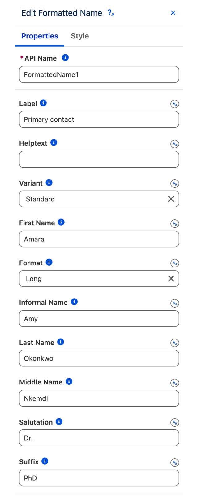
To configure the Formatted Name, select it on the canvas. The configuration panel opens on the right. The sections below mirror its properties from top to bottom.

### Properties

#### Label

Enter a label to display alongside the formatted name. When a label is set, the **Helptext** and **Variant** settings become available.

#### Helptext

Add a short help text that appears as a tooltip next to the label. Requires **Label** to be set.

#### Variant

Controls the position of the label relative to the formatted name. Requires **Label** to be set.

| Option                 | Description                                                    |
| ---------------------- | -------------------------------------------------------------- |
| **Standard** (default) | Label appears above the name.                                  |
| **Label Hidden**       | Label is not visible but remains accessible to screen readers. |
| **Label Inline**       | Label and name appear on the same line, label to the left.     |
| **Label Stacked**      | Label floats above the name field.                             |
| **Label Spread**       | Label and name are spread to opposite ends of the row.         |

#### First Name

The value for the first name.

#### Format

Controls how much of the name is displayed. Default is **Long**.

| Option             | Description                                         |
| ------------------ | --------------------------------------------------- |
| **Short**          | Renders a compact version of the name.              |
| **Medium**         | Renders a medium-length version of the name.        |
| **Long** (default) | Renders the full name including all provided parts. |

#### Informal Name

The value for the informal name (e.g. a nickname).

#### Last Name

The value for the last name.

#### Middle Name

The value for the middle name.

#### Salutation

A title such as Dr., Mr., or Mrs. that prefixes the name.

#### Suffix

A suffix such as Jr., Sr., or Esq. that follows the name.

### Avatar

Optionally display an avatar alongside the formatted name. Expand this section to configure it.

#### Variant

Sets the shape of the avatar. **Square** (default) or **Circle**.

#### Initials

Text initials to display inside the avatar when no image is provided.

#### Icon Name

A fallback icon shown when neither an image nor initials are available.

#### Size

Controls the avatar size. Options: **X Small**, **Small**, **Medium** (default), **Large**, **X Large**, **XX Large**.

#### Image

URL of the photo to display in the avatar.

#### Presence Type

Shows a presence indicator badge on the avatar. Options: **Online**, **Busy**, **Focus**, **Offline**, **Blocked**, **Away**.

#### Presence Position

Sets where the presence badge appears on the avatar. Options: **Top Left**, **Top Right**, **Bottom Left**, **Bottom Right** (default). Requires **Presence Type** to be set.

#### Avatar Position

Controls whether the avatar appears to the **Left** (default) or **Right** of the name.

#### Alternative Text

Accessible alternative text for the avatar image. Found under advanced options.

### Set Component Visibility

All components support conditional visibility — see [Component Visibility](/dynamic-components/core-concepts/component-visibility.md).


---

# Agent Instructions
This documentation is published with GitBook. GitBook is the documentation platform designed so that both humans and AI agents can read, navigate, and reason over technical content effectively. Learn more at gitbook.com.

## Querying This Documentation
If you need additional information that is not directly available in this page, you can query the documentation dynamically by asking a question.

Perform an HTTP GET request on the current page URL with the `ask` query parameter, and the optional `goal` query parameter:

```
GET https://docs.avonnicomponents.com/dynamic-components/components/formatted-name.md?ask=<question>&goal=<endgoal>
```

`ask` is the immediate question: it should be specific, self-contained, and written in natural language.
`goal` is optional and describes the broader end goal you are ultimately trying to accomplish on behalf of the user. GitBook uses it to tailor the answer towards what is most useful for that goal.

The response will contain a direct answer to the question and relevant excerpts and sources from the documentation.

Use this mechanism when the answer is not explicitly present in the current page, you need clarification or additional context, or you want to retrieve related documentation sections.


