Chart
Overview
The Chart component turns Salesforce data into bar charts, line charts, gauges, donuts, and more — directly on a Lightning Page. No code required.
Quick Start: Opportunity Pipeline Chart
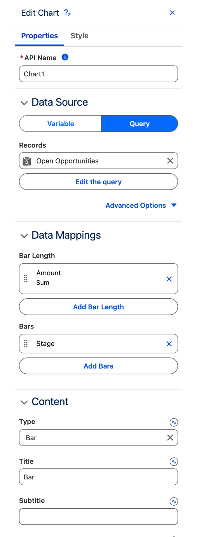
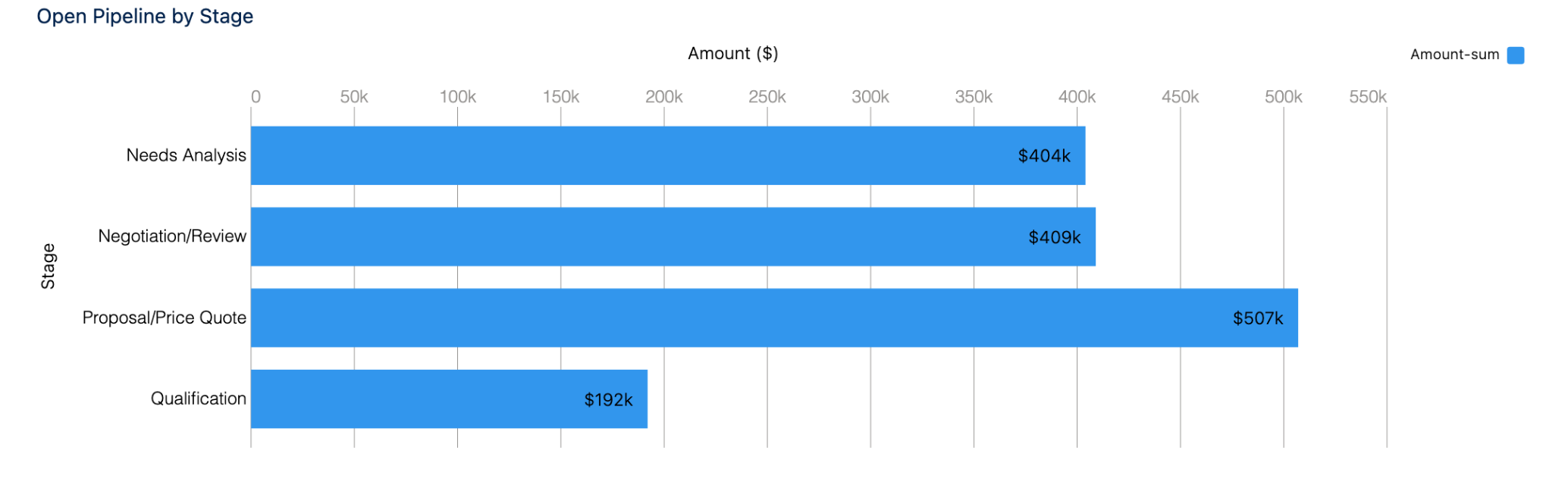
Build a chart showing open opportunities grouped by stage in under 5 minutes.
The chart now appears on the Lightning Page, showing opportunity amounts stacked by stage.
Configuration Reference
Data Source
Connect the chart to Salesforce data via Query, Variable, or Manual input.
Data Source
How the chart receives data. Query fetches Salesforce records; Variable uses a page variable; Manual loads hardcoded data.
Query, Variable, Manual
Object
The Salesforce object to query.
Opportunity, Account, Case, CaseComment
Filter
SOQL-style filter to limit records. Use Salesforce variables like {!RecordId} to reference the current record.
IsClosed = false, AccountId = '{!RecordId}'
Sort
Field and direction (ascending/descending) to sort results.
Amount DESC, CreatedDate ASC
Data Mappings
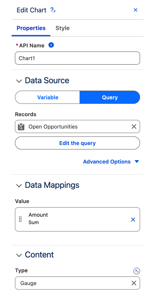
Map Salesforce fields to chart elements. Every chart needs at least one bar or line configuration and one bar length or line configuration.
Bars (Dimensions)
Bars define how to group or split the data. Each bar becomes a dimension on the chart.
Field
The Salesforce field to group by.
StageName, RecordType.Name, OwnerId
Group
Optional secondary grouping. Creates nested grouping within the first bar.
AccountId
Bar Length (Measures)
Bar Length defines the numeric values displayed in the chart.
Field
The Salesforce field containing numeric data.
Amount, Count, TotalPrice__c
Measures
How to aggregate the field: Sum (total), Average, Count (row count), Max, Min.
SUM, AVG, COUNT, MAX, MIN
Bar Segments (Optional)
Stacks bars into segments based on an additional field. Used with bar chart types.
Field
Field to create segments within each bar.
RecordType.Name, Owner.Department
Lines (Optional)
Add line series to combo or line charts.
Field
The Salesforce field to display as a line.
Probability, WinRate__c
Measures
How to aggregate: SUM, AVG, COUNT, MAX, MIN.
AVG
Display As (Combo only)
How the line appears: Line, Bar, or Dot.
Line, Bar, Dot
Trellis (Optional)
Create small multiples — separate mini-charts for each value of a field.
Field
Field to split the chart by. Each unique value creates its own mini-chart.
Owner.Name, RecordType.Name
Chart Type
Choose the visualization style that best displays your data.
Bar
Horizontal bars comparing values across categories.
1+ Bars, 1+ Bar Length
Show Values, Show Percentages
Stacked Bar
Horizontal bars with segments stacked within each bar.
1+ Bars, 1+ Bar Length, 1+ Bar Segments
Combine Small Groups
Column
Vertical bars comparing values across categories.
1+ Bars, 1+ Bar Length
Show Values, Show Percentages
Stacked Column
Vertical bars with segments stacked within each column.
1+ Bars, 1+ Bar Length, 1+ Bar Segments
Combine Small Groups
Line
Trends over time or continuous values.
1+ Lines
Show Points, Show Values in Chart Lines
Combo
Mix bars and lines on the same chart (e.g., revenue bars + trend line).
1+ Bar Length or Lines
Display As (Bar/Line/Dot per series)
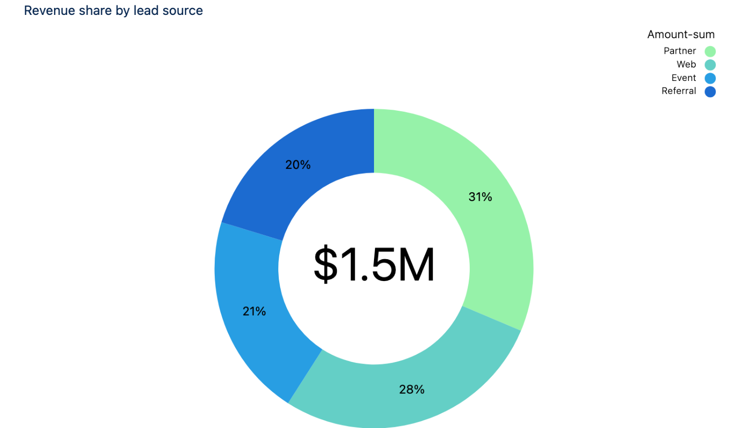
Donut
Proportional breakdown of a whole.
1+ Bars, 1+ Bar Length
Show Percentages, Center Size
Pyramid
Hierarchical breakdown or funnel visualization.
1+ Bars, 1+ Bar Length
Show Values
Stacked Pyramid
Hierarchical breakdown with segments.
1+ Bars, 1+ Bar Length, 1+ Bar Segments
Combine Small Groups
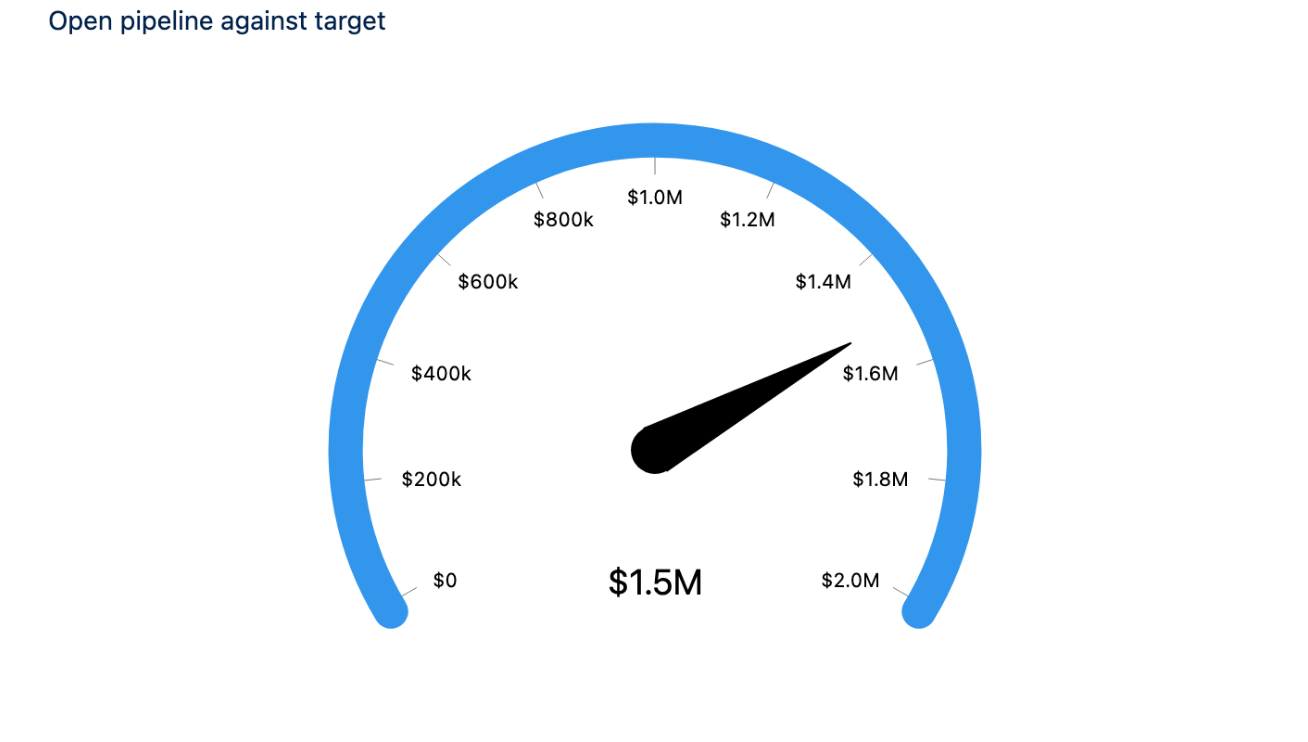
Gauge
Single metric as a circular gauge with range.
1+ Bar Length
Gauge Angle, Min Range, Max Range
Flat Gauge
Single metric as a horizontal gauge.
1+ Bar Length
Min Range, Max Range
Calendar Heatmap
Values distributed across calendar days.
1+ Bar Length
(Date field required in Bars)
Parallel Coordinates
Multivariate comparison across dimensions.
Multiple Lines
(Advanced; multiple dimensions)
Metrics Radar
Radar chart comparing multiple metrics.
Multiple Lines
(Advanced; for spider/radar visualization)
Display & Labels
Control how titles, axes, legends, and values appear on the chart.
Title
Main heading at the top of the chart.
"Quarterly Revenue", "Pipeline by Stage"
Title Font Size
Font size in pixels for the title.
16, 18, 20
Title Alignment
Position of the title: left, center, or right.
Left, Center, Right
Subtitle
Secondary text below the title.
"FY2024"
Subtitle Font Size
Font size in pixels for the subtitle.
12, 14
X Title
Label for the horizontal (X) axis. Hidden if Hide X Title is enabled.
"Stage", "Month", "Probability"
Y Title
Label for the vertical (Y) axis. Hidden if Hide Y Title is enabled.
"Amount ($)", "Count", "Percentage"
Hide X Axis
Hide the horizontal axis line and tick marks. (Default: off)
On, Off
Hide X Title
Hide the X axis label but keep the axis. (Default: off)
On, Off
Hide Y Axis
Hide the vertical axis line and tick marks. (Default: off)
On, Off
Hide Y Title
Hide the Y axis label but keep the axis. (Default: off)
On, Off
Show Legend
Display the legend showing which color represents which group. (Default: off)
On, Off
Show Legend Header
Show a title above the legend. (Default: off)
On, Off
Show Legend Inside Chart Area
Place the legend inside the chart rather than outside. (Default: off)
On, Off
Legend Reverse Ordering
Reverse the order of items in the legend. (Default: off)
On, Off
Values & Formatting
Control which numeric values and percentages display on the chart.
Show Values
Display the numeric value (e.g., amount, count) on each bar or point. (Default: off)
On, Off
Show Values in Chart Lines
For line charts, show values at each data point. (Default: off)
On, Off
Show Percentages
Display each value as a percentage of the total. (Default: off)
On, Off
Show Total
For stacked charts, display the total at the top of each stack. (Default: off)
On, Off
Total Font Size
Font size in pixels for the total value.
auto, 12, 14, 16
Show Points
For line charts, display a dot at each data point. (Default: off)
On, Off
Show Band Label
For gauges: show text labels on the colored bands. (Default: off)
On, Off
Show Band Value
For gauges: show the numeric value on the band. (Default: off)
On, Off
Show Band Percentage
For gauges: show the percentage on the band. (Default: off)
On, Off
Show Band Range
For gauges: show the min/max range below the gauge. (Default: off)
On, Off
Tooltip & Dimensions
Customize what information appears when users hover over chart elements.
Tooltip Show Dimensions
Show the grouping field(s) in the tooltip (e.g., "Stage: Negotiation"). (Default: off)
On, Off
Tooltip Show Measures
Show the numeric values in the tooltip (e.g., "Amount: $50,000"). (Default: off)
On, Off
Tooltip Show Percentage
Show the percentage contribution in the tooltip. (Default: off)
On, Off
Axis & Scaling
Control axis behavior, scale type, and numeric ranges.
Axis Mode
How to arrange multiple charts: sequential or stack horizontally/vertically. (For trellis only)
Sequential, Horizontal, Vertical
Use Log Scale
Use logarithmic scale on the Y axis instead of linear. Useful for exponential data. (Default: off)
On, Off
Min Range
Minimum value for the Y axis. If left blank, computed from data.
0, -100
Max Range
Maximum value for the Y axis. If left blank, computed from data.
1000, 10000
Normalize Values
Normalize all values to a 0-100 scale for comparison. (Default: off)
On, Off
Gauge-Specific Settings
Settings that apply only to gauge and flat-gauge chart types.
Gauge Angle
Sweep angle of the gauge in degrees (circular gauges). 240° is a standard 3/4 circle.
180, 240, 270, 360
Center Size
Size of the hollow center in a donut or gauge chart as a percentage.
50%, 60%, 75%
Trellis-Specific Settings
Settings that apply only when using a Trellis field for small multiples.
Trellis Type
Layout style: Grid displays mini-charts in rows/columns; Flow wraps based on width.
Grid, Flow
Trellis Flip Labels
Flip the orientation of dimension labels in trellis. (Default: off)
On, Off
Trellis Show Grid Lines
Show grid lines behind the mini-charts. (Default: off)
On, Off
Trellis Size Ratio
Aspect ratio of each mini-chart (width:height).
1:1, 16:9, 4:3
Palette & Styling
Choose color schemes and grouping behavior.
Palette
Predefined or custom color scheme for the chart.
Default, Pastel, Highcontrast, Neon, Custom
Combine Small Groups
Merge small data groups into an "Other" category for cleaner visualization. (Default: off)
On, Off
Charts Per Line
For trellis charts: how many mini-charts to display per row.
2, 3, 4, Auto
Interactions
Without Interactions, the chart displays data but does not write changes back to Salesforce. Connect triggers to actions so the chart can create, update, or execute workflows in response to user interaction.
On Item Click
User clicks a bar, line point, or segment.
Create Record, Execute Flow, Update Record, Navigate to Record
Field Mapping Example: Update Stage on Bar Click
When a user clicks a bar in a stage chart, update an Opportunity record.
Trigger: On Item Click (Stage bar is clicked)
Action: Update Record
Object: Opportunity
Record ID:
{!$Component.RecordId}(the current record on the page)Field Mappings:
StageName→ Dimension: StageName (the clicked stage value)
This maps the dimension value (e.g., "Negotiation") from the chart click to the Opportunity's StageName field.
Common Patterns
Pattern 1: Case Status Dashboard
Display all open cases grouped by status with a count of cases per status.
Chart Type: Column
Object: Case
Filter:
IsClosed = falseBars:
StatusBar Length: Field:
Id, Measures:COUNTShow Legend: Off (only one series)
Show Values: On (to see case counts)
Pattern 2: Sales Funnel by Stage
Show expected revenue at each stage of the sales process.
Chart Type: Stacked Pyramid
Object: Opportunity
Filter:
IsClosed = falseBars:
StageNameBar Length: Field:
Amount, Measures:SUMShow Percentages: On
Show Values: On
Pattern 3: Monthly Revenue Trend
Track revenue trend over time with a line chart.
Chart Type: Line
Object: Opportunity
Filter:
IsClosed = trueBars:
CALENDAR_MONTH(CloseDate)(if supported) or use a custom field for monthLines: Field:
Amount, Measures:SUMShow Points: On
Sort: CloseDate ASC
Pattern 4: Multi-Metric Dashboard (Combo)
Display both revenue bars and win rate trend on the same chart.
Chart Type: Combo
Object: Opportunity (for revenue) + custom aggregation for win rate
Bars:
StageNameBar Length: Field:
Amount, Measures:SUM(Display As: Bar)Lines: Field:
Probability, Measures:AVG(Display As: Line)Show Values: On
Show Legend: On
Troubleshooting
Chart shows "No Data" or is blank
Cause: The query filter is too restrictive or no records match the filter criteria.
Fix:
Verify the Filter condition (e.g.,
IsClosed = false) returns records when tested in a Report or SOQL query.Check that the Bars and Bar Length fields exist on the selected Object and contain values.
If using
{!RecordId}, ensure the page is loaded on a record (not a list view).
Chart shows unexpected colors or grouping
Cause: Data mapping fields are not correctly configured, or small groups are being combined.
Fix:
In Data Mappings, confirm Bars and Bar Length are set to the correct fields.
Check Combine Small Groups — if enabled, small values merge into "Other".
Verify field values are populated in the Salesforce records (check the Report builder to see the data).
The gauge shows an incorrect range
Cause: Min Range and Max Range settings do not match the data.
Fix:
If Min Range and Max Range are blank, the chart auto-calculates from data.
To set manual ranges, populate both Min Range and Max Range with appropriate values.
Example: For a win rate gauge (0–100%), set Min Range to 0 and Max Range to 100.
Legend takes up too much space or overlaps the chart
Cause: Chart size is small relative to the number of categories.
Fix:
Enable Show Legend Inside Chart Area to move the legend into the chart space.
Enable Legend Reverse Ordering if space is still tight.
Increase the width or height of the component container on the page.
Reduce the number of groups by enabling Combine Small Groups.
Lines or bars don't show values
Cause: Show Values or Show Values in Chart Lines is disabled.
Fix:
Enable Show Values to display numeric values on bars.
For line charts, enable Show Values in Chart Lines.
Ensure Bar Length or Lines contain valid numeric data
Last updated
Was this helpful?