> For the complete documentation index, see [llms.txt](https://docs.avonnicomponents.com/llms.txt). Markdown versions of documentation pages are available by appending `.md` to page URLs; this page is available as [Markdown](https://docs.avonnicomponents.com/dynamic-components/components/button-menu.md).

# Button Menu

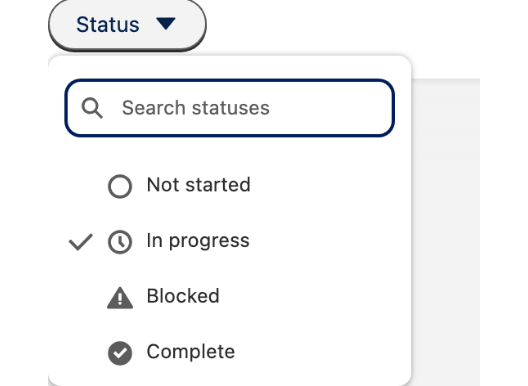
The Avonni Button Menu component displays a button that opens a dropdown menu. Use it whenever you need to surface a compact set of actions or choices — the menu can be triggered by click, hover, or focus, and supports label and/or icon triggers, a search input, a selection checkmark, and a draft indicator.

## Overview

To start with the Avonni Button Menu component, you'll first need to connect it to your data and configure how it is displayed. The sections below follow the configuration panel from top to bottom, so you can read along as you build.

## Configuration

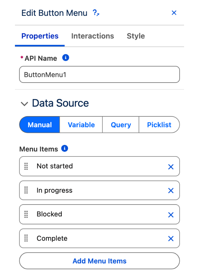
To configure the Button Menu, select it on the canvas. The **Edit Button Menu** panel opens on the right with two tabs: **Properties** and **Interactions**. The sections below mirror the Properties tab.

### Data Source

Before you build your menu, you must tell the Avonni Button Menu component where to get the items it should display. You have several options, depending on the source and nature of your data:

<table data-view="cards"><thead><tr><th></th><th></th><th data-hidden data-card-target data-type="content-ref"></th></tr></thead><tbody><tr><td><strong>Manual</strong></td><td>Enter data directly into the component configuration.</td><td></td></tr><tr><td><strong>Variable</strong></td><td>This is useful for data that changes based on user interactions or other component logic.</td><td></td></tr><tr><td><strong>Query</strong></td><td>This is the most common option for displaying Salesforce records.</td><td></td></tr><tr><td><strong>Picklist</strong></td><td>Retrieve data dynamically from a standard or custom picklist field within Salesforce.</td><td><a href="/pages/NMTcHeq9UuKYUmBedI8t">/pages/NMTcHeq9UuKYUmBedI8t</a></td></tr></tbody></table>

### Data Mapping

When using a dynamic data source for your Button Menu, configure the **Data Mappings** section to tell the component how to map your data fields to menu item properties such as label, value, and icon.

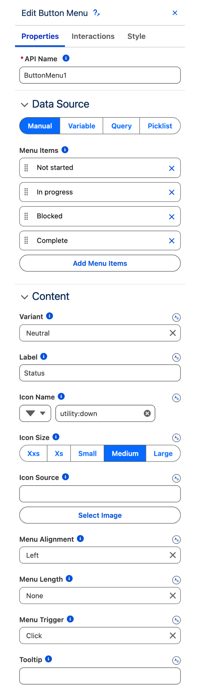
### Content

#### Variant

The **Variant** setting changes the visual appearance of the button trigger. The default value when no label is set is **Border**; the default when a label is present is **Neutral**.

Available variants: Bare, Bare Inverse, Base, Border, Border Filled, Border Inverse, Brand, Brand Outline, Container, Destructive, Destructive Text, Inverse, Neutral, and Success.

#### Label

Optional text displayed on the button trigger alongside the icon.

#### Icon Name

The Lightning Design System name of the icon shown on the button (for example, `utility:settings`). If an icon other than `utility:down` or `utility:chevrondown` is used, a down-arrow icon is appended to the right of it (unless **Hide Down Arrow** is enabled).

#### Icon Size

Controls the size of the trigger icon. Options: **Xxs**, **Xs**, **Small**, **Medium** (default), **Large**.

#### Icon Source

A URL or Content Document ID for a custom image to use as the trigger icon instead of a Lightning Design System icon.

#### Menu Alignment

Determines where the dropdown appears relative to the button. Options: **Auto**, **Left** (default), **Center**, **Right**, **Bottom Left**, **Bottom Center**, **Bottom Right**.

#### Menu Length

Sets the maximum visible height of the dropdown. Options: **None** (default, no restriction), **5 Items**, **7 Items**, **10 Items**.

#### Menu Trigger

Specifies the user action that opens the menu. Options: **Click** (default), **Hover**, **Focus**.

#### Tooltip

Text displayed when the user mouses over or focuses on the button.

#### Hide Down Arrow

When enabled, hides the additional down-arrow that normally appears to the right of a custom icon.

#### Hide Checkmark

When enabled, hides the checkmark that indicates the currently selected menu item. The checkmark is otherwise shown next to the item whose value matches the **Value** setting.

#### Nubbin

When enabled, adds a nubbin (a small pointer stub) to the menu. The nubbin position follows the **Menu Alignment** setting.

#### Disabled

When enabled, the menu cannot be opened by users.

#### Alternative Text

Assistive text for the button menu, used by screen readers.

#### Is Draft

When enabled, the button trigger shows a draft indicator (a blue asterisk).

#### Draft Alternative Text

Describes the reason for showing the draft indicator. Required when **Is Draft** is enabled.

#### Title

Text displayed as a tooltip when the user hovers over the button menu trigger.

#### Value

The currently selected value. When set, a checkmark appears next to the menu item whose value matches this setting.

#### Show Search

When enabled, a search input appears at the top of the dropdown, allowing users to filter the menu items.

#### Search Input Placeholder

Placeholder text shown in the search input when it is empty. Requires **Show Search** to be enabled.

### Actions

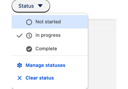
Actions are additional buttons displayed at the footer of the Button Menu dropdown. Each action has a **Label**, a **Name** (a unique identifier used in interactions), and an optional **Icon Name**.

### Set Component Visibility

All components support conditional visibility — see [Component Visibility](/dynamic-components/core-concepts/component-visibility.md).

## Interactions

[Interactions](/dynamic-components/component-builder/interactions.md) define what happens when users interact with the Button Menu. Configure them from the **Interactions** tab of the Edit Button Menu panel.

### Select

Fires when a user selects a menu item. Use the **targetName** output to identify which item was selected and drive downstream logic such as navigation, record updates, or opening a flow screen.

### Action Click

Fires when a user clicks one of the footer actions. Use the **targetName** output to identify which action was clicked and branch your flow logic accordingly.

## Output Variables

The Button Menu exposes these output variables you can reference elsewhere on the page after the user interacts with it.

### Item Selection

When a user selects a menu item, these variables update with the chosen item's data.

| Output variable           | Type             | What it returns                                                                                                 |
| ------------------------- | ---------------- | --------------------------------------------------------------------------------------------------------------- |
| **Selected Item**         | Object           | The selected menu item's data — its label, value, URL, icon name, and target.                                   |
| **Selected Item sObject** | Record (SObject) | The full Salesforce record associated with the selected item. Requires a **Query** or **Variable** data source. |

> **Example:** When a user picks a status from the Button Menu, use **Selected Item** to read its value and update a record field, or use **Selected Item sObject** to pass the full record to a detail component on the same page.

### Action Click

When a user clicks one of the footer actions, this variable identifies which action was triggered.

| Output variable           | Type          | What it returns                                 |
| ------------------------- | ------------- | ----------------------------------------------- |
| **Clicked Action - Name** | Text (String) | The name of the footer action the user clicked. |

> **Example:** Add a "Delete" footer action and branch page logic on **Clicked Action - Name** to show a confirmation modal only when that specific action is triggered.

### Others

| Output variable     | Type    | What it returns                                         |
| ------------------- | ------- | ------------------------------------------------------- |
| **Clicked**         | Boolean | `true` while a menu item selection event is firing.     |
| **Number of Items** | Number  | The total number of items currently loaded in the menu. |


---

# Agent Instructions
This documentation is published with GitBook. GitBook is the documentation platform designed so that both humans and AI agents can read, navigate, and reason over technical content effectively. Learn more at gitbook.com.

## Querying This Documentation
If you need additional information that is not directly available in this page, you can query the documentation dynamically by asking a question.

Perform an HTTP GET request on the current page URL with the `ask` query parameter, and the optional `goal` query parameter:

```
GET https://docs.avonnicomponents.com/dynamic-components/components/button-menu.md?ask=<question>&goal=<endgoal>
```

`ask` is the immediate question: it should be specific, self-contained, and written in natural language.
`goal` is optional and describes the broader end goal you are ultimately trying to accomplish on behalf of the user. GitBook uses it to tailor the answer towards what is most useful for that goal.

The response will contain a direct answer to the question and relevant excerpts and sources from the documentation.

Use this mechanism when the answer is not explicitly present in the current page, you need clarification or additional context, or you want to retrieve related documentation sections.