> For the complete documentation index, see [llms.txt](https://docs.avonnicomponents.com/llms.txt). Markdown versions of documentation pages are available by appending `.md` to page URLs; this page is available as [Markdown](https://docs.avonnicomponents.com/dynamic-components/components/checkbox.md).
# Checkbox
The Avonni Checkbox component lets admins embed a boolean toggle in any page. Use it when you need users to confirm a choice, accept a condition, or set a true/false value as part of a flow.
## Overview
The Checkbox renders a single labelled checkbox input. It supports required validation, a disabled state, and four label-display variants so it fits naturally alongside other form fields.
## Configuration
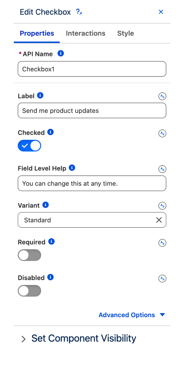
To configure the Checkbox, select it on the canvas. The **Edit Checkbox** panel opens on the right. The sections below mirror the configuration panel from top to bottom.
### Properties
#### Label
The text that identifies the checkbox to the user. Accepts a static value or a dynamic expression mapped to a Salesforce field.
#### Checked
Controls whether the checkbox is selected by default. Enable this toggle to pre-check the box when the component loads.
#### Field Level Help
Help text displayed as a tooltip next to the label. Use it to detail the purpose and function of the checkbox so users understand what they are confirming.
#### Variant
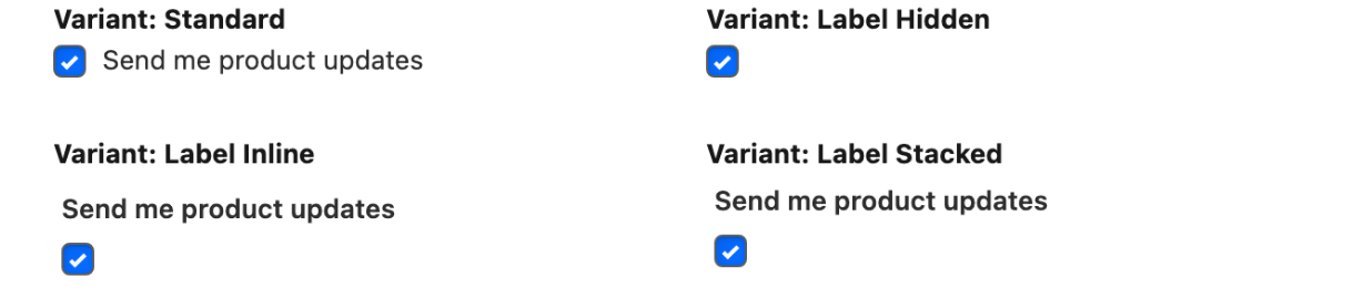
Changes how the label is positioned relative to the checkbox.
| Value | Description |
| ---------------------- | ------------------------------------------------------------------------ |
| **Standard** (default) | Label appears to the right of the checkbox, on the same line. |
| **Label Hidden** | Label is not visible; useful when the context makes the purpose obvious. |
| **Label Inline** | Label appears above the checkbox, aligned with the other form fields. |
| **Label Stacked** | Label is stacked above the checkbox in a compact form layout. |
The four Variant values on the same checkbox
#### Required
When enabled, the user must check the box before the form can be submitted.
#### Message When Value Missing
The error message displayed when the checkbox is left unchecked and the form is submitted. Requires: **Required** = enabled.
#### Disabled
When enabled, the checkbox is greyed out and users cannot interact with it. Its current value is still displayed.
#### Message When Bad Input
The error message displayed when the component detects an invalid input state. Available under advanced options.
A checkbox unchecked, checked, with field level help, and disabled
The Checkbox Properties tab
### Set Component Visibility
All components support conditional visibility — see [Component Visibility](/dynamic-components/core-concepts/component-visibility.md).
## Interactions
[Interactions](/dynamic-components/component-builder/interactions.md) define what happens when users interact with the Checkbox. Configure them from the **Interactions** tab of the Edit Checkbox panel.
### Change
Fires when the user checks or unchecks the box. Use this interaction to trigger downstream logic — for example, showing or hiding other components, updating a variable, or advancing a flow.
## Styling
Configure the Checkbox's appearance from the **Style** tab of the Edit Checkbox panel.
{% tabs %}
{% tab title="Margin" %}
Controls the *outer* spacing around the component.
* **Top / Right / Bottom / Left:** Adjust the space on each side.
{% endtab %}
{% tab title="Padding" %}
Controls the *inner* spacing between the component's content and its edges.
* **Top / Right / Bottom / Left:** Adjust the space on each side.
{% endtab %}
{% tab title="Size" %}
Sets the dimensions of the component.
* **Width / Height:** Set the component's size.
* **Min Width / Max Width / Min Height / Max Height:** Constrain the dimensions.
* **Overflow:** Choose how content that exceeds the size is handled.
* **Overflow X / Overflow Y:** Control overflow per axis.
{% endtab %}
{% tab title="Border" %}
Customizes the border surrounding the component.
* **Color / Size / Style / Radius:** Set the border color, thickness, style, and corner rounding.
{% endtab %}
{% tab title="Horizontal Alignment" %}
Sets the horizontal alignment of the checkbox within its container.
* **Horizontal Alignment:** Choose how the checkbox is justified.
{% endtab %}
{% tab title="Checkbox" %}
Customizes the checkbox box itself.
* **Background Color / Background Color Checked:** Set the box fill in the unchecked and checked states.
* **Checkmark Color:** Set the color of the checkmark.
* **Border Color / Border Color Checked / Border Color Focus:** Set the box border color in each state.
* **Border Radius:** Round the corners of the box.
{% endtab %}
{% endtabs %}
---
# Agent Instructions
This documentation is published with GitBook. GitBook is the documentation platform designed so that both humans and AI agents can read, navigate, and reason over technical content effectively. Learn more at gitbook.com.
## Querying This Documentation
If you need additional information that is not directly available in this page, you can query the documentation dynamically by asking a question.
Perform an HTTP GET request on the current page URL with the `ask` query parameter, and the optional `goal` query parameter:
```
GET https://docs.avonnicomponents.com/dynamic-components/components/checkbox.md?ask=&goal=
```
`ask` is the immediate question: it should be specific, self-contained, and written in natural language.
`goal` is optional and describes the broader end goal you are ultimately trying to accomplish on behalf of the user. GitBook uses it to tailor the answer towards what is most useful for that goal.
The response will contain a direct answer to the question and relevant excerpts and sources from the documentation.
Use this mechanism when the answer is not explicitly present in the current page, you need clarification or additional context, or you want to retrieve related documentation sections.