> For the complete documentation index, see [llms.txt](https://docs.avonnicomponents.com/llms.txt). Markdown versions of documentation pages are available by appending `.md` to page URLs; this page is available as [Markdown](https://docs.avonnicomponents.com/dynamic-components/components/progress-circle.md).

# Progress Circle

The Avonni Progress Circle component displays a circular indicator that shows completion toward a total, making it ideal for dashboards, KPI tracking, or any scenario where you want to visualise progress at a glance.

## Overview

The Progress Circle renders a ring that fills or drains as a value approaches its total. You can set the value directly as a static number, bind it to a Salesforce field, or have it computed from an aggregate query. A title and label can appear alongside the ring to give the number context.

## Configuration

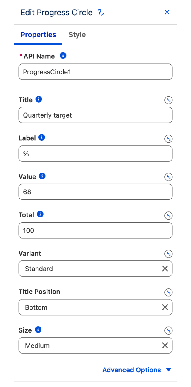
To configure the Progress Circle, select it on the canvas. The configuration panel opens on the right. The sections below mirror the properties in panel order.

### Properties

#### Title

Text displayed above or below the progress circle to introduce the metric being tracked. Use **Title Position** to place it at the top or bottom (default: **Bottom**).

#### Label

Text displayed after the value inside the ring — useful for adding a unit such as "%" or "pts".

#### Value

The current progress value. Enter a static number between 0 and 100 when tracking a simple percentage, or switch to Query mode to calculate the value from a Salesforce aggregate (SUM, COUNT, AVG, MIN, or MAX of a chosen field). In query mode you can also supply a SOQL filter expression to restrict which records contribute to the value.

#### Total

The number that represents 100 % completion (default: **100**). Change this when your value is not already a percentage — for example, set Total to 500 if your value is a raw record count. Like Value, Total supports Query mode with its own SOQL filter expression.

#### Variant

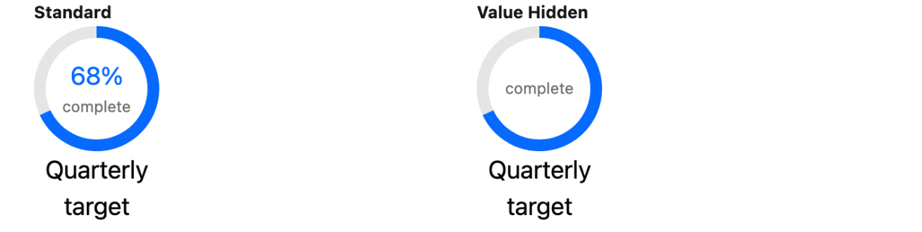
Controls whether the numeric value is shown inside the ring.

| Option                 | Description                                               |
| ---------------------- | --------------------------------------------------------- |
| **Standard** (default) | The current value is displayed in the centre of the ring. |
| **Value Hidden**       | The ring fills without showing a number inside.           |

#### Title Position

Where the title text appears relative to the ring. Options: **Top**, **Bottom** (default).

#### Size

Overall diameter of the progress circle. Options: **X-Small**, **Small**, **Medium** (default), **Large**, **X-Large**.

#### Thickness

Width of the ring stroke. Options: **X-Small**, **Small**, **Medium** (default), **Large**, **X-Large**.

#### Direction

Controls which way the colour flows from the top of the ring.

| Option             | Description                                              |
| ------------------ | -------------------------------------------------------- |
| **Fill** (default) | The ring fills clockwise as the value increases.         |
| **Drain**          | The ring drains counterclockwise as the value increases. |

#### Alternative Text

Accessible description of the component, announced to screen readers in place of the visual indicator.

### Set Component Visibility

All components support conditional visibility — see [Component Visibility](/dynamic-components/core-concepts/component-visibility.md).

## Output Variables

The Progress Circle exposes this output variable you can reference elsewhere on the page after the component renders.

### Progress State

| Output variable | Type   | What it returns                                                     |
| --------------- | ------ | ------------------------------------------------------------------- |
| **Percentage**  | Number | The current progress value expressed as a number between 0 and 100. |

> **Example:** Place a text component beside the Progress Circle and bind its content to **Percentage** to display the exact completion figure next to the ring.


---

# Agent Instructions
This documentation is published with GitBook. GitBook is the documentation platform designed so that both humans and AI agents can read, navigate, and reason over technical content effectively. Learn more at gitbook.com.

## Querying This Documentation
If you need additional information that is not directly available in this page, you can query the documentation dynamically by asking a question.

Perform an HTTP GET request on the current page URL with the `ask` query parameter, and the optional `goal` query parameter:

```
GET https://docs.avonnicomponents.com/dynamic-components/components/progress-circle.md?ask=<question>&goal=<endgoal>
```

`ask` is the immediate question: it should be specific, self-contained, and written in natural language.
`goal` is optional and describes the broader end goal you are ultimately trying to accomplish on behalf of the user. GitBook uses it to tailor the answer towards what is most useful for that goal.

The response will contain a direct answer to the question and relevant excerpts and sources from the documentation.

Use this mechanism when the answer is not explicitly present in the current page, you need clarification or additional context, or you want to retrieve related documentation sections.