# Welcome

<h2 align="center"><mark style="color:blue;">Welcome to the Avonni Components Knowledge Base</mark></h2>

<p align="center">Build powerful, custom Salesforce UIs—without code for admins, or with production-ready building blocks for developers. Our Component Suite provides pre-built components optimized for specific needs, such as enhancing <strong>Flows</strong>, customizing <strong>Lightning Pages</strong>, building <strong>Experience Cloud sites</strong>, or writing your own <strong>Lightning Web Components</strong>.</p>

<table data-view="cards"><thead><tr><th></th><th></th><th data-hidden data-card-cover data-type="image">Cover image</th><th data-hidden data-card-target data-type="content-ref"></th></tr></thead><tbody><tr><td><strong>App Builder Components</strong></td><td>Extend your Salesforce Lightning pages with <strong>15+ lightweight, high-performance components</strong> that integrate seamlessly into Lightning App Builder.</td><td><a href="https://4064884509-files.gitbook.io/~/files/v0/b/gitbook-x-prod.appspot.com/o/spaces%2FtAjHpTxL9rEknLdE4DOb%2Fuploads%2FsGLZ5bonV3jKf7XTGGaV%2FCopie%20de%20March%2028th%2C%20at%201200%20PM%20ET%20(Noon%20Eastern%20Time)%20(Vignette%20YouTube)%20(4).png?alt=media&#x26;token=ea2834db-d9b9-419a-8bc5-110748eba1f8">https://4064884509-files.gitbook.io/~/files/v0/b/gitbook-x-prod.appspot.com/o/spaces%2FtAjHpTxL9rEknLdE4DOb%2Fuploads%2FsGLZ5bonV3jKf7XTGGaV%2FCopie%20de%20March%2028th%2C%20at%201200%20PM%20ET%20(Noon%20Eastern%20Time)%20(Vignette%20YouTube)%20(4).png?alt=media&#x26;token=ea2834db-d9b9-419a-8bc5-110748eba1f8</a></td><td><a href="https://app.gitbook.com/s/uaBTxA8eavv941HMiZFW/">https://app.gitbook.com/s/uaBTxA8eavv941HMiZFW/</a></td></tr><tr><td><strong>Dynamic Components</strong></td><td>Build custom, reusable, high-performance UI components <strong>directly</strong> on your Salesforce <strong>App Pages, Record Pages, and Home Pages</strong>.</td><td><a href="https://4064884509-files.gitbook.io/~/files/v0/b/gitbook-x-prod.appspot.com/o/spaces%2FtAjHpTxL9rEknLdE4DOb%2Fuploads%2FsidlIIV2KNSfuvFlGwze%2FCopie%20de%20March%2028th%2C%20at%201200%20PM%20ET%20(Noon%20Eastern%20Time)%20(Vignette%20YouTube)%20(6).png?alt=media&#x26;token=8c6594f6-fe12-466b-8493-4325fc732557">https://4064884509-files.gitbook.io/~/files/v0/b/gitbook-x-prod.appspot.com/o/spaces%2FtAjHpTxL9rEknLdE4DOb%2Fuploads%2FsidlIIV2KNSfuvFlGwze%2FCopie%20de%20March%2028th%2C%20at%201200%20PM%20ET%20(Noon%20Eastern%20Time)%20(Vignette%20YouTube)%20(6).png?alt=media&#x26;token=8c6594f6-fe12-466b-8493-4325fc732557</a></td><td><a href="https://app.gitbook.com/s/ODPvvv7Cx9Z9RECLn3oV/">https://app.gitbook.com/s/ODPvvv7Cx9Z9RECLn3oV/</a></td></tr><tr><td><strong>Experience Sites Components</strong></td><td>Design engaging and branded digital experiences for your customers and partners on <strong>Experience Cloud sites</strong></td><td><a href="https://4064884509-files.gitbook.io/~/files/v0/b/gitbook-x-prod.appspot.com/o/spaces%2FtAjHpTxL9rEknLdE4DOb%2Fuploads%2FquZ5KYDIqdCUciAyV0Pe%2FCopie%20de%20March%2028th%2C%20at%201200%20PM%20ET%20(Noon%20Eastern%20Time)%20(Vignette%20YouTube)%20(7).png?alt=media&#x26;token=bec2a344-09bb-4ca9-acaf-f7821ce2b29a">https://4064884509-files.gitbook.io/~/files/v0/b/gitbook-x-prod.appspot.com/o/spaces%2FtAjHpTxL9rEknLdE4DOb%2Fuploads%2FquZ5KYDIqdCUciAyV0Pe%2FCopie%20de%20March%2028th%2C%20at%201200%20PM%20ET%20(Noon%20Eastern%20Time)%20(Vignette%20YouTube)%20(7).png?alt=media&#x26;token=bec2a344-09bb-4ca9-acaf-f7821ce2b29a</a></td><td><a href="https://app.gitbook.com/s/DL6JQuZArjJeQvX2ot4y/">https://app.gitbook.com/s/DL6JQuZArjJeQvX2ot4y/</a></td></tr><tr><td><strong>Flow Screen Components</strong></td><td>Improve data collection screens, create engaging multi-step wizards, and <strong>make your screen flows more user-friendly</strong>.</td><td><a href="https://4064884509-files.gitbook.io/~/files/v0/b/gitbook-x-prod.appspot.com/o/spaces%2FtAjHpTxL9rEknLdE4DOb%2Fuploads%2FFnOn682aAiS0XpO6eidw%2FCopie%20de%20March%2028th%2C%20at%201200%20PM%20ET%20(Noon%20Eastern%20Time)%20(Vignette%20YouTube)%20(5).png?alt=media&#x26;token=aad8f021-9893-4835-9800-bf08b283df98">https://4064884509-files.gitbook.io/~/files/v0/b/gitbook-x-prod.appspot.com/o/spaces%2FtAjHpTxL9rEknLdE4DOb%2Fuploads%2FFnOn682aAiS0XpO6eidw%2FCopie%20de%20March%2028th%2C%20at%201200%20PM%20ET%20(Noon%20Eastern%20Time)%20(Vignette%20YouTube)%20(5).png?alt=media&#x26;token=aad8f021-9893-4835-9800-bf08b283df98</a></td><td><a href="https://app.gitbook.com/s/1FUd4apB9YHgCEMUFbVb/">https://app.gitbook.com/s/1FUd4apB9YHgCEMUFbVb/</a></td></tr><tr><td><strong>LWC Components</strong></td><td>Build your own Lightning Web Components with <strong>55+ production-ready avonni-* building blocks</strong>, including 12 Data Driven components that query records with zero Apex.</td><td></td><td><a href="https://app.gitbook.com/s/PjQbBtFNxVSSOtnsjuwx/">https://app.gitbook.com/s/PjQbBtFNxVSSOtnsjuwx/</a></td></tr><tr><td><strong>Tutorial Projects</strong></td><td>Learn by doing! Follow step-by-step guides to build practical, real-world solutions using various Avonni Components across different platforms.</td><td><a href="https://4064884509-files.gitbook.io/~/files/v0/b/gitbook-x-prod.appspot.com/o/spaces%2FtAjHpTxL9rEknLdE4DOb%2Fuploads%2FdoADYs4zuX2bEqkB9Y2q%2FCopie%20de%20March%2028th%2C%20at%201200%20PM%20ET%20(Noon%20Eastern%20Time)%20(Vignette%20YouTube)%20(8).png?alt=media&#x26;token=f4394c71-eb33-48a7-9b50-2435182c9097">https://4064884509-files.gitbook.io/~/files/v0/b/gitbook-x-prod.appspot.com/o/spaces%2FtAjHpTxL9rEknLdE4DOb%2Fuploads%2FdoADYs4zuX2bEqkB9Y2q%2FCopie%20de%20March%2028th%2C%20at%201200%20PM%20ET%20(Noon%20Eastern%20Time)%20(Vignette%20YouTube)%20(8).png?alt=media&#x26;token=f4394c71-eb33-48a7-9b50-2435182c9097</a></td><td><a href="https://docs.avonnicomponents.com/projects">https://docs.avonnicomponents.com/projects</a></td></tr><tr><td><strong>Release Notes</strong></td><td>Stay up-to-date! Find detailed information about new features, improvements, and bug fixes for all Avonni Components packages in each version release</td><td><a href="https://4064884509-files.gitbook.io/~/files/v0/b/gitbook-x-prod.appspot.com/o/spaces%2FtAjHpTxL9rEknLdE4DOb%2Fuploads%2FRsG5Fak5J8Bq2zS7I9Cn%2FCopie%20de%20March%2028th%2C%20at%201200%20PM%20ET%20(Noon%20Eastern%20Time)%20(Vignette%20YouTube)%20(9).png?alt=media&#x26;token=7d773281-0d7e-4623-889b-1a81f4cbd84f">https://4064884509-files.gitbook.io/~/files/v0/b/gitbook-x-prod.appspot.com/o/spaces%2FtAjHpTxL9rEknLdE4DOb%2Fuploads%2FRsG5Fak5J8Bq2zS7I9Cn%2FCopie%20de%20March%2028th%2C%20at%201200%20PM%20ET%20(Noon%20Eastern%20Time)%20(Vignette%20YouTube)%20(9).png?alt=media&#x26;token=7d773281-0d7e-4623-889b-1a81f4cbd84f</a></td><td><a href="https://app.gitbook.com/o/9SPYZVrIHB81fz19OpSr/s/KhdnlWvAsVCp5hWw4Mfd/">https://app.gitbook.com/o/9SPYZVrIHB81fz19OpSr/s/KhdnlWvAsVCp5hWw4Mfd/</a></td></tr></tbody></table>

<h2 align="center"><mark style="color:blue;">Welcome to the Avonni Components Knowledge Base</mark></h2>

<p align="center">Build powerful, custom Salesforce UIs—without code for admins, or with production-ready building blocks for developers. Our Component Suite provides pre-built components optimized for specific needs, such as enhancing <strong>Flows</strong>, customizing <strong>Lightning Pages</strong>, building <strong>Experience Cloud sites</strong>, or writing your own <strong>Lightning Web Components</strong>.</p>

{% hint style="success" %}

#### **New: build with an AI assistant** 🪄

Describe what you want in plain language, and an AI assistant such as Claude, Cursor, or GitHub Copilot builds real Avonni components: on Lightning pages, in screen flows, on Experience Sites, and in your own code.

<a href="/pages/AzTcmSmoniT9ZdYK2KTq" class="button primary" data-icon="wand-magic-sparkles">Discover Build with AI</a>
{% endhint %}

<table data-view="cards"><thead><tr><th></th><th></th><th data-hidden data-card-cover data-type="image">Cover image</th><th data-hidden data-card-target data-type="content-ref"></th></tr></thead><tbody><tr><td><strong>App Builder Components</strong></td><td>Extend your Salesforce Lightning pages with <strong>15+ lightweight, high-performance components</strong> that integrate seamlessly into Lightning App Builder.</td><td><a href="https://4064884509-files.gitbook.io/~/files/v0/b/gitbook-x-prod.appspot.com/o/spaces%2FtAjHpTxL9rEknLdE4DOb%2Fuploads%2FsGLZ5bonV3jKf7XTGGaV%2FCopie%20de%20March%2028th%2C%20at%201200%20PM%20ET%20(Noon%20Eastern%20Time)%20(Vignette%20YouTube)%20(4).png?alt=media&#x26;token=ea2834db-d9b9-419a-8bc5-110748eba1f8">https://4064884509-files.gitbook.io/~/files/v0/b/gitbook-x-prod.appspot.com/o/spaces%2FtAjHpTxL9rEknLdE4DOb%2Fuploads%2FsGLZ5bonV3jKf7XTGGaV%2FCopie%20de%20March%2028th%2C%20at%201200%20PM%20ET%20(Noon%20Eastern%20Time)%20(Vignette%20YouTube)%20(4).png?alt=media&#x26;token=ea2834db-d9b9-419a-8bc5-110748eba1f8</a></td><td><a href="https://app.gitbook.com/s/uaBTxA8eavv941HMiZFW/">https://app.gitbook.com/s/uaBTxA8eavv941HMiZFW/</a></td></tr><tr><td><strong>Dynamic Components</strong></td><td>Build custom, reusable, high-performance UI components <strong>directly</strong> on your Salesforce <strong>App Pages, Record Pages, and Home Pages</strong>.</td><td><a href="https://4064884509-files.gitbook.io/~/files/v0/b/gitbook-x-prod.appspot.com/o/spaces%2FtAjHpTxL9rEknLdE4DOb%2Fuploads%2FsidlIIV2KNSfuvFlGwze%2FCopie%20de%20March%2028th%2C%20at%201200%20PM%20ET%20(Noon%20Eastern%20Time)%20(Vignette%20YouTube)%20(6).png?alt=media&#x26;token=8c6594f6-fe12-466b-8493-4325fc732557">https://4064884509-files.gitbook.io/~/files/v0/b/gitbook-x-prod.appspot.com/o/spaces%2FtAjHpTxL9rEknLdE4DOb%2Fuploads%2FsidlIIV2KNSfuvFlGwze%2FCopie%20de%20March%2028th%2C%20at%201200%20PM%20ET%20(Noon%20Eastern%20Time)%20(Vignette%20YouTube)%20(6).png?alt=media&#x26;token=8c6594f6-fe12-466b-8493-4325fc732557</a></td><td><a href="https://app.gitbook.com/s/ODPvvv7Cx9Z9RECLn3oV/">https://app.gitbook.com/s/ODPvvv7Cx9Z9RECLn3oV/</a></td></tr><tr><td><strong>Experience Sites Components</strong></td><td>Design engaging and branded digital experiences for your customers and partners on <strong>Experience Cloud sites</strong></td><td><a href="https://4064884509-files.gitbook.io/~/files/v0/b/gitbook-x-prod.appspot.com/o/spaces%2FtAjHpTxL9rEknLdE4DOb%2Fuploads%2FquZ5KYDIqdCUciAyV0Pe%2FCopie%20de%20March%2028th%2C%20at%201200%20PM%20ET%20(Noon%20Eastern%20Time)%20(Vignette%20YouTube)%20(7).png?alt=media&#x26;token=bec2a344-09bb-4ca9-acaf-f7821ce2b29a">https://4064884509-files.gitbook.io/~/files/v0/b/gitbook-x-prod.appspot.com/o/spaces%2FtAjHpTxL9rEknLdE4DOb%2Fuploads%2FquZ5KYDIqdCUciAyV0Pe%2FCopie%20de%20March%2028th%2C%20at%201200%20PM%20ET%20(Noon%20Eastern%20Time)%20(Vignette%20YouTube)%20(7).png?alt=media&#x26;token=bec2a344-09bb-4ca9-acaf-f7821ce2b29a</a></td><td><a href="https://app.gitbook.com/s/DL6JQuZArjJeQvX2ot4y/">https://app.gitbook.com/s/DL6JQuZArjJeQvX2ot4y/</a></td></tr><tr><td><strong>Flow Screen Components</strong></td><td>Improve data collection screens, create engaging multi-step wizards, and <strong>make your screen flows more user-friendly</strong>.</td><td><a href="https://4064884509-files.gitbook.io/~/files/v0/b/gitbook-x-prod.appspot.com/o/spaces%2FtAjHpTxL9rEknLdE4DOb%2Fuploads%2FFnOn682aAiS0XpO6eidw%2FCopie%20de%20March%2028th%2C%20at%201200%20PM%20ET%20(Noon%20Eastern%20Time)%20(Vignette%20YouTube)%20(5).png?alt=media&#x26;token=aad8f021-9893-4835-9800-bf08b283df98">https://4064884509-files.gitbook.io/~/files/v0/b/gitbook-x-prod.appspot.com/o/spaces%2FtAjHpTxL9rEknLdE4DOb%2Fuploads%2FFnOn682aAiS0XpO6eidw%2FCopie%20de%20March%2028th%2C%20at%201200%20PM%20ET%20(Noon%20Eastern%20Time)%20(Vignette%20YouTube)%20(5).png?alt=media&#x26;token=aad8f021-9893-4835-9800-bf08b283df98</a></td><td><a href="https://app.gitbook.com/s/1FUd4apB9YHgCEMUFbVb/">https://app.gitbook.com/s/1FUd4apB9YHgCEMUFbVb/</a></td></tr><tr><td><strong>LWC Components</strong></td><td>Build your own Lightning Web Components with <strong>55+ production-ready avonni-* building blocks</strong>, including 12 Data Driven components that query records with zero Apex.</td><td></td><td><a href="https://app.gitbook.com/s/PjQbBtFNxVSSOtnsjuwx/">https://app.gitbook.com/s/PjQbBtFNxVSSOtnsjuwx/</a></td></tr><tr><td><strong>Tutorial Projects</strong></td><td>Learn by doing! Follow step-by-step guides to build practical, real-world solutions using various Avonni Components across different platforms.</td><td><a href="https://4064884509-files.gitbook.io/~/files/v0/b/gitbook-x-prod.appspot.com/o/spaces%2FtAjHpTxL9rEknLdE4DOb%2Fuploads%2FdoADYs4zuX2bEqkB9Y2q%2FCopie%20de%20March%2028th%2C%20at%201200%20PM%20ET%20(Noon%20Eastern%20Time)%20(Vignette%20YouTube)%20(8).png?alt=media&#x26;token=f4394c71-eb33-48a7-9b50-2435182c9097">https://4064884509-files.gitbook.io/~/files/v0/b/gitbook-x-prod.appspot.com/o/spaces%2FtAjHpTxL9rEknLdE4DOb%2Fuploads%2FdoADYs4zuX2bEqkB9Y2q%2FCopie%20de%20March%2028th%2C%20at%201200%20PM%20ET%20(Noon%20Eastern%20Time)%20(Vignette%20YouTube)%20(8).png?alt=media&#x26;token=f4394c71-eb33-48a7-9b50-2435182c9097</a></td><td><a href="https://docs.avonnicomponents.com/projects">https://docs.avonnicomponents.com/projects</a></td></tr><tr><td><strong>Release Notes</strong></td><td>Stay up-to-date! Find detailed information about new features, improvements, and bug fixes for all Avonni Components packages in each version release</td><td><a href="https://4064884509-files.gitbook.io/~/files/v0/b/gitbook-x-prod.appspot.com/o/spaces%2FtAjHpTxL9rEknLdE4DOb%2Fuploads%2FRsG5Fak5J8Bq2zS7I9Cn%2FCopie%20de%20March%2028th%2C%20at%201200%20PM%20ET%20(Noon%20Eastern%20Time)%20(Vignette%20YouTube)%20(9).png?alt=media&#x26;token=7d773281-0d7e-4623-889b-1a81f4cbd84f">https://4064884509-files.gitbook.io/~/files/v0/b/gitbook-x-prod.appspot.com/o/spaces%2FtAjHpTxL9rEknLdE4DOb%2Fuploads%2FRsG5Fak5J8Bq2zS7I9Cn%2FCopie%20de%20March%2028th%2C%20at%201200%20PM%20ET%20(Noon%20Eastern%20Time)%20(Vignette%20YouTube)%20(9).png?alt=media&#x26;token=7d773281-0d7e-4623-889b-1a81f4cbd84f</a></td><td><a href="https://app.gitbook.com/o/9SPYZVrIHB81fz19OpSr/s/KhdnlWvAsVCp5hWw4Mfd/">https://app.gitbook.com/o/9SPYZVrIHB81fz19OpSr/s/KhdnlWvAsVCp5hWw4Mfd/</a></td></tr></tbody></table>


# Copy of Welcome to the Avonni Documentation Hub

Everything you need to build next-generation Salesforce interfaces—from simple App Builder layouts to complex, logic-driven Flows

<table data-card-size="large" data-view="cards"><thead><tr><th></th><th data-hidden data-card-cover data-type="image">Cover image</th><th data-hidden data-card-target data-type="content-ref"></th></tr></thead><tbody><tr><td><strong>App Builder Components</strong></td><td><a href="/files/6hSwF8bwoIew1GNHlauV">/files/6hSwF8bwoIew1GNHlauV</a></td><td><a href="/spaces/uaBTxA8eavv941HMiZFW/pages/RyI43oVILgJzxdzDVDJq">/spaces/uaBTxA8eavv941HMiZFW/pages/RyI43oVILgJzxdzDVDJq</a></td></tr><tr><td><strong>Dynamic Components</strong></td><td><a href="/files/6mX23Y0QvseECLTPRIGP">/files/6mX23Y0QvseECLTPRIGP</a></td><td><a href="/spaces/ODPvvv7Cx9Z9RECLn3oV/pages/P8PVbTIIkHp8MWRGbyzg">/spaces/ODPvvv7Cx9Z9RECLn3oV/pages/P8PVbTIIkHp8MWRGbyzg</a></td></tr><tr><td><strong>Experience Sites Components</strong></td><td><a href="/files/lzM7tVnJNhQ7XoMSIekL">/files/lzM7tVnJNhQ7XoMSIekL</a></td><td><a href="/spaces/DL6JQuZArjJeQvX2ot4y/pages/sTQODzPzsh10BXBDiunM">/spaces/DL6JQuZArjJeQvX2ot4y/pages/sTQODzPzsh10BXBDiunM</a></td></tr><tr><td><strong>Flow Screen Components</strong></td><td><a href="/files/TzW6UsIs5A9TfzzAeQkZ">/files/TzW6UsIs5A9TfzzAeQkZ</a></td><td><a href="/spaces/1FUd4apB9YHgCEMUFbVb/pages/vsY0bhe34sPopQOaHImz">/spaces/1FUd4apB9YHgCEMUFbVb/pages/vsY0bhe34sPopQOaHImz</a></td></tr></tbody></table>

***

## Which Avonni Component is Right for You?

Avonni provides specialized tools for every Salesforce environment—from internal Lightning pages to external Experience Cloud sites.

While there are **four distinct component types**, they are streamlined into **two specific managed packages**. Use the guide below to determine if your project needs the Speed & Simplicity of our App Builder tools, the Advanced Logic of our Dynamic Components, or the Guided Processes of our Flow Screen suite.

Use this guide to determine if your project requires:

* Speed & Simplicity ([**App Builder Components**](/app-builder-components))
* Advanced Logic & Power ([**Dynamic Components**](broken://spaces/ODPvvv7Cx9Z9RECLn3oV/pages/P8PVbTIIkHp8MWRGbyzg))
* Guided Processes ([**Flow Screen Components**](/flow))
* External Access ([**Experience Site Components**](/experience-cloud))

***

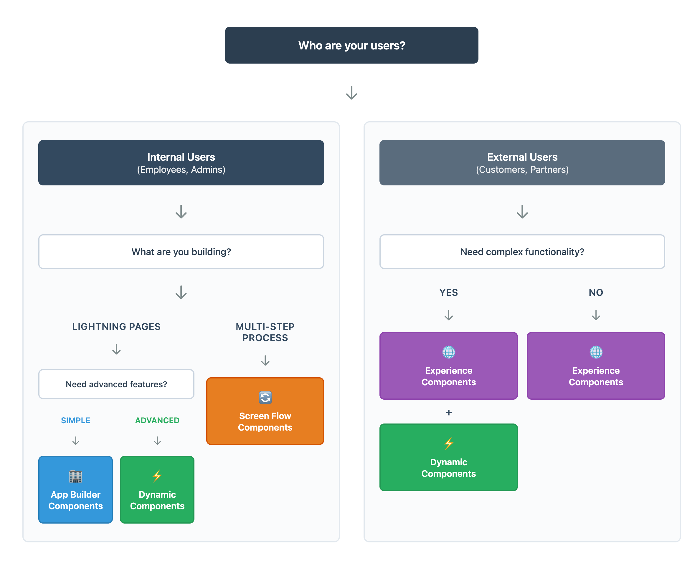
## Component Selection Flowchart

<figure><img src="/files/oSdFkfO442zCfEQxzr5C" alt=""><figcaption></figcaption></figure>

***

## Components Comparison

|                               | Avonni App Builder Components                                                                                                                                        | Avonni Dynamic Components                                                                                                                                            | Avonni Flow Screens Components                                                                                          | Avonni Experience Sites Components                                                                                                                                   |
| ----------------------------- | -------------------------------------------------------------------------------------------------------------------------------------------------------------------- | -------------------------------------------------------------------------------------------------------------------------------------------------------------------- | ----------------------------------------------------------------------------------------------------------------------- | -------------------------------------------------------------------------------------------------------------------------------------------------------------------- |
| 📦 **Required Package**       | [**Avonni Experience Components Package**](https://appexchange.salesforce.com/appxListingDetail?listingId=2e584bb3-b5e0-415d-9347-d6567158d840\&channel=recommended) | [**Avonni Experience Components Package**](https://appexchange.salesforce.com/appxListingDetail?listingId=2e584bb3-b5e0-415d-9347-d6567158d840\&channel=recommended) | [**70+ Flow Components Package**](https://appexchange.salesforce.com/listingDetail?listingId=a0N4V00000IDsfbUAD\&tab=e) | [**Avonni Experience Components Package**](https://appexchange.salesforce.com/appxListingDetail?listingId=2e584bb3-b5e0-415d-9347-d6567158d840\&channel=recommended) |
| **👥 Target Users**           | Internal                                                                                                                                                             | Any                                                                                                                                                                  | Internal                                                                                                                | External                                                                                                                                                             |
| **🏗️ Builder Tool**          | Lightning App                                                                                                                                                        | Lightning/Experience                                                                                                                                                 | Flow Builder                                                                                                            | Experience                                                                                                                                                           |
| **⚡ Complexity**              | Simple                                                                                                                                                               | Advanced                                                                                                                                                             | Standard                                                                                                                | FLexible                                                                                                                                                             |
| **🎨 Branding Customization** | Salesforce Style                                                                                                                                                     | Custom                                                                                                                                                               | Salesforce Style / Custom                                                                                               | Fully Branded                                                                                                                                                        |
| **📱 Best For**               | Quick Display                                                                                                                                                        | Complex Logic                                                                                                                                                        | Wizards                                                                                                                 | Customer Portals                                                                                                                                                     |
| 🎛️ **Setup**                 | Fast & Easy                                                                                                                                                          | More Configuration                                                                                                                                                   | Moderate                                                                                                                | Standard                                                                                                                                                             |
| **💡 Skill Level**            | Beginner-Intermediate                                                                                                                                                | Intermediate-Advanced                                                                                                                                                | Intermediate                                                                                                            | Intermediate-Advanced                                                                                                                                                |
| **🔄 Multi-Step Process**     | No                                                                                                                                                                   | No (Display Only)                                                                                                                                                    | Yes (Core Feature with Flow Builder)                                                                                    | No                                                                                                                                                                   |
| **📐 Formulas**               | No                                                                                                                                                                   | Yes                                                                                                                                                                  | Yes (via Flow Formulas)                                                                                                 | No                                                                                                                                                                   |
| **🎭 Conditional Visibility** | Yes (Core Feature within App Builder)                                                                                                                                | Yes                                                                                                                                                                  | Yes (via Flow Logic)                                                                                                    | Limited                                                                                                                                                              |
| **🌐 Guest User Support**     | No                                                                                                                                                                   | Yes                                                                                                                                                                  | Yes                                                                                                                     | Yes                                                                                                                                                                  |

***

## Component Breakdown

### 🏢 **Avonni App Builder Components**

**INTERNAL USE - LIGHTWEIGHT & QUICK -** *Part of the* [*Avonni Experience Components Package*](https://appexchange.salesforce.com/appxListingDetail?listingId=2e584bb3-b5e0-415d-9347-d6567158d840\&channel=recommended)

What you can build:

* 📊 Custom dashboards and reports
* 📝 Enhanced record page layouts
* 🏠 Personalized home page widgets
* 📋 Custom data tables and lists

Why choose this:

* ✅ Uses Salesforce styling
* ✅ Essential features only
* ✅ Fastest to implement
* ✅ Lightweight and simple setup

<a href="https://appexchange.salesforce.com/appxListingDetail?listingId=2e584bb3-b5e0-415d-9347-d6567158d840&#x26;channel=recommended" class="button primary" data-icon="inbox-in">Install the Components</a>  <a href="https://docs.avonnicomponents.com/app-builder-components/app-builder-components/explore-all-components" class="button secondary" data-icon="grid-round-2-plus">Explore the Components</a>

***

### ⚡ Avonni **Dynamic Components**

**ADVANCED FEATURES - MAXIMUM POWER -** *Part of the* [*Avonni Experience Components Package*](https://appexchange.salesforce.com/appxListingDetail?listingId=2e584bb3-b5e0-415d-9347-d6567158d840\&channel=recommended)

What you can build:

* 🔄 Real-time data updates
* 🧠 Complex business logic with formulas
* 🎛️ Interactive interfaces
* 📈 High-performance applications
* 🎨 Custom styling options

Why choose this:

* ✅ Maximum flexibility
* ✅ Deep customization
* ✅ Formula support
* ⚠️ More complex configuration

<a href="https://appexchange.salesforce.com/appxListingDetail?listingId=2e584bb3-b5e0-415d-9347-d6567158d840&#x26;channel=recommended" class="button primary" data-icon="inbox-in">Install the Components</a>  <a href="https://docs.avonnicomponents.com/dynamic-components" class="button secondary" data-icon="grid-round-2-plus">Explore the Components</a>

***

### 🔄 Avonni **Flow Screen Components**

**MULTI-STEP PROCESSES - GUIDED EXPERIENCES -** *Part of the* [*70+ Flow Components Package*](https://appexchange.salesforce.com/appxlistingdetail?listingid=a0n4v00000idsfbuad\&tab=e)

What you can build:

* 🧭 Multi-step wizards
* 📝 Data collection forms
* 🎯 Guided user workflows
* ✨ Step-by-step navigation
* 📋 Process-driven interfaces

Why choose this:

* ✅ Built for Flow Builder
* ✅ Perfect for sequential processes
* ✅ Guided user experience
* ✅ Ideal for data collection

<a href="https://appexchange.salesforce.com/listingDetail?listingId=a0N4V00000IDsfbUAD&#x26;tab=e" class="button primary" data-icon="inbox-in">Install the Components</a>  <a href="https://docs.avonnicomponents.com/flow" class="button secondary" data-icon="grid-round-2-plus">Explore the Components</a>

***

### 🌐 **Avonni Experience Site Components**

**EXTERNAL FACING - BRANDED EXPERIENCES -** *Part of the* [*Avonni Experience Components Package*](https://appexchange.salesforce.com/appxListingDetail?listingId=2e584bb3-b5e0-415d-9347-d6567158d840\&channel=recommended)

What you can build:

* 🛒 Customer portals
* 🤝 Partner sites
* 💬 Community platforms
* 📚 Knowledge bases

Why choose this:

* ✅ Full brand customization
* ✅ Public-facing design
* ✅ Optimized for external users

<a href="https://appexchange.salesforce.com/appxListingDetail?listingId=2e584bb3-b5e0-415d-9347-d6567158d840&#x26;channel=recommended" class="button primary" data-icon="inbox-in">Install the Components</a>  <a href="https://docs.avonnicomponents.com/experience-cloud/experience-components/view-all-components" class="button secondary" data-icon="grid-round-2-plus">Explore the Components</a>

***

## Detailed Comparison: App Builder vs Dynamic

**When to choose Avonni App Builder over Dynamic:**

* ✅ You need quick setup with minimal configuration
* ✅ Essential features are sufficient for your use case
* ✅ You want lightweight components
* ✅ Speed of implementation is priority

**When to choose Avonni Dynamic over App Builder:**

* ✅ You need formula support and calculations
* ✅ Complex business logic is required
* ✅ Custom styling beyond Salesforce standard is needed
* ✅ You need nested components and conditional visibility for reactive interfaces
* ✅ You're comfortable with more configuration options
* ✅ You need deeper customization capabilities

***

## 🚀 Ready to Install?

The Avonni Suite is delivered via two powerful managed packages. Select the package that matches your chosen path:

**Option A: The Experience Package**

📦 Package Name: Avonni Experience Components

Choose this if you need:

* 🏢 App Builder Components (Dashboards, Simple Layouts)
* ⚡ Dynamic Components (Advanced Logic, Formulas)
* 🌐 Experience Site Components (Portals, External Sites)

👉 [**Get the Avonni Experience Components Package**](https://appexchange.salesforce.com/appxListingDetail?listingId=2e584bb3-b5e0-415d-9347-d6567158d840\&channel=recommended)

**Option B: The Flow Package**

📦 Package Name: 70+ Flow Components&#x20;

Choose this if you need:

* 🔄 Flow Screen Components (Wizards, Guided Workflows, Data Collection)

👉 [**Get the 70+ Flow Components Package**](https://appexchange.salesforce.com/appxlistingdetail?listingid=a0n4v00000idsfbuad\&tab=e)

***

**💡 Still unsure?** Check out our [**Tutorial Projects**](/projects) to see each component type in action!


# Build with AI

Build Avonni components by describing what you want in plain language: one MCP server, one skill set, four Salesforce surfaces.

You can now build with Avonni by describing what you want in plain language. An AI assistant such as Claude, Cursor, or GitHub Copilot creates real, working Avonni components: on Lightning pages, in screen flows, on Experience Sites, and in your own LWC code.

This page is the short version of how it works, what you need, and where to go next.

## How it works

Avonni ships two things that turn a general-purpose AI assistant into an Avonni specialist:

<table><thead><tr><th width="215"></th><th></th></tr></thead><tbody><tr><td>🧠 <strong>Avonni MCP server</strong></td><td>A hosted documentation service at <code>https://mcp.avonnicomponents.com</code>. It gives the assistant accurate, always up-to-date knowledge of every component: properties, interactions, and styling hooks, refreshed with each release. Nothing to install or run.</td></tr><tr><td>🛠️ <strong>Avonni Skills</strong></td><td>Step-by-step workflows from the public <a href="https://github.com/avonni/skills">avonni/skills</a> repository. They teach the assistant how to create and update each kind of Avonni artifact, and how to verify every detail against the MCP server before writing it.</td></tr></tbody></table>

{% hint style="success" %}
**The skills tell the assistant what to do; the MCP server tells it what's true.** Using one without the other gives worse results. Install both.
{% endhint %}

## What building looks like

You describe the outcome; the assistant looks up the real components and builds. A few examples, one per surface:

> *"Create an Avonni Dynamic Component for the Account record page: a Data Table of the account's open Cases with inline editing."* — **Lightning pages**

> *"Create a screen flow where the user picks an appointment date on an Avonni Date Picker, then confirms on a summary screen."* — **Screen flows**

> *"Add an Avonni Kanban of Cases grouped by status to my customer portal page."* — **Experience Sites**

> *"Add an Avonni Data Table of Cases to my component, with sorting and inline editing."* — **Your own LWC code**

For complete use cases that span several artifacts (a page component plus the flow it launches, for example), the `avonni-architect` skill plans the pieces and builds them in the right order.

## Get set up in about 10 minutes

Five steps, one time. After that, you just describe what you want.

{% hint style="info" %}
**Not a developer?** You can do the whole setup from the Claude desktop app without touching a terminal: open a folder (step 2), then paste the commands from steps 3 and 4 into the chat and ask Claude to run them. Claude Code runs commands for you; you just approve.
{% endhint %}

{% stepper %}
{% step %}

### Get the foundation ready

Two installs power everything. Without them, the assistant can read documentation but cannot build or save anything.

1. Install [**Node.js**](https://nodejs.org/en/download) (version 18 or later). Download, run the installer, accept the defaults.
2. Install the [**Salesforce CLI**](https://developer.salesforce.com/docs/atlas.en-us.sfdx_setup.meta/sfdx_setup/sfdx_setup_install_cli.htm), then connect it to your Salesforce org:

```bash
sf org login web
```

This opens a browser window where you log in to Salesforce as usual. That's it: the CLI now acts on your behalf.
{% endstep %}

{% step %}

### Open a project folder

The assistant works inside a folder on your computer, where it saves the files it creates. Any folder works: create an empty one ("Avonni AI" on your Desktop is fine) and open it in your tool.

* **Claude desktop app or Claude Code**: open the folder as your project.
* **Cursor, VS Code**: File, then Open Folder.
  {% endstep %}

{% step %}

### Install the Avonni Skills

One command installs all five skills into the open project:

```bash
npx skills add avonni/skills
```

Run it in the terminal, or paste it into the Claude chat and ask Claude to run it.
{% endstep %}

{% step %}

### Connect the Avonni MCP server

The server is hosted by Avonni: nothing to install, you just point your assistant at it.

* **Claude desktop app or Claude Code**: run this command (or paste it into the chat, same as step 3):

```bash
claude mcp add --transport http avonni https://mcp.avonnicomponents.com
```

* **Cursor, VS Code, GitHub Copilot**: add `https://mcp.avonnicomponents.com` as an MCP server in your editor's JSON config (for example `.cursor/mcp.json`).
  {% endstep %}

{% step %}

### Test it, then build

Ask your assistant: *"List the available Avonni components."*

A real component list means everything is connected. Now describe your first component, like the examples above, and watch it build.
{% endstep %}
{% endstepper %}

{% hint style="info" %}
**Nothing is deployed automatically.** The assistant writes files locally; you review them and deploy with your usual process. Your org is never touched without you.
{% endhint %}

## Go deeper by product

Each documentation hub has a complete Build with AI section: setup details, prompt libraries, and limitations, written for that surface.

<table data-view="cards"><thead><tr><th></th><th></th><th data-hidden data-card-target data-type="content-ref"></th></tr></thead><tbody><tr><td>⚡ <strong>Dynamic Components</strong></td><td>Build components for Lightning pages from prompts.</td><td><a href="https://docs.avonnicomponents.com/dynamic-components/build-with-ai/overview">https://docs.avonnicomponents.com/dynamic-components/build-with-ai/overview</a></td></tr><tr><td>🔀 <strong>Flow Screen Components</strong></td><td>Build screen flows around Avonni components from prompts.</td><td><a href="https://docs.avonnicomponents.com/flow/build-with-ai/overview">https://docs.avonnicomponents.com/flow/build-with-ai/overview</a></td></tr><tr><td>🖥️ <strong>Experience Sites Components</strong></td><td>Add and configure Avonni components on portal pages from prompts.</td><td><a href="https://docs.avonnicomponents.com/experience-cloud/build-with-ai/overview">https://docs.avonnicomponents.com/experience-cloud/build-with-ai/overview</a></td></tr><tr><td>🧩 <strong>LWC Components</strong></td><td>Write avonni-* markup and code in your own LWCs from prompts.</td><td><a href="https://docs.avonnicomponents.com/lwc-components/build-with-ai/overview">https://docs.avonnicomponents.com/lwc-components/build-with-ai/overview</a></td></tr></tbody></table>

## For AI agents

This documentation is itself machine-readable: append `.md` to any page URL for clean Markdown, read the full index at [`llms.txt`](https://docs.avonnicomponents.com/llms.txt) (or the whole corpus at [`llms-full.txt`](https://docs.avonnicomponents.com/llms-full.txt)), and ask any page a question with `GET <page>.md?ask=<question>`. The structured component catalog lives on the MCP server at `https://mcp.avonnicomponents.com`.


# Selection Guide

## Choosing the right Avonni Components Package

At Avonni, we provide **four component lines** designed to supercharge different areas of the Salesforce platform, delivered through **three managed packages**. Three of the lines are no-code builders for admins. The fourth, **LWC Components**, is a code library for developers. Same component family, four Salesforce surfaces: pages, flows, sites, and your own code.

The most important thing to know is that **these are not "either/or" solutions**. Many Avonni power users install more than one package to create a seamless, high-performance user experience. To choose the right package for your current task, start by asking yourself: **"Where am I building in Salesforce today?"**

***

## Identify Your Needs

Your choice depends on which Salesforce "Builder" environment you are currently using — or whether you are writing code yourself.

#### I am in the Flow Builder

* **You need**: The [**70+ Flow Screen Components package**](https://appexchange.salesforce.com/listingDetail?listingId=a0N4V00000IDsfbUAD\&tab=e).
* **The Goal**: You are building a guided process. You need to move a user through a series of steps (Step 1 → Step 2 → Step 3) to collect data or perform complex logic.
* **Key Strength**: These components live within your Flow variables, enabling deep integration with your business logic and automation.

#### I am in the Lightning App Builder or Experience Builder

* **You need**: The [**Experience & Dynamic Components package**](https://appexchange.salesforce.com/appxListingDetail?listingId=2e584bb3-b5e0-415d-9347-d6567158d840\&channel=recommended). One install covers the App Builder, Dynamic, and Experience Site component lines.
* **The Goal**: You are building a page layout. You want to enhance a standard Record Page (Account, Opportunity, etc.), a Home Page, or a public-facing Experience Site.
* **Key Strength**: These components are "always-on" and reactive. They live directly on the page layout and don't require a user to "launch" a Flow to see information.

#### I am writing my own Lightning Web Components

* **You need**: The [**LWC Components package**](https://appexchange.salesforce.com/appxListingDetail?listingId=a0N4V00000FiERkUAN) — for your own code.
* **The Goal**: You're a developer writing your own Lightning Web Components, and you want production-ready building blocks instead of starting from scratch. You get 55+ components you reference with `avonni-*` tags, exactly like the standard `lightning-*` ones.
* **Key Strength**: The 12 Data Driven components (Data Table, Kanban, Scheduler, Map, Pivot Table and more) can query records themselves, so a full data table is about 30 lines of configuration with no Apex controller behind it.

**Choose LWC Components if:**

* Your team writes custom LWC and keeps rebuilding tables, boards, calendars and maps
* You want zero Apex for the data-display layer (query mode handles fetching, search, sort, filter, pagination)
* You use AI assistants to write LWC and want them generating against a discoverable component catalog instead of scaffolding black boxes

**Install:** [AppExchange listing](https://appexchange.salesforce.com/appxListingDetail?listingId=a0N4V00000FiERkUAN) · **Docs:** [LWC Components documentation](https://docs.avonnicomponents.com/lwc-components)

{% hint style="success" %}

#### 💡 Pro-Tip: The Hybrid Builder Strategy

Most Avonni power users don't choose just one; they use a Hybrid Approach. They use [**Dynamic Components**](https://app.gitbook.com/s/ODPvvv7Cx9Z9RECLn3oV/) to build a high-performance, reactive dashboard directly on a Record Page, and then use a "Button" or "Interaction" within that component to launch an [**Avonni Screen Flow**](https://app.gitbook.com/s/1FUd4apB9YHgCEMUFbVb/) (for complex data entry or specific tasks). Developers can join in too: the same `avonni-*` components power your custom LWC through the [LWC Components package](https://docs.avonnicomponents.com/lwc-components). They all work together in the same org!
{% endhint %}

***

## Component Line Summary

| Component line              | Where it runs                       | Who it's for | Managed package      |
| --------------------------- | ----------------------------------- | ------------ | -------------------- |
| Dynamic Components          | Lightning pages (App Builder)       | Admins       | Experience & Dynamic |
| Flow Screen Components      | Processes (Flow Builder)            | Admins       | Flow                 |
| Experience Cloud Components | External sites (Experience Builder) | Admins       | Experience & Dynamic |
| LWC Components              | Your own LWC code                   | Developers   | LWC Components       |

***

## Component Selection Flowchart

The flowchart below covers the no-code builder packages. If you are writing your own LWC code, go straight to [LWC Components](https://docs.avonnicomponents.com/lwc-components).

<figure><img src="https://4064884509-files.gitbook.io/~/files/v0/b/gitbook-x-prod.appspot.com/o/spaces%2FtAjHpTxL9rEknLdE4DOb%2Fuploads%2FoY2XVAw4nZBuUd5VPHkp%2F2025-09-29_15-35-50.png?alt=media&#x26;token=988fd23f-6457-45eb-a003-b7a4b6c7f707" alt=""><figcaption></figcaption></figure>

***

## Better Together: The "Extension" Architecture

Installing the **Avonni Experience Components package** is not an "upgrade" that replaces your Flow components—it is an **extension** of your no-code capabilities.

**Why use both?**

* **Modern UI**: Use Dynamic Components to make your standard Salesforce pages look and feel like custom-coded applications.
* **Triggered Logic**: Use those beautiful components to trigger your existing Screen Flows. For example, clicking a "Schedule Meeting" button on an Avonni Timeline can launch a Flow that handles the calendar logic.
* **Custom Code**: When your team needs something the builders don't cover, developers build it with the LWC Components package — using the same component family, so the UI stays consistent across the org.

***

## Frequently Asked Questions

**Q: Do I need to uninstall my Flow Components to use Dynamic Components?**\
A: No! All Avonni packages are designed to coexist. Installing one does not impact the performance or functionality of the others.

**Q: Which package should I start with?**\
A: If your priority is building automated business processes, start with the [**Flow Package**](https://appexchange.salesforce.com/listingDetail?listingId=a0N4V00000IDsfbUAD\&tab=e). If your priority is improving the look and feel of your Account/Contact pages or Experience Sites, start with the [**Experience Package**](https://appexchange.salesforce.com/appxListingDetail?listingId=2e584bb3-b5e0-415d-9347-d6567158d840\&channel=recommended). If your team writes its own Lightning Web Components, start with the [**LWC Components Package**](https://appexchange.salesforce.com/appxListingDetail?listingId=a0N4V00000FiERkUAN).

**Q: I am using the Flow Components. What is my path forward?**\
A: Continue using this package for all your Flow needs! If you want to start adding components directly to your Lightning Record Pages (outside of a Flow), simply install the **Experience Package** alongside it.

**Q: I'm a developer. Do I need the no-code packages to use LWC Components?**\
A: No. LWC Components is a standalone package: install it and reference any `avonni-*` component directly in your own LWC code. If admins in your org also use the no-code builders, the packages coexist without conflict — and your custom code shares the same component family as their pages, flows, and sites.


# Feature Comparison

Five component lines, one question: where are you building today? Compare at a glance, then dive into the details.

## Compare the Avonni Component Types

The Avonni Suite is designed to meet you where you work: the Flow Builder, the Lightning App Builder, Experience Cloud, or your own codebase. Components may share names (like "Button" or "Data Table"), but their capabilities differ depending on where they run.

Start with one question: **where are you building today?**

## At a glance

| Component line       | Where you build       | Best for           | Skill level           |
| -------------------- | --------------------- | ------------------ | --------------------- |
| **App Builder**      | Lightning App Builder | Quick display      | Beginner              |
| **Dynamic**          | Lightning/Experience  | Complex logic      | Intermediate-Advanced |
| **Flow Screen**      | Flow Builder          | Wizards            | Intermediate          |
| **Experience Sites** | Experience Builder    | Customer portals   | Intermediate-Advanced |
| **LWC**              | Your own code         | Custom development | Developer             |

## Find your fit

Open the tab that matches your project. Each one tells you what the line does best, and when to pick a different one.

{% tabs %}
{% tab title="🧩 App Builder" %}
**Fast, standard dashboards on Lightning pages.** Drag, drop, done.

* Simple setup, Salesforce look and feel
* Conditional visibility built into App Builder
* Lightweight components for quick display

**Pick a different line if** you need reactive formulas, custom branding, or components that talk to each other: that's [Dynamic Components](https://app.gitbook.com/s/ODPvvv7Cx9Z9RECLn3oV/).

📦 Included in the [Experience & Dynamic Components package](https://appexchange.salesforce.com/appxListingDetail?listingId=2e584bb3-b5e0-415d-9347-d6567158d840\&channel=recommended)
{% endtab %}

{% tab title="⚡ Dynamic" %}
**Advanced, reactive interfaces directly on your pages.** The closest thing to custom development without code.

* Formulas, real-time updates, and conditional visibility on the page
* Components react to each other and to record changes
* Custom branding beyond the Salesforce style
* Works for internal pages and guest users alike

**Pick a different line if** you need a multi-step guided process: that's [Flow Screen Components](https://app.gitbook.com/s/1FUd4apB9YHgCEMUFbVb/).

📦 Included in the [Experience & Dynamic Components package](https://appexchange.salesforce.com/appxListingDetail?listingId=2e584bb3-b5e0-415d-9347-d6567158d840\&channel=recommended)
{% endtab %}

{% tab title="🔀 Flow Screen" %}
**Multi-step wizards and guided data collection.** The only line built around a process, not a page.

* 70+ components that live inside your Flow variables
* Deep integration with Flow logic, formulas, and automation
* Multi-step processes as a core feature

**Pick a different line if** you want always-on content on a page, with no flow to launch: that's [Dynamic Components](https://app.gitbook.com/s/ODPvvv7Cx9Z9RECLn3oV/).

📦 [70+ Flow Components package](https://appexchange.salesforce.com/listingDetail?listingId=a0N4V00000IDsfbUAD\&tab=e)
{% endtab %}

{% tab title="🖥️ Experience Sites" %}
**Branded portals for customers and partners.** Built for external users.

* Fully branded, beyond the Salesforce look
* Designed for Experience Cloud sites and guest access
* Flexible layouts for public-facing pages

**Pick a different line if** your audience is internal only: App Builder or [Dynamic Components](https://app.gitbook.com/s/ODPvvv7Cx9Z9RECLn3oV/) cover that with less setup.

📦 Included in the [Experience & Dynamic Components package](https://appexchange.salesforce.com/appxListingDetail?listingId=2e584bb3-b5e0-415d-9347-d6567158d840\&channel=recommended)
{% endtab %}

{% tab title="💻 LWC" %}
**Production-ready building blocks for your own code.** For developers writing Lightning Web Components.

* 55+ components you reference with `avonni-*` tags, like the standard `lightning-*` ones
* 12 Data Driven components that query records themselves, with zero Apex
* Full control: your logic in JavaScript, your styling through CSS and styling hooks

**Pick a different line if** nobody on the team writes code: the no-code builders cover pages, flows, and sites.

📦 [Avonni LWC Components package](https://appexchange.salesforce.com/appxListingDetail?listingId=a0N4V00000FiERkUAN) · [Documentation](https://docs.avonnicomponents.com/lwc-components)
{% endtab %}
{% endtabs %}

## The full matrix

For a side-by-side view of every capability, expand the table below.

<details>

<summary>See the complete feature matrix</summary>

|                               | App Builder                                                                                                                                          | Dynamic                                                                                                                                              | Flow Screen                                                                                                     | Experience Sites                                                                                                                                     | LWC                                                                                                     |
| ----------------------------- | ---------------------------------------------------------------------------------------------------------------------------------------------------- | ---------------------------------------------------------------------------------------------------------------------------------------------------- | --------------------------------------------------------------------------------------------------------------- | ---------------------------------------------------------------------------------------------------------------------------------------------------- | ------------------------------------------------------------------------------------------------------- |
| 📦 **Required Package**       | [**Experience & Dynamic**](https://appexchange.salesforce.com/appxListingDetail?listingId=2e584bb3-b5e0-415d-9347-d6567158d840\&channel=recommended) | [**Experience & Dynamic**](https://appexchange.salesforce.com/appxListingDetail?listingId=2e584bb3-b5e0-415d-9347-d6567158d840\&channel=recommended) | [**70+ Flow Components**](https://appexchange.salesforce.com/listingDetail?listingId=a0N4V00000IDsfbUAD\&tab=e) | [**Experience & Dynamic**](https://appexchange.salesforce.com/appxListingDetail?listingId=2e584bb3-b5e0-415d-9347-d6567158d840\&channel=recommended) | [**LWC Components**](https://appexchange.salesforce.com/appxListingDetail?listingId=a0N4V00000FiERkUAN) |
| 👥 **Target Users**           | Internal                                                                                                                                             | Any                                                                                                                                                  | Internal                                                                                                        | External                                                                                                                                             | Any (developer-built)                                                                                   |
| 🏗️ **Builder Tool**          | Lightning App                                                                                                                                        | Lightning/Experience                                                                                                                                 | Flow Builder                                                                                                    | Experience                                                                                                                                           | Your own LWC code                                                                                       |
| ⚡ **Complexity**              | Simple                                                                                                                                               | Advanced                                                                                                                                             | Standard                                                                                                        | Flexible                                                                                                                                             | Code-based                                                                                              |
| 🎨 **Branding Customization** | Salesforce Style                                                                                                                                     | Custom                                                                                                                                               | Salesforce Style / Custom                                                                                       | Fully Branded                                                                                                                                        | Fully Custom (CSS & styling hooks)                                                                      |
| 📱 **Best For**               | Quick Display                                                                                                                                        | Complex Logic                                                                                                                                        | Wizards                                                                                                         | Customer Portals                                                                                                                                     | Custom Development                                                                                      |
| 🎛️ **Setup**                 | Fast & Easy                                                                                                                                          | More Configuration                                                                                                                                   | Moderate                                                                                                        | Standard                                                                                                                                             | Code (tags & attributes)                                                                                |
| 💡 **Skill Level**            | Beginner-Intermediate                                                                                                                                | Intermediate-Advanced                                                                                                                                | Intermediate                                                                                                    | Intermediate-Advanced                                                                                                                                | Developer                                                                                               |
| 🔄 **Multi-Step Process**     | No                                                                                                                                                   | No (Display Only)                                                                                                                                    | Yes (Core Feature with Flow Builder)                                                                            | No                                                                                                                                                   | Yes (your own logic)                                                                                    |
| 📐 **Formulas**               | No                                                                                                                                                   | Yes                                                                                                                                                  | Yes (via Flow Formulas)                                                                                         | No                                                                                                                                                   | Yes (via JavaScript)                                                                                    |
| 🎭 **Conditional Visibility** | Yes (Core Feature within App Builder)                                                                                                                | Yes                                                                                                                                                  | Yes (via Flow Logic)                                                                                            | Limited                                                                                                                                              | Yes (via code)                                                                                          |
| 🌐 **Guest User Support**     | No                                                                                                                                                   | Yes                                                                                                                                                  | Yes                                                                                                             | Yes                                                                                                                                                  | Yes                                                                                                     |

</details>

{% hint style="info" %}
Still deciding? The [Selection Guide](/choosing-the-right-components/selection-guide) walks you through the choice, and [Installation & Package](/choosing-the-right-components/installation-and-package) maps each line to its AppExchange package.
{% endhint %}


# Installation & Package

## Overview

To ensure your Salesforce org stays clean and performant, the Avonni Component Suite is delivered via three specialized managed packages.

Instead of installing one massive library, you simply choose the package that matches the way you build: Page Building (Lightning App Builder / Experience Builder), Process Building (Flow Builder), or Custom Development (your own LWC code).

***

## Option A - The Experience Package

The Avonni Experience Components Package Sub-headline: Best for Lightning Pages, Dashboards, and Community Sites

This is our primary package for building custom interfaces. It includes a comprehensive suite of components designed to drag-and-drop directly onto Lightning Pages or Experience Cloud sites.

**What’s Included**:

* **App Builder Components**: For quick, standard layouts and dashboards.
* **Dynamic Components**: For advanced UI logic, formulas, and reactive interfaces.
* **Experience Site Components**: For external customer portals and partner sites

✅ Install this package if:

* You work primarily in the Lightning App Builder or Experience Builder.
* You need to build modern internal tools or external websites.
* You need reactive components that communicate with each other on a single page

<a href="https://appexchange.salesforce.com/appxListingDetail?listingId=2e584bb3-b5e0-415d-9347-d6567158d840&#x26;channel=recommended&#x26;other_source=AppExchange+Recommended" class="button primary" data-icon="square-down">Install the Avonni Experience Components</a>

***

## Option B - The Flow Package

The 70+ Flow Components Package Sub-headline: Best for Wizards, Forms, and Guided Workflows

This package is engineered specifically for the Flow Builder. It contains over 70 components designed to enhance Screen Flows, allowing you to build complex wizards and data collection tools that standard Salesforce Flow components cannot handle.

**What’s Included**:

* **Flow Screen Components**: Specialized inputs, choices, and layout tools for Flow Screens

<a href="https://appexchange.salesforce.com/appxListingDetail?listingId=a0N4V00000IDsfbUAD&#x26;channel=recommended" class="button primary" data-icon="square-down">Install the Avonni Flow Screen Components</a>

***

## Option C - The LWC Components Package

The Avonni LWC Components Package Sub-headline: Best for Developers Writing Their Own Lightning Web Components

This package is a code library, not a builder. You're a developer writing your own Lightning Web Components, and you want production-ready building blocks instead of starting from scratch: 55+ components you reference with `avonni-*` tags, exactly like the standard `lightning-*` ones.

**What’s Included**:

* **43 Core Components**: Presentational building blocks (Avatar, Combobox, Layout, Progress Bar, Visual Picker, and more).
* **12 Data Driven Components**: Components that can query records themselves (Data Table, Kanban, Scheduler, Map, Pivot Table, and more) — a full data table is about 30 lines of configuration with no Apex controller behind it.

✅ Install this package if:

* Your team writes custom LWC and keeps rebuilding tables, boards, calendars and maps.
* You want zero Apex for the data-display layer (query mode handles fetching, search, sort, filter, pagination).
* You use AI assistants to write LWC and want them generating against a discoverable component catalog instead of scaffolding black boxes.

<a href="https://appexchange.salesforce.com/appxListingDetail?listingId=a0N4V00000FiERkUAN" class="button primary" data-icon="square-down">Install the Avonni LWC Components</a>

[Read the LWC Components documentation](https://docs.avonnicomponents.com/lwc-components)

***

#### Frequently Asked Questions

Can I install more than one package?

> Yes. Many organizations use several packages to cover their full range of needs. If you are building custom Page Layouts, complex Screen Flows, and custom LWC, the packages coexist without conflict — install whichever combination matches your team.

Do they work in Sandboxes?

> Yes, all packages are fully compatible with Sandbox environments for testing and development before deploying to Production


# Welcome

Transform your Salesforce Lightning pages with Avonni App Builder Components—a comprehensive suite of 15+ lightweight, high-performance components.

At Avonni, we believe every Salesforce user deserves powerful tools that are simple to use—our mission is to deliver that through thoughtfully designed pre-built UI components.

<a href="https://appexchange.salesforce.com/appxListingDetail?listingId=2e584bb3-b5e0-415d-9347-d6567158d840" class="button primary" data-icon="up-right-from-square">Install the Components</a> <a href="/pages/4DpbAZt0Gjfusma1L4T5" class="button secondary" data-icon="stars">Quickstart</a>

## Discover the App Builder Components

<table data-view="cards"><thead><tr><th></th><th></th><th data-hidden data-card-target data-type="content-ref"></th><th data-hidden data-card-cover data-type="image">Cover image</th></tr></thead><tbody><tr><td><strong>Product Tour</strong></td><td>Overview of all 15+ components and their capabilities</td><td><a href="/pages/nZQGXZSQulqEBUH48XTS">/pages/nZQGXZSQulqEBUH48XTS</a></td><td><a href="/files/X6HhZsgAjTrD7Q59Zkou">/files/X6HhZsgAjTrD7Q59Zkou</a></td></tr><tr><td><strong>Understanding the Essentials</strong></td><td>Essential concepts and configuration fundamentals</td><td><a href="/pages/8z71dGuzsHbgFKu4hpAc">/pages/8z71dGuzsHbgFKu4hpAc</a></td><td><a href="/files/1PjNp5kXCIBFr9eMV8X4">/files/1PjNp5kXCIBFr9eMV8X4</a></td></tr><tr><td><strong>Explore All Components</strong></td><td>Complete documentation and configuration guides</td><td><a href="/pages/BSWXeoQDWbrErGlHgxaI">/pages/BSWXeoQDWbrErGlHgxaI</a></td><td><a href="/files/23w75nrdQH2ngmF39ikJ">/files/23w75nrdQH2ngmF39ikJ</a></td></tr><tr><td><strong>Projects</strong></td><td>Step-by-step implementation projects</td><td><a href="/spaces/dHOej9Pd5IxJNGEJMZKW/pages/Abs6huXTqxNPys8SYKIe">/spaces/dHOej9Pd5IxJNGEJMZKW/pages/Abs6huXTqxNPys8SYKIe</a></td><td><a href="/files/TYuKMt7bkVwIZMv6PThT">/files/TYuKMt7bkVwIZMv6PThT</a></td></tr><tr><td><strong>Troubleshooting &#x26; FAQ</strong></td><td>Find quick solutions to common problems</td><td><a href="/pages/gho4aZOx4Q5VYfnzxub2">/pages/gho4aZOx4Q5VYfnzxub2</a></td><td><a href="/files/NJIxVMzAuFVwCzub71XM">/files/NJIxVMzAuFVwCzub71XM</a></td></tr><tr><td><strong>Trailblazer Community Group</strong></td><td>Sharing tips, solutions, and best practices</td><td><a href="https://trailhead.salesforce.com/trailblazer-community/groups/0F9KX000000iFxO0AU?tab=discussion&#x26;sort=LAST_MODIFIED_DATE_DESC">https://trailhead.salesforce.com/trailblazer-community/groups/0F9KX000000iFxO0AU?tab=discussion&#x26;sort=LAST_MODIFIED_DATE_DESC</a></td><td><a href="/files/rovDMWHbxLT6LB3NKB0b">/files/rovDMWHbxLT6LB3NKB0b</a></td></tr></tbody></table>


# Product Tour

## **What Are AX App Builder Components?**

**AX App Builder Components** are Lightning components that extend what you can build in Salesforce App Builder without code. They integrate directly into App Builder's component palette, giving you access to advanced UI elements—like data tables, kanban boards, maps, timelines, and more—that aren't available in standard Salesforce.

Use them to create interactive pages, custom dashboards, and specialized interfaces on record pages, app pages, and home pages. All configuration happens right in App Builder, so admins can build developer-level functionality without writing code.

***

## Guided Product Tour

{% @arcade/embed url="<https://app.arcade.software/share/Mu0RJACHsYHQdlLv2pq3>" flowId="Mu0RJACHsYHQdlLv2pq3" %}

***

## Installation

Before you can access Avonni App Builder Components in Lightning App Builder, you need to install the package in your Salesforce org.

{% hint style="danger" %}

#### Important Requirement

To successfully install the Avonni Dynamic Components Package, you [**MUST enable Lightning Web Security**](https://developer.salesforce.com/docs/platform/lightning-components-security/guide/lws-enable.html) in your org; otherwise, installation <mark style="background-color:red;">**WILL FAIL**</mark>.
{% endhint %}

<a href="https://appexchange.salesforce.com/appxListingDetail?listingId=2e584bb3-b5e0-415d-9347-d6567158d840" class="button primary" data-icon="up-right-from-square">Install the Components</a>

#### Install from Salesforce AppExchange

1. **Navigate to AppExchange**: Go to [Salesforce AppExchange](https://appexchange.salesforce.com/appxListingDetail?listingId=2e584bb3-b5e0-415d-9347-d6567158d840\&channel=recommended) or click the App Launcher in Salesforce and search for "AppExchange"
2. **Find Avonni Components**: Search for "**40+ App Builder - Avonni**" in the AppExchange marketplace
3. **Install the Package**: Click "Get It Now" and follow the installation prompts
4. **Choose Installation Options**:
   * Install for Admins Only (recommended for initial setup)
   * Install for All Users (after testing and configuration)
5. **Complete Installation**: Review and accept the package permissions, then click "Install"

#### <a href="/pages/9JbhYG96Vl8cLcY6QIZZ" class="button secondary" data-icon="square-down">Learn more about the installation process</a>

***

## Accessing Avonni Components

Once the Avonni package is installed in your Salesforce org, all components become immediately available in Lightning App Builder:

### Location in App Builder

* Navigate to **Setup > Lightning App Builder**
* Edit any Lightning page (App, Home, or Record page)
* Find all Avonni components in the **Custom Components** section of the component palette.
* Components follow the naming convention: **AX - \[Component Name]**
  * Example: **AX - Data Table**, **AX - Kanban**, **AX - Gallery**

The "AX" prefix stands for "Avonni Experience" and helps you quickly identify Avonni components among other custom components in your org

<figure><img src="/files/fPnldXcuiScGDvcofwkK" alt=""><figcaption></figcaption></figure>

***

## Component Categories

### Data Visualization Components

[**AX -Data Table**](/app-builder-components/app-builder-components/ax-data-table)

Transform your record lists into powerful, interactive tables with advanced filtering, inline editing, search, and export capabilities. Perfect for managing opportunities, cases, contacts, or any custom object data.

***

[**AX -Kanban**](/app-builder-components/app-builder-components/ax-kanban)

Visualize your workflows with drag-and-drop boards. Move opportunities through sales stages, manage support cases by status, or track project tasks from conception to completion.

***

[**AX -List**](/app-builder-components/app-builder-components/ax-list)

Display records in elegant card layouts with custom field mappings, filtering, and search. Ideal for browsing products, showcasing team members, or presenting any record collection.

***

[**AX -Timeline**](/app-builder-components/app-builder-components/ax-timeline)

Present chronological data with visual time groupings. Track account activities, case histories, project milestones, or any time-based business process.

***

[**AX -Pivot Table**](/app-builder-components/app-builder-components/ax-pivot-table)

Analyze data with powerful cross-tabulation capabilities. Summarize sales by region and rep, cases by priority and team, or any multi-dimensional data analysis need.

***

### Media & Content Components

[**AX -Gallery**](/app-builder-components/app-builder-components/ax-gallery)

Create stunning image and video carousels with auto-scroll, navigation controls, and customizable layouts. Showcase product images, event photos, or promotional content.

***

[**AX -Image**](/app-builder-components/app-builder-components/ax-image)

Display single images with professional cropping, sizing, and positioning options. Perfect for product shots, team photos, or branded visuals.

***

[**AX -Video**](/app-builder-components/app-builder-components/ax-video)

Embed videos from URLs, Salesforce files, YouTube, or Vimeo with full playback control and responsive sizing.

***

[**AX -Audio**](/app-builder-components/app-builder-components/ax-audio)

Integrate audio content with customizable playback controls for training materials, voicemails, or announcements.

***

### Interactive & Utility Components

[**AX -Calendar**](/app-builder-components/app-builder-components/ax-calendar)

Display events, tasks, and activities in familiar calendar, agenda, or timeline views with advanced filtering and search capabilities.

***

[**AX -Map**](/app-builder-components/app-builder-components/ax-map)

Visualize location-based data with interactive maps that support address fields or coordinates, ideal for account territories or service locations.

***

[**AX -Progress Indicator**](/app-builder-components/app-builder-components/ax-progress-indicator)

Show process stages with visual progress tracking based on picklist values—guide users through sales stages, case statuses, or project phases.

***

[**AX -Metric**](/app-builder-components/app-builder-components/ax-metric)

Display key performance indicators with aggregation functions (SUM, AVG, COUNT) and professional formatting for executive dashboards.

***

[**AX -Tags**](/app-builder-components/app-builder-components/ax-tags)

Present related records as visual tags with color coding, filtering, and optional navigation to detail pages.

***

[**AX -Alert**](/app-builder-components/app-builder-components/ax-alert)

Communicate important messages with contextual styling (error, warning, info) and optional dismissal capabilities.

***

[**AX -Barcode**](/app-builder-components/app-builder-components/ax-barcode)

Generate QR codes and barcodes for record identification, inventory tracking, or quick access links.

***

## Key Features Across All Components

### Dynamic Data References

Use the `{{Record.FieldName}}` syntax to create context-aware components that automatically adapt to the current record. When viewing Account A, see data for Account A. When viewing Account B, see data for Account B.

### SOQL-Style Configuration

Configure components using familiar SOQL patterns:

* **Filters**: `Status = 'Active' AND OwnerId = '{{Record.OwnerId}}'`
* **Field Selection**: `Name,Email,Phone,Title` (comma-separated)
* **Sorting**: `CreatedDate DESC`, `Name ASC`

{% hint style="warning" %}

#### Important

**Notice the single quotes** around the dynamic reference. This follows SOQL syntax rules, which require that text and ID values be enclosed in single quotes. The filter essentially becomes a SOQL WHERE clause, so it must follow proper SOQL formatting.
{% endhint %}

### Advanced Filtering & Search

Built-in capabilities include:

* User-driven filter panels
* Keyword search across specified fields
* Pagination for large datasets
* Export functionality (where applicable)

***

## Getting Started Journey

### Step 1: Learn the Basics

Understand the fundamental concepts of dynamic references (`{{Record.FieldName}}`) and SOQL-style configuration patterns.

<a href="/pages/MHU8CXuCdcSvRQi1FO0H" class="button secondary" data-icon="chalkboard-user">Learn the Basics</a>

### **Step 2: Join the Community**

Connect with other Avonni users in our Trailblazer Community Group to see real-world examples, ask questions, and learn from experienced builders. The community is a great place to get quick answers and discover creative ways others are using components.

<a href="https://trailhead.salesforce.com/trailblazer-community/groups/0F9KX000000iFxO0AU?tab=discussion&#x26;sort=LAST_MODIFIED_DATE_DESC" class="button secondary" data-icon="people-roof">Join the Trailblazer Community</a>

### Step 3: Try the Quick Start

Follow our hands-on Data Table example to experience the complete setup process and core concepts.

<a href="/pages/4DpbAZt0Gjfusma1L4T5" class="button secondary" data-icon="user-graduate">Quickstart Guide</a>

### Step 4: Explore Components

Review the documentation for each component to understand its specific capabilities and configuration options.

<a href="/pages/BSWXeoQDWbrErGlHgxaI" class="button secondary" data-icon="grid-2-plus">Explore Components</a>

### Step 5: Plan Your Implementation

Consider your use case to select the most appropriate components for each page. Evaluate whether App Builder Components meet your requirements, or if you need the advanced customization capabilities of Dynamic Components.

<a href="/pages/T3N9kEsf3eTEemlQVgVY" class="button secondary" data-icon="code-compare">App Builder VS Dynamic Components</a>

### Step 6: Build and Test

Begin with basic configurations and then gradually incorporate advanced features such as filtering, search, and custom styling.

***

## Common Implementation Patterns

### Related Record Displays

Show records related to the current page:

```
Filter: AccountId = '{{Record.Id}}'  // For Account-related records
Filter: WhatId = '{{Record.Id}}'     // For Activity-related records
Filter: OwnerId = '{{Record.OwnerId}}' // For Owner-related records
```

### Context-Aware Dashboards

Create dynamic dashboards that adapt to user roles or record types:

```
Filter: OwnerId = '{{Record.OwnerId}}' AND Status = 'Open'
Header Title: '{{Record.Owner.Name}}''s Open Items
```

**Ideal Components**: [Data Table](/app-builder-components/app-builder-components/ax-data-table) for detailed lists, [Kanban](/app-builder-components/app-builder-components/ax-kanban) for visual workflow management, [List](/app-builder-components/app-builder-components/ax-list) for card-based browsing, [Timeline](/app-builder-components/app-builder-components/ax-timeline) for chronological activity tracking, and [Metric](/app-builder-components/app-builder-components/ax-metric) components for personalized KPIs

### Process-Driven Layouts

Use multiple components on the same Lightning page to support complete business processes:

* **Kanban** for stage management
* **Data Table** for detailed record management
* **Metric** components for KPI tracking
* **Timeline** for historical context

### Mobile-Responsive Design

Configure components for optimal mobile experience:

* Use percentage-based widths (`100%`)
* Enable card containers for touch-friendly interfaces
* Configure appropriate pagination limits
* Test header text length on small screens

***

## Integration with Salesforce Features

### Security & Permissions

* Components respect field-level security automatically
* Users see only the data they have permission to access
* Sharing rules are enforced at the record level

### Lightning Page Integration

* Works seamlessly with Lightning App Builder
* Supports all Lightning page types (App, Home, Record)
* Compatible with Lightning communities and portals

### Performance Considerations

* Built-in pagination prevents performance issues
* Configurable limits optimize load times
* Efficient SOQL generation minimizes server impact

***

## **Getting Help**

### **Community Support**

Join our [**Trailblazer Community Group**](https://trailhead.salesforce.com/trailblazer-community/groups/0F9KX000000iFxO0AU?tab=discussion\&sort=LAST_MODIFIED_DATE_DESC) to connect with fellow Avonni users. Share your implementations, troubleshoot together, and learn from real-world use cases. Our team participates actively, and you'll benefit from the collective knowledge of the entire community.

### **Documentation & Tutorials**

Browse our comprehensive documentation and YouTube tutorials for step-by-step guidance on every component.

### **Direct Support**

Need personalized help? Contact our support team at <support@avonni.app> during business hours (Monday-Friday, 8 AM - 6 PM EST).

***

## Next Steps

1. [**Start with the Quick Start Guide**](/app-builder-components/getting-started/quickstart-guide) to build your first component
2. [**Review the Learn the Basics page**](/app-builder-components/getting-started/understanding-the-essentials/core-concepts) for fundamental concepts
3. [**Explore individual component documentation**](/app-builder-components/app-builder-components/explore-all-components) for specific features
4. **Plan your Lightning page strategy** based on user workflows
5. **Begin with simple implementations** and gradually add complexity

Transform your Salesforce experience with Avonni App Builder Components - where powerful functionality meets intuitive design.


# Quickstart Guide

***

Get started with AX App Builder Components in minutes. This guide walks you through building your first component using a practical example.

## **What You'll Build**

A Data Table on an Account record page that displays related Opportunities with filtering, inline editing, and search. This example covers the core setup patterns you'll use across all AX components in Lightning App Builder.

***

## Prerequisites

* [Avonni package installed](https://appexchange.salesforce.com/appxListingDetail?listingId=2e584bb3-b5e0-415d-9347-d6567158d840\&channel=recommended) in your Salesforce org
* Lightning App Builder access
* Permission to edit Lightning pages

<a href="https://appexchange.salesforce.com/appxListingDetail?listingId=2e584bb3-b5e0-415d-9347-d6567158d840" class="button primary" data-icon="up-right-from-square">Install the Components</a>

***

## Step-by-Step Setup

{% stepper %}
{% step %}

### Navigate to Lightning App Builder

* Go to **Setup** > **Lightning App Builder**
* Find your Account record page or create a new one
* Click **Edit** to open the page in the builder
  {% endstep %}

{% step %}

### Add the AX - Data Table Component

* In the component palette, search for "**AX - Data Table**"
* Drag the component onto your page layout
* Click on the component to open the property panel

<figure><img src="/files/sGsEEgZloob4SKO9TClb" alt=""><figcaption></figcaption></figure>
{% endstep %}

{% step %}

### Configure the Data Source

These settings tell the component what data to display:

**Object API Name**

```
Opportunity
```

This tells the component to pull data from the Opportunity object.

<figure><img src="/files/RHRjAMYGgA4bLS78LMFf" alt=""><figcaption></figcaption></figure>

**Filter**

```
AccountId = '{{Record.Id}}'
```

This dynamic filter shows only Opportunities related to the current Account. The `{{Record.Id}}` syntax automatically references the current Account's ID.

{% hint style="warning" %}

## Important

**Notice the single quotes** around the dynamic reference. This follows SOQL syntax rules where text and ID values must be enclosed in single quotes. The filter essentially becomes a SOQL WHERE clause, so it must follow proper SOQL formatting.
{% endhint %}

<figure><img src="/files/t1pQfbXNL97uBkpp1h56" alt=""><figcaption></figcaption></figure>

**Column Field Names**

```
Name,StageName,Amount,CloseDate
```

This comma-separated list defines which fields appear as columns in your table, in the order specified.

<figure><img src="/files/5jaDM1mUFdVn9YUMYI6J" alt=""><figcaption></figcaption></figure>

**Order By**

```
CloseDate DESC
```

This sorts Opportunities by Close Date, showing the most recent first.

<figure><img src="/files/ptjJPD5BNUQzMudKsUzp" alt=""><figcaption></figcaption></figure>
{% endstep %}

{% step %}

### Enable Editing and Filtering

**Editable Fields**

```
StageName,CloseDate
```

Users can edit these fields directly in the table without navigating away.

<figure><img src="/files/Rs6hx8PRHrYutojYDqbN" alt=""><figcaption></figcaption></figure>

**Filterable Fields**

```
StageName,OwnerId
```

This creates filter controls above the table for these specific fields.

<figure><img src="/files/vcGQhASaYRSfs3sppfqV" alt=""><figcaption></figcaption></figure>

**Search Options**

* Toggle **Allow Search on All Columns** to **On**
* This enables keyword search across all visible columns
  {% endstep %}

{% step %}

### Configure the Header

**Header Title**

```
Related Opportunities
```

**Header Caption**

```
Opportunities for this Account
```

**Header Icon Name**

```
standard:opportunity
```

This adds the standard Opportunity icon next to the title.
{% endstep %}

{% step %}

### Set Display Options

**Show Pagination**: **On** **Number of Items per Page**: **10**

This prevents the table from becoming too long and improves performance.

**Display as Card**: This component is wrapped in a styled card for better visual separation.
{% endstep %}

{% step %}

### Save and Test

* Click **Save** in Lightning App Builder
* Click **Activate** if this is a new page
* Navigate to an Account record to see your component in action
  {% endstep %}
  {% endstepper %}

### What You've Created

Your Data Table now provides:

* **Dynamic Data**: Automatically shows Opportunities for the current Account
* **Interactive Editing**: Users can update Stage and Close Date without leaving the page
* **Powerful Filtering**: Built-in filters for Stage and Owner
* **Search Capability**: Find specific Opportunities by keyword
* **Professional Appearance**: Clean, card-based layout with clear headers
* **Performance**: Pagination prevents slow loading with large datasets

***

## Understanding the Key Concepts

### Dynamic Record References

The filter `AccountId = '{{Record.Id}}'` demonstrates how components automatically adapt to different records. When users view Account A, they see Opportunities for Account A. When they view Account B, they see Opportunities for Account B.

### SOQL-Style Configuration

The field specifications like `Name,StageName,Amount,CloseDate` mirror how you'd write a SOQL SELECT statement. This approach gives you precise control over data display while staying familiar to Salesforce developers.

### Field-Level Security

Your component automatically respects Salesforce permissions. If a user can't see the Amount field in standard Salesforce, they won't see it in your Data Table either.

***

## Expanding Your Component

Now that you have a working Data Table, try these enhancements:

#### Add More Filters

```
StageName,OwnerId,Type
```

#### Include Additional Fields

```
Name,StageName,Amount,CloseDate,Probability,NextStep
```

#### Refine Your Filter Logic

```
AccountId = '{{Record.Id}}' AND (StageName != 'Closed Won' AND StageName != 'Closed Lost')
```

This shows only open Opportunities.

#### Enable More Editing

```
StageName,CloseDate,NextStep,Probability
```

***

## Next Steps: Try Other Components

Apply these same concepts to other Avonni components:

#### [Kanban Board](/app-builder-components/app-builder-components/ax-kanban) for Visual Pipeline Management

* **Object**: Opportunity
* **Filter**: `AccountId = '{{Record.Id}}' AND IsClosed = false`
* **Group Field**: StageName
* **Title Field**: Name
* **Summary Field**: Amount

#### [Calendar](/app-builder-components/app-builder-components/ax-calendar) for Activity Tracking

* **Object**: Event
* **Filter**: `WhatId = '{{Record.Id}}'`
* **Title Field**: Subject
* **From Field**: StartDateTime
* **To Field**: EndDateTime

#### [Metric](/app-builder-components/app-builder-components/ax-metric) for Key Performance Indicators

* **Object**: Opportunity
* **Filter**: `AccountId = '{{Record.Id}}' AND StageName = 'Closed Won'`
* **Field**: Amount
* **Aggregate Function**: SUM
* **Label**: Total Closed Revenue

***

## Troubleshooting Common Issues

<details>

<summary><strong>Component shows no data</strong></summary>

* Verify the filter syntax is correct
* Check that the field API names are spelled correctly
* Ensure the current record has related data to display

</details>

<details>

<summary><strong>Fields not appearing</strong></summary>

* Confirm field API names match exactly (case-sensitive)
* Verify users have permission to view those fields
* Check that the fields exist on the specified object

</details>

<details>

<summary><strong>Editing not working</strong></summary>

* Ensure fields in `editableFields` are actually editable
* Verify users have permission to edit those fields
* Check that the fields support inline editing

</details>

<details>

<summary><strong>Still stuck?</strong></summary>

Join our [**Trailblazer Community Group**](https://trailhead.salesforce.com/trailblazer-community/groups/0F9KX000000iFxO0AU?tab=discussion\&sort=LAST_MODIFIED_DATE_DESC) where you can:

* Post screenshots of your configuration for troubleshooting help
* See how others have solved similar challenges
* Get answers from both experienced users and our team
* Share your successful implementation once you've figured it out!

Many common setup questions have already been answered in the community, and you'll often find solutions faster by searching past discussions or asking the group

</details>

***

## Best Practices Learned

From this exercise, you've learned the essential patterns used across all Avonni components:

1. **Start with the data source** (Object API Name)
2. **Filter to relevant records** using SOQL WHERE syntax
3. **Specify fields** in comma-separated format
4. **Use dynamic references** with `{{Record.FieldName}}` syntax
5. **Configure headers** for user context
6. **Test with real data** to verify functionality

These same principles apply whether you're building a Gallery of product images, a Map of customer locations, or a Timeline of case activities. Master this Data Table example, and you'll be ready to implement any Avonni component effectively.


# Understanding the Essentials


# Core Concepts

Learn the core concepts you need to configure AX App Builder Components effectively in Lightning App Builder.

## **What You'll Learn**

* **Dynamic Data References** – Use field values from the current record, user, or role with {{Record.FieldName}}, {{User.FieldName}}, and {{UserRole.FieldName}} syntax
* **Lightning Page Context** – Understand which page types support which components and how record context works
* **SOQL-Style Configuration** – Write filters, specify fields, and sort data using Salesforce query syntax
* **Salesforce Relationships** – Pull data from parent objects, related records, and custom relationships

**Additional Resources:**

* [**Component Properties Reference**](/app-builder-components/getting-started/understanding-the-essentials/component-properties-reference) - Quick lookup for common property patterns
* [**Common Use Case Patterns**](/app-builder-components/getting-started/understanding-the-essentials/common-use-case-patterns) - Copy-and-paste solutions for typical scenarios
* [**Troubleshooting & FAQs**](/app-builder-components/resources/troubleshooting-and-faqs) - Solutions to common problems

***

## Understanding Dynamic Data References

AX App Builder Components can pull data directly from Salesforce records, users, and roles using dynamic field references in Lightning App Builder. Instead of hard-coding values, your components automatically display information based on the current page context—so the same component configuration works across all records.

### Three Types of Dynamic References

**{{Record.FieldName}}** - Pull data from the current record being viewed **{{User.FieldName}}** - Access information about the logged-in user **{{UserRole.FieldName}}** - Reference the current user's role details

**Need the complete field lists?** Jump to the Appendix: Complete Field References for all available fields.

### The {{Record.FieldName}} Syntax

This is the most commonly used dynamic reference. When configuring Avonni App Builder Components on Lightning Record Pages, use this syntax to insert values from the current record:

```
{{Record.FieldApiName}}
```

Replace `FieldApiName` with the exact API name of any field on the current object.

**Common Use Cases:**

* `{{Record.Id}}` - The record's unique identifier
* `{{Record.Name}}` - The record's name
* `{{Record.OwnerId}}` - The record owner's ID
* `{{Record.Account.Name}}` - Related account name (via lookup)
* `{{Record.Project__r.Manager__c}}` - Custom lookup field value

**Accessing Related Fields:** Use dot notation to traverse lookup relationships:

```
{{Record.LookupField__r.FieldName}}
```

### The {{User.FieldName}} Syntax

Reference information about the current logged-in user to personalize Avonni App Builder Components:

```
{{User.FieldApiName}}
```

**Commonly Used User Fields:**

* `{{User.FirstName}}` and `{{User.LastName}}` - User's name
* `{{User.Email}}` - User's email address
* `{{User.Department}}` - User's department
* `{{User.ManagerId}}` - User's manager
* `{{User.ProfileId}}` - User's profile

{% hint style="success" %}
[See the complete list of available User fields](#user-fields-reference)
{% endhint %}

### The {{UserRole.FieldName}} Syntax

Reference the current user's role information:

```
{{UserRole.FieldApiName}}
```

**Commonly Used UserRole Fields:**

* `{{UserRole.Name}}` - Role name
* `{{UserRole.DeveloperName}}` - Role API name

{% hint style="success" %}
[See the complete list of available UserRole fields](#userrole-fields-reference)
{% endhint %}

***

## Lightning Page Types and Component Context

Understanding where Avonni App Builder Components work and how context affects them is critical for successful implementation.

### Three Lightning Page Types

**Record Pages**

* Display details about a specific record (Account, Opportunity, Case, etc.)
* Have a "current record" context
* **Dynamic references work here:** `{{Record.FieldName}}` pulls from the displayed record
* **Best for:** Related lists, record-specific metrics, contextual information

**App Pages**

* Custom pages within your Salesforce app
* No specific record context
* **Dynamic references don't work:** No "current record" to reference
* **Best for:** Dashboards, reports, data exploration tools

**Home Pages**

* The landing page users see when entering Salesforce
* No specific record context
* **Dynamic references don't work:** No "current record" to reference
* **Best for:** Personal dashboards, company announcements, quick actions

### Why Context Matters

**This Works on Record Pages:**

```
Filter: AccountId = '{{Record.Id}}'
Header Title: Opportunities for {{Record.Name}}
```

**This Does NOT Work on App/Home Pages:**

```
Filter: AccountId = '{{Record.Id}}'  ❌ No current record
```

**For App/Home Pages, Use Static or User-Based Filters:**

```
Filter: OwnerId = '{{User.Id}}'  ✅ Works everywhere
Header Title: {{User.FirstName}}'s Dashboard  ✅ Works everywhere
```

***

## Practical Examples: See It In Action

### Example 1: Show Related Opportunities on an Account Page

**Page Type:** Record Page (Account)

**Filter Configuration:**

```
AccountId = '{{Record.Id}}'
```

<figure><img src="/files/2b3ttBejp29I5hpnoH99" alt=""><figcaption></figcaption></figure>

**What This Does:**

* When viewing Acme Corp's Account page → shows only Acme Corp's Opportunities
* When viewing Global Industries' Account page → shows only Global Industries' Opportunities

**Important:** Notice the single quotes around `{{Record.Id}}`. This follows SOQL syntax rules where ID and text values must be enclosed in quotes.

**See More Examples:** Check out Common Use Case Patterns for additional real-world scenarios.

### Example 2: Personalized Dashboard on Home Page

**Page Type:** Home Page

**Filter Configuration:**

```
OwnerId = '{{User.Id}}' AND Status = 'Open'
```

**Header Title Configuration:**

```
{{User.FirstName}}'s Open Items
```

**What This Does:** Each user automatically sees only their own open records.

### Example 3: Manager's Team View on App Page

**Page Type:** App Page

**Filter Configuration:**

```
ManagerId = '{{User.Id}}'
```

**What This Does:** Shows only records where the current user is the manager, creating automatic team views.

### Example 4: Related Account Information on Opportunity Page

**Page Type:** Record Page (Opportunity)

**Header Caption Configuration:**

```
Account: {{Record.Account.Name}} | Stage: {{Record.StageName}}
```

**What This Does:** Displays related account name and current stage dynamically.

***

## Working with SOQL-Style Configurations

Now that you understand how to reference data dynamically, let's explore how to filter and structure that data. Avonni App Builder Components use patterns similar to SOQL queries, making configuration familiar to Salesforce administrators.

**For detailed property syntax:** See the Component Properties Reference page.

### Filtering Data

The `filter` property works like a SOQL WHERE clause:

**Simple Filters:**

```
Status = 'Active'
```

**Multiple Conditions:**

```
Priority__c = 'High' AND OwnerId = '{{Record.OwnerId}}'
```

**Date Filters:**

```
CreatedDate = LAST_N_DAYS:30
CloseDate = THIS_MONTH
LastModifiedDate = THIS_YEAR
```

**Excluding Records:**

```
StageName != 'Closed Won' AND StageName != 'Closed Lost'
```

**NULL Checks:**

```
Amount != null
Description = null
```

**Having trouble with filters?** Check the Troubleshooting & FAQs page for common filter issues and solutions.

### Specifying Fields

Use comma-separated field API names (like a SOQL SELECT clause):

```
Name,Email,Phone,Title
```

This tells the component to display these four fields as columns in your table.

**Field Order Matters:** Fields appear in the order you list them.

### Sorting Data

The `orderBy` property works like SOQL's ORDER BY clause:

* `Name` - Ascending by default
* `CreatedDate DESC` - Descending order
* `Priority__c, Name` - Multiple fields (priority first, then name)

***

## Understanding Salesforce Relationships

Avonni App Builder Components become powerful when you leverage Salesforce's relationship structure to show connected data.

**For pre-built relationship patterns:** Visit Common Use Case Patterns for copy-and-paste examples.

### Parent-to-Child Relationships

Show child records from a parent record page.

**Example: Opportunities on Account Page**

```
Object API Name: Opportunity
Filter: AccountId = '{{Record.Id}}'
```

**Example: Cases on Account Page**

```
Object API Name: Case
Filter: AccountId = '{{Record.Id}}'
```

**Example: Contacts on Account Page**

```
Object API Name: Contact
Filter: AccountId = '{{Record.Id}}'
```

### Child-to-Parent Relationships

Reference parent record data from a child record page.

**Example: Account Name on Opportunity Page**

```
Header Caption: {{Record.Account.Name}}
```

**Example: Account Owner on Contact Page**

```
Filter: Account.OwnerId = '{{User.Id}}'
```

### Custom Relationships

Work with custom lookup fields using the `__r` suffix.

**Example: Project Manager from Custom Lookup**

```
Header Caption: Manager: {{Record.Project__r.Manager__c}}
```

**Example: Related Custom Object Records**

```
Object API Name: Custom_Task__c
Filter: Project__c = '{{Record.Id}}'
```

### Junction Objects (Many-to-Many)

Handle many-to-many relationships through junction objects.

**Example: Campaign Members**

```
Object API Name: CampaignMember
Filter: CampaignId = '{{Record.Id}}'
```

**Example: Opportunity Contact Roles**

```
Object API Name: OpportunityContactRole
Filter: OpportunityId = '{{Record.Id}}'
```

***

## Security and Permissions Model

Avonni App Builder Components integrate seamlessly with Salesforce's security framework. Understanding how security works helps you configure components correctly and troubleshoot access issues.

**Experiencing permission issues?** Check the Troubleshooting & FAQs page for security-related solutions.

### Field-Level Security (FLS)

**How It Works:** Avonni App Builder Components automatically respect field-level security settings. If a user doesn't have permission to view a field in Salesforce, they won't see it in the component.

**What This Means:**

* A component configured to show `Amount,CloseDate,Probability` will only display fields the user can access
* Users with limited FLS may see fewer columns than administrators
* No error messages appear; restricted fields simply don't render

**Best Practice:** Test components with users from different profiles to ensure they see appropriate data.

### Object Permissions

**How It Works:** Users must have Read access to the object to see any records in an Avonni App Builder Component.

**Common Issues:**

* Component shows no data even with correct filters → Check object-level Read permission
* Some users see the component, others don't → Profile or permission set differences

### Sharing Rules and Record Access

**How It Works:** Avonni App Builder Components honor all Salesforce sharing rules, including:

* Organization-Wide Defaults (OWD)
* Role hierarchy access
* Sharing rules
* Manual sharing
* Team access

**What This Means:**

* Two users viewing the same Lightning page may see different records
* Filters apply AFTER sharing rules (users only see records they can access)
* Record counts may differ between users

**Example:**

```
Filter: Status = 'Open'
```

This filter shows all Open records the user has permission to see, not all Open records in the org.

### Inline Editing Permissions

**How It Works:** For components with inline editing (like Data Table), users must have:

* Field-level Edit permission
* Record-level Edit access
* Object-level Edit permission

**What This Means:**

* Even if `editableFields` includes a field, users may not be able to edit it
* Some users might see editable fields while others see read-only fields
* Edit functionality respects field-level security dynamically

***

## Next Steps

You now understand the core concepts needed to build effective Lightning pages with Avonni App Builder Components. Continue your learning journey:

1. **Component Properties Reference** - Quick reference for property syntax and patterns
2. **Common Use Case Patterns** - Pre-built solutions for typical scenarios
3. **Troubleshooting & FAQs** - Solutions when things don't work as expected
4. **Quick Start Guide** - Build your first component with hands-on examples

strike a balance between functionality, performance,Remember: Start simple and add complexity gradually. The most effective Lightning pages balance functionality with performance and user experience.

***

## Appendix: Complete Field References

### User Fields Reference

**Available {{User.FieldName}} Fields:**

Address, Alias, City, CommunityNickname, CompanyName, ContactId, Country, Department, Division, Email, EmployeeNumber, Extension, Fax, FederationIdentifier, FirstName, GeocodeAccuracy, Id, IsActive, LanguageLocaleKey, LastName, Latitude, LocaleSidKey, Longitude, ManagerId, MobilePhone, Phone, PostalCode, ProfileId, Signature, State, Street, TimeZoneSidKey, Title, Username, UserRoleId, UserType

### UserRole Fields Reference

**Available {{UserRole.FieldName}} Fields:**

CaseAccessForAccountOwner, ContactAccessForAccountOwner, DeveloperName, Id, LastModifiedById, LastModifiedDate, MayForecastManagerShare, Name, OpportunityAccessForAccountOwner, RollupDescription


# Component Properties Reference

Quick reference guide for common property patterns used across Avonni App Builder Components.

**Related Pages:**

* [**Core Concepts**](/app-builder-components/getting-started/understanding-the-essentials/core-concepts) - Learn fundamental principles
* [**Common Use Case Patterns**](/app-builder-components/getting-started/understanding-the-essentials/common-use-case-patterns) - Pre-built configuration examples
* [**Troubleshooting & FAQs**](/app-builder-components/resources/troubleshooting-and-faqs) - Solutions to common problems

***

## Filter Property

The `filter` property uses SOQL WHERE clause syntax to limit which records appear in a component.

### Basic Syntax

```
FieldApiName Operator Value
```

### Common Operators

| Operator | Description             | Example                                       |
| -------- | ----------------------- | --------------------------------------------- |
| =        | Equals                  | Status = 'Active'                             |
| !=       | Not Equls               | Status != 'Closed'                            |
| >        | Greather Than           | Amount > 10000                                |
| <        | Less Than               | Amount < 5000                                 |
| >=       | Great Than or equal     | CloseDate >= TODAY                            |
| <=       | Less Than or equal      | CreatedDate <= LAST\_WEEK                     |
| LIKE     | Pattern matching        | Name LIKE '%Acme%'                            |
| IN       | Match any value in list | Status IN ('Open','Pending')                  |
| NOT IN   | Not in list             | StageName NOT IN ('Closed Won','Closed Lost') |

### Combining Conditions

**AND - All conditions must be true:**

```
Status = 'Active' AND OwnerId = '{{User.Id}}'
```

**OR - Any condition must be true:**

```
Priority = 'High' OR Status = 'Escalated'
```

**Complex Combinations:**

```
(Status = 'Active' OR Status = 'Pending') AND OwnerId = '{{User.Id}}'
```

### Date Filters

**Relative Dates:**

```
CreatedDate = TODAY
CreatedDate = YESTERDAY
CreatedDate = THIS_WEEK
CreatedDate = LAST_WEEK
CreatedDate = THIS_MONTH
CreatedDate = LAST_MONTH
CreatedDate = THIS_YEAR
```

**Date Ranges:**

```
CreatedDate = LAST_N_DAYS:30
CloseDate = NEXT_N_DAYS:7
CreatedDate = LAST_N_MONTHS:3
```

**Specific Dates:**

```
CreatedDate = 2024-01-15
CreatedDate >= 2024-01-01
```

#### NULL Checks

```
Description != null    // Has a value
Email = null          // Is empty
```

### Dynamic Reference in Filters

**Important:** Always wrap dynamic references in single quotes.

```
AccountId = '{{Record.Id}}'
OwnerId = '{{User.Id}}'
Department__c = '{{User.Department}}'
```

### Common Filter Patterns

**Related Records:**

```
AccountId = '{{Record.Id}}'
WhatId = '{{Record.Id}}'
ParentId = '{{Record.Id}}'
```

**User's Records:**

```
OwnerId = '{{User.Id}}'
CreatedById = '{{User.Id}}'
ManagerId = '{{User.Id}}'
```

**Exclude Closed Items:**

```
IsClosed = false
Status != 'Closed'
StageName NOT IN ('Closed Won','Closed Lost')
```

**Recent Records:**

```
CreatedDate = LAST_N_DAYS:30
LastModifiedDate = THIS_MONTH
ActivityDate >= TODAY
```

**Need help with filters?** Check Troubleshooting & FAQs for common filter issues.

***

## Field Names Property

Specifies which fields to display in comma-separated format (similar to SOQL SELECT clause).

### Syntax

```
FieldApiName1,FieldApiName2,FieldApiName3
```

### Examples

**Contact Fields:**

```
Name,Email,Phone,Title
```

**Opportunity Fields:**

```
Name,StageName,Amount,CloseDate,Probability
```

**With Related Fields:**

```
Name,Account.Name,Owner.Name,Amount
```

### Field Order

Fields appear in the order specified:

```
Name,Email,Phone  →  Name | Email | Phone
Phone,Name,Email  →  Phone | Name | Email
```

### Best Practices

* **Use readable order:** Put most important fields first
* **Consider width:** Long field lists may cause horizontal scrolling
* **Test on mobile:** Limit fields for mobile-friendly display
* **Check permissions:** Users only see fields they can access

***

## Order By Property

Specifies how records should be sorted (similar to SOQL ORDER BY clause).

### Syntax

```
FieldApiName [ASC|DESC]
```

### Examples

**Ascending (default):**

```
Name
CreatedDate
Amount
```

**Descending:**

```
CreatedDate DESC
Amount DESC
Priority__c DESC
```

**Multiple Fields:**

```
Priority__c DESC, Name ASC
StageName, CloseDate DESC
Status, LastModifiedDate DESC
```

### Common Patterns

**Alphabetical:**

```
Name
LastName, FirstName
```

**Most Recent First:**

```
CreatedDate DESC
LastModifiedDate DESC
ActivityDate DESC
```

**Highest Value First:**

```
Amount DESC
Quantity DESC
Score__c DESC
```

**Priority-Based:**

```
Priority__c, Name
Status, CreatedDate DESC
```

***

## Limit Property

Controls the maximum number of records retrieved and displayed.

### Syntax

```
Limit: [number]
```

### Examples

```
Limit: 50
Limit: 100
Limit: 200
```

### Purpose

* **Performance optimization** - Fewer records = faster queries
* **User experience** - Manageable amount of data to view
* **Page load speed** - Improves initial rendering time

### Recommendations

* **With Pagination:** Set based on per-page needs (e.g., `Limit: 100` with 20 items per page = 5 pages)
* **Without Pagination:** Set based on user needs and performance (typically 50-100)
* **For Metrics/Summaries:** Can be higher since only aggregated values display

### Combined with Pagination

```
Limit: 100
Show Pagination: On
Number of Items per Page: 20
```

Result: 100 records retrieved, displayed across 5 pages of 20 records each.

***

## Header Properties

Provide context and visual appeal to components.

### Header Title

**Syntax:**

```
Header Title: [Text or Dynamic Reference]
```

**Examples:**

```
Header Title: Related Opportunities
Header Title: {{User.FirstName}}'s Dashboard
Header Title: Opportunities for {{Record.Name}}
```

### Header Caption

**Syntax:**

```
Header Caption: [Text or Dynamic Reference]
```

**Examples:**

```
Header Caption: Last 30 Days
Header Caption: Filtered by {{Record.Status}}
Header Caption: Team: {{User.Department}}
```

### Header Icon Name

**Syntax:**

```
Header Icon Name: [category:icon_name]
```

**Common Icons:**

```
standard:account
standard:opportunity
standard:case
standard:contact
standard:task
standard:event
utility:metrics
utility:table
utility:kanban
```

**Find Icons:** Browse the [Salesforce Lightning Design System Icons](https://www.lightningdesignsystem.com/icons/)

***

## Display Options

Control how components appear on the page.

### Display as Card

**Purpose:** Wraps component in a styled container

**When to Use:**

* Multiple components on same page need visual separation
* Dashboard or summary views
* Professional, polished appearance desired

**Syntax:**

```
Display as Card: On
```

### Show Pagination

**Purpose:** Breaks large datasets into pages

**When to Use:**

* More than 50-100 records
* Improved initial load time needed
* Better user navigation desired

**Syntax:**

```
Show Pagination: On
Number of Items per Page: 20
```

### Number of Items per Page

**Purpose:** Controls records per page when pagination enabled

**Common Values:**

```
10 - Compact view
20 - Standard view
50 - Expanded view
```

***

## Searchable and Filterable Fields

Control which fields users can search or filter by.

### Search Fields Syntax

```
FieldName1,FieldName2,FieldName3
```

**Example:**

```
Name,Email,Phone,Description
```

### Filterable Fields Syntax

```
FieldName1,FieldName2,FieldName3
```

**Example:**

```
Status,Priority,OwnerId,Type
```

### Best Practices

**For Search:**

* Include text fields users would naturally search
* Add key identifiers (names, codes, descriptions)
* Consider email and phone for contact searches

**For Filters:**

* Include categorical fields (status, type, priority)
* Add lookup fields (owner, account, related records)
* Use fields with limited values for better UX

***

## Editable Fields

Control which fields support inline editing.

### Syntax

```
FieldName1,FieldName2,FieldName3
```

### Examples

**Opportunity Fields:**

```
StageName,CloseDate,Amount,Probability
```

**Case Fields:**

```
Status,Priority,OwnerId
```

**Task Fields:**

```
Status,Priority,ActivityDate
```

### Requirements

For inline editing to work:

* User must have field-level Edit permission
* User must have record-level Edit access
* Field must be editable (not formula or roll-up)

**Troubleshooting editing issues?** See [Troubleshooting & FAQs](/app-builder-components/resources/troubleshooting-and-faqs).

***

## Next Steps

* [**Core Concepts**](/app-builder-components/getting-started/understanding-the-essentials/core-concepts) - Understand fundamental principles
* [**Common Use Case Patterns**](/app-builder-components/getting-started/understanding-the-essentials/common-use-case-patterns) - See properties used in real scenarios
* [**Troubleshooting & FAQs**](/app-builder-components/resources/troubleshooting-and-faqs) - Fix configuration problems


# Common Use Case Patterns

Pre-built configuration patterns for typical Avonni App Builder Component scenarios. Copy and adapt these patterns to your specific needs.

**Related Pages:**

* [**Core Concepts**](/app-builder-components/getting-started/understanding-the-essentials/core-concepts) - Learn underlying principles
* [**Component Properties Reference**](/app-builder-components/getting-started/understanding-the-essentials/component-properties-reference) - Detailed property syntax
* [**Troubleshooting & FAQs**](/app-builder-components/resources/troubleshooting-and-faqs) - Fix implementation issues

***

## Related Record Displays

Show records related to the current page's record.

### Opportunities on Account Page

**Component:** [Data Table](/app-builder-components/app-builder-components/ax-data-table), [List](/app-builder-components/app-builder-components/ax-list), or [Kanban](/app-builder-components/app-builder-components/ax-kanban)

**Configuration:**

```
Object API Name: Opportunity
Filter: AccountId = '{{Record.Id}}'
Order By: CloseDate DESC
Column Field Names: Name,StageName,Amount,CloseDate
Header Title: Opportunities
Header Caption: For {{Record.Name}}
Header Icon Name: standard:opportunity
Display as Card: On
```

**Use Case:** Sales teams viewing account pages need quick access to related opportunities.

<figure><img src="/files/angpcAjcrz9OVuQNaAv2" alt=""><figcaption></figcaption></figure>

### Cases on Account Page

**Component:** [Data Table](/app-builder-components/app-builder-components/ax-data-table) or [Timeline](/app-builder-components/app-builder-components/ax-timeline)

**Configuration:**

```
Object API Name: Case
Filter: AccountId = '{{Record.Id}}' AND IsClosed = false
Order By: Priority DESC, CreatedDate DESC
Column Field Names: CaseNumber,Subject,Status,Priority
Header Title: Open Cases
Header Caption: Active support tickets
Header Icon Name: standard:case
Display as Card: On
```

**Use Case:** Service teams need visibility into active customer issues.

<figure><img src="/files/aRHdKVhToooOXjrhXawH" alt=""><figcaption></figcaption></figure>

### Contacts on Account Page

**Component:** [List](/app-builder-components/app-builder-components/ax-list) or [Data Table](/app-builder-components/app-builder-components/ax-data-table)

**Configuration:**

```
Object API Name: Contact
Filter: AccountId = '{{Record.Id}}'
Order By: LastName, FirstName
Column Field Names: Name,Title,Email,Phone
Searchable Fields: Name,Email
Filterable Fields: Title,Department
Header Title: Contacts
Header Caption: {{Record.Name}} team members
Header Icon Name: standard:contact
Display as Card: On
```

**Use Case:** View and search contacts associated with an account.

<figure><img src="/files/rfkyiQpkmzVjyTAo2lnf" alt=""><figcaption></figcaption></figure>

### Tasks for Current Record

**Component:** [Timeline](/app-builder-components/app-builder-components/ax-timeline) or [List](/app-builder-components/app-builder-components/ax-list)

**Configuration:**

```
Object API Name: Task
Filter: WhatId = '{{Record.Id}}' AND IsClosed = false
Order By: ActivityDate ASC
Title Field Name: Subject
Date Field Name: ActivityDate
Header Title: Open Tasks
Header Caption: Upcoming activities
Header Icon Name: standard:task
Display as Card: On
```

**Use Case:** Track pending tasks related to any record type.

***

## User-Specific Views

Display data relevant to the current logged-in user.

### My Open Opportunities

**Component:** [Data Table](/app-builder-components/app-builder-components/ax-data-table) or [Kanban](/app-builder-components/app-builder-components/ax-kanban) **Page Type:** Home Page or App Page

**Configuration:**

```
Object API Name: Opportunity
Filter: OwnerId = '{{User.Id}}' AND IsClosed = false
Order By: CloseDate ASC
Column Field Names: Name,Account.Name,StageName,Amount,CloseDate
Header Title: {{User.FirstName}}'s Opportunities
Header Caption: Active deals
Header Icon Name: standard:opportunity
Show Pagination: On
Number of Items per Page: 20
Display as Card: On
```

**Use Case:** Personal dashboard showing user's active opportunities.

### My Cases by Status

**Component:** [Kanban](/app-builder-components/app-builder-components/ax-kanban) **Page Type:** Home Page or App Page

**Configuration:**

```
Object API Name: Case
Filter: OwnerId = '{{User.Id}}' AND IsClosed = false
Group Field Name: Status
Title Field Name: Subject
Summary Field Name: (leave empty)
Header Title: My Cases
Header Caption: {{User.FirstName}}'s workload
Header Icon Name: standard:case
Display as Card: On
```

**Use Case:** Kanban view of user's cases organized by status.

### My Upcoming Events

**Component:** [Calendar](/app-builder-components/app-builder-components/ax-calendar) **Page Type:** Home Page

**Configuration:**

```
Object API Name: Event
Filter: OwnerId = '{{User.Id}}' AND StartDateTime >= TODAY
Order By: StartDateTime ASC
Title Field Name: Subject
From Field Name: StartDateTime
To Field Name: EndDateTime
Selected Display: calendar
Selected Time Span: week
Header Title: My Schedule
Header Caption: Week of {{TODAY}}
Header Icon Name: standard:event
Display as Card: On
```

**Use Case:** Personal calendar view on home page.

***

## Team and Manager Views

Display data for teams and direct reports.

### Manager's Team Opportunities

**Component:** [Data Table](/app-builder-components/app-builder-components/ax-data-table) **Page Type:** App Page or Home Page

**Configuration:**

```
Object API Name: Opportunity
Filter: Owner.ManagerId = '{{User.Id}}' AND IsClosed = false
Order By: Owner.Name, CloseDate
Column Field Names: Owner.Name,Name,StageName,Amount,CloseDate
Filterable Fields: Owner.Name,StageName
Header Title: Team Opportunities
Header Caption: {{User.FirstName}}'s team pipeline
Header Icon Name: standard:opportunity
Show Pagination: On
Display as Card: On
```

**Use Case:** Managers need visibility into their team's pipeline.

### Team Cases by Owner

**Component:** [Pivot Table](/app-builder-components/app-builder-components/ax-pivot-table) **Page Type:** App Page

**Configuration:**

```
Object API Name: Case
Filter: Owner.ManagerId = '{{User.Id}}' AND IsClosed = false
Group Row Fields: Status
Group Column Fields: OwnerId
Aggregation Fields: COUNT(Id)
Show Grand Total: On
Header Title: Team Case Load
Header Caption: Distribution by status and owner
Header Icon Name: standard:case
Display as Card: On
```

**Use Case:** Managers track case distribution across their team.

### Department Dashboard

**Component:** [Data Table](/app-builder-components/app-builder-components/ax-data-table) **Page Type:** App Page

**Configuration:**

```
Object API Name: Opportunity
Filter: Owner.Department = '{{User.Department}}' AND IsClosed = false
Order By: CloseDate ASC
Column Field Names: Owner.Name,Name,StageName,Amount,CloseDate
Filterable Fields: Owner.Name,StageName
Searchable Fields: Name,Account.Name
Header Title: {{User.Department}} Pipeline
Header Caption: Department-wide opportunities
Header Icon Name: standard:opportunity
Show Pagination: On
Display as Card: On
```

**Use Case:** Department-level visibility for all team opportunities.

***

## Time-Based Filtering

Display records within specific date ranges.

### Opportunities Closing This Month

**Component:** [Data Table](/app-builder-components/app-builder-components/ax-data-table) **Page Type:** App Page or Record Page

**Configuration:**

```
Object API Name: Opportunity
Filter: CloseDate = THIS_MONTH AND IsClosed = false
Order By: CloseDate ASC, Amount DESC
Column Field Names: Name,Account.Name,StageName,Amount,CloseDate,Probability
Header Title: Closing This Month
Header Caption: {{MONTH}} opportunities
Header Icon Name: standard:opportunity
Display as Card: On
```

**Use Case:** Focus on deals closing in the current month.

### Recent Cases (Last 30 Days)

**Component:** [Timeline](/app-builder-components/app-builder-components/ax-timeline) **Page Type:** App Page

**Configuration:**

```
Object API Name: Case
Filter: CreatedDate = LAST_N_DAYS:30
Order By: CreatedDate DESC
Title Field Name: Subject
Description Field Name: Description
Date Field Name: CreatedDate
Field Names: Status,Priority,Owner.Name
Header Title: Recent Cases
Header Caption: Last 30 days
Header Icon Name: standard:case
Show Pagination: On
Display as Card: On
```

**Use Case:** Track recent customer service activity.

### Overdue Tasks

**Component:** [List](/app-builder-components/app-builder-components/ax-list) **Page Type:** Home Page or App Page

**Configuration:**

```
Object API Name: Task
Filter: ActivityDate < TODAY AND IsClosed = false AND OwnerId = '{{User.Id}}'
Order By: ActivityDate ASC
Title Field Name: Subject
Description Field Name: Description
Field Names: ActivityDate,Priority,Status
Header Title: Overdue Tasks
Header Caption: Needs immediate attention
Header Icon Name: standard:task
Clickable: On
Display as Card: On
```

**Use Case:** Highlight tasks past their due date.

***

## Geographic and Location Views

Display location-based data on maps.

### Account Locations by Territory

**Component:** [Map](/app-builder-components/app-builder-components/ax-map) **Page Type:** App Page

**Configuration:**

```
Object API Name: Account
Filter: Type = 'Customer' AND BillingCountry != null
Title Field Name: Name
Description Field Name: Industry
Street Field Name: BillingStreet
City Field Name: BillingCity
State Field Name: BillingState
Country Field Name: BillingCountry
Filterable Fields: Industry,Type
Show Search: On
Header Title: Customer Locations
Header Caption: Active accounts
Header Icon Name: standard:account
Display as Card: On
```

**Use Case:** Visualize customer locations across territories.

### Service Locations for Current Account

**Component:** [Map](/app-builder-components/app-builder-components/ax-map) **Page Type:** Record Page (Account)

**Configuration:**

```
Object API Name: Asset
Filter: AccountId = '{{Record.Id}}' AND Status = 'Installed'
Title Field Name: Name
Description Field Name: Product2.Name
Latitude Field Name: Latitude__c
Longitude Field Name: Longitude__c
Header Title: Service Locations
Header Caption: Installed assets for {{Record.Name}}
Header Icon Name: standard:asset_object
Display as Card: On
```

**Use Case:** Map asset locations for field service planning.

***

## Metrics and KPIs

Display key performance indicators and summaries.

### Total Pipeline Value

**Component:** [Metric](/app-builder-components/app-builder-components/ax-metric) **Page Type:** Home Page or App Page

**Configuration:**

```
Object API Name: Opportunity
Filter: IsClosed = false AND OwnerId = '{{User.Id}}'
Field Field Name: Amount
Aggregate Function: SUM
Label: My Pipeline Value
Prefix: $
Icon Name: utility:money
Display as Card: On
```

**Use Case:** Show user's total opportunity value.

### Open Cases by Priority

**Component:** [Pivot Table](/app-builder-components/app-builder-components/ax-pivot-table) **Page Type:** App Page

**Configuration:**

```
Object API Name: Case
Filter: IsClosed = false
Group Row Fields: Priority
Group Column Fields: Status
Aggregation Fields: COUNT(Id)
Show Grand Total: On
Header Title: Case Distribution
Header Caption: By priority and status
Header Icon Name: standard:case
Display as Card: On
```

**Use Case:** Summarize case workload distribution for management reporting.

### Average Deal Size by Region

**Component:** [Pivot Table](/app-builder-components/app-builder-components/ax-pivot-table) **Page Type:** App Page

**Configuration:**

```
Object API Name: Opportunity
Filter: StageName = 'Closed Won' AND CloseDate = THIS_YEAR
Group Row Fields: Region__c
Group Column Fields: (leave empty for single column)
Aggregation Fields: AVG(Amount)
Show Grand Total: On
Header Title: Average Deal Size
Header Caption: By region - {{YEAR}}
Header Icon Name: standard:opportunity
Display as Card: On
```

**Use Case:** Compare average deal sizes across regions.

***

## Visual Workflow Management

Use Kanban boards for process visualization.

### Opportunity Pipeline by Stage

**Component:** [Kanban](/app-builder-components/app-builder-components/ax-kanban) **Page Type:** Record Page (Account) or App Page

**Configuration:**

```
Object API Name: Opportunity
Filter: AccountId = '{{Record.Id}}' AND IsClosed = false
Group Field Name: StageName
Title Field Name: Name
Summary Field Name: Amount
Description Field Name: NextStep
Clickable: On
Header Title: Sales Pipeline
Header Caption: Active opportunities
Header Icon Name: standard:opportunity
Display as Card: On
```

**Use Case:** Visual pipeline management with drag-and-drop stage updates.

### Project Tasks by Status

**Component:** [Kanban](/app-builder-components/app-builder-components/ax-kanban) **Page Type:** Record Page (Custom Project)

**Configuration:**

```
Object API Name: Project_Task__c
Filter: Project__c = '{{Record.Id}}'
Group Field Name: Status__c
Title Field Name: Name
Description Field Name: Description__c
Field Names: Assigned_To__c,Due_Date__c,Priority__c
Clickable: On
Show Search: On
Filterable Fields: Assigned_To__c,Priority__c
Header Title: Project Tasks
Header Caption: {{Record.Name}}
Header Icon Name: standard:task
Display as Card: On
```

**Use Case:** Agile-style task board for project management.

***

## Content and Media Displays

Showcase visual content with galleries and carousels.

### Product Image Gallery

**Component:** [Gallery](/app-builder-components/app-builder-components/ax-gallery) **Page Type:** Record Page (Product) or App Page

**Configuration:**

```
Object API Name: ContentDocumentLink
Filter: LinkedEntityId = '{{Record.Id}}' AND ContentDocument.FileType IN ('PNG','JPG','JPEG')
Media Source Field Name: ContentDocumentId
Title Field Name: ContentDocument.Title
Order By: ContentDocument.CreatedDate DESC
Columns: 3
Item Clickable: On
Header Title: Product Images
Header Caption: {{Record.Name}}
Header Icon Name: standard:photo
Display as Card: On
```

**Use Case:** Display product images stored as Salesforce files.

### Training Video Library

**Component:** [Gallery](/app-builder-components/app-builder-components/ax-gallery) **Page Type:** App Page

**Configuration:**

```
Object API Name: Training_Resource__c
Filter: Type__c = 'Video' AND Status__c = 'Published'
Media Source Field Name: Video_URL__c
Title Field Name: Name
Description Field Name: Description__c
Order By: Category__c, Name
Columns: 2
Show Search: On
Filterable Fields: Category__c,Difficulty_Level__c
Header Title: Training Videos
Header Caption: Learning resources
Header Icon Name: standard:video
Display as Card: On
```

**Use Case:** Corporate Training Video Library with Filtering.

***

## Alerts and Notifications

Provide contextual warnings and information.

### Missing Required Fields Alert

**Component:** [Alert](/app-builder-components/app-builder-components/ax-alert) **Page Type:** Record Page (Opportunity)

**Configuration:**

```
Variant: warning
Content: Important opportunity fields are incomplete. Please add Amount, Close Date, and Next Steps to maintain forecast accuracy.
Icon Name: utility:warning
Dismissible: On
```

**Visibility Rule:** Show when Amount = null OR CloseDate = null

**Use Case:** Data quality reminder for incomplete records.

### SLA Breach Warning

**Component:** [Alert](/app-builder-components/app-builder-components/ax-alert) **Page Type:** Record Page (Case)

**Configuration:**

```
Variant: error
Content: SLA breach imminent for {{Record.CaseNumber}}. Response due in less than 2 hours.
Icon Name: utility:error
Dismissible: Off
Textured: On
```

**Visibility Rule:** Show when SLA\_Status\_\_c = 'At Risk'

**Use Case:** Urgent notification for service level risks.

***

## Next Steps

* [**Core Concepts**](/app-builder-components/getting-started/understanding-the-essentials/core-concepts) - Understand the principles behind these patterns
* [**Component Properties Reference**](/app-builder-components/getting-started/understanding-the-essentials/component-properties-reference) - Look up specific property syntax
* [**Troubleshooting & FAQs**](/app-builder-components/resources/troubleshooting-and-faqs) - Fix issues with your implementations

**Can't find what you need?** Visit [individual component documentation pages](/app-builder-components/app-builder-components/explore-all-components) for more specialized examples.


# Installation & Licenses Management

Before you can access Avonni App Builder Components in Lightning App Builder, you need to install the package in your Salesforce org.

## Install from Salesforce AppExchange

1. **Navigate to AppExchange**: Go to [**Salesforce AppExchange**](https://appexchange.salesforce.com/appxListingDetail?listingId=2e584bb3-b5e0-415d-9347-d6567158d840\&channel=recommended) or click the App Launcher in Salesforce and search for "AppExchange"
2. **Find Avonni:** Search for "40+ App Builder & Sites Components" in the AppExchange marketplace
3. **Install the Package**: Click "Get It Now" and follow the installation prompts
4. **Choose Installation Options**:
   * Install for Admins Only (recommended for initial setup)
   * Install for All Users (after testing and configuration)
5. **Complete Installation**: Review and accept the package permissions, then click "Install"

<a href="https://appexchange.salesforce.com/appxListingDetail?listingId=2e584bb3-b5e0-415d-9347-d6567158d840" class="button primary" data-icon="up-right-from-square">Install the Components</a>

{% hint style="danger" %}

#### Important Requirement

[**Enable Lightning Web Security**](https://developer.salesforce.com/docs/platform/lightning-components-security/guide/lws-enable.html) in your org before installing the Avonni App Builder Components package: installation will fail without it. If the install fails with an error mentioning `LWC1503: Dynamic imports are not allowed`, this setting is the cause. Enable it in Setup, under Session Settings, and run the installation again.
{% endhint %}

***

## Post-Installation Setup

### **Assign Licenses**

After installation, assign licenses to users who will interact with the components:

1. Go to **Setup > Installed Packages**
2. Find "Avonni Experience Components" and click "Manage Licenses"
3. Assign licenses to appropriate users

### **Configure Permissions Sets**

Assign the appropriate permission sets based on user roles:

#### **Avonni Experiences Admin**

* **Who needs it**: Administrators and builders who will add and configure Avonni components in Lightning App Builder or create Dynamic Components.

{% hint style="warning" %}

#### Important Access Requirements

**For Non-Admin Users Adding App Builder Components**

* Users need Lightning App Builder access in their profile or through an additional permission set
* The Avonni Experiences Admin permission set alone is not sufficient
* Without Lightning App Builder access, users cannot add or configure Avonni components on pages

**Summary**

* **App Builder Components only** → Need Lightning App Builder access + Avonni Experiences Admin
  {% endhint %}

#### **Avonni Dynamic Components User**

* **Who needs it**: End users who will view and interact with Dynamic Components that have been added to Lightning pages or an Experience Sites.
* **What it allows**: Interaction with pre-configured Dynamic Components.

#### **Avonni Experience Cloud Components User**

* **Who needs it**: External users accessing Experience Cloud sites (community or portal users)
* **What it allows**: Interaction with Avonni components placed on Experience Sites pages

#### Permission Set Assignment Steps

1. Go to **Setup > Permission Sets**
2. Select the appropriate permission set from the list below
3. Click **Manage Assignments**
4. Click **Add Assignments**
5. Select users who need access
6. Click **Assign**

<mark style="color:red;background-color:orange;">**Key Reminder**</mark>: The Experiences Admin permission set provides configuration access but does not automatically grant Lightning App Builder access. Ensure users have the necessary profile permissions or additional permission sets to access Lightning App Builder.

<figure><img src="https://402837896-files.gitbook.io/~/files/v0/b/gitbook-x-prod.appspot.com/o/spaces%2FuaBTxA8eavv941HMiZFW%2Fuploads%2Fgit-blob-ebabf19fdd0f4deaa0e2dc1d7b89783cbe4f2a5a%2F2025-09-29_09-08-05.png?alt=media" alt=""><figcaption></figcaption></figure>

### Verify Installation

Once installed, verify the package is working correctly:

1. Navigate to **Setup > Lightning App Builder**
2. Edit any Lightning page
3. Look for components starting with "AX -" in the Custom Components section

If you see the Avonni components listed, installation was successful, and you're ready to begin building enhanced Lightning pages.

### **Need Help with Installation?**

If you encounter issues during installation or setup:

* Check our installation troubleshooting guide for common solutions
* Join our [**Trailblazer Community Group**](https://trailhead.salesforce.com/trailblazer-community/groups/0F9KX000000iFxO0AU?tab=discussion\&sort=LAST_MODIFIED_DATE_DESC) where other admins share their installation experiences and solutions
* Contact our support team at <support@avonni.app>

Many installation questions have already been answered in the community, including permission set configurations, Lightning Web Security setup, and license assignment best practices. Search the group or post your specific question to get help from both our team and experienced Avonni admins.

<details>

<summary>Package Compatibility Notice</summary>

**If you have existing Avonni packages installed** (Dynamic Components or Experience Sites), installing the Avonni Experience Components package will not cause conflicts, but there are essential details to understand:

**Dynamic Components Duplication**

* The Dynamic Components app will appear twice in your org, each with a different namespace.
* Both versions will function independently without interference
* Custom metadata will show Dynamic Components twice, but each serves its specific purpose
* Your existing Dynamic Components functionality remains unchanged

**Experience Sites Components Duplication**

* Experience Sites components will be duplicated with distinct naming conventions
* Components from the Avonni Experience Components package will be prefixed with "AX -" (e.g., "AX - Data Table")
* Components from the original Experience Sites package retain their original names
* This naming distinction prevents confusion when selecting components

**No Impact on Performance**

* Multiple package installations do not affect org performance or functionality
* Each package operates within its own namespace
* Users can continue using existing components without disruption

This duplication is by design to ensure compatibility across different Avonni product lines while maintaining clear component identification for administrators and developers.

</details>


# Choosing Between App Builder and Dynamic Components

Select the ideal Avonni solution for your Salesforce requirements. This guide helps you understand the differences between App Builder Components and Dynamic Components, enabling you to select the best fit for your use case.

***

## What Are These Products?

### Avonni App Builder Components

Pre-built components optimized for Lightning App Builder's drag-and-drop interface. Access 15+ carefully selected components that cover the most common business needs with simple, no-code configuration.

**Core Purpose:** Get powerful functionality deployed quickly through familiar Salesforce tools.

### Avonni Dynamic Components

A complete component development platform with 75+ components and advanced customization capabilities. Build sophisticated, interactive experiences with custom styling, logic, and component composition.

**Core Purpose:** Create fully customized, interactive user experiences with unlimited design flexibility.

***

## Key Differences at a Glance

| Aspect                    | App Builder Components                      | Dynamic Components                               |
| ------------------------- | ------------------------------------------- | ------------------------------------------------ |
| **Component Library**     | 15+ curated components for common use cases | 75+ complete component suite                     |
| **Configuration**         | Lightning App Builder Properties Panel      | Purpose-built component builder                  |
| **Customization**         | Standard properties and styling             | Complete visual and behavioral control           |
| **Learning Curve**        | Minimal, uses familiar Salesforce tools     | Requires learning the component builder          |
| **Deployment Speed**      | Minutes - drag, drop, configure             | Longer - build, customize, deploy                |
| **Styling Options**       | Lightning Design System Default             | Full custom branding                             |
| **Interactions**          | Basic display and filtering                 | Advanced logic, actions, component communication |
| **Component Composition** | Single components per placement             | Nest and combine multiple components             |
| **Best For**              | Standard Business Requirements              | Complex, custom experiences                      |

***

## Which One Is Right for You?

### Choose App Builder Components When

**You Need Quick Results**

* Deploy components in minutes, not hours
* Standard functionality meets your requirements
* Speed of implementation is the priority

**Example:** "I need to show a list of related Opportunities on my Account page with filtering and search by tomorrow."

**Your Team Uses Lightning App Builder**

* Salesforce admins are comfortable with the interface
* No need to learn new tools or platforms
* Want to stay within native Salesforce workflows

**Example:** "Our admin team manages all Lightning pages and isn't familiar with custom development tools."

**Standard Features Are Sufficient**

* Display data in tables, lists, calendars, or maps
* Basic filtering, sorting, and search capabilities
* Standard Lightning styling works for your brand

**Example:** "We need a Kanban board to visualize our opportunity pipeline by stage with standard Salesforce styling."

**Use Cases:**

* Related record lists with filtering (Opportunities, Cases, Contacts)
* Event calendars on record pages
* Sales metrics and KPI displays
* Product image galleries
* Location maps for accounts or assets
* Timeline views of activities

### Choose Dynamic Components When

**You Need the Complete Component Library**

* Require specialized components not available in the App Builder selection
* Need access to all 75+ components for diverse use cases
* Want future-proof access to new component releases

**Example:** "We need an advanced data visualization component with custom chart types and interactive drill-down capabilities that's not available in the App Builder selection."

**Custom Branding Is Important**

* Company branding requires specific colors, fonts, and styling
* Need pixel-perfect design control
* Want components that match custom design systems

**Example:** "Our portal needs components styled to match our corporate brand guidelines with specific colors and typography."

**You Need Advanced Interactions**

* Components must communicate with each other
* Require conditional logic and dynamic behaviors
* Need custom actions and event handlers

**Example:** "When a user selects a row in the data table, we need to update a chart and show detailed information in a side panel."

**Building Complex Experiences**

* Combine multiple components into integrated layouts
* Need nested components within other components
* Creating sophisticated multi-component dashboards

**Example:** "We're building a custom analytics dashboard with nested charts, filters that affect multiple visualizations, and drill-down capabilities."

**You Have Development Resources**

* Team members who can learn the component builder
* Time to invest in customization and configuration
* Need for ongoing component maintenance and updates

**Example:** "Our Salesforce development team can dedicate time to building and maintaining custom component experiences."

**Use Cases:**

* Custom portals with branded experiences
* Complex dashboards with component interactions
* Multi-step forms with conditional logic
* Specialized workflows and processes
* Custom data visualizations
* Applications requiring component-to-component communication

***

## Real-World Scenarios

### Scenario 1: Sales Team Needs Opportunity Tracking

**Requirement:** Display opportunities on account pages with filtering by stage and owner.

**Solution:** **App Builder Components**

* Use the Data Table component
* Configure in Lightning App Builder in 10 minutes
* Standard filtering and sorting built-in
* Meets the requirement completely

**Why Not Dynamic Components?** The standard functionality is sufficient, and the team needs it deployed quickly.

### Scenario 2: Customer Portal with Custom Branding

**Requirement:** Build a customer portal with company colors, custom fonts, and branded user experience for external customers.

**Solution:** **Avonni Experience Components**

* Custom styling and branding capabilities for Experience Cloud sites
* Purpose-built for customer portals and community sites
* Professional, branded user experience for external users
* Native Experience Cloud integration

**Why Not App Builder Components?** App Builder Components are designed exclusively for internal Lightning pages and are not available for Experience Cloud sites. For any customer-facing portal or community, you must use Experience Components or Dynamic Components.

### Scenario 3: Project Dashboard with Milestones

**Requirement:** Show project tasks in a timeline view with filtering by status and assignee.

**Solution:** **App Builder Components**

* Use the Timeline component
* Quick setup in Lightning App Builder
* Standard filtering capabilities
* Fast deployment

**Why Not Dynamic Components?** Standard timeline functionality is sufficient for the use case.

### Scenario 4: Interactive Application Form

**Requirement:** Multi-step application form with conditional fields, custom validation, and integration with external systems.

**Solution:** **Salesforce Flow Builder with** [**Avonni Flow Components**](https://docs.avonnicomponents.com/flow/)

* Build multi-step forms using Screen Flows
* Implement conditional logic with Flow's native capabilities
* Add custom validation with Flow formulas and decision elements
* Use Avonni Flow Components for enhanced visual design and user experience
* Integrate with external systems using Flow's integration actions

**Why Not App Builder Components?** App Builder Components are designed for displaying and managing existing data, not for building interactive forms with complex workflows and conditional logic. For any form-based process requiring step navigation, field visibility rules, or user input validation, Flow Builder is the appropriate Salesforce tool.

**When to Use Avonni Flow Components:** Add Avonni's Screen Flow Components to your flows for enhanced visual styling, better user interfaces, and improved form experiences beyond standard Flow screen components

***

## Can I Use Both Products?

### Compatibility

**Important clarification:** The Avonni Experience Components package is an all-in-one package that includes **both** App Builder Components and Dynamic Components. When you install Avonni Experience Components, you get access to:

* **App Builder Components** (15+ components with "AX -" prefix)
* **Dynamic Components** (complete 75+ component library and builder)
* **Experience Components** (for Experience Cloud sites)

### What This Means

**If you already have the standalone Dynamic Components package installed:**

Installing Avonni Experience Components will install Dynamic Components again, but with a different namespace. This means:

* You'll have **two installations of Dynamic Components** in your org
* Each installation operates independently within its own namespace
* The standalone Dynamic Components app remains functional
* The Dynamic Components included in Experience Components also remains functional
* Both versions appear separately in your org's app menu
* **No conflicts occur** - they coexist safely

**Result:** You'll see Dynamic Components listed twice in your org, with each instance clearly labeled by its namespace. You can continue using your existing standalone Dynamic Components without any disruption, and optionally start using the version included in the Experience Components package.

**In Custom Metadata:** Dynamic Components will appear twice in your custom metadata records, but each serves its specific package instance and won't interfere with the other

### Naming Conventions

**App Builder Components:** Prefixed with "AX -" (e.g., "AX - Data Table", "AX - Calendar")

**Dynamic Components:** Use standard naming without the prefix

This clear distinction prevents confusion when selecting components in Lightning App Builder.

### Migration Path

**Starting with App Builder Components:** If you start with App Builder Components and later need advanced capabilities:

1. Install Dynamic Components package
2. Rebuild specific pages using Dynamic Components when needed
3. Keep existing App Builder Component pages unchanged
4. Gradually migrate based on priority and requirements

**There is no automatic migration:** Pages built with App Builder Components must be manually rebuilt if you want to use Dynamic Components features. However, you're not required to migrate—both can coexist indefinitely.

***

## Licensing and Pricing

**Important:** App Builder Components and Dynamic Components are separate products with independent licensing. Contact <sales@avonni.app> for specific pricing information and to understand which license type fits your needs.

**Key Points:**

* Each product requires its own license
* You can purchase one or both depending on your requirements
* License terms and user counts may differ between products

***

## Getting Started

### App Builder Components Setup

1. **Install from AppExchange** - Search for "Avonni Experience Components"
2. **Assign Licenses** - Manage licenses in Setup > Installed Packages
3. **Configure Permissions** - Assign "Avonni Experiences Admin" permission set
4. **Open Lightning App Builder** - Edit any Lightning page
5. **Drag and Drop** - Find components with "AX -" prefix
6. **Configure** - Set properties in the right panel
7. **Save and Activate** - Deploy immediately

[View Installation Guide](/app-builder-components/getting-started/installation-and-licenses-management)

### Dynamic Components Setup

1. **Install from AppExchange** - Search for "Avonni Experience Components"
2. **Enable Lightning Web Security** - Required for installation
3. **Assign Licenses** - Manage licenses in Setup > Installed Packages
4. **Configure Permissions** - Assign appropriate permission sets
5. **Access Component Builder** - Navigate to the Dynamic Components app
6. **Build Components** - Use the visual builder to create custom components
7. **Deploy to Pages** - Add completed components to Lightning pages

[View Dynamic Components Documentation](broken://spaces/ODPvvv7Cx9Z9RECLn3oV/pages/P8PVbTIIkHp8MWRGbyzg)

***

## Making Your Decision

### Start Here

**If you're unsure which product to choose:**

1. **List your specific requirements** - What do you need the components to do?
2. **Check the App Builder Components list** - Are the 15+ available components sufficient?
3. **Consider customization needs** - Do you need custom styling or interactions?
4. **Assess team capabilities** - Can your team learn a new builder tool?
5. **Evaluate timeline** - How quickly do you need this deployed?

**For most organizations:** Start with App Builder Components for immediate needs. Add Dynamic Components later if you encounter limitations or need specialized functionality.

### Still Have Questions?

**Contact our team** for personalized guidance:

* **Email:** <sales@avonni.app>
* **Schedule a Demo** - See both products in action
* **Free Trial** - Test components in your org before purchasing

***

## Summary

**App Builder Components** delivers 15+ essential components optimized for speed and simplicity within Lightning App Builder. Choose this for standard business requirements and quick deployment.

**Dynamic Components** provides the complete 75+ component library with unlimited customization for complex, branded, interactive experiences. Choose this when you need advanced capabilities.

Both products are powerful tools—your choice depends on your specific use case, timeline, and customization requirements. Many organizations successfully use both products together, leveraging each for its strengths


# Explore All Components

<table data-view="cards"><thead><tr><th></th><th data-hidden data-card-target data-type="content-ref"></th></tr></thead><tbody><tr><td><strong>Alert</strong></td><td><a href="/pages/tXpChLsCEYLMtOEi7kUF">/pages/tXpChLsCEYLMtOEi7kUF</a></td></tr><tr><td><strong>Audio</strong></td><td><a href="/pages/v4cWi6HlnPUzTNjSkx2M">/pages/v4cWi6HlnPUzTNjSkx2M</a></td></tr><tr><td><strong>Barcode</strong></td><td><a href="/pages/EkmMtl05Ez1zHTuBVcuM">/pages/EkmMtl05Ez1zHTuBVcuM</a></td></tr><tr><td><strong>Calendar</strong></td><td><a href="/pages/kq0DQlrDWU1Yr9UOxPKl">/pages/kq0DQlrDWU1Yr9UOxPKl</a></td></tr><tr><td><strong>Data Table</strong></td><td><a href="/pages/6Q6q19eCHgUvEhWJaMLI">/pages/6Q6q19eCHgUvEhWJaMLI</a></td></tr><tr><td><strong>Dynamic Components</strong></td><td><a href="/pages/IgoxC738y08anCIlwPgw">/pages/IgoxC738y08anCIlwPgw</a></td></tr><tr><td><strong>Gallery</strong></td><td><a href="/pages/HA7xhx3Y0TNORzuzoDRV">/pages/HA7xhx3Y0TNORzuzoDRV</a></td></tr><tr><td><strong>Image</strong></td><td><a href="/pages/0YbUGPDT54D7QMsneefc">/pages/0YbUGPDT54D7QMsneefc</a></td></tr><tr><td><strong>Kanban</strong></td><td><a href="/pages/hFaQaR7GTG6TxcC5Pvp5">/pages/hFaQaR7GTG6TxcC5Pvp5</a></td></tr><tr><td><strong>List</strong></td><td><a href="/pages/EvUY6qubwhXeKtBUMCuW">/pages/EvUY6qubwhXeKtBUMCuW</a></td></tr><tr><td><strong>Map</strong></td><td><a href="/pages/ziLgGfPWlaEbW9vFZJQo">/pages/ziLgGfPWlaEbW9vFZJQo</a></td></tr><tr><td><strong>Metric</strong></td><td><a href="/pages/A3SJ68ui6VCTmMI0qIsQ">/pages/A3SJ68ui6VCTmMI0qIsQ</a></td></tr><tr><td><strong>Pivot Table</strong></td><td><a href="/pages/M1YrTwWQITezl9qmtRH2">/pages/M1YrTwWQITezl9qmtRH2</a></td></tr><tr><td><strong>Progress Indicator</strong></td><td><a href="/pages/qrWTBixZy48C6PMs26Qq">/pages/qrWTBixZy48C6PMs26Qq</a></td></tr><tr><td><strong>Timeline</strong></td><td><a href="/pages/l7TNOkelP2Scpz9rYc2x">/pages/l7TNOkelP2Scpz9rYc2x</a></td></tr><tr><td><strong>Tags</strong></td><td><a href="/pages/DFuAnPvI0DRkfiXNLVSX">/pages/DFuAnPvI0DRkfiXNLVSX</a></td></tr><tr><td><strong>Video</strong></td><td><a href="/pages/jtex5ot7XpMaPR8oDimN">/pages/jtex5ot7XpMaPR8oDimN</a></td></tr></tbody></table>


# AX - Alert

## Overview

**AX - Alert** is a Lightning App Builder component that displays important messages directly on your record, app, and home pages.

Use it to show system alerts, error messages, warnings, or status updates that users need to see. You control when alerts appear, what they say, and how they look—all configured right in App Builder without code.

### Getting Started

Use this simple tutorial to learn the basics of the Alert component and start building your use cases.

{% @arcade/embed url="<https://app.arcade.software/share/Z7uCI2YxfnAY69emHnRP>" flowId="Z7uCI2YxfnAY69emHnRP" %}

### Use Cases

* **Opportunity Page:** Alert users to missing fields or pending approvals before stage advancement.
* **Case Page:** Show errors when SLAs are breached or key data is missing.
* **Custom Object Page:** Notify users of restricted access or pending validations.
* **System Status Panel:** Alert to platform outages or connectivity issues with the Offline variant.
* **Daily Announcements:** Share company-wide reminders or policy changes.
* **Compliance Notices:** Display role-specific compliance alerts.

***

## Configuration

Add the Alert component to a Lightning page in App Builder, then configure it in the Properties Panel.

### Properties

| Label       | Type    | Default | Required | Description                                                                                                                                                                                        |
| ----------- | ------- | ------- | -------- | -------------------------------------------------------------------------------------------------------------------------------------------------------------------------------------------------- |
| Variant     | String  | `base`  |          | Controls the alert's visual style and semantic tone. Valid values: base, error, offline, warning. Use it to match message severity to UI emphasis. Options: `base`, `error`, `offline`, `warning`. |
| Content     | String  | —       |          | The main message text displayed inside the alert. Can include plain or formatted text depending on implementation.                                                                                 |
| Icon Name   | String  | —       |          | SLDS icon name (e.g., utility:warning) displayed next to the alert content to reinforce its meaning visually. Example: utility:error for error alerts, utility:warning for warning alerts.         |
| Dismissible | Boolean | —       |          | If true, displays a close button so users can dismiss the alert. Useful for temporary or one-time messages.                                                                                        |
| Textured    | Boolean | —       |          | If true, adds a textured background to the alert for improved visual emphasis and separation from other page elements.                                                                             |

### Variant Guidelines

| Variant | Use Case                                          | Recommended Icon  |
| ------- | ------------------------------------------------- | ----------------- |
| base    | Neutral info (e.g., tips, status updates).        | `utility:info`    |
| error   | Blocking issues (e.g., save errors, permissions). | `utility:error`   |
| offline | Connectivity problems (e.g., network issues).     | `utility:offline` |
| warning | Cautionary alerts (e.g., missing fields).         | `utility:warning` |

*Note:* Dynamic values (e.g., {{Record.FieldName}}) are supported only on Lightning Record Pages to pull field data at runtime.

***

## Use Case Examples

### Example 1: Add a Conditional Alert for Missing Opportunity Amount

{% @arcade/embed url="<https://app.arcade.software/share/a07ViQCBBVNEnnDxooam>" flowId="a07ViQCBBVNEnnDxooam" %}

**Scenario** : Create a general reminder alert that encourages sales reps to maintain complete opportunity records by ensuring critical fields like Amount and Close Date are populated.

**Prerequisites**

* Create a checkbox formula field on Opportunity to evaluate as true when the opportunity Amount is empty `AmountIsEmpty__c`

{% stepper %}
{% step %}

#### **Configure the AX - Alert Component on your Opportunity page**

* **Variant**: `warning` (yellow warning styling)
* **Content**: `Key fields are missing. Please complete the Amount to ensure accurate pipeline reporting.`
* **Icon Name**: `utility:warning` (warning triangle icon)
* **Dismissible**: `false` (users cannot close the alert)
* **Textured**: `true` (enhanced visual styling - optional)
  {% endstep %}

{% step %}

#### **Set Up Conditional Display**

**Optimize Display with Visibility Rules**: Utilize Lightning Page's "Set Component Visibility" feature to control when the alert appears, tailored to your specific business needs. This ensures the alert is shown only in relevant situations rather than on every page

* For this use case, set the rule to AmountIsEmpty = True
  {% endstep %}

{% step %}

#### **Save & review**

{% endstep %}
{% endstepper %}

**Result:** Users see a textured warning alert on the Opportunity page.

### Example 2: Set dynamic alerts on Opportunities

Display different messages with styling and component visibility to make alerts more dynamic. Create a two level alert to illustrate varying field importance.

{% @arcade/embed url="<https://app.arcade.software/share/yMlQKsRK0cXMq9e2ESPJ>" flowId="yMlQKsRK0cXMq9e2ESPJ" %}

{% stepper %}
{% step %}

#### **Configure the first AX - Alert Component on your Opportunity page**

* **Variant**: `warning` (yellow warning styling)
* **Content**: `Key fields are missing. Please complete the Amount to ensure accurate pipeline reporting.`
* **Icon Name**: `utility:warning` (warning triangle icon)
* **Dismissible**: `false`
* **Textured**: `true` (enhanced visual styling - optional)
  {% endstep %}

{% step %}

#### Configure the second AX - Alert Component

* **Variant** : `alert` (red alert styling)
* **Content** : `Key fields are missing on the Account. Complete the Account Number for billing.`
* **Icon Name** : `utility:error`
* **Dismissible** : `false`
* **Textured**: `true` (enhanced visual styling - optional)
  {% endstep %}

{% step %}

#### **Set Up Conditional Display**

* First Alert Component
  * Set the display rule to Description = empty
* Second Alert Component
  * Display the component if Record > Account > Account Number is empty
    {% endstep %}

{% step %}

#### Save & review

{% endstep %}
{% endstepper %}

***

## Key Considerations

* **Variant Selection:** Choose the variant based on message urgency (e.g., error for critical issues).
* **Dynamic Content:** Use {{Record.FieldApiName}} on Record Pages for real-time data (e.g., {{Record.Name}}).
* **Visibility Control:** Pair with Set Component Visibility to show alerts conditionally.
* **Performance:** Keep Content concise to avoid page load delays.
* **Accessibility:** Ensure text contrasts with the background; test with screen readers.

***

## Troubleshooting Common Issues

* **Alert Not Showing:** Verify the component is added to the page and Variant is set. Check page permissions.
* **Dynamic Content Fails:** Ensure the field API name (e.g., {{Record.Amount}}) matches the object and is accessible.
* **Dismiss Not Working:** Confirm Dismissible is true and the Interaction is configured.
* **If Issues Persist:** Contact our support team at <support@avonni.app> for assistance.


# AX - Audio

## Overview

**AX - Audio** is a Lightning App Builder component that embeds audio players directly on your record, app, and home pages.

Use it to add audio content like training materials, voice messages, product demos, or announcements right where users work in Salesforce. Configure the player's appearance and controls in App Builder—no code required.

### Getting Started

Use this simple tutorial to learn the basics of the Audio component and start building your use cases.

{% @arcade/embed url="<https://app.arcade.software/share/mIko3oDb6PSstZ1dnEzM>" flowId="mIko3oDb6PSstZ1dnEzM" %}

### Key Features

* Supports MP3, WAV, and OGG formats
* Customizable playback and display options
* Integrates audio into records and dashboards

### Use Cases

* **Product Page:** Embed sound samples for audio equipment or voice-over demos.
* **Training Record:** Add audio instructions linked to training modules.
* **Customer Record:** Play voicemail recordings or support call summaries.
* **Internal Announcements:** Share audio updates or leadership messages.
* **Learning Hub:** Include audio tips or reminders for employees.
* **Marketing Portal:** Feature promotional jingles or audio ads.

## Configuration

Add the Audio component to a Lightning page in App Builder, then configure it in the Properties Panel.

### Properties

| Label                            | Type    | Default | Required | Description                                                                                                                                                               |
| -------------------------------- | ------- | ------- | -------- | ------------------------------------------------------------------------------------------------------------------------------------------------------------------------- |
| Audio Url or Content Document Id | String  | —       | Yes      | The URL or ContentDocumentId of the audio file to play. Supports formats such as MP3, WAV, and OGG. Example: <https://example.com/audio.mp3> or 069XXXXXXXXXXXX.          |
| Auto Play                        | Boolean | `false` |          | If true, the audio will start playing automatically when loaded. Useful for announcements or urgent audio alerts but should be used with consideration for accessibility. |
| Loop                             | Boolean | `false` |          | If true, the audio will replay automatically after finishing. Ideal for continuous background audio or repeated training instructions.                                    |
| Hide Controls                    | Boolean | `false` |          | If true, hides the default audio player controls (play, pause, volume, etc.), providing a cleaner or more controlled listening experience.                                |
| Header - Title                   | String  | —       |          | Text shown as the main heading above the audio player. Ideal for contextual labeling, such as “Top Opportunities” or “Recent Cases.”                                      |
| Header - Caption                 | String  | —       |          | Subheading text shown below the main title. Used to provide additional context such as “Sorted by Close Date” or “Filtered by Priority.”                                  |
| Header - Icon Name               | String  | —       |          | Salesforce Lightning Design System icon name (e.g., utility:play, doctype:audio) that appears next to the title. Used for visual context or branding.                     |
| Display as Card                  | Boolean | `false` |          | If true, displays the audio player inside a styled card container for better integration into dashboards or record pages.                                                 |

## Use Case Examples

### Example 1: Add a customer recording on the Case record page

**Scenario**: Embed an audio recording on a Case record, allowing your support users to easily dive into your customers' needs.

{% @arcade/embed url="<https://app.arcade.software/share/uKmt5XXzr9fLDnXZpCOO>" flowId="uKmt5XXzr9fLDnXZpCOO" %}

**Prerequisites**: This example assumes you have created a `AudioRecording__c` custom field on the Case object to store the recording file's `ContentDocumentId`.

**Steps**

{% stepper %}
{% step %}

#### **Navigate to Lightning App Builder**

Edit your Case record page (Setup > Lightning App Builder > find your Case page)
{% endstep %}

{% step %}

#### **Drag the AX - Audio component onto your page layout**

{% endstep %}

{% step %}

#### **Configure Audio Source**

* Set **Audio Url or Content Document Id** to `{{Record.AudioRecording__c}}` (assumes custom field storing ContentDocumentId)
* Alternative: Use a direct ContentDocumentId like `069XXXXXXXXXXXX` for testing
  {% endstep %}

{% step %}

#### **Configure Playback Controls**

* Leave **Auto Play** unchecked (allows users to start audio when ready)
* Leave **Loop** unchecked (single playthrough for instructional content)
* Leave **Hide Controls** unchecked (gives users full control over playback)
  {% endstep %}

{% step %}

#### **Customize Header**

* Set **Header Title** to `Customer Complaint Call`
* Set **Header Caption** to `Recording of call with {{Record.Contact.Name}}`
* Set **Header Icon Name** to `utility:volume_high`
  {% endstep %}

{% step %}

#### **Configure Display Options**

Check **Display as Card** for professional presentation with styled container
{% endstep %}

{% step %}

#### **Save and test audio playback**

{% endstep %}
{% endstepper %}

### Example 2: Add audio instructions to Knowledge training article

{% @arcade/embed url="<https://app.arcade.software/share/f8QpIWJMAfODjnt5xszg>" flowId="f8QpIWJMAfODjnt5xszg" %}

**Scenario:** Provide smoother training with guided explanations for user onboarding.

**Prerequisites**: This example assumes you have created a `AudioRecording__c` custom field on the Knowledge object to store the recording file's `ContentDocumentId`.

**Steps**

{% stepper %}
{% step %}

#### **Navigate to Lightning App Builder**

Edit your Case record page (Setup > Lightning App Builder > find your Knowledge page)
{% endstep %}

{% step %}

#### **Drag the AX - Audio component onto your page layout**

{% endstep %}

{% step %}

#### **Configure Audio Source**

* Set **Audio Url or Content Document Id** to `{{Record.AudioRecording__c}}` (assumes custom field storing ContentDocumentId)
* Alternative: Use a direct ContentDocumentId like `069XXXXXXXXXXXX` for testing
  {% endstep %}

{% step %}

#### **Configure Playback Controls**

* Check **Auto Play** (allows users be welcomed to the training article as they open it)
* Leave **Loop** unchecked (single playthrough for instructional content)
* Leave **Hide Controls** unchecked (gives users full control over playback)
  {% endstep %}

{% step %}

#### **Customize Header**

* Set **Header Title** to `Training Instructions`
* Set **Header Caption** to `Audio guidance for the {{Record.Title}} module`
* Set **Header Icon Name** to `utility:volume_high`
  {% endstep %}

{% step %}

#### **Configure Display Options**

Check **Display as Card** for professional presentation with styled container
{% endstep %}

{% step %}

#### **Save and test audio playback**

{% endstep %}
{% endstepper %}

***

## Key Considerations

* **File Source:** Use ContentDocumentId for secure files; ensure URLs are accessible.
* **Playback Settings:** Avoid autoplay on public pages for accessibility; use Loop for repetitive content.
* **Page Layout:** Enable Display as Card for a polished look on dashboards.
* **Performance:** Keep audio files small to avoid page load issues.
* **Accessibility:** Test audio with screen readers; provide transcripts if needed.

***

## Troubleshooting Common Issues

* **Audio Not Playing:** Verify the URL or ContentDocumentId is valid and accessible. Check file format (MP3, WAV, OGG).
* **Controls Missing:** Ensure `Hide Controls` is `false` if controls are needed.
* **Dynamic Content Fails:** Confirm {{Record.FieldApiName}} syntax matches the object’s field on Record Pages.
* **If Issues Persist:** Contact our support team at <support@avonni.app> for assistance.


# AX - Barcode

## Overview

**AX - Barcode** is a Lightning App Builder component that generates scannable codes—including QR codes, standard barcodes, and other formats—directly on your record pages, app pages, and home pages.

Use it to display codes based on Salesforce field values like record IDs, product numbers, URLs, or tracking information. Users can scan these codes with mobile devices to quickly access records or information.

### Getting Started

Use this simple tutorial to learn the basics of the Barcode component and start building your use cases.

{% @arcade/embed url="<https://app.arcade.software/share/8j7qoXDuUEWZh3YEe2I5>" flowId="8j7qoXDuUEWZh3YEe2I5" %}

### Use Cases

#### Inventory & Asset Management

* Generate asset tags with QR codes linking to equipment records
* Create inventory labels with product codes and tracking information
* Display serial numbers as scannable codes for quick lookup

#### Event & Access Management

* Generate event tickets with QR codes for attendee check-in
* Create access badges with unique identifiers for security
* Display conference session codes for quick registration

***

## Configuration

### Properties

| Label              | Type    | Default         | Required | Description                                                                                                                                                                                                                                                                                                                         |
| ------------------ | ------- | --------------- | -------- | ----------------------------------------------------------------------------------------------------------------------------------------------------------------------------------------------------------------------------------------------------------------------------------------------------------------------------------- |
| Value              | String  | —               | Yes      | The data or text string to encode and display as a barcode or QR code. Example: <https://company.com/product/12345> or Asset-001.                                                                                                                                                                                                   |
| Type               | String  | —               |          | Defines the barcode format to render. Supports a wide range of barcode standards including QR codes, Code128, DataMatrix, EAN, UPC, PDF417, and many others. Options: `auspost`, `azteccode`, `azteccodecompact`, `aztecrune`, `bc412`, `channelcode`, `codablockf`, `code11`, … (105 total).                                       |
| Width              | String  | —               |          | The width of the barcode in pixels or valid CSS units (e.g., 200px, 100%).                                                                                                                                                                                                                                                          |
| Height             | String  | `150`           |          | The height of the barcode in pixels or valid CSS units (e.g., 200px, 150px).                                                                                                                                                                                                                                                        |
| Hide Value         | Boolean | `false`         |          | If true, hides the human-readable value displayed below the barcode.                                                                                                                                                                                                                                                                |
| Background Color   | String  | —               |          | The background color of the barcode area. Accepts valid CSS color values such as hex codes (#FFFFFF), RGB, or named colors.                                                                                                                                                                                                         |
| Color              | String  | —               |          | The color of the barcode's bars or QR modules. Accepts valid CSS color values.                                                                                                                                                                                                                                                      |
| Text Color         | String  | —               |          | The color of the human-readable value text, if displayed. Accepts valid CSS color values.                                                                                                                                                                                                                                           |
| Text Alignment     | String  | `bottom-center` |          | Controls how the human-readable value (the text shown with the barcode/QR) is aligned. Valid values: left, center, right. Applies to the text label—not the bars/modules themselves. Options: `top-right`, `top-left`, `top-center`, `top-justify`, `center-right`, `center-left`, `center-center`, `center-justify`, … (12 total). |
| Header - Title     | String  | —               |          | Text shown as the main heading above the audio player. Ideal for contextual labeling, such as “Top Opportunities” or “Recent Cases.”                                                                                                                                                                                                |
| Header - Caption   | String  | —               |          | Subheading text shown below the main title. Used to provide additional context such as “Sorted by Close Date” or “Filtered by Priority.”                                                                                                                                                                                            |
| Header - Icon Name | String  | —               |          | Salesforce Lightning Design System icon name (e.g., standard:product, standard:products) that appears next to the title. Used for visual context or branding.                                                                                                                                                                       |
| Display as Card    | Boolean | `false`         |          | If true, displays the barcode within a styled card container, suitable for dashboards or embedded record page use.                                                                                                                                                                                                                  |

## Use Case Examples

### Example 1: Asset Tracking QR Code

{% @arcade/embed url="<https://app.arcade.software/share/gyjakxQ1XTSlDPAFOoWm>" flowId="gyjakxQ1XTSlDPAFOoWm" %}

**Scenario**: Generate QR codes for equipment assets that link to their detail records with professional styling.

**Prerequisites**: This example uses the standard Asset object in Salesforce. For this demonstration, we've created a custom field `Asset_QR_URL__c` (Text field) that contains the asset's URL. In your implementation, you would create your own custom field with an appropriate name for your use case. Ensure your Asset records have populated Name and SerialNumber fields for proper display.

**Steps**

{% stepper %}
{% step %}

#### Navigate to Lightning App Builder and edit your Asset record page

Drag the AX - Barcode component onto your page layout (from the Custom Components panel)
{% endstep %}

{% step %}

#### **Configure the AX - Barcode component**

* Set **Value** to `{{Record.Asset_QR_URL__c}}` (this references our demo custom field - replace with your own field name)
* Set **Type** to `qrcode` (QR Code format)
* Leave **Hide Value** unchecked (show URL for reference)
  {% endstep %}

{% step %}

#### **Configure visual styling**

* Set **Width** to `200px`
* Set **Height** to `200px`
* Set **Background Color** to `white`
* Set **Color** to `black`
* Set **Text Color** to `#666666`
* Set **Text Alignment** to `center`
  {% endstep %}

{% step %}

#### **Configure the header**

* Set **Header Title** to `Asset QR Code`
* Set **Header Caption** to `{{Record.Name}} - {{Record.SerialNumber}}`
* Set **Header Icon Name** to `standard:asset_object`
  {% endstep %}

{% step %}

#### **Display as Card** for a professional presentation

{% endstep %}

{% step %}

#### **Save and test QR code scanning**

* Save and activate the page.
  {% endstep %}
  {% endstepper %}

**Result**: Professional asset QR codes that link directly to asset records when scanned, complete with asset information in the header.

### Example 2: Event Check-in Code

{% @arcade/embed url="<https://app.arcade.software/share/reimTiuPDPRTMEsfKrCr>" flowId="reimTiuPDPRTMEsfKrCr" %}

**Scenario**: Create compact event tickets with attendee-specific codes for mobile scanning at registration.

**Prerequisites**: This example assumes you have created a custom Event Attendee object (`Event_Attendee__c`) with custom fields including `Event__c` (lookup to Event), `Attendee_Name__c` (text field for attendee names), and appropriate Lightning record pages

**Steps**

{% stepper %}
{% step %}

#### Open Lightning App Builder and edit your Event Attendee record page

{% endstep %}

{% step %}

#### Add the Barcode component to your ticket section

{% endstep %}

{% step %}

#### Configure the check-in code

* Set **Value** to `EVENT-{{Record.Event__c}}-ATT-{{Record.Id}}`
* Set **Type** to `code128` (traditional barcode format)
* Check **Hide Value** for clean ticket appearance
  {% endstep %}

{% step %}

#### Configure compact sizing

* Set **Width** to `300px`
* Set **Height** to `80px`
* Set **Background Color** to `#f8f9fa`
* Set **Color** to `#000000`
  {% endstep %}

{% step %}

#### Configure event header

* Set **Header Title** to `Check-in Code`
* Set **Header Caption** to `{{Record.Attendee_Name__c}}`
* Set **Header Icon Name** to `standard:event`
  {% endstep %}

{% step %}

#### Check **Display as Card** for ticket-style presentation

{% endstep %}

{% step %}

#### Save and verify barcode readability

{% endstep %}
{% endstepper %}

**Result**: Clean, scannable event check-in codes with attendee information, perfect for mobile registration workflows.

***

## Key Considerations

* **Content Strategy:** Use meaningful, scannable values that include record IDs or unique identifiers for tracking; mind URL length and complexity in QR codes.
* **Visual Design:** Choose a barcode type suited to your scanning devices, with strong color/background contrast and sizing appropriate to the viewing distance.
* **User Experience:** Add header titles and captions for context, and include human-readable text when users need to reference the value manually.
* **Performance:** Avoid excessively long values that create complex barcodes; test generation with dynamic values and verify readability across screen sizes.

***

## Troubleshooting Common Issues

* **Barcode Not Generating:** Verify the Value field has valid, non-empty data and that `{{Record.FieldName}}` references point to existing fields users can view.
* **Scanning Issues:** Increase size for mobile or distance scanning, ensure sufficient Color/Background contrast, and try a different barcode type if reads are unreliable.
* **Display Problems:** Check Width/Height use valid CSS units and colors use valid formats; test responsive behavior across screen sizes.
* **Dynamic Content Issues:** Confirm referenced fields contain data, API names are spelled correctly, and users have read permission on those fields.
* **Styling Inconsistencies:** Use Display as Card for consistent treatment and verify color choices work with your Lightning page theme.


# AX - Calendar

## Overview

**AX - Calendar** is a Lightning App Builder component that displays your Salesforce records as events in an interactive calendar view on record pages, app pages, and home pages.

Use it to visualize any date-based records—like tasks, events, deadlines, appointments, or custom objects with date fields. Users can view events by month, week, day, or agenda format and click events to see details or take action.

### Getting Started

Use this simple tutorial to learn the basics of the Calendar component and start building your use cases.

{% @arcade/embed url="<https://app.arcade.software/share/LAemvU2Nh0q00Uu2l9ZW>" flowId="LAemvU2Nh0q00Uu2l9ZW" %}

### Key features

* **Data Integration:** Pulls events from any Salesforce object using queries.
* **View Options:** Supports calendar (grid), agenda (list), or timeline layouts with day/week/month spans.
* **Dynamic Bindings:** Use `{{Record.FieldApiName}}` to pull record data for titles or filters.
* **Interactivity:** Filtering, search, sorting, and customizable headers.
* **Customization:** Hide headers, date pickers, or tailor event fields for clarity.
* **Use Cases:** Track activities across Accounts, Projects, or Campaigns.

{% hint style="success" %}

#### Component Comparison

This is a lightweight version of the Calendar component optimized for Lightning App Builder's drag-and-drop interface. If you need more advanced options, such as custom event color coding, drag-and-drop event management, interactive event actions, advanced calendar styling, or specialized scheduling workflows, consider using the [Calendar component in Dynamic Components](/dynamic-components/components/calendar) for complete customization.
{% endhint %}

### Use Cases

* **Account/Contact Page:** Display upcoming meetings or follow-ups tied to the record.
* **Project Record Page:** Visualize milestones, task deadlines, or team meetings.
* **Event Management Page:** Track schedules, sessions, or bookings for campaigns.
* **Team Dashboard:** Show shared calendars for meetings or company events.
* **Sales/Service Overview:** Highlight demos, follow-ups, or case check-ins.
* **Training Enablement:** List training sessions or onboarding timelines.

***

## Configuration

Add the Calendar to a Lightning Record Page in App Builder and configure via the Properties Panel.

### Properties

| Label                            | Type    | Default    | Required | Description                                                                                                                                                                                                        |
| -------------------------------- | ------- | ---------- | -------- | ------------------------------------------------------------------------------------------------------------------------------------------------------------------------------------------------------------------ |
| Object API Name                  | String  | —          |          | The API name of the Salesforce object that contains the records to display as events in the calendar. This determines the data source for all displayed entries.                                                   |
| Filter                           | String  | —          |          | A string representing SOQL WHERE clause conditions to filter the records retrieved from the specified object.                                                                                                      |
| Order By                         | String  | —          |          | The API name of the field used to sort the records fetched for the calendar. This determines the display order of overlapping or adjacent events.                                                                  |
| Maximum Number of Records        | Integer | —          |          | The maximum number of records to fetch and display on the calendar. This prevents performance issues on pages with large datasets and allows users to control data volume.                                         |
| Title Field Name                 | String  | —          |          | The field API name from the selected object that provides the title or label for each event displayed. This is the main descriptor shown in the calendar block.                                                    |
| From Field Name                  | String  | —          |          | The API name of the field that defines the start date and time for an event. This field anchors the event's beginning on the calendar.                                                                             |
| To Field Name                    | String  | —          |          | The API name of the field representing the event's end date and time. Used to calculate the duration and time span of the calendar entry.                                                                          |
| All Day Field Name               | String  | —          |          | The API name of a checkbox or boolean field that indicates if the event is an all-day activity. When true, the event appears at the top of the calendar in an all-day section.                                     |
| Selected Display                 | String  | `calendar` |          | Specifies the default layout mode for the calendar. Accepted values include calendar for traditional grid layout or agenda for a linear list view. Defaults to calendar. Options: `calendar`, `agenda`.            |
| Selected Time Span               | String  | `week`     |          | Determines the default time span shown when the calendar loads. Supported values include day, week, or month. Helps users focus on the most relevant time window for their tasks. Options: `day`, `week`, `month`. |
| Day Start Time                   | String  | `00:00`    |          | Time at which the days start. The accepted format is an ISO 8601 time string, for example 09:00. Defaults to 00:00.                                                                                                |
| Day End Time                     | String  | `23:59`    |          | Time at which the days end. The accepted format is an ISO 8601 time string, for example 19:30. Defaults to 23:59.                                                                                                  |
| Week Start Day                   | String  | `default`  |          | Day that the week starts on. Defaults to the user locale default. Options: `default`, `Sunday`, `Monday`, `Tuesday`, `Wednesday`, `Thursday`, `Friday`, `Saturday`.                                                |
| Hide Header                      | Boolean | —          |          | If true, hides the toolbar that provides controls like view switchers, date navigation, and other calendar tools. Useful for embedding a simplified or read-only calendar view.                                    |
| Hide Date Picker                 | Boolean | `false`    |          | If true, hides the date picker control, preventing users from navigating directly to specific dates. Suitable for use cases where date navigation should be restricted.                                            |
| Show Search                      | Boolean | `false`    |          | If set to true, a search bar is displayed above the calendar, allowing users to quickly find specific events by keyword or phrase from the title field or other searchable fields.                                 |
| Filterable Fields                | String  | —          |          | A comma-separated list of field API names that users can filter by within the UI. Enables dynamic filtering of the calendar view based on values like OwnerId, Status, or Type\_\_c.                               |
| Action - Full Screen             | Boolean | `false`    |          | If true, displays a button that allows users to expand the data table to full screen, improving visibility for large datasets or detailed analysis.                                                                |
| Action - Enable Record Create    | Boolean | `false`    |          | If true, displays a button that allows users to create a new record in the calendar.                                                                                                                               |
| Action - Enable Record Edit      | Boolean | `false`    |          | If true, add an action that allows users to edit a record in the calendar.                                                                                                                                         |
| Action - Enable Record Delete    | Boolean | `false`    |          | If true, add an action that allows users to delete a record in the calendar.                                                                                                                                       |
| Action - Enable Record Duplicate | Boolean | `false`    |          | If true, add an action that allows users to duplicate a record in the calendar.                                                                                                                                    |
| Header - Title                   | String  | —          |          | Custom text that appears as the main header above the calendar. Allows personalization of the calendar context, such as “Team Events” or “Campaign Schedule.”                                                      |
| Header - Icon Name               | String  | —          |          | The name of the SLDS (Salesforce Lightning Design System) icon to show alongside the calendar header. For example, standard:event adds a visual identifier to enhance context.                                     |

## Use Case Examples

### Example 1: Add a weekly calendar to your Home Page

{% @arcade/embed url="<https://app.arcade.software/share/LLDnT5PDmwEoRr0MTvsZ>" flowId="LLDnT5PDmwEoRr0MTvsZ" %}

**Scenario**: Give your users a clear view of their week by adding an event calendar to their Home page.

**Steps**

{% stepper %}
{% step %}

#### **Navigate to Lightning App Builder**

Edit your Account record page (Setup > Lightning App Builder > find your Home page)
{% endstep %}

{% step %}

#### **Drag the AX - Calendar component onto your page layout**

{% endstep %}

{% step %}

#### **Configure Data Source**

* Set **Object Api Name** to `Event`
* Set **Filter** to `OwnerId = {{User.Id}}`
* Set **Title field name** to `Subject`
* Set **From field name** to `StartDateTime`
* Set **To field name** to `EndDateTime`
* Set **All day field name** to `IsAllDayEvent`
  {% endstep %}

{% step %}

#### **Set Display**

* Set **Selected Display** to `calendar`
* Set **Selected Time Span** to `week`
* Pick the **Day Start Time** and **End Time** to match your business hours
  {% endstep %}

{% step %}

#### **Customize Header**

* Set **Header Title** to `My Meetings`
* Set **Header Icon Name** to `standard:event`
  {% endstep %}

{% step %}

#### **Save and test the calendar functionality**

{% endstep %}
{% endstepper %}

### Example 2: Account Meetings Calendar

{% @arcade/embed url="<https://app.arcade.software/share/A0DOjWxKDLn8M5q0guol>" flowId="A0DOjWxKDLn8M5q0guol" %}

**Scenario**: Display all meetings and events related to an account in a monthly calendar view with search and filtering capabilities. Empower your users further with record actions.

**Steps**

{% stepper %}
{% step %}

#### Navigate to Lightning App Builder

Edit your Account record page (Setup > Lightning App Builder > find your Account page)
{% endstep %}

{% step %}

#### Drag the **AX - Calendar** component onto your page layout

{% endstep %}

{% step %}

#### **Configure Data Source**

* Set **Object Api Name** to `Event`
* Set **Filter** to `WhatId = '{{Record.Id}}'` (links to current Account)
* Set **Title field name** to `Subject`
* Set **From field name** to `StartDateTime`
* Set **To field name** to `EndDateTime`
* Set **All day field name** to `IsAllDayEvent`
  {% endstep %}

{% step %}

#### **Set Display and Header**

* Set **Selected Display** to `calendar`
* Set **Selected Time Span** to `month`
* Set **Header Title** to `"Meetings for {{Record.Name}}"`
* Set **Header Icon Name** to `standard:event`
  {% endstep %}

{% step %}

#### **Enable Features**

* Set **Show Search** to `On`
* Set **Filterable Fields** to `Subject`
  {% endstep %}

{% step %}

#### **Enable Actions**

* Check **Full screen**
* Check **Record create**
* Check **Record edit**
* Check **Record delete**
  {% endstep %}

{% step %}

#### Save and test the calendar functionality

(verify events appear and filtering works)
{% endstep %}
{% endstepper %}

**Result**: A monthly calendar of meetings tied to the Account, searchable and filterable by type or owner from which users cam act on data.

### Example 3: Project Task Agenda

**Scenario**: Display project tasks in a weekly agenda format with priority and status filtering for better task management.

**Steps**

{% stepper %}
{% step %}

#### Navigate to Lightning App Builder

Edit your Project record page (Setup > Lightning App Builder > find your Project page)
{% endstep %}

{% step %}

#### Drag the **AX - Calendar** component onto your page layout

{% endstep %}

{% step %}

#### **Configure Data Source**

* Set **sObjectApiName** to `Task`
* Set **filter** to `WhatId = '{{Record.Id}}'` (links to current Project record)
* Set **titleFieldName** to `Subject`
* Set **fromFieldName** to `ActivityDate`
* Set **orderBy** to `ActivityDate ASC`
  {% endstep %}

{% step %}

#### **Set Display**

* Set **selectedDisplay** to `agenda`
* Set **selectedTimeSpan** to `week`
* Set **hideHeader** to `Off`
* Set **headerTitle** to `"Project Tasks"`
  {% endstep %}

{% step %}

#### **Enable Filters**

Set **filterableFields** to `Priority,Status`
{% endstep %}

{% step %}

#### Save and test the agenda view

{% endstep %}
{% endstepper %}

**Result**: A list-style agenda of Tasks, sorted by date, with priority/status filters for efficient project task management.

This matches the step-by-step format and provides the complete implementation process from Lightning App Builder setup through final testing.

***

## Key Considerations

* **Dynamic Bindings:** Use `{{Record.FieldApiName}}` for context-aware filters or titles on Record Pages.
* **Field Types:** Ensure titleFieldName uses supported types; from/toFieldName must be Date or Date/Time.
* **Performance:** Set limit for large datasets; test filterableFields to avoid overloading.
* **Event Duration:** Map toFieldName for accurate spans; use allDayFieldName for all-day events.
* **Search and Filters:** Enable only relevant fields for efficiency; test search on titleFieldName.
* **Accessibility:** Use clear header titles; ensure view switches are keyboard-navigable.

***

## Troubleshooting Common Issues

* **No Events Shown:** Verify sObjectApiName, filter syntax, and field mappings; check object permissions.
* **Incorrect Event Timing:** Confirm fromFieldName/toFieldName are Date or Date/Time; test allDayFieldName.
* **Search/Filters Missing:** Enable showSearch/filterableFields; ensure fields are mapped.
* **Display Issues:** Check selectedDisplay/selectedTimeSpan; toggle hideHeader if toolbar missing.
* **Bindings Fail:** Validate {!Record.FieldApiName} context; test in Record Page preview.
* **Slow Loading:** Reduce limit or simplify filters; test on sample data.

***

{% hint style="success" %}

## Need More Advanced Features?

This App Builder version provides essential calendar functionality with simple configuration. For advanced capabilities like custom event styling, drag-and-drop scheduling, and specialized calendar workflows, explore [**the Calendar component in Dynamic Components**](/dynamic-components/components/calendar) for unlimited customization options.
{% endhint %}


# AX - Data Table

## Overview

**AX - Data Table** is a powerful component for the Salesforce Lightning App Builder that displays your Salesforce records in a clean, interactive table.

This component gives you complete control over how your data appears—customize columns, add filters, enable sorting, and let users interact with records directly from the table.

Use this simple tutorial to learn the basics of the Data Table component and start building your use cases.

{% @arcade/embed url="<https://app.arcade.software/share/64MJAUnrEA2OKch91zEd>" flowId="64MJAUnrEA2OKch91zEd" %}

### Key features

* **Data Integration:** Pulls records from any Salesforce object (standard or custom).
* **Customization:** Define columns, enable inline edits, and control search/filter fields.
* **Interactivity:** Sort, paginate, and export data with minimal clicks.
* **Header Styling:** Add titles, captions, and icons for context.
* **Flexible Display:** Show as a card or hide headers for a minimalist design.
* **Dynamic Bindings:** Use `{{Record.FieldApiName}}` to pull current record data on Lightning Record Pages.

{% hint style="success" %}

#### Component Comparison

This is a lightweight version of the Data Table component optimized for Lightning App Builder's drag-and-drop interface. If you need more advanced options **like custom header actions, row-level actions, advanced styling controls, or specialized data type visualizations**, consider using the [**Data Table component in Dynamic Components**](/dynamic-components/components/data-table) for complete customization capabilities.
{% endhint %}

### Use Cases

* **Account Record Page:** Display related Opportunities, Cases, or Contacts with filtering and export options.
* **Campaign Page:** List campaign members, filter by status or engagement, and export for follow-up.
* **Project Page:** Display tasks or deliverables with inline edits, enabling efficient management.
* **Sales Dashboard:** Present open Opportunities, sorted by stage or close date, with CSV export.
* **Service Overview:** Highlight high-priority or overdue Cases with filters by owner or status.
* **Custom Reports Hub:** Enable exploration of dynamic record sets (e.g., top accounts) without running reports.

***

## Configuration

Add the Data Table to your page in App Builder and configure its properties in the Properties Panel.

### Properties

| Label                             | Type    | Default | Required | Description                                                                                                                                                                                               |
| --------------------------------- | ------- | ------- | -------- | --------------------------------------------------------------------------------------------------------------------------------------------------------------------------------------------------------- |
| Object Api Name                   | String  | —       | Yes      | Defines the Salesforce object used as the data source for the table. Records displayed in the table are pulled from this object. Example: Opportunity, Case, or a custom object like Custom\_Object\_\_c. |
| Filter                            | String  | —       |          | SOQL WHERE clause used to filter retrieved records. Example: Status = 'Open' or Priority\_\_c = 'High'. Allows precise control over displayed data.                                                       |
| Order By                          | String  | —       |          | Field API name used to sort returned records. Common examples: CloseDate, Priority\_\_c. Sorting affects the default order in which rows appear.                                                          |
| Maximum Number of Records         | Integer | —       |          | The maximum number of records to fetch and display on the datatable.                                                                                                                                      |
| Column Field Names                | String  | —       | Yes      | Comma-separated list of field API names to show as columns in the table. The order determines column positioning.                                                                                         |
| Searchable Fields                 | String  | —       |          | Comma-separated list of field API names used in keyword search. If allColumnsSearchable is false, only fields listed here are searchable.                                                                 |
| All Columns Searchable            | Boolean | `false` |          | If true, applies search functionality to all visible columns, even if searchableFields is not specified.                                                                                                  |
| Sortable Fields                   | String  | —       |          | Comma-separated list of field API names that allow sorting via column headers. Use this to limit sortable fields when not using allColumnsSortable.                                                       |
| All Columns Sortable              | Boolean | `false` |          | If true, enables sorting on all columns, regardless of what's defined in sortableFields.                                                                                                                  |
| Filterable Fields                 | String  | —       |          | Comma-separated list of field API names used to build the filter panel UI. Allows user-driven filtering based on field values.                                                                            |
| All Columns Filterable            | Boolean | `false` |          | If true, makes every visible column filterable regardless of filterableFields.                                                                                                                            |
| Editable Fields                   | String  | —       |          | Comma-separated list of field API names that support inline editing directly in the table. Enables fast updates without navigating away.                                                                  |
| All Columns Editable              | Boolean | `false` |          | If true, enables inline editing for all visible columns in the table. Overrides editableFields.                                                                                                           |
| Metric Aggregation Fields         | String  | —       |          |                                                                                                                                                                                                           |
| Show Pagination                   | Boolean | `true`  |          | If true, pagination controls appear at the bottom of the table, allowing users to navigate through multiple pages of results.                                                                             |
| Number of Records per Page        | Integer | `25`    |          | When pagination is enabled, defines how many records appear per page. When pagination is disabled, it defines the number of records shown based on fixed height.                                          |
| Header - Title                    | String  | —       |          | Text shown as the main heading above the data table. Ideal for contextual labeling, such as “Top Opportunities” or “Recent Cases.”                                                                        |
| Header - Caption                  | String  | —       |          | Subheading text shown below the main title. Used to provide additional context such as “Sorted by Close Date” or “Filtered by Priority.”                                                                  |
| Header - Icon Name                | String  | —       |          | The Lightning Design System name of the icon (e.g.,…                                                                                                                                                      |
| Header - Show Number of Records   | Boolean | —       |          | If true, displays the total number of items in the datatable at the top of the component.                                                                                                                 |
| Action - Global Inline Edit       | Boolean | —       |          | If true, displays a global inline edit button that enables users to edit multiple rows directly within the table without navigating to individual records.                                                |
| Action - Show More Details Panel  | Boolean | `false` |          | If true, enables a side panel that displays additional record details when a row is selected, providing deeper context without leaving the page.                                                          |
| Action - Full Screen              | Boolean | `false` |          | If true, displays a button that allows users to expand the data table to full screen, improving visibility for large datasets or detailed analysis.                                                       |
| Action - Enable Record Create     | Boolean | `false` |          | If true, displays a button that allows users to create a new record in the table.                                                                                                                         |
| Action - Enable Record Edit       | Boolean | `false` |          | If true, add a row action that allows users to edit a record in the table.                                                                                                                                |
| Action - Enable Mass Edit         | Boolean | `false` |          | If true, displays a button that allows users to edit multiple records in the table.                                                                                                                       |
| Action - Enable Record Delete     | Boolean | `false` |          | If true, add a row action that allows users to delete a record in the table.                                                                                                                              |
| Action - Enable Mass Delete       | Boolean | `false` |          | If true, displays a button that allows users to delete multiple records in the table.                                                                                                                     |
| Action - Enable Record Duplicate  | Boolean | `false` |          | If true, add a row action that allows users to duplicate a record in the table.                                                                                                                           |
| Action - Enable Mass Duplicate    | Boolean | `false` |          | If true, displays a button that allows users to duplicate multiple records in the table.                                                                                                                  |
| Action - Enable Export            | Boolean | `false` |          | If true, displays a button that allows users to export the table data to a Excel/CSV file.                                                                                                                |
| Hide Table Header                 | Boolean | `false` |          | If true, hides the header row of the table (column names). Useful for minimalist or embedded layouts.                                                                                                     |
| Hide Table Header Default Actions | Boolean | `true`  |          | If true, removes default table header actions. Allows for a cleaner table interface.                                                                                                                      |

## Use Case Examples

### Example 1: Account's Related Opportunities

{% @arcade/embed url="<https://app.arcade.software/share/U94kyiv7h7dMCdhEIaxq>" flowId="U94kyiv7h7dMCdhEIaxq" %}

This example shows related Opportunities with filters and inline edits.

### Example 2: Campaign Member Checklist

{% @arcade/embed url="<https://app.arcade.software/share/xXrhErneyvoProRNoG8d>" flowId="xXrhErneyvoProRNoG8d" %}

This example lists Campaign Members with filters and CSV export.

**Result:** A card-wrapped table for Campaign Members, searchable and filterable.

### Example 3: Opportunity Summary with Aggregated Metrics

This example displays all Opportunities for an Account with total value and record count metrics in the header.

{% stepper %}
{% step %}

#### Configure Data Source

Defines which records to display and how they're organized.

* **sObjectApiName**: Opportunity
* **filter**: AccountId = '{{Record.Id}}'
* **columnFieldNames**: Name,Amount,Stage,CloseDate,FullName
* **orderBy**: Amount DESC
  {% endstep %}

{% step %}

#### **Set Header and Metrics**

Controls the visual header and summary calculations shown above the table.

* **headerTitle**: All Opportunities
* **headerCaption**: Related to {{Record.Name}}
* **headerIconName**: standard:opportunity
* **metricAggregationFields**: SUM(Amount), COUNT(Id)
  {% endstep %}

{% step %}

#### Enable Display Options

Configures pagination and user interaction capabilities.

* **showPagination**: On
* **nbItemsPerPage**: 25
* **allColumnsSortable**: On
* **allColumnsFilterable**: On
  {% endstep %}
  {% endstepper %}

**Result**: A comprehensive table showing all related Opportunities with live-updating metrics in the header. Users can see the total pipeline value and record count at a glance, and sort by any column and filter results. The metrics automatically recalculate when filters are applied, so filtering by Stage instantly shows the sum and count for just those filtered records.

<figure><img src="/files/0yFRmVWPc2vaURzsBu3c" alt=""><figcaption></figcaption></figure>

***

## Key Considerations

* **Dynamic Bindings:** Use `{{Record.FieldApiName}}` on Record Pages for context-aware headers/filters.
* **Performance:** Limit records (limit) for large datasets; combine with pagination.
* **Inline Editing:** Ensure editableFields match user permissions to avoid errors.
* **Filtering/Search:** Select specific fields for precision; allColumnsSearchable simplifies setup but may slow performance.
* **Accessibility:** Use clear header titles/captions; ensure sortable/editable columns are keyboard-navigable.

***

## Troubleshooting Common Issues

* **No Records Shown:** Verify sObjectApiName and filter syntax; check object permissions.
* **Bindings Fail:** Ensure `{{Record.FieldApiName}}` matches current page context; test in preview.
* **Search/Filters Missing:** Enable searchableFields/filterableFields or toggle allColumns options.
* **Edits Not Saving:** Confirm editableFields permissions; add On Change interaction if needed.
* **Layout Issues:** Adjust Style Panel for margins/padding; test card display on mobile.

***

{% hint style="success" %}

## Need More Advanced Features?

This App Builder version provides essential data table functionality with simple configuration. For advanced capabilities like custom actions, complex styling, and specialized data visualizations, explore the [**Data Table in Dynamic Components**](/dynamic-components/components/data-table) for unlimited customization options.
{% endhint %}


# AX - Dynamic Component

## Overview

**AX - Dynamic Component** is a Lightning App Builder component that lets you embed advanced components from Avonni's Dynamic Components platform directly onto your record pages, app pages, and home pages.

Use it when you need capabilities beyond standard App Builder components—like advanced styling, conditional logic, nested layouts, or access to 70+ specialized reactive components. Build your component in the Dynamic Components app, then drop it into App Builder using this connector.

Perfect for creating sophisticated custom interfaces, dashboards with complex interactions, or branded experiences that require more control than standard components offer

### Getting Started

Use this simple tutorial to learn the basics of the Dynamic component and start building your use cases.

{% @arcade/embed url="<https://app.arcade.software/share/XBCgV6DyVgcpqzsLkEvP>" flowId="XBCgV6DyVgcpqzsLkEvP" %}

***

## When to Use Dynamic Components

Choose Dynamic Components over standard App Builder components when you need:

**Complete Component Library Access**: Dynamic Components offers 75+ components, compared to \~15 in App Builder Components, including specialized widgets not available elsewhere.

**Advanced Styling & Branding**: Full visual control with custom styling options, branding elements, and design flexibility beyond Lightning App Builder's constraints.

**Complex Interactions & Logic**: Components that communicate with each other, conditional behaviors, and sophisticated user interactions that aren't possible with basic configuration.

**Component Composition**: Ability to combine multiple components into integrated layouts and embed components within other components.

**Specialized Use Cases**: Access to advanced components designed for specific business requirements that aren't covered by the standard App Builder selection.

<a href="/spaces/ODPvvv7Cx9Z9RECLn3oV/pages/P8PVbTIIkHp8MWRGbyzg" class="button primary" data-icon="bolt-lightning">Check the Dynamic Components Documentation Center</a>

***

## Prerequisites

Before using the Dynamic Component, you must:

1. **Have Dynamic Components Access**: Ensure you have access to Avonni's Dynamic Components platform
2. **Create Dynamic Components**: Build and configure your desired components using the Dynamic Components builder
3. **Activate Components**: Activate your Dynamic Components to make them available for selection
4. **Proper Permissions**: Ensure users have appropriate permission sets for both App Builder and Dynamic Components

***

## Configuration

| Property            | Type     | Required | Description                                                                                                                    | Example                                                                                  |
| ------------------- | -------- | -------- | ------------------------------------------------------------------------------------------------------------------------------ | ---------------------------------------------------------------------------------------- |
| **Component Name**  | Dropdown | Yes      | Select the pre-built Dynamic Component to embed on this Lightning page. Only activated Dynamic Components appear in this list. | `Advanced Sales Dashboard`\<br>`Interactive Product Catalog`\<br>`Custom Metrics Widget` |
| **Display as Card** | Checkbox | No       | Wraps the Dynamic Component in a styled card container for better visual presentation and separation                           | Checked for dashboard sections                                                           |

***

## Key Considerations

* **Component Design:** Give components clear, descriptive names, test them in the Dynamic Components builder first, and design responsive layouts that fit Lightning page constraints.
* **Integration Strategy:** Use Dynamic Components for functionality beyond standard App Builder components, and combine them with standard components and card containers as needed.
* **Performance:** Monitor page load when embedding complex components and test across different user profiles and permission levels.
* **User Experience:** Provide context through surrounding page elements, test with real end users, and document any special interactions for training.

***

## Troubleshooting Common Issues

* **Component Not Available in Dropdown:** Confirm the Dynamic Component is activated and that you have permission to access it.
* **Component Not Displaying Correctly:** Verify it works in the Dynamic Components builder, check the browser console for conflicts, and ensure the layout has adequate space.
* **Functionality Issues:** Test the component independently, confirm its data sources are configured, and check user permissions on the underlying data.
* **Performance Problems:** Compare page load before and after adding the component, simplify or split complex components, and test with realistic data volumes.


# AX - Gallery

## Overview

**AX - Gallery** is a Lightning App Builder component that displays images and videos in an interactive carousel on your record pages, app pages, and home pages.

Use it to showcase product photos, training videos, project visuals, or any media stored in Salesforce. Configure the layout, navigation controls, and image sources—including Content Documents, static resources, or URLs—right in App Builder without code.

Perfect for product catalogs, visual documentation, property listings, or any scenario where users need to browse through multiple images or videos

### Getting Started

Use this simple tutorial to learn the basics of the Gallery component and start building your use cases.

{% @arcade/embed url="<https://app.arcade.software/share/rDl7FfSoLHhDJwZwoZXc>" flowId="rDl7FfSoLHhDJwZwoZXc" %}

### Use Cases

* **Product Record Page:** Display rotating product images for sales reps.
* **Real Estate Listing Page:** Show property photos on listing records.
* **Event or Campaign Page:** Present event photos or promotional banners.
* **Internal News Carousel:** Share company updates via an image gallery.
* **Featured Product Highlights:** Showcase top-selling items.
* **Event Promotions:** Highlight upcoming webinars or sessions.

***

## Configuration

Add the Gallery component to a Lightning page in App Builder and configure it via the Properties Panel.

### Properties

| Label                           | Type    | Default | Required | Description                                                                                                                                                                                               |
| ------------------------------- | ------- | ------- | -------- | --------------------------------------------------------------------------------------------------------------------------------------------------------------------------------------------------------- |
| Object API Name                 | String  | —       | Yes      | Specifies the API name of the Salesforce object from which the gallery component retrieves records.                                                                                                       |
| Filter                          | String  | —       |          | Defines the SOQL WHERE clause conditions used to filter the records returned for the gallery.                                                                                                             |
| Order By                        | String  | —       |          | Specifies the field and direction used to sort the returned records (e.g., CreatedDate DESC).                                                                                                             |
| Maximum Number of Records       | Integer | —       |          | Sets the maximum number of records to retrieve and display in the gallery. Helps control load performance and visual density.                                                                             |
| Media Source Field Name         | String  | —       | Yes      | Identifies the API Name of the field in the record that contains the image or video to be displayed in the gallery.                                                                                       |
| Title Field Name                | String  | —       |          | Specifies the API Name of the field in the record used as the main title displayed with each gallery item.                                                                                                |
| Description Field Name          | String  | —       |          | Indicates the API Name of the field in the record used to provide a longer description or supporting text for each gallery item.                                                                          |
| Image Size                      | String  | `full`  |          | Defines the display size of the image. Valid values include small, medium, large, and full. Controls how prominently the image appears within the component. Options: `small`, `medium`, `large`, `full`. |
| Clickable                       | Boolean | `false` |          | If true, each gallery item becomes an interactive link that navigates users to the detail page of the associated Salesforce record when clicked.                                                          |
| Hide Indicator                  | Boolean | `false` |          | Determines whether to display the carousel's progress indicator—typically a series of dots showing the current item's position in the gallery.                                                            |
| Hide Navigation                 | Boolean | —       |          | Controls the visibility of left and right arrow buttons used for manually navigating through the gallery. When true, these arrows are hidden, limiting navigation to swipe or auto-scroll only.           |
| Loop                            | Boolean | `false` |          | If set to true, the carousel loops back to the beginning after the last item is displayed, creating an infinite scroll experience.                                                                        |
| Disable Auto Scroll             | Boolean | —       |          | Controls whether the carousel automatically transitions between items after a set interval. When true, auto-scroll is disabled and users must manually navigate through content.                          |
| Scroll Duration (seconds)       | Integer | `5`     |          | Defines the time interval, in seconds, between automatic transitions when auto-scroll is enabled. A typical default is 5 seconds.                                                                         |
| Number of Columns               | Integer | `1`     |          | Number of items shown per panel (between 1 and 10; defaults to 1). Higher values create a grid-like slide (e.g., 3 across for product tiles).                                                             |
| Header - Title                  | String  | —       |          | Text displayed as the main title in the component header. Example: “Gallery” or “Images”, “Documents”.                                                                                                    |
| Header - Caption                | String  | —       |          | Subheading text displayed below the header title to provide context.                                                                                                                                      |
| Header Icon Name                | String  | —       |          | The Lightning Design System name of the icon (e.g.,…                                                                                                                                                      |
| Header - Show Number of Records | Boolean | —       |          | If true, displays the total number of items in the gallery at the top of the component.                                                                                                                   |
| Display as Card                 | Boolean | `true`  |          | When enabled, the entire gallery is wrapped in a card-style visual container with padding and a subtle border or shadow.                                                                                  |

*Best Practice:* Use Filter to show relevant media; set Columns based on screen size. Dynamic values (e.g., `{{Record.FieldApiName}}`) work only on Lightning Record Pages.

*Note:* No Interactions or Style tabs are available in App Builder; functionality is managed via properties.

***

## Use Case Examples

### Example 1: Product Catalog Gallery on Home/App Page

{% @arcade/embed url="<https://app.arcade.software/share/Tya9fmemVcuptimBgYcy>" flowId="Tya9fmemVcuptimBgYcy" %}

**Scenario**: Display a visual catalog of headphone products in a carousel format, allowing users to browse and navigate to individual product details.

**Prerequisites**: This example assumes you have Product2 records with a custom field `Type__c` (picklist containing product categories like "Headphone", "Speaker", etc.) and `ThumbnailUrl__c` (text field containing image URLs).

**Steps**

{% stepper %}
{% step %}

#### Navigate to Lightning App Builder

Edit your Product2 record page.
{% endstep %}

{% step %}

#### Drag the **AX - Gallery** component onto your page layout

{% endstep %}

{% step %}

#### **Configure Data Source**

* Set **Object Api Name** to `Product2`
* Set **Filter** to `Type__c = 'Headphone'` (shows only headphone products)
* Set **Media Source Field** to `ThumbnailUrl__c` (custom field containing product image URLs)
* Set **Title Field Name** to `Name` (displays product names)
  {% endstep %}

{% step %}

#### **Configure Display Options**

* Check **Display as Card** for styled container presentation
* Set **Columns** to `3` (shows three product images per slide)
* Check **Item Clickable** for navigation to individual product records
  {% endstep %}

{% step %}

#### Save and test the gallery functionality

{% endstep %}
{% endstepper %}

**Result**: A product catalog gallery showing all headphone products in an interactive carousel, perfect for product browsing and discovery on dashboard or catalog pages

### Example 2: Knowledge Article Carousel

{% @arcade/embed url="<https://app.arcade.software/share/PAKI4TauBAosRW7Zb8FI>" flowId="PAKI4TauBAosRW7Zb8FI" %}

**Scenario:** Display a carousel of your company's most recent articles with images on your Home Page.

**Prerequisites:**

* Create a `ImageId__c` text field to store the ContentDocumentId on the Knowledge object
* Create a picklist field `Type__c` ('News'...) for filtering

{% stepper %}
{% step %}

#### Navigate to Lightning App Builder

Edit your Home page.
{% endstep %}

{% step %}

#### Drag the **AX - Gallery** component onto your page layout

{% endstep %}

{% step %}

#### **Configure Data Source**

* Set **Object Api Name** to Knowledge\_\_kav
* Set **Media Source Field** to ImageId\_\_c (custom field containing product image URLs)
* Set **Filter** : `Type__c = News`
* Set **Title Field Name** to `Name` (displays product names)
* **Order by** `CreatedDate desc` (show most recent articles first)
  {% endstep %}

{% step %}

#### **Configure Display Options**

* Choose **Image Size** = `full`
* Check **Item Clickable** for navigation to individual product records
* Set **Columns** to `3` (shows three articles per slide)
  {% endstep %}

{% step %}

#### Customize Header

* **Header Title** = `Latest Company News`
* Check **Display as Card** for styled container presentation
  {% endstep %}

{% step %}

#### Save & Review

{% endstep %}
{% endstepper %}

***

## Key Considerations

* **Data Source:** Use ContentDocument for org-wide files; filter by FileType (e.g., PNG, JPG).
* **Performance:** Limit records with Maximum Number of Records for faster loading.
* **Navigation:** Enable Item Clickable for record access; test URL reachability.
* **Accessibility:** Ensure media alt text is available via descriptions.
* **Limitations:** No file upload or editing; respect sharing/FLS rules.

***

## Troubleshooting Common Issues

* **No Media Displayed:** Check Media Source Field and Filter syntax; verify field permissions.
* **Carousel Not Scrolling:** Ensure Disable Auto Scroll is false and Scroll Duration is set.
* **Click Not Working:** Confirm Item Clickable is true and records have valid IDs.
* **If Issues Persist:** Contact our support team at <support@avonni.app> for assistance.


# AX - Image

## Overview

**AX - Image** is a Lightning App Builder component that displays images on your record pages, app pages, and home pages with full control over sizing, cropping, and positioning.

Use it to show product photos, profile pictures, logos, or any image from Salesforce—including Content Documents, static resources, or external URLs. Configure how images display, whether as thumbnails, full-width headers, or within card containers.

Perfect for visual record identification, branded page headers, or displaying dynamic images based on field values

Use this simple tutorial to learn the basics of the Image component and start building your use cases.

{% @arcade/embed url="<https://app.arcade.software/share/f4weSD51JW94GHtg4juv>" flowId="f4weSD51JW94GHtg4juv" %}

### Use Cases

* **Product Page:** Show a uniform product image.
* **Contact or User Page:** Display a consistent profile photo.
* **Asset Page:** Present a clear item image for verification.
* **Welcome Panel:** Feature a branded banner or greeting image.
* **Team Spotlight:** Highlight an employee with a thumbnail.
* **Promotion Highlight:** Display a featured campaign image.

***

## Configuration

Add the Image component to a Lightning page in App Builder and configure it via the Properties Panel.

### Properties

| Label                            | Type    | Default | Required | Description                                                                                                                                                                                                                             |
| -------------------------------- | ------- | ------- | -------- | --------------------------------------------------------------------------------------------------------------------------------------------------------------------------------------------------------------------------------------- |
| Image Url or Content Document Id | String  | —       | Yes      | The URL or ContentDocumentId of the image to display. Supports standard formats like JPG, PNG, and GIF. Example: <https://example.com/image.jpg> or 069XXXXXXXXXXXX.                                                                    |
| Width                            | String  | —       |          | The width of the image in pixels or valid CSS units (e.g., 200px, 100%).                                                                                                                                                                |
| Height                           | String  | —       |          | The height of the image in pixels or valid CSS units (e.g., 150px, auto).                                                                                                                                                               |
| Position                         | String  | `left`  |          | Alignment of the image within its container. Valid values: left, center, right. Options: `left`, `center`, `right`.                                                                                                                     |
| Crop Size                        | String  | `none`  |          | Sets the aspect ratio used to crop the image for consistent presentation. Valid values: 16x9, 4x3, 1x1. Pair with cropFit to control how the image fills that ratio. Options: `none`, `16x9`, `4x3`, `1x1`.                             |
| Crop Fit                         | String  | `cover` |          | Controls how the image fills the cropped aspect-ratio container. Valid values: cover, contain, fill. Use it with cropSize to lock the shape and then choose how the image should behave inside it. Options: `cover`, `contain`, `fill`. |
| Thumbnail                        | Boolean | `false` |          | If true, displays the image in a smaller thumbnail style, typically with a rounded or square border radius.                                                                                                                             |
| Clickable                        | Boolean | `false` |          | If true, the image becomes interactive. Clicking on it opens a full-screen preview modal, allowing users to view the image in greater detail.                                                                                           |
| Header - Title                   | String  | —       |          | Text displayed as the main title in the component header.                                                                                                                                                                               |
| Header - Caption                 | String  | —       |          | Subheading text displayed below the header title to provide context.                                                                                                                                                                    |
| Header - Icon Name               | String  | —       |          | The Lightning Design System name of the icon (e.g., standard:photo).                                                                                                                                                                    |
| Display as Card                  | Boolean | `false` |          | If true, displays the image inside a styled card container for better presentation in dashboards or record pages.                                                                                                                       |

### Crop Size and Fit Guidelines

*Note:* Use contain for critical content (e.g., logos); cover for immersive visuals.

## Use Case Examples

### Example 1: Profile Image on Contact Page

{% @arcade/embed url="<https://app.arcade.software/share/HYYB2GxwX30MxAwqwum5>" flowId="HYYB2GxwX30MxAwqwum5" %}

**Scenario**: Display a professional square thumbnail profile photo on Contact record pages using images stored in Salesforce Files.

**Prerequisites:**

* Create a custom field to store the image ContentDocumentId on the Contact object `Profile_Photo_ID__c`

**Steps**

**Result**: Users see a professional square thumbnail profile image in a styled card container on the Contact page, perfect for quick visual identification

### Example 2: Image on a Product page

{% @arcade/embed url="<https://app.arcade.software/share/pA1DSj34dtaEcVyGOGBK>" flowId="pA1DSj34dtaEcVyGOGBK" %}

**Scenario:** Display a professional photo of your products using an image stored in Salesforce files in order to drive your teams' product knowledge and showcase your products.

**Prerequisites**

* Create a text field on the Product2 object (`ThumbnailId__c`) to store the ContentDocumentId of the image
* Populate the field on your products

{% stepper %}
{% step %}

#### Navigate to Lightning App Builder

Edit your Contact record page (Setup > Lightning App Builder > find your Product2 page)
{% endstep %}

{% step %}

#### Drag the **AX - Image** component

{% endstep %}

{% step %}

#### **Configure Image Source**

* Set **Image Url or Content Document Id** to `{{Record.Profile_Photo_ID__c}}` (assumes you have a custom field storing the ContentDocumentId)
* Alternative: Use a direct ContentDocumentId like `069XXXXXXXXXXXX` for testing
  {% endstep %}

{% step %}

#### **Configure Size and Layout**

* Set **Width** to `300px`
* Set **Height** to `300px`
* Check **Thumbnail** for rounded profile styling
  {% endstep %}

{% step %}

#### Customize Header

* Set **Header Title** to `Product Image`
* Header caption : `Image of {{Record.Name}}`
  {% endstep %}

{% step %}

#### **Configure Display Options**

Check **Display as Card** for professional container styling
{% endstep %}

{% step %}

#### Save & Review

{% endstep %}
{% endstepper %}

### Example 3: Add your company banner to your Home page

{% @arcade/embed url="<https://app.arcade.software/share/Q2y62zdknjiBYPY5tlyJ>" flowId="Q2y62zdknjiBYPY5tlyJ" %}

**Scenario:** Display your company logo in a banner on your Home page to drive user engagement and adoption.

**Prerequisites**

* Create a static resource containing the image file named to store your company logo image file `/resource/CompanyLogo`

{% stepper %}
{% step %}

#### Navigate to Lightning App Builder

Edit your Contact record page (Setup > Lightning App Builder > find your Home page)
{% endstep %}

{% step %}

#### Drag the **AX - Image** component onto your Home page

{% endstep %}

{% step %}

#### **Configure Image Source**

* Set **Image Url or Content Document Id** to `/resource/CompanyLogo` (assumes you have a static resource storing your company logo)
  {% endstep %}

{% step %}

#### **Configure Display Options**

* Set **Crop** **Fit** to `contain`
* Check **Display as Card** for professional container styling
  {% endstep %}

{% step %}

#### Save & Review

{% endstep %}
{% endstepper %}

***

## Key Considerations

* **Image Source:** Use ContentDocumentId for secure files; ensure URLs are accessible.
* **Size and Crop:** Adjust Width, Height, and Crop Size for layout consistency.
* **Performance:** Optimize image size to avoid slow loading.
* **Accessibility:** Add alt text via descriptions; test with screen readers.
* **Limitations:** No editing; respects sharing/FLS rules.

***

## Troubleshooting Common Issues

* **Image Not Displaying:** Check Image Url or Content Document Id and file permissions.
* **Crop Issues:** Verify Crop Size and Crop Fit settings match the image aspect ratio.
* **Card Not Showing:** Ensure Display as Card is true.
* **If Issues Persist:** Contact our support team at <support@avonni.app> for assistance.


# AX - Kanban

## Overview

**AX - Kanban** is a Lightning App Builder component that displays your Salesforce records as draggable cards organized into columns on record, app, and home pages.

Use it to visualize and manage any workflow—like sales stages, case statuses, project phases, or custom picklist values. Users can drag cards between columns to update record values, filter and search for specific records, and view numeric summaries (such as totals or counts) at the column level.

Perfect for sales pipelines, support queues, project management boards, or any process where visual workflow management improves team efficiency.

### Getting Started

Use this simple tutorial to learn the basics of the Kanban component and start building your use cases.

{% @arcade/embed url="<https://app.arcade.software/share/bHAoEympRTWVCTcBhYDV>" flowId="bHAoEympRTWVCTcBhYDV" %}

### Use Cases

* **Opportunity Page:** Group opportunities by stage for quick drag-and-drop updates.
* **Case Management Page:** Organize cases by status or agent for faster resolution.
* **Project Page:** Track tasks by status (e.g., To Do, In Progress, Done).
* **Sales Pipeline Overview:** Display deals by stage with region filters.
* **Service Team Dashboard:** Manage cases by priority or queue.
* **Hiring Tracker:** View applicants by status (Applied, Interviewed, Hired).

***

## Configuration

Add the Kanban component to a Lightning page in App Builder and configure it via the Properties Panel.

### Properties

| Label                            | Type    | Default | Required | Description                                                                                                                                                     |
| -------------------------------- | ------- | ------- | -------- | --------------------------------------------------------------------------------------------------------------------------------------------------------------- |
| Object Api Name                  | String  | —       | Yes      | API name of the Salesforce object used to retrieve records displayed as Kanban cards. Examples: Opportunity, Case, or custom objects like Project\_Task\_\_c.   |
| Filter                           | String  | —       |          | SOQL WHERE clause to restrict which records are displayed. Example: StageName != 'Closed Lost' or Status = 'Open'.                                              |
| Order By                         | String  | —       |          | Field API name used to sort retrieved records before rendering. Sorting affects the default order of cards within columns. Example: CloseDate or Priority\_\_c. |
| Maximum Number of Records        | Integer | `250`   |          | The maximum number of records retrieved and displayed. Used to maintain performance and avoid visual clutter on boards with large datasets.                     |
| Group Field Name                 | String  | —       | Yes      | Field API name used to group records into columns. Example: StageName, Status, or OwnerId.                                                                      |
| Title Field Name                 | String  | —       |          | Field API name used as the main title for each Kanban card. Examples: Name, Subject, or Title\_\_c.                                                             |
| Description Field Name           | String  | —       |          | Field API name used to populate the description text on each Kanban card. Examples: Description, Summary\_\_c, or Details\_\_c.                                 |
| Summarize Field Name             | String  | —       |          | Field API name containing a numeric value used to calculate a column total. Common examples include Amount, Estimated\_Hours\_\_c, or Case\_Count\_\_c.         |
| Show Search                      | Boolean | `false` |          | If true, displays a search bar above the Kanban board, allowing keyword-based searches across visible fields.                                                   |
| Filter Fields                    | String  | —       |          | Comma-separated list of field API names displayed in the filter panel for user-driven filtering. Examples: OwnerId,StageName,Region\_\_c.                       |
| Metric Aggregation Fields        | String  | —       |          |                                                                                                                                                                 |
| Variant                          | String  | `base`  |          | Changes the visual appearance of the Kanban board. Valid values: base (default) or path (with path-specific styling). Options: `base`, `path`.                  |
| Clickable                        | Boolean | `false` |          | If true, card's titles become clickable links that redirect to the record's detail page. Useful for navigation-focused list displays.                           |
| Header - Title                   | String  | —       |          | Text displayed as the main title in the Kanban header. Useful for providing context, such as “Sales Pipeline” or “Open Support Cases.”                          |
| Header - Caption                 | String  | —       |          | Subheading text displayed under the header title to provide additional information. Example: “Grouped by Stage” or “Showing Open Items Only.”                   |
| Header - Icon Name               | String  | —       |          | SLDS icon name (e.g., standard:task) displayed beside the header title for visual context. Example: standard:opportunity for sales pipelines.                   |
| Header - Show Number of Records  | Boolean | `false` |          | If true, displays the total number of items in the kanban at the top of the component.                                                                          |
| Action - Show More Details Panel | Boolean | `false` |          | If true, enables a side panel that displays additional record details when a row is selected, providing deeper context without leaving the page.                |
| Action - Full Screen             | Boolean | `false` |          | If true, displays a button that allows users to expand the data table to full screen, improving visibility for large datasets or detailed analysis.             |
| Action - Enable Record Create    | Boolean | `false` |          | If true, displays a button that allows users to create a new record in the kanban.                                                                              |
| Action - Enable Record Edit      | Boolean | `false` |          | If true, add an item action that allows users to edit a record in the kanban.                                                                                   |
| Action - Enable Record Delete    | Boolean | `false` |          | If true, add an item action that allows users to delete a record in the kanban.                                                                                 |
| Action - Enable Record Duplicate | Boolean | `false` |          | If true, add an item action that allows users to duplicate a record in the kanban.                                                                              |
| Display as Card                  | Boolean | `true`  |          | If true, wraps the Kanban board in a styled card container for better visual presentation in dashboards or record pages.                                        |

## Use Case Examples

### Example 1 : Opportunity Stage Tracker on your Account Page

{% @arcade/embed url="<https://app.arcade.software/share/KaIUZxMUt19qobpIu9M5>" flowId="KaIUZxMUt19qobpIu9M5" %}

**Scenario**: Create a visual pipeline board showing opportunities organized by sales stage with drag-and-drop functionality to update stages and track total amounts.

**Steps**

{% stepper %}
{% step %}

#### **Navigate to Lightning App Builder**

Edit your Account record page
{% endstep %}

{% step %}

#### **Drag the AX - Kanban component**

{% endstep %}

{% step %}

#### **Configure Data Source**

* Set **Object Api Name** to `Opportunity`
* Set **Filter** to `StageName != 'Closed Lost' AND AccountId = '{{Record.Id}}'` (excludes lost opportunities from the pipeline view and display only opportunities related to the current account)
  {% endstep %}

{% step %}

#### **Configure Kanban Structure**

* Set **Group Field Name** to `StageName` (creates columns for each sales stage)
* Set **Title Field Name** to `Name` (displays opportunity names on each card)
* Set **Summary Field Name** to `Amount` (shows total dollar amounts at the top of each stage column)
  {% endstep %}

{% step %}

#### Customize Header

* Set **Title Header** to `Open Opportunities Kanban`
* Set **Header Icon** to `standard:opportunity`
  {% endstep %}

{% step %}

#### **Configure Display Options**

Check **Display as Card** for professional container styling
{% endstep %}

{% step %}

#### **Save & Review**

{% endstep %}
{% endstepper %}

**Result**: Users see a visual pipeline with opportunities grouped by stage, total amounts displayed per column, and the ability to drag opportunities between stages to update their progress

### Example 2 : Custom Project Milestones Tracker

{% @arcade/embed url="<https://app.arcade.software/share/bwA4yPINZ2JXDPBNRwXZ>" flowId="bwA4yPINZ2JXDPBNRwXZ" %}

**Scenario** : Display and interact with project milestones in a Kanban view. Make project overview and task management easier for your teams.

**Prerequisites** :

* Create a `Project__c` custom object.
* Create a second `Project_Milestone__c` custom object. This object stores the stages and deadlines of your project.
* Create 3 custom fields on the `Project_Milestone__c` object
  * A picklist field `Status__c` with values `New`, `In Progress`, `Done`
  * A Lookup field to the Project object `Project__c`
  * A date field `Target_Date__c`

{% stepper %}
{% step %}

#### **Navigate to Lightning App Builder**

Edit your Project record page
{% endstep %}

{% step %}

#### **Drag the AX - Kanban component**

{% endstep %}

{% step %}

#### **Configure Data Source**

* Set **Object Api Name** to `Project_Milestone__c`
* Set **Filter** to `Project__c = {{Record.Id}}` (display only milestones related to the current project)
  {% endstep %}

{% step %}

#### **Configure Kanban Structure**

* Set **Group Field Name** to `Status__c` (creates columns for each milestone stage)
* Set **Title Field Name** to `Name` (displays milestone names on each card)
* Set **Description Field Name** to `Target_Date__c` (shows adds the milestone date to each card)
  {% endstep %}

{% step %}

#### Customize Header

* Set **Title Header** to `Project Milestones`
* Set **Header Icon** to `standard:solution`
* Check **Show number of records**
  {% endstep %}

{% step %}

#### **Configure Display Options**

Check **Display as Card** for professional container styling
{% endstep %}

{% step %}

#### **Save & Review**

{% endstep %}
{% endstepper %}

***

## Key Considerations

* **Data Source:** Use `Filter` to limit records; ensure `Group Field Name` is valid.
* **Performance:** Set `Maximum Number of Records` to manage load times.
* **Drag-and-Drop:** Test column updates to confirm record field changes.
* **Accessibility:** Ensure card text is readable; test with keyboard navigation.
* **Limitations:** No file upload; respects sharing/FLS rules.

***

## Troubleshooting Common Issues

* **Cards Not Displaying:** Check `Object Api Name` and `Filter` syntax; verify field permissions.
* **Drag Not Working:** Ensure `Group Field Name` is updatable and permissions allow edits.
* **Search Missing:** Confirm `Show Search` is `true`.
* **If Issues Persist:** Contact our support team at <support@avonni.app> for assistance.


# AX - List

## Overview

**AX - List** is a Lightning App Builder component that displays your Salesforce records as customizable cards in grid or list layouts on record pages, app pages, and home pages.

Use it to display related records, search results, or filtered datasets, with complete control over which fields appear on each card. Users can search, filter, paginate through results, and click cards to navigate to records. Pull data from any standard or custom object and use dynamic field values for titles, descriptions, and additional details.

Perfect for related record displays, custom dashboards, searchable directories, or anywhere you need a flexible alternative to standard related lists.

### Getting Started

Use this simple tutorial to learn the basics of the List component and start building your use cases.

{% @arcade/embed url="<https://app.arcade.software/share/TQZcH4HflmTKbJV81IA8>" flowId="TQZcH4HflmTKbJV81IA8" %}

### Key features

* **Data Integration:** Retrieves records from any Salesforce object (standard or custom).
* **Flexible Layouts:** Card-based grid or list with configurable columns and dividers.
* **Interactivity:** Supports filters, search, pagination, and record linking.
* **Custom Fields:** Display titles, descriptions, and additional fields per card.
* **Header Customization:** Add titles, captions, and icons for context.
* **Dynamic Bindings:** Use `{{Record.FieldApiName}}` for record-specific data.

{% hint style="success" %}

#### Component Comparison

This is a streamlined version of the List component designed for quick implementation in Lightning App Builder. If you need advanced capabilities like custom row actions, click interactions, complex styling controls, conditional formatting, or component-to-component communication, consider using the List component in Dynamic Components for complete customization and interaction capabilities.
{% endhint %}

### Use Cases

* **Account Page:** List related Contacts or Opportunities with key fields like status or amount.
* **Campaign Page:** Display campaign members, filterable by engagement or response.
* **Property/Product Page:** Show listings or items in a grid with price, availability, or category.
* **Sales/Product Showcase:** Highlight top deals or clients with dynamic filters.
* **Task/Workload Overview:** Present team tasks with priority or status filters.
* **Partner/Customer Directory:** Create a searchable, filterable list of accounts or VIPs.

***

## Configuration

Add the List component to a Lightning Record Page in App Builder and configure via the Properties Panel.

### Properties

| Label                            | Type    | Default  | Required | Description                                                                                                                                                                               |
| -------------------------------- | ------- | -------- | -------- | ----------------------------------------------------------------------------------------------------------------------------------------------------------------------------------------- |
| Object API Name                  | String  | —        | Yes      | API name of the Salesforce object used to retrieve records for the list. Examples: Contact, Opportunity, Product2, Custom\_Object\_\_c.                                                   |
| Filter                           | String  | —        |          | SOQL WHERE clause applied to the records query to limit results. Example: Status = 'Active'.                                                                                              |
| Order By                         | String  | —        |          | Field API name used to sort returned records in ascending order. Example: Name, CloseDate.                                                                                                |
| Maximum Number of Records        | Integer | —        |          | The maximum number of records to retrieve and display. Helps maintain performance and avoid visual overload.                                                                              |
| Title Field Name                 | String  | —        |          | Field API name used as the title for each list item card. Examples: Name, Subject, Title\_\_c.                                                                                            |
| Description Field Name           | String  | —        |          | Field API name used as the description text for each list item card. Examples: Description, Summary\_\_c, Details\_\_c.                                                                   |
| Field Names                      | String  | —        |          | Comma-separated list of field API names that display additional details for each card. Examples: OwnerId,StageName,Amount.                                                                |
| Show Search                      | Boolean | `false`  |          | If true, displays a search bar above the list for keyword searches on configured fields.                                                                                                  |
| Searchable Fields                | String  | —        |          | Comma-separated list of field API names used for keyword search functionality. Examples: Name,Email,ProductCode.                                                                          |
| Filterable Fields                | String  | —        |          | Comma-separated list of field API names displayed in the filter panel for user-driven filtering. Examples: Status,OwnerId,StageName.                                                      |
| Sortable Fields                  | String  | —        |          | Comma-separated list of field API names displayed in the sort panel for user-driven sorting. Examples: Status,OwnerId,StageName.                                                          |
| Metric Aggregation Fields        | String  | —        |          |                                                                                                                                                                                           |
| Divider                          | String  | `bottom` |          | Controls the visual separators for list items, letting you tune density, scannability, and grouping. Valid values: top, bottom, around, card. Options: `card`, `around`, `top`, `bottom`. |
| Clickable                        | Boolean | `false`  |          | If true, cards become clickable links that redirect to the record's detail page. Useful for navigation-focused list displays.                                                             |
| Show Pagination                  | Boolean | `true`   |          | If true, enables pagination controls at the bottom of the list to navigate large datasets.                                                                                                |
| Number of Records Per Page       | Integer | `25`     |          | When pagination is enabled, defines how many records appear per page.                                                                                                                     |
| Header - Title                   | String  | —        |          | Text displayed as the main title in the component's header. Example: “Open Opportunities” or “Top Accounts.”                                                                              |
| Header - Caption                 | String  | —        |          | Subheading text displayed below the header title to provide extra context. Example: “Sorted by Stage” or “Filtered by Priority.”                                                          |
| Header - Icon Name               | String  | —        |          | The Lightning Design System name of the icon (e.g.,…                                                                                                                                      |
| Header - Show Number of Records  | Boolean | `false`  |          | If true, displays the total number of items in the list at the top of the component.                                                                                                      |
| Action - Show More Details Panel | Boolean | `false`  |          | If true, enables a side panel that displays additional record details when a row is selected, providing deeper context without leaving the page.                                          |
| Action - Full Screen             | Boolean | `false`  |          | If true, displays a button that allows users to expand the data table to full screen, improving visibility for large datasets or detailed analysis.                                       |
| Action - Enable Record Create    | Boolean | `false`  |          | If true, displays a button that allows users to create a new record in the list.                                                                                                          |
| Action - Enable Record Edit      | Boolean | `false`  |          | If true, add an item action that allows users to edit a record in the list.                                                                                                               |
| Action - Enable Record Delete    | Boolean | `false`  |          | If true, add an item action that allows users to delete a record in the list.                                                                                                             |
| Action - Enable Record Duplicate | Boolean | `false`  |          | If true, add an item action that allows users to duplicate a record in the list.                                                                                                          |
| Display as Card                  | Boolean | `true`   |          | If true, displays the component inside a styled card container for better visual presentation.                                                                                            |

## Use Case Examples

### Example 1: Account Contacts List

{% @arcade/embed url="<https://app.arcade.software/share/HWG3xAHFlUlvOFwYekrS>" flowId="HWG3xAHFlUlvOFwYekrS" %}

**Scenario** : This example shows Contacts related to an Account with clickable cards.

{% stepper %}
{% step %}

#### Navigate to Lightning App Builder

Edit your Account record page
{% endstep %}

{% step %}

#### Drag the **AX - List** component

{% endstep %}

{% step %}

#### **Configure Data Source**

* Set **Object Api Name** to `Contact`
* Set **Filter** to `AccountId = {{Record.Id}}` (shows contacts related to current account)
  {% endstep %}

{% step %}

#### **Configure Contact Display**

* Set **Title Field Name** to `Name` (displays contact names as card titles)
* Set **Description Field Name** to `Title` (shows job titles as descriptions)
* Set **Field Names** to `Email,Phone` (displays additional contact information)
* Check **clickable** to enable navigation to contact detail pages
  {% endstep %}

{% step %}

#### **Enable Search**

* Check **Show Search** for keyword searching
* Set **Searchable Fields** to `Name,Email` (enables search across names and email addresses)
  {% endstep %}

{% step %}

#### **Set Header and Visual Styling**

* Set **Header Title** to `{{Record.Name}}'s contacts` (dynamic header with account name)
* Set **Header Icon Name** to `standard:contact`
* Check **Display A sCard** for styled container presentation
* Check **Show Number Items** to display total contact count
  {% endstep %}

{% step %}

#### Save and test the list functionality

{% endstep %}
{% endstepper %}

**Result**: A visually appealing card-based list of contacts with search capabilities, role filtering, and clickable navigation to individual contact detail pages

### Example 2: Campaign Member Grid

{% @arcade/embed url="<https://app.arcade.software/share/G7pfy9UUyG0Lzc3JPZ2k>" flowId="G7pfy9UUyG0Lzc3JPZ2k" %}

**Scenario**: Display campaign members in a paginated grid layout with status filtering, perfect for managing large campaign audiences and tracking member engagement.

**Steps**

{% stepper %}
{% step %}

#### Navigate to Lightning App Builder

Edit your Campaign record page
{% endstep %}

{% step %}

#### Drag the **AX - List** component onto your page layout

{% endstep %}

{% step %}

#### **Configure Data Source**

* Set **Object Api Name** to `CampaignMember`
* Set **Filter** to `CampaignId = {{Record.Id}}` (shows members of the current campaign)
* Set **Order By** to `LastName` (alphabetical sorting by last name)
  {% endstep %}

{% step %}

#### **Configure Member Display**

* Set **Title Field Name** to `LastName` (displays member last names as card titles)
* Set **Field Names** to `Status,Email` (shows campaign status and email addresses)
  {% endstep %}

{% step %}

#### **Enable Search and Filtering**

* Check **Show Search** for keyword searching across member information
* Set **Searchable Fields** to `Name,Email` (allows for text search)
* Set **Filterable Fields** to `Status` (allows filtering by campaign member status)
  {% endstep %}

{% step %}

#### **Customize Display and Header**

* Set **Divider** to `around` (creates bordered cards for clear separation)
* Check **Show Pagination** to enable page navigation
* Set **Number of records per page** to `12` (displays 12 members per page)
* Set **Header Title** to `{{Record.Name}}'s campaign members`
* Set **Header Icon** to `standard:contact`
* Check **Display As Card** for styled container presentation
  {% endstep %}
  {% endstepper %}

**Result**: A clean, paginated grid of campaign members with status filtering capabilities, presented in a professional card container for efficient campaign management.

***

## Key Considerations

* **Dynamic Bindings:** Use `{{Record.FieldApiName}}` for filters/headers to tie to the current record.
* **Divider Choice:** `card` for rich, separated items; `bottom` for compact lists; test visually.
* **Performance:** Set limit for large datasets; use pagination to avoid overload.
* **Search/Filters:** Limit searchableFields/filterableFields for speed; test relevance.
* **Clickable Cards:** Ensure clickable is On for navigation; verify record ID access.
* **Accessibility:** Use clear titles/captions; ensure cards are keyboard-navigable.

***

## Troubleshooting Common Issues

* **No Records Shown:** Check sObjectApiName, filter syntax, or permissions; test query in SOQL.
* **Bindings Fail:** Verify `{{Record.FieldApiName}}` context; use Record Page preview.
* **Search/Filters Missing:** Enable showSearch/filterableFields; map fields correctly.
* **Layout Clutter:** Adjust divider or columns; test pagination for long lists.
* **Cards Not Clickable:** Toggle clickable On; ensure record IDs are accessible.
* **Slow Loading:** Reduce limit or fields; optimize SOQL filters.

***

{% hint style="success" %}

## Need More Advanced Features?

This App Builder version provides essential data table functionality with simple configuration. For advanced capabilities like custom actions, complex styling, and specialized data visualizations, explore the [**Data Table in Dynamic Components**](/dynamic-components/components/data-table) for unlimited customization options.
{% endhint %}


# AX - Map

## Overview

**AX - Map** is a Lightning App Builder component that displays your Salesforce records as interactive location markers on a map on record pages, app pages, and home pages.

Use it to visualize any records with location data—whether stored as addresses or latitude/longitude coordinates. Users can click markers to view record details, search and filter locations, and navigate directly to records on the map.

Perfect for territory planning, customer proximity views, asset tracking, service areas, or any scenario where geographic context helps users understand their data.

### Getting Started

Use this simple tutorial to learn the basics of the Map component and start building your use cases.

{% @arcade/embed url="<https://app.arcade.software/share/rULvEUY79Tk00HyZ2Jb0>" flowId="rULvEUY79Tk00HyZ2Jb0" %}

### Key features

* **Data Integration:** Retrieves records from any Salesforce object as map markers.
* **Flexible Locations:** Uses addresses or coordinates for marker placement.
* **Interactivity:** Supports clickable markers, filters, search, and restricted map controls.
* **Customization:** Dynamic titles, descriptions, and styled headers.
* **Dynamic Bindings:** Leverages `{{Record.FieldApiName}}` for context-aware displays.
* **Visual Options:** Card-style display and UI control toggles for tailored UX.

{% hint style="success" %}

#### Component Comparison

This is a streamlined version of the Map component designed for quick implementation in Lightning App Builder's drag-and-drop interface. If you need more advanced options like custom marker styling, marker click actions, advanced map controls, custom popup designs, or specialized geolocation features, consider using the [**Map component in Dynamic Components**](/dynamic-components/components/map) for complete customization capabilities.
{% endhint %}

### Use Cases

* **Account Page:** Map related Contacts, offices, or site visits.
* **Opportunity Page:** Visualize store or partner locations for deals.
* **Custom Object Page:** Display service locations, delivery points, or project sites.
* **Sales Territory Dashboard:** Show active Accounts or Leads by region with filters.
* **Service Operations Overview:** Plot technician routes or case locations.
* **Event Planning View:** Map event venues or marketing zones.

***

## Configuration

Add the Map component to a Lightning Record Page in App Builder and configure via the Properties Panel.

### Properties

| Label                            | Type    | Default | Required | Description                                                                                                                                         |
| -------------------------------- | ------- | ------- | -------- | --------------------------------------------------------------------------------------------------------------------------------------------------- |
| Object Api Name                  | String  | —       |          | API name of the Salesforce object used to retrieve records displayed as map markers. Examples: Account, Lead, Custom\_Object\_\_c.                  |
| Filter                           | String  | —       |          | SOQL WHERE clause used to filter which records are shown on the map. Example: Status = 'Active' or Region\_\_c = 'West'.                            |
| Order By                         | String  | —       |          | Field API name used to sort the records before display. Example: Name or LastModifiedDate.                                                          |
| Maximum Number of Records        | Integer | —       |          | The maximum number of records to retrieve and display as markers on the map. Helps manage performance and avoid clutter.                            |
| Title Field Name                 | String  | —       |          | Field API name used as the title for each marker. Examples: Name, Subject, or Title\_\_c.                                                           |
| Description Field Name           | String  | —       |          | Field API name used as the description for each marker. Examples: Description, Summary\_\_c, Details\_\_c.                                          |
| Street Field Name                | String  | —       |          | Field API name for the street address of a record. Example: BillingStreet, ShippingStreet.                                                          |
| City Field Name                  | String  | —       |          | Field API name for the city portion of the address. Example: BillingCity, ShippingCity.                                                             |
| Postal Code Field Name           | String  | —       |          | Field API name for the postal or ZIP code. Example: BillingPostalCode, MailingPostalCode.                                                           |
| State Field Name                 | String  | —       |          | Field API name for the state or province. Example: BillingState, ShippingState.                                                                     |
| Country Field Name               | String  | —       |          | Field API name for the country. Example: BillingCountry, ShippingCountry.                                                                           |
| Latitude Field Name              | String  | —       |          | Field API name for the latitude coordinate (used when address fields are not provided). Example: Latitude\_\_c.                                     |
| Longitude Field Name             | String  | —       |          | Field API name for the longitude coordinate (used when address fields are not provided). Example: Longitude\_\_c.                                   |
| Filter Fields                    | String  | —       |          | Comma-separated list of field API names displayed in the filter panel for user-driven filtering. Examples: Region\_\_c,OwnerId,Type.                |
| Metric Aggregation Fields        | String  | —       |          |                                                                                                                                                     |
| Show Search                      | Boolean | `false` |          | If true, displays a search bar above the map for keyword search on supported fields.                                                                |
| Disable Default UI               | Boolean | `false` |          | If true, hides default map UI controls such as zoom buttons and street view toggle.                                                                 |
| Disable Double Click Zoom        | Boolean | `false` |          | If true, disables zooming via double-click.                                                                                                         |
| Disable Dragging                 | Boolean | `false` |          | If true, disables the ability to move the map by dragging.                                                                                          |
| Disable Scrollwheel Zooming      | Boolean | `false` |          | If true, disables zooming with the mouse scroll wheel.                                                                                              |
| Header - Title                   | String  | —       |          | Text displayed as the main title in the component header. Example: “Service Locations” or “Customer Map.”                                           |
| Header - Caption                 | String  | —       |          | Subheading text displayed below the header title to provide context. Example: “Showing active accounts” or “Filtered by Territory.”                 |
| Header - Icon Name               | String  | —       |          | SLDS icon name (e.g., standard:address) displayed beside the header title. Example: utility:map for geographic views.                               |
| Header - Show Number of Records  | Boolean | `false` |          | If true, displays the total number of items in the map at the top of the component.                                                                 |
| Action - Show More Details Panel | Boolean | `false` |          | If true, enables a side panel that displays additional record details when a row is selected, providing deeper context without leaving the page.    |
| Action - Full Screen             | Boolean | `false` |          | If true, displays a button that allows users to expand the data table to full screen, improving visibility for large datasets or detailed analysis. |
| Action - Enable Record Create    | Boolean | `false` |          | If true, displays a button that allows users to create a new record in the map.                                                                     |
| Display as Card                  | Boolean | `true`  |          | If true, displays the map inside a styled card container for better visual presentation in dashboards or record pages.                              |

## Use Case Examples

### Example 1: Account Contacts Map

{% @arcade/embed url="<https://app.arcade.software/share/bBS5HaedcNqypNXr7I8R>" flowId="bBS5HaedcNqypNXr7I8R" %}

**Scenario**: Display a geographic view of all contacts related to an account, showing their mailing addresses on an interactive map with role-based filtering for territory management.

**Steps**

{% stepper %}
{% step %}

#### Navigate to Lightning App Builder

Edit your Account record page
{% endstep %}

{% step %}

#### Drag the **AX - Map** component onto your page layout

{% endstep %}

{% step %}

#### **Configure Data Source**

* Set **Object Api Name** to `Contact`
* Set **Filter** to `AccountId = {{Record.Id}}` (shows contacts related to current account)
  {% endstep %}

{% step %}

#### **Configure Marker Information**

* Set **Title Field Name** to `Name` (displays contact names on map markers)
* Set **Description Field Name** to `Title` (shows job titles in marker details)
  {% endstep %}

{% step %}

#### **Configure Address Fields**

* Set **Street Field Name** to `MailingStreet`
* Set **City Field Name** to `MailingCity`
* Set **Postal Code** to `MailingPostalCode`
* Set **Country Field Name** to `MailingCountry`
  {% endstep %}

{% step %}

#### **Enable Search and Filtering**

* Check **Show Search** for keyword searching
* Set **Filterable Fields** to `Title` (allows filtering by contact roles)
  {% endstep %}

{% step %}

#### **Customize Header**

* Set **Header Title** to `Contacts for {{Record.Name}}` (dynamic header with account name)
* Set **Header Icon Name** to `standard:contact`
* Check **Disable Dragging** to prevent accidental map movement
  {% endstep %}

{% step %}

#### **Save & review**

{% endstep %}
{% endstepper %}

**Result**: An interactive map showing contact locations with role-based filtering and clickable markers that provide contact details, perfect for territory planning and relationship management

### Example 2: Accounts Map Overview

{% @arcade/embed url="<https://app.arcade.software/share/SoQnRVAnzAuswfIrCUc0>" flowId="SoQnRVAnzAuswfIrCUc0" %}

**Scenario:** Empower your sales team with a geographical overview of your company's accounts.

{% stepper %}
{% step %}

#### Navigate to Lightning App Builder

Edit your Account record page
{% endstep %}

{% step %}

#### Drag the **AX - Map** component onto your page layout

{% endstep %}

{% step %}

#### **Configure Data Source**

* Set **Object Api Name** to `Account`
  {% endstep %}

{% step %}

#### **Configure Marker Information**

* Set **Title Field Name** to `Name` (displays contact names on map markers)
* Set **Description Field Name** to `Title` (shows job titles in marker details)
  {% endstep %}

{% step %}

#### **Configure Address Fields**

* Set **Street Field Name** to `BillingStreet`
* Set **City Field Name** to `BillingCity`
* Set **Postal Code** to `BillingPostalCode`
* Set **Country Field Name** to `BillingCountry`
  {% endstep %}

{% step %}

#### **Enable Search and Filtering**

* Check **Show Search** for keyword searching
* Set **Filterable Fields** to `Industry` (allows filtering by account industry)
  {% endstep %}

{% step %}

#### **Customize Header**

* Set **Header Title** to `Accounts Overview`
* Set **Header Caption** to `World map`
* Set **Header Icon Name** to `standard:account`
* Check **Disable Dragging** to prevent accidental map movement
* Check **Show more details panel** to activate a side panel when users click on a record
* Check **Enable record create** to let your users create accounts directly from the map
  {% endstep %}

{% step %}

#### **Save & review**

{% endstep %}
{% endstepper %}

### Example 3: Service Locations Dashboard

**Scenario**: Create a comprehensive dashboard view of active service locations using GPS coordinates, with regional filtering and search capabilities for operational management.

**Prerequisites**: This example assumes you have created a custom Service Location object (`Service_Location__c`) with custom fields including `Status__c` (picklist for Active/Inactive), `Latitude__c` and `Longitude__c` (number fields for GPS coordinates), and `Region__c` (picklist or text field for geographic regions).

**Steps**

{% stepper %}
{% step %}

#### Navigate to Lightning App Builder

Edit your Service Dashboard page
{% endstep %}

{% step %}

#### Drag the **AX - Map** component onto your page layout

{% endstep %}

{% step %}

#### **Configure Data Source**

* Set **sObjectApiName** to `Service_Location__c` (or your custom object name)
* Set **filter** to `Status__c = 'Active'` (shows only active service locations)
  {% endstep %}

{% step %}

#### **Configure Location Information**

* Set **titleFieldName** to `Name` (displays location names on map markers)
* Set **latitudeFieldName** to `Latitude__c` (uses stored GPS latitude coordinates)
* Set **longitudeFieldName** to `Longitude__c` (uses stored GPS longitude coordinates)
  {% endstep %}

{% step %}

#### **Configure Dashboard Display**

* Check **displayAsCard** for professional container styling
* Leave **disableDefaultUi** unchecked to keep standard map controls (zoom, street view)
  {% endstep %}

{% step %}

#### **Enable Search and Filtering**

* Check **showSearch** for keyword searching across location names
* Set **filterableFields** to `Region__c` (allows filtering by geographic regions)
  {% endstep %}

{% step %}

#### **Configure Marker Interaction**

Set markers to display location details when clicked
{% endstep %}

{% step %}

#### Save and test the dashboard functionality

{% endstep %}
{% endstepper %}

**Result**: A professional dashboard map showing active service locations with regional filtering, search capabilities, and detailed location information accessible through interactive markers

***

## Key Considerations

* **Location Fields:** Use address fields for geocoding or lat/long for precision; ensure at least one set is mapped.
* **Dynamic Bindings:** Leverage `{{Record.FieldApiName}}` for filters/headers on Record Pages.
* **Performance:** Set limit for large datasets; test filters to avoid overload.
* **Map Controls:** Disable dragging/zooming for static views; keep UI for interactive dashboards.
* **Interactions:** Bind marker data (e.g., ID via titleFieldName) for navigations or flows.
* **Accessibility:** Ensure clear titles/captions; test marker clickability with keyboards.

***

## Troubleshooting Common Issues

* **No Markers Shown:** Verify sObjectApiName, filter, and location fields (address or lat/long); check permissions.
* **Bindings Fail:** Confirm `{{Record.FieldApiName}}` context; test in Record Page preview.
* **Filters/Search Missing:** Enable showSearch/filterableFields; map relevant fields.
* **Map Not Interactive:** Check disableDragging/disableDefaultUi are Off; test permissions.
* **Marker Overlap:** Use limit to reduce markers; consider clustering in Screen Flows.
* **Layout Issues:** Adjust Style Panel for size/margins; test card display on mobile.

***

{% hint style="success" %}

## Need More Advanced Features?

This App Builder version provides essential mapping functionality with simple configuration. For advanced capabilities like custom marker designs, interactive click actions, and specialized geolocation workflows, explore [**the Map component in Dynamic Components**](/dynamic-components/components/map) for more customization options.
{% endhint %}


# AX - Metric

## Overview

**AX - Metric** is a Lightning App Builder component that displays calculated values from your Salesforce records—such as totals, averages, counts, and other aggregations—on record, app, and home pages.

Use it to show essential numbers at a glance, such as total revenue, average deal size, open case counts, or any custom calculation from your data. Configure the metric label, icon, formatting, and data source right in App Builder without formulas or code.

Perfect for executive dashboards, performance scorecards, at-a-glance summaries on record pages, or anywhere users need to see key numbers without running reports.

Use this simple tutorial to learn the basics of the Metric component and start building your use cases.

{% @arcade/embed url="<https://app.arcade.software/share/WZ2PHuO7PuFip3N1Gr9Q>" flowId="WZ2PHuO7PuFip3N1Gr9Q" %}

### Key Features

* Supports multiple aggregation functions
* Customizable with icons and formatting
* Displays data in cards or standalone

### Use Cases

* **Opportunity Page:** Show average deal size or total quote value with an owner avatar.
* **Account Page:** Display open case count or maximum past purchase value.
* **Campaign Page:** Present total leads or highest engagement rate with bold indicators.
* **Sales Dashboard:** Summarize pipeline value or deals per rep with team avatars.
* **Service Management Overview:** Show max resolution time or average CSAT score.
* **Marketing Overview:** Display campaign ROI or lead count with visual cues.

***

## Configuration

Add the Metric component to a Lightning page in App Builder and configure it via the Properties Panel.

### Properties

| Label              | Type    | Default | Required | Description                                                                                                                                                                                                                                       |
| ------------------ | ------- | ------- | -------- | ------------------------------------------------------------------------------------------------------------------------------------------------------------------------------------------------------------------------------------------------- |
| Object Api Name    | String  | —       | Yes      | API name of the Salesforce object used to retrieve records for metric calculation. Examples: Opportunity, Case, Campaign.                                                                                                                         |
| Filter             | String  | —       |          | SOQL WHERE clause used to filter which records are included in the metric calculation. Example: StageName = 'Closed Won' or Status = 'Open'.                                                                                                      |
| Field Api Name     | String  | —       | Yes      | Field API name containing the numeric value to be aggregated and displayed. Examples: Amount, ExpectedRevenue, Score\_\_c.                                                                                                                        |
| Aggregate Function | String  | —       |          | The type of aggregation applied to the field. Valid values: SUM, AVG, COUNT, COUNT\_DISTINCT, MAX, MIN. Example: SUM for total pipeline value or AVG for average resolution time. Options: `AVG`, `COUNT`, `COUNT_DISTINCT`, `MAX`, `MIN`, `SUM`. |
| Label              | String  | —       |          | Text displayed above or beside the metric value, describing what the metric represents. Example: “Average Deal Size” or “Open Case Count.”                                                                                                        |
| Description        | String  | —       |          | Additional text displayed with the metric to provide more context. Example: “Last 90 days” or “Based on closed deals.”                                                                                                                            |
| Icon Name          | String  | —       |          | The Lightning Design System name of the icon (e.g.,…                                                                                                                                                                                              |
| Prefix             | String  | —       |          | Text displayed before the metric value. Commonly used for currency symbols (e.g., $) or abbreviations (e.g., “No. of”).                                                                                                                           |
| Suffix             | String  | —       |          | Text displayed after the metric value. Useful for units (e.g., “hrs”, “%”, “days”).                                                                                                                                                               |
| Tooltip            | String  | —       |          | Text displayed on hover to provide additional context or explanation for the metric.                                                                                                                                                              |
| Display as Card    | Boolean | `true`  |          | If true, renders the metric inside a styled card container for visual prominence in dashboards or record pages.                                                                                                                                   |

## Use Case Examples

### Example 1: Rollup Open Opportunity Amount

{% @arcade/embed url="<https://app.arcade.software/share/DdUqqmmfGo8iNjd1vv5X>" flowId="DdUqqmmfGo8iNjd1vv5X" %}

**Scenario**: Display a key performance indicator showing the total value of all active opportunities for an account, providing sales teams with immediate visibility into pipeline value.

**Steps**

{% stepper %}
{% step %}

#### **Navigate to Lightning App Builder**

Edit your Account record page
{% endstep %}

{% step %}

#### **Drag the AX - Metric component onto your page layout**

{% endstep %}

{% step %}

#### **Configure Data Source**

* Set **Object Api Name** to `Opportunity`
* Set **Filter** to `AccountId = '{{Record.Id}}' AND IsClosed = false` (rolls up only open opportunities related to the current account)
  {% endstep %}

{% step %}

#### **Configure Metric Calculation**

* Set **Field Api Name** to `Amount` (the value to roll up)
* Set **Aggregate Function** to `SUM` (adds up the amount across all matching opportunities)
  {% endstep %}

{% step %}

#### **Configure Display Formatting**

* Set **Label** to `Open Pipeline` (descriptive title for the metric)
* Set **Description** to `Total open opportunity amount for {{Record.Name}}`
* Set **Prefix** to `$` (formats the value as currency)
* Set the **Icon Name** to `standard:opportunity`
  {% endstep %}

{% step %}

#### **Set Visual Presentation**

Check **Display as Card** for professional container styling
{% endstep %}

{% step %}

#### **Save & review**

{% endstep %}
{% endstepper %}

**Result**: A prominently displayed card showing the total value of all active opportunities, giving sales teams instant visibility into their pipeline performance

### Example 2: Count Open Cases on the Account page

{% @arcade/embed url="<https://app.arcade.software/share/9rQ9wyifY6J4unAYBqZQ>" flowId="9rQ9wyifY6J4unAYBqZQ" %}

**Scenario:** Display a service KPI to drive customer satisfaction providing teams with a clear view of case activity for a client.

**Steps**

{% stepper %}
{% step %}

#### **Navigate to Lightning App Builder**

Edit your Account record page
{% endstep %}

{% step %}

#### **Drag the AX - Metric component onto your page layout**

{% endstep %}

{% step %}

#### **Configure Data Source**

* Set **Object Api Name** to `Case`
* Set **Filter** to `AccountId = '{{Record.Id}}' AND Status != 'Closed'` (excludes closed cases from the calculation and only show records related to the current account)
  {% endstep %}

{% step %}

#### **Configure Metric Calculation**

* Set **Field Field Name** to `Id` (using the Id field to aggregate will help us count records)
* Set **Aggregate Function** to `COUNT` (count individual case records)
  {% endstep %}

{% step %}

#### **Configure Display Formatting**

* Set **Label** to `Open Cases` (descriptive title for the metric)
* Set **Description** to `Number of Open Cases for {{Record.Name}}`
* Set the **Icon Name** to `standard:case`
  {% endstep %}

{% step %}

#### **Set Visual Presentation**

Check **Display as Card** for professional container styling
{% endstep %}

{% step %}

#### **Save & review**

{% endstep %}
{% endstepper %}

***

## Key Considerations

* **Data Source:** Use `Filter` to limit records; ensure `Field Field Name` is numeric.
* **Formatting:** Add `Prefix` or `Suffix` for clarity (e.g., currency symbols).
* **Performance:** Set a low `Maximum Number of Records` for large datasets.
* **Accessibility:** Test contrast with icons; use tooltips for context.
* **Limitations:** Respects sharing/FLS rules; no real-time updates.

***

## Troubleshooting Common Issues

* **No Value Displayed:** Check `Field Field Name` and `Filter` syntax; verify field permissions.
* **Wrong Calculation:** Ensure `Aggregate Function` matches the field type (e.g., Number for SUM).
* **Card Not Showing:** Confirm `Display as Card` is `true`.
* **If Issues Persist:** Contact our support team at <support@avonni.app> for assistance.


# AX - Pivot Table

## Overview

**AX - Pivot Table** is a Lightning App Builder component that displays summarized data from your Salesforce records in a cross-tabular format with row and column groupings on record pages, app pages, and home pages.

Use it to analyze data across multiple dimensions—like revenue by region and product, cases by status and priority, or opportunities by stage and owner. The component automatically calculates subtotals and grand totals, giving users a spreadsheet-like analysis view without exporting data.

Perfect for sales performance analysis, support metrics breakdowns, financial summaries, or any scenario where users need to slice data multiple ways to spot trends and patterns.

### Getting Started

Use this simple tutorial to learn the basics of the Pivot Table component and start building your use cases.

{% @arcade/embed url="<https://app.arcade.software/share/C9BcFP7Tfzpfl10WBTtb>" flowId="C9BcFP7Tfzpfl10WBTtb" %}

### Use Cases

* **Opportunity Page:** Show revenue by region and sales rep.
* **Account Page:** Display open cases by priority and team.
* **Campaign Page:** Present leads by source and status.
* **Sales Dashboard:** Summarize deals by stage and owner.
* **Service Management Overview:** Track resolution time by category and channel.
* **Marketing Overview:** Analyze conversion rates by campaign and region.

***

## Configuration

Add the Pivot Table component to a Lightning page in App Builder, then configure it in the Properties Panel.

### Properties

| Label                | Type    | Default | Required | Description                                                                                                                                           |
| -------------------- | ------- | ------- | -------- | ----------------------------------------------------------------------------------------------------------------------------------------------------- |
| Object Api Name      | String  | —       | Yes      | API name of the Salesforce object used to retrieve records.                                                                                           |
| Filter               | String  | —       |          | SOQL WHERE clause used to filter which records are shown as tags. Example: Status = 'Active' or Type\_\_c = 'Premium'.                                |
| Group Row Fields     | String  | —       | Yes      | Comma-separated list of field API names used to group records into rows of the pivot table.                                                           |
| Group Column Fields  | String  | —       |          | Comma-separated list of field API names used to group records into columns of the pivot table.                                                        |
| Aggregation Fields   | String  | —       |          | List of aggregation functions to apply to the grouped records. Example: SUM(Amount), COUNT(Id), AVG(Score\_\_c). Multiple aggregations are supported. |
| Show Grand Total     | Boolean | —       |          | If true, displays a grand total row and column summarizing all data in the pivot table.                                                               |
| Show Subtotals       | Boolean | `false` |          | If true, displays subtotal rows and/or columns for each group to help users interpret grouped data more easily.                                       |
| Stacked Summaries    | Boolean | `false` |          | If true, displays aggregation values stacked vertically within each pivot table cell instead of placing them side by side.                            |
| Header - Title       | String  | —       |          | Text displayed as the main title in the component's header. Example: “Open Opportunities” or “Top Accounts.”                                          |
| Header - Caption     | String  | —       |          | Subheading text displayed below the header title to provide extra context. Example: “Sorted by Stage” or “Filtered by Priority.”                      |
| Header - Icon Name   | String  | —       |          | The Lightning Design System name of the icon (e.g.,…                                                                                                  |
| Action - Full Screen | Boolean | `false` |          | If true, displays a button that allows users to expand the data table to full screen, improving visibility for large datasets or detailed analysis.   |

## Use Case Examples

### Example 1: Display an Account's cases by priority and owner

{% @arcade/embed url="<https://app.arcade.software/share/IxRdO3T3YilwQVwUlwjf>" flowId="IxRdO3T3YilwQVwUlwjf" %}

**Scenario:** For a given account, summarize open case by priority and support representative to get a clear view on current case assignment and workload.

**Steps**

{% stepper %}
{% step %}

#### **Navigate to Lightning App Builder**

Edit your Opportunity record page
{% endstep %}

{% step %}

#### **Drag the AX - Pivot Table component onto your page layout**

{% endstep %}

{% step %}

#### **Set Up Data Source**

* Set **Object API Name** to `Case` (pulls data from Case records)
* Set **Filter** to `AccountId = {{Record.Id}}` (display only cases related to the current account)
  {% endstep %}

{% step %}

#### **Configure the Pivot Structure**

* Set **Group Row Fields** to `Priority` (creates rows for each Priority picklist value - High, Medium, Low etc.)
* Set **Group Column Fields** to `Owner.Name` (creates columns for each sales rep)
* Set **Aggregation Fields** to `COUNT(Id)` (counts the number of case records)
  {% endstep %}

{% step %}

#### **Configure Display Options**

* Check **Show Grand Total** to display total number of cases
* Check **Display as Card** to wrap the table in a styled container for better presentation
  {% endstep %}

{% step %}

#### Customize Header

* Set **Header Title** to `{{Record.Name}}'s cases`
* Set **Header Icon** to `standard:case`
  {% endstep %}

{% step %}

#### **Save and test the pivot table functionality**

{% endstep %}
{% endstepper %}

### Example 2: Display and Account's opportunity pipeline

{% @arcade/embed url="<https://app.arcade.software/share/noJ2T2CSME3zugOJ8775>" flowId="noJ2T2CSME3zugOJ8775" %}

**Scenario**: Display and Account pipeline with amount and stages.

**Steps**

{% stepper %}
{% step %}

#### **Navigate to Lightning App Builder**

Edit your Account record page
{% endstep %}

{% step %}

#### **Drag the AX - Pivot Table component onto your page layout**

{% endstep %}

{% step %}

#### **Set Up Data Source**

* Set **Object API Name** to `Opportunity` (pulls data from Opportunity records)
* Set **Filter** to `AccountId = {{Record.Id}}` (display only Opportunities related to the current account)
  {% endstep %}

{% step %}

#### **Configure the Pivot Structure**

* Set **Group Row Fields** to `StageName` (creates rows for each Stage)
* Set **Group Column Fields** to `Type` (creates columns for each opportunity type)
* Set **Aggregation Fields** to `SUM(Amount)` (adds up the dollar amounts for each stage/Type combination)
  {% endstep %}

{% step %}

#### **Configure Display Options**

* Check **Show Grand Total** to display total revenue
* Check **Show Subtotals** to display revenue per row
* Check **Display as Card** to wrap the table in a styled container for better presentation
  {% endstep %}

{% step %}

#### Customize Header

* Set **Header Title** to `{{Record.Name}}'s pipeline`
* Set **Header Icon** to `standard:opportunity`
  {% endstep %}

{% step %}

#### **Save and test the pivot table functionality**

{% endstep %}
{% endstepper %}

### Example 3: Sales Revenue by Region on your Home Page

**Scenario**: Create a comprehensive revenue analysis showing sales performance broken down by region and sales owner, enabling managers to identify top performers and regional trends.

**Prerequisites**: This example requires custom field setup on the Opportunity object:

* **Region\_\_c**: A custom picklist or text field containing region values (e.g., "West", "East", "Central", "North", "South"). This field must be populated on your Opportunity records to enable regional grouping.
* **Proper data**: Opportunities should have assigned owners (OwnerId) and varied stage names for effective analysis

**Steps**

{% stepper %}
{% step %}

#### Navigate to Lightning App Builder

Edit your Home record page
{% endstep %}

{% step %}

#### Drag the **AX - Pivot Table** component onto your page layout

{% endstep %}

{% step %}

#### **Set Up Data Source**

* Set **Object API Name** to `Opportunity` (pulls data from Opportunity records)
* Set **Filter** to `StageName != 'Closed Lost'` (excludes lost deals to focus on active and won opportunities)
  {% endstep %}

{% step %}

#### **Configure the Pivot Structure**

* Set **Group Row Fields** to `Region__c` (creates rows for each region - West, East, Central, etc.)
* Set **Group Column Fields** to `Owner.Name` (creates columns for each sales rep)
* Set **Aggregation Fields** to `SUM(Amount)` (adds up the dollar amounts for each region/owner combination)
  {% endstep %}

{% step %}

#### **Configure Display Options**

* Check **Show Grand Total** to display total revenue across all regions and owners
* Check **Display as Card** to wrap the table in a styled container for better presentation
  {% endstep %}

{% step %}

#### Save and test the pivot table functionality

{% endstep %}
{% endstepper %}

**What Users See**: A table where each row represents a region, each column represents a sales owner, and each cell shows the total opportunity value for that region-owner combination. The grand total appears at the bottom and right edges.

**Business Value**: Sales managers can instantly see which regions are performing best, which sales reps are excelling in specific territories, and overall revenue distribution without running separate reports

***

## Key Considerations

* **Data Source:** Use `Filter` to limit records; ensure `Aggregation Fields` are numeric.
* **Grouping:** Balance `Group Row Fields` and `Group Column Fields` to avoid overcrowding.
* **Performance:** Set a low `Maximum Number of Records` for large datasets.
* **Accessibility:** Ensure text is readable; test with screen readers.
* **Limitations:** No drill-downs; respects sharing/FLS rules.

***

## Troubleshooting Common Issues

* **No Data Displayed:** Check `Object Api Name` and `Filter` syntax; verify field permissions.
* **Wrong Totals:** Ensure `Aggregation Fields` matches the field type (e.g., Number for SUM).
* **Card Not Showing:** Confirm `Display as Card` is `true`.
* **If Issues Persist:** Contact our support team at <support@avonni.app> for assistance.


# AX - Progress Indicator

## Overview

**AX - Progress Indicator** is a Lightning App Builder component that displays process stages as a visual step tracker based on picklist field values on record, app, and home pages.

Use it to show users where records are in a workflow—like sales stages, case statuses, project phases, or approval processes. Users can click steps to update the record's status, with options for linear progression (steps must be completed in order) or non-linear (jump to any step). Choose from horizontal, vertical, or Salesforce Path-style layouts.

Perfect for guided workflows, status tracking, onboarding processes, or anywhere users need visual clarity on where a record stands in a multi-step process.

### Getting Started

Use this simple tutorial to learn the basics of the Progress Indicator component and start building your use cases.

{% @arcade/embed url="<https://app.arcade.software/share/MnAVl4sqqk4wjam08NeW>" flowId="MnAVl4sqqk4wjam08NeW" %}

### Use Cases

#### Sales Process Management

* Track opportunity progression through sales stages on Opportunity pages
* Display lead qualification steps with interactive stage updates
* Show quote approval processes with visual milestone tracking

#### Service & Case Management

* Visualize case resolution stages from creation to closure
* Track service request workflows with interactive status updates
* Display escalation processes with clear progression indicators

#### Project & Task Management

* Show project phase progression with milestone completion tracking
* Display task workflows from assignment to completion
* Track approval processes with visual stage indicators

***

## Configuration

### Properties

| Label               | Type    | Default  | Required | Description                                                                                                                                                                                      |
| ------------------- | ------- | -------- | -------- | ------------------------------------------------------------------------------------------------------------------------------------------------------------------------------------------------ |
| Object API Name     | String  | —        | Yes      | API name of the Salesforce object used to retrieve records.                                                                                                                                      |
| Picklist Field Name | String  | —        | Yes      | API name of the picklist field used to generate the steps in the progress indicator.                                                                                                             |
| Record Id           | String  | —        |          | The record ID to use. Leave this empty to use the current record page.                                                                                                                           |
| Completed Values    | String  | —        |          | Comma-separated list of picklist values that should be shown as completed in the progress indicator, regardless of the current value.                                                            |
| Hidden Values       | String  | —        |          | Comma-separated list of picklist values that should be excluded from the progress indicator and not displayed to the user.                                                                       |
| Type                | String  | `path`   |          | Defines the display layout of the progress indicator. Valid values include horizontal, vertical, and path. Default is horizontal. Options: `horizontal`, `vertical`, `path`.                     |
| Format              | String  | `linear` |          | Defines the visual behavior of completed steps. linear shows previous steps as completed, while non-linear highlights only the current step. Default is linear. Options: `linear`, `non-linear`. |
| Display as Card     | Boolean | `true`   |          | If true, displays the image inside a styled card container for better presentation in dashboards or record pages.                                                                                |
| Clickable           | Boolean | `false`  |          | If true, makes each step clickable and updates the record's picklist field value upon selection.                                                                                                 |
| Header - Title      | String  | —        |          | Text displayed as the main title in the component's header. Example: “Open Opportunities” or “Top Accounts.”                                                                                     |
| Header - Caption    | String  | —        |          | Subheading text displayed below the header title to provide extra context. Example: “Sorted by Stage” or “Filtered by Priority.”                                                                 |
| Header - Icon Name  | String  | —        |          | SLDS icon name (e.g., standard:account) displayed next to the header title. Example: standard:contact for a contact list.                                                                        |

***

## Use Case Examples

### Example 1: Case Resolution Workflow

{% @arcade/embed url="<https://app.arcade.software/share/RZ289eoU71NlK7WS15jB>" flowId="RZ289eoU71NlK7WS15jB" %}

**Scenario**: Track case status progression with vertical layout and non-linear completion tracking for service agent workflow management.

**Steps**

{% stepper %}
{% step %}

#### Open Lightning App Builder

Edit your Case record page
{% endstep %}

{% step %}

#### Add the **AX - Progress Indicator** component to your sidebar section

{% endstep %}

{% step %}

#### **Configure Process Tracking**

* Set **Object API Name** to `Case`
* Set **Picklist Field Name** to `Status`
* Set **Record Id** to `{{Record.Id}}`
* Leave **Completed Values** empty
* Leave **Hidden Values** empty (show all case statuses)
  {% endstep %}

{% step %}

#### **Configure Vertical Display**

* Set **Type** to `vertical` (stack steps vertically for sidebar placement)
* Set **Format** to `linear` (to show progression)
* Check **Clickable** to enable status updates through clicking
  {% endstep %}

{% step %}

#### **Set Display Options**

Check **Display as Card** for sidebar prominence (wraps in styled container)
{% endstep %}

{% step %}

#### Save and verify status updates work correctly

{% endstep %}
{% endstepper %}

**Result**: A vertical case status tracker positioned in the sidebar with non-linear progression highlighting, perfect for service agent workflows where only the current status needs emphasis

### Example 2: Track an opportunity approval process

{% @arcade/embed url="<https://app.arcade.software/share/N7XH2c9lJt84tf1cFr2V>" flowId="N7XH2c9lJt84tf1cFr2V" %}

**Scenario**: Track an ongoing approval process for high value opportunities

**Prerequisite**

* Create an `Approval_Status__c` custom picklist on the Opportunity object to track approval with values `None` / `Pending` / `Approved` / `Rejected`

**Steps**

{% stepper %}
{% step %}

#### Open Lightning App Builder

Edit your Opportunity record page
{% endstep %}

{% step %}

#### Add the **AX - Progress Indicator** component to your sidebar section

{% endstep %}

{% step %}

#### **Configure Process Tracking**

* Set **Object API Name** to `Opportunity`
* Set **Picklist Field Name** to `Approval_Status__c`
* Set **Record Id** to `{{Record.Id}}`
* Leave **Completed Values** empty
* Leave **Hidden Values** empty (show all case statuses)
  {% endstep %}

{% step %}

#### **Configure Vertical Display**

* Set **Type** to `horizontal` (stack steps horizontally for path-like display)
* Set **Format** to `linear` (to show progression)
* Uncheck **Clickable** to prevent status updates through clicking
  {% endstep %}

{% step %}

#### **Set Display Options**

Check **Display as Card** for sidebar prominence (wraps in styled container)
{% endstep %}

{% step %}

#### **Add a component visibility rule**

* Set the **Component visibility** to Approval Status ≠ `None` to only display the component if an opportunity has an ongoing approval process
  {% endstep %}

{% step %}

#### **Save & review**

{% endstep %}
{% endstepper %}

***

## Key Considerations

* **Process Design:** Choose picklist fields that represent clear, sequential steps, set meaningful completed values, and hide irrelevant or negative outcomes.
* **Visual Layout:** Use Path type for sales processes, vertical layout for sidebars or narrow containers, and horizontal layout for main content areas.
* **User Interaction:** Enable clickable functionality to let users update stages; use linear format for sequential processes and non-linear when only the current step matters.
* **Performance:** Keep picklist value lists short for visual clarity, test responsive behavior, and mind frequent field updates when clickable is enabled.

***

## Troubleshooting Common Issues

* **Progress Indicator Not Appearing:** Verify the Object API Name and Picklist Field Name exist and are accessible, and that the record holds valid picklist values.
* **Steps Showing Incorrectly:** Confirm completed and hidden value lists are comma-separated and match the picklist values exactly (case-sensitive).
* **Clicking Not Working:** Enable Clickable, confirm edit permission on the picklist field, and ensure the record is not locked or read-only.
* **Layout Issues:** Try different Type settings, check that header text length suits the layout, and use Display as Card for separation; test on mobile.
* **Format Behavior Problems:** Understand linear (progressive) vs. non-linear (current only) formats and align your completed-values configuration with the chosen format.


# AX - Tags

## Overview

**AX - Tags** is a Lightning App Builder component that displays your Salesforce records as compact, visual tags on record pages, app pages, and home pages.

Perfect for categorization displays, skill badges, multi-select picklist visualization, or anywhere you need a compact alternative to traditional lists

Use this simple tutorial to learn the basics of the Tags component and start building your use cases.

{% @arcade/embed url="<https://app.arcade.software/share/ZZB5CVPhLEAPuCH3bj0u>" flowId="ZZB5CVPhLEAPuCH3bj0u" %}

### Use Cases

#### Account & Contact Management

* Display related industries, partner types, or product interests on Account pages
* Show skills, languages, or certifications linked to Contact records
* Highlight account segments, lead sources, or customer tiers

#### Opportunity & Sales Management

* Present associated products, competitor names, or key stakeholders on Opportunity pages
* Display sales territories, lead sources, or opportunity types
* Show related campaigns or marketing channels

***

## Configuration

{% hint style="success" %}

#### Using a variant for colour coding

This component allows for the displayed records to be **colour coded**. To achieve this, create a formula field on your object returning the values Success, Yellow and Error.

To each of these values will correspond a colour matched by the component as such :

* **Success** = Green
* **Warning** = Yellow
* **Error** = Red

Go to Use case example 1 to see this in action.
{% endhint %}

### Properties

| Label                           | Type    | Default | Required | Description                                                                                                                                               |
| ------------------------------- | ------- | ------- | -------- | --------------------------------------------------------------------------------------------------------------------------------------------------------- |
| Object API Name                 | String  | —       | Yes      | API name of the Salesforce object used to retrieve the records displayed as tags. Examples: Contact, Opportunity, Custom\_Object\_\_c.                    |
| Filter                          | String  | —       |          | SOQL WHERE clause used to filter which records are shown as tags. Example: Status = 'Active' or Type\_\_c = 'Premium'.                                    |
| Order By                        | String  | —       |          | Field API name used to sort retrieved records before rendering tags. Example: Name, CreatedDate.                                                          |
| Maximum Number of Records       | Integer | —       |          | The maximum number of records to retrieve and display as tags. Useful for preventing clutter when there are many related records.                         |
| Label Field Name                | String  | —       | Yes      | Field API name used as the text label for each tag. Examples: Name, Skill\_\_c, Category\_\_c.                                                            |
| Variant Field Name              | String  | —       |          | Field API name that determines the tag's visual variant (e.g., success, warning, error) for conditional formatting. Examples: Priority\_\_c, Status\_\_c. |
| Clickable                       | Boolean | `false` |          | If true, makes tags clickable so they link directly to the related record's detail page.                                                                  |
| Outline                         | Boolean | `false` |          | If true, displays tags with an outlined style instead of a solid fill.                                                                                    |
| Single Line                     | Boolean | `false` |          | If true, forces all tags to display in a single horizontal line. Overflowing tags will be truncated or hidden.                                            |
| Header - Title                  | String  | —       |          | Text shown as the main heading above the audio player. Ideal for contextual labeling, such as “Top Opportunities” or “Recent Cases.”                      |
| Header - Caption                | String  | —       |          | Subheading text shown below the main title. Used to provide additional context such as “Sorted by Close Date” or “Filtered by Priority.”                  |
| Header - Icon Name              | String  | —       |          | The Lightning Design System name of the icon (e.g.,…                                                                                                      |
| Header - Show Number of Records | Boolean | `false` |          | If true, displays the total number of records associated with the tags in the header.                                                                     |
| Display as Card                 | Boolean | `true`  |          | If true, displays all tags inside a styled card container for better visual presentation in dashboards or record pages.                                   |

## Use Case Examples

### Example 1: Contact Skills on Account Page

{% @arcade/embed url="<https://app.arcade.software/share/GbRkXqliIck3YIzIAzwA>" flowId="GbRkXqliIck3YIzIAzwA" %}

**Scenario**: Display skills available within an account's team members with proficiency-based colour coding.

* Create a Skills custom object with the various skills you wish to track : **Skill\_\_c**
* Create a Contact Skills custom object that will act as a junction object between Contacts and Skills : `Contact_Skill__c`
* Create 4 custom fields on the `Contact_Skill__c` object
  * Lookup field to Contact : `Contact__c`
  * Lookup field to Skill : `Skill__c`
  * Picklist to track your contact skill level : `Proficiency_Level__c` with values (Beginner / Intermediate / Advanced)
  * Text formula field to colour code your tags depending on the `Proficiency_Level__c` picklist value : `Colour_Value_F__c`
  * Use this code : `CASE(Proficiency_Level__c, 'Beginner', 'Error', 'Intermediate', 'Warning', 'Success')`
  * The component records will be colour coded according to these expected values: **Success** = Green, **Warning** = Yellow, **Error** = Red

**Steps**

### Example 2: Display Opportunity related Products

{% @arcade/embed url="<https://app.arcade.software/share/iHaVVPeFzzmKgYoXrkx8>" flowId="iHaVVPeFzzmKgYoXrkx8" %}

**Scenario**: Create a clear and impactful view of an Opportunity's products to allow your reps to see products at a glance.

**Steps**

{% stepper %}
{% step %}

#### **Navigate to Lightning App Builder**

{% endstep %}

{% step %}

#### **Drag the Tags component onto your page layout**

{% endstep %}

{% step %}

#### **Configure the data source**

* Set **Object API Name** to `OpportunityLineItem`
* Set **Filter** to `OpportunityId = '{{Record.Id}}'`
* Set **Order By** to `Name`
  {% endstep %}

{% step %}

#### **Configure the header**

* Set **Header Title** to `SelectedProducts`
* Set **Header Icon Name** to `standard:product`
* Set **Display as Card** to check for visual separation
  {% endstep %}

{% step %}

#### **Save & review**

{% endstep %}
{% endstepper %}

## Key Considerations

* **Visual Design:** Use color variants sparingly; choose outline vs. filled and single- vs. multi-line display to suit your layout.
* **Performance:** Set record limits and use specific filters to keep large datasets responsive.
* **User Experience:** Enable clickable tags for navigation, and add header titles, captions, and meaningful variant fields for categorization.
* **Data Quality:** Use concise label fields that read well as tags, and verify variant values map to meaningful visual distinctions.

***

## Troubleshooting Common Issues

* **Tags Not Appearing:** Verify the Object API Name and SOQL filter return results, and that users can view the object and fields.
* **Incorrect Colors/Variants:** Confirm the Variant Field Name exists, is accessible, and contains values that map to Lightning Design System variant styles.
* **Layout Issues:** If tags are cut off, raise the limit or adjust single-line; test responsive display and header length on mobile.
* **Navigation Problems:** Ensure clickable tags point to existing records that users have permission to view.


# AX - Timeline

## Overview

**AX - Timeline** is a Lightning App Builder component that displays your Salesforce records in chronological order on record, app, and home pages.

Use it to track any date-based activity—like case updates, opportunity history, project milestones, customer interactions, or task completion. Users can search and filter entries, click items to navigate to records, and see events organized by time periods. Pull data from any standard or custom object with date fields.

Perfect for activity feeds, audit trails, customer interaction history, project timelines, or anywhere users need to see "what happened when" in a visual, scrollable format.

### Getting Started

Use this simple tutorial to learn the basics of the Timeline component and start building your use cases.

{% @arcade/embed url="<https://app.arcade.software/share/fpr9iqwn0MmgEejK7fXc>" flowId="fpr9iqwn0MmgEejK7fXc" %}

### Use Cases

#### Account & Contact Management

* Visualize interaction history, including calls, emails, and meetings, on Account or Contact page.s
* Track relationship development and touchpoint progression over time
* Display communication timeline with prospects and customers

#### Case & Service Management

* Show case activity timeline including updates, status changes, and internal comments
* Track service request progression from creation to resolution
* Display escalation history and resolution milestones

#### Sales & Opportunity Management

* Track key sales milestones, notes, and related tasks across the deal lifecycle
* Display opportunity progression with stage changes and important activities
* Show competitive activities and strategic decisions over time

***

## Configuration

### Properties

| Label                            | Type    | Default | Required | Description                                                                                                                                                  |
| -------------------------------- | ------- | ------- | -------- | ------------------------------------------------------------------------------------------------------------------------------------------------------------ |
| Object Api Name                  | String  | —       | Yes      | API name of the Salesforce object used to retrieve records for the timeline. Examples: Event, Case, Opportunity, or custom objects like Custom\_Object\_\_c. |
| Filter                           | String  | —       |          | SOQL WHERE clause applied to restrict the displayed records. Example: Status = 'Open' or Type = 'Milestone'.                                                 |
| Order By                         | String  | —       |          | Field API name used to sort records before rendering. Typically a date or time field to ensure chronological ordering.                                       |
| Maximum Number of Records        | Integer | —       |          | Sets the maximum number of records retrieved and displayed in the timeline to maintain performance and prevent excessive scrolling.                          |
| Title Field Name                 | String  | —       |          | Field API name used as the main title of each timeline item. Examples: Subject, Name, or Title\_\_c.                                                         |
| Description Field Name           | String  | —       |          | Field API name used as the descriptive text of each timeline item. Examples: Description, Summary\_\_c, or Details\_\_c.                                     |
| Date Field Name                  | String  | —       |          | Field API name representing the date that determines an item's position in the timeline. Examples: ActivityDate, CloseDate, DueDate, or Custom\_Date\_\_c.   |
| Field Names                      | String  | —       |          | Comma-separated list of field API names that display additional details for each item. Examples: OwnerId,StageName,Amount.                                   |
| Clickable                        | Boolean | `false` |          | If true, cards become clickable links that redirect to the record's detail page. Useful for navigation-focused list displays.                                |
| Show Search                      | Boolean | `false` |          | If true, displays a search bar above the timeline, enabling keyword search across configured fields.                                                         |
| Filter Fields                    | String  | —       |          | Comma-separated list of field API names displayed in the filter panel for user-driven filtering. Examples: Status,OwnerId,Type.                              |
| Show Pagination                  | Boolean | `false` |          | If true, displays pagination controls at the bottom of the timeline for navigating through large datasets.                                                   |
| Number of Records per Page       | Integer | `10`    |          | When pagination is enabled, defines how many records are displayed per page.                                                                                 |
| Header - Title                   | String  | —       |          | Text displayed as the main title in the timeline's header. Example: “Account Activity Timeline” or “Project Updates.”                                        |
| Header - Caption                 | String  | —       |          | Subheading displayed below the header title to provide additional context. Example: “Grouped by Month” or “Filtered by Event Type.”                          |
| Header - Icon Name               | String  | —       |          | SLDS icon name (e.g., standard:event) displayed beside the header title. Example: standard:case for a case timeline.                                         |
| Header - Show Number of Records  | Boolean | `false` |          | If true, displays the total number of records associated with the timeline in the header.                                                                    |
| Action - Full Screen             | Boolean | `false` |          | If true, displays a button that allows users to expand the data table to full screen, improving visibility for large datasets or detailed analysis.          |
| Action - Enable Record Create    | Boolean | `false` |          | If true, displays a button that allows users to create a new record in the timeline.                                                                         |
| Action - Enable Record Edit      | Boolean | `false` |          | If true, add an item action that allows users to edit a record in the timeline.                                                                              |
| Action - Enable Record Delete    | Boolean | `false` |          | If true, add an item action that allows users to delete a record in the timeline.                                                                            |
| Action - Enable Record Duplicate | Boolean | `false` |          | If true, add an item action that allows users to duplicate a record in the timeline.                                                                         |
| Display as Card                  | Boolean | `true`  |          | If true, displays the component inside a styled card container for better visual presentation.                                                               |

***

## Use Case Examples

### Example 1: Contact Life Events

{% @arcade/embed url="<https://app.arcade.software/share/BczfYul3vqj79A2iG3nS>" flowId="BczfYul3vqj79A2iG3nS" %}

**Scenario**: Track your contacts life events to drive customer knowledge and provide your users with a full 360 view.

**Prerequisites**

* Create a custom object to track your contact life events `Life_Event__c`
* Create 2 custom fields on the `Life_Event__c` object
  * Master-detail or lookup to Contact to link events to your contacts `Contact__c`
  * A Date field to track when the event happened `Date__c`
  * A Description field used to showcase details in your component `Description__c`

**Steps**

{% stepper %}
{% step %}

#### Navigate to Lightning App Builder and edit your Contact record page

{% endstep %}

{% step %}

#### Place the AX - Timeline component in your main content area

{% endstep %}

{% step %}

#### Configure the data source:

* Set **Object API Name** to `Life_Event__c`
* Set **Title field** to `Name`
* Set **Filter** to `Contact__c = {{Record.Id}}`
  {% endstep %}

{% step %}

#### Configure milestone display:

* Set **Title Field Name** to `Milestone_Name__c`
* Set **Date Field Name** to `Date__c`
* Set **Field Names** to `Description__c`
  {% endstep %}

{% step %}

#### Enable user interactions:

* Check **Clickable** to allow users to navigate to records
  {% endstep %}

{% step %}

#### Customize Header and display:

* Set **Header Title** to `Project Milestones`
* Set **Header Caption** to `Key deliverables and deadlines`
* Set **Header Icon Name** to `standard:task`
* Check **Display as Card** for a modern look
  {% endstep %}

{% step %}

#### Save & review

{% endstep %}
{% endstepper %}

### Example 2: Project Milestone Tracker

{% @arcade/embed url="<https://app.arcade.software/share/vxIam0xOLwBraA5tyOYc>" flowId="vxIam0xOLwBraA5tyOYc" %}

**Scenario**: Display project milestones and key events with team member filtering and completion tracking.

**Prerequisites**:

* Create a `Project__c` custom object.
* Create a second `Project_Milestone__c` custom object. This object stores the stages and deadlines of your project.
* Create 3 custom fields on the `Project_Milestone__c` object
  * A picklist field `Status__c` with values `New`, `In Progress`, `Done`
  * A Lookup field to the Project object `Project__c`
  * A date field `Target_Date__c`

**Steps**

{% stepper %}
{% step %}

#### **Navigate to Lightning App Builder and edit your Project record page**

{% endstep %}

{% step %}

#### **Place the AX - Timeline component in your main content area**

{% endstep %}

{% step %}

#### **Configure the data source:**

* Set **Object API Name** to `Project_Milestone__c`
* Set **Filter** to `Project__c = {{Record.Id}}`
  {% endstep %}

{% step %}

#### **Configure milestone display:**

* Set **Title Field Name** to `Milestone_Name__c`
* Set **Description Field Name** to `Status__c`
* Set **Date Field Name** to `Target_Date__c`
* Set **Field Names** to `Assigned_To__c,Status__c,Completion_Percentage__c`
  {% endstep %}

{% step %}

#### **Enable project team interactions:**

* Check **Clickable** to allow users to navigate to records
  {% endstep %}

{% step %}

#### **Customize header:**

* Set **Header Title** to `Project Milestones`
* Set **Header Icon Name** to `standard:solution`
* Check **Display as Card** for a modern look
  {% endstep %}

{% step %}

#### **Save & review**

{% endstep %}
{% endstepper %}

**Result**: A project milestone timeline with completion tracking, team member filtering, and direct navigation to milestone details.

### Example 3: Account Events Timeline

**Scenario**: Display events related to an account in chronological order with search and filtering capabilities.

{% stepper %}
{% step %}

#### Navigate to Lightning App Builder and edit your Account record page

{% endstep %}

{% step %}

#### Drag the Timeline component onto your page layout

{% endstep %}

{% step %}

#### Configure the data source

* Set **Object API Name** to `Event`
* Set **Filter** to `WhatId = '{{Record.Id}}'`
* Set **Order By** to `ActivityDate DESC`
* Set **Maximum Number of Items** to `100`
  {% endstep %}

{% step %}

#### Configure the timeline display

* Set **Title Field Name** to `Subject`
* Set **Description Field Name** to `Description`
* Set **Date Field Name** to `ActivityDate`
* Set **Field Names** to `OwnerId,Type,Duration`
  {% endstep %}

{% step %}

#### Enable user interactions

* Check **Clickable** for record navigation
* Check **Show Search** for keyword search
* Set **Filter Fields** to `OwnerId,IsAllDayEvent`
  {% endstep %}

{% step %}

#### Configure pagination

* Check **Show Pagination** for large datasets
* Set **Number of Items per Page** to `20`
  {% endstep %}

{% step %}

#### Configure the header

* Set **Header Title** to `Activity Timeline`
* Set **Header Caption** to `All activities for {{Record.Name}}`
* Set **Header Icon Name** to `standard:event`
  {% endstep %}

{% step %}

#### Check **Display as Card** for visual separation

{% endstep %}

{% step %}

#### Save and test with different account records

{% endstep %}
{% endstepper %}

**Result**: A comprehensive activity timeline showing all events related to the account with search, filtering, and navigation capabilities.

### Example 4: Case Resolution Timeline

**Scenario**: Track case updates and resolution progress with status-based filtering and milestone tracking.

{% stepper %}
{% step %}

#### Navigate to Lightning App Builder and edit your Case record page

{% endstep %}

{% step %}

#### Drag the AX - Timeline component onto your page layout

{% endstep %}

{% step %}

#### Configure the data source

* Set **Object API Name** to `Event`
* Set **Filter** to `WhatId = '{{Record.Id}}'`
* Set **Order By** to `ActivityDate DESC`
* Set **Maximum Number of Items** to `100`
  {% endstep %}

{% step %}

#### Configure the timeline display

* Set **Title Field Name** to `Subject`
* Set **Description Field Name** to `Description`
* Set **Date Field Name** to `ActivityDate`
* Set **Field Names** to `OwnerId,Type,Duration`
  {% endstep %}

{% step %}

#### Enable user interactions

* Check **Clickable** for record navigation
* Check **Show Search** for keyword search
* Set **Filter Fields** to `Type,OwnerId,IsAllDayEvent`
  {% endstep %}

{% step %}

#### Configure pagination

* Check **Show Pagination** for large datasets
* Set **Number of Items per Page** to `20`
  {% endstep %}

{% step %}

#### Configure the header

* Set **Header Title** to `Activity Timeline`
* Set **Header Caption** to `All activities for {{Record.Name}}`
* Set **Header Icon Name** to `standard:event`
  {% endstep %}

{% step %}

#### Check **Display as Card** for prominent display

{% endstep %}

{% step %}

#### Save and verify timeline shows case progression

{% endstep %}
{% endstepper %}

**Result**: A detailed case history timeline showing all status changes, field updates, and modifications with search and filtering.

***

## Key Considerations

* **Data Organization:** Choose meaningful date, title, and description fields, and add context fields without cluttering the display.
* **Performance Optimization:** Set item limits, use specific filters, and enable pagination for large datasets.
* **User Experience:** Enable search and meaningful filter fields, and use clickable items when navigating to detail records adds value.
* **Visual Design:** Use clear header titles, captions, and appropriate icons, and use card display when the timeline needs visual separation.

***

## Troubleshooting Common Issues

* **Timeline Shows No Data:** Verify the Object API Name, SOQL filter, and date field return valid results, and that users have object and field access.
* **Items Appear Out of Order:** Confirm the Date Field Name is a valid date/datetime field and Order By uses the right sort direction (ASC/DESC).
* **Search Not Working:** Enable Show Search and confirm searchable fields contain data that users have permission to view.
* **Pagination Issues:** Set a reasonable Items per Page and ensure the record count exceeds it without conflicting with the Maximum Number of Items.
* **Navigation Problems:** Enable Clickable and verify users can view the existing target record pages.


# AX - Video

## Overview

**AX - Video** is a Lightning App Builder component that embeds video players on your record, app, and home pages—supporting YouTube, Vimeo, Salesforce Content Documents, and direct video file URLs.

Use it to display training content, product demos, how-to guides, or promotional videos right where users work in Salesforce. Pull video sources from field values to display different videos per record, and configure playback options such as autoplay, looping, and player controls directly in App Builder.

Perfect for embedded training materials, video libraries, product demonstrations, or onboarding content without redirecting users to external sites.

### Getting Started

Use this simple tutorial to learn the basics of the Video component and start building your use cases.

{% @arcade/embed url="<https://app.arcade.software/share/gWdBBOtaozayQscpRbF8>" flowId="gWdBBOtaozayQscpRbF8" %}

### Use Cases

#### Sales & Marketing

* Product demonstration videos on Product or Opportunity pages
* Customer testimonials on Account record pages
* Training videos for sales processes

#### Training & Onboarding

* Instructional content on User or Training record pages
* Process documentation with visual walkthroughs
* Safety training videos on Equipment or Site records

***

## Configuration

### Properties

| Label                            | Type    | Default | Required | Description                                                                                                                                                        |
| -------------------------------- | ------- | ------- | -------- | ------------------------------------------------------------------------------------------------------------------------------------------------------------------ |
| Video Url or Content Document Id | String  | —       | Yes      | The URL or ContentDocumentId of the video to display. Supports MP4, WebM, YouTube, and Vimeo sources. Example: <https://example.com/video.mp4> or 069XXXXXXXXXXXX. |
| Auto Play                        | Boolean | `false` |          | If true, the video starts playing automatically when loaded. Useful for attention-grabbing content but should be used sparingly for accessibility.                 |
| Loop                             | Boolean | —       |          | If true, the video will replay automatically after it ends. Ideal for short clips or looping background videos.                                                    |
| Hide Controls                    | Boolean | `false` |          | If true, hides the default video player controls (play, pause, volume, etc.), providing a cleaner or more guided viewing experience.                               |
| Width                            | String  | —       |          | The width of the video player in pixels or valid CSS units (e.g., 200px, 100%).                                                                                    |
| Height                           | String  | —       |          | The height of the video player in pixels or valid CSS units (e.g., 200px, 100%).                                                                                   |
| Header - Title                   | String  | —       |          | Text displayed as the main title in the component header                                                                                                           |
| Header - Caption                 | String  | —       |          | Subheading text displayed below the header title to provide context.                                                                                               |
| Header - Icon Name               | String  | —       |          | The Lightning Design System name of the icon (e.g., standard:photo).                                                                                               |
| Display as Card                  | Boolean | `false` |          | If true, displays the video inside a styled card container for better presentation in dashboards or record pages.                                                  |

<details>

<summary>Vimeo Configuration Steps</summary>

You must configure Salesforce to trust these domains and utilize Vimeo URLs as video sources. Follow these steps:

1. In Salesforce Setup, navigate to `Security | Trusted URL's`.
2. Add the following URLs as trusted sites:
   * `https://vimeo.com`
   * `https://*.vimeo.com`
3. Enable the ALL the CSP directives for these sites:

![](https://docs.avonnicomponents.com/~gitbook/image?url=https%3A%2F%2F27923732-files.gitbook.io%2F%7E%2Ffiles%2Fv0%2Fb%2Fgitbook-x-prod.appspot.com%2Fo%2Fspaces%252F1FUd4apB9YHgCEMUFbVb%252Fuploads%252F7qtRtIwIgo6RD3KxzcuI%252F2024-07-04_14-43-46.png%3Falt%3Dmedia%26token%3D31c22a2f-9d90-400c-b34b-e163ff599826\&width=768\&dpr=4\&quality=100\&sign=b908a8cf\&sv=2)

This configuration ensures that your Avonni Video Player component can securely embed and play videos from Vimeo within your Salesforce

</details>

***

## Use Case Examples

### Example 1: Product Demo on the Product Page

{% @arcade/embed url="<https://app.arcade.software/share/7yKRNHeOoVwXmtWOL659>" flowId="7yKRNHeOoVwXmtWOL659" %}

**Scenario**: Display product demonstration videos specific to each opportunity with professional presentation for enhanced sales presentations.

**Prerequisite**:

* Create a `ProductDemoURL__c` field on the Product2 object to store the Content document Id

**Steps**

{% stepper %}
{% step %}

#### **Navigate to Lightning App Builder**

Edit your Product2 record page
{% endstep %}

{% step %}

#### **Drag the AX - Video component onto the layout**

{% endstep %}

{% step %}

#### **Configure Video Source**

* Set **Video URL or Content Document Id** to `{{Record.ProductDemoURL__c}}` (assumes custom field storing video URL)
* Leave **Auto Play** unchecked (respect user preferences and accessibility)
* Leave **Loop** unchecked (single viewing experience)
* Leave **Hide Controls** unchecked (allow user control over playback)
  {% endstep %}

{% step %}

#### **Customize Header**

* Set **Header Title** to `Product Demonstration`
* Set **Header Caption** to `{{Record.Name}}` (displays current product name dynamically)
* Set **Header Icon Name** to `standard:video`
* Check **Display as Card** for professional presentation with styled container
  {% endstep %}

{% step %}

#### **Save & review**

{% endstep %}
{% endstepper %}

**Result**: A card-wrapped video player showing product demonstrations specific to each product, providing sales teams with contextual demo content.

### Example 2: Knowledge Article Training Video

{% @arcade/embed url="<https://app.arcade.software/share/d0L0qs5LgciX8SQBNWyY>" flowId="d0L0qs5LgciX8SQBNWyY" %}

**Scenario**: Drive your user engagement and skills by adding training videos to you Knowledge base.

**Prerequisite**:

* Create a `Video__c` field on the Knowledge object to store the video URL

**Steps**

{% stepper %}
{% step %}

#### **Navigate to Lightning App Builder**

Edit your Knowledge record page
{% endstep %}

{% step %}

#### **Drag the AX - Video component onto the layout**

{% endstep %}

{% step %}

#### **Configure Video Source**

* Set **Video URL or Content Document Id** to `{{Record.Video__c}}` (assumes custom field storing video URL)
* Leave **Auto Play** unchecked (respect user preferences and accessibility)
* Leave **Loop** unchecked (single viewing experience)
* Leave **Hide Controls** unchecked (allow user control over playback)
  {% endstep %}

{% step %}

#### **Customize Header**

* Set **Header Title** to `Training session video`
* Set **Header Caption** to `This is a video for {{Record.Title}}`
* Set **Header Icon Name** to `standard:video`
* Check **Display as Card** for professional presentation with styled container
  {% endstep %}

{% step %}

#### **Save & review**

{% endstep %}
{% endstepper %}

***

## Key Considerations

* **Performance:** Use appropriate resolutions (720p for most business content), mind file sizes for direct URLs, and store frequently accessed videos as Content Documents.
* **User Experience:** Avoid auto-play in most scenarios, provide header titles and captions for context, and use card display to separate video from other content.
* **Accessibility:** Always include descriptive header titles, avoid hiding controls unless required, and add alternative descriptions in header captions.
* **Mobile Responsiveness:** Use percentage-based widths (`100%`) rather than fixed pixels, and test video display and header wrapping across screen sizes.

***

## Troubleshooting Common Issues

* **Video Not Loading:** Verify the URL is accessible and correctly formatted; for Content Document IDs ensure the file exists and is permitted, and check external URLs aren't firewall-blocked.
* **Controls Not Responding:** "Hide Controls" intentionally disables them, external platforms may override control settings, and browser-specific issues can affect playback — test across browsers.
* **Performance Issues:** Optimize large video files, limit multiple video components per page, and consider thumbnail images that launch videos in modals on high-traffic pages.


# Page 1


# Troubleshooting & FAQs

Find quick solutions to common problems with Avonni App Builder Components.

## **Browse by Problem Type**

<details>

<summary>Component Not Showing Data</summary>

## Quick Diagnostic Checklist

Before diving into detailed solutions, quickly verify:

* [ ] Component is visible on the page (not a visibility issue)
* [ ] Filter syntax uses single `=` not double `==`
* [ ] Field API names are spelled correctly (case-sensitive)
* [ ] Dynamic references use proper syntax: `{{Record.Id}}`
* [ ] User has Read permission on the object
* [ ] Records exist that match the filter criteria

If any of these fail, jump to the relevant section below.

***

## Invalid Filter Syntax

#### Symptom

Component appears but shows no data, even though records exist that should match the filter.

#### Common Mistakes

**1. Double Equals Instead of Single**

**❌ Wrong:**

```
Status == 'Active'
```

**✅ Correct:**

```
Status = 'Active'
```

**Why:** SOQL uses single `=` for equality comparisons, not double `==` like JavaScript.

***

**2. Invalid Operators**

**❌ Wrong:**

```
Name CONTAINS 'Acme'
```

**✅ Correct:**

```
Name LIKE '%Acme%'
```

**Why:** SOQL uses `LIKE` with wildcards, not `CONTAINS`.

***

**3. Missing Quotes Around Text Values**

**❌ Wrong:**

```
Status = Active
```

**✅ Correct:**

```
Status = 'Active'
```

**Why:** Text values in SOQL must be wrapped in single quotes.

***

**4. Quotes Around Numbers**

**❌ Wrong:**

```
Amount = '50000'
```

**✅ Correct:**

```
Amount = 50000
```

**Why:** Number fields should not be quoted in SOQL filters.

***

## How to Fix

**Step 1: Test in Developer Console**

Before fixing the component, verify your filter logic works:

1. Open Developer Console (Setup > Developer Console)
2. Click Query Editor tab
3. Test your filter as a SOQL query:

```
   SELECT Id, Name FROM Opportunity WHERE Status = 'Active'
```

4. If it returns results, the syntax is valid
5. If it errors, review the error message for guidance

**Step 2: Update Component Filter**

Copy the working WHERE clause from Developer Console directly into your component's Filter property.

**Step 3: Verify Results**

Save the Lightning page and test with actual data.

**Need more help with filter syntax?** See Component Properties Reference for detailed SOQL filter patterns.

***

### Field API Name Issues

#### Symptom

Component shows no data or displays errors about invalid fields.

#### Common Mistakes

**1. Using Label Instead of API Name**

**❌ Wrong:**

```
Filter: Stage = 'Closed Won'
Columns: Name,Stage,Close Date
```

**✅ Correct:**

```
Filter: StageName = 'Closed Won'
Columns: Name,StageName,CloseDate
```

**Why:** You must use the field's API name, not its display label.

***

**2. Case Sensitivity**

**❌ Wrong:**

```
Columns: name,email,phone
```

**✅ Correct:**

```
Columns: Name,Email,Phone
```

**Why:** Field API names are case-sensitive and typically use PascalCase.

***

**3. Custom Field Suffix Missing**

**❌ Wrong:**

```
Filter: Region = 'West'
```

**✅ Correct:**

```
Filter: Region__c = 'West'
```

**Why:** Custom fields require the `__c` suffix.

***

**4. Incorrect Relationship Syntax**

**❌ Wrong:**

```
Filter: Account_Name = 'Acme Corp'
```

**✅ Correct:**

```
Filter: Account.Name = 'Acme Corp'
```

**Why:** Relationship fields use dot notation, not underscores.

***

#### How to Find Correct Field API Names

**Method 1: Object Manager (Most Reliable)**

1. Setup > Object Manager
2. Select your object (e.g., Opportunity)
3. Click Fields & Relationships
4. Find your field and copy the API Name exactly
5. For custom fields, include the `__c` suffix

**Method 2: Field Inspector**

1. Go to any record page for the object
2. Click gear icon > Edit Page
3. In Lightning App Builder, hover over any field
4. API name appears in tooltip or field properties

**Pro Tip:** Always copy/paste field API names rather than typing them to avoid spelling errors.

***

## Object and Field Permissions

#### Symptom

Component shows no data for some users but works fine for administrators.

#### Understanding Permission Layers

Salesforce security has multiple layers that all must allow access:

1. **Object-Level Read Permission** - User must have Read access to the object
2. **Field-Level Security (FLS)** - User must have Read access to each field
3. **Record-Level Sharing** - User must have access to specific records (covered in next section)

***

#### Check Object Permissions

**For Profiles:**

1. Setup > Profiles
2. Select user's profile
3. Click Object Settings
4. Find the object (e.g., Opportunity)
5. Verify **Read** permission is checked

**For Permission Sets:**

1. Setup > Permission Sets
2. Select relevant permission set
3. Click Object Settings
4. Find the object
5. Verify **Read** permission is checked

**If missing:** Enable Read permission and test again.

***

#### Check Field-Level Security

**For Specific Fields:**

1. Setup > Object Manager
2. Select your object
3. Click Fields & Relationships
4. Click the field name
5. Click "Set Field-Level Security"
6. Find user's profile
7. Verify **Visible** is checked

**Quick Test:** Log in as the affected user and try to view the field on a record detail page. If you can't see it there, the component won't show it either.

***

#### Common Permission Scenarios

**Scenario 1: Admins See Data, Standard Users Don't**

* **Cause:** Standard User profile lacks object Read permission
* **Solution:** Grant Read permission to Standard User profile or create custom permission set

**Scenario 2: Some Fields Missing from Component**

* **Cause:** Field-level security restricts those fields
* **Solution:** Grant field Read access to user's profile or use different fields

**Scenario 3: Works in Sandbox, Not Production**

* **Cause:** Profile permissions differ between environments
* **Solution:** Verify and sync permission settings across environments

***

### Sharing Rules and Record Access

#### Symptom

Component shows fewer records than expected, or different users see different amounts of data.

#### Understanding Sharing Rules

Even with object and field permissions, users must have **record-level access** to see specific records. Salesforce sharing rules control this access.

**Key Concept:** The component filter is applied AFTER sharing rules. Users only see records they can access, even if those records match the filter.

***

#### Check Organization-Wide Defaults (OWD)

**Steps:**

1. Setup > Sharing Settings
2. Find your object in the list
3. Check the "Default Internal Access" column

**Common Issue:** OWD is set to Private, but users need to see records they don't own.

***

#### Check Sharing Rules

**Steps:**

1. Setup > Sharing Settings
2. Scroll to your object's Sharing Rules section
3. Review existing rules

**Common Sharing Rules:**

* **Role-based:** Share records with users in specific roles
* **Criteria-based:** Share records matching criteria (e.g., all accounts in "West" region)
* **Owner-based:** Share records based on owner's role or territory

**If users should see records but don't:** Create or modify sharing rules to grant access.

***

## Check Manual Sharing

Sometimes records are manually shared with specific users:

**Steps:**

1. Go to a record the user should see
2. Click Sharing button
3. Check who has access
4. Manually add the user if needed

***

## Test as the User

**Best Practice:** Always test components by logging in as the actual user experiencing the issue.

**Steps:**

1. Setup > Users
2. Find the user
3. Click "Login" (if you have that permission)
4. Navigate to the Lightning page with the component
5. Verify what data appears

**What to look for:**

* Do any records appear?
* Are fewer records shown than expected?
* Do fields show "Insufficient Access" or appear blank?

This reveals exactly what the user experiences and helps identify permission gaps.

</details>

<details>

<summary>Dynamic Reference Issues</summary>

#### Symptom

Filter uses `{{Record.Id}}` or similar syntax but component shows no data.

#### Common Causes

**1. Wrong Page Type**

**Problem:** Using `{{Record.FieldName}}` on App Page or Home Page

`{{Record.FieldName}}` only works on **Lightning Record Pages** where there's a "current record" context.

**Check your page type:**

* Setup > Lightning App Builder
* Edit your page
* Look at page type in properties panel

**If using App/Home Page:**

**Wrong:**

```
Filter: AccountId = '{{Record.Id}}'
```

**Correct:**

```
Filter: OwnerId = '{{User.Id}}'
```

**Why:** Use `{{User.FieldName}}` instead, which works on all page types.

***

**2. Missing Single Quotes**

**Wrong:**

```
Filter: AccountId = {{Record.Id}}
```

**Correct:**

```
Filter: AccountId = '{{Record.Id}}'
```

**Why:** ID values in SOQL must be wrapped in single quotes.

***

**3. Missing Curly Braces**

**Wrong:**

```
Filter: AccountId = 'Record.Id'
```

**Correct:**

```
Filter: AccountId = '{{Record.Id}}'
```

**Why:** Dynamic references require double curly braces: `{{...}}`

***

**4. Incorrect Field API Name**

**Wrong:**

```
Filter: AccountId = '{{Record.AccountId}}'
```

**Correct (on Opportunity page):**

```
Filter: AccountId = '{{Record.Id}}'
```

**Why:** Use the current record's `Id` field, not `AccountId`.

***

**5. Field Has No Value**

**Problem:** The referenced field is empty on the current record.

**Example:** Using `{{Record.ParentId}}` but the current account has no parent account.

**How to check:**

1. View the current record
2. Verify the field actually has a value
3. If empty, the filter won't match any records

***

#### Testing Dynamic References

**Step 1: Test with Static Value First**

Replace the dynamic reference with a real ID temporarily:

**Original (not working):**

```
Filter: AccountId = '{{Record.Id}}'
```

**Test version:**

```
Filter: AccountId = '001XX000003DGbYYAW'
```

If this works, the problem is with your dynamic reference syntax, not your filter logic.

***

**Step 2: Verify Correct Field**

On your Record Page, confirm which field should be referenced:

* **Account Page showing Opportunities:** Use `{{Record.Id}}`
* **Opportunity Page showing Account Name:** Use `{{Record.AccountId}}`
* **Contact Page showing Cases:** Use `{{Record.Id}}` and filter on `ContactId`

***

**For more on dynamic references:** See Core Concepts - Dynamic Data References for comprehensive syntax guide.

***

### No Matching Records

#### Symptom

Filter syntax is correct, permissions are fine, but component still shows no data.

#### Cause

Your filter criteria may be too restrictive, or no records exist that match all conditions.

***

#### Diagnostic Steps

**Step 1: Simplify the Filter**

Remove all filter conditions temporarily:

```
Filter: (leave blank)
```

**Result:**

* **If records appear:** Your original filter was too restrictive
* **If still no records:** Problem is permissions or object has no records

***

**Step 2: Test Each Condition Separately**

If you had multiple conditions, test each one individually:

**Original:**

```
Status = 'Active' AND Region__c = 'West' AND Amount > 50000
```

**Test each:**

```
Status = 'Active'          // Do records appear?
Region__c = 'West'         // Do records appear?
Amount > 50000             // Do records appear?
```

This identifies which condition eliminates all results.

***

**Step 3: Verify Data Exists**

Go to the object's tab or list view and manually check:

1. Do records exist at all?
2. Do any records match your filter criteria?
3. Are field values what you expect? (Check for typos, extra spaces, etc.)

***

#### Common "No Match" Scenarios

**Scenario 1: Case-Sensitive Text Values**

**Wrong:**

```
Status = 'active'
```

**Correct:**

```
Status = 'Active'
```

**Why:** Picklist values are case-sensitive. Check the exact value in Salesforce.

***

**Scenario 2: Extra Spaces in Data**

**Wrong:**

```
Region__c = 'West'
```

**Correct (if data has trailing space):**

```
Region__c = 'West '
```

**Better Solution:** Clean the data to remove trailing spaces.

***

**Scenario 3: NULL Values**

**Problem:** Filter excludes records with empty fields.

```
Amount > 0
```

This won't return records where Amount is blank/null.

**If you want to include nulls:**

```
Amount > 0 OR Amount = null
```

***

**Scenario 4: Date Range Issues**

**Wrong:**

```
CloseDate = 2024-01-15
```

**Correct:**

```
CloseDate = 2024-01-15
```

**Check:** Verify records actually have dates in the range you're filtering. Use relative dates for more flexibility:

```
CloseDate = THIS_MONTH
CloseDate >= TODAY
```

***

### Still Having Issues?

If you've tried all solutions above and the component still shows no data:

**Document the following:**

1. Exact filter configuration
2. Field API names used
3. User profile and permission sets
4. Whether admins see data (permission issue) or nobody sees data (configuration issue)
5. Page type (App, Home, or Record)
6. Screenshots of component configuration

**Get Help:**

* Contact Support - Email <support@avonni.app> with details above
* [**Report a Bug**](/app-builder-components/resources/report-issues) - If you suspect a component bug
* Community Forum - Ask other Avonni users

</details>

<details>

<summary>Performance Problems</summary>

### Symptom

Component loads slowly or causes performance issues on the Lightning page.

### Common Causes and Solutions

#### 1. Too Much Data Loaded

**Check:** Component may be retrieving thousands of records unnecessarily.

**Solution:**

* Implement pagination in component configuration
* Add record limits to reduce data volume
* Use more specific filters in data source settings
* Consider loading data on user interaction rather than on page load

#### 2. Multiple Components on Same Page

**Check:** Too many App Builder Components on a single Lightning page can impact performance.

**Solution:**

* Limit number of components per page (recommend 3-5 maximum)
* Use tabs or collapsible sections to organize content
* Consider breaking into multiple Lightning pages
* Remove unused or redundant components

#### 3. Complex Data Relationships

**Check:** Components displaying related list data or complex object relationships.

**Solution:**

* Simplify relationship queries
* Reduce number of related fields displayed
* Use summary fields instead of detailed lists
* Consider using Lightning related lists for complex relationships

#### 4. Large Record Result Sets

**Check:** Component configured to display too many records at once.

**Solution:**

* Reduce default number of visible records
* Enable pagination or "load more" functionality
* Add filters to narrow down displayed records
* Set appropriate default filter criteria

<mark style="background-color:orange;">**Note**</mark>**:** App Builder Components are designed for lightweight, focused use cases on Lightning pages. For complex, data-intensive applications requiring advanced performance optimization, consider using [**Dynamic Components**](broken://spaces/ODPvvv7Cx9Z9RECLn3oV/pages/P8PVbTIIkHp8MWRGbyzg)**,** which offer more granular control over data loading, caching, and rendering optimization

</details>

<details>

<summary>Component Features Not Working</summary>

## Filter Errors

### Symptom

Error message appears or unexpected filter behavior.

### Common Causes and Solutions

**1. Text vs Number Confusion**

**❌ Wrong:**

```
Amount = '50000'  // Amount is a number field, don't use quotes
```

**✅ Correct:**

```
Amount = 50000
Amount > 50000
```

**2. Date Format Issues**

**❌ Wrong:**

```
CreatedDate = '01/15/2024'  // Wrong format
```

**✅ Correct:**

```
CreatedDate = 2024-01-15
CreatedDate = TODAY
CreatedDate = LAST_N_DAYS:30
```

**3. Picklist Value Mismatch**

**❌ Wrong:**

```
Status = 'open'  // Case-sensitive
```

**✅ Correct:**

```
Status = 'Open'  // Match exact picklist value
```

**4. Relationship Field Errors**

**❌ Wrong:**

```
Filter: Account_Name = 'Acme'  // Incorrect relationship syntax
```

**✅ Correct:**

```
Filter: Account.Name = 'Acme'
```

***

## Inline Editing Not Working

### Symptom

Fields don't become editable when clicked, or edits don't save.

### Common Causes and Solutions

**1. Field Not in Editable Fields List**

**Check:**

```
Editable Fields: StageName,CloseDate
```

**Solution:** Add the field to the Editable Fields property.

**2. User Lacks Edit Permission**

**Check:** User must have field-level Edit permission.

**Solution:**

* Go to Setup > Object Manager > \[Object] > Fields
* Click field name
* Set Field-Level Security
* Enable Edit for user's profile

**3. Record Is Locked**

**Check:** Record may be locked by approval process or other mechanism.

**Solution:** Unlock the record or complete the approval process.

**4. Field Type Not Editable**

**Check:** Formula fields and roll-up summary fields cannot be edited inline.

**Solution:** Remove these field types from Editable Fields list.

***

## Search Not Finding Records

### Symptom

Search bar doesn't return expected results.

### Common Causes and Solutions

**1. Field Not in Searchable Fields List**

**Check:**

```
Searchable Fields: Name,Email
```

**Solution:** Add the field to Searchable Fields property.

**2. Partial Match Expectations**

**Note:** Search behavior varies by component. Some require exact matches.

**Solution:** Test search with various terms to understand behavior.

**3. Special Characters**

**Check:** Special characters in search terms may cause issues.

**Solution:** Try searching without special characters.

***

## Sorting Not Working

### Symptom

Clicking column headers doesn't sort, or sort order seems wrong.

### Common Causes and Solutions

**1. Field Not in Sortable Fields List**

**Check:**

```
Sortable Fields: Name,Amount,CloseDate
```

**Solution:** Add the field to Sortable Fields property or enable "Allow Sort on All Columns."

**2. Data Type Issues**

**Check:** Text fields containing numbers sort alphabetically (1, 10, 2) not numerically.

**Solution:** Use Number field types for numeric data.

</details>

<details>

<summary>Display &#x26; Layout Issues</summary>

### Symptom

Component doesn't display well on mobile devices.

### Solutions

**1. Use Percentage-Based Widths**

**❌ Wrong:**

```
Width: 800px
```

**✅ Better:**

```
Width: 100%
```

**2. Reduce Field Count**

Show fewer fields on mobile to prevent horizontal scrolling.

**3. Enable Card Display**

Cards provide better touch targets and mobile-friendly layouts.

**4. Test on Actual Devices**

Desktop preview doesn't always reflect mobile experience.

</details>

<details>

<summary>FAQs &#x26; Getting Help</summary>

### Can I use multiple dynamic references in one filter?

<mark style="background-color:green;">**Yes**</mark>**:**

```
Filter: AccountId = '{{Record.Id}}' AND OwnerId = '{{User.Id}}'
```

### Do components update automatically when records change?

**Partial:** Components refresh when you navigate to a different record or reload the page. They don't auto-refresh while viewing the same page.

### Can I use dynamic references in Header Title?

<mark style="background-color:green;">**Yes**</mark>**:**

```
Header Title: Opportunities for {{Record.Name}}
Header Caption: Owned by {{User.FirstName}}
```

### How many components can I add to one page?

**Technical limit:** No hard limit, but 5-10 components per page is recommended for performance.

### Can I export data from components?

<mark style="background-color:orange;">**No**</mark>**:** App Builder Components do not include data export functionality. For data export capabilities (CSV, Excel), use the [Data Table](/dynamic-components/components/data-table) or [List](/dynamic-components/components/list) components in [Dynamic Components](broken://spaces/ODPvvv7Cx9Z9RECLn3oV/pages/P8PVbTIIkHp8MWRGbyzg), which provide for full export features along with advanced filtering and customization options.

### Do components work in Experience Cloud?

<mark style="background-color:orange;">**No**</mark>**:** Avonni App Builder Components are designed exclusively for Lightning App Builder and work on Lightning pages (App Pages, Home Pages, and Record Pages) only.

**For Experience Cloud sites,** use [**Avonni Experience Sites Components**](https://docs.avonnicomponents.com/experience-cloud/)**,** which are built specifically for Experience Cloud and include the "Avonni Experience Cloud Components User" permission set for community and portal users.

### Can I style components with custom CSS?

<mark style="background-color:orange;">**No**</mark>**:** App Builder Components use standard Lightning styling. For custom styling, use Dynamic Components.

### What happens if I delete a field used in a component?

The component will show an error or skip that field. Update component configuration to remove deleted fields.

### Can components interact with each other?

<mark style="background-color:orange;">**No**</mark>**:** App Builder Components operate independently. For component interactions, use [**Dynamic Components**](broken://spaces/ODPvvv7Cx9Z9RECLn3oV/pages/P8PVbTIIkHp8MWRGbyzg).

***

## Still Need Help?

**Can't find a solution?**

* **Email Support:** <support@avonni.app>
* **Report a Bug:** See our Bug Reporting Guide
* **Request a Feature:** Contact our product team

**Before contacting support:**

1. Note the exact error message (if any)
2. Document steps to reproduce the issue
3. Include screenshots of component configuration
4. Specify affected user profiles/permissions
5. Note your App Builder Components package version

***

**Navigation:**

* [**Core Concepts**](/app-builder-components/getting-started/understanding-the-essentials/core-concepts) - Learn fundamental principles
* [**Component Properties Reference**](/app-builder-components/getting-started/understanding-the-essentials/component-properties-reference) - Property syntax guide
* [**Common Use Case Patterns**](/app-builder-components/getting-started/understanding-the-essentials/common-use-case-patterns) - Pre-built examples

</details>

***


# Security

Your data security and privacy are our top priority. Avonni App Builder Components are built with enterprise-grade security and have successfully passed Salesforce's comprehensive security review process.

## Salesforce Security Review Certification

Avonni App Builder Components have completed and passed Salesforce's rigorous AppExchange Security Review. This comprehensive evaluation process examines every aspect of our components to ensure they meet enterprise security standards.

The Salesforce Security Review includes thorough code security analysis, data handling verification, authentication and authorization validation, and privacy compliance assessment. By passing this review, we've demonstrated our commitment to maintaining the highest security standards that enterprise organizations require.

## Your Data Stays Secure

### Complete Data Privacy

Your business data never leaves your Salesforce environment. Avonni components operate entirely within your Salesforce instance, reading and displaying your data without any external transmission or storage. We do not collect, access, or store any of your business information outside of Salesforce.

### Salesforce Security Integration

Our components seamlessly integrate with Salesforce's built-in security framework. All field-level security settings, object permissions, sharing rules, and user profiles are automatically respected and enforced. Users can only see and interact with data they already have permission to access in Salesforce.

### No External Dependencies

Avonni components function entirely within Salesforce's secure environment. There are no external API calls, third-party integrations, or outside data connections that could create security vulnerabilities. Your data processing happens locally within your Salesforce org.

## Built-In Security Protection

### Secure Development Standards

Every Avonni component is developed following industry-standard secure coding practices. We implement comprehensive input validation, protect against common web vulnerabilities, and maintain minimal permission requirements. Our development process includes regular security testing and code reviews.

### Lightning Security Compliance

Our components are fully compliant with Salesforce Lightning's security model, including Content Security Policy requirements and cross-site scripting protection. They operate within Salesforce's secure domain and utilize only authenticated, encrypted connections.

### Automatic Security Updates

When Salesforce updates its security framework, our components automatically benefit from these enhancements. We also provide regular component updates that include any necessary security improvements, ensuring your implementation stays current with best practices.

## Access Control and Permissions

### Granular User Control

Administrators maintain complete control over which users can access Avonni components through Salesforce's standard license management and permission set assignment. You can precisely control who has access to specific components and functionality.

### Respect for Existing Policies

Avonni components honor all your existing Salesforce security policies, including IP restrictions, login policies, session management, and audit trail requirements. Implementation doesn't require any changes to your current security configuration.

## Privacy Protection

### Zero Data Collection

Avonni does not track user behavior, collect personal information, or gather analytics about component usage. Our components function purely as tools within your Salesforce environment without any data collection mechanisms.

### Privacy Regulation Support

Our components are designed to support compliance with data privacy regulations like GDPR. Since all data remains within your Salesforce environment and we don't collect any external data, your existing Salesforce privacy controls continue to apply.

## Implementation Security

### Safe Configuration

Avonni components use standard Salesforce configuration patterns that administrators can implement safely. All component settings work within established Salesforce security boundaries, and there are no configuration options that could compromise your data security.

### Transparent Operations

All component actions are logged through Salesforce's standard audit mechanisms. Administrators can monitor component usage and performance using existing Salesforce reporting and monitoring tools.

## Getting Security Support

If you have security questions or concerns about Avonni App Builder Components, our security team is available to provide detailed information and guidance. We maintain transparent communication about our security practices and are committed to addressing any questions you may have.

Contact our security team at <security@avonni.app> for specific security inquiries or implementation guidance.

## Our Commitment

Avonni is committed to earning and maintaining your trust through transparent security practices and robust protection of your data. Our Salesforce Security Review certification represents not just a one-time achievement but an ongoing commitment to security excellence.

We understand that choosing any third-party component requires careful security consideration. That's why we've built our components to work seamlessly within Salesforce's proven security framework while adding powerful functionality to your Lightning pages.


# Report Issues

Have you encountered an issue with Avonni App Builder Components? We're here to help! This page explains how to report bugs effectively so we can resolve them quickly.

## Before Reporting a Bug

Before submitting a bug report, please try the following:

**Check the Documentation**: Review our component documentation and [Release Notes](https://docs.avonnicomponents.com/releases-notes/app-builder-cmp-release-notes) to ensure you're using the component correctly and that the behavior isn't expected. If not using the latest version, please update to the latest one.

**Isolate the Issue**: Reproduce the bug in a minimal, isolated environment. Create a new Lightning page with only the specific Avonni component necessary to demonstrate the problem. This helps us pinpoint the cause.

**Clear Browser Cache**: Clear your browser cache and cookies, then test again.

**Try Another Browser**: Reproduce the issue on a different browser to rule out browser-specific problems.

**Check Lightning App Builder**: Verify that standard Lightning components work correctly in the same Lightning page to isolate the issue to Avonni components.

***

## How to Report a Bug

If you've gone through the troubleshooting steps and still encounter the issue, please report it by emailing us at [**support@avonni.app**](mailto:support@avonni.app). Include the following information in your report:

**Subject Line**: Use a clear and concise subject line, such as: `[Bug Report] AX - Data Table - Filtering Not Working on Record Pages`

**Avonni App Builder Components Version**: Specify the exact version number of the Avonni App Builder Components package you are using. You can find this in Salesforce Setup > Installed Packages.

**Component(s) Involved**: List the specific Avonni components involved in the issue (e.g., AX - Data Table, AX - Kanban, AX - Gallery).

**Lightning Page Details**: Include information about:

* Page type (App Page, Record Page, Home Page)
* Object type (if Record Page)
* Lightning page template used
* Other components on the same page

**Steps to Reproduce**: Provide detailed, step-by-step instructions on reproducing the bug. Be as specific as possible. Include:

* The exact component configuration in Lightning App Builder
* All property settings and field mappings
* Any filters, SOQL conditions, or dynamic references used
* The particular user actions that trigger the bug
* The expected behavior
* The actual (incorrect) behavior

**Screenshots/Videos**: Include screenshots or, even better, a short screen recording (using tools like Loom, Screencastify, etc.) to demonstrate the issue visually. Show both the component configuration and the runtime behavior.

**Error Messages**: If you see any error messages, include the full text of the message and any associated error codes.

**Console Errors**: Include any errors from your browser's developer console (usually accessed by pressing F12).

**Salesforce Environment**: Include:

* Salesforce edition (Professional, Enterprise, Unlimited, etc.)
* Lightning Experience or Classic (App Builder components only work in Lightning)
* User permissions and license type

***

### What to Expect After Reporting

**Acknowledgement**: We'll acknowledge receipt of your bug report, usually within two business days.

**Investigation**: Our team will investigate the issue and attempt to reproduce it in a similar Salesforce environment.

**Updates**: We'll keep you updated on the progress of the investigation and any potential solutions or workarounds.

**Resolution**: We'll strive to resolve the bug in a future release of Avonni App Builder Components. If possible, we may provide configuration workarounds in the meantime.

Thank you for helping us improve Avonni App Builder Components and making them more reliable for the entire Salesforce community


# Contact Support

Avonni is committed to providing excellent support to all users of Avonni App Builder Components. We're here to help you succeed with your Lightning page implementations!

## **Start Here: Self-Service Resources**

Most questions can be answered quickly through these resources:

[**Documentation**](/app-builder-components) - Detailed guides for every component, including configuration steps and troubleshooting tips

[**YouTube Tutorials**](https://www.youtube.com/@AvonniApp) - Watch step-by-step videos showing exactly how to set up and configure components in Lightning App Builder

[**Trailblazer Community Group**](https://trailhead.salesforce.com/trailblazer-community/groups/0F9KX000000iFxO0AU?tab=discussion\&sort=LAST_MODIFIED_DATE_DESC) - Join fellow Avonni users to share tips, ask questions, and learn from real-world implementations. Our team monitors this group, and you'll often get answers from other experienced users, too!

[**Component Examples**](/app-builder-components/app-builder-components/explore-all-components) - Every component doc includes practical examples you can follow

***

## Support Hours

Avonni is based in Canada and provides in-house support.

Our core support hours are **Monday to Friday, 8 AM to 6 PM Eastern Standard Time (EST)**.

***

## Contacting Support

**General Inquiries & Technical Issues**: <support@avonni.app>

**Sales Inquiries**: <sales@avonni.app>

**Security Questions**: <security@avonni.app>

When you contact us regarding an issue, please include:

* The version number of the Avonni App Builder Components package you're using (found in Setup > Installed Packages)
* The specific component name (e.g., AX - Data Table, AX - Kanban)
* Your Lightning page type (App Page, Record Page, Home Page)
* Screenshots of your component configuration in Lightning App Builder

Learn more about our bug reporting process for technical issues.

### Response Time

We aim to respond to all support inquiries within **one business day**.

Response times may occasionally be longer during peak periods or complex technical investigations.

***

## What We Support

Our support team is here to help with:

**Lightning App Builder Configuration**: We can help you properly configure Avonni components within Lightning App Builder, including property settings, filters, and field mappings.

**Component Features & Functionality**: We can answer questions about component capabilities, best practices, and optimal use cases for your business requirements.

**Troubleshooting Technical Issues**: We can help you resolve issues with component display, data loading, filtering, and other functionality.

**Implementation Guidance**: We can provide guidance on selecting the right components for your use case and configuring them effectively.

**License & Permission Issues**: We can help with license assignment, permission set configuration, and user access problems.

***

## What We Don't Support

Please note that our support scope focuses specifically on Avonni App Builder Components. We cannot provide:

* General Salesforce administration or Lightning App Builder training
* Custom code development or modifications
* Third-party integrations unrelated to Avonni components
* Salesforce org configuration outside of Avonni component setup

For general Salesforce questions, please consult Salesforce documentation or contact Salesforce support directly.


# Welcome

The Avonni Dynamic Components empower you to build custom, lightning-fast user interfaces directly for Salesforce Lightning Pages—with no code and no flows!

**Avonni Dynamic Components** let you build custom Salesforce UIs — no code, no Flow. Drop components onto a canvas, wire them to your data, and deploy to any Lightning Page or Experience Site.

<a href="https://appexchange.salesforce.com/appxListingDetail?listingId=2e584bb3-b5e0-415d-9347-d6567158d840&#x26;channel=recommended" class="button primary" data-icon="up-right-from-square">Install the Components</a> <a href="/pages/10UpC48n87IFNqBG3QR7" class="button secondary" data-icon="stars">Quickstart</a> <a href="/pages/tC9MJ340Ru72HlJh3d7e" class="button secondary" data-icon="wand-magic-sparkles">Build with AI</a>

## Discover the Dynamic Components <a href="#discover-the-avonni-components-for-flows" id="discover-the-avonni-components-for-flows"></a>

<table data-view="cards"><thead><tr><th></th><th data-hidden data-card-cover data-type="image">Cover image</th><th data-hidden data-card-target data-type="content-ref"></th></tr></thead><tbody><tr><td><strong>Product Tour</strong></td><td><a href="https://2532358799-files.gitbook.io/~/files/v0/b/gitbook-x-prod.appspot.com/o/spaces%2FODPvvv7Cx9Z9RECLn3oV%2Fuploads%2Fgit-blob-14706374729d19c6b595bc130502d06f9d925f7c%2FMiniature%20YouTube.png?alt=media">https://2532358799-files.gitbook.io/~/files/v0/b/gitbook-x-prod.appspot.com/o/spaces%2FODPvvv7Cx9Z9RECLn3oV%2Fuploads%2Fgit-blob-14706374729d19c6b595bc130502d06f9d925f7c%2FMiniature%20YouTube.png?alt=media</a></td><td><a href="/pages/v85twEj0xxgWDxoz2Okg">/pages/v85twEj0xxgWDxoz2Okg</a></td></tr><tr><td><strong>Quickstart Guide</strong></td><td><a href="https://2532358799-files.gitbook.io/~/files/v0/b/gitbook-x-prod.appspot.com/o/spaces%2FODPvvv7Cx9Z9RECLn3oV%2Fuploads%2Fgit-blob-5c5d39f1b302eccaa6577bb5e1142318db375368%2Fnew%20Deisnger%20(8).png?alt=media">https://2532358799-files.gitbook.io/~/files/v0/b/gitbook-x-prod.appspot.com/o/spaces%2FODPvvv7Cx9Z9RECLn3oV%2Fuploads%2Fgit-blob-5c5d39f1b302eccaa6577bb5e1142318db375368%2Fnew%20Deisnger%20(8).png?alt=media</a></td><td><a href="/pages/10UpC48n87IFNqBG3QR7">/pages/10UpC48n87IFNqBG3QR7</a></td></tr><tr><td><strong>Component Builder Overview</strong></td><td><a href="https://2532358799-files.gitbook.io/~/files/v0/b/gitbook-x-prod.appspot.com/o/spaces%2FODPvvv7Cx9Z9RECLn3oV%2Fuploads%2Fgit-blob-a7229d2315c61b8cfaf401869db96720af51998c%2Fnew%20Deisnger%20(9).png?alt=media">https://2532358799-files.gitbook.io/~/files/v0/b/gitbook-x-prod.appspot.com/o/spaces%2FODPvvv7Cx9Z9RECLn3oV%2Fuploads%2Fgit-blob-a7229d2315c61b8cfaf401869db96720af51998c%2Fnew%20Deisnger%20(9).png?alt=media</a></td><td><a href="/pages/zYDICNKSC9mKwlSn0d3p">/pages/zYDICNKSC9mKwlSn0d3p</a></td></tr><tr><td><strong>Example Projects</strong></td><td><a href="https://2532358799-files.gitbook.io/~/files/v0/b/gitbook-x-prod.appspot.com/o/spaces%2FODPvvv7Cx9Z9RECLn3oV%2Fuploads%2Fgit-blob-8f648159d7f04ba668b5a0b73adb3c0cd8163a40%2Fnew%20Deisnger%20(25).png?alt=media">https://2532358799-files.gitbook.io/~/files/v0/b/gitbook-x-prod.appspot.com/o/spaces%2FODPvvv7Cx9Z9RECLn3oV%2Fuploads%2Fgit-blob-8f648159d7f04ba668b5a0b73adb3c0cd8163a40%2Fnew%20Deisnger%20(25).png?alt=media</a></td><td><a href="https://app.gitbook.com/s/dHOej9Pd5IxJNGEJMZKW/dynamic-components/overview">https://app.gitbook.com/s/dHOej9Pd5IxJNGEJMZKW/dynamic-components/overview</a></td></tr><tr><td><strong>Troubleshooting &#x26; FAQ</strong></td><td><a href="https://2532358799-files.gitbook.io/~/files/v0/b/gitbook-x-prod.appspot.com/o/spaces%2FODPvvv7Cx9Z9RECLn3oV%2Fuploads%2Fgit-blob-c27682e12f913714ae27e232f209219b88d0973e%2Fnew%20Deisnger%20(23).png?alt=media">https://2532358799-files.gitbook.io/~/files/v0/b/gitbook-x-prod.appspot.com/o/spaces%2FODPvvv7Cx9Z9RECLn3oV%2Fuploads%2Fgit-blob-c27682e12f913714ae27e232f209219b88d0973e%2Fnew%20Deisnger%20(23).png?alt=media</a></td><td><a href="/pages/wLGawojtM494xniGkpfA">/pages/wLGawojtM494xniGkpfA</a></td></tr><tr><td><strong>Trailblazer Community Group</strong></td><td><a href="https://2532358799-files.gitbook.io/~/files/v0/b/gitbook-x-prod.appspot.com/o/spaces%2FODPvvv7Cx9Z9RECLn3oV%2Fuploads%2Fgit-blob-8b9d231f667ed12b6cef9273441401ff8adff3c7%2Fnew%20Deisnger%20(24).png?alt=media">https://2532358799-files.gitbook.io/~/files/v0/b/gitbook-x-prod.appspot.com/o/spaces%2FODPvvv7Cx9Z9RECLn3oV%2Fuploads%2Fgit-blob-8b9d231f667ed12b6cef9273441401ff8adff3c7%2Fnew%20Deisnger%20(24).png?alt=media</a></td><td><a href="https://trailhead.salesforce.com/trailblazer-community/groups/0F9KX000000iFxO0AU?tab=discussion&#x26;sort=LAST_MODIFIED_DATE_DESC">https://trailhead.salesforce.com/trailblazer-community/groups/0F9KX000000iFxO0AU?tab=discussion&#x26;sort=LAST_MODIFIED_DATE_DESC</a></td></tr></tbody></table>

***

## Quick Links <a href="#discover-the-avonni-components-for-flows" id="discover-the-avonni-components-for-flows"></a>

{% content-ref url="/pages/SNMAyDAWw0B5vTIXtrZS" %}
[Installation & Licenses Management](/dynamic-components/getting-started/installation-and-licenses-management)
{% endcontent-ref %}

{% content-ref url="/pages/o0YFOG5EoWvE6cGsJVQj" %}
[Overview](/dynamic-components/avonni-components-app/overview)
{% endcontent-ref %}

{% content-ref url="/pages/yIYjls9gKz1u6r6Ip10g" %}
[Explore All Components](/dynamic-components/components/explore-all-components)
{% endcontent-ref %}


# Product Tour

## Build Custom Salesforce UIs Without Code

The Avonni Dynamic Components App provides a robust, *no-code* alternative for creating custom, interactive experiences *directly on your Salesforce Lightning Pages*.

{% @arcade/embed url="<https://app.arcade.software/share/5r5BhZIizg1rn1m6Dqh5>" flowId="5r5BhZIizg1rn1m6Dqh5" %}

{% hint style="success" %}

#### Avonni Dynamic Components vs. Avonni Flow Components

Dynamic Components **are built&#x20;*****directly*****&#x20;for Lightning Pages**, offering superior layout control and faster page performance. They excel at UI customizations like enhanced related lists or reports where direct manipulation and speed are prioritized over Flow's process logic.

<a href="/pages/6MPSoLMMCrry6n1gti0E" class="button secondary" data-icon="square-question">Learn about the differences between Dynamic & Flow Components</a>
{% endhint %}

## Getting Started (Quick Links)

{% content-ref url="/pages/SNMAyDAWw0B5vTIXtrZS" %}
[Installation & Licenses Management](/dynamic-components/getting-started/installation-and-licenses-management)
{% endcontent-ref %}

{% content-ref url="/pages/10UpC48n87IFNqBG3QR7" %}
[Quickstart Guide](/dynamic-components/getting-started/quickstart-guide)
{% endcontent-ref %}

{% content-ref url="/pages/yIYjls9gKz1u6r6Ip10g" %}
[Explore All Components](/dynamic-components/components/explore-all-components)
{% endcontent-ref %}

### Deeper Exploration

{% content-ref url="/pages/6MPSoLMMCrry6n1gti0E" %}
[Dynamic vs. Flow Components](/dynamic-components/getting-started/dynamic-vs.-flow-components)
{% endcontent-ref %}

***

## Key Advantages: Speed, Simplicity, and Power

* **Native Reactivity**: Components update automatically based on user interactions and data changes – *no complex formulas required*.
* **Top-Notch Performance:** Experience near-instant loading times and a responsive user experience thanks to optimized component design.
* **Faster Development:** Dramatically reduce development time and costs compared to custom coding.
* **Empower Admins and Business Users:** Enable non-developers to create and customize Salesforce UIs.
* **Customize Styles:** Tailor the appearance to match your branding.

***

## Build with an AI Assistant

Avonni ships a hosted **MCP server** and a set of **agent skills** that let AI assistants such as Claude, Cursor, and GitHub Copilot create and update Dynamic Components from plain-language prompts, using accurate component knowledge instead of guesses.

<a href="/pages/kkQYZC8DpSQAbuyUvJse" class="button secondary" data-icon="wand-magic-sparkles">Set up the AI assistant</a>

***

## Accessing the Avonni Dynamic Components App

Once you've installed the Avonni Components Package, finding it is simple:

1. Open the **App Launcher** in Salesforce (the nine-dot grid icon)
2. Type "Avonni" in the search bar
3. Click on **"Avonni Experiences"**

That's it—you're in!

{% embed url="<https://avonni.share.arcade.software/share/8Jn7NsPFt4GO05sl63LH>" %}

{% hint style="warning" %}
Make sure the [**Avonni Dynamic Components package is installed**](https://appexchange.salesforce.com/appxListingDetail?listingId=2e584bb3-b5e0-415d-9347-d6567158d840\&channel=recommended) and you have the required permission sets assigned. See the [**Installation Page for details**](/dynamic-components/getting-started/installation-and-licenses-management).
{% endhint %}

*<mark style="color:blue;">**That’s it—you’re in!**</mark>*

***

## The Dynamic Components Home Page

The home page is your central hub for managing your Dynamic Components:

* **Create New Components:** Start building from scratch.
* **Manage Existing Components:** View, edit, and organize your components.

***

## The Component Builder: A Quick Look

The Component Builder is your visual design environment.

<figure><img src="https://2532358799-files.gitbook.io/~/files/v0/b/gitbook-x-prod.appspot.com/o/spaces%2FODPvvv7Cx9Z9RECLn3oV%2Fuploads%2Fgit-blob-6659342bfcd76c6a99437017e0418f41154559dd%2F2025-03-13_13-41-05.png?alt=media" alt=""><figcaption><p>Avonni Dynamic Component Builder Overview</p></figcaption></figure>

It features:

* **Canvas:** Drag and drop components.
* **Component Library:** Find all available components and fields.
* **Properties Panel:** Customize the selected component's settings.
* **Resources Panel:** Manage variables, constants, formulas, and queries.
* **Top Bar:** Undo/redo, access settings, preview, and save.

## Ready to dive in?

{% content-ref url="/pages/10UpC48n87IFNqBG3QR7" %}
[Quickstart Guide](/dynamic-components/getting-started/quickstart-guide)
{% endcontent-ref %}

## **Learn from the Community**

Join our [**Trailblazer Community Group**](https://trailhead.salesforce.com/trailblazer-community/groups/0F9KX000000iFxO0AU?tab=discussion\&sort=LAST_MODIFIED_DATE_DESC) to see what others are building with Dynamic Components. You'll find:

* Real-world examples and use cases
* Tips for optimizing component performance
* Solutions to common configuration challenges
* Inspiration for your next project

Whether you're just getting started or looking to push Dynamic Components to their limits, the community is full of builders eager to share what they've learned.


# Quickstart Guide

## Overview

You're about to build a live, reactive Salesforce dashboard component in 15 minutes — no Apex, no LWC, no test classes, no deployment pipeline. Just drag, configure, ship.

By the end of this tutorial, you'll have a working **My Active Opportunities** component sitting on an Account record page, with a Data Table, three metrics that recalculate as you click rows, and a button that creates new Opportunities.

<figure><img src="/files/L0syf2A1B7BCdJLDxCY3" alt=""><figcaption></figcaption></figure>

**Time:** \~15 minutes **Skill level:** No code experience required.

### **What You'll Learn** <a href="#what-youll-learn" id="what-youll-learn"></a>

* How the Avonni builder works — Component Library, Canvas, and Properties Panel.
* How to connect any component to live Salesforce data using the Avonni Query Data Source.
* The reactive pattern: making one component listen to another. This is the moment most builders say "oh, *that's* what this tool does."
* How to wire a button to a Salesforce action without code.
* How to deploy your component to a Lightning Page

***

## Guided Steps

{% hint style="danger" %}

#### **Prerequisites**

Make sure your org has the Avonni Dynamic Components package installed, licenses assigned, and the **Avonni Experiences Admin** permission set assigned to your user. Setup takes about 5 minutes — [**see the Installation page**](/dynamic-components/getting-started/installation-and-licenses-management) for full instructions.

**Lightning Web Security must be enabled** in your org for the package to install correctly.
{% endhint %}

{% stepper %}
{% step %}

#### **Create a New Component**

1. Open the **Avonni Experiences** app from the Salesforce App Launcher.
2. On the All Components page, click **New**.
3. Enter a name (e.g., `MyActiveOpportunities`) and an optional description.
4. Click **Save**

{% @arcade/embed url="<https://app.arcade.software/share/O5MiXDuWghYgQ8CQEC8H>" flowId="O5MiXDuWghYgQ8CQEC8H" %}
{% endstep %}

{% step %}

#### **Add a Card**

The Card component serves as the container for everything else.

1. From the Component Library, drag a **Card** onto the canvas.
2. Select the Card and open the Properties Panel.
3. Set **Title** to `My Active Opportunities`.
4. *(Optional)* Add an icon using the **Icon Name** property, or adjust colors in the **Style** tab.

{% @arcade/embed url="<https://app.arcade.software/share/lCPyqdtOMHvSUHoQkuLx>" flowId="lCPyqdtOMHvSUHoQkuLx" %}
{% endstep %}

{% step %}

#### **Add a "New Opportunity" Button**

1. Drag a **Button** component into the Card's header area.
2. In the Properties Panel, configure:
   * **Label:** `New Opportunity`
   * **Variant:** Choose a style (e.g., Brand, Neutral)
   * *(Optional)* Add an icon
3. Click **Add Interaction** and select **On Click**.
4. Set the action to **Navigate to Object Page** and choose **Opportunity** → **New Record**.

{% @arcade/embed url="<https://app.arcade.software/share/KBFka4j9JkCeBNmwGkuO>" flowId="KBFka4j9JkCeBNmwGkuO" %}
{% endstep %}

{% step %}

#### **Add a Data Table**

1. Drag a [**Data Table**](/dynamic-components/components/data-table) into the Card, below the header.
2. In the Properties Panel, set **Data Source** to `Avonni Query Data Source`.
3. Configure the query:
   * **Object:** Opportunity
   * **Filter:** `StageName` not in `Closed Won, Closed Lost`
4. Under **Columns**, select the fields to display (e.g., Name, StageName, Amount).

{% @arcade/embed url="<https://app.arcade.software/share/PpwZkvpCUumwIPsupSox>" flowId="PpwZkvpCUumwIPsupSox" %}
{% endstep %}

{% step %}

#### Add a Columns layout for metrics

1. Drag a [**Columns**](/dynamic-components/components/columns) component into the Card, above the Data Table.
2. Click the **+** button three times to create three columns.
3. In the Properties Panel, set each column:
   * **Size:** `4`
   * **Horizontal Align:** `Center`

This creates three equal-width columns to hold your metrics.

{% @arcade/embed url="<https://app.arcade.software/share/OdU4RL6LI4ZHAAW8EbjQ>" flowId="OdU4RL6LI4ZHAAW8EbjQ" %}
{% endstep %}

{% step %}

#### Add Metric components

* From the Component Library, drag a [**Metric**](/dynamic-components/components/metric) into the first column.
* Use **Copy/Paste** to duplicate it into the second and third columns quickly

{% @arcade/embed url="<https://app.arcade.software/share/t28GPf7aEZCpQ1mTOrWy>" flowId="t28GPf7aEZCpQ1mTOrWy" %}
{% endstep %}

{% step %}

#### Configure reactive metrics

Each metric will show a sum based on the rows selected in the Data Table.

**To configure the first metric:**

1. Select the Metric and set **Data Source** to `Query Data Source`.
2. Configure the query:
   * **Object:** Opportunity
   * **Fields:** Amount only
   * **Aggregate Function:** `SUM`
3. Add a **Reactive Filter:**
   * **Field:** `AccountId`
   * **Operator:** `in`
   * **Value:** `!YourDataTableApiName.selectedRowsKeyValue` *(Replace `YourDataTableApiName` with your Data Table's actual API Name)*
4. Set the **Label** to `Total Amount`.
5. Adjust formatting as needed (currency, decimals, etc.).

**Repeat for the other two metrics**, changing the Label and aggregate function (e.g., `COUNT`, `AVG`).

{% @arcade/embed url="<https://app.arcade.software/share/Awvv15NbTFcaqacdf4yu>" flowId="Awvv15NbTFcaqacdf4yu" %}
{% endstep %}

{% step %}

#### Style the metrics

*(Optional)* Use the Style tab to customize colors, fonts, and spacing for each Metric component.
{% endstep %}

{% step %}

#### Activate and add to a page

Your component is built. Now let's make it visible to users.

{% hint style="warning" %}

#### **Components that aren't deployed don't appear in Lightning App Builder.**

If you can't find your component in the next step, this is almost always why.
{% endhint %}

#### Add it to a Salesforce page

1. Navigate to the page where you want the component (e.g., an Account record page).
2. Click the **Setup gear** → **Edit Page** to open Lightning App Builder.
3. In the left panel, scroll to the **Custom** section.
4. Drag the **AX - Dynamic Components** onto the page layout.
5. In the right panel, select your specific component from the dropdown.
6. Click **Save**, then **Activate** (if prompted).

{% @arcade/embed url="<https://app.arcade.software/share/ApD2Sr11jVEcRTrWEvUh>" flowId="ApD2Sr11jVEcRTrWEvUh" %}
{% endstep %}
{% endstepper %}

***

## What You Just Built

In 15 minutes, you built a Salesforce component that traditionally requires:

* An Apex controller with secure SOQL.
* A Lightning Web Component (HTML, JS, CSS, meta XML).
* Test classes with at least 75% coverage.
* A managed deployment pipeline.

**Lines of code you wrote: zero.**

Because Avonni Dynamic Components run natively on the Lightning platform, your component:

* Respects field-level security and sharing rules automatically.
* Renders with native SLDS styling.
* Works on Lightning Pages today, and on Flow Screens or Experience Cloud sites with the matching Avonni packages — same builder, same components, same skills.

## What Else Can You Build

The reactive pattern you just learned applies across the Avonni component library. A few directions to explore next:

| Component                 | What you can build                                                                     |
| ------------------------- | -------------------------------------------------------------------------------------- |
| **Drag-and-drop Kanban**  | Update Opportunity stages by dragging cards between columns.                           |
| **Resource Scheduler**    | Book appointments and reassign resources by drag-and-drop.                             |
| **Reactive Map**          | Plot Accounts on a map filtered by a Data Table or a search input.                     |
| **Threaded Chat**         | Build a Slack-style discussion on any record using CaseComment or a custom object.     |
| **Multi-step Wizard**     | Collect input across multiple screens, branch on conditions, write back to Salesforce. |
| **Charts and Dashboards** | Bar, line, donut — all reactive to filters, selections, and record context.            |

## Stuck or Have Questions?

Most issues with this tutorial trace back to one of three causes:

| Problem                                                       | Cause                                                                                                             | Fix                                                                                                                                               |
| ------------------------------------------------------------- | ----------------------------------------------------------------------------------------------------------------- | ------------------------------------------------------------------------------------------------------------------------------------------------- |
| Component doesn't appear in Lightning App Builder             | The component was saved but not deployed.                                                                         | Open the component in the Avonni Experiences app and click **Deploy**.                                                                            |
| Metrics show no data when rows are selected in the Data Table | The Reactive Filter Value doesn't match the Data Table's actual API Name, or the Data Table key field isn't `Id`. | Re-check the Data Table's **API Name** in its Properties Panel and set the Metric filter Value to `!{exactApiName}.selectedRowsKeyValue`.         |
| Button doesn't open the New Opportunity page                  | The On Click Interaction was added but the component wasn't saved after, or the action target wasn't selected.    | Reopen the Button's **Interactions** tab, confirm the **On Click → Navigate to Object Page → Opportunity → New Record** action is set, then save. |
| Data Table shows no rows                                      | The org has no open Opportunities, or the running user lacks access to the Opportunity object.                    | Create a test Opportunity, or check the user's profile and permission sets.                                                                       |

Still stuck? Join the [Avonni Trailblazer Community](https://trailhead.salesforce.com/trailblazer-community) — share screenshots of your build, get help from other builders, and see what others have done starting from this same tutorial.


# Installation & Licenses Management

This guide covers the essential steps to get Avonni Dynamic Components running in your Salesforce environment.

## Overview

Before configuring users, it is important to understand that access to Avonni Components is controlled by a two-step security model. For a user to successfully view or interact with a component, they must have BOTH:

1. **A Package License**: This allocates a specific "seat" to the user (managed in *Installed Packages*).
2. **A Permission Set**: This grants the technical rights to load the component code (managed in *Permission Sets*).

> Note: If a user has a License but no Permission Set (or vice versa), the components will not load, and they will encounter an error.

#### Environment & Limits

* Sandbox Environments: Installation includes a Site License. You have unlimited users and no time limits for testing and development.
* Production Environments: Installation includes a Freemium Plan with 10 Licenses. If you need to grant access to more than 10 users, you will need to purchase additional licenses

***

## **Installation**

{% hint style="danger" %}

#### Important Prerequisite: Lightning Web Security

To successfully install and use the Avonni Dynamic Components Package, you MUST enable Lightning Web Security (LWS) in your org.

1. Go to Setup > Security & Privacy.
2. Locate Lightning Web Security.
3. Ensure the toggle is Enabled

If the installation fails with an error mentioning `LWC1503: Dynamic imports are not allowed`, this setting is the cause: enable it and run the installation again.
{% endhint %}

{% hint style="success" %}

#### Direct Link Install

Visit the [**Release Notes site**](https://app.gitbook.com/o/9SPYZVrIHB81fz19OpSr/s/JU6zQrEzmfEcUVL9Ocs7/) to access direct links to install the Avonni Experience Components App.
{% endhint %}

## Step 1: Assign Package Licenses

The package license grants the user the fundamental right to use the Avonni Components within Salesforce.

{% hint style="info" %}
In Installed Packages you will see a single entry, **Avonni Experience Components**. That one package delivers the Dynamic Components as well, so there is no separate Dynamic Components package to look for.
{% endhint %}

### How to Assign

1. Navigate to Setup.
2. Search for Installed Packages.
3. Locate **Avonni Experience Components** and click Manage Licenses.
   * *Legacy Note: If you are still on the legacy standalone package, the entry is named "Avonni Dynamic Component" (singular).*
4. Click Add Users, select the required users, and click Save.

***

## Step 2: Assign Permission Sets

When you install the Avonni Experience Components package, three specific Permission Sets are automatically added to your Salesforce org.

These permission sets control the level of technical access a user has, determining whether they can simply view a component on a page or build new configurations using the Avonni Builder

<figure><img src="https://2532358799-files.gitbook.io/~/files/v0/b/gitbook-x-prod.appspot.com/o/spaces%2FODPvvv7Cx9Z9RECLn3oV%2Fuploads%2Fgit-blob-4a9f6858e3a7d2d1ed6fa5eccb79a6a7b9bec615%2F2025-11-26_15-33-34.png?alt=media" alt=""><figcaption></figcaption></figure>

Select the permission set that matches the user's role:

| Role                                                                           | Permission Set Name                     | Function                                                                                                                           |
| ------------------------------------------------------------------------------ | --------------------------------------- | ---------------------------------------------------------------------------------------------------------------------------------- |
| <p><strong>End Users</strong></p><p><strong>(Internal Salesforce)</strong></p> | Avonni Dynamic Components User          | Required for users who need to view/interact with Dynamic Components (e.g., custom Data Tables, action buttons) inside Salesforce. |
| <p><strong>End Users</strong></p><p><strong>(Experience Cloud)</strong></p>    | Avonni Experience Cloud Components User | Required for users who need to view/interact with components on Experience Sites or standard Lightning App Builder pages.          |
| **Admins & Builders**                                                          | Avonni Experiences Admin                | Required for users who need to create, edit, or build Dynamic Components using the Avonni Component Builder.                       |

### How to Assign

1. Navigate to **Setup** > **Permission Sets**.
2. Select the appropriate Permission Set from the table above.
3. Click **Manage Assignments** > **Add Assignment**.
4. Select the users to whom you assigned licenses in Step 1.
5. Click Assign.

> Best Practice (Least Privilege): Only assign the Avonni Experiences Admin permission set to users who actually need to build components. Most users only require the User permission sets.

If you plan to use the components on an Experience site, see [Experience Sites Integration](/dynamic-components/core-concepts/experience-sites-integration) for the site-specific setup.

***

## Advanced: Allowing Non-Admins to Build Components

By default, only System Administrators can create/edit components. If you wish to grant a non-admin user the ability to create Dynamic Components, you must assign them the Avonni Experiences Admin permission set (Step 2) **AND grant two specific system permissions**.

Required System Permissions

1. **Author Apex**: Allows creation/modification of custom components.
2. **Modify Metadata Through Metadata API Functions**: Enables saving component configurations.

How to configure

1. Go to **Setup** > **Permission Sets**.
2. Create a New Permission Set (e.g., "Avonni Builder System Permissions").
3. Go to System Permissions and check the boxes for **Author Apex** and **Modify Metadata Through Metadata API Functions**.
4. Assign this custom permission set to your non-admin builder.

***

## **Purchasing Licenses**

The Avonni Components package has a freemium plan that allows up to 10 users in your production org. You'll need additional licenses to grant access to more than 10 users.

{% hint style="success" %}
To purchase licenses, please email us at <sales@avonni.app> with your requirements or [schedule a time](https://calendly.com/avonni/15min) to discuss pricing options.
{% endhint %}

***

## Need Help?

If you are encountering issues with license assignment or permissions:

* Community: Join our [Trailblazer Community Group](https://trailhead.salesforce.com) to discuss best practices, bulk assignment, and large-org strategies.
* Support: Contact our team at [`support@avonni.app`](mailto:support@avonni.app).
* Sales: For pricing discussions or high-volume licensing, contact [`sales@avonni.app`](mailto:sales@avonni.app).


# Dynamic vs. Flow Components

Avonni offers two no-code solutions to customize Salesforce UIs. Both build great experiences without code, but they're designed for different places. This guide helps you pick the right one.

***

## The Fundamental Difference: Where Will You Build?

Choosing between the two products comes down to one question: **where** are you building your UI?

### Are You Customizing *Directly* on a Salesforce Lightning Page?

📄 **Use Case:** You're in the Lightning App Builder, creating custom sections, layouts, or interfaces on App Pages, Record Pages, or Home Pages.

🎯 **Your Goal:** Build reusable UI elements, dashboards, record views, or data visualizations that live *on the page itself* — outside of any Flow process.

✅ **Then Choose:** [**Avonni Dynamic Components**](/dynamic-components)

> Optimized for performance, reusability across multiple pages, and native reactivity directly within the Lightning Page environment.

### Are You Customizing Screens *Inside* a Salesforce Flow?

📄 **Use Case:** You're in Flow Builder, creating a guided multi-step process, a wizard, an approval workflow, or any task that navigates through screens.

🎯 **Your Goal:** Enhance the visual appearance and interactivity of screens *presented during that Flow*.

✅ **Then Choose:** [**Avonni Components for Flows**](https://docs.avonnicomponents.com/flow/)

> Designed to integrate seamlessly with Flow Builder, leveraging Flow variables and logic within the Flow runtime.

{% hint style="info" %}

#### In Short

If your work is *inside Flow Builder*, use **Components for Flows**. If your work is *on a Lightning Page*, use **Dynamic Components**
{% endhint %}

***

## Dynamic Components: Key Strengths

| Strength                            | Description                                          |
| ----------------------------------- | ---------------------------------------------------- |
| **📄 Lightning Page Customization** | Build unique App, Record, & Home Pages               |
| **♻️ Reusable**                     | Build once, deploy across many pages                 |
| **⚡ Performance**                   | Optimized for fast loading directly on pages         |
| **🔗 Native Reactivity**            | Components update automatically — no formulas needed |
| **🎨 Full Layout & Style Control**  | Design complex interfaces visually                   |
| **📊 Data Visualization**           | Ideal for dashboards, charts, interactive tables     |

***

## Components for Flows: Key Strengths

| Strength                  | Description                                        |
| ------------------------- | -------------------------------------------------- |
| ➡️ Guided Processes       | Perfect for multi-step wizards and forms           |
| 📝 Enhanced Flow Screens  | Make your Flow interactions visually appealing     |
| 🤖 Flow Logic Integration | Works seamlessly with Flow variables and decisions |
| ✅ Structured Data Input   | Great for controlled data entry steps              |

***

## At a Glance: Quick Comparison

| Feature         | Dynamic Components (Pages) | Components for Flows   |
| --------------- | -------------------------- | ---------------------- |
| **Environment** | Lightning App Builder      | Flow Builder           |
| **Reusability** | High (Across Pages)        | Low (Single Flow)      |
| **Reactivity**  | Native / Visual            | Formulas / Variables   |
| **Performance** | Optimized for Pages        | Optimized within Flow  |
| **Layout**      | Full Control               | Limited by Flow Screen |

***

## Using Them Together: Best of Both Worlds

You *can* — and should — combine them!

**Launch Flows from Pages:** Use an Avonni Dynamic Component on a Lightning Page to trigger a Flow (via "Open Flow Dialog/Panel" or "Execute Flow" interactions).

This gives you the custom UI and performance of Dynamic Components *plus* the process automation power of Flows.

***

## ⚠️ A Common Mistake: Building Full Apps in Flow Screens

One of the most frequent mistakes we see is using Flow Screen Components to build entire application pages — dashboards, multi-tab record views, or data-heavy layouts — instead of guided processes.

Flow Screens work well for wizards, intake forms, and approval workflows. They were **not designed to be the layout engine for a full page**.

{% hint style="warning" %}

#### **What happens when you try**

**Performance degrades.** Every component on a Flow Screen loads within the Flow runtime, adding overhead that isn't present on a Lightning Page.

**You lose reusability.** A Dynamic Component built once can be dropped onto any page. A Flow Screen layout is locked to that specific Flow.

**Maintenance gets painful.** Flow Screens don't support the same reactivity. You end up writing formulas and decision elements that Dynamic Components handle automatically.

**The real cost is time.** Teams typically realize the problem 3–6 months in, after significant effort. Rebuilding at that point means redoing work that could have been avoided.
{% endhint %}

### When Flow Screens Are the Right Choice

Flow Screens are the right tool when your users are following a **defined path**:

* Multi-step wizards (case intake, employee onboarding, quote generation)
* Approval workflows with user input at specific stages
* Guided data entry where the next screen depends on previous answers
* Quick actions that collect a few fields and run automation

{% hint style="info" %}

#### **Rule of thumb**

If your screen doesn't have a "Next" button and users aren't moving through steps, you probably want Dynamic Components instead
{% endhint %}

### The Best Pattern: Use Both Together

Most Salesforce orgs benefit from installing both packages:

1. **Build your page layouts** (dashboards, record pages, app pages) → **Dynamic Components**
2. **Trigger Flows from those pages** → "Open Flow Dialog" or "Open Flow Panel" interactions
3. **Build the guided process** (wizard, form, approval step) → **Flow Screen Components**

Each product does what it was designed for. Pages load fast, layouts are reusable, guided processes stay clean.

***

## Do I Need to Install Both Packages?

Yes, in most cases. They are separate packages on the AppExchange, each with its own license.

| You need to...                           | Install this         |
| ---------------------------------------- | -------------------- |
| **Build custom Lightning Pages**         | Dynamic Components   |
| **Enhance Flow Screens**                 | Components for Flows |
| **Build pages AND run guided processes** | Both                 |

{% hint style="success" %}

#### Tip

There is **no conflict** between the two packages. They coexist without issues and share the same Component Builder interface
{% endhint %}

***

## Conclusion

Choose based on **WHERE** you need the custom UI:

* Need to enhance **Lightning Pages**? → **Dynamic Components**
* Need to improve screens **inside a Flow**? → **Components for Flows**
* Need both? → **Install both** and let each product do what it does best


# Overview

Connect your AI assistant to the Avonni MCP server and install the Avonni Skills to build and update Dynamic Components from plain-language prompts.

Describe what you want in plain language, and your AI assistant (Claude, Cursor, or GitHub Copilot) builds real, working Dynamic Components. Two tools make that possible:

<table data-view="cards"><thead><tr><th></th><th></th><th data-hidden data-card-target data-type="content-ref"></th></tr></thead><tbody><tr><td><strong>🧠 Avonni MCP server</strong></td><td>A hosted documentation service that gives the assistant accurate, always up-to-date knowledge of every Dynamic Component: properties, interactions, and styling hooks.</td><td><a href="/pages/kkQYZC8DpSQAbuyUvJse">/pages/kkQYZC8DpSQAbuyUvJse</a></td></tr><tr><td><strong>🛠️ Avonni Skills</strong></td><td>Step-by-step workflows that teach the assistant how to create and update Avonni artifacts, including the Dynamic Component metadata format.</td><td><a href="/pages/kkQYZC8DpSQAbuyUvJse">/pages/kkQYZC8DpSQAbuyUvJse</a></td></tr></tbody></table>

{% hint style="success" %}
**In short: skills tell the agent what to do; the MCP tells it what's true.** Using one without the other gives worse results. Install both.
{% endhint %}

## Why you need both

AI assistants are trained on public data, so their knowledge of Avonni is incomplete and out of date. Left on their own, they invent property names, guess at styling hooks, and misunderstand the metadata format. The result looks plausible but doesn't work.

The two tools solve different halves of the problem:

|                   | What it provides                                                                                                                                             | What it fixes                                                                                               |
| ----------------- | ------------------------------------------------------------------------------------------------------------------------------------------------------------ | ----------------------------------------------------------------------------------------------------------- |
| **Avonni MCP**    | *Knowledge.* Accurate component documentation, styling hooks, and interactions for the `dynamic` package, plus the `lwc`, `flow`, and `experience` packages. | No more invented properties or styling hooks. The assistant looks up the real API instead of guessing.      |
| **Avonni Skills** | *Process.* Workflows for creating and updating each Avonni artifact type, plus `avonni-architect`, which coordinates multi-artifact use cases.               | The assistant follows Avonni's artifact formats and the correct order of operations instead of improvising. |

## From a single component to a complete use case

Real requirements rarely stop at one artifact. The `avonni-architect` skill turns a business outcome into a plan, then invokes the right skills in dependency order so every piece is wired to the others correctly.

{% hint style="info" %}
**Example:** *"Create a dynamic component with a button that launches a screen flow."* The assistant builds both the Dynamic Component and the flow in one pass, with the component's interaction correctly pointing at the flow.
{% endhint %}

<a href="/pages/kkQYZC8DpSQAbuyUvJse" class="button primary" data-icon="plug">Set it up in minutes</a>

## In this section

{% content-ref url="/pages/kkQYZC8DpSQAbuyUvJse" %}
[Setup](/dynamic-components/build-with-ai/setup)
{% endcontent-ref %}

{% content-ref url="/pages/Ssqdx5ERK7yXU72FNNV1" %}
[Using the AI Assistant](/dynamic-components/build-with-ai/using-the-ai-assistant)
{% endcontent-ref %}

{% content-ref url="/pages/j7WE2GeXiGZ57LrYVoBv" %}
[Limitations & FAQ](/dynamic-components/build-with-ai/limitations-and-faq)
{% endcontent-ref %}


# Setup

Install the Avonni Skills and connect the Avonni MCP server to your AI assistant.

Two things to connect: the **Avonni Skills** and the **Avonni MCP server**. One set of requirements first, then pick your client.

## Requirements

The skills write files on your machine and work against your Salesforce org, so every client needs the same foundation, including the Claude desktop app:

* [**Node.js**](https://nodejs.org/en/download) **18 or later.** The skills run local scripts; without Node.js they cannot run at all.
* [**Salesforce CLI**](https://developer.salesforce.com/docs/atlas.en-us.sfdx_setup.meta/sfdx_setup/sfdx_setup_install_cli.htm)**, authenticated to your org.** It powers the org-aware steps (object and field documentation lookup, component-version queries, saving the component) and it is how you deploy what the assistant produces. Connect your org with:

```bash
sf org login web
```

{% hint style="warning" %}
**Do this first.** Without Node.js and an authenticated Salesforce CLI, the skills and the MCP server have nothing to work with: the assistant can read documentation, but it cannot generate or save anything usable in your org.
{% endhint %}

## Choose your client

{% tabs %}
{% tab title="🖥️ Claude Code (desktop app or terminal)" %}
**1. Install the skills**

From your project directory (in the desktop app, open your project folder first), run:

```bash
npx skills add avonni/skills
```

This downloads and installs all five skills into your project's configuration automatically.

**2. Connect the MCP server**

The server is hosted: there is nothing to install or run locally. Run:

```bash
claude mcp add --transport http avonni https://mcp.avonnicomponents.com
```

That's the whole setup.
{% endtab %}

{% tab title="⌨️ Cursor, VS Code, GitHub Copilot" %}
**1. Install the skills**

From your project directory, run:

```bash
npx skills add avonni/skills
```

This downloads and installs all five skills into your project's configuration automatically.

**2. Connect the MCP server**

Add a JSON config entry, for example in `.cursor/mcp.json` or `.vscode/mcp.json`:

```json
{
    "mcpServers": {
        "avonni": {
            "url": "https://mcp.avonnicomponents.com"
        }
    }
}
```

Check your assistant's documentation for the exact file name and location. The shape of the entry stays the same everywhere: a name and a URL.
{% endtab %}
{% endtabs %}

## What's in the skill set

All five skills live in the public [avonni/skills](https://github.com/avonni/skills) repository:

* `avonni-architect`, the coordinator that plans and builds complete use cases
* `avonni-dynamic-components`, for Dynamic Components
* `avonni-flow-components`, for Avonni Flow Screen Components in screen flows
* `avonni-experience-components`, for Avonni components on Experience site pages
* `avonni-lwc-components`, for Avonni components in LWC code

{% hint style="success" %}

#### **Keep avonni-architect in the set**

It is the highest-value skill of the five: describe a business outcome ("a component with a button that launches a booking flow") and the architect plans the architecture, then runs the right skills in dependency order so every piece is wired to the others correctly. It needs the other skills installed alongside it to do its work.
{% endhint %}

## Verify the setup

Ask your assistant: *"List the available Avonni dynamic components."*

If it responds with a real component list fetched through the MCP server rather than a generic answer from memory, the connection works.

## Filter the toolsets (optional)

By default the server exposes tools for all four Avonni packages (`lwc`, `dynamic`, `flow`, `experience`). If you only build Dynamic Components, append a `?toolsets=` query parameter to the URL to keep the assistant's tool list minimal:

```
https://mcp.avonnicomponents.com?toolsets=dynamic
```

Add packages back with a comma-separated list, for example `?toolsets=dynamic,flow`.

{% hint style="info" %}
If you filter the toolsets, components from the excluded packages become invisible to the assistant. See Limitations & FAQ.
{% endhint %}


# Using the AI Assistant

Describe what you want in plain language, and the right skill activates and looks up accurate component knowledge through the MCP server.

You don't invoke skills or MCP tools yourself. Describe the outcome in plain language, and the assistant activates the right skill and looks up real component knowledge through the MCP server.

## The right skill activates for you

| You're working on…                                                | Skill that activates           |
| ----------------------------------------------------------------- | ------------------------------ |
| An Avonni Dynamic Component                                       | `avonni-dynamic-components`    |
| Avonni components in LWC code (HTML/JS/CSS)                       | `avonni-lwc-components`        |
| Avonni Flow Screen Components in a screen flow                    | `avonni-flow-components`       |
| Avonni components on a Digital Experience site page               | `avonni-experience-components` |
| Anything spanning multiple artifact types, or a business use case | `avonni-architect`             |

{% hint style="info" %}
**Rule of thumb:** a single artifact of a known type goes to its specific skill. A request that spans artifact types or describes an end-to-end use case goes to `avonni-architect`. When in doubt, just describe the goal: the skills' activation rules make this decision for you.
{% endhint %}

## Prompt ideas

Copy any of these, adapt the object names to your org, and send. Refer to components by the names used in this documentation ("Data Table", "Kanban", "Chat"): the assistant resolves them to the right component through the MCP server.

{% tabs %}
{% tab title="🆕 Create a component" %}

> Create an Avonni Dynamic Component that shows a Kanban of Opportunities grouped by stage, with a card action that opens the record.

> Build a Dynamic Component with a Data Table of open Cases for the current user, with a search bar.

> Create a Dynamic Component that displays a Map of my Accounts.

**What happens:** the `avonni-dynamic-components` skill activates, looks up each component's real properties and interactions through the MCP server, and generates the component's metadata file.
{% endtab %}

{% tab title="✏️ Update an existing one" %}

> Add a search bar and pagination to the case list in my Dynamic Component.

> Change the Kanban grouping from stage to owner.

> Reorder the Data Table columns and hide the Amount column.

**What happens:** the skill reads your existing component file, checks the component's options through the MCP server, and applies the change.
{% endtab %}

{% tab title="🎨 Style and branding" %}

> Restyle the Kanban to match our brand colors.

> Round the corners and increase the spacing on the card list.

**What happens:** the skill looks up the component's real styling hooks through the MCP server, so the styling lands on supported hooks instead of guessed CSS.
{% endtab %}

{% tab title="🧩 Use case" %}

> Create a dynamic component with a button that launches a screen flow for booking an appointment.

This spans two artifact types, so `avonni-architect` activates. It plans the architecture, builds the flow first, then builds the Dynamic Component with its button interaction wired to launch that flow.

**What happens:** one request, several artifacts, all wired together in dependency order.
{% endtab %}
{% endtabs %}

## What to expect

A typical session runs in three steps:

{% stepper %}
{% step %}

### Lookup

The assistant queries the MCP server for the components involved, with their properties, styling hooks, and interactions.
{% endstep %}

{% step %}

### Plan

It proposes an approach and may ask clarifying questions. For multi-artifact requests, it lays out the artifacts in dependency order.
{% endstep %}

{% step %}

### Generate

It creates or updates the files: Dynamic Component metadata, flow XML, or site content. Review the generated files as you would any code.
{% endstep %}
{% endstepper %}

{% hint style="warning" %}
Nothing is deployed to your org: deployment stays in your hands. See [Limitations & FAQ](/dynamic-components/build-with-ai/limitations-and-faq).
{% endhint %}


# Prompt Library

Copy-paste prompts for building Dynamic Components with your AI assistant, organized by goal.

Every prompt on this page is ready to paste into Claude, Cursor, or GitHub Copilot once your assistant is [set up](/dynamic-components/build-with-ai/setup). Copy one, swap in your own objects and fields, and send. The assistant verifies every component and property against the MCP server before generating, so you can be ambitious.

{% hint style="info" %}
**How to adapt a prompt:** replace the objects (`Account`, `Case`, `Opportunity`) and groupings with yours, and describe the outcome you want. You don't need to name properties or settings: the assistant looks up what exists and configures it.
{% endhint %}

## Record page essentials

Components that give a record page its core information at a glance.

> Create a Dynamic Component for the Account record page showing a Data Table of the account's open Cases with inline editing.

> Build a component with a Map of the account's billing address and an Avatar with the account owner's details.

> Add an Activity Timeline of the record's recent Tasks and Events.

## Dashboards and metrics

Turn Salesforce data into something the team actually looks at.

> Build a dashboard component with a Chart of Opportunities by stage and a Pivot Table of revenue by region and quarter.

> Create a component showing this month's closed-won Opportunities in a List, sorted by amount.

## Team productivity

Working views for people who live in Salesforce all day.

> Create a Kanban of my team's Opportunities grouped by stage, with drag and drop between columns.

> Build a List of today's new Leads with a button on each row that opens the record.

> Create a Repeater of my open Tasks displayed as cards, ordered by due date.

## Look and feel

Styling requests work in plain language too.

> Restyle my component to match our brand: white cards, rounded corners, and our primary color on buttons.

> Make the Data Table denser and add a search bar.

## Complete use cases

When a request spans several artifacts, `avonni-architect` plans and builds all the pieces in the right order.

> Create a screen flow for logging a customer visit, and a Dynamic Component with a button on the record page that launches it.

> Build a case management component with a Kanban of Cases, plus a screen flow to escalate a case that opens from each card.

***

## Make these prompts yours

* **Name real objects and fields.** "A Data Table of `Invoice__c` records filtered on `Status__c = 'Overdue'`" beats "a table of invoices".
* **Iterate in the same conversation.** Follow up with "make the columns sortable" or "change the grouping to owner": the assistant updates the same component.
* **Chain goals.** Start with the component, then ask for the flow it should launch. The architect keeps the pieces wired together.

{% hint style="success" %}
Not set up yet? The whole thing takes a few minutes: [Setup](/dynamic-components/build-with-ai/setup).
{% endhint %}


# Limitations & FAQ

What the Avonni MCP server and Skills do not cover, and fixes for common setup problems.

## Limitations

These tools are focused and deliberately narrow. Knowing where they stop saves you from expecting things they were never built to do.

* **Avonni components only, not general Salesforce development.** The skills create and update Avonni artifacts, and nothing else. They do not create custom objects or fields, write Apex, add non-Avonni LWC components, or build the non-Avonni parts of a flow (decisions, assignments, loops, record operations). Use your normal Salesforce tooling for that, then bring the Avonni pieces back to these skills.
* **Nothing is deployed.** Every skill writes or edits files locally and stops there. It never pushes to an org. Deploying the generated Dynamic Component metadata is your responsibility, using the Salesforce CLI or your usual deployment process.
* **They edit artifacts, not their surrounding infrastructure.** If the container doesn't exist yet (a site, a page, an LWC bundle), create it first with other tooling.
* **The MCP server is a hard dependency.** The skills refuse to run without it rather than guess. There is no offline mode: if the server is unreachable, the skill stops and asks you to connect it.
* **The MCP server documents the latest release, which may be ahead of your installed package.** The documentation service updates automatically with each Avonni package release. If your org is on an older package version, the assistant may confidently use a component or property you don't yet have. Keep your installed Avonni packages up to date to stay in sync.
* **Node.js and an authenticated Salesforce CLI are the working foundation, in every client.** The skills run local scripts that require Node.js 18+, and the Salesforce CLI connects them to your org for documentation lookups, component-version queries, and saving your work. Without that foundation, the assistant can read documentation but cannot produce anything usable, including in the Claude desktop app.
* **The architect coordinates three artifact skills, not all four.** `avonni-architect` orchestrates the Dynamic Component, Flow, and Experience skills. `avonni-lwc-components` is a direct-edit workflow you invoke on its own.

## Troubleshooting

| Problem                                                     | Cause                                                                                                                                                     | Fix                                                                                                                                                                                                           |
| ----------------------------------------------------------- | --------------------------------------------------------------------------------------------------------------------------------------------------------- | ------------------------------------------------------------------------------------------------------------------------------------------------------------------------------------------------------------- |
| The skill doesn't activate                                  | The skills aren't installed in the assistant or project you have open. The `npx skills add avonni/skills` command installs into the current project only. | Re-run the install command from the open project, copy the skill folders into your assistant's skills directory (`.claude/skills/` for Claude Code), or add them again from your assistant's Skills settings. |
| The skill doesn't activate                                  | The prompt is too vague to trigger the right skill.                                                                                                       | Name what you're building explicitly ("Avonni Dynamic Component"), or invoke the skill by name. In Claude, type `/avonni-dynamic-components`.                                                                 |
| The assistant guesses attributes instead of looking them up | The MCP server isn't connected.                                                                                                                           | Check your assistant's MCP status (in Claude Code, run `claude mcp list`) and verify the server URL. Then test with *"List the available Avonni components."*                                                 |
| The skill runs but cannot save or look up org data          | Node.js is missing, or the Salesforce CLI isn't installed or isn't authenticated to your org.                                                             | Install Node.js 18+, install the Salesforce CLI, then run `sf org login web` and retry.                                                                                                                       |
| The MCP connection fails                                    | Wrong URL, wrong transport, or the server was added to a different project. The `claude mcp add` command registers it for the current project only.       | Confirm the URL is `https://mcp.avonnicomponents.com` over HTTP transport. Re-run the command from the right project, or add it at a wider scope (in Claude Code, `claude mcp add --scope user …`).           |
| The assistant can't find a component I know exists          | A `?toolsets=` filter excludes the component's package. With `?toolsets=dynamic`, LWC, flow, and experience components are invisible.                     | Remove the filter or add the missing package to the list.                                                                                                                                                     |
| A multi-artifact request only built one piece               | The `avonni-architect` skill isn't installed, so a single-artifact skill handled only its own part.                                                       | Make sure `avonni-architect` is installed alongside the other skills.                                                                                                                                         |


# For AI Agents

Everything on this site is machine-readable: Markdown URLs, a full index, a question-answering endpoint, and the Avonni MCP server.

This documentation is machine-readable end to end. If you are an AI agent, or you build with one, here is everything you can consume programmatically. No scraping needed.

## Read any page as Markdown

Append `.md` to any page URL to get clean Markdown instead of HTML:

```
https://docs.avonnicomponents.com/dynamic-components/components/data-table.md
```

## Get the full index

The site publishes a complete index of every page, and a full-corpus export:

```
https://docs.avonnicomponents.com/llms.txt
https://docs.avonnicomponents.com/llms-full.txt
```

`llms.txt` lists every page with its Markdown URL. `llms-full.txt` returns the entire documentation corpus in one response.

## Ask the documentation a question

Any `.md` URL accepts an `ask` query parameter and answers in Markdown, with sources. An optional `goal` parameter tailors the answer to what you are trying to accomplish:

```
GET https://docs.avonnicomponents.com/dynamic-components/welcome.md?ask=<question>&goal=<end_goal>
```

## Query the component catalog

Prose is one thing; the structured truth is the **Avonni MCP server**. It documents every component's properties, interactions, and styling hooks, and updates with each release:

```
https://mcp.avonnicomponents.com
```

Use the `toolset` parameter (`dynamic` for this package) on `list_components` and `list_interactions`, or filter the whole server with `?toolsets=dynamic`. Full setup in Setup.

## Install the workflows

The [avonni/skills](https://github.com/avonni/skills) repository ships the agent workflows for creating and updating Avonni artifacts:

```bash
npx skills add avonni/skills
```

{% hint style="info" %}
Human reading this? All of the above powers the Build with AI experience: connect your assistant once and it uses these sources for you.
{% endhint %}


# Component Builder Overview

## Overview

The Component Builder is where you assemble Dynamic Components — drag elements from the library, wire them to data, and define how they react to user actions. Everything is visual: no code, no XML, no metadata files. If you've used a page builder like Webflow or Figma, the layout will feel familiar, just with Salesforce data flowing through it.

Your work here produces a deployable component you can place on any Lightning Page or Experience Site.

***

## Anatomy of the Builder

<figure><img src="/files/74iEwo7WqpZdfHfjmCrY" alt=""><figcaption></figcaption></figure>

Four areas split the screen. Each has a distinct job.

| Area                         | What it does                                                           |
| ---------------------------- | ---------------------------------------------------------------------- |
| **Canvas (center)**          | The visual workspace where you assemble and arrange components.        |
| **Left Panel (left)**        | Your toolkit — components, resources, interactions, styles, structure. |
| **Properties Panel (right)** | Context-sensitive settings for whatever is selected on the canvas.     |
| **Top Bar (top)**            | Save, Preview, Undo/Redo, and global Settings for the component.       |

***

## Canvas

The canvas is the central area where you drop components and arrange them into a layout. Drag from the **Component Library** on the left and drop anywhere on the canvas. Drop one component inside another to nest them — the same way you'd nest a Button inside a Card.

**Layout components** give the canvas its structure: Cards, Columns, Containers, and Tabbed Containers hold other components and define how they are positioned relative to one another. See Layout Components for the full set.

{% hint style="info" %} Use the **Component Structure Panel** (in the Left Panel) when nesting gets deep. The tree view makes it much easier to select the exact component you want than it is to click through layers on the canvas. {% endhint %}

***

## Left Panel

The Left Panel is your toolkit. Five tabs sit along the edge — switch between them depending on what you're doing.

### Component Library

The catalog of every Avonni component, organized by category (Data, Display, Input, Layout). Drag any component onto the canvas to add it.

A second tab — **Fields** — appears once you've set the **Target Object API Name** in Settings. Every field on that object shows up there, and dragging a field onto a component binds it to data in one move. Faster than configuring Data Mappings manually for each field.

[**→ Browse the Component Library**](/dynamic-components/components/explore-all-components)

### Resources Panel

Where you create the data and logic that drive the component. Five resource types live here:

| Resource         | Used for                                                                       |
| ---------------- | ------------------------------------------------------------------------------ |
| **Variable**     | Values that change at runtime — user input, selections, computed state.        |
| **Constant**     | Fixed values that never change — labels, configuration flags.                  |
| **Formula**      | A value computed from other resources — totals, conditions, formatted strings. |
| **Query**        | Records fetched from a single Salesforce object.                               |
| **Nested Query** | Records fetched together with their related child records.                     |

[**→ Resources Overview — when to use which**](/dynamic-components/component-builder/resources/overview)

### Interactions Panel

A single place to view and manage every interaction configured across the component. Each interaction connects an event (**On Click**, **On Load**, **On Row Select**) to one or more actions (**Execute Flow**, **Set Variable**, **Navigate to Record**).

[**→ Interactions Overview**](/dynamic-components/component-builder/interactions)

### Style Panel

Reusable named styles you apply across multiple components for visual consistency. Define a style once, apply it everywhere, change it in one place to update every instance.

[**→ Custom Styles**](/dynamic-components/component-builder/configuring-components/style)

### Component Structure Panel

A hierarchical tree of every component on the canvas. Critical when layouts get nested — easier to click a row in the tree than to find the right element buried in the canvas.

***

## Properties Panel

The right-side panel changes based on what's selected on the canvas. Click a Button and you see Button settings. Click a Data Table to see the Data Table settings.

Most pages in this documentation describe the contents of this panel, organized by component. Settings are grouped into sections — typically:

<table><thead><tr><th width="277.40625">Section</th><th>What it controls</th></tr></thead><tbody><tr><td><strong>Data Source</strong></td><td>Where the component pulls its data from (Query, Variable, Manual).</td></tr><tr><td><strong>Data Mappings</strong></td><td>How Salesforce fields map to the component's fields or columns.</td></tr><tr><td><strong>General Settings</strong></td><td>Labels, sizes, layout options.</td></tr><tr><td><strong>Display / Behavior</strong></td><td>Visual options, conditional visibility, formatting.</td></tr><tr><td><strong>Interactions</strong></td><td>Event-to-action wiring (also accessible from the Left Panel).</td></tr></tbody></table>

[**→ Data Sources Overview**](/dynamic-components/component-builder/data-sources/overview) — how Data Source and Data Mappings work together

***

## Top Bar

| Control                     | Location  | What it does                                                                                                             |
| --------------------------- | --------- | ------------------------------------------------------------------------------------------------------------------------ |
| **Settings** (gear icon ⚙️) | Top-left  | Component-wide settings — most importantly the **Target Object API Name** that drives the Fields tab and record context. |
| **Undo / Redo**             | Top-left  | Step backward or forward through recent canvas changes.                                                                  |
| **Preview**                 | Top-right | Opens a live preview of the component as end users will experience it.                                                   |
| **Save**                    | Top-right | Saves the component. Save is not Deploy — see the warning below.                                                         |

{% hint style="warning" %}

#### **Save vs. Activate**

Save persists your work inside the Component Builder. To make the component available on a Lightning Page or Experience Site, you also need to **Activate** it from the component list view
{% endhint %}

→ [**Settings & Target Object**](/dynamic-components/core-concepts/target-page-object) — what each global setting controls

→ [**Publishing a Component**](/dynamic-components/core-concepts/publishing-your-dynamic-components) — pushing your work live.

***

## Where to go next

| Page                                                                                     | What's on it                                                       |
| ---------------------------------------------------------------------------------------- | ------------------------------------------------------------------ |
| [**Quick Start tutorial**](/dynamic-components/getting-started/quickstart-guide)         | Build your first Dynamic Component in under 10 minutes.            |
| [**Resources Overview**](/dynamic-components/component-builder/resources/overview)       | Variables, Constants, Formulas, Queries — when to use which.       |
| [**Data Sources Overview**](/dynamic-components/component-builder/data-sources/overview) | How components connect to Salesforce data and your own variables.  |
| [**Interactions Overview**](/dynamic-components/component-builder/interactions)          | Make components react to user actions and trigger Salesforce work. |


# Target Page Object

The **Target Page Object** tells your Dynamic Component which Salesforce object it's working with — for example, `Account`, `Contact`, `Opportunity`, or `My_Custom_Object__c`. This setting is what connects the component to live record data when it's placed on a record page

{% embed url="<https://youtu.be/e5Nc96s1kCA>" %}

***

## How to Set It

You can set the Target Page Object in two places:

### *When creating a new component*

The creation dialog includes a Target Page Object dropdown. Select the object before finishing setup.

<figure><img src="/files/HsWP4u6DDM6JGrjABG6R" alt=""><figcaption></figcaption></figure>

### *In an existing component*

Open the component in the Component Builder, click the Settings icon (⚙️, top-right), and select the object from the Target Page Object dropdown. Save when done.

<figure><img src="/files/j7yX10mTberlMMlQkTIK" alt=""><figcaption></figcaption></figure>

***

## Why is the Target Page Name Important?

<table><thead><tr><th width="249.91796875">Effect</th><th>Details</th></tr></thead><tbody><tr><td>Populates the Fields tab</td><td>The left-panel Fields tab loads all fields from the selected object, letting you drag fields directly onto the canvas as data-bound components.</td></tr><tr><td>Enables <code>$Component.record</code></td><td>On a record page, when the Target Page Object matches the page's object type, the <code>$Component.record</code> variable becomes available — giving you direct access to field values like <code>$Component.record.Name</code> or <code>$Component.record.Id</code>.</td></tr><tr><td>Simplifies related data</td><td>With <code>$Component.record.Id</code> available, you can easily filter queries to show related records — for example, Contacts belonging to the current Account.</td></tr></tbody></table>

<figure><img src="/files/RTqasNoEAYOlXsTDmRnN" alt="" width="346"><figcaption></figcaption></figure>

***

## When to Use the Target Page Name

Set the Target Page Object whenever your component is placed on a record page and needs access to that record's data — Account pages, Contact pages, Opportunity pages, and so on. This covers the large majority of use cases.

***

## When You Might *Not* Need It

If your component doesn't need a specific record's context — **for example, a dashboard on an App Page pulling org-wide data** — you can leave this unset and use an Avonni Query Data Source to fetch data directly. Similarly, if a component receives a record ID as an input variable (such as when launched in a modal), you may not need the Target Page Object for data access, though setting it still helps populate the Fields tab.

***


# Component Visibility

## Overview

Instead of always showing all components, you can define rules that determine *when* a component is visible. Show a section only when a checkbox is checked, hide a chart on mobile, or display a form only after the user picks an option.

Visibility rules work on Lightning Pages and Experience Cloud sites (both Aura and LWR). The conditions you define in the Component Builder apply at runtime regardless of where the Dynamic Component is deployed.

{% hint style="info" %}

#### Info

If you're building on an Experience Cloud site and find that Salesforce Audiences are too broad for your needs, visibility rules give you field-level and interaction-level control over what appears on the page. See [**Experience Sites Integration**](/dynamic-components/core-concepts/experience-sites-integration#visibility-rules-on-experience-cloud) for setup details.
{% endhint %}

***

## How Dynamic Visibility Works

Every Avonni component has a **Set Component Visibility** panel in the Properties Panel. The **When to Display Component** dropdown controls when the component is shown:

| Option                     | Behaviour                                                                                                                             |
| -------------------------- | ------------------------------------------------------------------------------------------------------------------------------------- |
| **Always**                 | The component is always visible. This is the default.                                                                                 |
| **All Conditions Are Met** | The component is shown only when every condition you define evaluates to true.                                                        |
| **Any Condition Is Met**   | The component is shown when at least one of your conditions evaluates to true.                                                        |
| **Custom Logic Is Met**    | The component is shown based on a custom logical expression you write (e.g. `1 AND (2 OR 3)`), referencing your conditions by number. |

<figure><img src="/files/IxaPyNhNkXCuTtiXlMH0" alt="" width="323"><figcaption></figcaption></figure>

***

## Setting Up Conditional Visibility

1. **Select the component** on the canvas.
2. **Open the Properties Panel** (right side) and find the **Set Component Visibility** section.
3. **Choose a display mode** from the **When to Display Component** dropdown: *All Conditions Are Met*, *Any Condition Is Met*, or *Custom Logic Is Met*.
4. **Add one or more conditions.** Each condition compares a value on the left to a value on the right using an operator. The left-hand value can be:
   * **Component Attribute:** The state or value of another component (e.g., `@MyCheckbox.checked`).
   * **Variable:** A Variable resource you created.
   * **Formula:** A Formula resource — useful for complex expressions.
   * **Global Variable:** System-provided information such as `$Component.FormFactor`, which returns `'Desktop'`, `'Tablet'`, or `'Phone'`.
5. **If using Custom Logic**, enter your expression in the logic field using condition numbers (e.g., `1 AND (2 OR 3)`).

***

## Examples

### Conditionally Displaying a Calendar

Let's create an example in which an Avonni Calendar component is visible only when the user selects the "Calendar" option from an [Avonni Button Menu](/dynamic-components/components/button-menu).

{% stepper %}
{% step %}

#### **Add a Button Menu**

* Drag an Avonni **Button Menu** component onto the canvas.
* In its properties, configure the `Items`:
  * Add an item with `Label: Table`, `Value: table`
  * Add an item with `Label: Calendar`, `Value: calendar`
* Give the Button Menu a descriptive `API Name` (e.g., `ViewModeMenu`).
  {% endstep %}

{% step %}

#### **Add the Calendar**

Drag an Avonni **Calendar** component onto the canvas
{% endstep %}

{% step %}

#### **Set the Calendar's Visibility**

* Select the **Calendar** component.
* In the Properties Panel, open **Set Component Visibility**.
* Set **When to Display Component** to **All Conditions Are Met**.
* Add a condition: left side → **Component Attribute** → `ViewModeMenu` → `value`; operator → **equals**; right side → `calendar`.
  {% endstep %}
  {% endstepper %}

<figure><img src="/files/Hp686IbBlgwb3UbHlvJT" alt=""><figcaption></figcaption></figure>

#### **How It Works**

The Calendar's `Visible` property is now directly linked to the `value` of the `ViewModeMenu` Button Menu. When the user selects "Calendar" in the Button Menu, the `value` becomes `'calendar'`, the condition evaluates to `true`, and the Calendar component is displayed. If any other option is selected, the condition is `false`, and the Calendar is *not loaded*.

### Device-Specific Layout

Let's show a detailed Data Table on desktops/tablets, but a simpler List component on phones.

{% stepper %}
{% step %}
**Add Data Table**

Add your Data Table component (e.g., `MyDataTable`).
{% endstep %}

{% step %}
**Set Data Table Visibility**

* Select `MyDataTable`.
* Open **Set Component Visibility** → set **When to Display Component** to **All Conditions Are Met**.
* Add a condition: **Global Variable** `$Component.FormFactor` **not equal to** `'Phone'`.
  {% endstep %}

{% step %}
**Add List Component**

Add your List component (e.g., `MyList`) designed for mobile viewing.
{% endstep %}

{% step %}
**Set List Visibility**

* Select `MyList`.
* Open **Set Component Visibility** → set **When to Display Component** to **All Conditions Are Met**.
* Add a condition: **Global Variable** `$Component.FormFactor` **equals** `'Phone'`.
  {% endstep %}
  {% endstepper %}

<figure><img src="/files/GTGqYkrDkTsoH93AiYds" alt=""><figcaption></figcaption></figure>

**Result:** Users on desktops or tablets will see the Data Table, while users viewing on a phone will see the List component, providing an optimized view for each device form factor.

***

## Common Use Cases

* **Conditional Forms:** Show/hide form fields based on previous selections.
* **Personalized Dashboards:** Display different components based on user role or profile.
* **Progressive Disclosure:** Gradually reveal information as the user interacts.
* **Error Messages:** Show error messages only when an error occurs.
* **Loading Indicators:** Show a loading indicator while data is being fetched, then hide it and show the data component.
* **Creating Responsive Layouts** that adapt to Desktop, Tablet, and Phone screens
* **Experience Cloud sites:** Control component visibility based on record data or user interactions when Salesforce Audiences don't offer enough granularity. For example, show a Flow only to users whose Account has a specific `Type` value, or hide a section until the user selects a tab. This works on both Aura and LWR sites.

***

## Tips

* **Start Simple:** Begin with simple conditions and gradually increase complexity.
* **Test Thoroughly:** Test your visibility conditions with different data and user interactions.
* **Use Formulas Carefully:** While powerful, complex formulas can be more complicated to maintain.
* **Use Boolean Variables:** Create boolean variables to make it more readable.

***

## **In Summary**

Use the **When to Display Component** dropdown — **All Conditions Are Met**, **Any Condition Is Met**, or **Custom Logic Is Met** — to define when a component appears. Conditions can reference component attributes, variables, formulas, or `$Component.FormFactor`. This works on Lightning Pages and Experience Cloud sites alike. In Experience Cloud, visibility rules provide the fine-grained, condition-based control that Salesforce Audiences doesn't cover.


# Using Variables and Component Data

## Overview

Dynamic Components can pull from three types of data: **global variables** provided by Salesforce and the platform, **resources** you define yourself (variables, constants, formulas), and **live attribute values from other components on your canvas**. All three are accessed the same way — through the Resource Selector.

***

## The Resource Selector

The Resource Selector is the small icon (`x` or a tag symbol) that appears **next to configurable properties throughout the builder — in the Properties Panel**, filter fields, and interaction settings. Clicking it opens a picker where you choose what data to bind to that property.

<figure><img src="/files/6IXWx8ty9nKLXnhNs2QH" alt="" width="316"><figcaption></figcaption></figure>

The three categories you'll see in the picker correspond to the three data types covered below:

***

### Global Variables

Global variables give you context about the running environment — the current user, org, record, and component. They're always prefixed with `$`.

<figure><img src="/files/YVu1G39rZ32IDRMiFqjC" alt="" width="282"><figcaption></figcaption></figure>

<table><thead><tr><th width="205.0791015625">Variable</th><th>What it provides</th></tr></thead><tbody><tr><td><code>$User</code></td><td>Currently logged-in user. Common fields: <code>$User.Id</code>, <code>$User.FirstName</code>, <code>$User.LastName</code>, <code>$User.Email</code>. Useful for personalization and "My Records" filters.</td></tr><tr><td><code>$UserRole</code></td><td>Current user's role in the role hierarchy: <code>$UserRole.Id</code>, <code>$UserRole.Name</code>. Useful for visibility rules based on role.</td></tr><tr><td><code>$Profile</code></td><td>Current user's profile: <code>$Profile.Id</code>, <code>$Profile.Name</code>. Useful for visibility rules based on profile.</td></tr><tr><td><code>$Permission</code></td><td>Custom permissions assigned to the current user. Useful for showing or hiding UI elements based on specific permissions.</td></tr><tr><td><code>$Component</code></td><td>The full record currently being viewed, when the Target Page Object is set and the component is on a record page. Access any field with dot notation: <code>$Component.record.Name</code>, <code>$Component.record.Industry</code>.</td></tr><tr><td><code>$Component.recordId</code></td><td>Just the ID of the current record (15 or 18 characters). Also accessible as <code>@recordId</code> in the Resource Selector. Useful for passing to queries or interactions.</td></tr><tr><td><code>$Organization</code></td><td>Current org details: <code>$Organization.Id</code>, <code>$Organization.Name</code>.</td></tr><tr><td><code>$Location</code></td><td>Current user's geolocation (latitude and longitude), when location access is available. Useful for map components or proximity-based filters.</td></tr><tr><td><code>$System</code></td><td>System-level information such as the current date and time.</td></tr><tr><td><code>$Api</code></td><td>Salesforce API context. Used in advanced scenarios.</td></tr></tbody></table>

`$Component` and `$Component.recordId` require the [**Target Page Object**](/dynamic-components/core-concepts/target-page-object) to be set — see the Target Page Object page for details.

***

### **Resources (Variables, Constants, Formulas)**

Resources are values you define in the Resources Panel. To use one, click the Resource Selector next to any property and select it from the list. The builder displays the reference as `{!YourResourceApiName}`.

Common uses: storing user input, computing display values with formulas, setting filter values, controlling component visibility, and passing data between interactions.

### **Component Attributes**

Component attributes let one component read another's live state — this is the main mechanism for building reactive interfaces.

To reference a component attribute:

1. Click the Resource Selector
2. Select the source component

| Attribute           | Component type              | What it holds                           |
| ------------------- | --------------------------- | --------------------------------------- |
| `.value`            | Inputs, comboboxes, sliders | Current selected or entered value       |
| `.firstSelectedRow` | Data Table                  | The full row object of the selected row |
| `.activeItemValue`  | Tabs                        | The value of the currently active tab   |

***

## Examples

### Example 1: **Showing the current user's full name**

### Example 2: **Showing a button only when a specific status is selected**

Imagine you have a combobox that allows users to select a status ('Active' or 'Inactive'). You want to show a "Reactivate" button only when 'Inactive' is selected.

1. **Add Combobox:** Add an Avonni Combobox. Give it an `API Name` (e.g., `StatusSelector`). Configure its options (Label/Value: Active/active, Inactive/inactive).
2. **Add Button:** Add an Avonni Button. Set its `Label` to "Reactivate".
3. **Set Button Visibility:** Select the Button. In the property, click the resource selector:
   * Choose **Component Attribute**.
   * **Component:** Select your Combobox (`StatusSelector`).
   * **Attribute:** Select `value`.
   * **Operator:** Set to `equals`.
   * **Value:** Enter the text `inactive` (matching the combobox option value).


# Publishing your Dynamic Components

Once your Dynamic Component is built and saved, add it to a Lightning page so users can see it. After installing the Avonni Experiences Components package, the **AX – Dynamic Component** becomes available in Lightning App Builder.

Drag it onto your page, then configure it to display your Dynamic Component.

## Step-by-Step Guide

{% stepper %}
{% step %}

#### Save and Activate

Click Save in the Dynamic Component builder, then click Activate to make your component available for addition to a Lightning page.
{% endstep %}

{% step %}

#### Open Lightning App Builder

Navigate to the page where you want to add your component (Home page, Account record page, etc.), click the **Setup gear icon** (⚙️), and select **Edit Page**.
{% endstep %}

{% step %}

#### Drag the "AX - Dynamic Component" Component

From the component list on the left (under "Custom - Managed"), drag the **AX - Dynamic Component** onto your page canvas.

<figure><img src="/files/IlAWQQDVWNUHFDuik1ci" alt=""><figcaption></figcaption></figure>

{% hint style="warning" %}

#### For Legacy Package Installations

If you installed the legacy standalone Dynamic Components package (instead of the [**Avonni Experiences Components package**](https://appexchange.salesforce.com/appxListingDetail?listingId=2e584bb3-b5e0-415d-9347-d6567158d840\&channel=recommended\&other_source=AppExchange+Recommended)), look for **"Avonni Dynamic Component"** in the component list instead of "AX - Dynamic Component."
{% endhint %}
{% endstep %}

{% step %}

#### Select Your Component

In the Properties Panel on the right, use the dropdown to select your newly created Dynamic Component from the list of available components

<figure><img src="/files/cylMBrNbgWXrQDkZfwSQ" alt=""><figcaption></figcaption></figure>
{% endstep %}

{% step %}

#### Save and Activate

Click Save in the Lightning App Builder. If needed, click Activate and assign the page to the appropriate apps, record types, and profiles.
{% endstep %}
{% endstepper %}

**Done!** Your Avonni Dynamic Component is published and visible to users with access to that Lightning page, provided they have the [**required Avonni licenses and permissions**](/dynamic-components/getting-started/installation-and-licenses-management).

{% @arcade/embed url="<https://app.arcade.software/share/ApD2Sr11jVEcRTrWEvUh>" flowId="ApD2Sr11jVEcRTrWEvUh" %}


# Experience Sites Integration

## Overview

Your Dynamic Components work on Experience Cloud sites just like they do on internal Lightning pages. You build your component in the Dynamic Component Builder, activate it, then add it to your site pages through the Experience Builder.

***

## **How to Add Dynamic Components to Your Site**

{% stepper %}
{% step %}

#### Build and activate your component

Create your Dynamic Component in the Component Builder, save it, then click Activate. Without activation, it won't appear in the Experience Builder.
{% endstep %}

{% step %}

#### Add it to your site page

1. Open your Experience Cloud site in the Experience Builder
2. Navigate to the page where you want to add your component
3. In the Components panel (left side), find **"AX - Dynamic Component"** under the Custom section
4. Drag it onto your page

<figure><img src="/files/0NBQxnR3c8Uiuekugo9P" alt="" width="351"><figcaption></figcaption></figure>

{% hint style="warning" %}

#### **For Legacy Package Installations**

If you installed the legacy standalone Dynamic Components package (instead of the [**Avonni Experiences Components package**](https://appexchange.salesforce.com/appxListingDetail?listingId=2e584bb3-b5e0-415d-9347-d6567158d840\&channel=recommended\&other_source=AppExchange+Recommended)), look for **"Avonni Dynamic Component"** in the component list, not "AX - Dynamic Component."
{% endhint %}
{% endstep %}

{% step %}

#### **Choose which component to display**

Select the component you just placed on the page. In the Properties Panel on the right, you'll see:

**Component Name:** Select which Dynamic Component you want to display from the dropdown. If your component doesn't appear, make sure it's activated in the Component Builder.

**Record ID:** On record detail pages (like Case Detail or custom object pages), enter `{!recordId}` to pass the current record's ID to your component automatically. Your component can then use `$Component.recordId` to display the correct data.

**Object Name:** Enter `{!objectApiName}` to pass the object's API name to your component, giving it additional context about the page.
{% endstep %}
{% endstepper %}

## **Two Ways to Use Avonni in Experience Cloud**

### **Dynamic Components (what this guide covers)**

Build complex, custom solutions—like a filterable data table, Kanban board, or metrics dashboard—then place the entire custom component on your site page. Best for advanced, interactive use cases.

### **Pre-Built Experience Site Components**

Use [**our library of 40+ individual components**](https://docs.avonnicomponents.com/experience-cloud/) (Map, Gallery, Image List, etc.) that you can drag directly onto pages. Best for simpler needs where you want a quick, pre-made element.

You can use both on the same site! Use pre-built components for simple tasks and Dynamic Components for custom, complex experiences.

***

## Visibility Rules on Experience Cloud

Visibility rules work on Experience Cloud pages the same way they work on internal Lightning Pages. Any condition you set up in the Component Builder (based on record data, variables, formulas, or device type) applies at runtime on your site, for both Aura and LWR sites.

This matters because Salesforce's built-in Audiences feature controls visibility at the page or component level, but only using broad criteria such as profile, location, or record type. If you need finer control — showing a section only when a field has a specific value, or hiding a form until the user clicks a button — Audiences won't get you there.

With Dynamic Components, you define those conditions directly in the Component Builder using the **Set Component Visibility** property. The rules run on the client side at page load and update as the user interacts. No need to create separate page variations or duplicate components for different audiences.

This applies to every component inside your Dynamic Component, including embedded Flows (via the [**Flow component**](/dynamic-components/components/flow)) and custom LWCs (via the [**LWC Container**](/dynamic-components/components/lwc-container)).

For a full walkthrough of visibility rules, see [**Component Visibility**](/dynamic-components/core-concepts/component-visibility).

***

## Aura vs. LWR: what to know

Both site types are supported. A few differences worth noting:

|                                   | Aura sites                                                                                                                 | LWR sites                                                                                                         |
| --------------------------------- | -------------------------------------------------------------------------------------------------------------------------- | ----------------------------------------------------------------------------------------------------------------- |
| **Dynamic Components**            | Supported                                                                                                                  | Supported                                                                                                         |
| **Visibility rules**              | Work identically                                                                                                           | Work identically                                                                                                  |
| **Record ID on non-record pages** | Not auto-populated. Use `{!recordId}` in the component properties, or the builder derives it from context via an Apex call | Auto-populated                                                                                                    |
| **Lightning Locker**              | Standard behavior                                                                                                          | More restrictive. Some features (like the Language Selector's window object access) require Locker to be disabled |
| **Slots**                         | Not available                                                                                                              | Available                                                                                                         |

If you're on an Aura site and your Dynamic Component doesn't display record data on a non-record page, check that you've passed `{!recordId}` in the component properties. This is the most common issue we see.


# Overview

The Avonni Components App is the management hub inside Salesforce where you organize, version, and deploy your Dynamic Components. The Component Builder is where you build them; the Components App is where you keep them tidy, control which version is live, and manage your library as it grows.

***

## Builder vs. App

Two distinct surfaces with two distinct jobs.

<table><thead><tr><th width="199.3203125"></th><th>Component Builder</th><th>Avonni Components App</th></tr></thead><tbody><tr><td><strong>What it is</strong></td><td>A visual canvas for designing components.</td><td>A Salesforce app for managing them.</td></tr><tr><td><strong>Where you find it</strong></td><td>Opens when you click into a component.</td><td>Salesforce App Launcher → "Avonni Dynamic Components".</td></tr><tr><td><strong>Use it for</strong></td><td>Drag-and-drop, configure properties, wire up data and interactions.</td><td>Versioning, folders, deployment, cloning, sharing.</td></tr><tr><td><strong>Output</strong></td><td>A configured component definition.</td><td>A live, deployed component available on Lightning Pages.</td></tr></tbody></table>

***

## Open the App

In Salesforce, click the **App Launcher** (9-dot waffle icon, top-left), search for **Avonni Experience Components**, and open it. The app lands on the component list view, showing every Dynamic Component in your org.

{% hint style="info" %}
Pin the app to your Salesforce navigation bar to skip the App Launcher each time. Click the dropdown arrow next to the app name and select **Add to Nav Bar**
{% endhint %}

***

## Manage Component Versions

Every Dynamic Component carries a version history. New versions let you experiment without breaking what's already live, roll back if something goes wrong, and track how a component evolved over time.

| Action           | What it does                                                                                                          |
| ---------------- | --------------------------------------------------------------------------------------------------------------------- |
| **New Version**  | Creates an editable copy from the current active version. The active version stays live for end users while you work. |
| **Activate**     | Promotes a version to live. Lightning Pages start using it on next load.                                              |
| **View History** | Lists every version with its created date and author. Click any version to inspect or clone it.                       |
| **Deactivate**   | Takes the active version offline. Use sparingly — pages embedding the component will break.                           |

[**→ Working with Versions**](/dynamic-components/avonni-components-app/version-management) — full workflow with screenshots

## Organize with Folders

Folders let you group components by team, project, or use case. Good folder hygiene becomes essential once you pass a dozen or so components.

| Action             | What it does                                                                                         |
| ------------------ | ---------------------------------------------------------------------------------------------------- |
| **Create Folder**  | Spins up a new folder from the list view. Name it for the team, the page, or the use case it serves. |
| **Move Component** | Drag any component into a folder, or use the row action menu.                                        |
| **Nested Folders** | Organize folders inside folders for finer structure (e.g., **Sales** → **Pipeline Dashboards**).     |

[**→ Folder Management**](/dynamic-components/avonni-components-app/folders) — full setup and best practices

## Where to go next

| Page                                                                                              | What's on it                                                         |
| ------------------------------------------------------------------------------------------------- | -------------------------------------------------------------------- |
| [**Component Builder Overview**](/dynamic-components/core-concepts/component-builder-overview)    | Tour of the visual design environment where components are built.    |
| [**Working with Versions**](/dynamic-components/avonni-components-app/version-management)         | Step-by-step on creating, activating, and rolling back versions.     |
| [**Folder Management**](/dynamic-components/avonni-components-app/folders)                        | How to set up and maintain a folder structure as your library grows. |
| [**Publising a Component**](/dynamic-components/core-concepts/publishing-your-dynamic-components) | Pushing a component live to a Lightning Page or Experience Site.     |

***


# Accessing the App

## Accessing the Avonni Dynamic Components App

Once you’ve installed the Avonni Components Package, finding it is simple:

1. **App Launcher:** Open the App Launcher in Salesforce (the nine-dot grid icon).
2. **Search:** Type "Avonni" in the search bar.
3. **Select:** Click on "Avonni Components."

{% hint style="warning" %}
Ensure the Avonni Dynamic Components package is installed, and you **have the permission sets assigned**. [**See the Installation Page**](/dynamic-components/getting-started/installation-and-licenses-management) for details.
{% endhint %}

*<mark style="color:blue;">**That’s it—you’re in!**</mark>*

{% embed url="<https://avonni.share.arcade.software/share/8Jn7NsPFt4GO05sl63LH>" %}


# Creating a new component

## Overview

The New Component Modal is the starting point for every Dynamic Component you build. It opens when you click **New Component** in the Avonni Components App and offers three paths to get going: a standard template or one of your team's custom templates.

Choose the path that matches how much you already know about what you want to build.

***

## Open the New Component Modal

1. Open the **Avonni Components App** from the Salesforce App Launcher.
2. Click **New Component** (top-right of the component list view).
3. The modal opens with three tabs at the top: **Standard Templates and** **Custom Templates**.

<figure><img src="/files/6T3eTX78qUQovlVuuvYb" alt=""><figcaption></figcaption></figure>

If you're already inside a folder, the new component lands in that folder by default. Move it later from the row action menu if needed.

***

## Choose a Starting Point

<table><thead><tr><th width="232.44183349609375">Path</th><th>Best when...</th></tr></thead><tbody><tr><td><strong>Standard Templates</strong></td><td>You want a known starting shape (a Data Table page, a Kanban view, a Map) and prefer to tweak from a working baseline.</td></tr><tr><td><strong>Custom Templates</strong></td><td>Your team has already built and saved a reusable starting point that matches your use case.</td></tr></tbody></table>

{% hint style="info" %}
There's no wrong choice — every component is fully editable in the Builder regardless of how it was created. Pick the path that gets you closest to what you have in mind, then iterate.
{% endhint %}

***

## Standard Templates

<figure><img src="/files/cYcVAbTxgbe8YsXHr16k" alt=""><figcaption></figcaption></figure>

Standard Templates are preconfigured starting points maintained by Avonni and organized by use case. Each template comes with the right components on the canvas, sensible default settings, and example data wiring you can replace with your own.

Common categories include:

* **Data display** — Data Table, Kanban, List, Repeater starting points
* **Visualization** — Map, Chart, Calendar...
* **Forms & input** — Multi-field input layouts with validation patterns
* **Conversations** — Chat, Feed, Comment-thread starting points

To use one:

1. Click the **Standard Templates** tab.
2. Browse the gallery or filter by category.
3. Click a template to see a preview and a description of its contents.
4. Click **Use Template**.
5. Give the new component a name (use a clear, descriptive one — `Account_PipelineKanban`, not `MyComponent1`).
6. Click **Create**. The Component Builder opens with the template loaded.

[**→ Component Builder Overview**](/dynamic-components/core-concepts/component-builder-overview) — what to do once the Builder opens

***

## Custom Templates

[**Custom Templates**](/dynamic-components/avonni-components-app/templates) are components your team has saved as reusable starting points. They appear in this tab for everyone in the org with access.

**To use a custom template:**

1. Click the **Custom Templates** tab.
2. Find the template (filter by name or by who created it).
3. Click **Use Template** and follow the same naming flow as standard templates.

**To save a component as a custom template:**

1. Open the component in the Component Builder.
2. From the component menu (top-right), select **Save as Template**.
3. Give the template a name and a short description so others can find it.
4. Set the visibility (org-wide or restricted to specific profiles).

{% hint style="info" %}
Custom Templates pay off when you have a recurring pattern — a standard "record detail" layout, a branded form, a shared filter panel. Save it once, and every future component starts five steps ahead
{% endhint %}

***

## After Creation

Whichever path you choose, the flow is the same:

1. The Component Builder opens with your new component loaded.
2. Set the **Target Object API Name** in **Settings** if it isn't already populated.
3. Review the components on the canvas and the bindings in the Properties Panel.
4. Save your work, then **Preview** to confirm it looks right.
5. **Deploy** the component when you're ready to use it on a Lightning Page.

[**→ Publishing a Component**](/dynamic-components/core-concepts/publishing-your-dynamic-components) — pushing it live

***

## Picking the Right Starting Point

A quick decision guide:

| You want to...                                                     | Pick                                                                                              |
| ------------------------------------------------------------------ | ------------------------------------------------------------------------------------------------- |
| **Build something close to what a Standard Template already does** | **Standard Template** — fastest to a working result                                               |
| **Reproduce a layout your team uses across multiple pages**        | **Custom Template** — consistency for free                                                        |
| **Build something simple from scratch and skip the templates**     | Pick the closest **Standard Template** and clear what you don't need — faster than starting blank |

***

## Troubleshooting

| Problem                                                   | Cause                                                                                                        | Fix                                                                                                            |
| --------------------------------------------------------- | ------------------------------------------------------------------------------------------------------------ | -------------------------------------------------------------------------------------------------------------- |
| **A custom template I expect to see isn't there**         | Visibility was restricted to specific profiles when the template was saved, and your profile isn't included. | Ask the template creator to update visibility, or have an admin adjust the sharing settings.                   |
| **The new component lands in the wrong folder**           | The modal defaults to the folder you opened it from.                                                         | Move the component from the row action menu in the component list view.                                        |
| **I picked a template by mistake and want to start over** | The component is editable but already has the template's content.                                            | Delete the component from the list view and start a new one — faster than clearing everything from the canvas. |

### Where to go next

| Page                                                                                               | What's on it                                                              |
| -------------------------------------------------------------------------------------------------- | ------------------------------------------------------------------------- |
| [**Component Builder Overview**](/dynamic-components/core-concepts/component-builder-overview)     | Tour of the visual design environment you just landed in.                 |
| [**Quick Start tutorial**](/dynamic-components/getting-started/quickstart-guide)                   | Build a real component end to end in under 10 minutes.                    |
| [**Publishing a Component**](/dynamic-components/core-concepts/publishing-your-dynamic-components) | Make your new component available on Lightning Pages or Experience Sites. |
| [**Working with Versions**](/dynamic-components/avonni-components-app/version-management)          | Once it's live, manage updates safely with versioning.                    |


# Folders

## Folders: Organizing Your Dynamic Components

As your library of Avonni Dynamic Components grows, keeping them organized becomes essential. The **Folders** feature provides a simple yet powerful way to categorize, manage, and quickly locate your components directly within the Avonni Dynamic Components App.

## Creating and Managing Folders

You can create, customize, and delete folders to suit your organizational needs.

### Creating a New Folder

1. **Locate "New Folder" Option:** In the Folders panel on the left, look for a button or icon to create a new folder (e.g., a "+" icon next to the Folders heading, or a "New Folder" button).
2. **Enter Folder Name:** Provide a clear and descriptive name for your folder.
3. **Assign a Color (Optional):** You can assign a specific color to the folder for better visual distinction in the folder list.
4. **Save:** Confirm the creation of the folder.

<figure><img src="/files/VJRLWwEtPEtzBXoOQjK7" alt=""><figcaption></figcaption></figure>

### Editing Folder Properties (Renaming, Changing Color)

1. **Select the Folder:** Find the folder you wish to edit in the Folders panel.
2. **Access Edit Options:** Click on the Edit Button located at the top right corner associated with that folder.
3. **Modify:** Choose options like "Rename Folder" or "Change Color" and make your desired adjustments.
4. **Save Changes.**

<figure><img src="/files/hFSJKdBkpdLnLATzH0eW" alt=""><figcaption></figcaption></figure>

### Deleting a Folder

Deleting a folder is a multi-step process because Dynamic Components (and likely folders themselves) are stored as Custom Metadata Types in Salesforce.

1. **Select the Folder to Delete:** In the Folders panel within the Avonni app, identify the folder you want to remove.
2. **Initiate Deletion from Avonni App:** Use the action menu for that folder and select the "Delete Folder" option.
3. **Redirection to Salesforce Setup**
   * **Important:** Clicking "Delete" in the Avonni App will **redirect you** to the corresponding Custom Metadata Type record page for that folder within **Salesforce Setup**. This is a necessary step because the final, permanent deletion must occur through standard Salesforce mechanisms.
4. **Confirm Deletion in Salesforce Setup**
   * On the Custom Metadata Type record page you were redirected to, click the standard Salesforce **"Delete"** link/button.
   * Confirm the deletion when prompted by Salesforce. The deletion is not effective until this Salesforce step is completed.

<figure><img src="/files/t2E4vrRR54ycKcQ0bVWC" alt=""><figcaption></figcaption></figure>

{% hint style="warning" %}
**What Happens to Components When a Folder is Deleted?**

* Deleting a folder **WILL NOT delete the Dynamic Components** assigned to it.
* Instead, it will simply **remove the assignment** of those components to the folder you are deleting. The components will still exist (likely appearing as "unfiled" or in any other folders they might be assigned to).
  {% endhint %}

## Assigning Components to Folders

You can assign a Dynamic Component to one or multiple folders during its creation or by editing it later.

### During New Component Creation

1. When you click "New" to create a Dynamic Component from the Avonni Components App home page, the creation dialog will include an option to **assign it to folders**.
2. You can select one or more existing folders to associate with your new component.

<figure><img src="/files/udGAu6GBMCOZGO18ChZN" alt=""><figcaption></figcaption></figure>

### For Existing Components (from Component Builder Settings)

1. Open the Dynamic Component you wish to assign to a folder in the **Component Builder**.
2. Click the **Settings** icon (usually a gear ⚙️ in the top-left).
3. In the settings panel, find the section for **Folder Assignments** (or similar).
4. Here, you can add or remove the component's association with existing folders. You can typically assign a component to multiple folders if needed.
5. **Save** your Dynamic Component changes.

<figure><img src="/files/p3zquw6Na6xAL2J3RO37" alt=""><figcaption></figcaption></figure>

### Adding Components to a Folder (from Folder View)

1. **Select a Folder:** In the Folders panel on the Avonni Dynamic Components app home page, click on the folder to which you want to add existing components.
2. **Find "Add Component" Button:** Look for an "Add Component" button within the view of the selected folder's contentsWithin the view of the selected folder's contents, look for an "**Add Component**" button (or similar).
3. **Select Components:** Clicking this button will likely open a list or search interface allowing you to select one or more existing Dynamic Components to assign to the currently viewed folder.
4. **Confirm Assignment.**

<figure><img src="/files/N4GDu27m5vky3SEn089o" alt=""><figcaption></figcaption></figure>

## Key Considerations

* **Organizational Tool:** Folders are primarily for organization and do not typically enforce security or sharing rules (Salesforce profiles, permission sets, etc. still handle these).
* **Multiple Folders:** A single Dynamic Component can often be assigned to multiple folders if that suits your organizational structure.
* **Deleting Folders vs. Components:** Deleting a folder only removes the organizational tag; it does not delete the components themselves. Component deletion is a separate process (see Version Management documentation).

## In Summary

The Folders feature in the Avonni Dynamic Components App provides an essential way to keep your custom components organized and easily accessible. By creating a logical folder structure and assigning components appropriately, you can significantly improve your workflow, especially as your library of custom solutions grows


# Templates

## Overview

Templates let you turn any version of a Dynamic Component into a reusable starting point. When you create a new Dynamic Component, you can pick a template instead of starting from scratch — the new component opens in the Component Builder as an independent copy of the template, ready to customize.

Use templates to standardize layouts across an org, share proven component patterns with your team, and skip the repetitive setup that most new components share.

***

## Quick Start

**Save a Record Page Layout as a Template**

This walkthrough takes a finished Dynamic Component (a two-column record page with a header, a Data Table, and a Tabbed Container), saves it as a template, and then uses that template to create a new component.

{% stepper %}
{% step %}

#### **Open the Avonni Components App**

* From the App Launcher (nine-dot grid), open the **Avonni Components** app.
* Locate the Dynamic Component you want to use as a template (for example, `Account_Record_Page_v3`).
  {% endstep %}

{% step %}

#### **Open the Avonni Components App**

* Click the dropdown arrow next to the component's name to expand the list of saved versions.
* Find the version you want to use as a template — typically the active or most recent version.
* From the version's action menu, select **Save as Template**.

*Why a specific version: a template is a snapshot of one version. If you keep working on the source component after saving the template, those changes do not flow into the template*
{% endstep %}

{% step %}

#### **Name and Describe the Template**

* **Template Name**: enter a clear, descriptive name (for example, `Standard Record Page Layout`).
* **Description** (optional): explain what the template contains and when to use it. This helps other admins pick the right template later.
* Click **Save**.

The template now appears in the Templates section of the Avonni Components App.
{% endstep %}

{% step %}

#### **Create a New Component from the Template**

* Return to the Avonni Components App home page.
* Click **New** to start a new Dynamic Component.
* In the creation dialog, select **Create from Template**.
* Pick `Standard Record Page Layout` from the list.
* Enter an **API Name** for the new component (for example, `Contact_Record_Page`).
* (Optional) Assign the new component to a folder.
* Click **Create**
  {% endstep %}
  {% endstepper %}

The Component Builder opens with a copy of the template. You can now modify it freely — changes here do not affect the original template or the component the template was created from.

***

## Creating a Template

You can create a template from any saved version of an existing Dynamic Component. Templates are version-specific — they capture the layout, components, data sources, resources, interactions, and styling of the version you select whenat the moment you save them.

### From the Component List

1. Open the **Avonni Components** app.
2. Find the Dynamic Component you want to convert to a template.
3. Click the dropdown arrow next to the component name to expand its versions.
4. Locate the version you want to capture.
5. From the version's action menu, select **Save as Template**.
6. Enter a **Template Name** and (optional) **Description**.
7. Click **Save**.

<figure><img src="/files/weCewdR5X6Y6ttbnF7LP" alt=""><figcaption></figcaption></figure>

### What Gets Captured in a Template

| Captured                                                       | Not Captured                                                                               |
| -------------------------------------------------------------- | ------------------------------------------------------------------------------------------ |
| Component layout and structure (Columns, Sections, Tabs, etc.) | Run-time data fetched by Data Sources (templates store the configuration, not the records) |
| All components placed on the canvas                            | The original component's version history                                                   |
| Data Source configurations (Query, Picklist, Manual, Variable) | Folder assignments                                                                         |
| Resources (Variables, Constants, Formulas)                     | Lightning Page placement — you must add the new component to a page yourself               |
| Interactions and On Load Interaction                           |                                                                                            |
| Component styling and properties                               |                                                                                            |

{% hint style="info" %}

#### **Templates are independent snapshots**

Updating the source Dynamic Component after saving a template does not update the template. To "update" a template, save a new template from the latest version and (optionally) delete the old one
{% endhint %}

***

## Using a Template to Create a New Component

When you create a new Dynamic Component, you can either start from a blank canvas or start from a template. Starting from a template gives you a working component immediately, which you can then customize.

### Steps

1. From the Avonni Components App home page, click **New**.
2. In the new component dialog, select **Create from Template**.
3. Browse or search the available templates. The list shows the template name and description.
4. Select the template you want to use.
5. Enter the new component's **API Name**. This is the unique identifier in Salesforce metadata — it must follow standard API name rules (no spaces, no special characters except underscores).
6. (Optional) Enter a **Description** and assign one or more **Folders**.
7. Click **Create**.

The Component Builder opens with a new component, an independent copy of the template. Modifying it has no effect on the template or on any other component created from the same template.

### What to Customize After Creation

A template is a starting point — most of the time, you'll need to adjust:

<table><thead><tr><th width="191.986083984375">Area</th><th>Common Customizations</th></tr></thead><tbody><tr><td><strong>Data Sources</strong></td><td>Repoint Query filters to the correct object or filter values (for example, swap <code>AccountId = '{!RecordId}'</code> for <code>ContactId = '{!RecordId}'</code>).</td></tr><tr><td><strong>Field Mappings</strong></td><td>Update Data Mappings if the new component targets a different object than the template was built for.</td></tr><tr><td><strong>Interactions</strong></td><td>Re-map field values inside Execute Flow, Create Record, or Navigate actions if the target object changed.</td></tr><tr><td><strong>Visibility</strong></td><td>Adjust component-level visibility rules if the new use case has different conditions.</td></tr><tr><td><strong>Styling</strong></td><td>Apply branding tweaks if the template was built for a different theme.</td></tr></tbody></table>

***

## Managing Templates

Templates appear in the **Templates** section of the Avonni Components App, separate from your active Dynamic Components.

### Viewing Templates

* Navigate to the **Templates** tab in the Avonni Components App.
* The list shows the template name, description, and creation date.
* Use the search bar to filter by name.

### Editing a Template's Metadata

You can rename a template or update its description without rebuilding it.

1. Open the **Templates** tab.
2. Find the template and click its action menu.
3. Select **Edit Details**.
4. Update the **Name** or **Description**.
5. Click **Save**.

To change the template's actual content (layout, components, configuration), you need to create a new template from an updated Dynamic Component version. Templates are snapshots — the canvas inside them cannot be edited directly.

### Deleting a Template

1. From the **Templates** tab, locate the template you want to remove.
2. Open its action menu and select **Delete**.
3. Confirm the deletion.

Deleting a template does **not** affect any Dynamic Components that were previously created from it. Each component created from a template is an independent copy.

{% hint style="warning" %} Like Dynamic Components and Folders, templates are stored as Custom Metadata Type records. Deleting a template from the Avonni app may redirect you to Salesforce Setup to confirm the deletion of the underlying metadata record. {% endhint %}

***

## Troubleshooting

| Problem                                                                                            | Cause                                                                                                                                                                                              | Fix                                                                                                                                                               |
| -------------------------------------------------------------------------------------------------- | -------------------------------------------------------------------------------------------------------------------------------------------------------------------------------------------------- | ----------------------------------------------------------------------------------------------------------------------------------------------------------------- |
| **Save as Template** does not appear in the version's action menu                                  | You're viewing the component list level, not the version level. The action lives on a specific version, not on the component itself.                                                               | Click the dropdown arrow next to the component name to expand its versions, then open the action menu on the version you want to capture.                         |
| New component created from a template shows no data                                                | The Data Source filters in the template reference a record context (for example, `{!RecordId}`) that doesn't apply to the page you placed the new component on, or the target object is different. | Open the new component, check each Data Source filter, and update the field references and `{!RecordId}` bindings to match the new use case.                      |
| Changes to the source component aren't appearing in the template                                   | Templates are one-time snapshots. They do not stay synced with the source Dynamic Component.                                                                                                       | Save a new template from the updated version and delete the old one if it's no longer needed.                                                                     |
| Two components created from the same template behave differently after a template update           | Each component is an independent copy created at the moment the template was used. Updating the template does not update existing components.                                                      | If you need both components to share the latest template, recreate them from the new template — or apply the same changes manually to each.                       |
| The template's interactions reference fields that don't exist on the new component's target object | The template was built against a different Salesforce object, and the field API names do not exist on the new object.                                                                              | Open each interaction in the new component and update field mappings to use API names that exist on the new target object.                                        |
| Cannot create a template — the **Save as Template** option is disabled                             | The component version is in **Draft** state and has not been saved at least once, or the user does not have permission to manage Avonni metadata.                                                  | Save the version first. If the option is still disabled, confirm the user has the Avonni admin permission set assigned.                                           |
| Template list is empty after creating one                                                          | The new template was saved but the Templates tab hasn't refreshed.                                                                                                                                 | Refresh the Avonni Components App page (or close and reopen the tab).                                                                                             |
| Deleted a template by mistake — components created from it stopped working                         | This is not possible. Components created from a template are independent of the template. If a component stopped working after a template was deleted, the cause is unrelated.                     | Check the component's version status, Lightning Page placement, and Data Source configuration — the failure is in the component itself, not the deleted template. |

***

## Key Considerations

* **Templates are snapshots, not links.** A template captures a single version of a component at one point in time. It does not stay in sync with the source.
* **Naming matters.** Use descriptive template names with a clear pattern (for example, `RecordPage_TwoColumn_Standard` or `Dashboard_SalesKPI_Compact`). Templates are reused across teams — vague names ("template1", "test") make them hard to pick.
* **Document templates in the description field.** Include the target object, the intended use case, and any prerequisites (such as required Custom Fields or Flows). Admins picking a template later need this context.
* **Audit templates periodically.** Templates created against an older Salesforce schema may reference fields that have been renamed or deleted. When you change your data model, review templates that touch the affected objects.
* **Templates and folders are independent.** Folder assignment is not captured in a template. When creating a new component from a template, assign folders manually.
* **Permissions still apply.** A template doesn't bypass field-level security or sharing rules. A user creating a component from a template still needs read access to the underlying objects and fields the template references.
* **Plan for variation.** A single template that requires heavy customization for every use case is a sign that it's too specific. If you find yourself rewriting half the component every time, consider splitting into smaller, more focused templates


# Version management

## Overview

Version management provides several key benefits:

* **Safe Experimentation**: Create and test changes in a new version without affecting the live version used on your pages.
* **Change Tracking**: Maintain a history of component modifications.
* **Easy Rollback**: Quickly revert to a previous, working version if needed.
* **Organized Development**: Separate experimental and stable versions.

### Key Concepts

* **Multiple Versions**: Save unlimited versions of a single Dynamic Component.
* **Active Version**: Only one version is "active" at a time. This version is displayed when you add the component to a Salesforce page.
* **Independent Versions**: Each version is a separate copy. Changes to one version do not affect others until you activate a different version.

## Viewing Component Versions (from Home Page)

You can view all saved versions of a specific Dynamic Component directly from the Avonni Dynamic Components home page within the Avonni Components app. This view serves as the starting point for managing individual versions.

1. **Access the App**: From the Salesforce App Launcher (nine-dot grid), open the "Avonni Components" app.
2. **Find Your Component**: Locate the Dynamic Component you want to manage in the main list.
3. **View Versions**: Click the dropdown arrow next to the component's name. This will expand the list to show all saved versions for that component.
4. **Identify the Active Version**: The currently active version (the one used on Lightning Pages) will be marked within the list (often with a specific status label like "Active", a checkmark, or distinct styling). Other versions might show statuses like "Draft".

From this version list, you can typically access actions like editing a specific version, activating a different version, or archiving the entire component (see subsequent sections for details on those actions).

## Saving a New Version

1. Open and Edit: Open the Dynamic Component in the Component Builder and make your changes.
2. Save as New Version: Instead of clicking "Save" (which would overwrite the current version), select the option to save as a new version. This creates a new version, leaving the active version unchanged.
3. Automatic Numbering: Avonni automatically assigns a new version number (e.g., Version 2, Version 3).

## Activating a Version

To make a specific version of your component live (the one displayed on pages):

1. **Go to the Home Page**: Navigate to the Avonni Dynamic Components home page.
2. **Find Your Component**: Locate your component in the list.
3. **View Versions**: Expand the list of versions.
4. **Edit Targeted Version**: Click the dropdown arrow next to the version you want to activate and select "Edit".
5. **Activate**: Click the "Activate" button. This makes the version chosen active and deactivates the previous one.

## Deleting Dynamic Component Versions

Deleting versions requires careful handling due to the underlying Custom Metadata Type storage in Salesforce. While direct deletion isn't possible within the Avonni app, it guides you through the process.

{% hint style="danger" %}

#### Crucial Prerequisite: Check Component Usage!

Before deleting, ensure the component is NOT used on any Lightning Page. Deleting a used component will break those pages. Please remove it from all pages in the Lightning App Builder first.
{% endhint %}

### Recommended Deletion Process (via Avonni App):

1. Archive the Dynamic Component:
   * You must first archive the entire Dynamic Component (all versions).
   * Use the component's action menu from the Avonni Dynamic Components home page and select "Archive."
   * Effect: Inactivates the component and all versions, moving it to the Archive section.
2. Navigate to the Archive Section: Go to the Archive folder/section within the Avonni Components app.
3. Locate the Archived Component & Version: Find and expand the component to view its archived versions.
4. Initiate Version Deletion: Select the specific version you want to delete and choose "Delete" from its action menu.
5. Redirection to Salesforce Setup:
   * Important: Clicking "Delete" in the Avonni App redirects you to the Custom Metadata Type record page in Salesforce Setup.
6. Confirm Deletion in Salesforce Setup: Click the standard Salesforce "Delete" link/button on the redirected page and confirm.

Understanding the Process: Avonni manages "versions," each corresponding to a Custom Metadata Type record. The app guides you to Salesforce Setup for permanent deletion.

### Direct Deletion via Setup (Advanced - Use with Extreme Caution):

Technically, you can delete directly from Salesforce Setup:

{% stepper %}
{% step %}
**Go to Setup > Custom Metadata Types**

Click the **Setup** gear icon, then select **Setup**. In the Quick Find box, type `Custom Metadata Types` and select it from the results.
{% endstep %}

{% step %}
**Find the Avonni Dynamic Components Custom Metadata Type (e.g., avonnidc\_\_Dynamic\_Component\_\_mdt).**

In the list of Custom Metadata Types, locate the specific one used by Avonni Dynamic Components. The API name will typically be something like `avonnidc__Dynamic_Component__mdt`
{% endstep %}

{% step %}
**Click "Manage Records."**

On the Custom Metadata Type detail page, find the section for the records themselves and click the **"Manage Records"** button. This will display a list of all individual records, each representing a specific version of an Avonni Dynamic Component.
{% endstep %}

{% step %}
**Locate the specific version's record (can be difficult).**

* This is the most critical and potentially complex step. You must meticulously identify the *exact* Custom Metadata record corresponding to the specific component version you intend to delete permanently.
* Records might be identifiable by their "Label" (often the component name and version information) or "API Name." There is **no visual "version list" here as in the Avonni app**, making it much easier to select the wrong record.
* **Double-check and triple-check** the details (Name, Last Modified Date, any identifying information) to ensure you have the correct record before proceeding. Mistakenly deleting the wrong record can have significant consequences.
  {% endstep %}

{% step %}
**Click the "Del" link.**

* Once you are *absolutely certain* you have identified the correct record for the version you wish to delete, click the **"Del"** (Delete) link in the "Action" column next to that specific record.
* Salesforce will then ask you to confirm the deletion. **Once confirmed, this action is immediate and permanent through this interface and bypasses any lifecycle management or safeguards within the Avonni app.**
  {% endstep %}
  {% endstepper %}

<mark style="background-color:red;">**Final Note**</mark>: Deletion is permanent. Before deleting, ensure the version is no longer needed and not in use. Consider keeping archived versions.

Important Notes about Deletion

* Permanent Deletion (Advanced): Only experienced admins with backups should delete Custom Metadata Type records directly. Archiving is usually sufficient.

## Example: Testing a New Button

You have a Dynamic Component named "ContactForm," with Version 1 active.

1. **Add New Feature**: You want to add a new button. You open "ContactForm" and add the button.
2. **Save as New Version**: You save this as Version 2. Version 1 remains active.
3. **Test New Version**: You test Version 2 (potentially on a test page).
4. **Activate New Version**: When satisfied, activate Version 2 from the Avonni Dynamic Components home page. Version 1 is now inactive, and Version 2 is live.

Avonni Dynamic Components include built-in version management, allowing you to save multiple versions of your components, track changes, and easily switch between different versions. This feature is similar to version control in Salesforce Flow Builder, but tailored for Dynamic Components.


# Overview

This documentation section provides a comprehensive guide to building and customizing Avonni Dynamic Components.

## **Configuring Components**

This section covers the essential steps for setting up and customizing Avonni components within your Dynamic Component. You'll learn how to modify component properties, integrate Salesforce data, control visibility, apply styles, and manage different versions.

<table data-view="cards"><thead><tr><th></th><th data-hidden data-card-cover data-type="files"></th><th data-hidden data-card-target data-type="content-ref"></th></tr></thead><tbody><tr><td><strong>Properties</strong></td><td><a href="/files/CCRiPSx57snsp1czQRbe">/files/CCRiPSx57snsp1czQRbe</a></td><td><a href="/pages/iK6Q6RbEnGlwMKE2T58l">/pages/iK6Q6RbEnGlwMKE2T58l</a></td></tr><tr><td><strong>Fields</strong></td><td><a href="/files/LaSXXO3URLNMW5aJUQ1t">/files/LaSXXO3URLNMW5aJUQ1t</a></td><td><a href="/pages/FH7gVy9skJHLKyFZ6JE5">/pages/FH7gVy9skJHLKyFZ6JE5</a></td></tr><tr><td><strong>Component Visibility</strong></td><td><a href="/files/fsTH4yYBGB3rsMZeiUeM">/files/fsTH4yYBGB3rsMZeiUeM</a></td><td><a href="/pages/FIfqbWQRPHenKeudbqYE">/pages/FIfqbWQRPHenKeudbqYE</a></td></tr><tr><td><strong>Style</strong></td><td><a href="/files/OI7l009gU6XkrazbQXpi">/files/OI7l009gU6XkrazbQXpi</a></td><td><a href="/pages/Zv2bY2wilbsV417wqsfB">/pages/Zv2bY2wilbsV417wqsfB</a></td></tr><tr><td><strong>Target Object Page</strong></td><td><a href="/files/gILxbVfyJ7ynh3Hx0rLY">/files/gILxbVfyJ7ynh3Hx0rLY</a></td><td><a href="/pages/wfY5BByvIwNDpIxUcDgZ">/pages/wfY5BByvIwNDpIxUcDgZ</a></td></tr><tr><td><strong>Version Management</strong></td><td><a href="/files/QBAPCmrGzUQ7X62VuRg1">/files/QBAPCmrGzUQ7X62VuRg1</a></td><td><a href="/pages/83epiyuHSuHnQjKsCXe7">/pages/83epiyuHSuHnQjKsCXe7</a></td></tr></tbody></table>

## **Data and Interactions**

This section explores how to bring your Avonni Dynamic Components to life by connecting them to data and adding interactive behaviors. Mastering these concepts is key to building dynamic and functional user interfaces.

### Data Sources

<table data-view="cards"><thead><tr><th></th><th data-hidden data-card-target data-type="content-ref"></th></tr></thead><tbody><tr><td><strong>Manual</strong></td><td><a href="/pages/p2RQTJ1oud3ALc4E5ott">/pages/p2RQTJ1oud3ALc4E5ott</a></td></tr><tr><td><strong>Picklist</strong></td><td><a href="/pages/NMTcHeq9UuKYUmBedI8t">/pages/NMTcHeq9UuKYUmBedI8t</a></td></tr><tr><td><strong>Query</strong></td><td><a href="/pages/LS6kWKFeoYxoYLwO5pvK">/pages/LS6kWKFeoYxoYLwO5pvK</a></td></tr><tr><td><strong>Nested Queries</strong></td><td><a href="/pages/nLmnEEgTMr9Ezh8Xhe92">/pages/nLmnEEgTMr9Ezh8Xhe92</a></td></tr><tr><td><strong>Variables</strong></td><td><a href="/pages/TQE8Wz5q8lxGZKdGEHSI">/pages/TQE8Wz5q8lxGZKdGEHSI</a></td></tr></tbody></table>

### Interactions

<table data-view="cards"><thead><tr><th></th><th data-hidden data-card-target data-type="content-ref"></th></tr></thead><tbody><tr><td><strong>Download</strong></td><td><a href="/pages/geBDHV208nrBy0PebOv8">/pages/geBDHV208nrBy0PebOv8</a></td></tr><tr><td><strong>Execute Flow</strong></td><td><a href="/pages/AvP1rkPziFUMba331nbv">/pages/AvP1rkPziFUMba331nbv</a></td></tr><tr><td><strong>On Load</strong></td><td><a href="/pages/1GrGlrzcpSAxkoT6ak1u">/pages/1GrGlrzcpSAxkoT6ak1u</a></td></tr><tr><td><strong>Show Toast</strong></td><td><a href="/pages/qRK2XVJtdMOe1bPxvDqx">/pages/qRK2XVJtdMOe1bPxvDqx</a></td></tr><tr><td><strong>Navigate</strong></td><td><a href="/pages/5em6ojs9ERshcfkZzvWO">/pages/5em6ojs9ERshcfkZzvWO</a></td></tr><tr><td><strong>Open Alert Modal</strong></td><td><a href="/pages/QWVjNeBlaazYtEEBrP95">/pages/QWVjNeBlaazYtEEBrP95</a></td></tr><tr><td><strong>Open Confirm</strong></td><td><a href="/pages/UvUrPZvN1WpMi2gAM3AH">/pages/UvUrPZvN1WpMi2gAM3AH</a></td></tr><tr><td><strong>Open Dynamic Component Dialog</strong></td><td><a href="/pages/szISVdLeZB0qVCa9pdW8">/pages/szISVdLeZB0qVCa9pdW8</a></td></tr><tr><td><strong>Open Dynamic Component Panel</strong></td><td><a href="/pages/JVAMbUAhsdjd7jrj3y95">/pages/JVAMbUAhsdjd7jrj3y95</a></td></tr><tr><td><strong>Open Flow Panel</strong></td><td><a href="/pages/ZmK73GFojyxXub0RMkti">/pages/ZmK73GFojyxXub0RMkti</a></td></tr><tr><td><strong>Open Flow Dialog</strong></td><td><a href="/pages/BaQkyQsIc8iM6rVETwlq">/pages/BaQkyQsIc8iM6rVETwlq</a></td></tr><tr><td><strong>CRUD from Record Variable</strong></td><td><a href="/pages/I8YjZYITFF6ZedwhcRqY">/pages/I8YjZYITFF6ZedwhcRqY</a></td></tr></tbody></table>

### Resources

<table data-view="cards"><thead><tr><th></th><th data-hidden data-card-target data-type="content-ref"></th></tr></thead><tbody><tr><td><strong>Constant</strong></td><td><a href="/pages/d9eCVsTQ1mklXVP0AHom">/pages/d9eCVsTQ1mklXVP0AHom</a></td></tr><tr><td><strong>Formula</strong></td><td><a href="/pages/MMvyTHDiA6zgpwweQqhD">/pages/MMvyTHDiA6zgpwweQqhD</a></td></tr><tr><td><strong>Nested Queries</strong></td><td><a href="/pages/nLmnEEgTMr9Ezh8Xhe92">/pages/nLmnEEgTMr9Ezh8Xhe92</a></td></tr><tr><td><strong>Query</strong></td><td><a href="/pages/LS6kWKFeoYxoYLwO5pvK">/pages/LS6kWKFeoYxoYLwO5pvK</a></td></tr><tr><td><strong>Variable</strong></td><td><a href="/pages/TQE8Wz5q8lxGZKdGEHSI">/pages/TQE8Wz5q8lxGZKdGEHSI</a></td></tr></tbody></table>

## **Advanced Topics**

This section covers advanced features that will boost your productivity and allow you to build even more sophisticated components. You'll learn about undo/redo, copy/paste, keyboard shortcuts, and how to create reusable components by nesting Dynamic Components.

<table data-view="cards"><thead><tr><th></th><th data-hidden data-card-target data-type="content-ref"></th></tr></thead><tbody><tr><td><strong>Undo/Redo</strong></td><td><a href="/pages/Gpzbu9kixZgUHaAEehz3">/pages/Gpzbu9kixZgUHaAEehz3</a></td></tr><tr><td><strong>Copy and Paste</strong></td><td><a href="/pages/TtjZFSWXeJiLonmosTOX">/pages/TtjZFSWXeJiLonmosTOX</a></td></tr><tr><td><strong>Keyboard Shortcuts</strong></td><td><a href="/pages/LAx4rXMTK8hI2RfIDjN0">/pages/LAx4rXMTK8hI2RfIDjN0</a></td></tr></tbody></table>


# Configuring Components


# Properties

The **Properties Panel** is your central hub for configuring and customizing individual Avonni components within the Dynamic Component Builder. It's where you control a component's appearance, behavior, data connections, and interactions.

## Location and Behavior

* **Location:** The Properties Panel is located on the *right-hand side* of the Component Builder interface when an Avonni Component is selected.
* **Context-Sensitive:** The Properties Panel is *dynamic*. It changes to display the settings for the *currently selected component* on the canvas. If you don't have a component selected, the Properties Panel might be blank or show general Dynamic Component settings.

<figure><img src="/files/8xHe5QdqzIPXLrTzbdXF" alt=""><figcaption><p>Location of the Properties Panel</p></figcaption></figure>

***

## What You Can Do with the Properties Panel

The Properties Panel lets you:

* **Configure Behavior:** Define how the component functions, such as setting data limits, enabling sorting/filtering, or controlling visibility.
* **Connect to Data:** Specify the component's *Data Source* (e.g., Avonni Query, Manual Data, Picklist) and map data fields to the component's display elements.
* **Set Component-Specific Options:** Each Avonni component has its unique properties. The Properties Panel displays only the relevant options for the selected component.

***

## How to Use the Properties Panel

1. **Select a Component:** In the Component Builder canvas, *click on* the component you want to configure. The Properties Panel will update to show that component's settings.
2. **Find the Property:** Browse or search within the Properties Panel to find the specific property you want to modify (e.g., "Label," "Value," "Data Source," "Visible"). Properties are often grouped into logical sections (e.g., "Display," "Data," "Interactions").
3. **Modify the Property:** Change the property's value using the provided input field, dropdown, selection list, or other control.
4. **Preview (Optional):** Click the "Preview" button to see the effect of your changes.
5. **Save:** Remember to save your Dynamic Component to persist your changes.

***

## Common Property Types

While specific properties vary by component, here are some *common types* of properties you'll encounter:

* **Text Fields:** For entering text (e.g., labels, messages, URLs).
* **Dropdown Lists/Picklists:** For selecting from a predefined list of options.
* **Checkboxes:** For boolean (true/false) settings.
* **Number Fields:** For entering numeric values.
* **Color Pickers:** For selecting colors.
* **Data Source Selectors:** For choosing a Data Source (e.g., Query, Picklist, Manual).
* **Resource Selectors:** For linking to Variables, Constants, or Formulas.
* **Textarea**: For adding multiple lines of text.

***

## Finding Help

* **Component-Specific Documentation:** Each Avonni component has a documentation page that describes its specific properties in detail. *Refer to* [*the component's documentation*](/dynamic-components/components/explore-all-components) *for the most accurate and complete information.*
* **Tooltips:** Hover your mouse cursor over a property in the Properties Panel. A tooltip might appear, providing a brief description of the property.

***

## **In Summary**

The Properties Panel is where all specific component settings are. All components settings will be available from there.


# Fields

## Overview

The Dynamic Components App empowers you to build sophisticated, data-driven Salesforce App and Record Pages without writing a single line of code. By leveraging the Fields tab, you can seamlessly integrate Salesforce data into your components using either a [**Target Page Object**](https://github.com/avonni/xp-sfdx/blob/main/broken/pages/uSlKppaYP3g8GPpWStKE/README.md#id-2.-target-object-api-name) *or* a [**Record Variable**](https://docs.avonnicomponents.com/dynamic-components/component-builder/configuring-components/pages/TQE8Wz5q8lxGZKdGEHSI#id-3.-creating-a-variable-resource).

This no-code data binding allows you to:

* **Display Record Data**: Show real-time field values from specific Salesforce records directly within your layout.
* **Enable Data Input & Editing**: Create interactive interfaces that allow users to enter new information or modify existing field values.
* **Trigger Dynamic Actions**: Utilize record data to power complex interactions, such as passing a Record ID to a Salesforce Flow or triggering specific component behaviors

<figure><img src="/files/2hDtSlj5Cs8IYuQ1lLy4" alt=""><figcaption><p>Location of the Fields Panel</p></figcaption></figure>

***

## How it Works

**Accessing Fields**

The Fields tab provides a convenient way to add data-bound components to your canvas. To populate the Fields tab, you have two options:

### **Option 1: Target Object API Name (for Record Pages and general object access)**

1. **Click the Settings icon** (top-left of the Component Builder).
2. **Set the Target Object API Name** to the API name of the Salesforce object you want to work with (e.g., `Account`, `Contact`, `My_Custom_Object__c`). This is *typically* the object of the record page where you'll place the component.
3. Open the **Component Library** (left panel) and click the **Fields** tab. You'll now see a list of fields from the selected object.
4. When you drag fields from here, the created component is automatically bound to the special `$Component.record` variable, pre-populating with the data of the current record.

### **Option 2: Record Variable (for specific records or custom logic)**

1. **Create a Record Variable:** In the **Resources** panel, create a new *Variable* resource and set its **Data Type** to `Record`. Choose the appropriate Salesforce object for the record type.
2. **Populate the Record Variable:** You'll typically use an "[On Load](/dynamic-components/component-builder/on-load-interaction)" interaction with a "Get Records" action to fetch and store a specific record in your Record Variable. (See the "[On Load Interaction](/dynamic-components/component-builder/on-load-interaction)" documentation for details.*.*
3. Open the **Component Library** (left panel) and click the **Fields** tab. You should see a list of fields corresponding to the object type of Record Variable.
4. When you drag fields, the created component is bound to your Record Variable.

***

## The `$Component.record` Variable

When you set the [**Target Page Object**](/dynamic-components/core-concepts/target-page-object), Avonni automatically makes a special variable available: `$Component.record`.

* **On Record Pages:** If your Dynamic Component is placed on a *record page*, `$Component.record` will contain the data for the *current record*. For example, `$Component.record.Name` the account's name would be held on an account record page.
* **Not on Record Pages:** If your component is *not* on a record page (e.g., on an App page), `$Component.record` might be empty or undefined. In these cases, you'd often use a Query Data Source to fetch data and then work with *that* data instead of `$Component.record`.

***

## Saving or Deleting Field Data: Using Interactions

When you drag fields onto your Dynamic Component canvas using the **Fields** tab, they are typically bound to data (either the `$Component.record` global variable on a record page or a specific Record Variable resource). This allows users to view and, if configured, edit the data directly within those components (like Text Inputs, Picklists, etc.).

{% hint style="warning" %}

#### Important Information

Editing a field on the canvas does not automatically save that change to Salesforce. You need to configure separate Interactions to perform actions such as saving updates, [**Creating New Records**](/dynamic-components/component-builder/interactions/variable-operations/create-record), or [**Deleting Records**](/dynamic-components/component-builder/interactions/variable-operations/delete-record) based on the data displayed or entered in these fields. These interactions are most often triggered by clicking an **Avonni Button** component.
{% endhint %}

### **Key Interactions for Record Operations**

Here are the primary interactions you'll use to make your fields actionable

#### [**Update Record**](/dynamic-components/component-builder/interactions/variable-operations/update-record)

* **Use Case:** Use this when you have loaded data into a *specific Record Variable* (using an "[On Load](/dynamic-components/component-builder/on-load-interaction)" > "Get Records" action, or by binding various input fields to its fields) and you want to save changes *from that variable* back to the corresponding Salesforce record.
* **How:** Add this to a "Save" or "Update" button's "On Click" event, making sure to select the correct Record Variable in the interaction's configuration.

#### [**Create Record**](/dynamic-components/component-builder/interactions/variable-operations/create-record)

* **Use Case:** Use this to create a *new* Salesforce record from data entered into input fields bound to a specific Record Variable (often used in custom forms).
* **How:** Add this to a "Create," "Submit," or "Save New" button's "On Click" event, selecting the Record Variable containing the new record's data.

#### [**Upsert Record**](/dynamic-components/component-builder/interactions/variable-operations/upsert-record)

* **Use Case:** Combines create and update logic. It will update an existing record if an ID is present in the Record Variable or create a new one otherwise.
* **How:** Configure similarly to Create/Update, linking it to the relevant Record Variable.

#### [**Delete Record**](/dynamic-components/component-builder/interactions/variable-operations/delete-record)

* **Use Case:** Deletes the Salesforce record whose ID is in the specified Record Variable.
* **How:** Add this to a "Delete" button's "On Click" event. **Crucially, it's highly recommended to use an "Open Confirm" interaction&#x20;*****before*****&#x20;this action** to ask the user for confirmation, preventing accidental deletions. You must select the Record Variable containing the ID of the record to be deleted.

<figure><img src="/files/fIgAtdQsgmpbNtu38qrk" alt=""><figcaption></figcaption></figure>

***

## Example

**Displaying and Editing Account Name**

1. **Set Target Object:** In your Dynamic Component's settings, set the [**Target Page Name**](/dynamic-components/core-concepts/target-page-object) to `Account`.
2. **Drag Field:** Open the **Fields** tab in the Component Library. Find the `Name` field (under Account) and drag it onto the canvas. Avonni will likely create a `Text Input` component.
3. **Add a Button:** Drag a **Button** component onto the canvas. Label it "Save".
4. **Add an "On Click" Interaction to the Button:**
   * Select the Button.
   * Go to the Interactions panel.
   * Add an "On Click" interaction.
   * **Action Type:** Choose **`Update Record`** and select the corresponding record variable.

Now, when you place this Dynamic Component on an Account record page:

* The Text Input will *display* the current Account's name (because it's bound to `$Component.record.Name`).
* The user can *edit* the name in the Text Input.
* Clicking the "Save" button will trigger the flow to *save* the changes.

***

## Key Advantages

* **Rapid Development:** Quickly create data-bound components without writing code.
* **Visual Configuration:** The drag-and-drop interface and automatic component creation make the process intuitive.
* **Data Consistency:** Ensures that your components always display the correct data from the current record.

***

## **In Summary**

The Field tab displays the object fields and standard objects available based on the Target Object API Name set. You can drag and drop those fields to let the users view, edit, and create records.


# Style

Avonni Dynamic Components offer extensive styling options, allowing you to customize the appearance of your components to match your brand and create a polished user experience. The **Style Panel** is your central hub for managing these styles.

## Overview

Every Avonni component has a set of default styles defining its basic appearance. You can customize these styles in two ways:

* **Component-Specific Styling (Default Style Selector):** Modify the styles of a *single, specific component instance*. These changes will *only* affect that one component.
* **Reusable Custom Styles:** Create named *custom style selectors* that define a set of style attributes. You can then *apply* these custom styles to multiple components, ensuring consistency and making it easy to update styles globally.

<figure><img src="/files/umRs6sS2N7iHFaApBKGv" alt="" width="175"><figcaption><p>Location of the Style Panel</p></figcaption></figure>

***

## The Style Tab

The Style tab is on the right side of the Component Builder when you select an Avonni Component. It contains:

* **Style Attributes:** A list of attributes you can customize to change the component's appearance (e.g., colors, fonts, spacing).
* **Style Selector:** A menu where you can create and apply custom CSS classes to the component.

***

## Component-Specific Styling (Default Style)

When adding a component to the canvas, it uses the "Default" style. If you modify style attributes (e.g., color, font size, padding) *while the "Default" style is selected*, those changes will ***only*****&#x20;affect that&#x20;*****specific instance*** of the component.

### **Example**

1. You add a Button component.
2. You select the Button component.
3. You see "Default" is selected in the Style Panel.
4. You change the Button's background color to red in the Properties Panel.
5. *Only that specific Button* will have a red background. Other Button components will retain their default appearance.

This is useful for one-off customizations.

***

## Creating and Using Reusable Custom Styles

To create reusable styles that you can apply to multiple components:

1. **Select a Component:** Select *any* component on the canvas. It doesn't matter which component you select initially.
2. **Open the Style Panel:** Go to the Style Panel.
3. **To create a new style**
   1. **Go to the Style Selector:** This is in the Style tab of the Component Builder.
   2. **Name your style:** Give it a clear name that describes its purpose (e.g., RedMetric, PrimaryButton).
   3. **Create the style:** Click the `+ Create "[styleName]"` button to generate the custom CSS class.
4. **Customize the Style Attributes**
   * With your *new custom style* selected (highlighted) in the Style Panel, use the *Properties Panel* to modify the style attributes of the *currently selected component*. For example, you might change the background color, font size, border, padding, etc.
   * *Important:* The changes you make here are saved to the *custom style*, not just to the individual component you initially selected.
5. **Apply the Style to Other Components**
   * Select another component on the canvas (of the *same type* as the component you used to create the style – you can apply a Button style to another Button, but not to a Data Table).
   * In the Style Panel, you'll see your custom style listed.
   * Click on the Style attribute in the Properties Panel
   * Select your custom style to apply it to the selected component.
6. **See applied Styles**
   * You can also visualize components that uses styles from the Style Panel directly.

Now, *all* components you've applied that custom style will share the same appearance. If you edit the custom style later, *all* components using that style will automatically update.

***

## Example: Reusable "RedMetric" Style

1. Add a Metric component to your canvas.
2. Open the Style Panel.
3. Click the "+" (or "New Style") button to create a new style.
4. Name the style `RedMetric`.
5. With the `RedMetric` style *selected* in the Style Panel, select the Metric component.
6. Change the Metric component Background color to red (using the Properties Panel).
7. Add another Metric component to your Canvas.
8. Click on this component, then select the Style Attribute.
9. Select your custom `RedMetric` style.

{% @arcade/embed url="<https://app.arcade.software/share/6YjbZYalDdyJAcW3asmJ>" flowId="6YjbZYalDdyJAcW3asmJ" %}

Now, both Metric components will have a red background. If you later change the background color defined in the `RedMetric` style (in the Style Panel), *both* Metric components will update automatically.

***

## Important Considerations

* **Style Scope:** Currently, custom styles are scoped to the *individual* Dynamic Component where they are created. They are not shared between different Dynamic Components. *However*, we plan to introduce cross-component style sharing in an upcoming release.
* **Component Type Compatibility:** You can only apply a custom style to components of the *same type* as the component you used to *create* the style. You can't apply a Button style to a Data Table.
* **Overriding Styles:** You can *override* a custom style on a specific component by making further changes while selecting the "Default" style. This creates a component-specific override.
* **Deleting Styles:** You can delete custom styles in the Style Panel. Be careful, as this will affect all components using that style.
* **Style Naming:** Use a straightforward naming convention to organize your custom styles so they are easily recognized.

***

## **Tutorials**

{% content-ref url="/pages/awg7BRxJm6pvc8GdavrN" %}
[How do you add space or a break between sections or fields?](/dynamic-components/tutorials/style/how-do-you-add-space-or-a-break-between-sections-or-fields)
{% endcontent-ref %}

***

## **In Summary**

Custom styles in Avonni Components can be easily added and applied to other component of the same type. You can also easily visualize component that uses your Styles


# Data Sources


# Overview

A Data Source is the way a component retrieves the records it displays. Every data-aware component in Avonni — Data Table, List, Kanban, Calendar, Map, Repeater, Carousel, Visual Picker — needs one. Without a Data Source, the component has nothing to show.

This page helps you pick the right type for your scenario and links you to the page that covers it in depth.

***

## Data Source vs. Resource

Avonni has two different concepts that both deal with data, and they answer different questions.

| Concept         | Answers the question                                            | Example                                      |
| --------------- | --------------------------------------------------------------- | -------------------------------------------- |
| **Data Source** | *What records should this component display?*                   | A Data Table showing open Opportunities      |
| **Resource**    | *What values should my filters, formulas, or interactions use?* | A Variable holding the current user's region |

Data Sources feed **components**. Resources feed **logic**.

One type — **Query** — can live in both worlds. You can configure it directly on a component as a Data Source, or configure it as a reusable Resource in the Resources panel so that multiple components and interactions share the same query result.

{% hint style="info" %}

#### Rule of thumb

If you're asking *"what should this component show?"*, use a Data Source. If you're asking *"what value should my filter, formula, or interaction use?"*, use a Resource
{% endhint %}

***

## The Four Data Source Types

| Type                                                                                    | Best For                                               | Where the Data Lives                   | Example                                                     |
| --------------------------------------------------------------------------------------- | ------------------------------------------------------ | -------------------------------------- | ----------------------------------------------------------- |
| [**Manual**](/dynamic-components/component-builder/data-sources/manual)                 | Fixed lists, hardcoded options, mockups                | In the component configuration         | A Status dropdown with five fixed values                    |
| [**Picklist**](/dynamic-components/component-builder/data-sources/picklist)             | Field-driven options that stay in sync with Salesforce | A Salesforce picklist field definition | A Lead Source filter pulling from the `LeadSource` picklist |
| [**Query**](/dynamic-components/component-builder/data-sources/query)                   | Live records from a single Salesforce object           | Salesforce (fetched on page load)      | A Data Table of open Opportunities this quarter             |
| [**Nested Queries**](/dynamic-components/component-builder/data-sources/nested-queries) | Parent-child or related records in one structure       | Salesforce (multi-object)              | An Account with its Contacts and Opportunities in one view  |

***

## Choosing the Right Type

Walk through these questions in order:

1. **Do the values ever change?** No → use **Manual**.
2. **Do the values come from a Salesforce picklist field?** Yes → use **Picklist**.
3. **Do you need live records from Salesforce?**
   * From a single object → use **Query**.
   * From an object plus its related records → use **Nested Queries**.
4. **Do you also need the component to update automatically when records change?** → Add **Real-Time Updates** on top of your Query.

{% hint style="info" %}

#### Info

**Real-Time Updates is not a Data Source — it's a refresh mechanism layered on top of a Query.** See the [Real-Time Data section](/dynamic-components/component-builder/real-time-data) to enable live updates
{% endhint %}

***

## Where to Configure a Data Source

Every data-aware component exposes its Data Source in the **Properties Panel** on the right side of the builder.

1. Select the component on the **Canvas**.
2. In the Properties Panel, open the **Data Source** section (usually near the top).
3. Pick the type: **Manual**, **Picklist**, **Query**, or **Nested Queries**.
4. Configure the type-specific settings — object, filters, columns, fields.

Components that use Data Sources include:

* **Data Table**, **List**, **Kanban**, **Pivot Table**
* **Calendar**, **Scheduler**, **Activity Timeline**
* **Map**, **Carousel**, **Visual Picker**
* **Repeater**, **Tree**, **Chat**

***

## Using a Variable as a Data Source

A data-aware component can also be fed from a **Variable** — specifically, a JSON Collection Variable.

Use this when:

* Records come from a **Flow** output that is mapped to a Variable.
* An **Agentforce** interaction writes a collection of records into a Variable.
* You've transformed or filtered records from a Query into a new shape through an Assignment Interaction.

To use a Variable as a Data Source, set the component's Data Source type to **Variable** and select the JSON Collection Variable from the list. See the Variable page for the full JSON Collection reference.

***


# Manual

The Manual Data Source lets you enter data directly into an Avonni Dynamic Component's configuration. This provides a simple way to populate components with small, static datasets without connecting to a Salesforce object or external source.

***

## 1. Overview

The Manual Data Source is the most straightforward way to provide data to specific Avonni components. It's best suited for:

* **Small, Static Datasets:** Data that doesn't change frequently (or at all).
* **Prototyping and Demos:** Quickly creating sample data to demonstrate component functionality.
* **Testing:** Providing controlled data for testing component behavior.
* **Simple list of options**: Like options for a combobox.

It's *not* recommended for large datasets, frequently changing data, or data that needs to be synchronized with Salesforce records.

***

## 2. Supported Components

The Manual Data Source is typically available for components that display lists or collections of data, such as:

* **Data Table**
* **List**
* **Carousel**
* **Lookup**
* **Combobox**
* And potentially others (check the specific component's documentation)

***

## 3. How it Works

1. **Select the Component:** Add the Avonni component (e.g., Data Table) to your Dynamic Component.
2. **Choose "Manual" Data Source:** In the component's properties panel, find the "Data Source" setting (or similar) and select "Manual."
3. **Enter Data:** The component's properties will now display an interface for entering your data. The exact interface varies depending on the component:
   * **Data Table:** You'll typically see a table-like interface where you can add rows and columns, and enter data into each cell. You can often define the data type for each column (Text, Number, Date, etc.).
   * **List:** You might enter data as a comma-separated list or have individual fields for each item's properties.
   * **Carousel:** You might enter data for each slide in the carousel (e.g., image URL, title, description).
   * **Lookup/Combobox:**: You will define the list of options available.
4. **Preview:** The component will immediately display the data you've entered.

***

## 4. Use Cases and Examples

* **Static Product List (Small Catalog):** A Data Table displaying a small, unchanging list of products with their names, descriptions, and prices.
* **Demo Data:** Populating a Data Table or List with sample data to demonstrate how the component looks and behaves.
* **Testing Filter Logic:** Creating a small, controlled dataset to test filtering and sorting functionality within a Data Table.
* **Navigation Menu (Simple):** A List component used as a simple navigation menu, where each item's label and URL are entered manually.
* **Combobox/Lookup options**: A list of static options.

**Example: Data Table with Manual Data**

1. Add an Avonni Data Table component.
2. Set its "Data Source" to "Manual."
3. The Data Table's properties will now show a table editor.
4. Add columns (e.g., "Product Name" - Text, "Price" - Number, "Description" - Text).
5. Add rows and enter your data directly into the table cells.

***

## 5. Limitations

* **Not for Large Datasets:** Manually entering data is not practical for large numbers of records.
* **Not for Dynamic Data:** The data is *static*. It won't automatically update if the underlying information changes.
* **No Connection to Salesforce:** The data is stored *within* the component's configuration, not in Salesforce.
* **Maintenance:** Updating the data requires manually editing the component's configuration.

***

## 6. Best Practices

* **Keep it Small:** Use the Manual Data Source only for small, manageable datasets.
* **Use for Static Data:** Reserve it for rarely or never-changing data.
* **Consider Alternatives:** For dynamic data, use the Avonni Query Data Source, Picklist Data Source, or Variable resources (populated via "On Load" actions).
* **Document Clearly:** If you *use a Manual Data Source, clearly document its purpose and the data* within the component's description or comments. This is important for maintainability.

***

## **In Summary**

The manual data source is a simple way to provide static data for your components. Use this data source to create a list of options for your components or any data set that does not change.


# Picklist

## Overview

The Picklist Data Source enables you to connect input components within your Avonni Dynamic Components to standard or custom picklist fields in your Salesforce organization. This provides a seamless way to present users with pre-defined choices, ensuring data consistency and a user-friendly experience. The Picklist data source also supports record types.

This offers several advantages:

* **Data Consistency:** Ensures that users can only select valid values defined in your Salesforce picklists.
* **Automatic Updates:** If the picklist values in Salesforce are updated, the changes are automatically reflected in your Dynamic Component (no manual updates required).
* **Simplified Configuration:** Reduces development time by leveraging existing Salesforce configuration.
* **Record Type Support:** The Picklist Data Source respects record type restrictions. If record types control a picklist field's values, the component will display only the values appropriate for the current record's record type (if applicable).
* **Picklist Filtering Based on Current Record Value:** You can now filter picklist options based on the current record’s field value, ensuring even more relevant choices for users.

***

## Supported Components

You can use the Picklist Data Source with Avonni components designed for selecting options, such as:

* [**Combobox**](/dynamic-components/components/combobox)
* [**Dual Listbox**](/dynamic-components/components/dual-listbox)
* [**List**](/dynamic-components/components/list)
* [**Visual Picker**](/dynamic-components/components/visual-picker)
* And potentially others

***

## How it Works

1. **Component Configuration:** Within your Avonni Dynamic Component, select an input component that supports the Picklist Data Source (e.g., Combobox).
2. **Select Data Source:** In the component's properties panel, locate the "Data Source" setting (or a similar option) and select "Picklist."
3. **Configure the Picklist Data Source:**
   * **Object API Name:** Select the Salesforce object that contains the picklist field you want to use (e.g., `Account`, `Opportunity`, `My_Custom_Object__c`).
   * **Field API Name:** Select the specific *picklist field* from that object (e.g., `Industry`, `StageName`, `My_Custom_Picklist__c`).
   * **Record Type ID (Optional):** If record types control the picklist field's values, you can *optionally* provide a Record Type ID. This is typically done dynamically:
     * You'll usually get this ID from a variable or resource within your Dynamic Component, most likely from the `@recordId` (if on a record page) combined with a "Get Records" on the `RecordType` object to get the correct ID.
     * If you leave the Record Type ID blank, and there are Record Types, the component may show no picklist options.
     * If you leave the Record Type ID blank, and no Record Type are defined on the object, the component will display the values.
   * **Picklist Values Attribute (Optional)**\
     We've added a new attribute called **Picklist Values**, which lets you explicitly control which picklist options are displayed.
     * You can pass values from the current record (e.g., `component.record.picklistvalue`) to filter the options based on that record's existing data.
     * If you leave **Picklist Values** empty, all available options will be shown by default.
4. **Automatic Population:** The component automatically retrieves valid picklist values (based on the object, field, and optional record type) and displays them as options to the user.

***

## Use Cases

Here are some examples of how you can use the Picklist Data Source:

* **Account Industry Selection:** On an Account record page, use a Combobox component connected to the `Industry` picklist field on the `Account` object.
* **Opportunity Stage Selection:** In a component for updating Opportunities, use a Combobox or Radio Button Group connected to the `StageName` picklist on the `Opportunity` object.
* **Custom Object Picklists:** Use the Picklist Data Source with any custom picklist field on any custom object.
* **Case Origin Selection**: You could have a custom picklist to set values on a case record page.

***

## Important Considerations

* **Picklist Updates:** Changes to the picklist values in Salesforce (such as adding, removing, or modifying options) will be automatically reflected in your Dynamic Component.
* **Record Type Dependencies:** If the picklist field has record type dependencies, ensure you provide the correct Record Type ID (or handle the scenario where no record type is specified).
* **Multi-Select Picklists:** Some Avonni components (like Dual Listbox) can be used with *multi-select* picklist fields.
* **Access Control**: The picklist values visible will respect user access and field level security.
* **Picklist Values Attribute:** When used, only the specified values are displayed. Leaving this attribute empty shows all available values.

***

## **In Summary**

The Picklist Data Source is a simple yet powerful way to integrate your Avonni Dynamic Components with your existing Salesforce picklist configuration. It promotes data consistency, simplifies development, and ensures that your components always display the most up-to-date picklist options.


# Query

## Avonni Query Data Source

The Avonni Query Data Source lets you connect Avonni components (Data Table, List, Carousel, Map) to your Salesforce data within App & Record Pages. It offers a flexible and efficient way to retrieve and display data, giving you precise control over what's shown and how.

***

## Core Concepts

### What is the Avonni Query Data Source?

The Avonni Query Data Source is a powerful way to connect your Avonni components (such as Data Table, List, Carousel, and Map) directly to your Salesforce data. It provides a flexible and efficient method for retrieving and displaying data within your App & Record Pages, giving you fine-grained control over what data is shown and how it's presented.

### Reusable Queries

You can create a Query as a reusable resource and then use that same query across multiple Avonni components within your Dynamic Component. This promotes consistency and simplifies maintenance.

***

## Permissions

### A query runs with the permissions of the person viewing the page

An Avonni Query is executed in the context of the logged in user, not the person who built the component. Object access, field level security and sharing rules all apply, so the same page can show different results to different users. The component displays exactly what Salesforce returns for that user.

It is also why a query can work perfectly for you as an administrator and return nothing, or fail, for a standard user.

### Relationships on the User object that need an extra permission

Two relationships on the User object stay hidden from users who do not hold a specific permission:

* `Profile` (for example `Profile.Name`) needs **View All Profiles** or **View Setup and Configuration**.
* `UserRole` (for example `UserRole.Name`) needs **View Roles and Role Hierarchy**.

If your query selects or filters on one of them and the viewing user does not have the permission, Salesforce rejects the relationship and the component shows an error similar to this one:

`Errors while executing the query: No such relation 'Profile' on entity 'User'`

Everything that depends on that query goes empty at the same moment. A Kanban filtered on the rows selected in a Data Table, for example, has nothing left to filter on and shows no records, which usually looks like the second component being the broken one.

There are two ways to fix it:

1. **Take the relationship out of the query.** Filter on the record Id, a public group, or a custom field on the User record instead. This works for every user without changing any permission, and it is the option to prefer.
2. **Grant the permission.** Add **View All Profiles** (plus **View Roles and Role Hierarchy** if the query uses roles) to a permission set, assign it, and validate with one affected user before rolling it out.

{% hint style="warning" %}

#### The query works for admins but not for standard users

Check permissions before looking at the component. An administrator bypasses most of these checks, so testing your page with a profile your users actually have is the fastest way to see what they see. If the component is hidden altogether rather than empty, look at its visibility condition instead: see [Component Visibility](/dynamic-components/core-concepts/component-visibility).
{% endhint %}

***

## Managing Queries

### Creating a Query

There are two ways to create a new Avonni Query:

* **Via the Resources Button:** Click the **Resources** button and create a new **Query Resource**.
* **From an Avonni Component:** Select the component (e.g., Data Table), and in its properties, click the "**Create a Query**" button

### Editing a Query

You can modify an existing Avonni Query in two ways:

* **From the Resources Menu:**
  1. Click the **Resources** button.
  2. Locate the Query you want to edit in the list of resources.
  3. Select the option to edit the Query by clicking on the Query name.
* **From an Avonni Component:**
  1. Select the Avonni component (e.g., Data Table, List) currently using the Query.
  2. Find the section related to the data source or query in the component's properties panel.
  3. Look for an option to edit the Query (this is an "Edit" button).

{% hint style="warning" %}

#### Important Note

Modifying an existing Query will affect *all* Avonni components within your project using that same Query. This is because Queries are reusable resources.
{% endhint %}

{% hint style="success" %}

#### Creating a New Version (Recommanded)

If you want to make changes to a Query *without* affecting other components, use the "**Save As**" or "**Duplicate**" option (if available) to create a *new* copy of the Query. Then, modify the latest copy.
{% endhint %}

***

## Filtering Data

### Configuring Query Filters

Avonni Dynamic Components allow you to filter the data retrieved by your queries, similar to using a `WHERE` clause in a SOQL query. This lets you control which records are displayed in components like Data Tables, Lists, and Maps.

### Types of Filters

* **Static Filters:** These filters use fixed values. You define them directly in the query's filter panel by selecting a field, an operator, and a specific value (e.g., `Location equals 'New York'`). Static filters *do not* change automatically based on user interactions.
* **Reactive Filters:** These filters use dynamic values that *do* change based on user interactions or changes in other components. Instead of entering a fixed value, you reference an attribute of another component on the page (e.g., `@AccountsTable.firstSelectedRow.Id`). This creates a dynamic link, so the query automatically updates whenever the referenced attribute changes. See the \[Reactive Queries documentation]\(*Insert Link to Reactive Queries Section Here*) for more details.

### **Setting Up a Static Filter (Example)**

To retrieve Contact records where the `Location` is 'New York':

1. **Select the Component:** Choose the component you want to filter (e.g., a Data Table displaying Contacts).
2. **Open the Filter Panel:** In the component's properties panel, find and open the section for configuring the data source and its filters.
3. **Add a Filter Condition:**
   * **Field:** Select the `Location` field (or the field containing the location information).
   * **Operator:** Choose the `equals` operator.
   * **Value:** Enter the text `'New York'` (including the single quotes for a text value).

This setup will filter the component to show only Contacts where the `Location` field is equal to 'New York'

### Grouping Filter Conditions

You can create more complex filters by grouping conditions using `AND` and `OR` logic. For example, to retrieve Contacts where the `Location` is 'New York' OR 'San Francisco', AND the `Status` is 'Active':

1. **Create a Group:** Use the grouping feature in the filter panel (usually represented by buttons or options to group conditions).
2. **Add Conditions to the Group:**
   * `Location equals 'New York'`
   * `Location equals 'San Francisco'`
3. **Set Group Operator:** Change the operator of the created group to `OR`.
4. **Add Another Condition (Outside the Group):**
   * `Status equals 'Active'`
5. By default, the condition and the group will be combined using `AND` operator.

### Available Filter Operators

The Avonni Query Data Source supports a range of operators for creating precise filters:

* **Comparison Operators:**
  * `equals` ( = )
  * `not equal to` ( <> or != )
  * `less than` ( < )
  * `greater than` ( > )
  * `less than or equal to` ( <= )
  * `greater than or equal to` ( >= )
* **String Operators:**
  * `contains`
  * `starts with`
  * `ends with`
* **Set Operators**:
  * `in`
  * `not in`
* **Logical Operators (for Grouping):**
  * `AND`
  * `OR`
  * `NOT`

***

## **Reactive Queries**

### Introduction to Reactive Queries

Reactive queries are a core feature of Avonni Dynamic Components, enabling your components (like Data Tables, Lists, Maps, etc.) to automatically update their displayed data based on user interactions or changes in other components. This creates a dynamic and responsive user experience without requiring manual page refreshes. All Avonni Dynamic Components are natively reactive-ready.

### **How Reactive Queries Work**

Reactive queries in Avonni Dynamic Components automatically update data in a component (like a Data Table, List, or Map) based on changes in other components on the page. This is achieved *without* needing to write complex formulas. Instead, you directly reference the attributes of other components within the query's filter.

### **Direct Attribute Referencing**

When configuring a query's filter, you can select attributes from other components on the page. For example:

* If you have a Data Table displaying Accounts (let's call it `AccountsTable`) and another Data Table displaying Contacts, you can configure the Contacts Data Table's query to filter based on the selected row in the `AccountsTable`.
* In the Contacts Data Table's filter, you would select the `AccountId` field (or the relevant field linking Contacts to Accounts).
* For the filter's value, you would directly reference the `Id` attribute of the *selected row* in the `AccountsTable`. This might look something like: `@AccountsTable.firstSelectedRow.Id`.
* When a user selects a different row in the Accounts Table, the value from the selected row attributes will dynamically change, making the Contact Table reactive.

### **Automatic Updates**

Whenever the referenced attribute's value changes (e.g., a new row is selected in the `AccountsTable`), the query automatically re-executes, and the connected component (the Contacts Data Table) updates to display the new results.


# Nested Queries

The Avonni Nested Query Data Source allows you to retrieve hierarchical data from your Salesforce org—specifically, parent records and their related child records—in a single query. This is ideal for displaying data in components like the Avonni Tree, which requires a nested structure.

{% hint style="warning" %}
Currently, nested queries are only supported by the [Avonni Tree](/dynamic-components/components/tree) and [Avonni Relationship Graph](/dynamic-components/components/relationship-graph) components.
{% endhint %}

***

## Core Concepts

### What is a Nested Query?

A Nested Query retrieves a list of parent records and, for *each* parent record, also retrieves its associated child records. This creates a nested data structure reflecting your Salesforce data's parent-child relationships. This differs from a standard Query, which retrieves a flat list of records.

### When to Use Nested Queries

Use Nested Queries when you need to display hierarchical data, typically in components like:

* **Avonni Tree:** The primary use case, as the Tree component is designed to visualize hierarchical data.
* Other components might benefit from displaying nested relationships in the future.

***

## Managing Nested Queries

{% hint style="warning" %}

#### Important Note: Nested Query Configuration Updates

We are enhancing the configuration process for Nested Queries to make it even more straightforward. As a result, the specific steps and options described on *this page* may differ slightly from the latest version available in the Avonni Dynamic Components builder. This documentation will be updated shortly to reflect these improvements once fully released.
{% endhint %}

### Creating a Nested Query

You can create a new Avonni Nested Query in two ways:

* **Via the Resources Button:**
  1. Click the **Resources** button (usually located in the page editor or component panel).
  2. Select the option to create a new **Nested Query Resource**.
* **From an Avonni Component (e.g., Tree):**
  1. Select the Avonni component (e.g., Tree) to connect to the nested query.
  2. In the component's properties panel, look for a button or link labeled "**Create a Nested Query**" or "**New Nested Query**". Click it.

{% @arcade/embed url="<https://app.arcade.software/share/kThBCDpa9aWmKcckM3dh>" flowId="kThBCDpa9aWmKcckM3dh" %}

### Editing a Nested Query

You can modify an existing Avonni Nested Query in two ways:

* **From the Resources Menu:**
  1. Click the **Resources** button.
  2. Locate the Nested Query you want to edit in the list of resources.
  3. Select the option to edit the Nested Query (this might be an "Edit" button, a pencil icon, or clicking the query name).
* **From an Avonni Component:**
  1. Select the Avonni component (e.g., Tree) currently using the Nested Query.
  2. Find the section related to the data source or query in the component's properties panel.
  3. Look for an option to edit the Nested Query (this might be an "Edit" button, a pencil icon, or similar).

{% hint style="warning" %}

#### Important Note

* Modifying an existing Nested Query will affect *all* Avonni components within your project using that same Nested Query.
* **Creating a New Version (Recommended):** If you want to change a Nested Query *without* affecting other components, use the "**Save As**" to create a *new* copy of the Nested Query. Then, modify the latest copy.
  {% endhint %}

***

## Configuring Nested Queries

Configuring a Nested Query involves defining both the parent query (to retrieve the top-level records) and the child query (to retrieve the related records for each parent).

### Parent Query Configuration

The parent query defines the top-level records you want to retrieve. This is similar to configuring a standard Query:

* **Object:** Select the Salesforce object for the parent records (e.g., `Account`).
* **Fields:** Choose the fields you want to retrieve from the parent object.
* **Filters (Optional):** Add filters to limit the parent records retrieved (e.g., `Type equals 'Customer'`). You can use both static and reactive filters here.

### Child Query Configuration

The child query defines how to retrieve the related records for *each* parent record.

* **Object:** Select the Salesforce object for the child records (e.g., `Contact`).
* **Fields:** Choose the fields you want to retrieve from the child object.
* **Relationship Field:** *Crucially*, you'll need to specify the field on the *child* object that relates it to the *parent* object (e.g., `AccountId` on the `Contact` object). This is how the Nested Query knows which child records belong to which parent record.
* **Filters (Optional):** You can add filters to refine the child records retrieved further. You can even use reactive filters here, referencing attributes of the *parent* record. For example, you could filter Contacts to only show those with a `Status` of 'Active' for each selected Account.

### Example: Accounts and Contacts

To display a tree of Accounts and their related Contacts:

1. **Create a Nested Query Resource.**
2. **Parent Query:**
   * **Object:** `Account`
   * **Fields:** `Id`, `Name` (and any other Account fields you want to display)
3. **Child Query:**
   * **Object:** `Contact`
   * **Fields:** `Id`, `FirstName`, `LastName`, `Email`
   * **Relationship Field:** `AccountId` (This links the Contact to its parent Account)
4. **Connect the Nested Query to an Avonni Tree component.**
5. **Configure the Tree component** to display the desired fields from parent (Account) and child (Contact) records.

***

## Reactive Nested Queries

Nested Queries can also be reactive, just like standard Queries. This means that the data displayed can update dynamically based on user interactions or changes in other components.

* **Reactive Filters in Parent Query:** You can use reactive filters to control which top-level records are displayed in the parent query.
* **Reactive Filters in Child Query:** You can use reactive filters in the *child* query, and these filters can even reference attributes of the *parent* record. This allows for very dynamic and context-aware data displays. For example, you could have a dropdown that controls which *type* of Contacts are shown for each Account.


# Real-Time Data

## Overview

By default, Salesforce data in your browser remains static until you manually refresh the page. **Platform Events** transform your Avonni components ([Chat](/dynamic-components/components/chat), [Kanban](/dynamic-components/components/kanban), [List](/dynamic-components/components/list), [Data Table](/dynamic-components/components/data-table), etc.) into "live" interfaces that update instantly whenever changes occur in your Salesforce org.

This eliminates data lag and ensures your team is always working with the most current information without interruption.

***

## The Architecture of Real-Time Updates

To enable this functionality, you need to configure three specific elements:

<table><thead><tr><th width="220.35546875">Requirement</th><th width="170.12890625">Role</th><th>Description</th></tr></thead><tbody><tr><td><ol><li><strong>Platform Event</strong></li></ol></td><td>The Signal</td><td>A custom "broadcast" channel in Salesforce used to announce data changes.</td></tr><tr><td><ol start="2"><li><strong>Trigger Flow</strong></li></ol></td><td>The Broadcaster</td><td>A Record-Triggered Flow that sends the signal the moment a record is created or updated.</td></tr><tr><td><ol start="3"><li><strong>Component Config</strong></li></ol></td><td>The Listener</td><td>The settings within your Avonni component that tell it to "listen" for the signal and refresh automatically.</td></tr></tbody></table>

***

## Configuration Walkthrough

The following steps walk through one specific example to illustrate how the three required elements work together. The scenario — refreshing a Case Chat when a new comment is posted — was chosen because it clearly demonstrates the logic.

{% hint style="info" %}

#### Adapting the Pattern to Your Own Use Case

**Your actual setup will use different objects, fields, and component types depending on your use case.** Once you understand the pattern, you can apply it to any record type and any Avonni component.
{% endhint %}

**The example scenario:** A support team uses an Avonni Chat component on a Case record page. When a new CaseComment is posted, they want the Chat to refresh automatically for everyone viewing that Case — without anyone having to click refresh.

{% stepper %}
{% step %}

#### Create a Platform Event

***What you're doing**:* Creating a custom "notification channel" in Salesforce. Think of it like a radio frequency: once it exists, anything in your org can broadcast on it, and anything tuned to it can receive the signal.

***Why this step exists**:* Salesforce doesn't have a built-in way to say "something changed, go refresh that component." Platform Events are the mechanism that makes this possible. You need to create one before anything else can reference it.

* Go to **Setup** > **Integrations** > **Platform Events**.
* Click **New Platform Event**.
* **Label:** Enter `Chat Notification` (or `Record Change Event`).
* **Plural Label:** `Chat Notifications`.
* **Publish Behavior:** Select **Publish Immediately**.
* Click **Save**.

<figure><img src="/files/4655cYnJApUKl5oiZ78o" alt=""><figcaption></figcaption></figure>

**Add a Payload Field**

***What you're doing**:* Adding a field to your Platform Event that will carry the ID of the record that changed.

***Why this step exists**:* The event signal alone just says "something happened." Without a payload, the component has no way to know *which* record changed. By passing a Record ID, the component can compare it to the record currently on screen and refresh only when there's a match — avoiding unnecessary refreshes for unrelated records.

* In the **Custom Fields & Relationships** section of your new Platform Event, click **New**.
* Select **Text** as the data type.
* **Field Label:** `RecordId`.
* **Length:** `18`.
* **Field Name:** `RecordId` (API Name will be `RecordId__c`).
* Click **Save**.

<figure><img src="/files/Yy8VEGogbafJy0UPW2KS" alt=""><figcaption></figcaption></figure>

> **Note:** You can add more fields if you want to pass specific data, but the Record ID is usually sufficient for refreshing components.
> {% endstep %}

{% step %}

#### Create a Trigger Flow

***What you're doing**:* Building the automation that fires the Platform Event the moment a record is created or updated.

***Why this step exists**:* The Platform Event is just a channel — it doesn't broadcast anything on its own. This Flow is what actually sends the signal. Every time the triggering condition is met (e.g., a record is created or updated), the Flow publishes an event with the relevant Record ID in the payload.

<mark style="background-color:orange;">**Adapt this to your use case**</mark>**:** The object you trigger on and the ID you pass will depend entirely on what you're refreshing and where you're refreshing it. In this example, we trigger on `CaseComment` and pass the `ParentId` (the Case ID) because the Chat lives on the Case page — not the Comment page. Always ask: *"What page is my component on, and what is the ID of the record on that page?"* That's the ID you need to pass.

* Go to **Setup** > **Process Automation** > **Flows**.
* Click **New Flow** and select **Record-Triggered Flow**.
* **Configure Start:**
  * **Object:** `CaseComment` (or the object your component is displaying).
  * **Trigger:** A record is **Created** (or Updated).
  * **Optimize for:** Actions and Related Records.
* **Add Element: Create Records**.
  * **Label:** `Publish Platform Event`.
  * **Object:** Select the Platform Event you created in Step 1 (e.g., `Chat Notification`).
  * **Set Field Values:**
    * `RecordId__c` ← `{!$Record.ParentId}`
  * *Why ParentId?* Since the Chat is displayed on the **Case** page, we need to notify the Case of the event. When a *Comment* is created, we grab its *Parent's ID* and broadcast that.
* **Save** and **Activate** the flow.

<figure><img src="/files/VdspUNirX2BTaFXYXG5t" alt=""><figcaption></figcaption></figure>
{% endstep %}

{% step %}

#### Connect Your Component

***What you're doing**:* Telling the component which Platform Event channel to listen to, and how to decide whether an incoming signal is relevant to the current page.

***Why this step exists**:* This is where the component "tunes in" to the broadcast. The Channel Name tells it which event to listen for. The Key Field Name tells it which field in the payload contains the Record ID. When an event fires, the component compares that ID to the record currently on screen — if they match, it refreshes. If they don't, it ignores the signal.

* Open your component in the **Avonni Component Builder**.
* Ensure the **Data Source** is set to **Query**.
* Open **Advanced Options** > **Query Refresh EMP**.
* Fill in the settings:
  * **Channel Name:** The API name of your event (e.g., `Chat_Notification__e`).
  * **Key Field Name:** The API name of the payload field (e.g., `RecordId__c`).
  * **Key Field Value (Optional):** Leave blank. When blank, the component automatically compares the incoming Record ID against the ID of the record currently displayed on the page. If they match, it refreshes. You only need to fill this in if you want to hardcode a specific ID to watch for.

**Result:** Your component will now refresh its data automatically whenever the flow from Step 2 runs.

<figure><img src="/files/eNCJUlLtqhI1R4W8rqvq" alt=""><figcaption></figcaption></figure>
{% endstep %}
{% endstepper %}

***

## Testing Your Configuration

To verify that real-time updates are working:

1. Open your Salesforce Record Page in **two separate browser tabs** (or use an Incognito window for the second one).
2. In Tab 1, post a new message (or update a record).
3. Watch Tab 2. The component should update instantly to show the change without you clicking refresh.

***

## Troubleshooting

If the component does not update:

* **Check Permissions:** Ensure the user has permission to read/create the Platform Event object.
* **Check API Names:** Ensure `Channel Name` includes the `__e` suffix and `Key Field Name` includes `__c`.
* **Check Flow Debug:** Use the Flow Debugger to ensure the Platform Event is actually being published when you create a record.


# Resources

The **Resources** menu is your central hub for managing the building blocks of your Dynamic Components projects. Think of it as your organized toolbox where you keep all the essential pieces you need to create powerful and interactive user interfaces.

## **What's Inside?**

[**Constants**](/dynamic-components/component-builder/resources/constant)**:** Define fixed values that you can reuse throughout your project. This is great for API keys, default settings, or frequently used text strings.

[**Formula**](/dynamic-components/component-builder/resources/formula)**:** Create dynamic calculations and expressions to manipulate data and control component behavior. Use formulas to personalize content, perform calculations, or make decisions based on user input.

[**Variable**](/dynamic-components/component-builder/resources/variable)**:** Store and manage data that can change during your application's runtime. Variables can hold user input, record information, or calculate results.

## **Why is the Resources Menu Useful?**

* **Organization:** Keep your project tidy and maintainable by centralizing key resources.
* **Reusability:** Define a constant or formula once and use it multiple times throughout your project, saving time and effort.
* **Flexibility:** Create dynamic and responsive interfaces using variables and formulas to adapt to user interactions and data changes.
* **Efficiency:** Access and manage all your project's elements (components).

## **What Can You Do with Resources?**

* **Personalize Content:** Use variables and formulas to tailor the user experience based on individual preferences or data.
* **Create Dynamic Interactions:** Show or hide components, update values, and trigger actions based on user input or calculated results.
* **Streamline Development:** Define reusable constants and formulas to avoid repetition and improve consistency.
* **Build Complex Logic:** Combine variables, formulas, and components to create sophisticated applications with advanced functionality.

The Resources menu is indispensable for building dynamic and efficient user interfaces with Avonni Dynamic Components. Master its features to unlock your projects' full potential.


# Overview

A Resource is a reusable value you define once and use throughout your Dynamic Component. Resources, power filters, formulas, interactions, conditional visibility, and the values that flow between your component, Flows, and Agentforce.

This page helps you pick the right type and explains how Resources relate to Data Sources.

***

## Resource vs. Data Source

Avonni has two different concepts that both deal with data. They answer different questions.

| Concept         | Answers the question                                            | Example                                      |
| --------------- | --------------------------------------------------------------- | -------------------------------------------- |
| **Resource**    | *What values should my filters, formulas, or interactions use?* | A Variable holding the current user's region |
| **Data Source** | *What records should this component display?*                   | A Data Table showing open Opportunities      |

Resources feed **logic**. Data Sources feed **components**.

{% hint style="info" %}

#### Rule of thumb

If you're building a filter, a formula, an interaction, or a visibility condition, you want a Resource. If you're feeding records into a data-aware component, you want a Data Source
{% endhint %}

***

## The Three Resource Types

| Type                                                                     | What It Holds                                            | Value Can Change?                                       | Best For                                                                                    |
| ------------------------------------------------------------------------ | -------------------------------------------------------- | ------------------------------------------------------- | ------------------------------------------------------------------------------------------- |
| [**Constant**](/dynamic-components/component-builder/resources/constant) | A single fixed value                                     | No — set once, never changes                            | Default country codes, max record limits, status codes, record type IDs                     |
| [**Formula**](/dynamic-components/component-builder/resources/formula)   | A computed value derived from other Resources and fields | Recomputed automatically when its inputs change         | Full name from first + last, totals, conditional labels, formatted strings                  |
| [**Variable**](/dynamic-components/component-builder/resources/variable) | Any value — text, number, boolean, date, record, or JSON | Yes — read and written during the component's lifecycle | Filters, toggles, form state, records, Flow outputs, Agentforce responses, JSON collections |

***

## Choosing the Right Resource

Walk through these questions in order:

1. **Does the value never change, ever?** → use **Constant**.
2. **Is the value computed from other values or Salesforce fields?** → use **Formula**.
3. **Does the value need to be read, updated, or written to during the component's lifecycle?** → use **Variable**.
4. **Do you need to store structured data, a collection, or a Flow output?** → use a **Variable** with the **JSON** data type.

{% hint style="info" %}

#### **Variables are the most flexible Resource type**

With the JSON data type, a Variable can hold an entire record, a collection of records, or any nested structure — making it the bridge between Flows, Agentforce, Assignment Interactions, and your components
{% endhint %}

***

## A Note on Query and Nested Queries

You may notice that **Query** and **Nested Queries** are not listed in this Resources panel. That's deliberate.

In the Avonni app, Queries and Nested Queries are configured as **Data Sources** — directly on data-aware components — because that's where they're most useful. Under the hood they work like Resources, but exposing them in the component's Data Source section keeps the configuration close to the thing that displays the records.

| What you want to do                                             | Where to configure it |
| --------------------------------------------------------------- | --------------------- |
| **Fetch records to feed a Data Table, List, Kanban, Map, etc.** | Data Sources          |
| **Pull parent-child or multi-object records in one structure**  | Data Sources          |

See the [**Data Sources Overview**](/dynamic-components/component-builder/data-sources/overview) for the full picture.

***

### Where to Create a Resource

All Resources are managed in the **Resources panel** inside the Component Builder.

1. Open the Component Builder for your Dynamic Component.
2. Click the **Resources** button to open the Resources panel.
3. Click **New Resource** (usually a **+** icon).
4. Choose the type: **Constant**, **Formula**, or **Variable**.
5. Configure the resource — API name, data type, default value, and any type-specific settings.
6. Click **Save**.

***

### Referencing a Resource

Once a Resource exists, you can use it anywhere a dynamic value is accepted — filter values, component defaults, formula expressions, interaction inputs, visibility conditions, and more.

1. Open the property where you want the value.
2. Click the resource selection icon next to the field.
3. Pick the Resource from the list.

The reference is inserted automatically, wrapped in curly braces:

* `{!DEFAULT_COUNTRY_CODE}` — reference a Constant
* `{!currentUserRegion}` — reference a Variable
* `{!selectedRecord.Account.Name}` — drill into a JSON Variable's nested path
* `{{Record.email}}` — reference a Variable inside a loop (for example, a Repeater bound to a JSON Collection)


# Variable

## Overview

A Variable is a Resource that holds a value that can change as users interact with your Dynamic Component. Use a Variable when a value needs to be read, updated, or written to during the component's lifecycle — filters, form inputs, toggles, Flow outputs, Agentforce responses, or structured data passed between components.

Unlike a [Constant](/dynamic-components/component-builder/resources/constant) (which never changes) or a [Formula](/dynamic-components/component-builder/resources/formula) (which is computed), a Variable is the only Resource type you can actively write to.

***

## JSON Data Type

**The JSON data type** lets a Variable hold structured data — a single object, a collection, or a nested hierarchy — and bind that shape directly to your components. Before JSON, modeling anything beyond simple inputs meant flattening data into a dozen text and number variables, or pushing the work into Apex. JSON Variables let you keep the original shape and reference it where you need it.

### When to use JSON

Reach for JSON when:

* The data comes from outside your component — a Flow output, an Agentforce response, an Apex-defined type, or an external API.
* You need to feed a collection to a data-aware component (Data Table, Kanban, List, Map, Repeater, Carousel, Chart).
* The structure is hierarchical and you want to drill into nested fields directly.

Stick with Text, Number, or Boolean when a single scalar value will do, or when the value never crosses the boundary out of your component.

Here's what becomes possible.

<details>

<summary><strong>Pipe a Flow's Apex-defined output straight into your UI</strong></summary>

Your Flow returns a list of opportunities with their related contacts and last activity. A JSON Variable captures the entire shape and feeds it into a Data Table without a line of code. Will the Apex output structure change next sprint? Update the Variable and rebind. No rewrite

</details>

<details>

<summary><strong>Capture what Agentforce gives back and display it</strong></summary>

An agent action returns a structured recommendation: top 3 accounts to call today, with reasons and suggested next steps. Store the response in a JSON Variable, then drop a List, a Kanban, or a custom card layout on top to render it. Your component now reacts to AI output as fluidly as it reacts to a click

</details>

<details>

<summary><strong>Build a record on the fly without a Salesforce object</strong></summary>

A multi-step wizard collects company info, contacts, and product preferences across five screens. Instead of juggling fifteen flat variables, assemble one JSON Variable that grows as the user moves through the flow. At the end, send the full object to Apex, MuleSoft, or a webhook — already shaped the way the receiver expects

</details>

<details>

<summary><strong>Use a JSON collection as a Data Source</strong></summary>

Load a list once — the result of a callout to a pricing API, a curated list of strategic accounts, the output of an Agentforce action — store it in a JSON Variable, and point a Data Table, Kanban, Map, or Repeater at it. The collection becomes a reusable source any data-aware component can read from, with no new Salesforce object and no Apex

</details>

<details>

<summary><strong>Hold a shopping cart, a filter context, or any working state</strong></summary>

A guided selling experience requires a cart that includes line items, quantities, totals, and applied promo codes. A complex filter panel needs to pass twelve criteria to a query at once. A dashboard needs to remember which tabs are expanded and which rows are selected. JSON Variables hold all of this in a single named shape that any component on the canvas can read or write

</details>

<details>

<summary><strong>Mock the data while you build the rest</strong></summary>

Waiting on the backend team to expose the right SOQL or REST endpoint? Drop the expected payload into a JSON Variable as a placeholder, build the entire UI against it, then swap the Variable's source for the real call when it's ready. The components downstream don't know the difference.

</details>

<details>

<summary><strong>Assemble exactly the payload an external system expects</strong></summary>

Some endpoints want their input shaped in a specific way — nested objects, arrays of arrays, renamed fields, formatted dates. JSON Variables let you compose that exact structure through Assignment interactions, then hand it off to Apex, a Flow, or a callout with no translation layer in between

</details>

The pattern across all of these is that the JSON Variable serves as the shared memory between your UI, your data sources, and whatever sits on the other side of the page. Anything that has shape can now live inside your component

### JSON vs Record

Both can hold a Salesforce record. Pick **Record** when you only need a reference (an Id) that other parts of the component can resolve. Pick **JSON** when you want the actual field values in hand — Name, Industry, custom fields, related records — without an extra Salesforce roundtrip.

***

## Quick Start: Build a Region Filter in 2 Minutes

Create a Variable to hold the user's selected region, and use it to filter a Data Table.

### Create the Variable

1. Click the Resources button to open the Resources panel.
2. Click New Resource, then choose Variable.
3. API Name: `selectedRegion`
4. Data Type: Text
5. Default Value: `North America`
6. Click Save.

The default makes the filter work on first load before the user picks anything.

### Add a Combobox to capture the user's choice

1. Drag a Combobox onto the Canvas.
2. In the Properties Panel, set Options to a Manual list with `North America`, `EMEA`, `APAC`.
3. Set Value to `{!selectedRegion}` so the Combobox reads from the Variable.

### Wire the Combobox to update the Variable

1. With the Combobox selected, open the Interactions tab.
2. Add an interaction on the Change trigger.
3. Action: Assignment.
4. Target: `selectedRegion` Variable.
5. Operator: Equals.
6. Value: `{!Component.Value}` — the new Combobox value.

### Filter a Data Table by the Variable

1. Drag a Data Table onto the Canvas.
2. Configure its Data Source as a Query on the Account object.
3. Add a filter: Field `BillingCountry`, Operator `Equals`, Value `{!selectedRegion}`.
4. Save and Deploy.

The Data Table now refreshes whenever the user changes the Combobox.

***

## Creating a Variable

To create a Variable in the Component Builder:

1. Open the Resources panel.
2. Click New Resource, then select Variable.
3. Fill in the configuration fields described below.
4. Click Save.

| Setting                                        | Description                                                                                                                                     | Example / Options                                    |
| ---------------------------------------------- | ----------------------------------------------------------------------------------------------------------------------------------------------- | ---------------------------------------------------- |
| API Name                                       | Unique identifier used to reference the Variable. Must start with a letter and contain only alphanumeric characters and underscores.            | `selectedRegion`, `currentUser`, `searchResults`     |
| Description                                    | Optional note about the Variable's purpose. Visible in the Resources panel.                                                                     | "Holds the region selected by the user"              |
| Data Type                                      | The kind of value the Variable holds. See Data Types.                                                                                           | Text, Number, Boolean, Date, Date/Time, Record, JSON |
| Allow multiple values (collection)             | Stores multiple values of the same type as an ordered list.                                                                                     | Default: off                                         |
| Default Value                                  | Initial value the Variable holds before any interaction writes to it. Hidden for JSON Variables — set defaults in the Structure Editor instead. | `North America`, `42`, `true`                        |
| Decimal Places                                 | (Number type only) Digits after the decimal point.                                                                                              | `2`                                                  |
| Availability Outside of this Dynamic Component | Exposes the Variable as an input or output for Flows and Agentforce.                                                                            | Input, Output, Both                                  |

### Naming Variables

Use API names you will recognize months later. Avoid generic names like `var1`, `data`, `temp`, or `result` — they help no one when you (or a teammate) revisit the component to extend it.

Good: `selectedRegion`, `enrichedAccounts`, `isApproved`, `currentUser`. Avoid: `var1`, `myVar`, `temp`, `data2`.

***

## Data Types

| Data Type | Use For                                                | Example Value                          |
| --------- | ------------------------------------------------------ | -------------------------------------- |
| Text      | Strings, IDs, single-line text                         | `"Acme Corp"`                          |
| Number    | Integers and decimals                                  | `42`, `3.14`                           |
| Boolean   | True/false flags                                       | `true`                                 |
| Date      | Date without time (ISO 8601)                           | `2026-04-21`                           |
| Date/Time | Date with time and timezone (ISO 8601)                 | `2026-04-21T14:30:00Z`                 |
| Record    | A reference to a Salesforce record by Id               | `0014x00000XYZab`                      |
| JSON      | Structured data — records, collections, nested objects | `{"name": "Acme", "industry": "Tech"}` |

Any data type can be converted to a Collection by checking Allow multiple values. A collection holds multiple values of the same type in an ordered list — a collection of Text holds an array of strings, a collection of JSON holds an array of records.

***

## JSON Structure Editor

When you set a Variable's data type to JSON, the Structure Editor opens so you can define the shape of the value the Variable holds.

The Structure Editor is a tree where each node represents a field in your JSON object. The values you set on each node become the Variable's default value — there is no separate Default Value field for JSON Variables.

<figure><img src="/files/ZPnMAeh2FIMxW6MhypD9" alt="" width="563"><figcaption></figcaption></figure>

### Supported Node Types

| Node Type | Holds                                  | Notes                                   |
| --------- | -------------------------------------- | --------------------------------------- |
| String    | Text                                   | Use for IDs, labels, free text          |
| Number    | Numeric value                          | Integers or decimals                    |
| Boolean   | True/false                             | Renders as a toggle in the editor       |
| Object    | Nested structure with its own children | Build hierarchies of any depth          |
| Array     | An ordered list of items               | Items inside follow the same node types |

### Example Structure

A `currentUser` Variable holding a user record:

* `currentUser` (Object)
  * `id` (String) — `"005xx0000012345"`
  * `name` (String) — `"Cedric Verge"`
  * `email` (String) — `"cedric@avonni.app"`
  * `isActive` (Boolean) — `true`
  * `region` (Object)
    * `country` (String) — `"France"`
    * `timezone` (String) — `"Europe/Paris"`

You can then reference any path inside the structure: `{!currentUser.email}`, `{!currentUser.region.country}`, and so on.

### JSON Collections

Setting Allow multiple values on a JSON Variable creates a JSON Collection — an array of objects matching the structure you defined. JSON Collections are the foundation for feeding records to data-aware components such as Data Table, Kanban, List, Map, Repeater, Chart, and Carousel.

### Limits and Behavior

* **No hard cap on depth or array size**, but render time degrades as collections grow. For lists above a few hundred items, paginate at the source (Apex, Flow, query) rather than loading everything into a single JSON Collection.
* **Field names are case-sensitive.** `Email` and `email` are two different paths. Match the casing of whatever populates the Variable (Apex type, Flow output, API response).
* **Missing paths return empty.** A reference to `{!user.email}` resolves to empty if the path doesn't exist or the field is unset — it does not throw, which makes typos easy to miss. Confirm with the Debug Panel.

***

## Variable Availability

The Availability Outside of this Dynamic Component setting controls whether a Variable can be read or written from outside the component — by Flows, Agentforce, or the Lightning Page that hosts the component.

| Availability | What It Does                                                                                                             |
| ------------ | ------------------------------------------------------------------------------------------------------------------------ |
| Input        | The Variable accepts a value from outside. Set by a Flow input, an Agentforce parameter, or a Lightning Page property.   |
| Output       | The Variable's value is exposed to outside callers. Read by a Flow output, an Agentforce response, or another component. |
| Both         | The Variable accepts an input value and exposes its current value as an output.                                          |

Availability is only configurable for non-collection Variables.

***

## Using a Variable

Once a Variable exists, you can reference it anywhere a dynamic value is accepted — filter values, component defaults, formula expressions, interaction inputs, visibility conditions.

### Inserting a Reference

1. Open the property where you want the Variable's value.
2. Click the resource selection icon next to the field.
3. Pick the Variable from the list.

The reference is inserted automatically, wrapped in curly braces.

### Reference Syntax

Two reference styles exist because they resolve at different scopes:

* `{!variableName}` resolves at the **component level**. Use this everywhere except inside a loop.
* `{{Record.field}}` resolves inside the **loop scope** of a Repeater or List bound to a JSON Collection. `Record` refers to the currently rendered item.

| Syntax                          | Use Case                                                            | Example                         |
| ------------------------------- | ------------------------------------------------------------------- | ------------------------------- |
| `{!variableName}`               | Reference the full Variable value                                   | `{!selectedRegion}`             |
| `{!variableName.path.to.field}` | Drill into a JSON Variable's nested path                            | `{!currentUser.region.country}` |
| `{{Record.field}}`              | Reference the current item inside a loop bound to a JSON Collection | `{{Record.email}}`              |

### Feeding a Data-Aware Component from a JSON Collection

A JSON Collection Variable can be used directly as a component's Data Source.

1. Drag a data-aware component onto the Canvas (Data Table, List, Kanban, Map, Repeater, Chart, etc.).
2. In the Properties Panel, set Data Source to Variable.
3. Pick your JSON Collection Variable from the list.
4. Map the component's fields to paths inside the Variable's structure.

***

## Assigning Values to a Variable

Variables are written to in three ways: through Assignment Interactions, by Flow outputs, and by Agentforce responses.

### Assignment Interaction

The most common way to update a Variable is through an Assignment Interaction triggered by a user action— such as — a button click, a value change, or a row selection.

1. Select the component that triggers the assignment.
2. Open the Interactions tab.
3. Add an interaction on the relevant trigger.
4. Choose Assignment as the action.
5. Pick the target Variable, choose an operator, and supply the value.

Operators by data type:

<table><thead><tr><th width="202.12066650390625">Data Type</th><th>Operators</th></tr></thead><tbody><tr><td>Text</td><td>Equals, Add (concatenate), Replace, Replace All, Replace by Regex</td></tr><tr><td>Number</td><td>Equals, Add, Subtract</td></tr><tr><td>Boolean</td><td>Equals, Toggle</td></tr><tr><td>Date / Date/Time</td><td>Equals, Add (days), Subtract (days)</td></tr><tr><td>JSON</td><td>Equals (full replacement of the Variable's value)</td></tr></tbody></table>

### Updating a Single Field of a JSON Variable

JSON only supports `Equals`, which replaces the entire Variable value. To update one field while preserving the rest, you have three options:

1. **Build the full structure in the assignment value.** Type the JSON object literally, referencing the existing fields you want to keep. Example: assign `{"name": "{!currentUser.name}", "email": "{!Component.Value}", "isActive": {!currentUser.isActive}}` to update only the email.
2. **Use a Formula Resource to compose the new structure** and reference the Formula in the assignment value. Cleaner when the object has many fields.
3. **Push the update through a Flow.** The Flow receives the current Variable as input, modifies the field, and returns the updated structure. Best for objects with many fields or complex logic.

### Adding or Removing Items in a JSON Collection

There is no built-in operator to push or splice an item into a JSON Collection. Use a Flow that receives the current collection and the new item as inputs, performs the array operation in Flow logic, and returns the updated collection. Map the Flow output back to your Variable.

### Sorting and Filtering a JSON Collection

To sort or filter a JSON Collection without going back to the source, use a Formula Resource to derive a transformed collection, then bind your component to the Formula instead of the raw Variable. This keeps the original data intact while letting you render a different view of it.

### Flow Output

Variables marked as Input can receive values from a Flow's output.

1. Configure a Flow Builder Integration interaction on the component.
2. After the Flow runs, map its output variables to your Dynamic Component Variables in the Output Variables section.
3. Apex-defined Flow outputs map cleanly into JSON Variables — the JSON structure must match the Apex type's field names and types, character for character.

**Apex to JSON Variable: Field Mapping**

Given this Apex type returned by a Flow:

```
public class AccountSummary {
    @AuraEnabled public String accountId;
    @AuraEnabled public String name;
    @AuraEnabled public Decimal annualRevenue;
    @AuraEnabled public Boolean isCustomer;
}
```

Build the JSON Variable structure as:

* `summary` (Object)
  * `accountId` (String)
  * `name` (String)
  * `annualRevenue` (Number)
  * `isCustomer` (Boolean)

Field names are case-sensitive. `accountId` ≠ `accountID` ≠ `AccountId`. Mismatches resolve to empty without raising an error, which makes them easy to miss — start with the Debug Panel to confirm the structure populates.

### Agentforce

Variables marked as Input can be written to by Agentforce responses. JSON Variables are particularly useful for capturing structured agent output that includes multiple fields or a list of records.

**Example: Capture an Agent's Lead Recommendations**

An Agentforce action returns a list of recommended leads with a score and a reason for each.

1. Create a JSON Variable `recommendedLeads` with Allow multiple values checked.
2. Build the Structure: `id` (String), `name` (String), `score` (Number), `reason` (String).
3. Set Availability to Input.
4. In the Agentforce action configuration, map the agent's response fields to the corresponding paths in `recommendedLeads`.
5. Bind a List or Data Table on the Canvas to the Variable to render the recommendations.

***

## Debug Panel

The Debug Panel on the right side of the Component Builder preview lets you inspect and modify Variable values without leaving the builder.

| Tab       | What It Shows                                                                                  |
| --------- | ---------------------------------------------------------------------------------------------- |
| Variables | Input Variables (editable inline) and Output Variables (read-only, show current runtime value) |
| Formulas  | The current computed value of every Formula Resource                                           |

Click Save in the Debug Panel to persist the current Variable values as the debug defaults — useful for testing the same scenario across sessions.

### Testing JSON Variables

For JSON Variables, the Debug Panel accepts raw JSON. Paste a sample payload (an Apex response, an Agentforce output, an API response) directly into the Variable's value field to test how your component renders it. This is the fastest way to validate your structure matches the source before wiring up the real data path.

***

## Data Persistence: The Reset

Variable values reset when Salesforce performs a DML operation triggered by your component — Create, Update, Delete, or Upsert. This is intentional: after the database changes, the component re-reads its data to stay in sync, and Variables go back to their default values.

### Workarounds

If you need a value to survive a DML operation:

* **Re-assign the value after the DML** — chain an Assignment Interaction after the Save action.
* **Store the value outside the component** — write it to the underlying Salesforce record, or pass it through a Flow that persists it.
* **Use a Constant** if the value never needs to change.

### Under the Hood

After a DML, the component reloads its Data Sources and resets its Variables to their defaults (or to the values captured by the Debug Panel). This guarantees the displayed data reflects what's actually in Salesforce.

***

## Examples

### Filter a Data Table by a Text Variable

The user types in a search box, and the Data Table updates to show matching records.

Create a Text Variable:

* API Name: `searchTerm`
* Data Type: Text
* Default Value: empty

Add an Input:

* Drag an Input component onto the Canvas.
* Bind its value to `{!searchTerm}`.
* Add an interaction on Change that assigns the input value to `searchTerm`.

Filter the Data Table:

* Add a Data Table with a Query Data Source on the Account object.
* Filter: Field `Name`, Operator `Like`, Value `%{!searchTerm}%`. The `%` wildcards must be supplied — Avonni passes the value through to SOQL as written.

### Capture a Flow's Apex-Defined Output in a JSON Variable

A Flow returns a list of enriched Account records as an Apex-defined output. Display them in a Data Table.

Create a JSON Collection Variable:

* API Name: `enrichedAccounts`
* Data Type: JSON
* Allow multiple values: checked
* Build the Structure to match the Apex type's fields exactly: `id` (String), `name` (String), `industry` (String), `revenue` (Number).

Run the Flow and Map the Output:

* Add a button with a Flow Builder Integration interaction.
* In the Output Variables section, map the Flow's `apexCollectionOutput` to `enrichedAccounts`.

Display the Results in a Data Table:

* Add a Data Table with Data Source set to Variable.
* Pick `enrichedAccounts`.
* Map columns to the Variable's structure paths: `name`, `industry`, `revenue`.

### Build a Repeating List from a JSON Collection

A JSON Collection of project tasks rendered as cards using a Repeater.

Create the Variable:

* API Name: `tasks`
* Data Type: JSON
* Allow multiple values: checked
* Structure: `id` (String), `title` (String), `assignee` (String), `dueDate` (String), `isComplete` (Boolean).

Bind a Repeater:

* Drag a Repeater onto the Canvas.
* Set Data Source to Variable and pick `tasks`.
* Inside the Repeater item template, place a Card and bind its title to `{{Record.title}}`, body to `{{Record.assignee}} — Due {{Record.dueDate}}`.

### Chart a JSON Collection

Render a quarterly revenue trend from a JSON Collection returned by a Flow or Apex.

Create the Variable:

* API Name: `revenueByQuarter`
* Data Type: JSON
* Allow multiple values: checked
* Structure: `quarter` (String), `revenue` (Number).

Bind a Chart:

* Drag a Chart component onto the Canvas.
* Set Data Source to Variable and pick `revenueByQuarter`.
* Map the X axis to `quarter` and the Y axis to `revenue`.

***

## Troubleshooting

| Problem                                                                            | Cause                                                                                                 | Fix                                                                                                                                                                 |
| ---------------------------------------------------------------------------------- | ----------------------------------------------------------------------------------------------------- | ------------------------------------------------------------------------------------------------------------------------------------------------------------------- |
| Variable's value is empty after a Save / Update                                    | Variable resets after a DML operation.                                                                | Re-assign the value with an Assignment Interaction chained after the Save action.                                                                                   |
| JSON Variable's nested path returns no value (`{!user.email}` is empty)            | The path doesn't match the structure, or the JSON object is missing that property.                    | Open the Structure Editor and confirm the path exists. Check field name casing. For dynamic data, inspect the source value in the Debug Panel.                      |
| Data Table fed by a JSON Collection shows no rows                                  | The Variable is empty, or Allow multiple values is not checked.                                       | Verify the Variable holds a non-empty array — open the Debug Panel and inspect the value. Confirm Allow multiple values is on for the Variable.                     |
| Cannot find Variable in the resource selection list                                | The property doesn't accept the Variable's data type.                                                 | Check the property's expected type. For example, a Text input won't show a JSON Collection Variable in its picker.                                                  |
| Assignment Interaction on a JSON Variable replaces everything instead of one field | JSON only supports the Equals operator, which writes the entire Variable value.                       | Build the full JSON object in the assignment value, use a Formula to compose it, or push the update through a Flow. See Updating a Single Field of a JSON Variable. |
| Variable not visible to a Flow input                                               | The Availability is set to Output only (or not set at all).                                           | Open the Variable, check Input under Availability Outside of this Dynamic Component.                                                                                |
| Apex-defined Flow output doesn't map to JSON Variable                              | The Variable's Structure doesn't match the Apex type.                                                 | Open the Structure Editor and rebuild the structure to mirror the Apex type's field names and types. Field names are case-sensitive.                                |
| Repeater renders nothing or shows raw text instead of values                       | Wrong reference syntax inside the Repeater — `{!variableName}` is used instead of `{{Record.field}}`. | Inside loops, use the loop-scoped syntax `{{Record.field}}` to reference the current item's properties.                                                             |

### Key Considerations

* **Variables reset on DML.** Plan for this when designing flows that need to persist values across saves.
* **JSON Variables are the link to Flows and Agentforce.** Use them whenever data crosses the boundary between your component and external systems.
* **JSON only supports full-value assignment.** Build the entire structure in your Assignment Interactions, compose it with a Formula, or rely on a Flow to return the updated object.
* **Field names are case-sensitive** when JSON Variables receive data from Apex, Flows, or Agentforce. Match the source exactly.
* **Use API names you'll recognize months later.** `selectedRegion` is clearer than `var1` when you revisit the component to extend it.
* **Test with the Debug Panel.** Paste raw JSON to validate your structure before wiring up the real data path

***


# Constant

## Overview

A Constant resource is a named value that is set *once* and remains unchanged throughout the lifecycle of the Dynamic Component. This provides several benefits:

* **Centralized Configuration:** Store important values in a single place, making it easy to update them without searching through multiple components or interactions.
* **Readability:** Using a descriptive Constant name (e.g., `DEFAULT_COUNTRY_CODE`) makes your component configuration more straightforward to understand than using a hardcoded value (e.g., `'US'`).
* **Maintainability:** If a constant value needs to change (e.g., a new default country code), you only need to update it in *one* place (the Constant resource).
* **Type Safety:** Constants have a defined data type (Text, Number, Boolean, etc.), which helps prevent errors.

***

## Use Cases

Here are some common scenarios where Constant resources are helpful:

* **Default Values:** Provide default values for input fields, filters, or other component settings. Example: A default country code for an address form.
* **Configuration Settings:** Store configuration options that control the behavior of your component. Example: A maximum number of records to display in a list.
* **Lookup Values:** Define a set of fixed values that can be used in comparisons or calculations. Example: Status codes, category names, error codes.
* **API Endpoints (Careful Consideration):** You *could* store an API endpoint URL as a constant, *but* be careful if the endpoint might change (e.g., between development, testing, and production environments). Custom Metadata Types or Named Credentials are generally better choices for API endpoints.
* **Boolean Flags:** Use Boolean constants to represent fixed states or conditions. Example: `IS_DEBUG_MODE` (set to `true` or `false`).
* **Record Type Ids**: Store Record Type Ids.

***

## Creating a Constant Resource

To create a Constant resource in your Avonni Dynamic Component:

1. **Open the Resources Panel:** Click the **Resources** button (usually located in the page editor or component panel).
2. **Create a New Resource:** Click the button to create a new resource (often a "+" icon or a button labeled "New Resource").
3. **Select "Constant":** Choose "Constant" as the resource type.
4. **Configure the Constant:**
   * **API Name:** Enter a unique identifier for the constant. Use a descriptive name that follows a consistent naming convention (e.g., `DEFAULT_COUNTRY_CODE`, `MAX_LIST_ITEMS`). This name is how you'll reference the constant in your component. The API name must be unique.
   * **Description (Optional):** Provide a brief description of the constant's purpose. This is helpful for documentation and maintainability.
   * **Data Type:** Select the appropriate data type for the constant:
     * **Boolean:** `true` or `false`.
     * **Date:** A date value (e.g., `2024-07-26`).
     * **Date/Time:** A date and time value (e.g., `2024-07-26T14:30:00Z`).
     * **Number:** A numeric value (integer or decimal).
     * **Record:** Used to store a reference to a Salesforce record, typically by its ID. You will generally not define all the fields of a record here. Instead, you'll store the record's 15 or 18-character ID.
     * **Text:** A string of text.
   * **Value:** Enter the *initial* and *only* value for the constant. This value cannot be changed after the constant is created. The value provided must match the data type.

***

## Using a Constant Resource

Once you've created a Constant resource, you can easily reference it throughout your Dynamic Component's configuration. You *don't* need to type a special syntax manually. Instead, you'll select the Constant from a list:

1. **Locate the Property:** In the component's properties panel (or within an interaction's settings), find the property where you want to use the Constant value. This might be a filter value, a component's default value, a text field's content, etc.
2. **Select the Resource:** Look for a dropdown list, a selection button, or an icon (often a variable/resource icon) next to the property. This indicates that you can choose a dynamic value. Click it.
3. **Choose Your Constant:** The available resources (variables and constants) will be displayed. Select your Constant resource from the list. The system will automatically insert the correct reference to the Constant. It's generally displayed between curly braces { }.

**Examples:**

* **In a Filter:** You're configuring a filter on a Data Table. You want to filter by `Country`. Instead of typing `'US'`, you click the resource selection button next to the "Value" field, and choose your `DEFAULT_COUNTRY_CODE` constant from the list.
* **In a Component Property:** You're setting the default value of a Text Input component. Instead of typing the default value directly, you click the resource selection button and choose your Constant.
* **Conditional Visibility:** If you created a constant named `SHOW_ADVANCED_OPTIONS` of type Boolean, in a visibility condition, select your Constant directly from the available resources

***

## Important Considerations

* **Immutability:** Constants *cannot* be changed after they are created. If you need a value that can change, use a *Variable* resource instead.
* **Naming Conventions:** Use clear and consistent naming conventions for your constants (e.g., all uppercase with underscores: `MAX_RECORDS`).
* **Data Types:** Choose the correct data type for your constant.
* **Alternatives:** For sensitive data or values that need to be managed outside of the component (e.g., API keys, environment-specific settings), consider using Custom Metadata Types, Custom Settings, or Named Credentials instead of constants.

***

## **In Summary**

Constant resources in Avonni Dynamic Components offer a way to manage fixed values efficiently, contributing to more organized, readable, and maintainable components. Use them for defaults, configurations, and values that should not change during the component's lifecycle.


# Formula

Formula resources in Avonni Dynamic Components allow you to perform calculations and derive values dynamically *within* your component. Unlike Constants (which are fixed), Formula resources re-evaluate whenever their referenced values change, providing a powerful way to create dynamic and responsive behavior.

***

## 1. Overview

A Formula resource is essentially a named expression that calculates a value. This value can then be used in other parts of your component, such as:

* **Component Properties:** Set the value of a component property (e.g., a label, a visibility condition, a filter value).
* **Interactions:** Pass calculated values to interactions (e.g., as input variables to a Flow).
* **Other Formulas:** Use the result of one Formula resource within another Formula resource (creating chained calculations).
* **Filters**: Directly in Data Filters

***

## 2. Creating a Formula Resource

To create a Formula resource in your Avonni Dynamic Component:

1. **Open the Resources Panel:** Click the **Resources** button.
2. **Create a New Resource:** Click the button to create a new resource ("+" icon or "New Resource").
3. **Select "Formula":** Choose "Formula" as the resource type.
4. **Configure the Formula:**
   * **API Name:** Enter a unique and descriptive identifier for the formula (e.g., `TotalPrice`, `IsDiscountApplicable`, `FormattedOrderDate`). This is how you'll reference the formula.
   * **Description (Optional):** Briefly describe the formula's purpose.
   * **Data Type:** Select the data type of the *result* of the formula:
     * **Boolean:** The formula will return `true` or `false`.
     * **Date:** The formula will return a date value.
     * **Date/Time:** The formula will return a date and time value.
     * **Number:** The formula will return a numeric value.
     * **Record:** The formula will return a Salesforce record (you'd typically construct a record ID dynamically).
     * **Text:** The formula will return a string of text.
   * **Formula:** Enter the formula expression itself. This is where you define the calculation. You can use:
     * **Resources:** Reference other resources (variables, constants, component attributes) from the resources menu.
     * **Operators:** Use standard mathematical operators (`+`, `-`, `*`, `/`), comparison operators (`=`, `<`, `>`, `<=`, `>=`, `!=`), and logical operators (`AND`, `OR`, `NOT`).
     * **Functions:** Use built-in functions provided by Avonni.
     * **Literals**: Directly add number, text, or date.

***

## 3. Using a Formula Resource

Once you've created a Formula resource, you can reference it throughout your Dynamic Component, just like any other resource:

1. **Locate the Property:** Find the property where you want to use the formula's result (e.g., a component's `label`, a filter's `value`, an interaction's input variable).
2. Click the **resource selector** icon next to the property and choose your Formula resource from the list.

<figure><img src="/files/3PXT9X2jtQ2ZczqxJu1E" alt="" width="375"><figcaption></figcaption></figure>

***

## 4. Example Formulas

* **5.1 Total Price Calculation:**
  * **Data Type:** `Number`
  * **Formula:** `{!Quantity} * {!UnitPrice}` (Assumes `Quantity` and `UnitPrice` are Number variables or component attributes)
  * **Use Case:** Display the total price in a Text component, or use it in a filter condition.
* **5.2 Discount Eligibility Check:**
  * **Data Type:** `Boolean`
  * **Formula:** `{!Quantity} > 10` (Assumes `Quantity` is a Number variable)
  * **Use Case:** Control the visibility of a "Discount Applied" message, or enable/disable a "Discount" button.
* **5.3 Formatted Date:**
  * **Data Type:** `Text`
  * **Formula:** `TEXT({!OrderDate}, 'MMMM dd, yyyy')` (Assumes `OrderDate` is a Date variable)
    * **Note:** You may need date/time formatting function to format the date.
  * **Use Case:** Display a date in a specific format in a Text component or label.
* **5.4 Dynamic Button Menu Icon (Your Example):**
  * **Data Type:** `Text`
  * **Formula:**

    ```
    IF(@ButtonMenu1.value == 'table', 'utility:table',
      IF(@ButtonMenu1.value == 'kanban', 'utility:kanban',
        IF(@ButtonMenu1.value == 'grid', 'utility:tile_card_list',
          IF(@ButtonMenu1.value == 'groupby', 'utility:summarydetail',
            IF(@ButtonMenu1.value == 'calendar', 'utility:shift_pattern',
              IF(@ButtonMenu1.value == 'map', 'utility:location',
                'utility:table'  // Default icon
              )
            )
          )
        )
      )
    )
    ```

    * **Use Case**: In this case, the `ButtonMenu1` is the name of a Button Menu Component.
  * **Explanation:** This formula dynamically sets the *icon name* of a component (likely a Button or Button Menu) based on the selected value of a Button Menu component named `ButtonMenu1`. It uses nested `IF()` statements to check the selected value and return the appropriate icon name. This is a powerful example of using a formula to control a component's *appearance* based on user interaction.
* **5.5 Conditional Visibility based on Record Data:**
  * **Data Type:** `Boolean`
  * **Formula:** `{!Account.Type} = 'Customer'` (Assumes you have a Record variable named `Account` populated via an "On Load" interaction)
  * **Use Case:** Show a specific section of your component *only* if the current Account's `Type` field is equal to 'Customer'.
* **5.6 Dynamic URL**:
  * **Data Type:** `Text`
  * **Formula:** `'https://www.avonnicomponents.com/example?id=' & {!recordId}`
  * **Use Case**: Create a URL link to another page.
* **5.7 Concatenate fields**:
  * **Data Type:** `Text`
  * **Formula:** `{!FirstName} & " " & {!LastName}`
  * **Use Case:** Create a Full Name value

***

## 5. Important Considerations

* **Data Type Compatibility:** Ensure the data types of the resources and operators you use in your formula are compatible.
* **Error Handling:** Consider how your formula should behave if any referenced resources are null or have unexpected values. Use functions like `IF()` and `ISBLANK()` to handle these cases gracefully.
* **Performance:** While formulas are generally efficient, very complex ones with many nested functions or references to large datasets could impact performance.
* **Referencing other components**: You can reference components using the `@` symbol.

## **In Summary**

Formula resources provide a powerful and flexible way to perform calculations and derive dynamic values within your Avonni Dynamic Components. They promote reusability, readability, and maintainability, making your components more dynamic and responsive


# Interactions

## Overview

Interactions define the logic and behavior of your Dynamic Components. They determine how the application responds when users engage with the interface—whether clicking a button, selecting a row, or loading a page.

Using the no-code builder, you can define complex behaviors following a simple Event-Driven Pattern:

> Trigger *(e.g., On Click)* $$\rightarrow$$ Action *(e.g., Navigate)* $$\rightarrow$$ Result *(e.g., Opens Page)*

***

## How to Configure Interactions

1. **Select Component**: Open your Dynamic Component and click on the specific element (e.g., Button, Data Table) you wish to make interactive.
2. **Access Interactions**: Navigate to the Interactions tab in the right-hand Properties Panel.
3. **Choose Trigger**: Select the event that starts the sequence (e.g., *On Click*, *On Row Action*, *On Load*).
4. **Add Action**: Click Add Action and select the desired interaction type from the library below.
5. **Chain Actions** (Optional): You can add multiple actions to a single trigger. They will execute sequentially (e.g., *Update Record* $$\rightarrow$$ *Show Toast* $$\rightarrow$$ *Close Modal*).

<figure><img src="/files/98LAGC7fjUiAL78BabVL" alt="" width="563"><figcaption></figcaption></figure>

💡 **Tip:** Chain multiple actions together for one trigger. They execute in order, letting you create sequences like Execute Flow → Show Toast → Navigate.

***

## Interaction Reference

### Navigation & Feedback

*Guide users to different pages and provide visual feedback on their actions.*

<table><thead><tr><th width="198.73046875">Action</th><th>Description</th></tr></thead><tbody><tr><td><a href="/pages/5em6ojs9ERshcfkZzvWO"><strong>Navigate</strong></a></td><td>Redirects the user to a Record Page, Object Home, External URL, or another App.</td></tr><tr><td><a href="/pages/qRK2XVJtdMOe1bPxvDqx"><strong>Show Toast</strong></a></td><td>Displays a temporary notification banner (Success, Warning, Error, or Info) at the top of the screen.</td></tr><tr><td><a href="/pages/QWVjNeBlaazYtEEBrP95"><strong>Open Alert Modal</strong></a></td><td>Interrupts the workflow with a critical message that requires user acknowledgment to proceed.</td></tr><tr><td><a href="/pages/UvUrPZvN1WpMi2gAM3AH"><strong>Open Confirm Dialog</strong></a></td><td>Requires the user to confirm or cancel an action (ideal for "Delete" or "Submit" scenarios).</td></tr></tbody></table>

### Dynamic Components

*Open other Dynamic Components within your current page for layered workflows.*

<table><thead><tr><th width="198.73046875">Action</th><th>Description</th></tr></thead><tbody><tr><td><a href="/pages/szISVdLeZB0qVCa9pdW8"><strong>Open Component Dialog</strong></a></td><td>Opens another Dynamic Component in a modal overlay. Great for wizards or complex forms.</td></tr><tr><td><a href="/pages/JVAMbUAhsdjd7jrj3y95"><strong>Open Component Panel</strong></a></td><td>Opens another Dynamic Component in a sliding side panel.</td></tr></tbody></table>

### Flows

*Integrate Salesforce Flows to execute business logic and display guided processes.*

<table><thead><tr><th width="198.73046875">Action</th><th>Description</th></tr></thead><tbody><tr><td><a href="/pages/AvP1rkPziFUMba331nbv"><strong>Execute Flow</strong></a></td><td>Runs an Autolaunched Flow in the background to perform calculations or data operations.</td></tr><tr><td><a href="/pages/BaQkyQsIc8iM6rVETwlq"><strong>Open Flow Dialog</strong></a></td><td>Launches a Screen Flow inside a modal window (pop-up) over the current page.</td></tr><tr><td><a href="/pages/ZmK73GFojyxXub0RMkti"><strong>Open Flow Panel</strong></a></td><td>Launches a Screen Flow inside a sliding side panel, keeping the main content visible.</td></tr></tbody></table>

### Selected Records Operations

Use these native operations to manage data in bulk directly from the Data Table component without needing to build custom logic.

<table><thead><tr><th width="198.73046875">Action</th><th>Description</th></tr></thead><tbody><tr><td><a href="/pages/iMWClkPsUUVdiKnCstnu"><strong>Delete Selected Records</strong></a></td><td>Automatically removes one or multiple records from Salesforce after a mandatory user confirmation.</td></tr><tr><td><a href="/pages/ZkST9MBQVn7xvJTKsPo4"><strong>Duplicate Selected Records</strong></a></td><td>Creates exact clones of the selected records in a single backend transaction.</td></tr><tr><td><a href="/pages/XsKxYsWdbIlJjLCsfeGr"><strong>Edit Selected Records</strong></a></td><td>Opens a modal allowing users to select a field and apply a new value to all targeted records.</td></tr></tbody></table>

### Records & Data

*Manage Salesforce records and export data directly from your components.*

<table><thead><tr><th width="198.73046875">Action</th><th>Description</th></tr></thead><tbody><tr><td><a href="/pages/VURVUXi4CT246B111NDN"><strong>Create Record</strong></a></td><td>Creates a new record in Salesforce using values stored in a record variable.</td></tr><tr><td><a href="/pages/eICv4WV5A8YQGpIEQFnp"><strong>Update Record</strong></a></td><td>Commits changes made to a record variable back to Salesforce.</td></tr><tr><td><a href="/pages/FORMWSyXYxUuTTvvHWpE"><strong>Delete Record</strong></a></td><td>Permanently deletes the record associated with the current record variable.</td></tr><tr><td><a href="/pages/v2EaAjbkwcgrBKtp0HEg"><strong>Get Record</strong></a></td><td>Refreshes or fetches the latest data for a specific record variable from the database.</td></tr><tr><td><a href="/pages/iRF7BT39o7oBiF264Ztb"><strong>Copy Records</strong></a></td><td><em>(Data Table Header Only)</em> Copies selected rows to the clipboard, formatted for pasting into Excel or email.</td></tr><tr><td><a href="/pages/geBDHV208nrBy0PebOv8"><strong>Download</strong></a></td><td>Enables direct file downloading from Data Table content.</td></tr></tbody></table>

### Variables & AI

*Store information and leverage AI capabilities within your components.*

<table><thead><tr><th width="198.73046875">Action</th><th>Description</th></tr></thead><tbody><tr><td><a href="/pages/zM4ayrYxR0sCCirA4VQJ"><strong>Assignment</strong></a></td><td>Modifies the value of a variable (e.g., Set, Add, Toggle). Used for state management and calculations.</td></tr><tr><td><a href="/pages/FO2Gp0MmC8lwMj7CBXaF"><strong>Invoke AgentForce</strong></a></td><td>Triggers an AI agent to perform tasks like recommendations, summarization, or automated decision-making.</td></tr></tbody></table>

### Other Actions

*Additional specialized interactions for specific use cases.*

<table><thead><tr><th width="198.73046875">Action</th><th>Description</th></tr></thead><tbody><tr><td><a href="/pages/zLivhMHpUlMPCa9u40f5"><strong>Open Quick Action</strong></a></td><td>Launches a standard Salesforce Quick Action (e.g., Log a Call, New Task).</td></tr><tr><td><a href="/pages/jY4RWK7PtcKRcI4mhwJ2"><strong>Update Location</strong></a></td><td>Captures the device's current geographic coordinates and updates location-based data fields.</td></tr></tbody></table>

***

## Common Patterns

**After updating data:** Always add a "Refresh Query" action to show the latest information.

**Before deleting:** Use "Open Confirm Dialog" to prevent accidental deletions.

**Complex workflows:** Chain actions like Execute Flow → Assignment → Show Toast → Navigate.

**User feedback:** Include Show Toast after important actions to confirm success or explain errors.

***

## Troubleshooting

<details>

<summary><strong>⚠️ My interaction doesn't do anything when I click</strong></summary>

Interactions don't work in the Component Builder's preview. You need to test them on an actual page.

**Here's how to test your interaction properly:**

1. **Save your Dynamic Component** in the builder
2. **Go to a Lightning Page** where you've added this component (like your Account page or Home page)
3. **Refresh the page** to load your latest changes
4. **Try your interaction** - click the button, select a row, etc.

If you haven't added your component to a page yet:

1. Go to Setup → Lightning App Builder
2. Edit a page (or create a new one)
3. Drag your Dynamic Component onto the page
4. Save and activate the page
5. Now go view that page and test your interaction

**Still not working?** Press F12 on your keyboard to open the browser console. Look for red error messages - they'll tell you what's going wrong

</details>

<details>

<summary><strong>↕️ My actions happen in the wrong sequence</strong></summary>

When you add multiple actions to one interaction, they run top-to-bottom in the list.

**To change the order:**

1. Go to the Interactions panel
2. Find your list of actions
3. **Drag and drop** them into the correct order (grab the handle on the left side)
4. Save your component

If actions still seem out of sync, they might be running too fast. Try adding a small delay between them.

</details>

<details>

<summary><strong>↻ My data shows old information after an action</strong></summary>

When you update, create, or delete records, the component doesn't automatically know to refresh what it's displaying.

**The fix:**

1. Open your interaction
2. After your update/create/delete action, click **"Add Action"**
3. Choose **"Refresh Query"**
4. Select which data table or component needs to refresh
5. Save

Now your component will reload the data after making changes, so users see the updated information immediately.

</details>

<details>

<summary><strong>→ My navigation button goes to the wrong place</strong></summary>

Your Navigate action has settings that tell it where to go. One of these is probably incorrect:

**Check these settings:**

* **Page Reference Type**: Are you trying to go to a "Record Page" but selected "Object Home"?
* **Record ID**: If going to a specific record, is this the correct record's ID? (It might be pulling from the wrong field)
* **Object API Name**: Did you type "Account" when you meant "Contact"?

**How to verify:**

1. Click on the interaction in the Interactions panel
2. Review each field in the Navigate configuration
3. Make sure you're using the right variable or field name for Record IDs
4. Test with a record you know exists

Still having issues? Try navigating to a simple test record first to make sure the Navigate action itself works.

</details>

***

## Next Steps

Start with simple interactions like Navigate and Show Toast, then build up to complex sequences as you get comfortable. Each interaction type has detailed documentation with specific examples and configuration options


# Navigation & Notifications


# Navigate

## Overview

The Navigate interaction lets you control where users go when they click interactive elements (such as buttons, links, or table rows) in your Dynamic Component.

**Important:** Navigate interactions only work on deployed Lightning Pages. They will not function in Preview Mode.

<figure><img src="/files/fZTGAW1YfTJAzYa5bb1O" alt=""><figcaption></figcaption></figure>

***

## Understanding Page Reference Types

When you add a Navigate interaction, you first choose a **Page Reference Type**. This tells Salesforce what kind of destination you're navigating to.

**Available types**:

* [**App**](#app)**:** Navigate to a specific Lightning App.
* [**Knowledge Article**](#knowledge-article)**:** Navigate to a particular article of knowledge.
* [**Lightning Component**](#lightning-component)**:** Navigate to a custom Lightning Component.
* [**Login Page**](#login-page-experience-builder-sites)**:** Navigate to the login page of an Experience Builder site.
* [**Named Page (Standard)**](#named-page-standard)**:** Navigate to standard Salesforce pages (like Home, Chatter, etc.).
* [**Navigation Item Page**](#navigation-item-page)**:** Navigate to a page associated with a custom tab.
* [**Object Page**](#object-page)**:** Navigate to a standard or custom object page (list view, new record page, etc.).
* [**Record Page**](#record-page-most-common)**:** Navigate to a specific record's detail page.
* [**Record Relationship Page**](#record-relationship-page): A specific related list for a record (e.g., an Account's Contacts).
* [**Web Page**](#web-page)**:** Navigate to an external website (URL).

The following sections detail how to configure each page reference type.

***

## Configuration

### Record Page (Most Common)

Use this to open the detail, edit, or clone screen for a specific record.

* **Object API Name**: The API name of the target object (e.g., `Account`, `Contact`).
* **Action Name**: Choose `view` (detail page), `edit`, or `clone`.
* **Record ID**: You must specify which record the interaction should act on. You have two primary ways to do this:

#### **Option A: From a Table Row**

**Use this when**: Your component contains a list or table, and you want to open the record the user just clicked.

* **Syntax**: `Record:Id`
* **Example**: A user clicks a "View" button next to a specific contact in your custom list. The interaction grabs the ID of *just that row*.

#### **Option B: From the Current Page (@recordId)**

Use this when: Your component is sitting on a Record Detail Page (like an Account page) and you want to trigger an action on that exact record.

* **Syntax**: `$Component.RecordId`
* **What it does**: It automatically grabs the 18-digit ID from the browser URL of the page the user is currently viewing.
* **Example**: You place a custom "Edit Account" button on the Account Record Page.
  * If a user is looking at the "Acme Corp" account, `$Component.RecordId` automatically becomes the ID for Acme Corp.
  * If they switch to the "Global Industries" account, the exact same button now uses the ID for Global Industries.

{% hint style="warning" %}

#### Important

Prerequisite for `$Component.RecordId`: For `$Component.RecordId` to work, you must set the [**Target Page Object**](/dynamic-components/core-concepts/target-page-object) in your component settings to match the page it lives on. If your component is on an Account page, set the Target Page Object to Account. This "unlocks" the component's ability to see the current record's ID.
{% endhint %}

{% @arcade/embed url="<https://app.arcade.software/share/iMxXZbQESywpcC8OFa2W>" flowId="iMxXZbQESywpcC8OFa2W" %}

***

### Object Page

Use this for high-level object navigation rather than specific records.

* **Object API Name**: The target object (e.g., `Lead`).
* **Action Name**: \*
  * `home`: The object's home page.
  * `list`: A specific list view.
  * `new`: Opens a blank "New Record" modal.

{% hint style="success" %}

#### **💡 Tip**

When using the `new` action, you can pre-populate fields. For example, when creating a Contact from an Account page, map `AccountId` to `@recordId` to link them automatically.
{% endhint %}

{% @arcade/embed url="<https://app.arcade.software/share/OrrlygDeqJsK1R9gedpz>" flowId="OrrlygDeqJsK1R9gedpz" %}

***

### Web Page

Navigate to any internal or external URL.

#### **Configuration**

* **Page Reference Type:** `Web Page`
* **URL:** You have two options:
  * **Static URL:** Enter the full URL of the website directly (e.g., `https://www.example.com`). This will always navigate to the same website.
  * **Dynamic URL (from a Field):** Select a field from the component's context that contains the URL. This formula field typically constructs the URL based on other data. For example, you might have a formula field on an Account object that generates a URL to the Account's website. You could then select that formula field here. This lets the destination URL change dynamically based on the record being viewed or selected.

#### Troubleshooting Web Page Navigation

<details>

<summary><strong>Problem:</strong> Clicking a button with a Web Page interaction does nothing, or navigation doesn't work</summary>

**Possible Causes & Solutions:**

1. **Preview Mode Limitation**
   * <mark style="background-color:orange;">⚠️</mark> <mark style="background-color:orange;">**Interactions do not work in Preview Mode**</mark>
   * You must deploy your Dynamic Component to a Lightning Page and view it in the actual Salesforce environment to test navigation interactions
   * Preview mode is only for visual layout verification, not functional testing
2. **Invalid or Empty URL**
   * Verify the URL is formatted correctly and includes the protocol (e.g., `https://`)
   * If using a dynamic URL field, check that the field actually contains a valid URL value
   * Test the URL directly in a browser to ensure it's accessible
   * Use the browser Developer Tools (F12) Console to check for JavaScript errors
3. **Missing Protocol (http\:// or https\://)**
   * URLs must include the full protocol: `https://www.example.com` (correct)
   * `www.example.com` alone will not work (incorrect)
   * If using a dynamic field, ensure the field value includes the protocol
4. **Salesforce Security Restrictions**
   * External URLs may need to be added to your org's Trusted Sites
   * Go to Setup → CSP Trusted Sites and add the domain
   * Some organizations have strict Content Security Policies that block external navigation
5. **Pop-up Blockers**
   * If the navigation opens in a new tab/window, browser pop-up blockers may prevent it
   * Check browser settings and allow pop-ups for your Salesforce domain
   * Consider using navigation that opens in the same tab instead
6. **Dynamic URL Field Issues**
   * Verify the field reference is correct and pointing to the right object/record
   * Check that the field has data (not null or empty)
   * For formula fields, verify the formula is correctly constructing the URL
   * Test the field value independently to ensure it contains a valid URL
7. **Interaction Not Properly Configured**
   * Verify the interaction is actually added to the component (check the Interactions panel)
   * Ensure the correct event trigger is selected (e.g., "On Click" for buttons)
   * Check that the Navigate action is configured correctly within the interactio.n
8. **Component Context Issues**
   * If using a dynamic URL from a selected row or record, ensure a record is actually selected
   * For Data Table components, verify that row selection is enabled and working
   * Check that the context variable (e.g., `@AccountsTable.firstSelectedRow.Website__c`) has a value.

</details>

***

### App

Use this to navigate to a Lightning App.

#### **Configuration**

* **Page Reference Type:** `App`
* **App Target:** Enter *either*:
  * The **App ID** (e.g., `06mRM0000008dNrYAI`). You can find the App ID in the URL when editing the app in Setup > App Manager. The URL will look like: `/lightning/app/06mRM0000008dNrYAI`.
  * The **App Developer Name** (e.g., `standard__LightningSales`). This is the API name of the app.
* **Example URLS (For Information Only - you don't&#x20;*****enter*****&#x20;these URLs):**
  * To App Homepage (using App ID): `/lightning/app/06mRM0000008dNrYAI`
  * To Object Home within App (using App ID): `/lightning/app/06mRM0000008dNrYAI/o/Case/home`
  * To App Homepage (using Developer Name): `/lightning/app/standard__LightningSales`
  * To Object Home within the App (using the Developer Name): `/lightning/app/standard__LightningSales/o/Case/home`

***

### Knowledge Article

Use this to navigate to a specific Knowledge Article.

#### **Configuration**

* **Page Reference Type:** `Knowledge Article`
* **Article Type:** Enter the API name of the Knowledge Article type (e.g., `Knowledge__kav`).
* **URL Name:** Enter the URL Name of the specific article you want to link to.

{% hint style="warning" %}

#### Important

In Experience Builder sites, the `Article Type` is ignored; only the `URL Name` is used.
{% endhint %}

***

### Lightning Component

**Use this to:** Navigate to a custom Lightning Web Component (LWC) or Aura component.

#### **Configuration**

1. **Page Reference Type:** Lightning Component
2. **Component Name:** The component's API name
   * Format: `namespace__componentName`
   * Default namespace: `c__myComponent`
   * Managed package: `myNamespace__myComponent`

***

### Login Page (Experience Builder Sites)

**Use this to:** Navigate to login or logout pages in Experience Builder sites.

#### **Configuration**

1. **Page Reference Type:** Login Page
2. **Action Name:**
   * `login` - Navigate to login page
   * `logout` - Log the user out

***

### Named Page (Standard)

**Use this to:** Navigate to standard Salesforce pages.

#### **Configuration**

1. **Page Reference Type:** Named Page (Standard)
2. **Page Name:** Choose from:
   * `home` - Salesforce home page
   * `chatter` - Chatter feed
   * `today` - Today's calendar view
   * `dataAssessment` - Data assessment page
   * `filePreview` - File preview page

***

### Record Relationship Page

The Record Relationship Page interaction acts as a "Deep Link" to a specific related list. Instead of just sending a user to a record's main page, it takes them directly to the "View All" screen for a related category (e.g., all Contacts for a specific Account).

#### Configuration

To set this up, you need to define the Parent (where the data comes from) and the Relationship (which list you want to see).

* **Object API Name**: The API name of that Parent record (e.g., `Account`).
* **Record ID**: The ID of the "Anchor" or Parent record.
  * *Example:* If you are on an Account page, use `$Component.RecordId`.
  * *Example:* If clicking a row in a table of Accounts, use `Record: Id`.
* **Relationship API Name**: The API name of the relationship you want to open.
  * *<mark style="background-color:red;">Crucial Note</mark>:* This is often plural and different from the Object name.
  * *Common Examples:* `Contacts`, `Opportunities`, `Cases`, or `Custom_Objects__r`.

**A Visual Scenario**

**The Setup**: You have a "Summary Component" on your Home Page showing high-priority Accounts. You add a button labeled "Manage All Contacts."

The Configuration:

* **Record ID**: `Record: Id`
* **Object API Name**: `Account`
* **Relationship API Name**: `Contacts`

**The Result**: When the user selects "Acme Corp" in your table and clicks the button, Salesforce immediately opens the full-page list of every Contact associated with Acme Corp.

<figure><img src="/files/3BWPUwYE5QCixCWAoqly" alt="" width="375"><figcaption></figcaption></figure>

***

### Navigation Item Page

**Use this to:** Navigate to a page associated with a custom tab.

#### **Configuration**

1. **Page Reference Type:** Navigation Item Page
2. **Tab API Name:** The API name of your custom tab
   * Example: `My_Custom_Tab__c`


# Open Alert Modal

## Overview <a href="#overview" id="overview"></a>

The Open Alert Modal interaction displays essential information to the user within a modal window. This is a way to notify users about critical updates, potential issues, or required actions.

### **When to Use Alert Modals**

Use an alert modal for these types of messages:

* **Neutral/General Information:** Notify users of changes or updates.
* **Warning:** Deliver critical information to help users avoid problems.
* **Error:** Inform users of critical errors that block progress and require action to resolve

<figure><img src="https://docs.avonnicomponents.com/~gitbook/image?url=https%3A%2F%2F27923732-files.gitbook.io%2F%7E%2Ffiles%2Fv0%2Fb%2Fgitbook-x-prod.appspot.com%2Fo%2Fspaces%252F1FUd4apB9YHgCEMUFbVb%252Fuploads%252FyMB9ghRkmIdJR4FJXGeU%252F2022-11-03_21-26-21.png%3Falt%3Dmedia%26token%3D0d1be44d-fb56-4060-83f9-67ab8f086e54&#x26;width=768&#x26;dpr=4&#x26;quality=100&#x26;sign=4c3aa346&#x26;sv=2" alt=""><figcaption></figcaption></figure>

## Configuration <a href="#configuration" id="configuration"></a>

### Accessing the Alert Modal action <a href="#accessing-the-alert-modal-action" id="accessing-the-alert-modal-action"></a>

| Label    | The text displayed in the modal's header.                                                         | Any text string.                                                                                                           |
| -------- | ------------------------------------------------------------------------------------------------- | -------------------------------------------------------------------------------------------------------------------------- |
| Message  | The main content message displayed in the alert modal.                                            | Any text string.                                                                                                           |
| Variant  | Determines the appearance of the alert modal. Controls whether the header is displayed.           | With Header, Without Header (or similar, depending on your actual implementation)                                          |
| Theme    | Sets the color theme for the header (if a header is displayed).                                   | Default, Shade, Inverse, Alt Inverse, Success, Info, Warning, Error, Offline                                               |
| On Close | Allows you to define a subsequent interaction that triggers when the user closes the alert modal. | This likely refers to configuring another interaction (e.g., Navigate, Show Toast, etc.). This is not a simple text value. |

<br>


# Show Toast

## Overview

Toast notifications are a standard and user-friendly way to communicate short status updates without significantly interrupting the user's workflow. They are essential for confirming actions, alerting users to potential issues, or providing informational cues.

### Key Features

* Provides Feedback: Informs users about the result of an action (success, error, warning, info).
* Temporary: Designed for brief messages that don't require permanent display.
* Configurable Appearance: Control the style (color/icon) based on the message type.
* Configurable Behavior: Control how long the toast stays visible and if the user can dismiss it.
* Triggered by Interactions: Launched as an action following a user interaction (like a button click) or another event (like a Flow finishing).

<figure><img src="https://docs.avonnicomponents.com/~gitbook/image?url=https%3A%2F%2F27923732-files.gitbook.io%2F%7E%2Ffiles%2Fv0%2Fb%2Fgitbook-x-prod.appspot.com%2Fo%2Fspaces%252F1FUd4apB9YHgCEMUFbVb%252Fuploads%252FBNK1Yh9nqHygaobX4pWs%252F2022-11-06_21-39-14.png%3Falt%3Dmedia%26token%3D30e699fb-a78f-4fbe-8543-4a205d197874&#x26;width=768&#x26;dpr=4&#x26;quality=100&#x26;sign=48f5448a&#x26;sv=2" alt=""><figcaption></figcaption></figure>

***

## When to Use Toasts

Use the Show Toast interaction to provide feedback for these types of responses:

* ***Success*** (success variant): Confirm a successful action (e.g., "Record saved successfully," "Settings updated").
* ***Error*** (error variant): Indicate an issue that prevented an action from completing (e.g., "Save failed: Missing required fields," "Could not connect to server").
* ***Warning*** (warning variant): This option alerts users to potential problems or provides cautions (e.g., "Approaching data limit," "Duplicate record detected," etc.).
* ***Info*** (info variant): Inform users about an ongoing process or provide neutral information (e.g., "Processing your request...", "Report generation started").

***

## How to Configure the Show Toast Interaction

You don't add the Show Toast interaction directly to the canvas. Instead, you configure it as an action part of another component's interaction.

### Steps

{% stepper %}
{% step %}

### Select the Trigger Component

Choose the component (like a Button, Data Table row action, etc.) that will initiate the toast message when a user interacts with it
{% endstep %}

{% step %}

### **Access the Interactions Panel**

Select the component you chose in Step 1. In the Properties Panel on the right side of the builder, find and open the 'Interactions' section
{% endstep %}

{% step %}

### Choose the Triggering Event

Within the Interactions section, decide which event should cause the toast to appear. Common events include 'On Click' (for buttons) or 'On Finish' / 'On Error' (which can run after other actions like saving data or executing a Flow)
{% endstep %}

{% step %}

### Add the 'Show Toast' Action

Click the' Add Action' button for the specific event you selected in Step 3. From the list of available action types, choose 'Show Toast.
{% endstep %}

{% step %}

### Configure the Toast Details

Set the specific properties for your toast notification:

* **Title:** (Text) Enter the main heading for the toast message. This appears in bold. You can type static text (e.g., "Success!") or click the resource selector icon to use a dynamic value from a variable (e.g., {!StatusTitleVariable}).
* **Message:** (Text) Enter the detailed body text for the notification. Keep this brief. You can type static text (e.g., "Your changes have been saved.") or click the resource selector icon to use a dynamic value (e.g., {!FeedbackMessageVariable}).
* **Variant:** (Select) Choose the style and purpose, which controls the color and icon:
  * ***info***: (Blue) For informational messages.
  * ***success***: (Green) For confirming successful actions.
  * ***warning***: (Yellow/Orange) For potential issues or cautions.
  * ***error***: (Red) For indicating problems or failed actions.
* **Mode:** (Select) Choose how the toast is dismissed:
  * ***dismissible*** (Default): Hides automatically after about 5 seconds; users can close it sooner. Best for success/info.
  * ***pester***: Hides automatically after about 5 seconds; users *cannot* close it early. Use for important warnings.
  * ***sticky***: Stays visible *until the user manually closes it*. Use for critical errors requiring acknowledgment
    {% endstep %}
    {% endstepper %}


# Open Confirm Dialog

## Overview <a href="#overview" id="overview"></a>

The Open Confirm action displays a confirmation dialog, a modal window that overlays the page and *requires* user interaction. This dialog presents critical information and blocks interaction with the rest of the page until the user takes a specific action (e.g., clicking a confirmation button).

### **When to Use Confirm Dialogs**

Use Confirm dialogs when you need explicit user acknowledgement of important information or decisions. They are intentionally disruptive to ensure the user doesn't miss the message.

### **Typical Use Cases**

* Confirming irreversible actions, such as deleting data.
* Communicating critical system messages, like scheduled maintenance downtime.

***

## **Difference from Alert Modals**

While visually similar to [Alert Modals](/dynamic-components/component-builder/interactions/navigation-and-notifications/open-alert-modal), Confirm dialogs *require* users to interact with them before continuing. The user cannot simply ignore or dismiss the dialog without taking action. The page content behind the dialog is inaccessible until the Confirm dialog is closed.

<figure><img src="https://docs.avonnicomponents.com/~gitbook/image?url=https%3A%2F%2F27923732-files.gitbook.io%2F%7E%2Ffiles%2Fv0%2Fb%2Fgitbook-x-prod.appspot.com%2Fo%2Fspaces%252F1FUd4apB9YHgCEMUFbVb%252Fuploads%252FtG7L4kyxkEZpcA5EeNiC%252F2022-11-03_21-33-18.png%3Falt%3Dmedia%26token%3D789477b6-d7b9-4ac0-8dbd-124b16a7ff6a&#x26;width=768&#x26;dpr=4&#x26;quality=100&#x26;sign=132c8a55&#x26;sv=2" alt=""><figcaption></figcaption></figure>

### Configuration <a href="#configuration" id="configuration"></a>

| Property   | Description                                                                                                            | Possible Value                                                                                                              |
| ---------- | ---------------------------------------------------------------------------------------------------------------------- | --------------------------------------------------------------------------------------------------------------------------- |
| Label      | The text displayed in the confirmation dialog's header.                                                                | Any text string.                                                                                                            |
| Message    | The main content message displayed in the confirmation dialog.                                                         | Any text string.                                                                                                            |
| Variant    | Determines the appearance of the confirmation dialog. Controls whether a header is displayed.                          | With Header, Without Header (or similar, depending on your implementation).                                                 |
| Theme      | Sets the color theme for the header (if a header is displayed).                                                        | Default, Shade, Inverse, Alt Inverse, Success, Info, Warning, Error, Offline (or your specific theme options).              |
| On Confirm | Allows you to define a subsequent interaction that triggers when the user clicks the confirmation button (e.g., "OK"). | This likely refers to configuring another interaction (e.g., Navigate, Save Record, etc.). This is not a simple text value. |

***

## Configuring the "On Confirm" Action

The "On Confirm" setting lets you choose what happens after the user clicks the confirmation button (usually labeled "OK") in the Confirm dialog. You can link this button click to another interaction, creating a sequence of actions.

**Available Actions:**

You can trigger these actions when the user confirms:

* [**Show Toast**](/dynamic-components/component-builder/interactions/navigation-and-notifications/show-toast)**:** Display a brief, temporary message to the user (e.g., "Record saved successfully!").
* [**Open Flow Dialog**](/dynamic-components/component-builder/interactions/flow-builder-integration/open-flow-dialog)**:** Launch a new Flow within a dialog window.
* [**Open Dynamic Component Dialog**](/dynamic-components/component-builder/interactions/dynamic-component-control/open-dynamic-component-panel)**:** Display a dynamically configured component inside a dialog window.

***

## Example: use the On Confirm interaction before deleting a record <a href="#example-use-the-on-confirm-interaction-before-deleting-a-record" id="example-use-the-on-confirm-interaction-before-deleting-a-record"></a>

In this example, we demonstrate how to use the "On Confirm interaction" to prompt end-users for confirmation before deleting a record.

### Practical use cases <a href="#practical-use-cases" id="practical-use-cases"></a>

Some practical use cases for the Open Confirm interaction with next actions after clicking "OK" include:

1. **Deleting a record**: Display a confirmation message, ensuring users know the consequences before proceeding with the deletion. Upon clicking "OK," the record is removed, and a follow-up interaction or notification confirms the action's success.
2. **Submitting a form**: When users submit a form, an Open Confirm action can be triggered, providing them with a final review opportunity. After clicking "OK," the form is submitted, and a success message or redirect can be initiated.
3. **Confirming a high-priority action**: For actions with significant impact, such as changing user permissions or approving a substantial financial transaction, the Open Confirm interaction ensures users are fully aware of the implications. Clicking "OK" executes the action and can be followed by an audit log entry or a confirmation email to relevant stakeholders.


# Record Operations


# Copy Records to Clipboards

## Overview

The Copy Records to Clipboards interaction is a specialized action available exclusively for the Data Table component. It allows users to copy information from selected table rows directly to their clipboard, making it easy to paste the data into other applications such as Excel, Google Sheets, or email.

<mark style="background-color:orange;">**Availability**</mark>**:** This interaction can only be added as a **Header Action** on Data Table components. It is not available for other component types or as a row-level action.

***

## What It Does

When users click a button or action configured with the Copy Records interaction, the system automatically copies data from the selected rows in the Data Table to the clipboard in a structured format (typically tab-separated or comma-separated values).

### **Key features**

* Copies data from all selected rows in the table
* Includes column headers for context
* Formats data for easy pasting into spreadsheet applications
* Works with single or multiple row selections
* Provides immediate feedback when the copy is successful

***

## How to Add Copy Records Interaction

### **Location**

Data Table component → Header Actions

1. Select your Data Table component on the canvas
2. In the properties panel, find the **Header Actions** section
3. Click **Add Action** or **New Header Action**
4. Choose **Copy Records** as the interaction type
5. Configure the action properties (label, icon, etc.)

{% hint style="warning" %}

#### Important

Copy Records is only available when configuring header actions. You won't find this option in:

* Row actions
* Button components
* Other interaction types
  {% endhint %}

***

## User Experience

### **How users interact with Copy Records**

1. **Select rows** in the Data Table (single or multiple)
2. **Click the Copy Records action** in the table header
3. **System copies the data** to the clipboard
4. **Confirmation appears** (typically a toast message: "Records copied to clipboard")
5. **User pastes** the data into another application using Ctrl+V (Windows) or Cmd+V (Mac)

### **What gets copied**

* All visible columns from the selected rows
* Column headers (for context)
* Formatted as tab-separated or comma-separated values
* Hidden columns are typically excluded

***

## Troubleshooting

### Copy action doesn't appear

**Possible causes**

* Action not added as a Header Action
* Visibility conditions hiding the action
* Incorrect component type (not a Data Table)

**Solutions**

* Verify you're configuring Header Actions, not row actions
* Check visibility conditions to ensure they evaluate to true
* Confirm you're working with a Data Table component

***

### Nothing copied to the clipboard

**Possible causes**

* No rows selected in the table
* Browser permissions blocking clipboard access
* JavaScript errors preventing the action

**Solutions**

* Ensure at least one row is selected before clicking copy
* Check browser console (F12) for permission errors
* Grant clipboard permissions if prompted by the browser
* Test in a different browser to rule out browser-specific issues

***

### Copied data format is wrong

**Possible causes**

* Hidden columns being included or excluded
* Special characters are causing formatting issues
* Locale-specific formatting differences

**Solutions**

* Review which columns are visible in the table
* Check for special characters in data that might break formatting
* Test with simple data first to isolate formatting issues
* Consider data cleansing if special characters are problematic

***

### Copy action works but paste doesn't

**Possible causes**

* Target application doesn't support the data format
* Clipboard was overwritten before pasting
* Paste permissions blocked in target application

**Solutions**

* Verify the target application supports tab-separated or CSV data
* Copy and paste immediately without copying anything else in between
* Try pasting into a simple text editor first to verify the data is in clipboard
* Check target application's paste permissions and settings

***

## Accessibility Considerations

* **Keyboard access:** Ensure the copy action can be triggered via keyboard navigation (Tab + Enter)
* **Screen reader support:** Use descriptive labels that clearly indicate the action's purpose
* **Visual feedback:** Provide both visual (toast) and potentially auditory confirmation
* **Alternative methods:** Consider providing export options in addition to clipboard copying for users who may have difficulty with clipboard operations


# Delete Selected Records

## Overview

The Delete Selected Records interaction allows users to remove one or multiple records from Salesforce directly from the Data Table. To prevent accidental data loss, this interaction includes a built-in confirmation workflow that requires the user to verify the action before the deletion is processed.

### Prerequisites

The Delete Selected Records operation is exclusive to the Data Table component.

* **User Permissions**: The running user must have the "Delete" permission in Salesforce for the object being managed.
* **Component Type**: This interaction is designed specifically for the Data Table's row-selection architecture.

***

## How to Configure Delete Selected Records

### 1. Enable Selection

For the component to identify which records should be removed, row selection must be active.

* In the Data Table property editor, ensure "Hide Checkboxes" is unchecked. This enables the selection column required for bulk deletion.

### 2. Choose Your Interaction Placement

The behavior of the Delete Selected Records operation is determined by its placement:

| Placement         | Behavior                                                                        | Requirement                  |
| ----------------- | ------------------------------------------------------------------------------- | ---------------------------- |
| **Header Action** | Mass Delete: Deletes all records currently checked/selected by the user.        | Checkboxes must be enabled.  |
| **Row Action**    | Single Delete: Deletes *only* the specific record where the action was clicked. | Does not require checkboxes. |

### 3. Create and Configure the Interaction

Once you have created your Header or Row actions in the Properties panel, set up the interaction logic:

* Navigate to Interactions: Open the [**Interactions tab**](/dynamic-components/component-builder/interactions) in the component builder.
* Select Your Action:
  * **For Bulk Deletion**: Click on the Add Header Action Click (using the header action you created).
  * **For Single Record Deletion**: Click on the Add Row Action Click (using the row action you created).
* Assign the Operation:
  * **Type**: In the operation dropdown, search for and select Delete Selected Records.
  * **Target**: Ensure the target matches the specific Header or Row action name.

<figure><img src="/files/lF09AjpPFWDtmmmXiAnj" alt="" width="563"><figcaption></figcaption></figure>

### 4. Post-Action Configuration (Optional)

To ensure the UI remains accurate after records are removed:

* **On Success**: It is highly recommended to add a Refresh All Queries interaction so the deleted rows disappear from the table immediately. Adding a Show Toast notification (Success variant) is also recommended to confirm the action.
* **On Error**: Add a Show Toast notification with the "Error" variant to display Salesforce system errors (e.g., the record is associated with a restricted relationship).

***

## User Experience & Safety

To ensure data security, the user workflow includes a mandatory confirmation step:

1. **Select**: The user checks the boxes for the records they wish to delete.
2. **Trigger**: The user clicks the Delete button.
3. **Confirmation Modal**: A warning modal automatically appears asking the user to confirm the deletion. The action will not proceed until the user clicks "Confirm" in this modal.
4. **Execution**: Upon confirmation, the component processes the deletion and refreshes the view.

***

## Technical Details & Limits

* **Safety First**: The confirmation modal is a native feature of the interaction when used on a live page; you do not need to build a separate "Are you sure?" flow.
* **Automatic ID Collection**: The component automatically gathers the IDs of all selected rows and handles the batch deletion call to Salesforce.
* **Transaction Safety**: The operation is optimized to handle bulk deletions in a single transaction, respecting Salesforce governor limits.
* **Restricted Deletions**: If a record cannot be deleted (due to Apex triggers, Validation Rules, or master-detail relationship constraints), the entire transaction will fail, and the error can be caught via the "On Error" interaction.


# Duplicate Selected Records

## Overview

The **Duplicate Selected Records** interaction allows users to quickly clone one or multiple records directly from the Data Table. This feature eliminates the need for manual data entry when creating similar records, processing the duplication in a single backend transaction for maximum efficiency.

### Prerequisites

The **Duplicate Selected Records** operation is exclusive to the Data Table component. The interaction relies on the table’s ability to capture specific record IDs from the user's selection to perform the cloning process in Salesforce.

***

## How to Configure Duplicate Selected Records

Follow these steps to enable cloning capabilities within your Data Table.

### 1. Enable Selection

To duplicate multiple records at once, the component must be able to identify the user's selection.

* **Enable Row Selection**: In the Data Table property editor, ensure "**Hide Checkboxes**" is **unchecked**. This enables the selection column required for bulk duplication.

### 2. Choose Your Interaction Placement

The behavior of the Duplicate Selected Records operation depends on where the interaction is placed:

| Placement         | Behavior                                                                          | Requirement                  |
| ----------------- | --------------------------------------------------------------------------------- | ---------------------------- |
| **Header Action** | Mass Duplicate: Clones all records currently checked/selected by the user.        | Checkboxes must be enabled.  |
| **Row Action**    | Single Duplicate: Clones *only* the specific record where the action was clicked. | Does not require checkboxes. |

### 3. Create and Configure the Interaction

Once you have defined your Header or Row actions in the Properties panel, assign the duplication logic:

1. **Navigate to Interactions**: Open the Interactions tab in the component builder.
2. Select Your Action:
   * **For Bulk Duplication**: Click on the Add Header Action Click (using the header action you created).
   * **For Single Record Duplication**: Click on the Add Row Action Click (using the row action you created).
3. Assign the Operation:
   * **Type**: In the operation dropdown, search for and select Duplicate Selected Records.
   * **Target**: Ensure the target matches the specific Header or Row action name.

<figure><img src="/files/cON46jB0YpmvzJAWvaHL" alt="" width="563"><figcaption></figcaption></figure>

### 4. Post-Action Configuration (Optional)

To ensure the user sees the newly created records immediately:

* **On Success**: It is highly recommended to add a Refresh All Queries interaction. This ensures the table reloads and displays the new cloned records. You should also add a Show Toast notification to confirm that the records were successfully duplicated.
* **On Error**: Add a Show Toast notification with the "Error" variant to display any Salesforce-side issues (such as duplicate rules or validation errors) to the user.

***

## User Experience

When the feature is active, the end-user workflow is as follows:

1. **Select**: The user checks the boxes for the records they wish to clone.
2. **Trigger**: The user clicks the Duplicate button in the header (or the specific row action).
3. **Confirm**: The system processes the duplication.
4. **Refresh**: The table updates to show the new duplicate records alongside the originals.

***

## Technical Details & Limits

* **Automatic ID Collection**: The component automatically gathers the IDs of all selected rows and handles the cloning logic—no manual ID mapping is required.
* **Transaction Efficiency**: Even when duplicating many records at once, the operation is handled in a single transaction to respect Salesforce governor limits.
* **Validation & Duplicate Rules**: This interaction respects your Salesforce configuration. If a record fails a Duplicate Rule or Validation Rule, the duplication will fail, and the specific error message will be captured and can be displayed via a "Show Toast" interaction


# Edit Selected Records

## Overview

The **Edit Selected Records** interaction allows users to perform bulk updates on multiple rows simultaneously. When this action is triggered—either via a Header or Row action—a modal opens, prompting the user to select a field and specify a new value.

The component then processes the update for all currently selected records in a single backend transaction. This ensures that changes are applied efficiently across the entire selection without requiring individual record edits.

#### Prerequisites

The **Edit Selected Records** operation is exclusive to the Data Table component. This exclusivity is due to the table's architecture, which enables precise row-level selection and the batching of record IDs required for native mass updates.

<a href="/pages/85KP6lw2JA3gubQtgLFy" class="button primary" data-icon="pen-to-square">Tutorial: Enable Bulk Editing on the Data Table</a>

***

## How to Configure Edit Selected Records interaction

Follow these steps to enable bulk editing capabilities within your Data Table.

### **1. Enable Selection and Map Editable Fields**

Before setting up the interaction, you must prepare the table and define which fields are editable.

* **Enable Row Selection**: In the Data Table property editor, ensure "**Hide Checkboxes**" is **unchecked**. This is mandatory if you intend to use mass editing via the Header.
* **Define Editable Fields**: Within the component configuration, navigate to the Fields section. You must specify which fields are "Editable." Only fields selected here will appear in the modal popup when the user triggers the interaction.

***

### **2. Choose Your Interaction Placement**

The behavior of the Edit Selected Records operation changes significantly based on its placement:

| Placement         | Behavior                                                                          | Requirement                                               |
| ----------------- | --------------------------------------------------------------------------------- | --------------------------------------------------------- |
| **Header Action** | **Mass Edit**: Updates all records currently checked/selected by the user.        | Checkboxes must be enabled.                               |
| **Row Action**    | **Single Edit**: Updates *only* the specific record where the action was clicked. | Does not require checkboxes; ignores other selected rows. |

***

### **3. Create and Configure the Interaction**

Once your actions are defined in the Properties panel, you must assign the "Edit Selected Records" logic to them via the Interactions tab.

* **Navigate to Interactions**: Open the Interactions tab in the component builder.
* **Select Your Action**:
  * For **Bulk Updates**: Click on the **Add** **Header Action Click** to create the interaction.
  * For **Single Record Updates**: Click on the **Add** **Row Action click** to create the interaction.
* **Assign the Operation**:
  * **Type**: In the operation dropdown, search for and select **Edit Selected Records**.
  * **Target**: Ensure the target is set to the specific Header or Row action name you intend to use.

<figure><img src="/files/gbFvJtgzVNM9b1kjUCV2" alt="" width="375"><figcaption></figcaption></figure>

* **Post-Action Configuration** (Optional): To improve the user experience, you can define what happens after the edit is completed or if it fails:
  * <mark style="background-color:$success;">**On Success**</mark>: It is highly recommended to add a Refresh All Queries interaction to ensure the table displays the updated data immediately. You can also add a Show Toast notification to confirm the update was successful.
  * <mark style="background-color:$warning;">**On Error**</mark>: Add a Show Toast notification with the "Error" variant to display Salesforce validation or system error messages to the user

***

## User Experience

When the feature is active, the end-user workflow is as follows:

1. **Select**: The user checks the boxes for the desired records.
2. **Trigger**: The user clicks the Edit button in the header or in the row action column.
3. **Input**: A popup window appears. The user selects the field to update and enters the new value.
4. **Confirm**: Upon clicking "Save," the component processes the batch update and refreshes the data view to reflect the changes.

***

## Technical Details & Limits

* **Automatic ID Collection**: You do not need to manually pass a collection of IDs. The component automatically identifies which rows are checked and sends those IDs to the update service.
* **UI Feedback**: Once the user submits the changes in the mass edit modal, the Data Table performs a "silent refresh" to update the displayed values without reloading the entire page.
* **Error Handling**: If a Salesforce validation rule or trigger prevents the update, the Data Table will catch the exception and display the error message directly to the user.

***

## Related Operations

In addition to Mass Edit, you can use the same setup steps to enable:

* [**Delete Selected Records**](/dynamic-components/component-builder/interactions/record-operations/delete-selected-records): Permanently removes all selected records after a user confirmation prompt.
* [**Duplicate Selected Records**](/dynamic-components/component-builder/interactions/record-operations/duplicate-selected-records): Creates copies of all selected records with the same field values.


# Dynamic Component Control


# Open Dynamic Component Dialog

## Overview

The "Open Dynamic Component Dialog" interaction lets users launch another Dynamic Component directly from within a Dynamic Component. This allows you to create modular and reusable components, streamline user interactions, and easily build complex applications.

## **Tutorials**

* **Passing Data Between Dynamic Components:** Learn how to connect your Dynamic Components and pass data between them.
* **Auto-Refresh After Dialog Close:** This feature automatically refreshes data in the originating component after the dialog closes, ensuring users see the latest information.

## **Specification**

The "Open Dynamic Component Dialog" interaction launches another Dynamic Component in a modal dialog. Here's a breakdown of the configurable attributes:

### **Launching the Dynamic Component**

* **Dynamic Component API Name:** Select the Dynamic Component you want to launch.

### **Passing Data to the Launched Component (Input Properties)**

* **Input Property / Name:** The API name of the property you want to set in the launched Dynamic Component.

{% hint style="warning" %}

#### Important consideration

Before you can select a name here, you **must** first perform these steps in the **Dynamic Component you intend to launch in the dialog**:

1. Create a **Variable resource** for each piece of data you want to receive (e.g., a Text variable to receive a record ID).
2. For *each* Variable resource, ensure the **"Available for Input"** checkbox is **checked** in its configuration.

Only Variables marked as "Available for Input" in the target dialog component will appear in the "Input Property / Name" dropdown list. This setting allows the dialog component to receive data from this interaction.

<img src="/files/VOA4FFCyr3Tx1La51qYg" alt="" data-size="original">
{% endhint %}

* **Input Property / Value:** The value you want to pass to the input property.
* **Input Property / Type:** Choose the data type you're passing (Text, Number, Boolean, Date, Date/Time, Custom, etc.).
* **Allow multiple values (collection):** Enable this to pass a collection of values.

### **Configuring the Dialog Box**

* **Modal Header:** Enter a title for the dialog box.
* **Modal Padding:** Adjust the padding within the modal dialog to control the spacing between the content and the dialog's border.
* **Modal Size:** Choose the dialog box size (Small, Medium, Large).

### **Handling Dialog Outcomes**

* **On Close:** Define an interaction when the user closes the dialog box.

{% hint style="success" %}

#### Handy Tip

**Refresh Originating Component on Close:** Select "Refresh All Queries" option if you want the data sources within the *originating* Dynamic Component (the one that launched this dialog) to automatically refresh *immediately after* this dialog is closed.

* **Purpose:** This ensures that any data changes made or initiated *within the dialog* (such as creating a new record, updating an existing one shown in the original component, or deleting a record) are immediately visible in the originating component's display without requiring the user to perform a manual refresh. It keeps the data synchronized and provides instant feedback.
* **Example:** Imagine you use this dialog to create a new Contact record. If you enable "Refresh Originating Component on Close," when the user finishes creating the Contact and the dialog closes, the list or data table in the original component will automatically update to include the newly created Contact. The new Contact wouldn't appear without this enabled until the user manually refreshed the original component or the page.
  {% endhint %}

### **Step-by-Step Guide**

1. **Create the Dialog Component:** Build the Dynamic Component you want to launch in the dialog. This component will perform a specific task or display particular information.
2. **Configure the "Open Dynamic Component Dialog" Interaction:** Find the "Open Dynamic Component Dialog" interaction in your originating Dynamic Component.
3. **Configure Input Properties:** Locate the "Input Properties" section in the interaction's properties. Add the input properties and enter their API Names. These must match the API names of the properties you created in the dialog component. Provide the values you want to pass.
4. **Configure Dialog Settings:** Customize the modal header, accessibility description, and dialog box size.
5. **Define Outcome Interactions:** Specify the actions you want to occur when the dialog finishes, is closed, or encounters an error.

## **Example**

Imagine you have a Dynamic Component that displays a list of products. When the user clicks on a specific product in the list, you can use the "Open Dynamic Component Dialog" interaction to launch a separate Dynamic Component that displays detailed information about that product. You could pass the product ID as an input property to the detail component. You could refresh the product list component when the user closes the detail dialog.

Using the "Open Dynamic Component Dialog" interaction, you can create modular, reusable components that enhance the user experience and streamline development.


# Open Dynamic Component Panel

## Overview

The "**Open Dynamic Component Panel**" interaction lets you display another Avonni Dynamic Component in a side panel that slides in from the edge of the screen. Unlike modals that cover the entire screen, panels appear alongside your existing content, making them perfect for showing details, forms, or additional information without losing context of what you were viewing.

{% hint style="success" %}

#### Important Concepts

Before diving into the configuration, it's essential to understand the architecture of panel interactions and the relationships among the components involved.

#### The Two Components

When using this interaction, you're **working with two separate Dynamic Components**:

1. The Main Component (Originating Component):
   * This is where users start
   * Contains the trigger (button, table row action, etc.)
   * Stays visible in the background when the panel opens
2. The Panel Component (Launched Component):
   * This is what displays inside the panel
   * A completely separate Dynamic Component you build specifically for this purpose
   * Receives data from the primary component through input variables

You must create both components before configuring this interaction.
{% endhint %}

***

## Configuration

### **Dynamic Component Name**

Select which Dynamic Component to display in the panel. Choose from the dropdown of your available Dynamic Components and select the panel component you created and activated earlier.

### **Input Variables (Passing Data to the Panel)**

This is where you connect data from your main component to the panel component's input variables. For each piece of data you want to pass, click "**Add Item**" to create a new mapping.

#### **Name field**

A dropdown lists all variables from the panel component marked "**Available for Input**." Select the variable you want to populate, such as inputAccountId.

{% hint style="warning" %}

#### Important

Make sure variables are marked as "**Available for Input**" in the component you want to open as a panel. If you can't see your variable in the dropdown, go back to the panel component and ensure the "**Available for Input**" checkbox is checked for that variable.
{% endhint %}

#### **Value field**

Enter the record field values you want to pass as input variables to the component.

**Examples (illustration purposes only)**

* `Record: Name` - Pass the Account Name field
* `Record: Email` - Pass the Contact Email field
* `Record: Amount` - Pass the Opportunity Amount field
* `Record: Status` - Pass the Case Status field

**Note:** The available field values depend on how your main component is configured and which record data it has access to.

### **Header**

The title that appears at the top of the panel. You can configure this in two ways:

* Click the field name selector to choose a dynamic value from your component
* Enter static text directly using the custom value.

### **Position**

Choose which side of the screen the panel slides in from. You can select Left to have the panel appear from the left side, or Right (most common) to have it appear from the right side. Most applications use "Right" as it follows standard UI conventions for detail panels and side navigation.

### **Superposed**

Controls whether the panel overlays the main component. When checked, the panel displays over (on top of) the main component, dimming or covering the background. When unchecked, the panel displays alongside the main component without an overlay.

**When to use Superposed:**

* When you want to focus user attention entirely on the panel
* For modal-like behavior while still using a panel format
* When the main content isn't needed while the panel is open

### **Outer**

Controls whether the panel appears within or outside the component's boundaries. When checked, the panel displays outside the component's container, potentially using more screen space. When unchecked, the panel displays within the component's allocated space.

**When to use Outer:**

* When your component has limited width and you need more panel space
* For full-page component layouts where panels should extend to screen edges
* When you want the panel to feel separate from the component container

### **Size**

Choose how wide the panel should be:

* **Small**: Narrow panel, good for simple forms or brief information
* **Medium**: Balanced width, works for most use cases
* **Large**: Wide panel, suitable for detailed views or complex forms
* **X-Large:** Very wide panel, for extensive content or data tables
* **Full**: Panel takes up the entire available width

Tip: Start with Medium and adjust based on your content needs. Larger panels work better when Outer is enabled

### **Padding**

Controls the internal spacing around the panel's content. Small provides minimal padding with content closer to panel edges for a compact look. Medium offers balanced padding with comfortable spacing and is recommended for most cases. Large gives generous padding with more breathing room around content.

### **Hide Close Icon**

Controls whether the standard close (X) button appears in the panel header. When checked, the close icon is hidden and users must close the panel through other means. When unchecked, the close icon is visible (standard behavior).

**When to hide the close icon:**

* When you want to force users through a specific flow or process
* When you provide custom close/cancel buttons in the panel content
* For wizard-like experiences where users should complete all steps

Warning: If you hide the close icon, ensure users have another straightforward way to close the panel (like a Cancel or Close button in your panel component), or they may feel trapped.

### **On Close**

Define what happens when the panel closes (via the close icon, a custom button, or other means). You can configure several types of actions:

#### **Show Toast Notification**

Display a message when the panel closes, such as "Changes saved successfully" or "Panel closed." This is useful for confirming task completion.

#### **Refresh All Queries**

Automatically refreshes all data sources in the main component. Use this when users can modify data in the panel to ensure the main component shows updated information. For example, when a user edits an account in the panel, the panel closes, and the account table refreshes automatically.

#### **Get Records**

Fetch specific records when the panel closes. This is more targeted than Refresh All Queries and valuable when you know exactly which data needs updating.

***

## Step-by-Step Example

#### Account Details Panel

Let's build a complete example where users can click on an account in a table to see its full details in a side panel.

<figure><img src="/files/5IZf27o3XEmxF54URB5J" alt=""><figcaption></figcaption></figure>

#### Scenario Overview

* **Main Component**: Displays a list of accounts in a data table
* **Panel Component**: Shows detailed account information
* **Interaction**: Click a "View Details" button on any row to open the panel for that account

{% stepper %}
{% step %}

#### Create the Panel Component

* **Create New Dynamic Component**
  * Name: "Account Details Panel"
  * Description: "Displays detailed account information"
* **Create Input Variable**

  * Create a new resource, then select Variable
  * **API Name**: inputAccountId
  * **Data Type**: Text
  * **Available for Input**: Checked (Don't forget this!)

  \>> This variable will receive the Account ID from the main component

<figure><img src="/files/RSsNCFDEHyNpWqW9GkGB" alt=""><figcaption></figcaption></figure>

* **Create Record Variable**

  * Create another new resource, then select Variable
  * API Name: accountRecord
  * Data Type: Record
  * Object Type: Account

  \>> This variable will store the fetched Account record

<figure><img src="/files/WXo1vgO1Q8iQ1orllexb" alt=""><figcaption></figcaption></figure>

* **Add "On Load" Interaction to Fetch Account**

  * Add an ["On Load" interaction](/dynamic-components/component-builder/on-load-interaction) to your panel component
  * Action: Get Records
  * Record Variable: Select accountRecord (the record variable you just created)
  * Record ID: Map to inputAccountId (the input variable)

  **>> This fetches the Account record when the panel loads, using the ID passed from the main component**

<figure><img src="/files/jdvdRB005HntYocerMkQ" alt=""><figcaption></figcaption></figure>

* **Design the Panel Layout**
  * Add Display Text components for account fields:
    * Account Name: accountRecord.Name
    * Industry: accountRecord.Industry
    * Annual Revenue: accountRecord.AnnualRevenue
    * Phone: accountRecord.Phone
  * Add any other components you want (images, related lists, etc.)

<figure><img src="/files/BWR8s08EkZsXnc3c7wc6" alt=""><figcaption></figcaption></figure>

* **Save and Activate**
  * Save your panel component
  * Click Activate
    {% endstep %}

{% step %}

#### Configure the Main Component

* **Add Data Table**
  * Add an Avonni Data Table to your main component
  * Configure it to display Account records using a Query Data Source
* **Add Row Action**
  * In the data table's column configuration, add a new column
  * Set the column Type to one of the following:
    * Action
    * Button
    * Button Icon
  * This creates a clickable element in each row that users can click to open the panel
  * Label: "View Details"
  * Choose an appropriate icon (optional, like an eye or info icon)

<figure><img src="/files/njuaYForhEpVymrFphsD" alt="" width="375"><figcaption></figcaption></figure>

* **Configure the Interaction**
  * Select the "View Details" row action
  * Type: Open Dynamic Component Panel

<figure><img src="/files/fZ7QATNMf5FrX0nmP8gK" alt=""><figcaption></figcaption></figure>

* **Configure Panel Settings Dynamic Component API Name**

  * Select: Account\_Details\_Panel

  Input Properties:

  * Click "Add Item"
  * Name: inputAccountId (from dropdown)
  * Value: Record: Id

  On Close:

  * Leave empty (no refresh needed since we're just viewing, not editing)

<figure><img src="/files/buOUdlzVE9UTVTWc91wa" alt="" width="375"><figcaption></figcaption></figure>

* Save Your Main Component
  {% endstep %}

{% step %}

#### Test It

* Activate and add it to a Page
  * Add your main component to a Lightning page
  * Save and activate the page
* Test the Interaction
  * Find an account in the table
  * Click the "View Details" action
  * The panel should slide in from the right
  * Account details should display for the clicked account
  * Click the X or outside the panel to close it
    {% endstep %}
    {% endstepper %}

## Troubleshooting

### Panel opens but shows no data

* Verify input variables are marked "**Available for Input**" in the panel component.
* Check that you're passing the correct value (use browser console to debug)
* Ensure the panel component's "On Load" action is correctly fetching data using the input variable

### Input variable doesn't appear in the dropdown

* Go to the panel component
* Find the variable
* Ensure "Available for Input" checkbox is checked
* Save and re-activate the panel component
* Refresh your main component's configuration page

### Wrong data displays in the panel

* Check the Input Property Value—are you passing the correct field/variable?
* Verify you're using .firstSelectedRow for data tables
* Use debug mode to inspect what value is actually being passed

### Panel doesn't open at all

* Verify the panel component is activated
* Check browser console for errors
* Ensure the panel component API Name is correct
* Verify the trigger component's interaction is configured correctly

***

## Next Steps

Now that you understand panel interactions, consider:

* Building reusable panel components for common tasks
* Creating a library of detail/edit panels for different objects
* Combining panels with other interactions for complex workflows
* Using panels within panels for hierarchical navigation (advanced)

***

## Need More Help?

If you have questions about implementing panel interactions, configuring input variables, or troubleshooting panel behavior, [**don't hesitate to reach out**](/dynamic-components/resources/contact-support). We're here to help you create intuitive, multi-component experiences with Avonni Dynamic Components.


# Flow Builder Integration

## Overview

Avonni Dynamic Components offer four distinct ways to connect to Salesforce Flow Builder. You can run auto-launched flows in the background, open screen flows in a modal or side panel, or embed a screen flow directly into your component layout.

Each method serves a different purpose. This page helps you understand which one to use and when.

### When to Use Each Method

| Method                                                                                                               | Flow Type                | What the User Sees                                | Best For                                                                                                      |
| -------------------------------------------------------------------------------------------------------------------- | ------------------------ | ------------------------------------------------- | ------------------------------------------------------------------------------------------------------------- |
| [**Execute Flow**](/dynamic-components/component-builder/interactions/flow-builder-integration/execute-flow)         | Auto-launched flows only | Nothing — runs in the background                  | Fetching data on load, bulk record updates, running calculations, any automation that doesn't need user input |
| [**Open Flow Dialog**](/dynamic-components/component-builder/interactions/flow-builder-integration/open-flow-dialog) | Screen flows             | A modal popup over the page                       | Guided processes triggered by a button click (create a record, fill a form, run a wizard)                     |
| [**Open Flow Panel**](/dynamic-components/component-builder/interactions/flow-builder-integration/open-flow-panel)   | Screen flows             | A side panel (left or right)                      | Inline editing, contextual forms that stay visible alongside the component                                    |
| [**Flow Component**](/dynamic-components/components/flow)                                                            | Screen flows             | The flow renders directly in the component layout | Embedding a persistent flow as part of the page (questionnaires, checklists, kiosk-style data entry)          |

### How They Compare

#### Data Flow

All four methods support passing **input variables** from your Dynamic Component into the flow and capturing **output variables** back when the flow finishes.

**Input variable types supported:** Text, Number, Boolean, Date, Date/Time, Salesforce Object (SObject), and Custom. All support collections.

**Output variable differences**

<table><thead><tr><th width="210.1640625">Method</th><th>Output Variable System</th></tr></thead><tbody><tr><td><strong>Execute Flow</strong></td><td>Up to 10 numbered slots (<code>variable1</code> through <code>variable10</code>) stored in <code>flowInteractionOutputVariables</code></td></tr><tr><td><strong>Open Flow Dialog</strong></td><td>Up to 10 numbered slots (same system)</td></tr><tr><td><strong>Open Flow Panel</strong></td><td>Up to 10 numbered slots (same system)</td></tr><tr><td><strong>Flow Component</strong></td><td>Maps each output variable directly to a Dynamic Component <strong>resource</strong> (Variable) — more flexible, no slot limit</td></tr></tbody></table>

#### Interaction Chaining

After a flow finishes, you can trigger follow-up actions. The available event hooks differ by method:

| Method               | On Finish | On Error | On Close                  | On Started | On Paused |
| -------------------- | --------- | -------- | ------------------------- | ---------- | --------- |
| **Execute Flow**     | ✅         | ✅        | —                         | —          | —         |
| **Open Flow Dialog** | ✅         | ✅        | ✅ (user closed the modal) | —          | —         |
| **Open Flow Panel**  | ✅         | ✅        | ✅ (user closed the panel) | —          | —         |
| **Flow Component**   | ✅         | ✅        | —                         | ✅          | ✅         |

Common chained actions include: **Show Toast**, **Refresh All Queries**, **Navigate**, **Assignment**, or even launching another flow.

#### Execution

| Method               | Where It Runs                                           | How It's Triggered                                                               |
| -------------------- | ------------------------------------------------------- | -------------------------------------------------------------------------------- |
| **Execute Flow**     | Server-side via Apex                                    | Any interaction trigger (button click, on load, row action, etc.)                |
| **Open Flow Dialog** | Client-side (`lightning-flow` inside a Lightning Modal) | Any interaction trigger                                                          |
| **Open Flow Panel**  | Client-side (`lightning-flow` inside a side panel)      | Any interaction trigger                                                          |
| **Flow Component**   | Client-side (`lightning-flow` embedded in the layout)   | Runs automatically when the component renders (if visibility conditions are met) |

### Common Patterns

#### Fetch Data on Page Load

Use [**Execute Flow**](/dynamic-components/component-builder/interactions/flow-builder-integration/execute-flow) with an [**On Load**](/dynamic-components/component-builder/on-load-interaction) interaction to run an auto-launched flow when the component first renders. The flow can query records, perform calculations, or call external services — then return results to output variables that feed into your component's display.

> **Example:** On Load → Execute Flow `Calculate_Account_Health_Score` with `accountId` = `{!$Component.RecordId}` → Store the score in `variable1` → Display it in a Metric component.

#### Button Click Opens a Creation Form

Use [**Open Flow Dialog**](/dynamic-components/component-builder/interactions/flow-builder-integration/open-flow-dialog) on a button's On Click interaction. Pass context (like a parent record ID) as an input variable. On Finish, refresh the data and show a success toast.

> **Example:** Data Table header button "New Contact" → Open Flow Dialog `Create_Contact_Flow` with `AccountId` = `Record: Account ID` → On Finish: Refresh All Queries + Show Toast "Contact created."

#### Inline Editing in a Side Panel

Use [**Open Flow Panel**](/dynamic-components/component-builder/interactions/flow-builder-integration/open-flow-panel) on a row action button. The panel slides in from the right, showing a screen flow pre-filled with the selected record's data. The user edits without leaving the page.

> **Example:** Data Table row action "Edit" → Open Flow Panel `Edit_Contact_Status` with `ContactId` = `@ThisItem.Id` → Position: Right, Size: Medium → On Finish: Refresh All Queries.

#### Persistent Embedded Flow

Use the [**Flow component**](/dynamic-components/components/flow) to place a screen flow directly in the component layout. It renders inline — no button click needed. Combine it with other components (a Kanban on the left, the flow on the right) for split-screen workflows.

> **Example:** A Dynamic Component on the Case record page has a Flow Element running `Quick_Update_Task_Flow` with `inputCaseId` = `{!$Component.RecordId}`. Finish Behavior is set to **Restart** so the user can submit multiple tasks in a row.

### Choosing the Right Method

Use this decision tree:

1. **Does the flow need user input (screens)?**
   * **No** → Use **Execute Flow** (auto-launched, server-side, no UI)
   * **Yes** → Continue to step 2
2. **Should the flow be visible at all times, as part of the page layout?**
   * **Yes** → Use the **Flow** component (inline embed)
   * **No** → Continue to step 3
3. **Should the flow appear alongside the component content, or overlay it?**
   * **Alongside (side panel)** → Use **Open Flow Panel**
   * **Overlay (modal popup)** → Use **Open Flow Dialog**

{% hint style="info" %}

#### Info

You can combine multiple methods in the same Dynamic Component. For example: an **On Load** interaction runs **Execute Flow** to fetch data, a button opens an **Open Flow Dialog** for record creation, and a **Flow Component** provides a persistent inline form — all in the same component
{% endhint %}


# Execute Flow

## Overview

The Execute Flow interaction triggers a background process (an autolaunched Flow) from within a Dynamic Component. This is useful for automating tasks, updating records, performing calculations, or implementing any other logic in a Flow.

{% hint style="warning" %}

#### Important Note

The "**Execute Flow**" interaction is designed for *autolaunched* Flows (Flows that run in the background). If you want to launch a *Screen Flow* (a Flow with user interface elements), use the "[Open Flow Dialog](/dynamic-components/component-builder/interactions/flow-builder-integration/open-flow-dialog)" or "[Open Flow Panel](/dynamic-components/component-builder/interactions/flow-builder-integration/open-flow-panel)" interactions instead
{% endhint %}

***

## Configuration

Use these settings to connect your component to an Autolaunched Flow. This interaction runs background logic without opening any screens.

### **Flow Selection & Requirements**

Define which specific automation logic to trigger by specifying the Flow API Name.

* **What it is**: The unique identifier of the Flow you want to execute (e.g., `Create_Case_Records`).
* **Where to find it**: Open your Flow in Salesforce Flow Builder and check the Flow Properties (the gear icon) to view and copy the API Name.

### **Input Variables (Passing Data)**

Input variables serve as parameters, allowing you to send context (such as a Record ID) from your component into the Flow so it knows which data to process.

#### A. The Variable Name

Enter the exact API name of the input variable as defined in your Flow.

* **Requirement**: The variable must be marked as "Available for Input" inside Salesforce Flow Builder.
* **Formatting**: This field is case-sensitive. It must match the Flow variable exactly (e.g., `recordId`, `accountName`, `opportunityStage`).

#### B. The Value

Select the data you want to send into that variable. You can choose between two types of values:

* **Static Value**: Enter a fixed value directly. Use this for data that never changes regardless of user interaction.
  * *Examples:* `"Active"`, `100`, `true`, `"High Priority"`
* **Dynamic Value** (Mapped): Click the Map Icon to link the value to a dynamic source within your component. This allows the flow to react to the specific record or user selection. Common sources include:
  * **Record Fields**: Pass the ID or field value of the current record (e.g., `Record: Id`).
  * **Component Attributes**: Pass the state of another component (e.g., `Datatable.SelectedRows`).

| Value Type               | Description                                                       |
| ------------------------ | ----------------------------------------------------------------- |
| **Component Resource**   | Variables, queries, or formulas defined in your Dynamic Component |
| **Component Attributes** | Properties passed into your component                             |
| **Global Variables**     | System-wide values like current user or organization info         |
| **Selected Row Data**    | Data from a selected row in a Data Table                          |
| **Formulas**             | Calculated values or expressions                                  |

<mark style="background-color:green;">💡</mark> <mark style="background-color:green;">**Tip**</mark>**:** Use the Mapped (x) icon whenever you need the value to be dynamic or come from your component's context. Use static values for constants that never change.

***

### Output Variables

Output variables capture data that the Flow returns after it finishes running. This allows your Flow to send results back to your Dynamic Component—such as newly created record IDs, calculated values, or status messages—which you can then use to update the UI or trigger additional actions.

#### **How output variables work**

* Each output variable you configure maps to a corresponding variable in your Flow
* The Flow variables must be marked as **"Available for Output"** in Flow Builder
* The returned data is stored in a Dynamic Component resource that you specify

#### **Configuring each output variable**

**Name**\
The exact API name of the output variable as defined in your Flow.

* Must match precisely (case-sensitive)
* Examples: `outputContentDocumentId`, `calculatedDiscount`, `errorMessage`

**Resource Name**\
The name of the Dynamic Component resource where the Flow's output will be stored.

* This must be a variable you've already created in your Dynamic Component
* The data type should match the type returned by the Flow (Text, Number, Boolean, Record, etc.).

**Example mappings**

* Flow outputs a Document ID → Store in: `contentDocumentId` (Text variable)
* Flow outputs a discount amount → Store in: `finalDiscount` (Number variable)
* Flow outputs success status → Store in: `wasSuccessful` (Boolean variable)

<mark style="background-color:green;">💡</mark> <mark style="background-color:green;">**Tip:**</mark> Create your Dynamic Component variables before configuring the Execute Flow interaction, so they're available to select in the Resource Name field.

***

### On Finish

The On Finish configuration defines what happens after the Flow completes successfully. This is where you create a responsive user experience by providing feedback, updating the interface, or triggering follow-up actions.

***

## Step-by-Step Example

### Bulk Update Contact Status

This example demonstrates how to create a header action button in a Data Table that updates the status of selected Contact records to "Active" using an autolaunched Flow.

#### Scenario

You have a Data Table in your Dynamic Component displaying Contact records. You want to add a **"Set as Active"** button in the Data Table's header actions. When users select one or more Contact rows and click this button, the selected Contacts' status should automatically be set to "Active" via an autolaunched Flow.

<figure><img src="/files/OHTlLU4MY3Tj6r4iVmMX" alt=""><figcaption></figcaption></figure>

**What you'll build:**

* A Data Table showing Contact records with selectable rows
* A header action button labeled "Set as Active"
* An autolaunched Flow that updates the Status field
* An Execute Flow interaction that triggers when the button is clicked

{% stepper %}
{% step %}

#### **Create the Autolaunched Flow**

First, build the Flow that will handle the bulk status update in Salesforce

**Flow Setup**

1. In Salesforce Setup, go to **Flows** → **New Flow**
2. Select **Autolaunched Flow (No Trigger)** and click **Create**

**Flow Logic**

The Flow needs three key components:

1. **Input Variable (Collection):**
   * Name: `ContactIds`
   * Type: **Text Collection** (must allow multiple values)
   * **Critical:** This must be configured as a collection to receive multiple Contact IDs from the Data Table when users select multiple rows
   * This is what allows the Flow to process bulk updates rather than just a single record
2. **Update Records Element:**
   * Find Contacts where: `Id Is In {!ContactIds}`
   * Update field: `Status__c = "Active"`
   * This updates all selected Contact records in bulk

**Save and Activate**

* Save the Flow with a descriptive name (e.g., `Set_Contact_Status_Active`)
* **Activate** the Flow

***

**The key principle:** The Flow receives a collection of Contact IDs as input, finds all matching Contact records, and updates their Status field to "Active".
{% endstep %}

{% step %}

#### Configure Your Data Table in the Dynamic Component

Now that your Flow is created and activated, switch to configuring your Dynamic Component where the Data Table will display Contact records.

**Where you are:** In the Dynamic Component builder (not in Flow Builder anymore)

Set up your Data Table to display Contacts with row selection enabled:

1. **Select your Data Table component** in the Dynamic Component
2. **Configure the data source and columns:**
   * Ensure your Data Table is connected to a Query resource that retrieves Contact records
   * Add columns to the Data Table by selecting the fields you want to display (e.g., `Name`, `Status__c`, `Email`)
3. **Enable multiple row selection:**
   * In the Data Table properties, locate the **Max Row Selection** attribute
   * Make sure it's **not set to 1** to allow users to select multiple records on the Data Table
   * This ensures users can bulk update multiple Contacts at once.

<figure><img src="/files/5g8FoA7e3KwTg8pnkzu3" alt=""><figcaption></figcaption></figure>
{% endstep %}

{% step %}

#### Add the Header Action Button

Add the "Set as Active" button to your Data Table's header:

1. **With your Data Table selected**, navigate to the **Header** section in the properties panel
2. **Click "Add Header Action"**
3. **Configure the button:**
   * **Label:** `Set as Active`
   * **Icon (optional):** `utility:check`
   * **Type:** Button

<figure><img src="/files/rg97qPZN89fhP07Xj6ug" alt="" width="375"><figcaption></figcaption></figure>
{% endstep %}

{% step %}

#### Configure the Execute Flow Interaction

Now connect the header action button to your autolaunched Flow so it triggers when clicked.

**Where you are:** Still in the Dynamic Component builder, now configuring the interaction

1. **Add the interaction:**
   * In the **Interactions panel**, click **"Add Interaction"**
   * **Interaction Type:** Select `Header Action Click`
   * **Target Name:** Select the "Set as Active" header action button you created in Step 3
2. **Set the action type:**
   * **Type:** Select `Execute Flow`
3. **Configure the Flow connection:** **Flow API Name:**
   * Enter: `Set_Contact_Status_Active`
   * This must match exactly the API name of the autolaunched Flow you created in Step 1
4. **Pass the selected Contact IDs to the Flow:** **Flow Input Variables:**
   * Click **"Add Input Variable"**
   * **Name:** `ContactIds` (must match exactly with your Flow's input variable name)
   * **Value:** Click the **Mapped icon** (🔗)
     * Navigate to your Data Table component
     * Select: `{!DataTableComponentName.SelectedRowsKeyValue}`
   * **Important:** Toggle on **"Allow Multiple values (collection)"**
     * This allows passing multiple selected Contact IDs from the Data Table to the Flow as a collection
     * Without this, only one Contact ID would be passed
5. **Configure what happens after the Flow completes:** **On Finish Actions:**
   * Click **"Add Item"** → **"Refresh All Queries"**
   * This automatically reloads the Data Table to display the updated Status values after the Flow finishes.

<figure><img src="/files/o2veg6XirsBNXxB7odxe" alt="" width="563"><figcaption></figcaption></figure>

***

**What you've configured:** When users click the "Set as Active" button, the Execute Flow interaction captures all selected Contact IDs from the Data Table, passes them as a collection to your Flow, and refreshes the table once the update is complete
{% endstep %}

{% step %}

#### Activate and test

Now that everything is configured, it's time to test your work:

1. **Save your Dynamic Component:**
   * Click **Save** in the Dynamic Component builder to save all your changes
2. **Deploy to a Lightning page:**
   * Navigate to a Lightning page where you want to use this functionality (e.g., a Contact list page or home page)
   * Edit the page and add your Dynamic Component to it
   * **Save** and **Activate** the page
3. **Test the functionality:**
   * Go to the Lightning page where you added your component
   * Select one or more Contact rows by clicking the checkboxes
   * Click the **"Set as Active"** header button
   * Verify that:
     * The selected Contacts' Status updates to "Active"
     * The Data Table refreshes automatically to show the changes
     * You can select and update multiple Contacts at once
       {% endstep %}
       {% endstepper %}

***

{% hint style="warning" %}

## Important Considerations

* **Autolaunched Flows Only:** The "Execute Flow" interaction only works with *autolaunched* Flows, not Screen Flows.
* **Input/Output Variable Names:** The API names of your input and output variables *must* match strictly between the Flow and the "Execute Flow" configuration.
* **Error Handling:** Use the "On Error" action to handle any errors that might occur during flow execution gracefully.
* **Data Types:** Ensure that the data types of your input and output variables match between the Flow and the component.
  {% endhint %}

***

## **In Summary**

The **Execute Flow** interaction lets you trigger autolaunched Flows directly from your Dynamic Components, enabling powerful automation without requiring users to leave the page.

### **Key capabilities**

* **Automate tasks in the background** - Update records, perform calculations, or execute complex business logic when users interact with your component
* **Pass dynamic data to Flows** - Send context-specific information like selected record IDs, user inputs, or field values through input variables
* **Handle results intelligently** - Capture Flow outputs and use them to update your UI, display messages, or trigger follow-up actions
* **Create seamless experiences** - Combine Execute Flow with actions like refreshing data, showing toast notifications, or navigating to different pages to keep users informed

### **Best practices**

* Always use **autolaunched Flows** (not Screen Flows) with this interaction
* Ensure variable names match **exactly** between your Flow and the Execute Flow configuration
* Use **collections** for input variables when working with multiple selected records
* Configure **On Finish** and **On Error** actions to provide clear feedback to users
* Test thoroughly with both single and multiple record selections

The Execute Flow interaction bridges the gap between user interface and automation, allowing you to build sophisticated, user-friendly applications that leverage the full power of Salesforce Flows


# Open Flow Panel

## Overview

The Open Flow Panel interaction launches a Screen Flow in a side panel that slides into your Dynamic Component. Unlike the Open Flow Dialog (which overlays the page as a modal), the panel stays alongside the component content, allowing users to reference existing data while interacting with the flow.

{% hint style="success" %}

#### Key Difference from "Open Flow Dialog"

The "Open Flow Panel" displays the Screen Flow *as a panel within the component's layout*. The "Open Flow Dialog" displays the Screen Flow in a modal dialog window overlaying the page. Both are for Screen Flows (Flows with UI), not auto-launched Flows.
{% endhint %}

### Tutorials

{% content-ref url="/pages/cmo9hgzFGsDnAum2nCSY" %}
[How to Pass Multiple Selected Records from a Dynamic Component to a Screen Flow](/dynamic-components/tutorials/interactions/flow-integration/how-to-pass-multiple-selected-records-from-a-dynamic-component-to-a-screen-flow)
{% endcontent-ref %}

### How It Works

1. **User triggers the interaction** — clicks a button, row action, or header action.
2. **The panel slides in** from the left or right side of the component.
3. **The Screen Flow renders** inside the panel. The user works through the flow screens.
4. **Data passes back and forth** — input variables send context to the flow; output variables capture results when the flow finishes.
5. **The panel closes** — either when the flow finishes, the user clicks the close icon, or a chained action hides it.
6. **Follow-up actions run** — On Finish, On Close, or On Error interactions trigger (refresh data, show toast, etc.).

***

## Configuration Reference

### Flow Selection

| Setting           | Description                                                                                                                 | Example / Options                                 |
| ----------------- | --------------------------------------------------------------------------------------------------------------------------- | ------------------------------------------------- |
| **Flow API Name** | The Screen Flow to run inside the panel. Only Screen Flows appear in the list — auto-launched flows are not supported here. | `Update_Contact_Status`, `Quick_Edit_Opportunity` |

### Input Variables

Pass data from your Dynamic Component into the flow. Click **Add Item** to create each mapping.

| Setting                                | Description                                                                                                           | Example                                                           |
| -------------------------------------- | --------------------------------------------------------------------------------------------------------------------- | ----------------------------------------------------------------- |
| **Name**                               | The API name of an input variable defined in your Screen Flow (must be marked "Available for Input" in Flow Builder). | `ContactId`, `AccountName`                                        |
| **Value**                              | The value to send. Use the **resource selector** to map a dynamic value, or type a static value.                      | `@ThisItem.Id`, `Record: Account ID`, `{!MyVariable}`             |
| **Type**                               | The data type of the variable.                                                                                        | Text, Number, Boolean, Date, Date/Time, Salesforce Object, Custom |
| **Object API Name**                    | Required only when Type is set to **Salesforce Object**. The API name of the SObject.                                 | `Contact`, `Opportunity`                                          |
| **Allow Multiple Values (collection)** | Enable this when passing a list of values (e.g., multiple selected record IDs from a Data Table).                     | Toggle on/off                                                     |

### Output Variables

Capture data returned by the flow after it finishes. Click **Add Item** to create each mapping.

| Setting             | Description                                                                                                                                            | Example                               |
| ------------------- | ------------------------------------------------------------------------------------------------------------------------------------------------------ | ------------------------------------- |
| **API Name**        | The API name of an output variable defined in your Screen Flow (must be marked "Available for Output" in Flow Builder).                                | `newContactId`, `updatedStatus`       |
| **Variable Number** | Which slot to store the result in. Values are available as `flowInteractionOutputVariables.variable1` through `variable10` in subsequent interactions. | Variable 1, Variable 2, … Variable 10 |

### Panel Layout

These settings control how the panel appears and behaves within (or outside of) your component. This is what differentiates the panel from the dialog.

| Setting             | Description                                                                                                                                                                           | Options / Default                                                 |
| ------------------- | ------------------------------------------------------------------------------------------------------------------------------------------------------------------------------------- | ----------------------------------------------------------------- |
| **Header**          | Title text displayed at the top of the panel. Supports expressions and data binding — you can map it to a resource or component attribute.                                            | `"Edit Contact"`, `{!SelectedContactName}`                        |
| **Position**        | Which side the panel slides in from.                                                                                                                                                  | **Left**, **Right** (default: Right)                              |
| **Size**            | Width of the panel.                                                                                                                                                                   | **Small**, **Medium** (default), **Large**, **X-Large**, **Full** |
| **Outer**           | When enabled, the panel extends **outside the component boundary**. Use this when your component is placed in a narrow column on the Lightning Page and the panel needs more room.    | Toggle on/off (default: off)                                      |
| **Superposed**      | When enabled, the panel **floats over** the component content instead of pushing it aside. The component content remains visible behind the panel.                                    | Toggle on/off (default: off)                                      |
| **Shadow Backdrop** | Only available when **Superposed** is enabled. Adds a grayed-out overlay behind the panel, drawing the user's attention to the flow.                                                  | Toggle on/off (default: off)                                      |
| **Hide Close Icon** | Removes the X close button from the panel header. Use this when you want users to complete the flow before they can exit — the only way to close the panel is for the flow to finish. | Toggle on/off (default: off)                                      |

{% hint style="warning" %} When **Outer** is enabled, the panel renders outside the component's own container. This means it may overlap other components on the Lightning Page. Test the layout on your target page to verify the positioning works as expected. {% endhint %}

### Interactions

| Event         | Fires When                                                                                                                                                     | Common Actions                                        |
| ------------- | -------------------------------------------------------------------------------------------------------------------------------------------------------------- | ----------------------------------------------------- |
| **On Finish** | The flow reaches its end (status `FINISHED` or `FINISHED_SCREEN`). Output variables are captured before this fires.                                            | Show Toast, Refresh All Queries, Navigate, Assignment |
| **On Error**  | The flow encounters an error (status `ERROR`). If no custom toast is configured in the On Error chain, a default error toast is shown automatically.           | Show Toast (custom error message), Navigate           |
| **On Close**  | The user clicks the **close icon** to dismiss the panel without the flow finishing. This does **not** fire when the flow finishes normally — that's On Finish. | Refresh All Queries, Assignment (reset a variable)    |

***

## Quick Start

### Updating Contact Status from a Data Table Row Action

{% stepper %}
{% step %}

#### Create the Screen Flow

Build a Screen Flow named `Update_Contact_Status`:

* Add an input variable `ContactId` (Text, Available for Input).
* Add a **Get Records** element to retrieve the Contact by `ContactId`.
* Add a Screen with a picklist that lets the user for the user to select a new Status value.
* Add an **Update Records** element to save the new Status.
* Activate the flow. {% endstep %}
  {% endstep %}

{% step %}

#### Set Up the Data Table

In your Dynamic Component, add a Data Table displaying Contact records. Add a **row action** button labeled "Update Status."
{% endstep %}

{% step %}

#### Configure the Interaction

Select the row action button and add an interaction:

* **Action Type**: Open Flow Panel
* **Flow API Name**: `Update_Contact_Status`
* **Input Variables**:
  * Name: `ContactId`
  * Value: `@ThisItem.Id`
* **Position**: Right
* **Size**: Medium
* **Header**: `"Update Status"`
* **On Finish**: Add **Refresh All Queries** + **Show Toast** ("Status updated.")

> **Why**: Mapping `@ThisItem.Id` passes the Contact ID of the specific row the user clicked, so the flow loads the correct record.
> {% endstep %}

{% step %}

#### Save and Test

Save and activate your Dynamic Component. On the Lightning Page, click the "Update Status" row action — the panel slides in from the right with the flow pre-loaded for that Contact. After submitting, the Data Table refreshes automatically.
{% endstep %}
{% endstepper %}

***

## Troubleshooting

* **Flow doesn't launch.** Verify the **Flow API Name** matches an active Screen Flow. Check that the user has permission to run the flow.
* **No data passed to the flow.** Confirm the input variable name matches exactly (case-sensitive) what's defined in Flow Builder and that the variable is marked "Available for Input."
* **Panel overlaps other components.** This happens when **Outer** is enabled. Either disable **Outer** or adjust the component's column width on the Lightning Page.
* **Panel doesn't close after flow finishes.** The panel closes automatically when the flow reaches a `FINISHED` status. If the flow ends on a screen without a Finish element, it stays open. Add a proper end to your flow in Flow Builder.
* **Output variables are empty.** Verify the output variable is marked "Available for Output" in Flow Builder and that the **API Name** in the configuration matches exactly


# Open Flow Dialog

## Overview

The "Open Flow Dialog" interaction lets you launch a Salesforce *Screen Flow* in a modal dialog window directly from within an Avonni Dynamic Component. This provides a powerful way to incorporate interactive, multi-step processes into your user interface without requiring the user to navigate away from the current page.

### Use Cases

The "Open Flow Dialog" interaction embeds a Screen Flow within your Dynamic Component. This is ideal for scenarios where you need to:

* Guide users through a complex process.
* Collect information in a structured way.
* Present a series of screens based on user input.
* Perform user-interaction steps *before* continuing with the main component's logic.

(**Key Difference:** Use "Open Flow Dialog" for **Screen Flows** with UI. Use the separate "[Execute Flow](/dynamic-components/component-builder/interactions/flow-builder-integration/execute-flow)" interaction to run **Autolaunched Flows** in the background.)

## Tutorials

See practical examples and learn how to implement specific scenarios using this interaction:

{% content-ref url="/pages/cmo9hgzFGsDnAum2nCSY" %}
[How to Pass Multiple Selected Records from a Dynamic Component to a Screen Flow](/dynamic-components/tutorials/interactions/flow-integration/how-to-pass-multiple-selected-records-from-a-dynamic-component-to-a-screen-flow)
{% endcontent-ref %}

***

## How it Works

1. **User Action:** The user interacts with the component (e.g., clicks a button).
2. **Dialog opens:** The "Open Flow Dialog" interaction opens a modal dialog window.
3. **Screen Flow Executes:** The specified Screen Flow runs *within* the dialog window.
4. **User Interaction with Flow:** The user interacts with the Screen Flow's screens, providing input and making choices.
5. **Data Passing (Optional):** You can pass data from the Dynamic Component to the Flow as *input variables*.
6. **Output (Optional):** The Flow can return data to the Dynamic Component as *output variables*.
7. **Dialog Closes:** The modal window closes when the Flow finishes (or the user closes the dialog).
8. **Post-Execution Actions (Optional):** You can configure actions to occur after the Flow finishes (e.g., display a toast message, refresh data).

***

## Configuration

To configure the "Open Flow Dialog" interaction:

1. **Select the Component:** Choose the Avonni component that will trigger the Flow (e.g., a Button).
2. **Add the Interaction:** In the component's properties panel, find the section for configuring "Actions" or "Interactions." Add a new action and select the "Open Flow Dialog" type.
3. **Configure the Settings:**
   * **Flow API Name:** Select the API name of the *Screen Flow* you want to launch.
   * **Flow Input Variables (Optional):**
     * **Name:** The API name of the input variable in your Screen Flow.
     * **Value:** The value you want to pass to the input variable. This can be a static value, a dynamic value from the component (e.g., a selected row's ID), or a resource.

{% hint style="warning" %}

#### Important

This list shows variables already defined in your Screen Flow and marked as Available for Input. You must create these input variables in your Flow before configuring the Open Flow Dialog interaction. For the Value, provide the value you want to pass to the selected input variable.
{% endhint %}

* **Output Variables (Optional):**
  * **Name:** The API name of the output variable in your Screen Flow.
  * **Resource Name:** The name of the resource (variable) in your *Dynamic Component* where you want to store the value the Flow returns.
* **Modal Header:** The text to display as the title of the dialog window. This can be static text or a dynamic value from a resource/field.
* **Accessible Description:** (Optional) Provide a description for screen readers to improve accessibility.
* **Size:** Choose the dialog window size (Small, Medium, Large).
* **On Finish (Optional):** Configure actions to occur when the Flow completes *successfully*. Everyday use cases include displaying a toast message or refreshing data.
* **On Close (Optional):** Configure actions to occur when the user *closes* the dialog window (regardless of whether the Flow finished).
* **On Error (Optional):** Configure actions to occur if the Flow encounters an *error*.

***

## Example Use Case: Creating a Contact from an Account

Imagine you have an Avonni Data Table displaying Accounts. You want to add a button to each row that, when clicked, opens a Screen Flow to create a new related Contact.

1. **Create the Screen Flow**
   * Create a new Screen Flow in Salesforce Setup.
   * Add an input variable named `AccountId` (Text type).
   * Add screen elements to collect Contact information (First Name, Last Name, Email, etc.).
   * Add a "Create Records" element to create a new Contact, setting the `AccountId` field to the value of the `AccountId` input variable.
   * (Optional) Add an output variable, for instance, to return the newly created Contact ID.
   * Activate the Flow. Note the Flow's API Name.
2. **Add a Data Table Component:** Add an Avonni Data Table component to your Dynamic Component, and configure it to display Accounts.
3. **Add a Button (Row Action):** Add a Button component as a row action to the Data Table.
4. **Configure the "Open Flow Dialog" Interaction**
   * Select the Button component (the row action).
   * Add an "Open Flow Dialog" interaction.
   * **Flow API Name:** Enter the API name of your Screen Flow.
   * **Flow Input Variables:**
     * **Name:** `AccountId`
     * **Value:** `Record: Account ID` (This passes the ID of the selected Account to the Flow).
   * **Modal Header:** Set to 'Create new Contact'
   * **On Finish:** Add a "Show Toast" action to confirm the Contact creation, and refresh your query table to see the new contact appear.
5. **Test:** Save and test. Clicking the button in a Data Table row should now open your Screen Flow in a dialog, pre-populated with the Account ID.

***

## Important Considerations

* **Screen Flows Only:** The "Open Flow Dialog" interaction only works with *Screen Flows*, not autolaunched Flows.
* **Input/Output Variable Names:** The API names of your input and output variables *must* match strictly between the Flow and the "Open Flow Dialog" configuration.
* **Modal Behavior:** The Flow runs within a modal dialog window. Users must complete or close the Flow before interacting with the rest of the page.

***

## **In Summary**

The "Open Flow Dialog" interaction is a powerful tool for launching Screen Flows directly within your Avonni Dynamic Components. It provides a user-friendly way to incorporate complex, multi-step processes into your applications. You can create seamless interactions between your components and Flows by carefully configuring input and output variables.


# Data Export & Refresh


# Download

## Overview

The Download Interaction provides a streamlined way to make files related to your Salesforce records accessible within a Data Table. This improves user experience and efficiency by eliminating the need to navigate away from the table to find and download files.

## How it Works

The Download Interaction is configured *within* an Avonni Data Table component. Here's the process:

### **Data Table Setup**

* Your Data Table should be configured to display records from a Salesforce object with associated files (e.g., Cases with attached documents, Accounts with contract files, etc.).
* You'll need a way to identify the file associated with each record. This is usually done through one of these methods:
  * A field containing the **Content Document ID** of the associated file.
  * A field containing a **URL** pointing directly to the file.
  * A relationship to the `ContentDocument` object (this is less common for direct download links, but possible).

### **Add the Download Interaction**

* Select the Avonni Data Table component in your page editor.
* Add "Actions" or "Button" columns in the component's properties panel.
* Add a new interaction and choose the "Download" type.

### **Configure the Download Interaction**

* **URL Field:** (Optional) Select the field from your Data Table's data source that contains the *file's URL*. If you provide a URL, it takes precedence over the Content Document ID.
* **Content Document ID Field:** (Optional) Select the field from your Data Table's data source that contains the *Content Document ID* of the file.
* **Auto Generate Public Link:** (Optional, *but very important*)
  * **If checked (enabled):** The component will attempt to generate a publicly accessible link for the file. This allows users *without* Salesforce login access to download the file.
    * If a public link already exists for the Content Document, it will be used.
    * If no public link exists, one will be *automatically created*. **Important:** This makes the file publicly accessible via the generated link.
  * **If unchecked (disabled):** The component will generate a download link that *requires* Salesforce authentication. Only users logged into your Salesforce org with sufficient permissions can download the file.

{% hint style="warning" %}

#### Important Note

The *URL Field* takes precedence. If both a URL field and a Content Document ID field are provided, the component will use the URL. If you use *Auto Generate Public Link*, be very careful about data security.
{% endhint %}

### **User Interaction**

* When the Data Table is displayed, a download icon will appear in the configured column or next to each row.
* Clicking this icon will initiate the download of the file associated with *that specific record*.

### Example Use Case: Case Attachments

Let's say you have a Data Table displaying a list of Cases. Each Case might have an attached file (e.g., a screenshot, a log file, a PDF report).

1. **Data Source:** Your Data Table's query retrieves Case records. It *should* also include:
   * The `ContentDocumentId` of the attached file (this is the standard way to link files to records in Salesforce). *OR*
   * A custom field on the Case object contains a URL pointing to the file.
2. **Download Interaction:** You add a Download Interaction to the Data Table.
   * You would select *either* the `ContentDocumentId` field *or* the custom URL field.
   * You would decide whether to enable "Auto Generate Public Link" based on whether the files should be accessible to users *outside* of Salesforce.
3. **Result:** The Data Table will display a download icon for each Case. Clicking the icon for a specific Case will download the file associated with *that* Case, either through a Salesforce-authenticated link or a public link, depending on your configuration.

### Key Benefits

Integrating the Download Interaction offers real advantages:

* **Less Clicking, More Doing (Streamlined Workflow):** Users don't have to leave the table and hunt for files on record pages. They download right from the row, saving time and effort.
* **Happier Users (Improved UX):** Getting files directly linked to the data they're looking at is simply more convenient and intuitive.
* **The Right File, Right There (Contextual Access):** The download icon sits next to the record it belongs to, removing guesswork and ensuring users grab the correct document

### Important Considerations

* **Permissions:** To download the files, users must have the necessary Salesforce permissions (e.g., "View Content" on the ContentDocument object, or appropriate sharing settings).
* **Field Availability:** Ensure that the field containing the Content Document ID or URL is included in your Data Table's data source.
* **URL Validity (if using URLs):** If you use a URL field, ensure the URLs are valid and accessible.
* **Public Link Security (if using Auto Generate Public Link):** Be *extremely* cautious when enabling "Auto Generate Public Link." This makes files publicly accessible, so only use it when appropriate and with a complete understanding of the security implications. Consider using a short expiration time for public links.

## **In Summary**

The Download Interaction provides a powerful way to add direct file download capabilities to your Avonni Data Tables. Carefully consider whether to use Content Document IDs or URLs, and be mindful of the security implications of the "Auto Generate Public Link" option.


# Export To

## Overview

The Export Data interaction allows users to download information from your [**Data Table**](/dynamic-components/components/data-table) or [**Pivot Table**](/dynamic-components/components/pivot-table) components directly to their local device. This is essential for offline analysis, sharing data with external stakeholders, or generating snapshots for reporting.

With the latest update, the export engine has been significantly upgraded to **handle enterprise-scale datasets**, moving beyond simple "on-screen" exports to full query extractions

### Key Features

* **Massive Data Export**: You can now export up to 50,000 records in a single file, bypassing previous limits that only allowed for visible rows.
* **Full Dataset Extraction**: Choose between exporting only the rows currently visible on the screen or the entire result set returned by your query.
* **Flexible Formats**: Supports universal CSV and formatted Excel (.xlsx) files.
* **One-Click Experience**: Option to hide the export dialog for a streamlined, immediate download using predefined settings.

🆕 The export modal now includes an Export all data toggle.

* **Active Toggle**: When enabled, the system bypasses pagination and visible row limits to export every record returned by your query—up to 50,000 records.
* **Inactive Toggle**: When disabled, the export only includes the records currently visible in the component's current view or filtered state.

***

## Tutorials

See practical examples and learn how to implement specific scenarios using this interaction:

{% content-ref url="/pages/rGcJxqxQHX99anoiW9iH" %}
[Enable Data Export](/dynamic-components/tutorials/components/data-table/enable-data-export)
{% endcontent-ref %}

***

## Configuration

The Export Data interaction is configured directly on your Data Table or Pivot Table component. Access the component's properties panel and add the "Export Data" interaction under the "Header Click Actions". The following settings control how the export behaves.

#### Default File Name

The name that will be used for the downloaded file. This can be static text or dynamic, using resources.

**Example**: `Contact_Report_2024`.

#### Default Export View

Choose how the data should be formatted in the export:

* **Formatted Report**: Exports data with formatting preserved, similar to how it appears on screen. Better for presentation and readability.
* **Detailed Report**: Exports raw data values without formatting. Better for data analysis and manipulation in external tools.

#### Export All Data

Previously, exports were limited to the records currently displayed in the component's view. The new **Export All Data** capability allows users to:

* **Export Full Query Results**: Download every record returned by your query—<mark style="background-color:orange;">**up to 50,000 records**</mark>—in a single file.
* **Bypass Pagination**: Ignore UI limits and pagination to capture the entire dataset.
* **Maintain Performance**: Extract large volumes of data efficiently without hitting Salesforce "Too many query rows" governor limits.

<figure><img src="/files/UXARo6CfpH3uwQeeTigr" alt=""><figcaption></figcaption></figure>

#### Available File Format

Select which file formats users can choose from when exporting:

* **CSV**: Comma-separated values file. Universal format compatible with all spreadsheet applications. Best for simple data exports and maximum compatibility.
* **Excel**: Microsoft Excel format (.xlsx). Preserves formatting and supports multiple sheets. Best for complex reports that require formatting or for recipients who primarily use Excel.

You can enable one or both formats depending on your users' needs.

#### Default Encoding Type

Select the character encoding for the exported file. This ensures special characters and international text display correctly:

* **UTF-8**: Universal encoding supporting all languages and special characters. Recommended for most use cases.
* **UTF-16**: Alternative Unicode encoding. Use if required explicitly by downstream systems.
* **Windows-1252**: Western European character set. Use only for legacy systems that don't support UTF-8.
* **ISO-8859-1**: Latin alphabet encoding. Use for basic text without international characters.

<mark style="background-color:green;">**Tip**</mark>: When in doubt, choose UTF-8 for maximum compatibility.

#### Hide Export Dialog

Toggle this option to control whether users see an export options dialog:

* **Disabled (Dialog Shown)**: Users can choose format, encoding, and edit the file name before exporting. Provides maximum flexibility.
* **Enabled (Dialog Hidden)**: Export occurs immediately using the default settings. Provides a streamlined, one-click export experience.

**When to Hide the Dialog**: Enable this when you want a simple, quick export process, and your users don't need to choose between formats or change settings.

***

## Important Considerations

* **Component Support**: The Export Data interaction is exclusively available for the Data Table and Pivot Table components.
* **Export All Data Limits**: With the Export All Data feature, you can export up to 50,000 records in a single transaction.
* **Filter Integrity**: All exports—including those using Export All Data—strictly respect any active filters applied to the component.
* **User Feedback**: For large datasets, it is recommended to configure a Show Toast interaction on the "On Success" event to notify users when the file is ready.
* **Formatting Constraints**: While the "Formatted Report" view preserves visual styles, complex formatting may vary between Excel and CSV formats.
* **Pivot Table Structure**: Data exported from a Pivot Table maintains its pivoted structure rather than reverting to a flat data format

***

## In Summary

The Export Data interaction provides a powerful way to give users access to their Data Table and Pivot Table data outside of Salesforce. By configuring the file format, encoding, and dialog options appropriately for your use case, you can create export experiences that range from simple one-click downloads to flexible user-controlled exports with multiple format options.


# Refresh Queries

## Overview

A dynamic component reads its data when it loads. If an interaction then changes a record, the component still shows what it read before, so the change only appears once the page is reloaded.

The refresh interactions exist for that moment. Add one after the action that writes, and the component re-reads its data in place.

There are two of them:

* **Refresh All Queries**, when everything on the page (or the whole current component) should re-read.
* **Refresh Query**, when you want to name the components that should re-read.

Both act on components that run a query. See [What a refresh does not do](#what-a-refresh-does-not-do) for what falls outside that.

## When to use them

Add a refresh after any interaction that creates, updates or deletes data, including a Flow you run from the component with Execute Flow. A common shape is two actions on the same trigger: Update Record, then Refresh All Queries.

This also covers the case where a Salesforce automation reacts to your write. If a record-triggered flow fills in other fields after the update, those fields are on the record but not yet in the component. For components that run a query, the refresh is what brings them in.

## Refresh All Queries

Re-runs the data queries of dynamic components so they show current information.

| Property                           | What it does                                                                                                                                                                                                                           |
| ---------------------------------- | -------------------------------------------------------------------------------------------------------------------------------------------------------------------------------------------------------------------------------------- |
| **Scope to the current component** | Refreshes only the queries inside the dynamic component that triggered the action. Leave it off and every dynamic component on the page refreshes. Turn it on when a single component is affected and you want to keep the page light. |
| **Exclude self**                   | Skips the triggering component's own query. Use it when that component has already updated what it displays and does not need to fetch its data again.                                                                                 |

## Refresh Query

Refreshes the query of the components you name, and nothing else.

| Property       | What it does                                                                              |
| -------------- | ----------------------------------------------------------------------------------------- |
| **Components** | The components that should refresh. Leave it empty to refresh the current component only. |

Use this one when a page holds several components and only some of them display the data you just changed.

## What a refresh does not do

A refresh re-runs the queries of Avonni components. Two things sit outside that.

### Components that do not run a query

A refresh interaction only reaches components that run a query, such as Data Tables, Lists, Kanbans, metrics and charts. A component bound directly to a field on the record, such as a Record Picker, does not run a query, so a refresh has nothing to re-run on it.

Those components pick up the new value another way: Update Record refreshes the page record fields and pushes them in on its own. Get Record does the same for a record variable. So a picker that reflects a change after Update Record is not doing so because of the refresh, and adding Refresh All Queries next to it changes nothing for that component.

### Standard Salesforce sections

A refresh does not re-render standard Salesforce sections on the same record page, such as the highlights panel or a standard field section.

If a standard part of the page also has to show the new value straight away, a refresh is not enough on its own. A Navigate interaction back to the record reloads everything, at the cost of a full page load.

## Related

* [Interactions](/dynamic-components/component-builder/interactions)
* Navigate
* Execute Flow


---

[Next Page](/llms-full.txt/1)