> For the complete documentation index, see [llms.txt](https://docs.avonnicomponents.com/llms.txt). Markdown versions of documentation pages are available by appending `.md` to page URLs; this page is available as [Markdown](https://docs.avonnicomponents.com/experience-cloud/experience-components/ax-banner.md).

# AX - Banner

## Overview

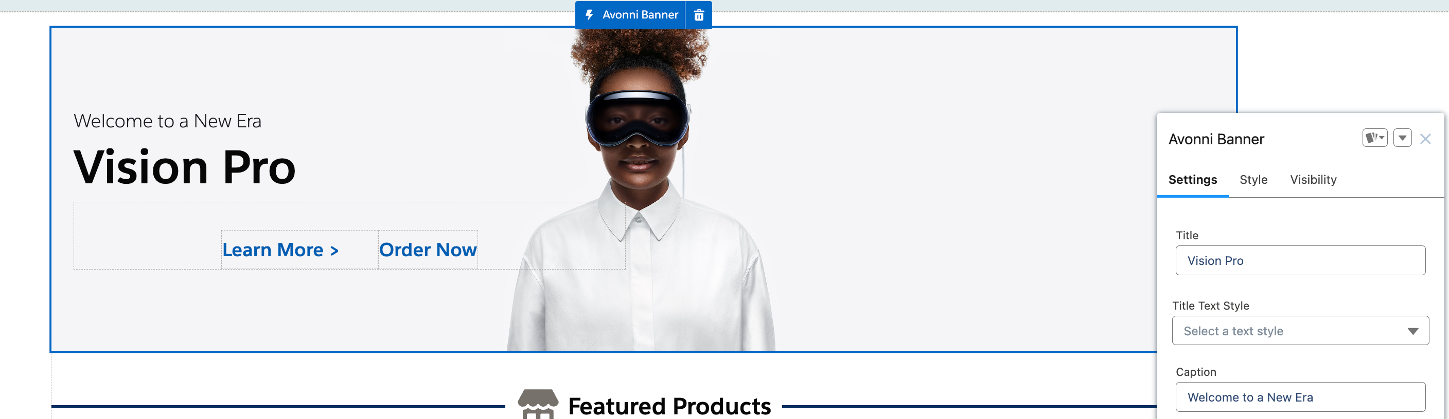
**AX - Banner** is an Experience Cloud component that displays prominent messages with headlines, images, and text content on Experience Sites pages.

Use it to announce new features, share important updates, highlight promotions, or welcome portal users with branded messaging. Combine text, images, icons, and call-to-action buttons to create attention-grabbing announcements at the top of pages.

Perfect for portal homepages, announcement sections, feature highlights, or anywhere you need to communicate important information to customers or partners visiting your site.

{% hint style="danger" %}
This component [leverages slots](/experience-cloud/getting-started/learning-the-basics.md#understanding-slots) for advanced customization, making it ideal for LWR sites. Aura sites do not support this level of customization.
{% endhint %}

<figure><img src="https://2929066058-files.gitbook.io/~/files/v0/b/gitbook-x-prod.appspot.com/o/spaces%2FDL6JQuZArjJeQvX2ot4y%2Fuploads%2Fgit-blob-bf96d5a1aa7519e2b16ede8f3bb4704a3f621fee%2F2024-02-14_20-48-00.png?alt=media" alt=""><figcaption></figcaption></figure>

## Configuration

### Adding Title and Content

Configuring the title and content is a straightforward process that significantly impacts the effectiveness of your banner.

**Adding Title and Content**

**1. Using the Custom Property Editor:**

* **Typing in Content**: You can quickly type the title and content directly into the custom property editor provided within the Avonni Banner component. This approach is user-friendly and efficient, allowing for quick updates and edits.

**2. Text Styling Options:**

* **Inheriting from Site Theme**: The Avonni Banner component allows the title and content to inherit text styles from the Experience Cloud site theme settings. This ensures consistency across your site, maintaining a cohesive look and feel.
* **Custom Styling**: You can use the Avonni dedicated styling customization at the bottom of the custom property editor for more specific needs. This option allows you to manually set the styling for the title and content, independent of the site's overall theme.
* **Advantages of Custom Styling**: Custom styling is particularly useful for making the banner stand out, highlighting key messages, or when the banner needs to have a distinct style that differs from the rest of the site

### Define Content Horizontal Alignment

* **Center:** Place your text in the center of the banner for a balanced look.
* **Left:** Align your text to the left for a traditional layout.
* **Right:** Align your text to the right for a unique design

### Define Media element

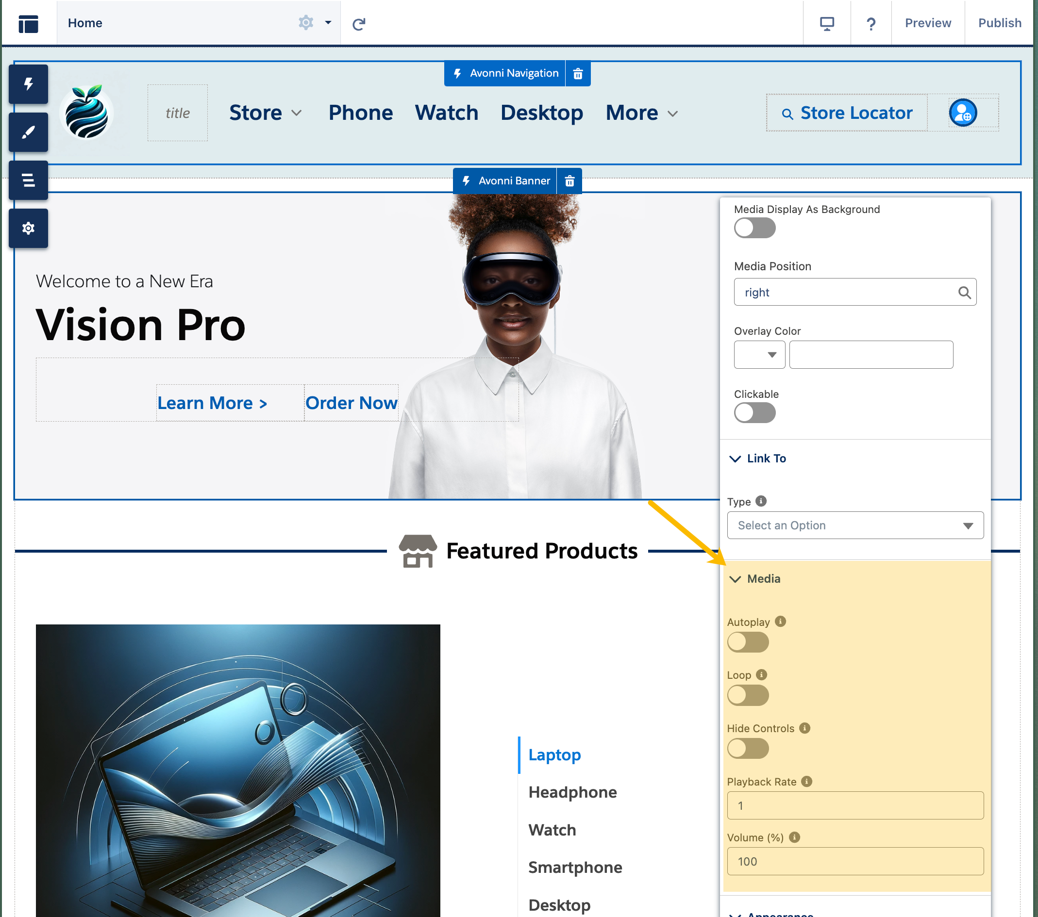
The Avonni Banner component isn't limited to text and static images. Incorporate video into your banner design to spice up your message and increase user engagement.

* **Enhance Your Banner with Video**
  * Add a video element to make your banner more dynamic and engaging.
  * Position your video for the best visual impact. Choose from these options: right, top left, top center, top right, left, bottom left, bottom center, bottom right.
  * Optionally, make your video clickable so that users can interact with it by clicking.
* **Additional Video Settings**
  * Choose whether your video automatically plays when the banner loads.
  * Make the video play repeatedly in a loop.
  * Decide whether to show or hide the video player controls.
  * Control the speed at which the video plays.
  * Set the starting volume level for the video.

<figure><img src="https://2929066058-files.gitbook.io/~/files/v0/b/gitbook-x-prod.appspot.com/o/spaces%2FDL6JQuZArjJeQvX2ot4y%2Fuploads%2Fgit-blob-f011ba9c8a4d4574a472e293f9eea608e7934091%2F2024-02-14_20-53-10.png?alt=media" alt=""><figcaption></figcaption></figure>

### Adding a background image

This feature is handy for creating a visually striking first impression and can be used to align the banner's appearance with the site's overall branding or theme.

Background images can be added in three different ways:

**1. Manual Upload:**

* Users can upload an image file directly from their device.
* This option is ideal for custom graphics, company logos, or specific marketing materials already prepared and stored locally.

**2. Generated Using an Experience Cloud Site Expression:**

* The background image can be dynamically generated based on site expressions.
* This method allows real-time banner customization based on user interactions, site data, or specific criteria defined within the Experience Cloud site.

**3. From CMS Media:**

* Users can select an image from the integrated Content Management System (CMS).
* This option provides access to a library of images, offering a convenient way to choose high-quality and relevant graphics already part of the site's content repository.

### Properties

**Title** defines the primary headline of the banner, drawing immediate attention to your main message. **Caption** accompanies it with a concise subtitle or descriptor for additional context, and **Content** enriches the banner with detailed text — a comprehensive insight, explanation, or call-to-action. Their text styles (Heading 1–4 or Paragraph 1–2) are set on the Style tab.

**Content Horizontal Alignment** adjusts the horizontal positioning of the content text — `left`, `center`, or `right`.

**CMS Background** and **Background URL or Expression** set the banner's background image — use CMS content or a direct web link.

**CMS Media** and **Media URL or Expression** feature a multimedia element (video, audio, or other) alongside or as part of the banner. **Media Display as Background** sets the media as the banner's background for an immersive experience while keeping text at the forefront, and **Media Position** designates its placement (top-left, center, right, and so on).

**Overlay Color** adds a color overlay to enhance readability, set mood, or align with branding colors.

**Clickable** turns the entire banner into an interactive element that redirects users or triggers a defined action (configure it under [Interactions](#interactions)).

### Media Attributes

When the banner includes media, these settings control playback. **Autoplay** starts it automatically when the page loads. **Loop** replays it continuously once it reaches the end. **Hide Controls** keeps the player controls hidden for a cleaner look. **Playback Rate** adjusts the speed at which the media plays. **Volume** controls the audio level, from subtle background tunes to dominant narration.

## Interactions

**Clickable Banner**

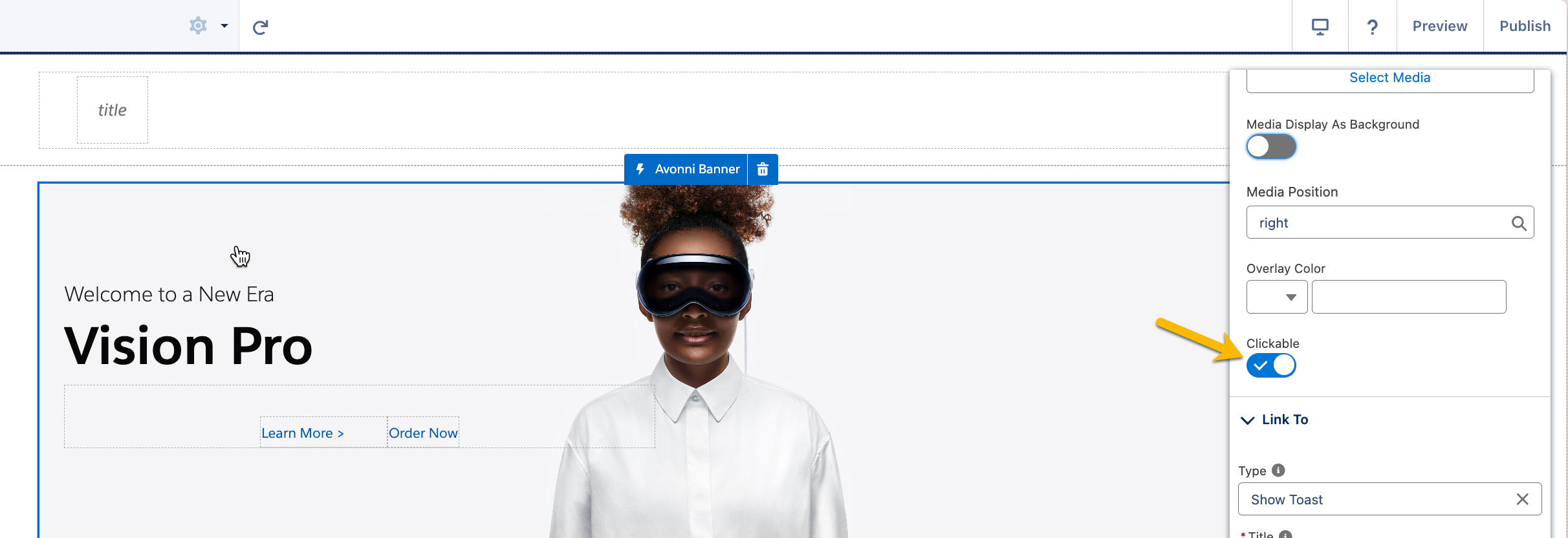
One of the key interactive features of the Avonni Banner component is the ability to be clickable. This transforms passive viewers into active participants, encouraging them to engage more deeply with the content.

<figure><img src="https://2929066058-files.gitbook.io/~/files/v0/b/gitbook-x-prod.appspot.com/o/spaces%2FDL6JQuZArjJeQvX2ot4y%2Fuploads%2Fgit-blob-3d9fc84708dc88163a34feee353a9a233c36509e%2F2024-03-16_11-16-16.png?alt=media" alt=""><figcaption></figcaption></figure>

**Implementing Interactions**

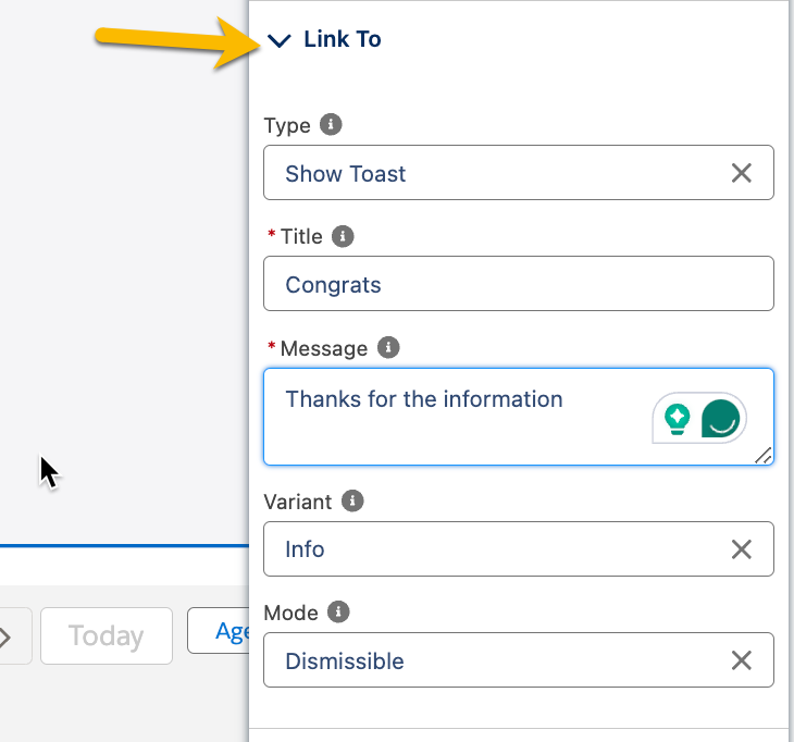
To make your banner clickable, first turn on the clickable toggle. Then, use the "Link To" section to choose what happens when someone clicks the banner. This lets you add cool features to your banner.

<figure><img src="https://2929066058-files.gitbook.io/~/files/v0/b/gitbook-x-prod.appspot.com/o/spaces%2FDL6JQuZArjJeQvX2ot4y%2Fuploads%2Fgit-blob-18022913b2d9754a42a890b024ed0c27f3557b62%2F2024-03-16_11-17-42.png?alt=media" alt="" width="365"><figcaption></figcaption></figure>

**Defining Interactions**

When a user clicks on the banner, the component can trigger a predefined interaction. This level of customization ensures that the user experience is interactive and tailored to the site's specific needs and goals.

<table><thead><tr><th width="184.5">Interaction Type</th><th>Description</th></tr></thead><tbody><tr><td><a href="/experience-cloud/properties-panel/interactions/show-toast.md">Show Toast</a></td><td>Displays a brief, informative message post-click. Ideal for confirming actions or providing context.</td></tr><tr><td><a href="/experience-cloud/properties-panel/interactions/navigate.md">Navigate</a></td><td>Redirects users to another page or resource upon clicking. Suitable for guiding to related content or resources.</td></tr><tr><td><a href="/experience-cloud/properties-panel/interactions/open-alert-modal.md">Open Alert Modal</a></td><td>Presents information or warnings in an alert modal following a click. Useful for important announcements.</td></tr><tr><td><a href="/experience-cloud/properties-panel/interactions/open-flow-dialog.md">Open Flow Dialog</a></td><td>Initiates a Salesforce flow in a dialog, enabling complex interactions. Helps in guiding step-by-step processes.</td></tr><tr><td><a href="/experience-cloud/properties-panel/interactions/open-confirm.md">Open Confirm</a></td><td>Triggers a confirmation dialog post-interaction. Essential for actions requiring user confirmation or acknowledgment.</td></tr></tbody></table>

## Styling

{% tabs %}
{% tab title="Size" %}
Controls the banner's dimensions.
{% endtab %}

{% tab title="Border" %}
Controls the banner border (Color / Size / Style / Radius).
{% endtab %}

{% tab title="Margin" %}
Controls the outer spacing around the banner.
{% endtab %}

{% tab title="Padding" %}
Controls the inner spacing of the banner.
{% endtab %}

{% tab title="Title" %}

* **Color / Font Size / Font Style / Font Weight:** Style the title text.
* **Horizontal Alignment:** Align the title.
  {% endtab %}

{% tab title="Caption" %}

* **Color / Font Size / Font Style / Font Weight:** Style the caption text.
  {% endtab %}

{% tab title="Content" %}

* **Color / Font Size / Font Style / Font Weight:** Style the content text.
* **Horizontal Alignment / Width:** Control the content alignment and width.
  {% endtab %}

{% tab title="Background" %}

* **Color:** Set the background color.
* **Image Object Fit:** Control how the background image fills the banner.
  {% endtab %}

{% tab title="Media" %}

* **Object Fit:** Control how the media fills its area.
  {% endtab %}
  {% endtabs %}

### **Note**

**Object Fit**:

* **`fill`**: Stretches the image to fit the container, potentially distorting it.
* **`contain`**: Keeps the image's aspect ratio and fits it within the container without cropping.
* **`cover`**: Keeps the image's aspect ratio but could crop some parts to ensure the container is fully covered.
* **`none`**: The image will have its original size regardless of the container size.
* **`scale-down`**: Compares the difference between `none` and `contain`, and provides a smaller concrete object size.

**Border Styles:**

* **`none`**: No border will be displayed.
* **`solid`**: A continuous, unbroken line creates the border. It's the most common and straightforward style.
* **`dashed`**: The border appears as a series of short line segments or dashes.
* **`dotted`**: The border is made up of a series of round dots.
* **`double`**: Two parallel solid lines are used for the border. The space between the two lines is transparent or matches the background.
* **`groove`**: The border looks carved into the page, giving a 3D appearance. The effect depends on the border color value.
* **`ridge`**: Opposite of groove, it looks like it's coming out of the page, giving another 3D effect. The visual outcome is affected by the border color.
* **`inset`**: The top and left borders are shaded to appear as though the element is embedded into the page, while the right and bottom borders are highlighted.
* **`outset`**: Opposite of inset, the right and bottom borders are shaded, while the top and left borders are highlighted, giving the illusion that the element is popping out of the page.

**Font Style**:

* **`normal`**: Displays text in a standard, non-italic font style.
* **`italic`**: Displays text in an italicized style, slanting the characters to the right.

**Horizontal Alignment**:

* **`left`**: Aligns the content to the left side of the container.
* **`center`**: Centers the content horizontally within the container.
* **`right`**: Aligns the content to the right side of the container.


---

# Agent Instructions
This documentation is published with GitBook. GitBook is the documentation platform designed so that both humans and AI agents can read, navigate, and reason over technical content effectively. Learn more at gitbook.com.

## Querying This Documentation
If you need additional information that is not directly available in this page, you can query the documentation dynamically by asking a question.

Perform an HTTP GET request on the current page URL with the `ask` query parameter, and the optional `goal` query parameter:

```
GET https://docs.avonnicomponents.com/experience-cloud/experience-components/ax-banner.md?ask=<question>&goal=<endgoal>
```

`ask` is the immediate question: it should be specific, self-contained, and written in natural language.
`goal` is optional and describes the broader end goal you are ultimately trying to accomplish on behalf of the user. GitBook uses it to tailor the answer towards what is most useful for that goal.

The response will contain a direct answer to the question and relevant excerpts and sources from the documentation.

Use this mechanism when the answer is not explicitly present in the current page, you need clarification or additional context, or you want to retrieve related documentation sections.