> For the complete documentation index, see [llms.txt](https://docs.avonnicomponents.com/llms.txt). Markdown versions of documentation pages are available by appending `.md` to page URLs; this page is available as [Markdown](https://docs.avonnicomponents.com/lwc-components/data-driven-components/scheduler.md).

# Scheduler

## Overview

Show Salesforce events in a calendar, agenda or resource timeline. Use `query` and `mapping` for records, or `items` and `resources` when your LWC supplies the schedule.

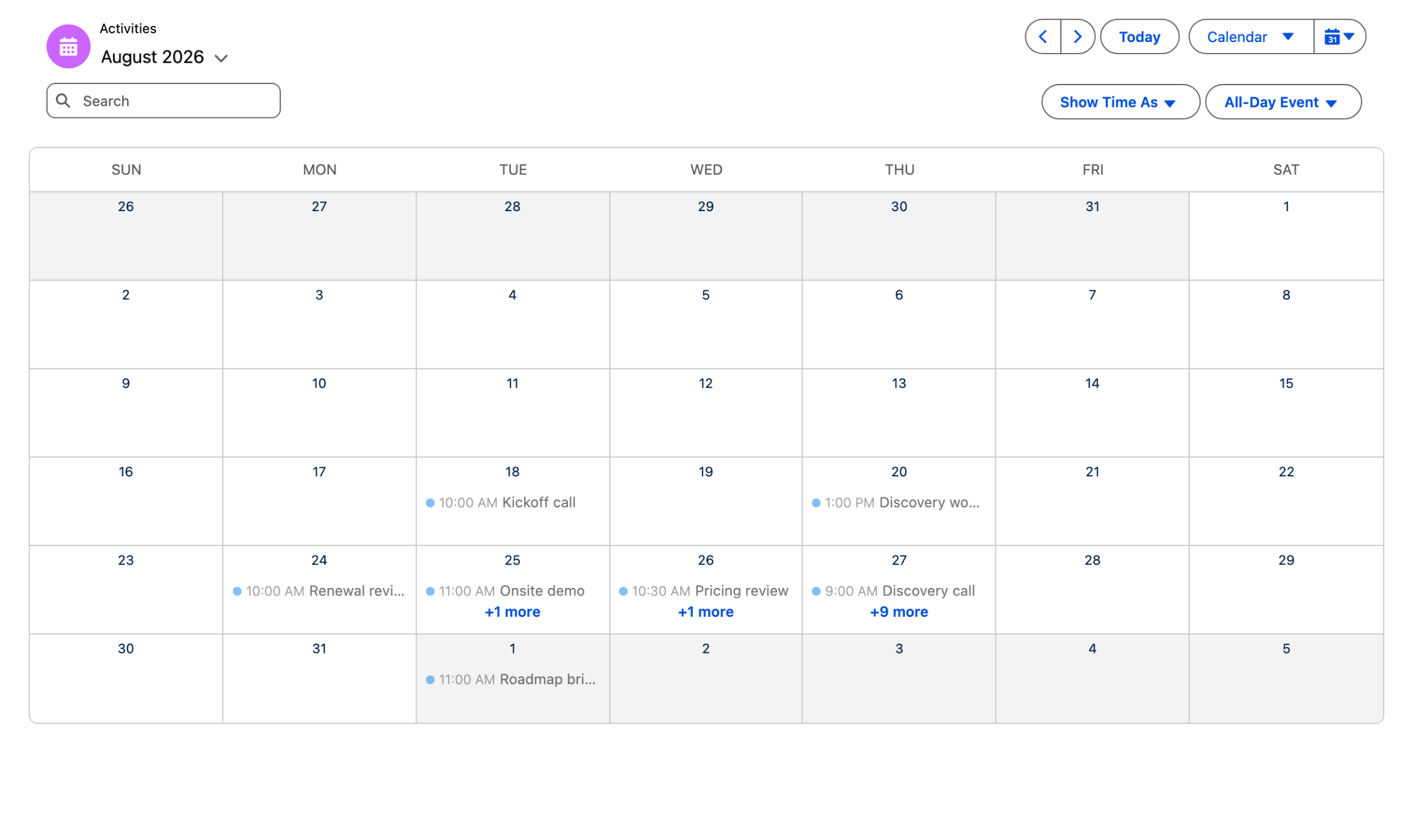
<figure><img src="https://2403786217-files.gitbook.io/~/files/v0/b/gitbook-x-prod.appspot.com/o/spaces%2FPjQbBtFNxVSSOtnsjuwx%2Fuploads%2FHEmSWTZCys3jgv0QLSM8%2Fscheduler-example-calendar.png?alt=media" alt="A month calendar of events with a header titled Activities, a search box, filters and view switches, each event shown on its day"><figcaption><p>Example 1 on sample events: a month view, with each event on its day and a "+ more" link on busy days.</p></figcaption></figure>

### Pick a view

{% columns %}
{% column %}
{% hint style="info" %}

#### Calendar

Start with Activity events in a monthly calendar.

[See the example](#example-1-query-mode)
{% endhint %}
{% endcolumn %}

{% column %}
{% hint style="success" %}

#### Resource timeline

Group appointments by account and handle drag edits.

[See the example](#example-2-query-mode-resource-timeline-with-drag-editing)
{% endhint %}
{% endcolumn %}
{% endcolumns %}

{% hint style="warning" %}
`itemedit` reports a changed time; your handler must save it if the change should persist.
{% endhint %}

## Tutorials

Follow these step-by-step guides to build with this component.

<table data-view="cards"><thead><tr><th></th><th></th><th data-hidden data-card-cover data-type="files"></th><th data-hidden data-card-target data-type="content-ref"></th></tr></thead><tbody><tr><td><a href="https://docs.avonnicomponents.com/projects/use-cases/boards-and-pipelines/live-crew-board.md">Build a Crew Dispatch Scheduler in Salesforce LWC</a></td><td>Build a Salesforce Lightning crew dispatch board with Avonni Scheduler. Show one row per technician, view job times and connect your own dispatch actions.</td><td><a href="https://2403786217-files.gitbook.io/~/files/v0/b/gitbook-x-prod.appspot.com/o/spaces%2FPjQbBtFNxVSSOtnsjuwx%2Fuploads%2FfW3xRoQJVhUryatSxBTl%2Ftutorial-live-crew-board.png?alt=media">tutorial-live-crew-board.png</a></td><td><a href="https://docs.avonnicomponents.com/projects/use-cases/boards-and-pipelines/live-crew-board.md">Build a Crew Dispatch Scheduler in Salesforce LWC</a></td></tr></tbody></table>

## Projects

See how this component works with other Avonni components in a Salesforce workspace.

<table data-view="cards"><thead><tr><th></th><th></th><th data-hidden data-card-cover data-type="files"></th></tr></thead><tbody><tr><td><a href="https://docs.avonnicomponents.com/projects/use-cases/boards-and-pipelines/field-service-dispatch-queue-lwc"><strong>Field Service Dispatch Queue</strong></a></td><td>Assign unstaffed field jobs from a queue and see them on a technician schedule. Requires Avonni LWC Components and a field-job object with scheduled times and a technician field.</td><td><a href="broken://files/D6Q9RV9KTf1ywq6I9Gub">Broken link</a></td></tr></tbody></table>

## Watch it in action

{% embed url="<https://www.youtube.com/watch?v=7gi-zfWtbAg>" %}

## Use Case Examples

### Example 1: Query mode

**Scenario:** Display standard Activity Events on a calendar, with a header avatar and search, letting users select an event to inspect it.

{% tabs %}
{% tab title="activityCalendar.html" %}

```html
<!-- activityCalendar.html -->
<template>
    <avonni-dd-scheduler
        query={eventQuery}
        mapping={eventMapping}
        filters={eventFilters}
        search-fields={eventSearchFields}
        header-avatar={headerAvatar}
        header-title="Activities"
        selected-time-span-name="Standard.Scheduler.MonthTimeSpan"
        variant="calendar"
        onerror={handleError}
        onfilter={handleFilter}
        onitemselect={handleItemSelect}
        onnavigate={handleNavigate}
    ></avonni-dd-scheduler>
</template>
```

{% endtab %}

{% tab title="activityCalendar.js" %}

```js
// activityCalendar.js
import { LightningElement } from 'lwc';

export default class ActivityCalendar extends LightningElement {
    eventQuery = {
        objectApiName: 'Event',
        orderBy: 'StartDateTime ASC',
        limit: 200
    };

    // Field values are inserted with the {{Record.FieldApiName}} syntax.
    eventMapping = {
        title: '{{Record.Subject}}',
        name: '{{Record.Id}}',
        startDate: '{{Record.StartDateTime}}',
        endDate: '{{Record.EndDateTime}}',
        allDay: '{{Record.IsAllDayEvent}}'
    };

    eventSearchFields = ['Subject'];
    eventFilters = ['ShowAs', 'IsAllDayEvent'];
    headerAvatar = { fallbackIconName: 'standard:event', variant: 'circle' };

    handleItemSelect(event) {
        const record = event.detail.record; // selected Event SObject
    }

    handleNavigate(event) {
        const date = event.detail.date; // ISO 8601 of the new selected date
    }

    handleFilter(event) {
        const value = event.detail.value;
    }

    handleError(event) {
        const message = event.detail.message;
    }
}
```

{% endtab %}
{% endtabs %}

**Result:** A monthly calendar of Activity events centered on today. Users can search by subject, filter by Show Time As and All-Day Event, switch views, and click an event to fire `itemselect` with the underlying record.

### Example 2: Query mode, resource timeline with drag editing

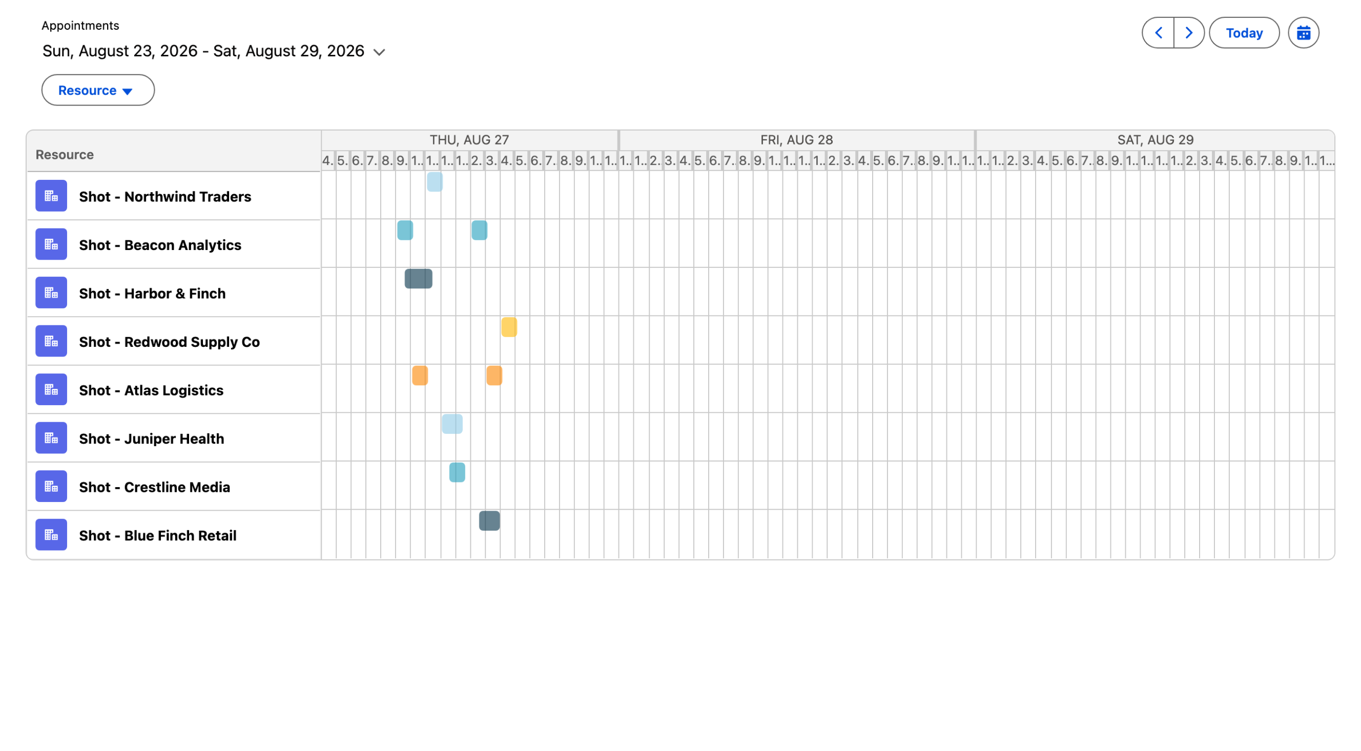
**Scenario:** Show appointments on a timeline grouped by account resource, with per-resource colors, and allow reps to drag to reschedule.

{% tabs %}
{% tab title="appointmentTimeline.html" %}

```html
<!-- appointmentTimeline.html -->
<template>
    <avonni-dd-scheduler
        query={apptQuery}
        mapping={apptMapping}
        selected-time-span-name="Standard.Scheduler.WeekTimeSpan"
        variant="timeline"
        variant-attributes={timelineAttributes}
        item-palette={palette}
        item-actions={itemActions}
        header-title="Appointments"
        onitemedit={handleItemEdit}
        onitemactionclick={handleItemActionClick}
    ></avonni-dd-scheduler>
</template>
```

{% endtab %}

{% tab title="appointmentTimeline.js" %}

```js
// appointmentTimeline.js
import { LightningElement } from 'lwc';
import { updateRecord } from 'lightning/uiRecordApi';

export default class AppointmentTimeline extends LightningElement {
    apptQuery = {
        objectApiName: 'Event',
        filter: 'WhatId != null',
        orderBy: 'StartDateTime ASC',
        limit: 300
    };

    // resourceName maps to the related account; resourceMapping describes how
    // to render that related record as a scheduler resource.
    apptMapping = {
        title: '{{Record.Subject}}',
        name: '{{Record.Id}}',
        startDate: '{{Record.StartDateTime}}',
        endDate: '{{Record.EndDateTime}}',
        resourceName: '{{Record.AccountId}}',
        resourceMapping: {
            label: '{{Record.Name}}',
            name: '{{Record.Id}}',
            avatarFallbackIconName: 'standard:account'
        }
    };

    timelineAttributes = { editItemOnDrag: true, zoomToFit: true };
    palette = ['#8ecae6', '#219ebc', '#023047', '#ffb703', '#fb8500'];
    itemActions = [{ name: 'edit', label: 'Edit', iconName: 'utility:edit' }];

    async handleItemEdit(event) {
        // start and end are present only when they changed.
        const { start, end, record } = event.detail;
        const fields = { Id: record.Id };
        if (start) {
            fields.StartDateTime = start;
        }
        if (end) {
            fields.EndDateTime = end;
        }
        await updateRecord({ fields });
        this.template.querySelector('avonni-dd-scheduler').refresh(true);
    }

    handleItemActionClick(event) {
        const { name, record } = event.detail;
    }
}
```

{% endtab %}
{% endtabs %}

**Result:** A horizontal timeline grouping appointments by account, each resource in its own palette color. Dragging an item fires `itemedit` with the new `start`/`end`; the item action menu fires `itemactionclick`. Persist the change in your `itemedit` handler.

<figure><img src="https://2403786217-files.gitbook.io/~/files/v0/b/gitbook-x-prod.appspot.com/o/spaces%2FPjQbBtFNxVSSOtnsjuwx%2Fuploads%2FSqDeHu1i5Tkzvv8inenV%2Fscheduler-example-timeline.png?alt=media" alt="A week timeline with one row per account, each with an account icon, and the events of each account drawn as colored bars along the days"><figcaption><p>Example 2 on sample events: one row per account along the week, with each account's events in its own color.</p></figcaption></figure>

***

## Specifications

### Attributes

| Name                           | Description                                                                                                                                                                                                                                                                                                                                                                                               | Type                           | Default                                  | Required |
| ------------------------------ | --------------------------------------------------------------------------------------------------------------------------------------------------------------------------------------------------------------------------------------------------------------------------------------------------------------------------------------------------------------------------------------------------------- | ------------------------------ | ---------------------------------------- | -------- |
| `available-days-of-the-week`   | Array of available days of the week. If present, the scheduler will only show the available days of the week. Defaults to all days being available. The days are represented by a number, starting from 0 for Sunday, and ending with 6 for Saturday. For example, if the available days are Monday to Friday, the value would be: `[1, 2, 3, 4, 5]`                                                      | number\[]                      | `"0, 1, 2, 3, 4, 5, 6"`                  |          |
| `available-months`             | Array of available months. If present, the scheduler will only show the available months. Defaults to all months being available. The months are represented by a number, starting from 0 for January, and ending with 11 for December. For example, if the available months are January, February, June, July, August and December, the value would be: `[0, 1, 5, 6, 7, 11]`                            | number\[]                      | `"0, 1, 2, 3, 4, 5, 6, 7, 8, 9, 10, 11"` |          |
| `available-time-frames`        | Array of available time frames. If present, the scheduler will only show the available time frames. Defaults to the full day being available. Each time frame string must follow the pattern ‘start-end’, with start and end being ISO 8601 formatted time strings. For example, if the available times are from 10am to 12pm, and 2:30pm to 6:45pm, the value would be: `['10:00-11:59', '14:30-18:44']` | string\[]                      | `"'00:00-23:59'"`                        |          |
| `empty-spot-actions`           | Array of actions. They will be displayed in the scheduler context menu, if there is no item at the clicked position.                                                                                                                                                                                                                                                                                      | DdSchedulerAction\[]           | Not specified                            |          |
| `filters`                      | Array of field API names that belong to the queried object. These fields will be displayed as user filters.                                                                                                                                                                                                                                                                                               | string\[]                      | Not specified                            |          |
| `filters-attributes`           | Object defining the filters-specific attributes.                                                                                                                                                                                                                                                                                                                                                          | DdElementFiltersAttributes     | Not specified                            |          |
| `header-actions`               | Array of actions to display at the top right of the header. On click on a header action, the `headeractionclick` event is fired.                                                                                                                                                                                                                                                                          | DdElementAction\[]             | Not specified                            |          |
| `header-avatar`                | Avatar displayed at the top left of the header.                                                                                                                                                                                                                                                                                                                                                           | DdElementAvatar                | Not specified                            |          |
| `header-help-text`             | If present, a help text icon is displayed next to the header title. On focus or hover on the icon, the header help text is displayed in a tooltip.                                                                                                                                                                                                                                                        | String                         | Not specified                            |          |
| `header-help-text-attributes`  | Object defining the help text-specific attributes.                                                                                                                                                                                                                                                                                                                                                        | DdElementHelpTextAttributes    | Not specified                            |          |
| `header-show-time-zone`        | If present, a time zone picker will be displayed in the header.                                                                                                                                                                                                                                                                                                                                           | Boolean                        | `false`                                  |          |
| `header-title`                 | Main title displayed in the header.                                                                                                                                                                                                                                                                                                                                                                       | String                         | Not specified                            |          |
| `header-visible-actions-count` | Number of header actions that appear as regular buttons. Remaining actions appear in a dropdown menu.                                                                                                                                                                                                                                                                                                     | integer                        | Not specified                            |          |
| `hidden-variants`              | Array of variants that cannot be selected by the user. Defaults to all variants being available. The variants values are agenda, calendar, and timeline.                                                                                                                                                                                                                                                  | string\[]                      | Not specified                            |          |
| `hide-empty-resource-items`    | If present, the items without a resource are hidden.                                                                                                                                                                                                                                                                                                                                                      | Boolean                        | `false`                                  |          |
| `hide-header`                  | If present, the header is hidden.                                                                                                                                                                                                                                                                                                                                                                         | Boolean                        | `false`                                  |          |
| `ics-calendars`                | Array of links to ICS files or IDs of Content Document objects containing ICS files. If present, the scheduler will display the events from these calendars alongside the other events. For the links, the URL must be added as a Remote Site Setting in Salesforce.                                                                                                                                      | string\[]                      | Not specified                            |          |
| `item-actions`                 | Array of actions. They will be displayed in the context menu and in the detail popover of an item.                                                                                                                                                                                                                                                                                                        | DdSchedulerAction\[]           | Not specified                            |          |
| `item-palette`                 | Array of valid CSS color strings. They will be used as a default palette for the items that do not have a specific color assigned through their mapping. Each resource will be assigned a color, and the items that belong to that resource will be displayed in that color. If there are more resources than colors in the palette, the colors will be repeated.                                         | string\[]                      | Not specified                            |          |
| `item-popover-fields`          | Array of fields that will be displayed in the popover visible on hover on an item. If not provided, the start and end dates of the items are displayed.                                                                                                                                                                                                                                                   | DdSchedulerItemPopoverField\[] | Not specified                            |          |
| `item-theme`                   | Styling theme of the items. Valid values include default, transparent, line, hollow, and rounded.                                                                                                                                                                                                                                                                                                         | String                         | `"default"`                              |          |
| `items`                        | Array of static items displayed in the scheduler. When this property is set, the scheduler ignores the `query` and `mapping` properties and displays the items directly.                                                                                                                                                                                                                                  | DdSchedulerItem\[]             | Not specified                            |          |
| `label-no-items-found`         | Label of the message displayed when there are no items found.                                                                                                                                                                                                                                                                                                                                             | String                         | `"No events for the selected date."`     |          |
| `label-today-button`           | Label of the button displayed in the header, that navigates to the current date.                                                                                                                                                                                                                                                                                                                          | String                         | `"Today"`                                |          |
| `mapping`                      | Object defining the way the records returned by the query should be mapped to the scheduler item properties. To insert the value of a field, use the syntax `{{Record.FieldApiName}}`. For example, to use the value of the Subject field, use `{{Record.Subject}}`.                                                                                                                                      | DdSchedulerMapping             | Not specified                            |          |
| `query`                        | Definition of the query to execute to get the records that will be mapped to the scheduler items.                                                                                                                                                                                                                                                                                                         | DdElementQuery                 | Not specified                            |          |
| `refresh-emp`                  | Object describing a platform event that should be subscribed to in order to refresh the component when an event is published.                                                                                                                                                                                                                                                                             | DdElementRefreshEmp            | Not specified                            |          |
| `resources`                    | Array of resources (participants) referenced by the static `items`. Each resource's `name` is matched against the `resourceName` of the events to resolve their label and avatar. Used only in static mode; in query mode the resources are resolved from the `mapping`.                                                                                                                                  | DdSchedulerResource\[]         | Not specified                            |          |
| `search-attributes`            | Object defining the search-specific attributes.                                                                                                                                                                                                                                                                                                                                                           | DdElementSearchAttributes      | Not specified                            |          |
| `search-fields`                | Array of field API names that can be used by the search box to filter the records. The fields must belong to the queried object, and they must be filterable.                                                                                                                                                                                                                                             | string\[]                      | Not specified                            |          |
| `selected-date`                | Selected date of the scheduler, represented as an ISO 8601 formatted string. The scheduler will be centered on this date. If no date is selected, the scheduler will be centered on the current date.                                                                                                                                                                                                     | String                         | Not specified                            |          |
| `selected-time-span-name`      | Name of the selected time span. If `time-spans` are provided, the value should match one of the given time span names. Otherwise, it should match one of the default names: `Standard.Scheduler.DayTimeSpan`, `Standard.Scheduler.WeekTimeSpan`, or `Standard.Scheduler.MonthTimeSpan`. If not provided, the first time span of the list will be selected.                                                | String                         | Not specified                            |          |
| `side-panel-attributes`        | Object defining the side panel-specific attributes.                                                                                                                                                                                                                                                                                                                                                       | DdElementSidePanelAttributes   | Not specified                            |          |
| `time-spans`                   | Array of available time spans. The time spans can be selected by the user in the header and define the visible duration of the scheduler.                                                                                                                                                                                                                                                                 | DdSchedulerTimeSpan\[]         | Not specified                            |          |
| `variant`                      | Selected variant of the scheduler. Valid values include agenda, calendar, and timeline.                                                                                                                                                                                                                                                                                                                   | String                         | `"calendar"`                             |          |
| `variant-attributes`           | Object defining variant-specific attributes.                                                                                                                                                                                                                                                                                                                                                              | DdSchedulerVariantAttributes   | Not specified                            |          |
| `week-start-day`               | Day displayed as the first day of the week. The value has to be a number between 0 and 6, 0 being Sunday, 1 being Monday, and so on until 6. If it is not provided, the user locale will be used.                                                                                                                                                                                                         | Number                         | Not specified                            |          |

### Mapping

The `mapping` object ties queried record fields to scheduler event properties. Insert a field value with the `{{Record.FieldApiName}}` syntax (e.g. `{{Record.Subject}}`).

| Mapping Key       | Type    | Description                                                                                                                                                                                                          |
| ----------------- | ------- | -------------------------------------------------------------------------------------------------------------------------------------------------------------------------------------------------------------------- |
| `title`           | String  | Event title. e.g. `'{{Record.Subject}}'`.                                                                                                                                                                            |
| `name`            | String  | Unique item name. Defaults to the `Id` field.                                                                                                                                                                        |
| `startDate`       | Date    | Event start. e.g. `'{{Record.StartDateTime}}'`.                                                                                                                                                                      |
| `endDate`         | Date    | Event end. e.g. `'{{Record.EndDateTime}}'`.                                                                                                                                                                          |
| `allDay`          | Boolean | Whether the event is all-day. e.g. `'{{Record.IsAllDayEvent}}'`.                                                                                                                                                     |
| `color`           | String  | Item color. Defaults to the resource color.                                                                                                                                                                          |
| `theme`           | String  | Item theme. Defaults to the scheduler's `item-theme`.                                                                                                                                                                |
| `resourceName`    | String  | Unique name of the resource the item belongs to. e.g. `'{{Record.AccountId}}'`.                                                                                                                                      |
| `resourceMapping` | Object  | Used when `resourceName` maps to a relationship field. Maps the related record with `{ label, name, avatarFallbackIconName, avatarInitials, avatarSrc }`, where `{{Record.Field}}` refers to the **related** record. |

### Static Items

In static mode, each entry of `items` is a `DdSchedulerItem` object with the following fields.

| Field          | Type    | Description                                                                                                    |
| -------------- | ------- | -------------------------------------------------------------------------------------------------------------- |
| `name`         | String  | Unique name of the event.                                                                                      |
| `title`        | String  | Title of the event.                                                                                            |
| `startDate`    | Date    | Start date of the event.                                                                                       |
| `endDate`      | Date    | End date of the event.                                                                                         |
| `allDay`       | Boolean | If true, the event is displayed as an all-day event. Defaults to `false`.                                      |
| `color`        | String  | Color of the event. If present, it overrides the default color.                                                |
| `theme`        | String  | Theme of the event. Valid values include `default`, `transparent`, `line`, `hollow`, and `rounded`.            |
| `resourceName` | String  | Unique name of the resource the event belongs to. It is matched against the `name` of an entry in `resources`. |
| `value`        | String  | Value of the event.                                                                                            |

### Methods

| Name      | Description                                                   | Argument Name       | Argument Type | Argument Description                                              |
| --------- | ------------------------------------------------------------- | ------------------- | ------------- | ----------------------------------------------------------------- |
| `refresh` | Refresh the query and the records displayed in the component. | `stayOnCurrentPage` | Boolean       | If true, the component will refresh but stay on the current page. |

### Custom Events

#### `emptyspotactionclick`

Event fired when an empty spot action is clicked.

The `emptyspotactionclick` event returns the following parameters.

| Parameter | Type   | Description                                            |
| --------- | ------ | ------------------------------------------------------ |
| `from`    | string | Start date of the cell clicked, as an ISO 8601 string. |
| `name`    | string | Name of the action clicked.                            |
| `to`      | string | End date of the cell clicked, as an ISO 8601 string.   |

The event properties are as follows.

| Property   | Value | Description                                                                                               |
| ---------- | ----- | --------------------------------------------------------------------------------------------------------- |
| bubbles    | false | This event does not bubble.                                                                               |
| cancelable | false | This event has no default behavior that can be canceled. You can't call `preventDefault()` on this event. |
| composed   | false | This event does not propagate outside of the component in which it was dispatched.                        |

#### `error`

The event fired when an error occurs in the component.

The `error` event returns the following parameters.

| Parameter | Type   | Description           |
| --------- | ------ | --------------------- |
| `message` | string | Message of the error. |

The event properties are as follows.

| Property   | Value | Description                                                                                               |
| ---------- | ----- | --------------------------------------------------------------------------------------------------------- |
| bubbles    | false | This event does not bubble.                                                                               |
| cancelable | false | This event has no default behavior that can be canceled. You can't call `preventDefault()` on this event. |
| composed   | false | This event does not propagate outside of the component in which it was dispatched.                        |

#### `filter`

The event fired when the user filters the records.

The `filter` event returns the following parameters.

| Parameter | Type   | Description                                                                                                                                                                                                   |
| --------- | ------ | ------------------------------------------------------------------------------------------------------------------------------------------------------------------------------------------------------------- |
| `value`   | object | Object containing the filters applied by the user. Its keys correspond to the field API names of the selected filters. The values are arrays of strings, corresponding to the values selected for the filter. |

The event properties are as follows.

| Property   | Value | Description                                                                                               |
| ---------- | ----- | --------------------------------------------------------------------------------------------------------- |
| bubbles    | false | This event does not bubble.                                                                               |
| cancelable | false | This event has no default behavior that can be canceled. You can't call `preventDefault()` on this event. |
| composed   | false | This event does not propagate outside of the component in which it was dispatched.                        |

#### `headeractionclick`

The event fired when a header action is clicked.

The `headeractionclick` event returns the following parameters.

| Parameter | Type   | Description                 |
| --------- | ------ | --------------------------- |
| `name`    | string | Name of the action clicked. |

The event properties are as follows.

| Property   | Value | Description                                                                                               |
| ---------- | ----- | --------------------------------------------------------------------------------------------------------- |
| bubbles    | false | This event does not bubble.                                                                               |
| cancelable | false | This event has no default behavior that can be canceled. You can't call `preventDefault()` on this event. |
| composed   | false | This event does not propagate outside of the component in which it was dispatched.                        |

#### `itemactionclick`

Event fired when an item action is clicked.

The `itemactionclick` event returns the following parameters.

| Parameter | Type   | Description                                                                                                         |
| --------- | ------ | ------------------------------------------------------------------------------------------------------------------- |
| `name`    | string | Name of the action clicked.                                                                                         |
| `item`    | object | Item the action belongs to, with its mapped properties.                                                             |
| `record`  | object | Record corresponding to the item the action belongs to. In static mode, no record is associated and this is `null`. |

The event properties are as follows.

| Property   | Value | Description                                                                                               |
| ---------- | ----- | --------------------------------------------------------------------------------------------------------- |
| bubbles    | false | This event does not bubble.                                                                               |
| cancelable | false | This event has no default behavior that can be canceled. You can't call `preventDefault()` on this event. |
| composed   | false | This event does not propagate outside of the component in which it was dispatched.                        |

#### `itemedit`

Event fired when an item is edited.

The `itemedit` event returns the following parameters.

| Parameter | Type   | Description                                                                                            |
| --------- | ------ | ------------------------------------------------------------------------------------------------------ |
| `end`     | string | End date of the item, as an ISO 8601 string. Present only if the end date of the item has changed.     |
| `item`    | object | Item that was edited, with its mapped properties.                                                      |
| `record`  | object | Record corresponding to the item that was edited.                                                      |
| `start`   | string | Start date of the item, as an ISO 8601 string. Present only if the start date of the item has changed. |

The event properties are as follows.

| Property   | Value | Description                                                                                               |
| ---------- | ----- | --------------------------------------------------------------------------------------------------------- |
| bubbles    | false | This event does not bubble.                                                                               |
| cancelable | false | This event has no default behavior that can be canceled. You can't call `preventDefault()` on this event. |
| composed   | false | This event does not propagate outside of the component in which it was dispatched.                        |

#### `itemselect`

Event fired when an item is selected.

The `itemselect` event returns the following parameters.

| Parameter | Type   | Description                                         |
| --------- | ------ | --------------------------------------------------- |
| `item`    | object | Item that was selected, with its mapped properties. |
| `record`  | object | Record corresponding to the item that was selected. |

The event properties are as follows.

| Property   | Value | Description                                                                                               |
| ---------- | ----- | --------------------------------------------------------------------------------------------------------- |
| bubbles    | false | This event does not bubble.                                                                               |
| cancelable | false | This event has no default behavior that can be canceled. You can't call `preventDefault()` on this event. |
| composed   | false | This event does not propagate outside of the component in which it was dispatched.                        |

#### `navigate`

Event fired when the user navigates to a new date.

The `navigate` event returns the following parameters.

| Parameter | Type   | Description                           |
| --------- | ------ | ------------------------------------- |
| `date`    | string | Selected date, as an ISO 8601 string. |

The event properties are as follows.

| Property   | Value | Description                                                                                               |
| ---------- | ----- | --------------------------------------------------------------------------------------------------------- |
| bubbles    | false | This event does not bubble.                                                                               |
| cancelable | false | This event has no default behavior that can be canceled. You can't call `preventDefault()` on this event. |
| composed   | false | This event does not propagate outside of the component in which it was dispatched.                        |

#### `nbitemschange`

The event fired when the number of items displayed in the component changes.

The `nbitemschange` event returns the following parameters.

| Parameter | Type    | Description                                 |
| --------- | ------- | ------------------------------------------- |
| `value`   | integer | Number of items displayed in the component. |

The event properties are as follows.

| Property   | Value | Description                                                                                               |
| ---------- | ----- | --------------------------------------------------------------------------------------------------------- |
| bubbles    | false | This event does not bubble.                                                                               |
| cancelable | false | This event has no default behavior that can be canceled. You can't call `preventDefault()` on this event. |
| composed   | false | This event does not propagate outside of the component in which it was dispatched.                        |

#### `newitem`

Event fired when a new item is created.

The `newitem` event returns the following parameters.

| Parameter | Type   | Description                                        |
| --------- | ------ | -------------------------------------------------- |
| `end`     | string | End date of the new item, as an ISO 8601 string.   |
| `start`   | string | Start date of the new item, as an ISO 8601 string. |

The event properties are as follows.

| Property   | Value | Description                                                                                               |
| ---------- | ----- | --------------------------------------------------------------------------------------------------------- |
| bubbles    | false | This event does not bubble.                                                                               |
| cancelable | false | This event has no default behavior that can be canceled. You can't call `preventDefault()` on this event. |
| composed   | false | This event does not propagate outside of the component in which it was dispatched.                        |

#### `timespanselect`

Event fired when the user selects a time span.

The `timespanselect` event returns the following parameters.

| Parameter | Type   | Description                     |
| --------- | ------ | ------------------------------- |
| `name`    | string | Name of the selected time span. |

The event properties are as follows.

| Property   | Value | Description                                                                                               |
| ---------- | ----- | --------------------------------------------------------------------------------------------------------- |
| bubbles    | false | This event does not bubble.                                                                               |
| cancelable | false | This event has no default behavior that can be canceled. You can't call `preventDefault()` on this event. |
| composed   | false | This event does not propagate outside of the component in which it was dispatched.                        |

#### `variantselect`

Event fired when the user selects a variant.

The `variantselect` event returns the following parameters.

| Parameter | Type   | Description                   |
| --------- | ------ | ----------------------------- |
| `name`    | string | Name of the selected variant. |

The event properties are as follows.

| Property   | Value | Description                                                                                               |
| ---------- | ----- | --------------------------------------------------------------------------------------------------------- |
| bubbles    | false | This event does not bubble.                                                                               |
| cancelable | false | This event has no default behavior that can be canceled. You can't call `preventDefault()` on this event. |
| composed   | false | This event does not propagate outside of the component in which it was dispatched.                        |

### Styling Hooks

| CSS Variable                                                   | Type      | Default       |
| -------------------------------------------------------------- | --------- | ------------- |
| `--avonni-dd-scheduler-header-actions-color-background`        | color     | Not specified |
| `--avonni-dd-scheduler-header-actions-color-background-active` | color     | Not specified |
| `--avonni-dd-scheduler-header-actions-color-background-hover`  | color     | Not specified |
| `--avonni-dd-scheduler-header-actions-color-border`            | color     | Not specified |
| `--avonni-dd-scheduler-header-actions-color-border-active`     | color     | Not specified |
| `--avonni-dd-scheduler-header-actions-color-border-hover`      | color     | Not specified |
| `--avonni-dd-scheduler-header-actions-text-color`              | color     | Not specified |
| `--avonni-dd-scheduler-header-actions-text-color-active`       | color     | Not specified |
| `--avonni-dd-scheduler-header-actions-text-color-hover`        | color     | Not specified |
| `--avonni-dd-scheduler-header-caption-font-family`             | string    | Not specified |
| `--avonni-dd-scheduler-header-caption-font-size`               | dimension | Not specified |
| `--avonni-dd-scheduler-header-caption-font-style`              | string    | `normal`      |
| `--avonni-dd-scheduler-header-caption-font-weight`             | number    | `400`         |
| `--avonni-dd-scheduler-header-caption-letter-spacing`          | string    | Not specified |
| `--avonni-dd-scheduler-header-caption-line-height`             | string    | Not specified |
| `--avonni-dd-scheduler-header-caption-text-color`              | color     | `#000000`     |
| `--avonni-dd-scheduler-header-color-background`                | color     | Not specified |
| `--avonni-dd-scheduler-header-color-border`                    | color     | Not specified |
| `--avonni-dd-scheduler-header-color-border-bottom`             | color     | `#c9c9c9`     |
| `--avonni-dd-scheduler-header-icon-color-background`           | color     | Not specified |
| `--avonni-dd-scheduler-header-icon-color-foreground`           | color     | Not specified |
| `--avonni-dd-scheduler-header-icon-color-foreground-default`   | color     | Not specified |
| `--avonni-dd-scheduler-header-icon-radius-border`              | string    | Not specified |
| `--avonni-dd-scheduler-header-margin-block-end`                | dimension | Not specified |
| `--avonni-dd-scheduler-header-radius-border`                   | string    | Not specified |
| `--avonni-dd-scheduler-header-sizing-border`                   | string    | Not specified |
| `--avonni-dd-scheduler-header-sizing-border-bottom`            | dimension | `1px`         |
| `--avonni-dd-scheduler-header-spacing-block-end`               | dimension | `0.75rem`     |
| `--avonni-dd-scheduler-header-spacing-block-start`             | dimension | `0.75rem`     |
| `--avonni-dd-scheduler-header-spacing-inline-end`              | dimension | `1rem`        |
| `--avonni-dd-scheduler-header-spacing-inline-start`            | dimension | `1rem`        |
| `--avonni-dd-scheduler-header-styling-border`                  | string    | Not specified |
| `--avonni-dd-scheduler-header-styling-border-bottom`           | string    | `solid`       |
| `--avonni-dd-scheduler-header-title-font-family`               | string    | Not specified |
| `--avonni-dd-scheduler-header-title-font-size`                 | dimension | `1rem`        |
| `--avonni-dd-scheduler-header-title-font-style`                | string    | `normal`      |
| `--avonni-dd-scheduler-header-title-font-weight`               | number    | `400`         |
| `--avonni-dd-scheduler-header-title-letter-spacing`            | string    | Not specified |
| `--avonni-dd-scheduler-header-title-line-height`               | number    | `1.25`        |
| `--avonni-dd-scheduler-header-title-text-color`                | color     | `#080707`     |

## Key Considerations

* **Query or static:** In static mode, `items` replaces `query`/`mapping` and `resources` lists the rows. In query mode the resources come from the `resourceName` mapping and the `resources` property is ignored.
* **Required mapping fields:** Only `startDate` is strictly required; `endDate` falls back to it when not mapped. Map `title` so events have a label; `name` defaults to the `Id` field.
* **Date types:** `startDate`/`endDate` should map to date or datetime fields (e.g. `StartDateTime`). All-day events come from a boolean field via `allDay`.
* **Resources:** Use `resourceName` with `resourceMapping` to group items by a related record, and `item-palette` to color them per resource.
* **Availability constraints:** `available-days-of-the-week`, `available-months`, and `available-time-frames` restrict what the user can see and schedule.
* **ICS calendars:** each `ics-calendars` entry is either a link to an `.ics` file or the ID of a Content Document holding one. A link is read server-side, so its host needs a Remote Site Setting in Setup and the file must begin with `BEGIN:VCALENDAR`; a Content Document is read from the org and needs neither. Only the entries falling around the visible span are imported, and recurring entries are expanded over it.
* **Recurring ICS entries:** a simple rule, `DAILY`, `WEEKLY`, `MONTHLY` or `YEARLY`, with or without a `COUNT` or an `UNTIL`, is imported as one recurring event, with no limit on the occurrences it draws. Every other rule is expanded one occurrence at a time: several `RRULE` properties, an `EXDATE` or an `RDATE`, a modified occurrence, an hourly or finer frequency, or a `BY...` part the scheduler cannot express. That expansion stops at 200 occurrences per entry for each visible span and drops the rest without warning, so an hourly entry viewed over a month is cut short, narrow the time span to see the later occurrences. A rule that has to be stepped through more than 5,000 times to cover the span also stops, and that case does log a warning in the browser console.
* **Imported events carry no record:** an ICS entry contributes a title, description, start, end, and all-day flag, plus its recurrence fields when its rule is a simple one. It has no resource, so it sits on the **Empty** resource row, and `itemselect`, `itemedit`, and `itemactionclick` fire for it with `record` set to `null`.
* **Time zones in an ICS file:** an entry that names a time zone is placed at that absolute time. An entry that names none is read in the scheduler's current time zone, so changing the time zone in the header re-imports those calendars.
* **Hiding the Empty row:** `hide-empty-resource-items` drops the items whose `resourceName` resolves to nothing, together with the **Empty** resource row. ICS-imported events are the exception, they keep that row, since they can never have a resource.
* **Best Practice:** Always map `startDate` (required) and `title`, and map `endDate` for events that have a duration (without it, each event ends at its start date). Use `item-palette` and a `resourceName` mapping when you want events visually grouped by resource.

***

## Troubleshooting Common Issues

* **No events appear:** Verify `query.objectApiName` and that `startDate`/`endDate` map to real date fields; events outside `selected-date`'s visible range, days, months, or time frames are hidden.
* **Only today's events show:** The default time span is the first one in `time-spans` (Day), so only today's events show. Set `selected-time-span-name` and `selected-date`.
* **Items all the same color:** Without a `color` mapping or a `resourceName`, the `item-palette` cannot vary by resource, add a `resourceName` mapping.
* **Drag editing does nothing:** `editItemOnDrag` (and `createItemOnDrag`) must be set in `variant-attributes`, and these apply only to the calendar and timeline variants. Changes are not saved automatically: handle `itemedit` (and `newitem`) to save them.
* **An ICS calendar shows nothing:** a link needs a Remote Site Setting for its host, has to answer `200`, and has to return a file starting with `BEGIN:VCALENDAR`; a Content Document ID has to point at an `.ics` file the running user can read. Entries outside the window around the visible span are not imported. Imported events are also hidden while any filter other than the resources filter is selected, since they carry no record for a filter to match.
* **The Empty resource row is still there:** `hide-empty-resource-items` leaves it in place while an ICS calendar is configured, because imported events have no resource and are shown on that row.
* **If issues persist:** Contact our support team at <support@avonni.app> for assistance.


---

# Agent Instructions
This documentation is published with GitBook. GitBook is the documentation platform designed so that both humans and AI agents can read, navigate, and reason over technical content effectively. Learn more at gitbook.com.

## Querying This Documentation
If you need additional information that is not directly available in this page, you can query the documentation by asking a question.

Perform an HTTP GET request on the following URL with the `ask` and `goal` query parameters:

```
GET https://docs.avonnicomponents.com/lwc-components/data-driven-components/scheduler.md?ask=<question>&goal=<user_goal>
```

`ask` is the immediate question: it should be specific, self-contained, and written in natural language.
`goal` is what the user is ultimately trying to achieve, the reason they need the answer. Sharing it helps GitBook give you a better, more relevant answer. A goal is most helpful when it describes the outcome the user wants rather than restating the question. For example, with `ask=how do I create an API token`, a goal like `automate deployments from our CI pipeline` lets GitBook tailor the answer to that use case.

The response will contain a direct answer to the question and relevant excerpts and sources from the documentation.

Use this mechanism when the answer is not explicitly present in the current page, you need clarification or additional context, or you want to retrieve related documentation sections.