> For the complete documentation index, see [llms.txt](https://docs.avonnicomponents.com/llms.txt). Markdown versions of documentation pages are available by appending `.md` to page URLs; this page is available as [Markdown](https://docs.avonnicomponents.com/flow/flow-components/list.md).

# List

The Avonni List displays records or custom items in a fully customizable, interactive list. It supports multiple layouts, inline actions, filtering, sorting, drag-to-reorder, and pagination.

## Overview

The Avonni List displays records or custom items in a fully customizable, interactive list. It supports multiple layouts, inline actions, filtering, sorting, drag-to-reorder, and pagination.

***

## Tutorials

<table><thead><tr><th width="181.37890625">Category</th><th width="130.0234375">Type</th><th>Tutorial</th></tr></thead><tbody><tr><td><strong>📘 Core</strong></td><td>Build</td><td><a href="/flow/tutorials/projects/interactive-contact-list.md">Create a contact master details list</a></td></tr><tr><td><strong>🖼️ Display</strong></td><td>Build</td><td><a href="/flow/tutorials/components/list/create-a-grid-list-with-images.md">Create a grid list with images</a></td></tr><tr><td><strong>↕️ Sorting</strong></td><td>Build</td><td><a href="/flow/tutorials/components/list/create-a-sortable-list.md">Create a sortable list</a></td></tr><tr><td><strong>▶️ Actions</strong></td><td>Build</td><td><a href="/flow/tutorials/components/list/vertical-list-with-actions.md">Vertical list with actions</a></td></tr><tr><td><strong>🔄 Data</strong></td><td>Guide</td><td><a href="/flow/tutorials/components/list/how-to-reorder-items-and-update-records.md">How to reorder items and update records</a></td></tr><tr><td><strong>🌍 Example</strong></td><td>Example</td><td><a href="/flow/tutorials/projects/todays-accounts-to-visit.md">Today's accounts to visit</a></td></tr><tr><td><strong>🔄 Example</strong></td><td>Example</td><td><a href="https://www.youtube.com/watch?v=u8A8C6oSQy4">Build a reorderable list</a></td></tr></tbody></table>

***

## Configuration

Configure the List from the **Properties** tab of the Edit List Component panel. The sub-sections below mirror the Properties tab.

### Data Source

The **Data Source** setting determines where the list's content comes from.

| Data Source                                                      | Best For                              | When to Use                                                               |
| ---------------------------------------------------------------- | ------------------------------------- | ------------------------------------------------------------------------- |
| [**Manual**](/flow/component-builder/data-sources/manual.md)     | Fixed, pre-defined items              | Static content — e.g., a menu of options that never changes               |
| [**Variable**](/flow/component-builder/data-sources/variable.md) | Items from a Flow collection variable | Content that changes as the flow runs based on prior steps                |
| [**Picklist**](/flow/component-builder/data-sources/picklist.md) | A Salesforce picklist field's values  | Letting users pick from a defined set of options                          |
| [**Query**](/flow/component-builder/data-sources/query.md)       | Live Salesforce records               | Large or complex datasets — replaces the need for a "Get Records" element |

> **Example (Query):** A rep opens a flow and sees all open Accounts assigned to them, fetched directly via Query, with no separate "Get Records" step.

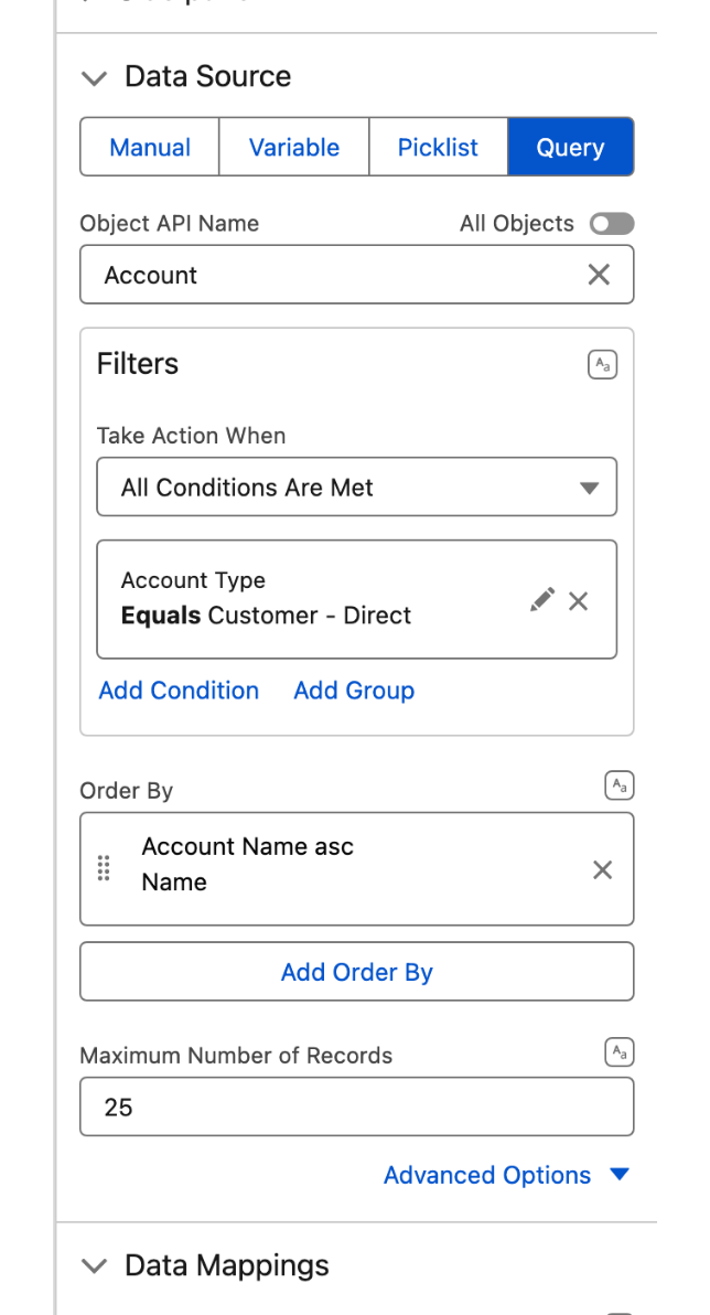
The data source is set at the bottom of the **Properties** tab. Choosing **Query** replaces the collection picker with a query editor: the object, the filter conditions, the sort order and a record cap.

<figure><img src="https://27923732-files.gitbook.io/~/files/v0/b/gitbook-x-prod.appspot.com/o/spaces%2F1FUd4apB9YHgCEMUFbVb%2Fuploads%2FLwkAwgl3L7XrxAIkzuR5%2Flist-builder-query-source.png?alt=media" alt="" width="320"><figcaption><p>The Query data source in the property editor</p></figcaption></figure>

> **Note:** Images are not supported when using the **Picklist** data source.

### Data Mapping

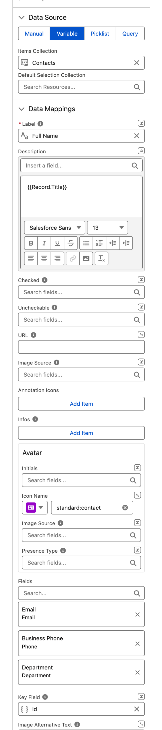
When using Variable or Query as your data source, you need to tell the List which Salesforce fields map to which parts of each item.

Think of **Data Mappings** as a translator: you connect `Account.Name` to Label, `Account.Phone` to Description, and so on. Without it, the list doesn't know what to display. **Data Mappings** sits directly under **Data Source** at the bottom of the Properties tab.

> **Example:** For a list of Contacts, you might map:
>
> * `Name` to **Label**
> * `Title` to **Description**
> * `Email`, `Phone` and `Department` to **Fields**

<figure><img src="https://27923732-files.gitbook.io/~/files/v0/b/gitbook-x-prod.appspot.com/o/spaces%2F1FUd4apB9YHgCEMUFbVb%2Fuploads%2FrFpk6DtYJWcJ3NWzhfXn%2Flist-builder-data-mappings.png?alt=media" alt="" width="320"><figcaption><p>Data Mappings on a record collection variable</p></figcaption></figure>

Every part of an item can be mapped, not just the label:

<table><thead><tr><th width="207">Mapping</th><th>What it sets on each item</th></tr></thead><tbody><tr><td><strong>Label</strong> <em>(required)</em></td><td>The item's main line of text.</td></tr><tr><td><strong>Description</strong></td><td>The secondary line under the label. Rich text, so it can carry formatting and other mapped fields.</td></tr><tr><td><strong>Checked</strong></td><td>The field that backs the checkbox in the Check List variant. Without it, checks live only in memory for the current screen.</td></tr><tr><td><strong>Uncheckable</strong></td><td>When this field is true, the item can no longer be unchecked. Point it at a different field from <strong>Checked</strong>, or leave it blank.</td></tr><tr><td><strong>URL</strong> and <strong>Target</strong></td><td>Turns the item into a link. Target is Self, Blank, Parent or Top.</td></tr><tr><td><strong>Image Source</strong></td><td>The field holding the URL of the item's image.</td></tr><tr><td><strong>Annotation Icons</strong></td><td>Small icons shown against the item, added one at a time.</td></tr><tr><td><strong>Infos</strong></td><td>Extra labelled entries under the item, each with its own optional URL and target.</td></tr><tr><td><strong>Avatar</strong></td><td>Per item: <strong>Initials</strong>, <strong>Icon Name</strong>, <strong>Image Source</strong> and <strong>Presence Type</strong> (Online, Busy, Focus, Offline, Blocked, Away).</td></tr><tr><td><strong>Fields</strong></td><td>The Salesforce fields listed under each item. Pick several; their layout is set separately under <strong>Fields Layout</strong> in the Properties tab.</td></tr><tr><td><strong>Key Field</strong></td><td>The unique identifier for each item, <code>{{Record.Id}}</code> by default. Selection and reordering both depend on it.</td></tr><tr><td><strong>Image Alternative Text</strong></td><td>Accessibility text describing the item's image.</td></tr></tbody></table>

The same section also holds **Filters**, **Search Fields** and **Sortable Fields**, which decide the fields those three features are allowed to work on, and **Sort By**, the field the list is ordered on.

### Variant

The **Variant** controls the overall shape and behavior of the list.

| Variant              | What It Looks Like                   | Best For                                                 |   |
| -------------------- | ------------------------------------ | -------------------------------------------------------- | - |
| **Base** *(default)* | Vertical list, one item per row      | Detailed records with multiple fields, avatars, or media |   |
| **Single Line**      | Horizontal scrolling row with arrows | Compact summaries, quick navigation between items        |   |
| **Check List**       | Vertical list with checkboxes        | Task lists, preference selections, multi-select input    |   |

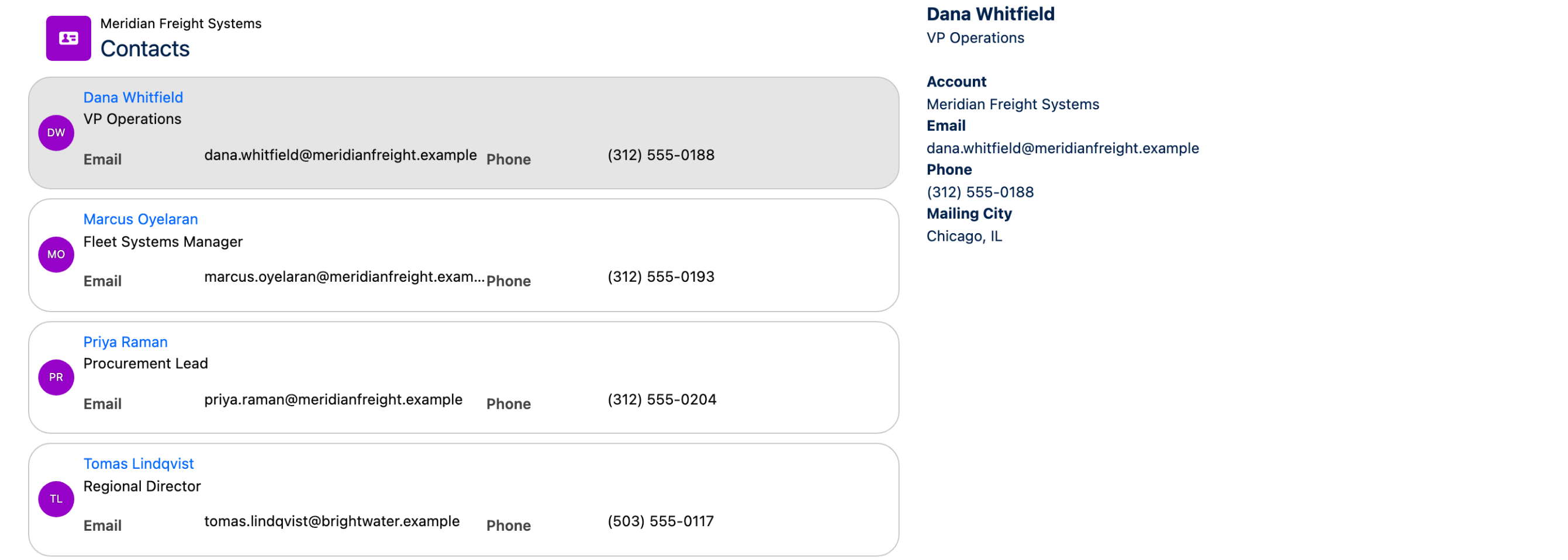
> **Example (Base):** A master-detail layout. Click a Contact in the list to see their full record on the right.

<figure><img src="https://27923732-files.gitbook.io/~/files/v0/b/gitbook-x-prod.appspot.com/o/spaces%2F1FUd4apB9YHgCEMUFbVb%2Fuploads%2FKWKZeSjpDmg3mLCQE567%2Flist-base-master-detail.png?alt=media" alt=""><figcaption><p>Base variant on the left of a two column screen, with the selected contact on the right</p></figcaption></figure>

> **Example (Single Line):** Show today's scheduled account visits in a horizontal strip at the top of a flow screen.

<figure><img src="https://27923732-files.gitbook.io/~/files/v0/b/gitbook-x-prod.appspot.com/o/spaces%2F1FUd4apB9YHgCEMUFbVb%2Fuploads%2FcK38hZiZM7WJAF5WAZKH%2Flist-single-line.png?alt=media" alt=""><figcaption><p>Single Line variant. The number of items shown at once follows the column settings under Layout</p></figcaption></figure>

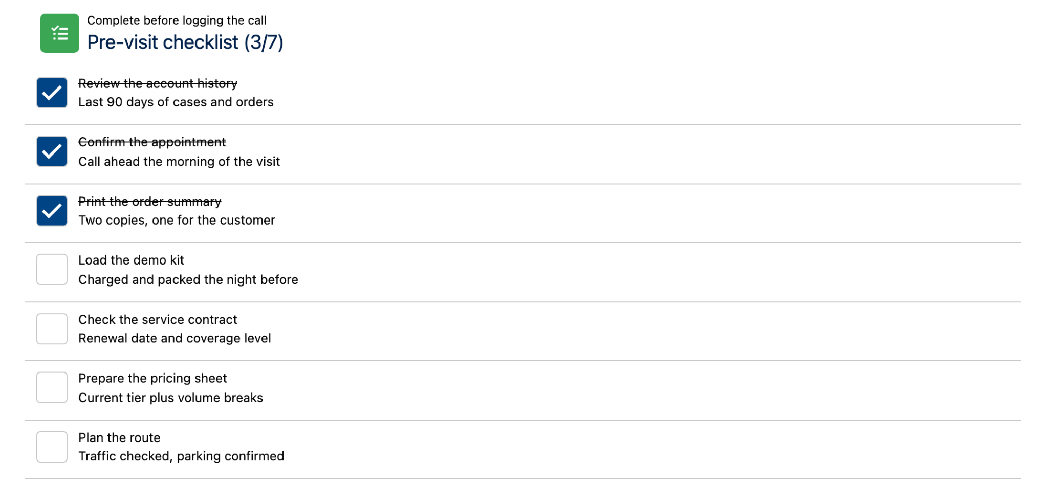
> **Example (Check List):** A pre-visit checklist a field rep completes before logging a call.

<figure><img src="https://27923732-files.gitbook.io/~/files/v0/b/gitbook-x-prod.appspot.com/o/spaces%2F1FUd4apB9YHgCEMUFbVb%2Fuploads%2FmtP7F3bBwq7y65e8P48D%2Flist-checklist.png?alt=media" alt=""><figcaption><p>Check List variant with Strike Through On Check and Show Check Counter both on</p></figcaption></figure>

#### Check List Settings

When **Check List** is selected, two additional options appear:

<table><thead><tr><th width="237.0029296875">Setting</th><th>What It Does</th></tr></thead><tbody><tr><td><strong>Strike Through On Check</strong></td><td>Draws a line through completed items, giving users instant visual confirmation.</td></tr><tr><td><strong>Show Check Counter</strong></td><td>Appends the count of checked items to the header title, in the form "(3/7)".</td></tr></tbody></table>

Which items start out checked, and whether a check survives the screen, both come from the **Checked** mapping in Data Mappings.

### Layout & Display

#### Columns

Control how many columns the list uses (1, 2, 3, 4, 6, or 12). Set different column counts for each screen size to enable responsive behavior.

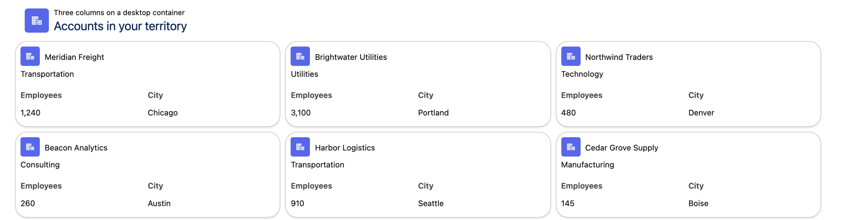
> **Example:** 1 column on the narrowest container, 3 on a desktop one, which is what turns a list into a product or account card grid.

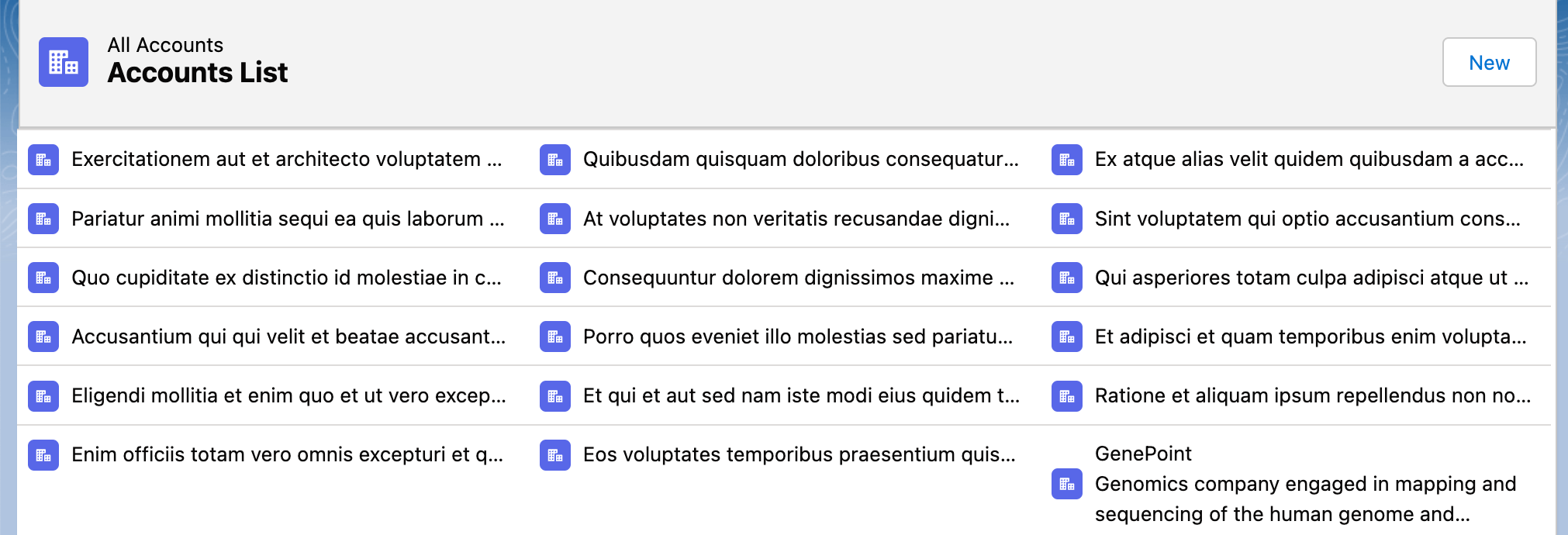
<figure><img src="https://27923732-files.gitbook.io/~/files/v0/b/gitbook-x-prod.appspot.com/o/spaces%2F1FUd4apB9YHgCEMUFbVb%2Fuploads%2F4Zna0bg747t0CD6WwASd%2Flist-columns.png?alt=media" alt=""><figcaption><p>Three columns on a desktop container, with the Card divider</p></figcaption></figure>

The four settings are **Number of Columns** (the fallback, and the value used below 480px), **Number of Columns Small Container**, **Number of Columns Medium Container** (above 768px) and **Number of Columns Large Container** (above 1024px).

#### Dividers

Dividers visually separate list items. Choose a style to match your design:

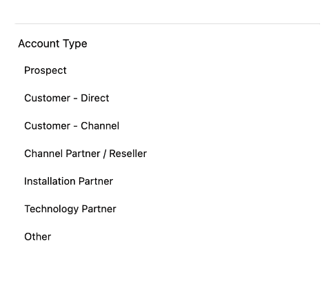
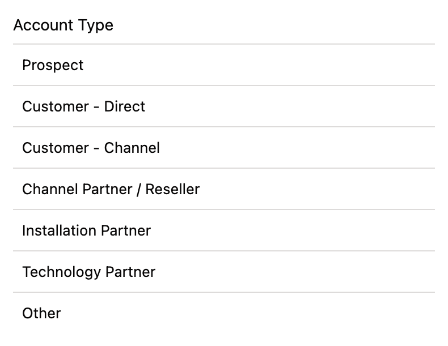
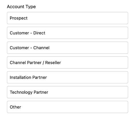
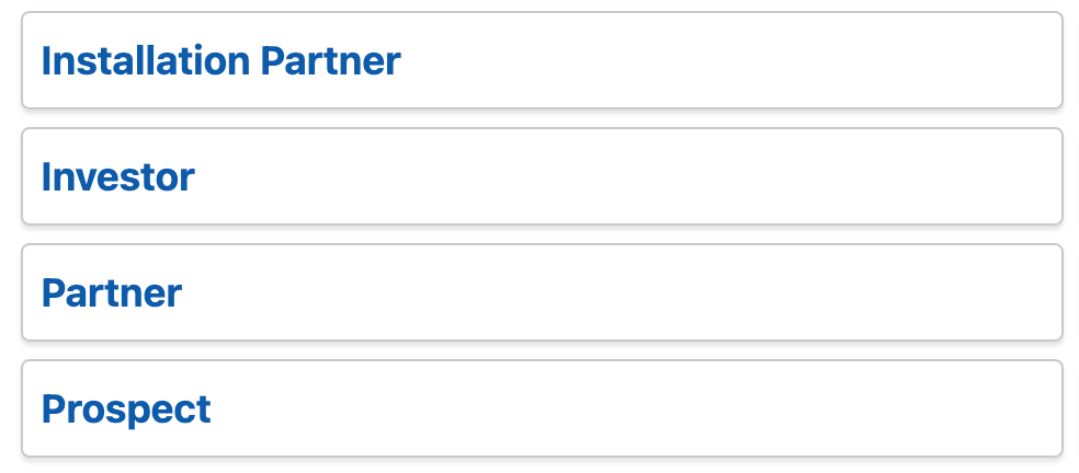
<table><thead><tr><th width="125.33333333333331">Divider</th><th width="309">Description</th><th>Illustration</th></tr></thead><tbody><tr><td><strong>None</strong> <em>(default)</em></td><td>No divider between items.</td><td></td></tr><tr><td><strong>Top</strong></td><td>Allows you to place a divider at the top of each item in the list.</td><td><img src="https://27923732-files.gitbook.io/~/files/v0/b/gitbook-x-prod.appspot.com/o/spaces%2F1FUd4apB9YHgCEMUFbVb%2Fuploads%2Fgit-blob-bc22a65601b9782fd27500682d51fffe947378b4%2F2023-09-03_20-33-55.png?alt=media" alt=""></td></tr><tr><td><strong>Bottom</strong></td><td>Adds a divider line at the bottom of each list item.</td><td><img src="https://27923732-files.gitbook.io/~/files/v0/b/gitbook-x-prod.appspot.com/o/spaces%2F1FUd4apB9YHgCEMUFbVb%2Fuploads%2Fgit-blob-3366e899d449e00432ec1223446a75135c3ac53e%2F2023-09-03_20-34-23.png?alt=media" alt=""></td></tr><tr><td><strong>Around</strong></td><td>Places divider lines both above and below each item in the list.</td><td><img src="https://27923732-files.gitbook.io/~/files/v0/b/gitbook-x-prod.appspot.com/o/spaces%2F1FUd4apB9YHgCEMUFbVb%2Fuploads%2Fgit-blob-5c061daaf5cd8a6bc89542704b1536a797c404fd%2F2023-09-03_20-34-47.png?alt=media" alt=""></td></tr><tr><td><strong>Card</strong></td><td>Sets each list item within its own card-like container, separated by dividers.</td><td><img src="https://27923732-files.gitbook.io/~/files/v0/b/gitbook-x-prod.appspot.com/o/spaces%2F1FUd4apB9YHgCEMUFbVb%2Fuploads%2Fgit-blob-0ff168ada363ce922e14e1c5aacba8e312082ea6%2F2023-09-03_20-36-02.png?alt=media" alt=""></td></tr></tbody></table>

#### Items Clickable

Toggle **Items Clickable** on to make entire list items clickable, not just action buttons. Wire the click to an interaction to navigate, open a modal, or trigger flow logic.

Two related settings sit beside it in the Properties tab:

<table><thead><tr><th width="237">Setting</th><th>What It Does</th></tr></thead><tbody><tr><td><strong>Highlight On Click</strong></td><td>Keeps the last clicked item highlighted. An interaction that opens a panel on item click highlights the last clicked item anyway, whatever this is set to.</td></tr><tr><td><strong>Show Number of Items</strong></td><td>Displays the item count in the header.</td></tr></tbody></table>

### Item Content

#### Avatar

Display a profile image, icon, or initials alongside each item.

The **Avatar** group in the Properties tab sets how avatars look for every item:

<table><thead><tr><th width="191.6171875">Attribute</th><th>Options</th></tr></thead><tbody><tr><td><strong>Icon Name</strong></td><td>The fallback icon, used when an item has no image and no initials.</td></tr><tr><td><strong>Size</strong></td><td>X-Small, Small, Medium <em>(default)</em>, Large, X-Large</td></tr><tr><td><strong>Initials Auto Formatted</strong></td><td>Derives the initials from the item's label instead of taking them from a field.</td></tr><tr><td><strong>Variant</strong></td><td>Circle, Square <em>(default)</em></td></tr><tr><td><strong>Position</strong></td><td>Left <em>(default)</em>, Top Left, Bottom Left, Right, Top Right, Bottom Right, Left of the Title, Right of the Title</td></tr></tbody></table>

What each individual avatar shows is a Data Mapping, not a property: **Initials**, **Icon Name**, **Image Source** and **Presence Type** (Online, Busy, Focus, Offline, Blocked, Away) are mapped per item in the **Data Mappings** section.

#### Images

Add an image to any list item. Configure position, size, height, and crop behavior directly in the component settings.

> Note: Images are not available with the Picklist data source.

#### Fields

Display additional Salesforce fields beneath each list item's main label.

**To set up fields:**

1. In **Data Mappings**, add the fields you want to display to the **Fields** mapping.
2. In the **Fields Layout** group of the Properties tab, set how many columns the fields use and which label style they take.

**Field label styles:**

<table><thead><tr><th width="180.42578125">Variant</th><th>What It Looks Like</th></tr></thead><tbody><tr><td><strong>Standard</strong></td><td>Label sits above the value — clean and readable</td></tr><tr><td><strong>Label Hidden</strong></td><td>No label shown — good when the field's purpose is obvious</td></tr><tr><td><strong>Label Inline</strong></td><td>Label sits to the left of the value — efficient use of horizontal space</td></tr><tr><td><strong>Label Stacked</strong></td><td>Label floats above the value when focused — modern, mobile-friendly</td></tr></tbody></table>

### Header

The header appears above the list and provides context and global controls.

<figure><img src="https://27923732-files.gitbook.io/~/files/v0/b/gitbook-x-prod.appspot.com/o/spaces%2F1FUd4apB9YHgCEMUFbVb%2Fuploads%2Fgit-blob-351c927cce17377331af6b24216b45e78e3d4839%2F2023-07-03_20-45-20.png?alt=media" alt=""><figcaption><p>Header section on a list</p></figcaption></figure>

<table><thead><tr><th width="119.009765625">Attribute</th><th>Purpose</th></tr></thead><tbody><tr><td><strong>Title</strong></td><td>Identifies what the list contains.</td></tr><tr><td><strong>Caption</strong></td><td>Short description or context below the title.</td></tr><tr><td><strong>Avatar</strong></td><td>The visual next to the title. Holds a <strong>Fallback Icon Name</strong>, an <strong>Image</strong>, <strong>Initials</strong>, <strong>Alternative Text</strong>, a <strong>Size</strong> and a <strong>Variant</strong>.</td></tr><tr><td><strong>Is Joined</strong></td><td>Squares off the bottom edge of the header and drops its shadow, so the header reads as one panel with the list underneath it.</td></tr><tr><td><strong>Actions</strong></td><td>Global action buttons, wired to the "On Header Action" interaction.</td></tr></tbody></table>

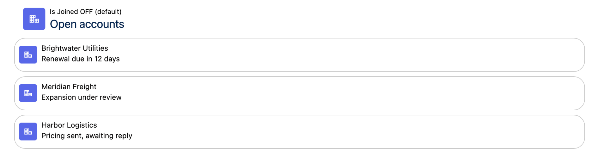
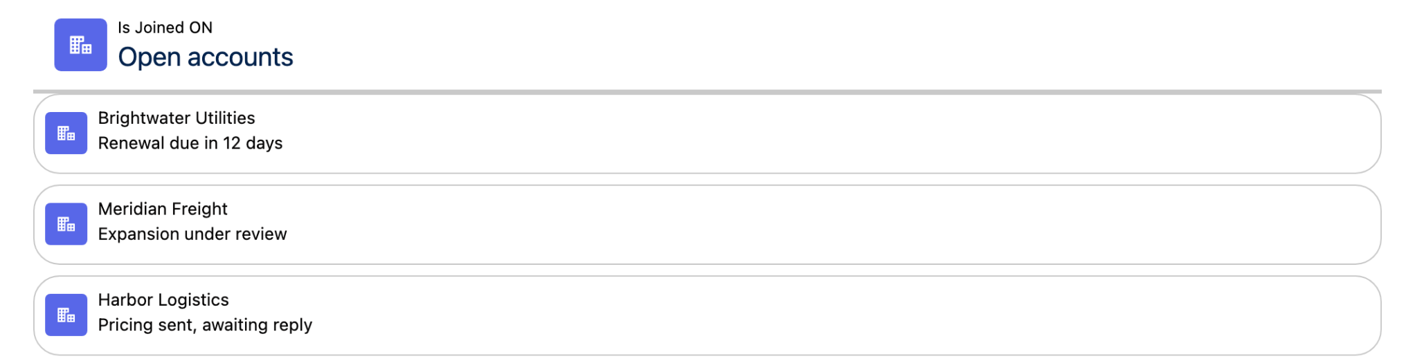
> **Example (Is Joined):** A list whose header should read as a banner over its own content rather than as a separate card.

<figure><img src="https://27923732-files.gitbook.io/~/files/v0/b/gitbook-x-prod.appspot.com/o/spaces%2F1FUd4apB9YHgCEMUFbVb%2Fuploads%2FYrdypXSdbrvtgJWFkmzE%2Flist-is-joined-off.png?alt=media" alt=""><figcaption><p>Is Joined off, the default: the header floats above the items</p></figcaption></figure>

<figure><img src="https://27923732-files.gitbook.io/~/files/v0/b/gitbook-x-prod.appspot.com/o/spaces%2F1FUd4apB9YHgCEMUFbVb%2Fuploads%2FozroKU8CxdlrAQyZDGN6%2Flist-is-joined-on.png?alt=media" alt=""><figcaption><p>Is Joined on: the header's bottom edge is squared off and a rule separates it from the items</p></figcaption></figure>

### Actions

Actions let users *perform actions from within the list — edit, navigate, delete, or trigger* flow logic.

#### Item Actions

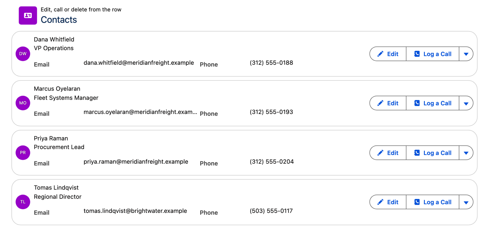
Buttons or links attached to individual list items. **Visible Item Actions** caps how many are shown on the row; the rest fold into an overflow menu.

> **Example:** An "Edit" button on each Contact row that opens an edit screen in the same flow.

<figure><img src="https://27923732-files.gitbook.io/~/files/v0/b/gitbook-x-prod.appspot.com/o/spaces%2F1FUd4apB9YHgCEMUFbVb%2Fuploads%2FLKXdCEJVqZpowPL8iK6m%2Flist-item-actions.png?alt=media" alt=""><figcaption><p>Three item actions with Visible Item Actions set to 2, so the third sits in the overflow menu</p></figcaption></figure>

#### Media Actions

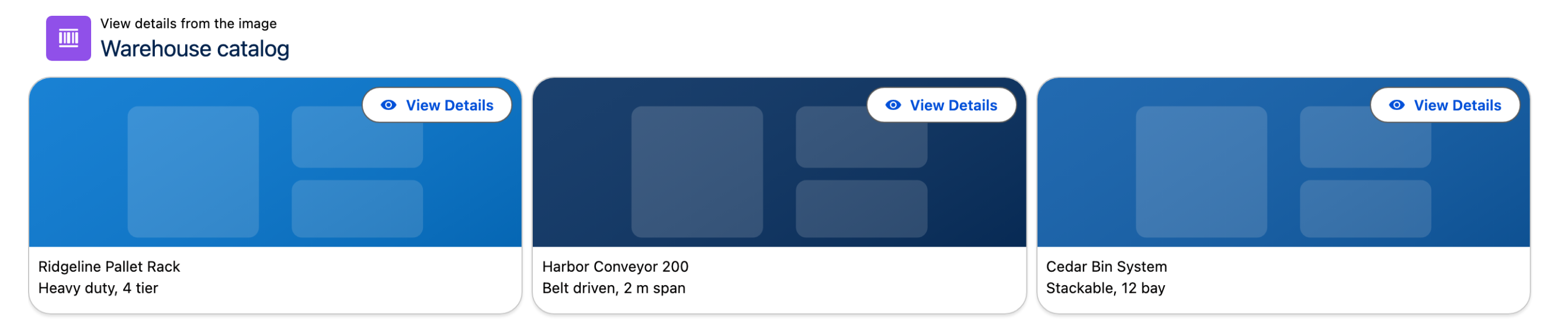
Buttons embedded in images or video thumbnails. **Visible Media Actions** caps how many appear, the same way **Visible Item Actions** does for row actions.

> **Example:** A "View Details" button overlaid on a product image that opens a detail screen.

<figure><img src="https://27923732-files.gitbook.io/~/files/v0/b/gitbook-x-prod.appspot.com/o/spaces%2F1FUd4apB9YHgCEMUFbVb%2Fuploads%2FWsqPRKlV3Z8AA4nmVxMf%2Flist-media-actions.png?alt=media" alt=""><figcaption><p>A media action drawn over each item's image</p></figcaption></figure>

### Filtering & Search

#### Search

Toggle on **Searchable** to add a search bar above the list.

| Setting              | Options                                |
| -------------------- | -------------------------------------- |
| **Placeholder text** | Custom hint text inside the search bar |
| **Position**         | Left, Right, Center, Fill, Panel       |

Setting **Position** to **Panel** moves the search box into the side panel, which is the same panel the filters can use. Which fields the search looks at comes from the **Search Fields** mapping in Data Mappings.

> **Tip:** Use descriptive placeholder text — "Search by account name or city" is more helpful than "Search…"

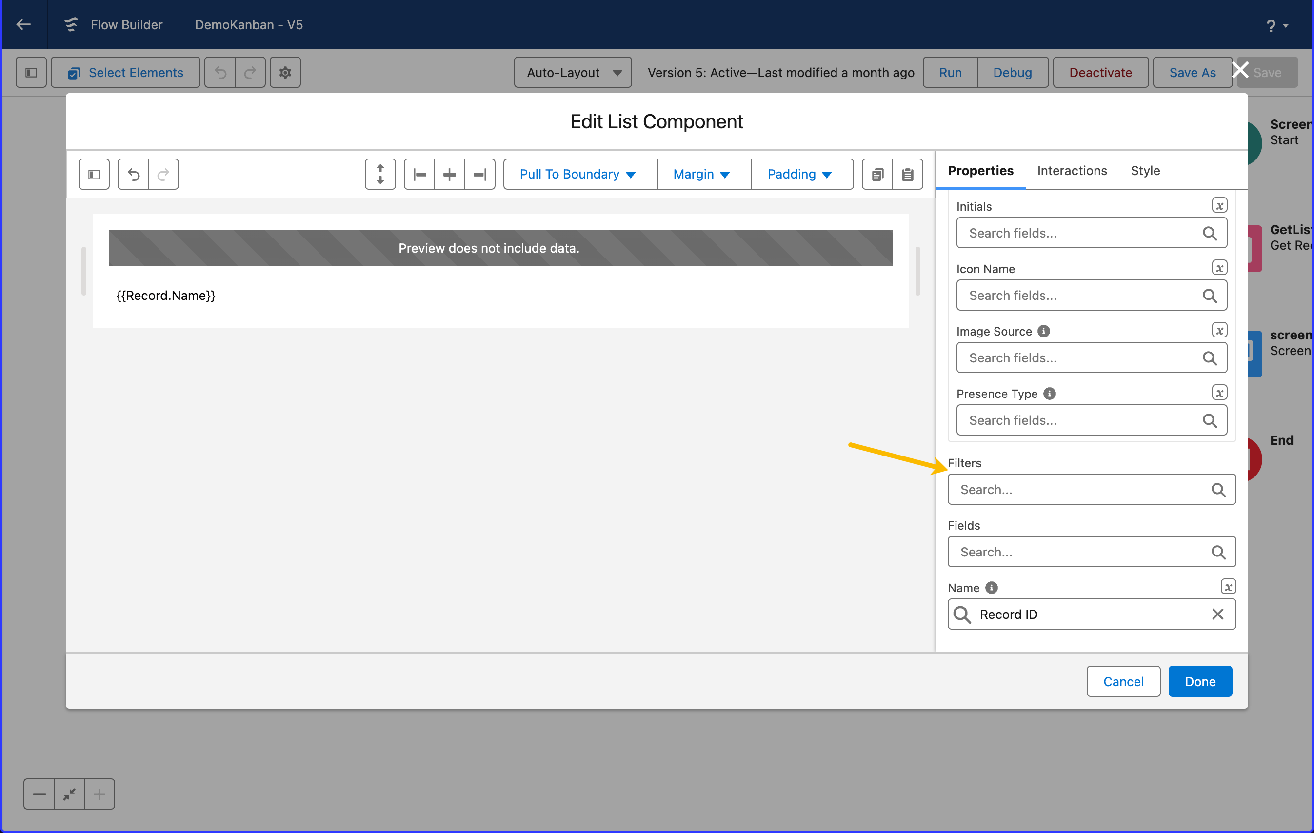
#### Filters

Add fields as filters so users can narrow down what the list shows. Which fields can be filtered on comes from the **Filters** mapping in Data Mappings; the **Type** setting in the **Filter** group decides how they are presented.

<figure><img src="https://27923732-files.gitbook.io/~/files/v0/b/gitbook-x-prod.appspot.com/o/spaces%2F1FUd4apB9YHgCEMUFbVb%2Fuploads%2Fgit-blob-37dcbcbc9a123a4f3a81b6208608023d62c50ce1%2F2023-11-27_20-21-50.png?alt=media" alt=""><figcaption><p>How to add filters</p></figcaption></figure>

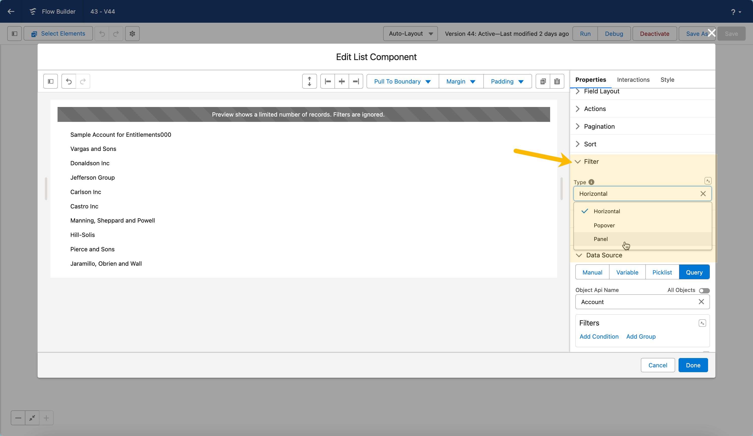
Choose how filters are displayed by going on the filter section.

<figure><img src="https://27923732-files.gitbook.io/~/files/v0/b/gitbook-x-prod.appspot.com/o/spaces%2F1FUd4apB9YHgCEMUFbVb%2Fuploads%2Fgit-blob-84b0bc9de5619c2efeb37558fa421ebfe6a53e45%2F2024-02-18_14-21-17.png?alt=media" alt=""><figcaption></figcaption></figure>

| Filter Type    | How It Works                                   | Best For                                                       | Illustration                                                                                                                                                                                                     |
| -------------- | ---------------------------------------------- | -------------------------------------------------------------- | ---------------------------------------------------------------------------------------------------------------------------------------------------------------------------------------------------------------- |
| **Horizontal** | Filter pills appear directly above the list    | Quick access, desktop-first flows                              | ![](https://27923732-files.gitbook.io/~/files/v0/b/gitbook-x-prod.appspot.com/o/spaces%2F1FUd4apB9YHgCEMUFbVb%2Fuploads%2Fgit-blob-0c9b90d2afe4d3c9563e9ee0ceb7bb0d05e4ee30%2F2024-03-15_14-21-46.png?alt=media) |
| **Popover**    | Filters hide behind a button — click to reveal | Keeping the interface clean when filters are used occasionally | ![](https://27923732-files.gitbook.io/~/files/v0/b/gitbook-x-prod.appspot.com/o/spaces%2F1FUd4apB9YHgCEMUFbVb%2Fuploads%2Fgit-blob-302e5535ad8682051046c36bd70cc1f81ba16e52%2F2024-03-15_14-22-47.png?alt=media) |
| **Panel**      | Filter panel slides in from left or right      | Complex filter sets with many fields                           | ![](https://27923732-files.gitbook.io/~/files/v0/b/gitbook-x-prod.appspot.com/o/spaces%2F1FUd4apB9YHgCEMUFbVb%2Fuploads%2Fgit-blob-5d28c238e1ad1534879c070b98d11712e9112cad%2F2024-03-15_14-23-44.png?alt=media) |

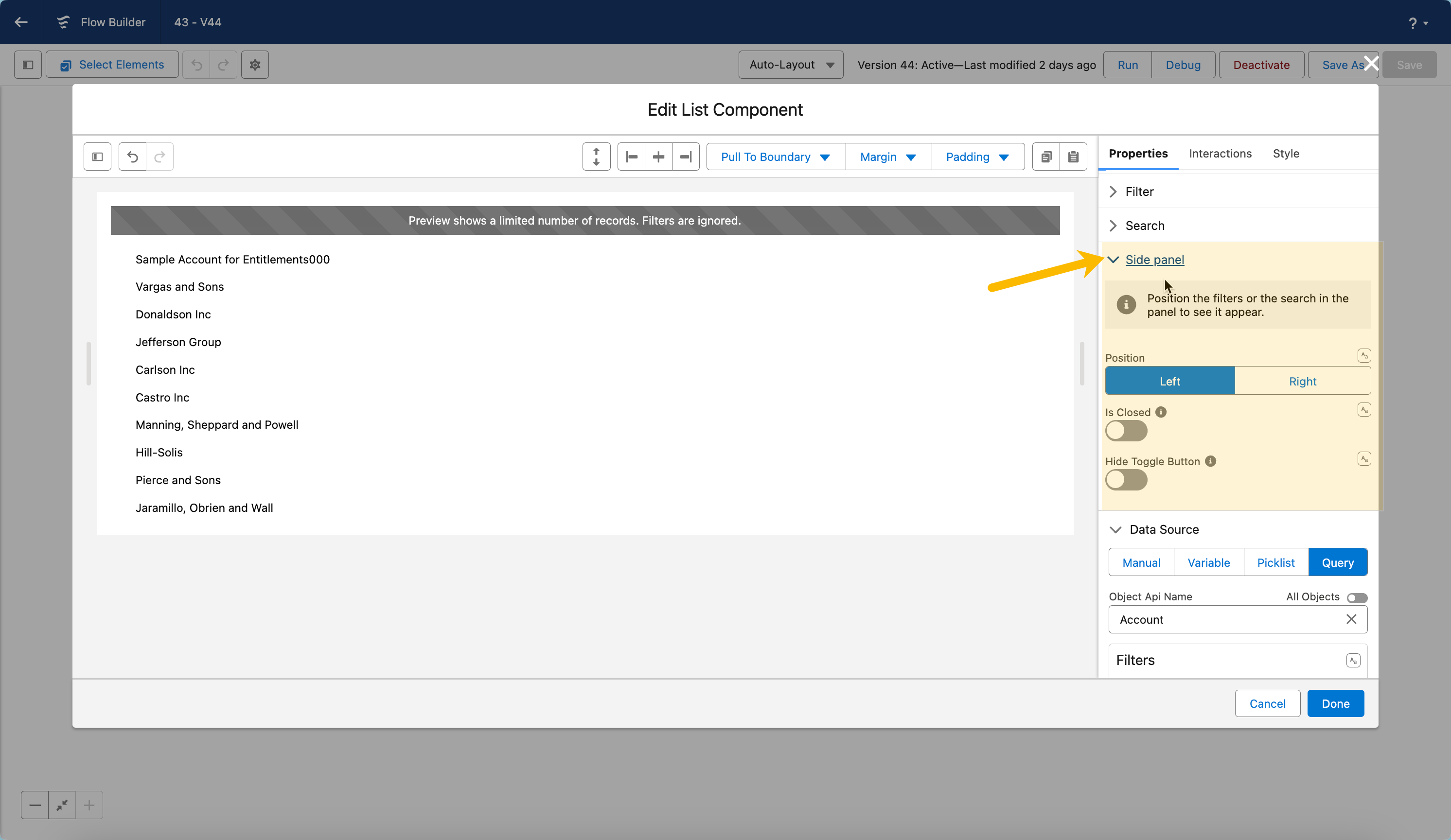
#### Side Panel

**Side panel** is its own group in the Properties tab, not a filter setting. It is shared: the panel appears when the filter **Type** is set to **Panel**, or when the search **Position** is set to **Panel**, or both.

| Setting                | Options                      | When to Use                                                                  |
| ---------------------- | ---------------------------- | ---------------------------------------------------------------------------- |
| **Position**           | Left, Right                  | Match the panel to your overall layout                                       |
| **Closed by Default**  | Open or Closed               | Closed puts the focus on the data first; open encourages filtering upfront   |
| **Hide Toggle Button** | Show or Hide                 | Hide when another element, such as a header action, should control the panel |
| **Reset Button Label** | Any text, "Reset" by default | Rename the button that clears the filter values                              |

<figure><img src="https://27923732-files.gitbook.io/~/files/v0/b/gitbook-x-prod.appspot.com/o/spaces%2F1FUd4apB9YHgCEMUFbVb%2Fuploads%2Fgit-blob-6684aaa38bdf7d97043d4db5caef679b3823927f%2F2024-02-18_14-23-32.png?alt=media" alt=""><figcaption></figcaption></figure>

### Sorting & Reordering

These are two different features, and they are configured in two different places.

#### Sort by Field

Users pick a field and the list reorders itself on it. The fields they can choose from come from the **Sortable Fields** mapping in Data Mappings, and **Sort By** in the same section sets the field the list opens on. In the **Sort** group of the Properties tab, **Sorted Direction** sets ascending or descending and **Show Sorted By Value** shows the current choice in the header.

#### Drag-to-Reorder

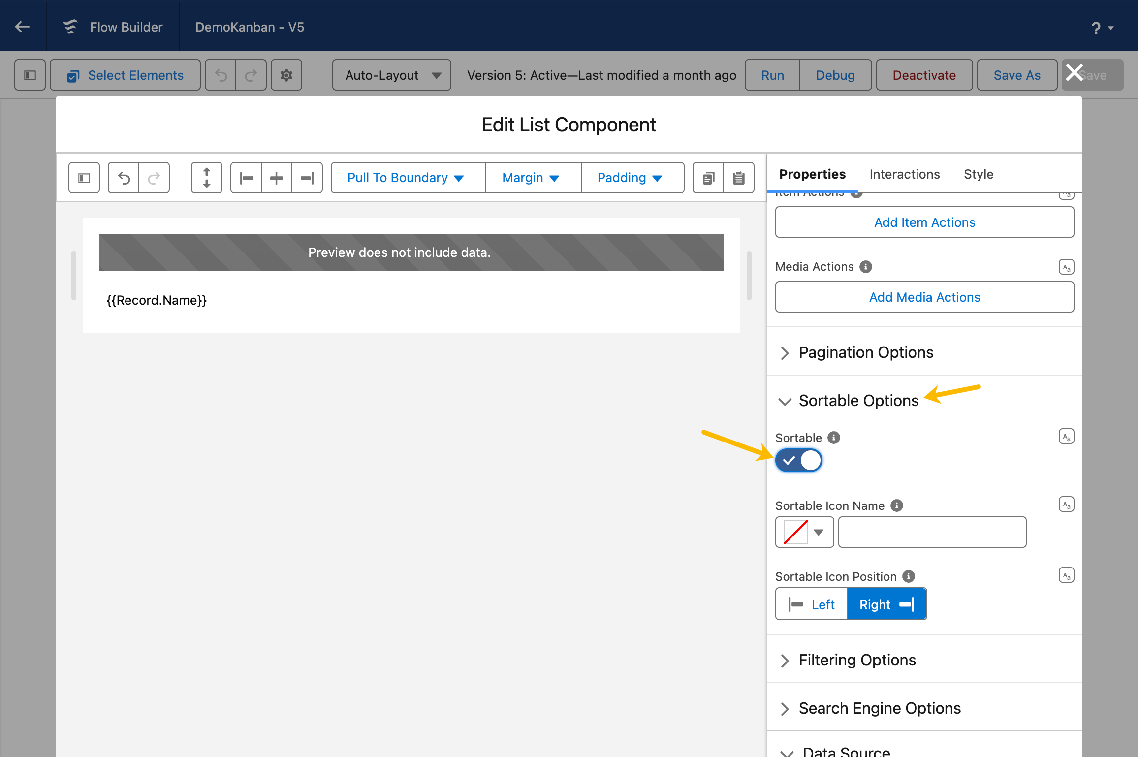
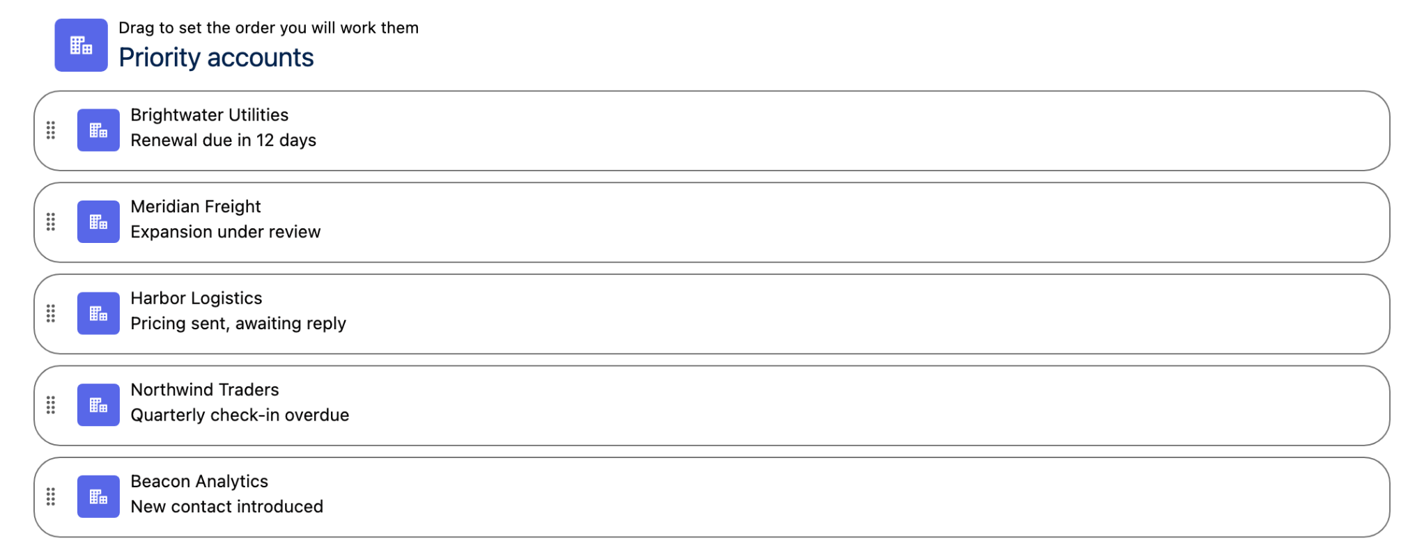
Enable **Sortable** to let users drag items into a new order. Each item then carries a drag handle, whose icon and side are set by **Sortable Icon Name** and **Sortable Icon Position**.

<figure><img src="https://27923732-files.gitbook.io/~/files/v0/b/gitbook-x-prod.appspot.com/o/spaces%2F1FUd4apB9YHgCEMUFbVb%2Fuploads%2Fgit-blob-b4572abf5d84ddc7f681ab25ad823ec8e70dea70%2F2023-11-27_20-23-27.png?alt=media" alt=""><figcaption><p>How to activate the Sortable option</p></figcaption></figure>

<figure><img src="https://27923732-files.gitbook.io/~/files/v0/b/gitbook-x-prod.appspot.com/o/spaces%2F1FUd4apB9YHgCEMUFbVb%2Fuploads%2F77vC7ATdjzQTGggHGYrR%2Flist-reorder-handles.png?alt=media" alt=""><figcaption><p>With Sortable on, every item carries a drag handle</p></figcaption></figure>

Wire the **On Reorder** interaction to an update action to persist the new order to Salesforce.

> ⚠️ **Important:** You must set a **Sort By** field in Data Mappings for drag-to-reorder to work correctly with the "Update Records Order" interaction option.

> **Example:** A rep drags their top priority accounts to the top of the list. The flow automatically updates an "Order" field on each Account record to reflect the new sequence.

### Pagination

Split long lists into pages to keep the interface fast and readable.

| Setting                   | Description                                    | Options                        |
| ------------------------- | ---------------------------------------------- | ------------------------------ |
| **Show Pagination**       | Display or hide pagination controls            | Enable / Disable               |
| **Items Per Page**        | How many items show per page                   | 1–200                          |
| **Alignment**             | Where pagination controls appear               | Left, Center, Right            |
| **Button Labels & Icons** | Customize First, Last, Next, Previous controls | Adapt for language or branding |

{% hint style="info" %}
**Items loading.** With **Pagination** off, the List loads **Items Per Page** items at a time behind a **Show More** button — or, if you set a fixed **Height** (Size style), it switches to **infinite scroll** (loading the next batch as you reach the bottom). With **Pagination** on, it shows one page of **Items Per Page** items with pagination controls.
{% endhint %}

## Interactions

[Interactions](/flow/component-builder/interactions-panel.md) define what happens when users interact with the List. Configure them from the **Interactions** tab of the Edit List panel.

### Item Click

Fires when a user clicks a list item (requires **Items Clickable** to be enabled or an Item Click interaction to be configured). Exposes the clicked record through the **clickedItem** and **clickedItemName** outputs — use it to navigate to a detail screen, open a modal, or pre-fill a form.

### Item Action Click

Fires when a user clicks an item-level action button. Use the **targetName** sub-property to scope the interaction to a specific action, and read the **clickedItemActionName**, **clickedItemActionItem**, and **clickedItemActionItemName** outputs to identify which action fired and on which record.

### Media Action Click

Fires when a user clicks an action embedded in an item's image or media area. Scope it with the **targetName** sub-property, and read the **clickedItemMediaActionName**, **clickedItemMediaActionItem**, and **clickedItemMediaActionItemName** outputs to identify the action and its record.

### Header Action

Fires when a user clicks one of the header action buttons. Use the **targetName** sub-property to target a specific header action, and read the **clickedHeaderActionName** output to branch your flow logic.

### Reorder

Fires when a user drags items into a new order (requires **Sortable** to be enabled). Exposes the new sequence through the **sortedItems**, **sortedItemsSObject**, and **sortedItemsSerialized** outputs — wire it to an Update Records element to persist the order. Set a **Sort By** field in Data Mappings to enable the **Update Records Order** interaction option.

### Item Check

Fires when a user checks or unchecks an item (Check List variant only). Updates the **selectedItems** and **selectedItemNames** outputs to reflect the current selection.

## Styling

The **Style** tab gives you fine-grained control over the List's appearance. Configure it from the **Style** tab of the Edit List panel.

{% tabs %}
{% tab title="Margin" %}
Controls outer spacing.

* **Top:** Space above the component.
* **Right:** Space to the right of the component.
* **Bottom:** Space below the component.
* **Left:** Space to the left of the component.
  {% endtab %}

{% tab title="Padding" %}
Controls inner spacing.

* **Top:** Inner space at the top.
* **Right:** Inner space on the right.
* **Bottom:** Inner space at the bottom.
* **Left:** Inner space on the left.
  {% endtab %}

{% tab title="Size" %}
Controls dimensions.

* **Width / Height:** Sets the component's width and height.
* **Min / Max Width / Height:** Constrains how small or large the component can grow.
* **Overflow:** Determines how content behaves when it exceeds the component's bounds.
  {% endtab %}

{% tab title="Border" %}
Customizes the border.

* **Color:** Border color.
* **Size:** Border thickness.
* **Style:** Border style (solid, dashed, etc.).
* **Radius:** Corner rounding.
  {% endtab %}

{% tab title="Header" %}
Styles the optional header above the content.

* **Color:** Header background color.
* **Title Text Color:** Color of the title text.
* **Title Font Size:** Size of the title text.
* **Title Font Style:** Style of the title text (normal, italic).
* **Title Font Weight:** Weight of the title text (normal, bold).
* **Subtitle Text Color:** Color of the subtitle text.
* **Subtitle Font Size:** Size of the subtitle text.
* **Icon Color:** Color of the header icon.
* **Action Color:** Color of the header action buttons.
  {% endtab %}

{% tab title="Flow Dialog" %}
Adjusts display when opened as a modal dialog inside a Flow screen.

* **Width:** Dialog width.
* **Height:** Dialog height.
* **Background Color:** Dialog background color.
  {% endtab %}

{% tab title="Flow Panel" %}
Adjusts display when opened as a side panel inside a Flow screen.

* **Width:** Panel width.
* **Background Color:** Panel background color.
  {% endtab %}

{% tab title="Item" %}
Controls individual list item appearance.

* **Avatar Image Object Fit:** How the avatar image fits within its container.
  {% endtab %}

{% tab title="Item Spacing" %}
Controls spacing around and between list items.

* **Top:** Space above each item.
* **Bottom:** Space below each item.
* **Left:** Space to the left of each item.
* **Right:** Space to the right of each item.
* **Block Between:** Vertical space between items.
* **Inline Between:** Horizontal space between items.
  {% endtab %}

{% tab title="Item Vertical Alignment" %}
Controls vertical alignment of item sub-elements.

* **Body:** Vertical alignment of the item body.
* **Actions:** Vertical alignment of item action buttons.
* **Avatar:** Vertical alignment of the item avatar.
  {% endtab %}

{% tab title="Item Label" %}
Styles the primary label text on each item.

* **Text Color:** Label text color.
* **Link Color:** Color of label links.
* **Link Color Hover:** Label link color on hover.
* **Font Size:** Label font size.
* **Font Style:** Label font style (normal, italic).
* **Font Weight:** Label font weight.
  {% endtab %}

{% tab title="Item Description" %}
Styles the description text on each item.

* **Color:** Description text color.
* **Font Size:** Description font size.
* **Font Style:** Description font style.
* **Font Weight:** Description font weight.
* **Line Clamp:** Maximum number of lines before truncation.
  {% endtab %}

{% tab title="Item Background" %}
Controls the background of list items.

* **Color:** Default item background color.
* **Color Hover:** Background color on hover.
* **Color Highlight:** Background color when highlighted.
* **Color Sortable:** Background color when the item is sortable.
* **Color Sortable Hover:** Background color when a sortable item is hovered.
  {% endtab %}

{% tab title="Item Border" %}
Customizes the border on each list item.

* **Color:** Item border color.
* **Size:** Item border thickness.
* **Style:** Item border style.
* **Radius:** Item border corner radius.
  {% endtab %}

{% tab title="Item Info" %}
Styles the secondary info text on each item.

* **Text Color:** Info text color.
* **Link Color:** Info link color.
* **Link Color Hover:** Info link color on hover.
* **Font Size:** Info font size.
* **Font Style:** Info font style.
* **Font Weight:** Info font weight.
  {% endtab %}

{% tab title="Item Fields" %}
Styles the fields section displayed within each item.

* **Background Color:** Fields area background color.
* **Border Color:** Fields area border color.
* **Border Size:** Fields area border thickness.
* **Border Style:** Fields area border style.
* **Border Radius:** Fields area corner radius.
* **Spacing Inline:** Horizontal spacing within the fields area.
* **Spacing Block:** Vertical spacing within the fields area.
  {% endtab %}

{% tab title="Item Fields Label" %}
Styles the labels of output fields inside each item.

* **Color:** Field label text color.
* **Font Size:** Field label font size.
* **Font Style:** Field label font style.
* **Font Weight:** Field label font weight.
  {% endtab %}

{% tab title="Item Fields Value" %}
Styles the values of output fields inside each item.

* **Color:** Field value text color.
* **Font Size:** Field value font size.
* **Font Style:** Field value font style.
* **Font Weight:** Field value font weight.
  {% endtab %}

{% tab title="Pagination Buttons" %}
Styles the pagination controls at the bottom of the list.

* **Background Color:** Button background color.
* **Background Color Active:** Background when the button is active.
* **Background Color Hover:** Background on hover.
* **Background Color Disabled:** Background when disabled.
* **Text/Icon Color:** Button text and icon color.
* **Text/Icon Color Active:** Text/icon color when active.
* **Text/Icon Color Hover:** Text/icon color on hover.
* **Text/Icon Color Disabled:** Text/icon color when disabled.
* **Color Border:** Button border color.
* **Color Border Active:** Border color when active.
* **Color Border Hover:** Border color on hover.
* **Color Border Disabled:** Border color when disabled.
* **Border Size:** Button border thickness.
* **Border Style:** Button border style.
* **Active Button Background Color:** Background of the currently active page button.
* **Active Button Background Color Active:** Background when the active page button is pressed.
* **Active Button Background Color Hover:** Background when hovering the active page button.
* **Active Button Text/Icon Color:** Text/icon color of the active page button.
* **Active Button Text/Icon Color Active:** Text/icon color when the active page button is pressed.
* **Active Button Text/Icon Color Hover:** Text/icon color when hovering the active page button.
* **Active Button Color Border:** Border color of the active page button.
* **Active Button Color Border Active:** Border when the active page button is pressed.
* **Active Button Color Border Hover:** Border when hovering the active page button.
  {% endtab %}

{% tab title="Footer" %}
Styles the footer area below the list items.

* **Background Color:** Footer background color.
* **Border Color:** Footer border color.
* **Border Size:** Footer border thickness.
* **Border Style:** Footer border style.
* **Border Radius:** Footer corner radius.
  {% endtab %}

{% tab title="Show More Button" %}
Styles the button that loads additional items.

* **Background Color:** Button background color.
* **Background Color Active:** Background when pressed.
* **Background Color Hover:** Background on hover.
* **Text Color:** Button text color.
* **Text Color Active:** Text color when pressed.
* **Text Color Hover:** Text color on hover.
* **Border Color:** Button border color.
* **Border Color Active:** Border when pressed.
* **Border Color Hover:** Border on hover.
* **Border Size:** Border thickness.
* **Border Radius:** Corner rounding.
* **Block Start:** Space above the button.
* **Block End:** Space below the button.
* **Inline Start:** Space to the left of the button.
* **Inline End:** Space to the right of the button.
  {% endtab %}

{% tab title="Checkbox Button" %}
Styles the checkbox used in the Check List variant.

* **Size:** Checkbox button size.
* **Background Color:** Checkbox background color.
* **Background Color Active:** Background when checked.
* **Icon Color:** Color of the checkmark icon.
* **Border Color:** Checkbox border color.
* **Border Size:** Checkbox border thickness.
* **Border Radius:** Checkbox corner rounding.
  {% endtab %}
  {% endtabs %}

## Output Variables

The List exposes these output variables you can reference in your flow after the screen. To use them, select the screen element in Flow Builder, then the List component, and pick the output variable you need.

Most of the examples below follow the same shape: the List screen runs, and the element after it branches or loops on what the user did.

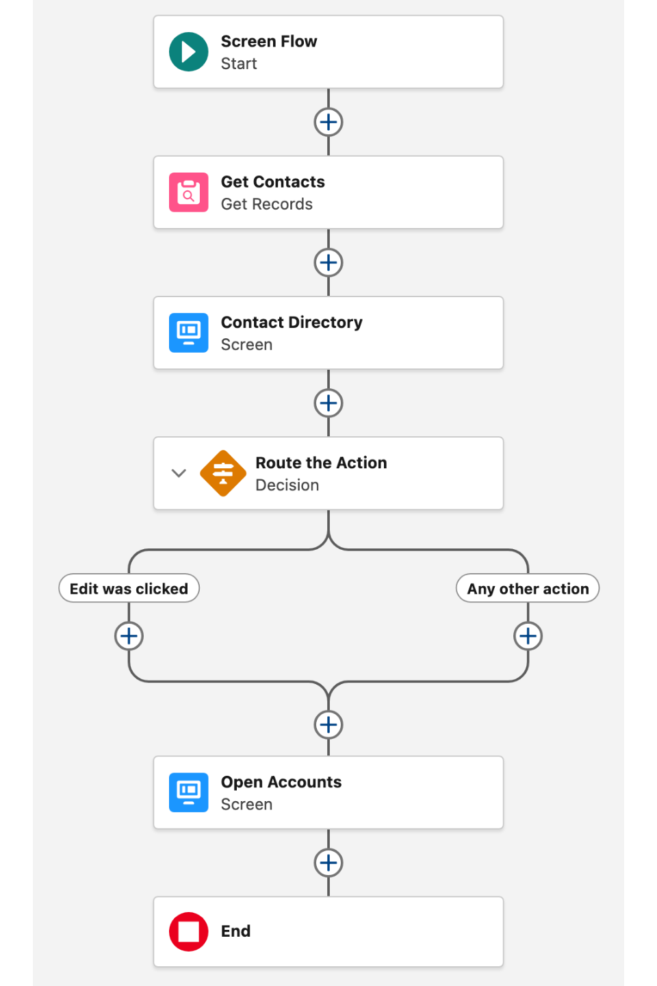
<figure><img src="https://27923732-files.gitbook.io/~/files/v0/b/gitbook-x-prod.appspot.com/o/spaces%2F1FUd4apB9YHgCEMUFbVb%2Fuploads%2F8INB2i2JjnZJR80hyQvU%2Flist-flow-canvas-decision.png?alt=media" alt="" width="320"><figcaption><p>A List screen feeding a Decision that branches on the action the user clicked</p></figcaption></figure>

### Item Click

When a user clicks a list item (requires **Items Clickable** to be enabled or an Item Click interaction to be configured).

| Output variable       | Type             | What it returns                                   |
| --------------------- | ---------------- | ------------------------------------------------- |
| **Clicked Item**      | Record (SObject) | The full record behind the item the user clicked. |
| **Clicked Item Name** | Text (String)    | The name (key) of the clicked item.               |

> **Example:** After the List screen, use **Clicked Item** to pre-fill a details screen with the contact or account the user selected.

### Item Actions

When a user clicks an action button on an individual list item.

| Output variable                   | Type             | What it returns                                                   |
| --------------------------------- | ---------------- | ----------------------------------------------------------------- |
| **Clicked Item Action Name**      | Text (String)    | The name of the action button the user clicked.                   |
| **Clicked Item Action Item**      | Record (SObject) | The record belonging to the item on which the action was clicked. |
| **Clicked Item Action Item Name** | Text (String)    | The name (key) of that record.                                    |

> **Example:** A row action called "Edit" is triggered. Use a **Decision** element to check if **Clicked Item Action Name** equals "Edit", then navigate to a record edit screen using the data from **Clicked Item Action Item**.

### Media Actions

When a user clicks an action embedded in an item's image or media area.

| Output variable                         | Type             | What it returns                                                         |
| --------------------------------------- | ---------------- | ----------------------------------------------------------------------- |
| **Clicked Item Media Action Name**      | Text (String)    | The name of the media action the user clicked.                          |
| **Clicked Item Media Action Item**      | Record (SObject) | The record belonging to the item on which the media action was clicked. |
| **Clicked Item Media Action Item Name** | Text (String)    | The name (key) of that record.                                          |

> **Example:** On a product list, a media action "View Details" lets users click the product image. Use **Clicked Item Media Action Item** to pass the product record to a detail screen.

### Header Actions

When a user clicks one of the header action buttons.

| Output variable                | Type          | What it returns                                        |
| ------------------------------ | ------------- | ------------------------------------------------------ |
| **Clicked Header Action Name** | Text (String) | The name of the header action button the user clicked. |

> **Example:** Use a **Decision** element after the screen to branch on **Clicked Header Action Name** — route to a "New Record" screen when the value equals "new".

### Reorder

When a user drags items into a new order.

| Output variable          | Type              | What it returns                                                                                       |
| ------------------------ | ----------------- | ----------------------------------------------------------------------------------------------------- |
| **Items**                | Item Collection   | The reordered list items as Avonni List Item objects.                                                 |
| **Sorted Items SObject** | Record Collection | The reordered items as Salesforce records — use this to pass directly into an Update Records element. |
| **Items Serialized**     | Text (String)     | The reordered items as a JSON string — useful when you need to pass the sequence to an Apex action.   |

> **Example:** After the user drags accounts into priority order, pass **Sorted Items SObject** into an **Update Records** element to persist the new sequence in a custom `Sort_Order__c` field.

### Item Check

When a user checks or unchecks an item (Check List variant only).

| Output variable         | Type              | What it returns                                    |
| ----------------------- | ----------------- | -------------------------------------------------- |
| **Selected Items**      | Record Collection | The currently checked items as Salesforce records. |
| **Selected Item Names** | Text Collection   | The name (key) of each checked item.               |

> **Example:** After the List screen, use a **Loop** element to iterate through **Selected Items** and update each record's status — e.g., mark each selected Task as "Completed".

### Others

| Output variable     | Type    | What it returns                                         |
| ------------------- | ------- | ------------------------------------------------------- |
| **Number of Items** | Integer | The total number of items currently loaded in the list. |

### Flow Interaction Output Variables

Like all interactive Flow components, the List exposes generic output slots (Variable 1–10) that an [Open Flow Dialog](/flow/component-builder/interactions-panel/open-flow-dialog.md) or [Open Flow Panel](/flow/component-builder/interactions-panel/open-flow-panel.md) interaction can fill with values from a launched flow. See [Flow Interaction Output Variables](/flow/component-builder/interactions-panel/flow-interaction-output-variables.md).

## Troubleshooting Common Issues

* **List shows nothing at runtime but items appear in the Component Builder preview** — The flow variable feeding the Items input is empty when the screen loads — the Get Records element hasn't run yet, or the variable was reset earlier in the flow. Place the Get Records element before the screen, and confirm the collection variable is populated by adding a temporary Display Text element before the List screen.
* **Items show but the title, description, or avatar is empty** — The Data Mappings section maps to fields the running user can't read (Field-Level Security), or the mapping points to a field that doesn't exist on the source object. Verify each mapped field's API name in Setup → Object Manager → \[Object] → Fields & Relationships, and grant Visible FLS on the running user's profile.
* **Drag-and-drop reorder works visually but the new order is not saved** — The **Sort By** mapping in Data Mappings is empty, or the sort field is non-writeable (formula, roll-up, system). Set Sort By to a numeric or text field the running user can edit (e.g., a custom `Sort_Order__c` field) and ensure the user has Edit FLS on that field.
* **Reordering doesn't persist after refreshing the screen** — The Data Source is set to Manual items; reorder persistence is only supported for Variable and Query sources because the component needs Salesforce records (with Ids) to write back to. Switch to Variable or Query as the Data Source if reorder needs to persist across sessions.
* **Checked state is lost on refresh** — No field is mapped to Checked in Data Mappings; without a backing field, checks are stored only in memory for the current screen. In Data Mappings, map the Checked property to a checkbox field on the source object and ensure the running user has Edit FLS on that field.
* **Once an item is checked, the user can no longer uncheck it** — The Checked and Uncheckable properties in Data Mappings point to the same field, triggering the "complete and lock" behavior — once true, the item becomes uncheckable. If users should be able to uncheck items, leave Uncheckable blank or map it to a different field.
* **Panel filters have no effect when records are loaded from a query** — Panel filters only apply to Manual and Variable Data Sources; in Query mode, filtering is done server-side through Query Filters in the Properties tab. Open the Query panel and add filter conditions there instead.
* **Sort changes from the header have no effect in Query mode** — In Query mode, sort order comes from Query Order By in the Properties tab, not from the visible Sort By menu. Open the Query panel and configure Order By with the desired field and direction.
* **Search returns no results even though the value appears in an item** — Searchable fields are not configured; the component automatically searches the fields used in the Title and Description mappings, so values in other fields (e.g., Email or Phone) won't be found. Open Search Engine Attributes and add the field API names you want included in the search.
* **Clicking an item does nothing** — Neither Items Clickable is on nor an Item Click interaction is configured; the list only treats items as clickable when at least one of these is set. Toggle Items Clickable on for navigation use cases, or wire an Item Click interaction in the Interactions tab.
* **Selected Items output variable is empty after the user checks rows** — The Name mapping in Data Mappings is empty, or the field it points to has duplicate or empty values; the component identifies items by the Name field and without a unique value per item, selection can't be tracked. Map Name to a field with a unique, non-null value per row (typically `{{Record.Id}}`).


---

# Agent Instructions
This documentation is published with GitBook. GitBook is the documentation platform designed so that both humans and AI agents can read, navigate, and reason over technical content effectively. Learn more at gitbook.com.

## Querying This Documentation
If you need additional information that is not directly available in this page, you can query the documentation dynamically by asking a question.

Perform an HTTP GET request on the following URL with the `ask` and `goal` query parameters:

```
GET https://docs.avonnicomponents.com/flow/flow-components/list.md?ask=<question>&goal=<user_goal>
```

`ask` is the immediate question: it should be specific, self-contained, and written in natural language.
`goal` is what the user is ultimately trying to achieve, the reason they need the answer. Sharing it helps GitBook give you a better, more relevant answer. A goal is most helpful when it describes the outcome the user wants rather than restating the question. For example, with `ask=how do I create an API token`, a goal like `build a script that syncs our docs to a CMS` lets GitBook tailor the answer to that use case.

The response will contain a direct answer to the question and relevant excerpts and sources from the documentation.

Use this mechanism when the answer is not explicitly present in the current page, you need clarification or additional context, or you want to retrieve related documentation sections.