> For the complete documentation index, see [llms.txt](https://docs.avonnicomponents.com/llms.txt). Markdown versions of documentation pages are available by appending `.md` to page URLs; this page is available as [Markdown](https://docs.avonnicomponents.com/flow/flow-components/tree-grid.md).

# Tree Grid

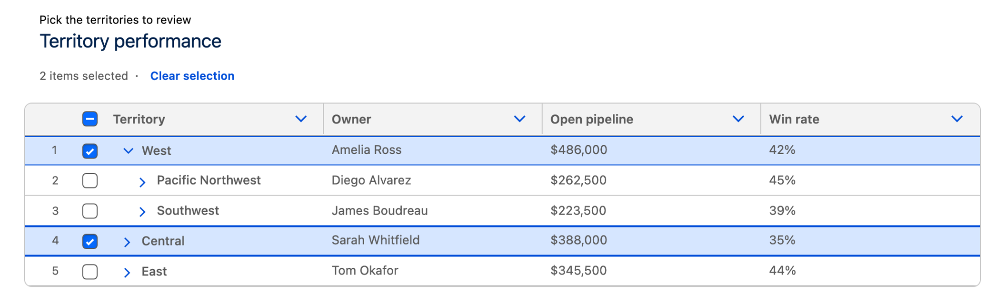
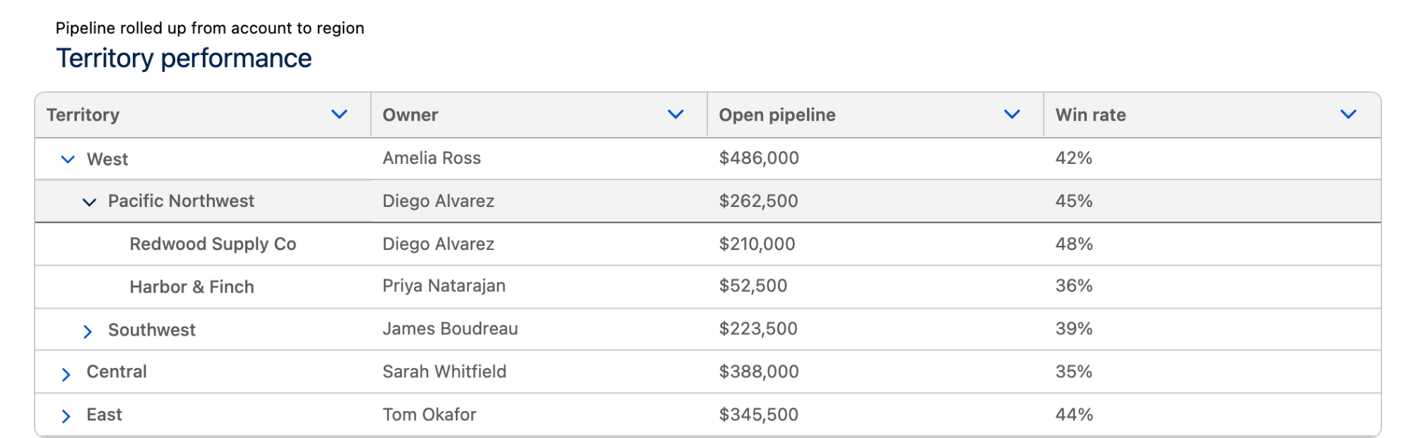
The **Tree Grid** displays hierarchical (parent/child) records in an expandable, columnar table on a Flow screen. Rows expand and collapse to reveal nested items, with configurable columns, selection, and header actions.

## Overview

Use the Tree Grid when records have a parent/child relationship users should browse in place: expandable rows, resizable columns, sortable columns, and optional row selection, sourced either from rows you enter by hand or from a Salesforce query.

## Configuration

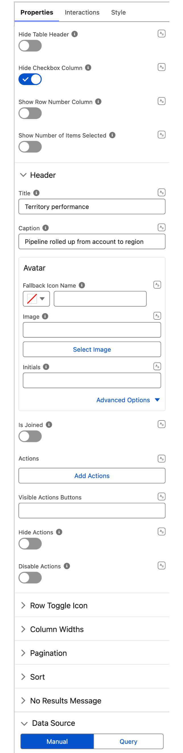
To configure the Tree Grid, click the component on the Flow screen. The **Edit Tree Grid Component** panel opens on the right with three tabs: **Properties**, **Interactions**, and **Style**. The sections below mirror the Properties tab.

### Data Source

| Data source                                                  | What it does                                                                                                                  |
| ------------------------------------------------------------ | ----------------------------------------------------------------------------------------------------------------------------- |
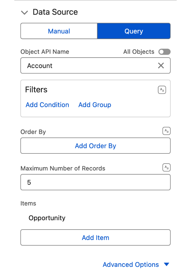
| [**Manual**](/flow/component-builder/data-sources/manual.md) | Enter rows directly in the component configuration, nesting child rows under their parent. Best for small, fixed hierarchies. |
| [**Query**](/flow/component-builder/data-sources/query.md)   | Fetch records from Salesforce so child records load beneath their parent. The usual choice for live data.                     |

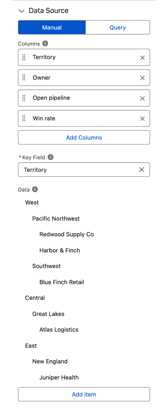
With the **Manual** source, configure three properties in this order, because each one depends on the previous.

1. **Columns**: add one entry per column, each with a **Label** (the text shown in the column header) and a **Name** (the key that binds the column to your data).
2. **Key Field**: select which column uniquely identifies a row. This is required, and the **Data** property stays locked until you set it.
3. **Data**: enter your rows. The editor shows one field per column you defined.

To build the hierarchy, open a row's action menu and choose **Add**. The new row is created as a child of the row you started from, and you can nest as many levels as you need. The same menu offers **Edit**, **Move Up**, **Move Down**, and **Delete**.

{% hint style="warning" %}
Manual columns have no type setting, so every value renders as plain text. To format columns as currency, date, badge, avatar, and so on, use the **Query** data source and set the types in **Data Mapping**.
{% endhint %}

### Data Mapping

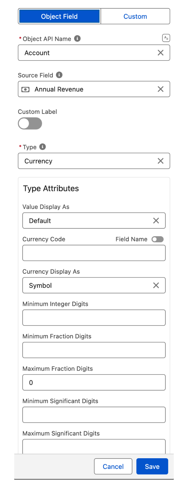
Available with the **Query** data source. Add one entry per column you want to display, and configure it with the following properties.

* **Object Field / Custom**: choose whether the column reads a Salesforce field or is a custom column you populate yourself, such as a button or an action menu.
* **Object API Name** and **Source Field**: for an Object Field column, the object and the field that populate the column.
* **Custom Label** and **Label**: turn on **Custom Label** to enter your own header text. Left off, the column uses the Salesforce field label.
* **Type**: how the value is formatted (Text, Number, Currency, Date, Badge, Avatar, Button, Action, and more). It is detected from the field, and you can override it.
* **Type Attributes**: the settings specific to the chosen type, such as the currency code for a Currency column or the list of row actions for an Action column.
* **Cell Attributes**: alignment, and an optional icon shown in the cell.
* **Icon Name**: an icon displayed in the column header.
* **Sortable**: lets users sort the grid on this column.
* **Hidden**: keeps the column in the configuration without displaying it.
* **Initial Width** and **Wrap Text**: the column's starting width in pixels, and whether long values wrap instead of being truncated.

{% hint style="info" %}
Row actions are configured as a column: add a column, set its **Type** to **Action**, and define the actions in its type attributes. Those actions are what the **Row Action Click** interaction responds to.
{% endhint %}

### Properties

* **Hide Table Header** hides the column header row.
* **Hide Checkbox Column** removes the selection checkboxes, disabling row selection.
* **Show Row Number Column** displays a leading column that numbers the rows.
* **Row Number Offset** sets the number the row count starts from (default `0`). Requires **Show Row Number Column** to be enabled.
* **Show Number of Items Selected** displays a running count of the selected rows.

### Header

* **Title** sets the heading shown above the grid, and **Caption** sets a smaller line displayed above the title.
* **Avatar** adds an avatar next to the title. Provide an **Image**, or **Initials** and a **Fallback Icon Name** used when the image is unavailable. **Size** and **Variant** are available as advanced settings.
* **Is Joined** squares off the header's bottom border so it sits flush on the component below it.
* **Actions** define the buttons shown in the header. **Visible Actions Buttons** sets how many appear inline before the rest collapse into an overflow menu.
* **Hide Actions** and **Disable Actions** hide or disable every header action at once.

### Row Toggle Icon

* **Open Icon Name** is shown when a row is expanded (default `utility:chevrondown`).
* **Close Icon Name** is shown when a row is collapsed (default `utility:chevronright`).

### Column Widths

* **Column Widths Mode** controls how column widths are calculated: **Fixed** (default) or **Auto**.
* **Max Column Width** (default `1000`) and **Min Column Width** (default `50`) bound each column's width in pixels.
* **Resize Column Disabled** prevents users from dragging column borders to resize.

### Pagination

* **Number of Additional Rows** sets how many more rows load at a time as the user scrolls to the end of the grid.

### Sort

* **Default Sort Direction** sets the direction applied the first time a user sorts an unsorted column: **Ascending order** (default) or **Descending order**.
* Which columns users can sort is set per column, with the **Sortable** property in **Data Mapping**.

### No Results Message

* **No Results Message** replaces the default text shown when the grid has no rows to display.
* **Hide No Results Image** and **Hide No Results Message** suppress the image and the text.

## Interactions

[Interactions](/flow/component-builder/interactions-panel.md) define what happens when users interact with the Tree Grid. Configure them from the **Interactions** tab of the Edit Tree Grid Component panel.

Both interactions are scoped with a **Target Name**: you pick the specific action the interaction responds to, so each action can run its own logic without any branching on your side.

### Header Action Click

Fires when a user clicks a header action button. Set **Target Name** to the header action you want to react to.

### Row Action Click

Fires when a user clicks an action in a row's action menu. Set **Target Name** to the row action you want to react to, then use the **Clicked Row Action Row** output to act on the corresponding record.

## Styling

Configure the Tree Grid's appearance from the **Style** tab of the Edit Tree Grid Component panel.

{% tabs %}
{% tab title="Margin" %}
Controls the *outer* spacing around the component.

* **Top / Right / Bottom / Left:** Adjust the space on each side.
  {% endtab %}

{% tab title="Padding" %}
Controls the *inner* spacing between the component's content and its border.

* **Top / Right / Bottom / Left:** Adjust the inner spacing on each side.
  {% endtab %}

{% tab title="Size" %}
Controls the grid's dimensions.

* **Width / Height:** Set fixed dimensions.
  {% endtab %}

{% tab title="Border" %}
Customizes the border surrounding the component.

* **Color / Size / Style / Radius:** Set the border color, thickness, style, and corner rounding.
  {% endtab %}

{% tab title="Header" %}
Styles the band that holds the title, caption, and avatar.

* **Background Color:** Header background color.
* **Padding Top / Right / Bottom / Left:** Inner spacing of the header.
* **Margin Bottom:** Space between the header and the grid.
  {% endtab %}

{% tab title="Flow Panel" %}
Adjusts display when the component is opened as a side panel inside a Flow screen.

* **Width:** Panel width.
* **Background Color:** Panel background color.
  {% endtab %}
  {% endtabs %}

## Output Variables

The Tree Grid exposes these output variables you can reference in your flow after the screen. To use them, select the screen element in Flow Builder, then the Tree Grid component, and pick the output variable you need.

### Row Selection

When a user selects one or more rows, these variables update with the current selection. Users select rows with the checkbox column, so they stay empty when **Hide Checkbox Column** is on.

| Output variable                                        | Type                           | What it returns                                                                                                                          |
| ------------------------------------------------------ | ------------------------------ | ---------------------------------------------------------------------------------------------------------------------------------------- |
| **Selected Rows**                                      | Record Collection (SObject\[]) | The full Salesforce records for every selected row.                                                                                      |
| **Selected Rows Key Field Value**                      | Text Collection                | The key-field value of every selected row.                                                                                               |
| **Selected Rows Key Field Value comma separated**      | Text (String)                  | The same values in one string, each wrapped in single quotes and separated by commas (`'a','b'`), ready to drop into a SOQL `IN` clause. |
| **Selected Rows Key Field Value semi colon separated** | Text (String)                  | The same values in one string, unquoted and separated by semicolons (`a;b`).                                                             |
| **Selected Rows Serialized**                           | Text (String)                  | The selected rows as a JSON string.                                                                                                      |

> **Example:** Let users tick several rows, then pass **Selected Rows** to a Delete Records element after the screen to remove them all in one step.

### Row Actions

When a user clicks an action in a row's action menu, these variables capture which action was clicked and on which row.

| Output variable                        | Type             | What it returns                                                  |
| -------------------------------------- | ---------------- | ---------------------------------------------------------------- |
| **Clicked Row Action Name**            | Text (String)    | The name of the row action the user clicked.                     |
| **Clicked Row Action Key Field Value** | Text (String)    | The key-field value of the row whose action was clicked.         |
| **Clicked Row Action Row**             | Record (SObject) | The full Salesforce record for the row whose action was clicked. |

> **Example:** After a "View details" row action, use **Clicked Row Action Row** on the next screen to show that record's fields.

### Header Actions

| Output variable                | Type          | What it returns                                        |
| ------------------------------ | ------------- | ------------------------------------------------------ |
| **Clicked Header Action Name** | Text (String) | The name of the header action button the user clicked. |

### Flow Interaction Output Variables

Like all interactive Flow components, the Tree Grid exposes generic output slots (Variable 1 to 10) that an [Open Flow Dialog](/flow/component-builder/interactions-panel/open-flow-dialog.md) or [Open Flow Panel](/flow/component-builder/interactions-panel/open-flow-panel.md) interaction can fill with values from a launched flow. See [Flow Interaction Output Variables](/flow/component-builder/interactions-panel/flow-interaction-output-variables.md).

## Troubleshooting Common Issues

* **Rows don't expand.** With the **Manual** source, child rows are created from a row's action menu with **Add**, not by adding separate top-level rows. With the **Query** source, confirm the query nests the child records under their parent. In both cases **Key Field** must be set and unique.
* **Columns are truncated.** Switch **Column Widths Mode** to **Auto**, raise **Max Column Width**, or turn on **Wrap Text** for the column in **Data Mapping**.
* **Values show as plain text.** Column types are only available with the **Query** data source. Manual rows always render as text.
* **No data appears.** Verify the Manual rows or the Query return records, and check **No Results Message** to confirm what the empty state should say.


---

# Agent Instructions
This documentation is published with GitBook. GitBook is the documentation platform designed so that both humans and AI agents can read, navigate, and reason over technical content effectively. Learn more at gitbook.com.

## Querying This Documentation
If you need additional information that is not directly available in this page, you can query the documentation dynamically by asking a question.

Perform an HTTP GET request on the current page URL with the `ask` query parameter, and the optional `goal` query parameter:

```
GET https://docs.avonnicomponents.com/flow/flow-components/tree-grid.md?ask=<question>&goal=<endgoal>
```

`ask` is the immediate question: it should be specific, self-contained, and written in natural language.
`goal` is optional and describes the broader end goal you are ultimately trying to accomplish on behalf of the user. GitBook uses it to tailor the answer towards what is most useful for that goal.

The response will contain a direct answer to the question and relevant excerpts and sources from the documentation.

Use this mechanism when the answer is not explicitly present in the current page, you need clarification or additional context, or you want to retrieve related documentation sections.