> For the complete documentation index, see [llms.txt](https://docs.avonnicomponents.com/llms.txt). Markdown versions of documentation pages are available by appending `.md` to page URLs; this page is available as [Markdown](https://docs.avonnicomponents.com/flow/flow-components/record-grid.md).

# Record Grid

The Record Grid displays a collection of records in a transposed grid — each record becomes a column and each configured field becomes a row — on a Flow screen.

The **Record Grid** puts a handful of records side by side so their fields line up for comparison. Each record becomes a column, headed by a field you choose, and each field you display becomes a row running across them.

## Overview

Use it when the question is "how do these compare?" rather than "what is in this list?": three quotes an approver has to pick between, the five largest deals in a pipeline review, two candidate accounts a rep is weighing up. For long lists, or anything users need to sort, filter and page through at length, use the Data Table instead.

<figure><img src="https://27923732-files.gitbook.io/~/files/v0/b/gitbook-x-prod.appspot.com/o/spaces%2F1FUd4apB9YHgCEMUFbVb%2Fuploads%2F1YRJjxERPmZ9JIMfFmiM%2Frecord-grid-screen.png?alt=media" alt="A Record Grid on a flow screen, with five opportunities as columns and Stage, Amount, Close Date, Opportunity Type and Lead Source as rows"><figcaption><p>Five records across the top, one row per field down the side. The header row and the first column stay frozen, and the chevrons page through the rest of the collection.</p></figcaption></figure>

The records come from an **in-flow record collection** (a Get Records output, or another component's selection), or from rows you enter in the component itself. The Record Grid never runs its own query, so something else in the flow has to supply the data. It supports a frozen header row and first column, resizable columns, per-field help text, inline editing, and exporting the underlying records.

***

## Set up a Record Grid

From an empty screen to a working grid. Every setting named here has its full reference further down the page.

{% stepper %}
{% step %}

#### **Give the flow something to display**

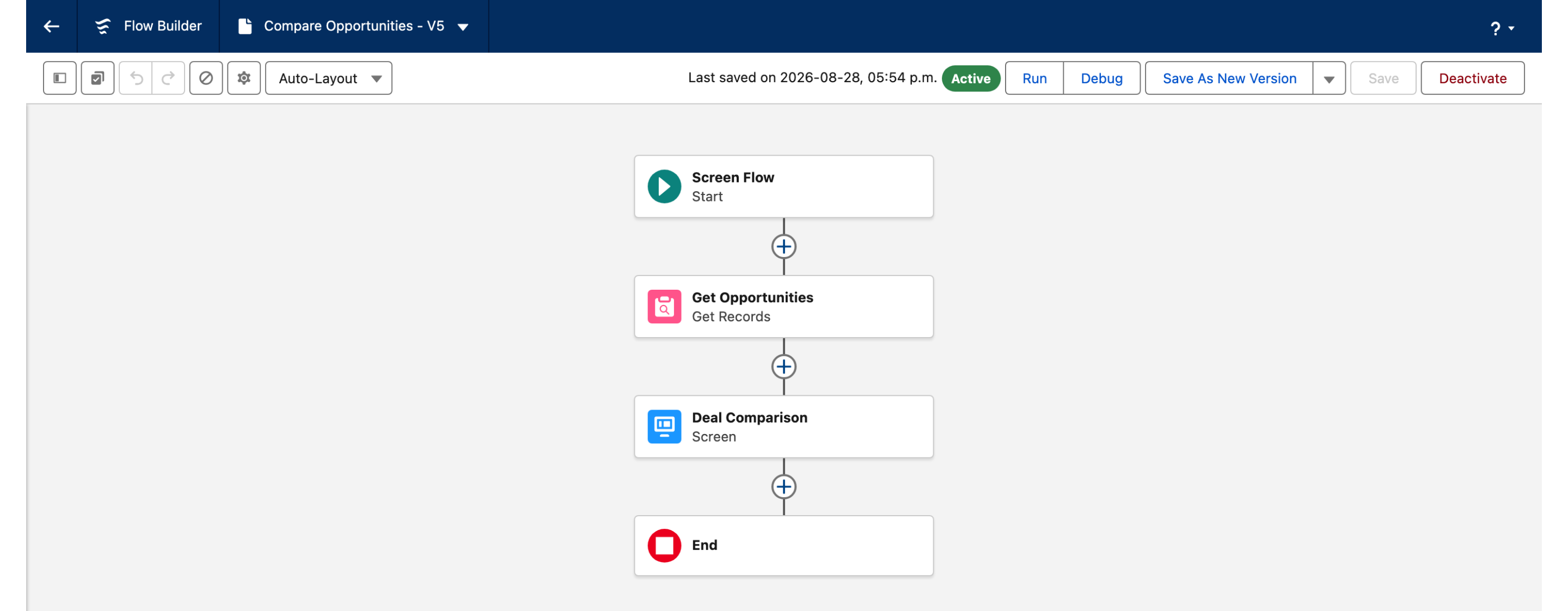
Add a **Get Records** element before your screen. Filter and sort it there: the grid displays what it is handed, in the order it is handed. Skip this step if another component on the screen already produces a collection.

<figure><img src="https://27923732-files.gitbook.io/~/files/v0/b/gitbook-x-prod.appspot.com/o/spaces%2F1FUd4apB9YHgCEMUFbVb%2Fuploads%2FywyWmkHTWtEPaJLBizp3%2Frecord-grid-flow-canvas.png?alt=media" alt="Flow Builder canvas showing Start, then a Get Records element named Get Opportunities, then a screen named Deal Comparison, then End"><figcaption><p>The grid displays a collection, so something upstream has to produce one. Here a <strong>Get Records</strong> runs before the screen.</p></figcaption></figure>
{% endstep %}

{% step %}

#### **Add the Record Grid to the screen**

Drop it onto the screen, select it, and open the Component Builder.
{% endstep %}

{% step %}

#### **Set the data source**

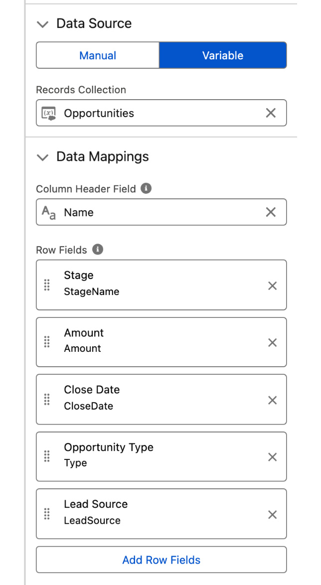
Under **Data Source**, choose **Variable**, then pick your collection in **Records Collection**.
{% endstep %}

{% step %}

#### **Choose the column headings**

Set **Column Header Field** to the field that should head each record's column, usually the record name.
{% endstep %}

{% step %}

#### **Add the rows**

Under **Row Fields**, click **Add Row Fields** once per field you want down the side. Each entry takes a **Field** and a **Type**, and the Type is filled in from the field you chose.

<figure><img src="https://27923732-files.gitbook.io/~/files/v0/b/gitbook-x-prod.appspot.com/o/spaces%2F1FUd4apB9YHgCEMUFbVb%2Fuploads%2F7DFaolZj0ACROdItUCQB%2Frecord-grid-builder-data.png?alt=media" alt="The Data Source and Data Mappings sections of the property editor, with Variable selected, a Records Collection, a Column Header Field and five Row Fields" width="320"><figcaption><p>The data source, the field that heads each column, and one entry per row.</p></figcaption></figure>
{% endstep %}

{% step %}

#### **Save and run the flow**

You get one column per record, five at a time by default, with chevrons in the header to page through the rest.
{% endstep %}
{% endstepper %}

{% hint style="info" %}
In **Manual** mode, add your **Row Fields** before setting **Column Header Field**: it offers only the row fields you have already defined, so it is empty until they exist.
{% endhint %}

***

## Make the grid editable

Editing is off until you ask for it, and saving is a separate decision from editing.

{% stepper %}
{% step %}

#### **Mark the rows users can change**

Turn on **Editable** on each **Row Fields** entry that should be editable.
{% endstep %}

{% step %}

#### **Leave Read Only off**

It overrides every row's **Editable** setting, so a grid that refuses to edit is usually this.
{% endstep %}

{% step %}

#### **Decide how the cells look**

By default an editable cell stays formatted until the user clicks it. Turn on **Display As Input** to render those cells as inputs from the start.

<figure><img src="https://27923732-files.gitbook.io/~/files/v0/b/gitbook-x-prod.appspot.com/o/spaces%2F1FUd4apB9YHgCEMUFbVb%2Fuploads%2Fsv0GtmfciZf8uUsgyzNX%2Frecord-grid-inline-edit.png?alt=media" alt="A Record Grid with one Amount cell open as an input while every other cell stays formatted"><figcaption><p>With <strong>Display As Input</strong> off, an editable cell stays formatted until it is clicked, then opens as an input.</p></figcaption></figure>
{% endstep %}

{% step %}

#### **Write the changes back to Salesforce**

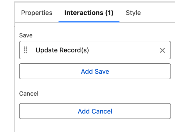
On the **Interactions** tab, add **Update Record(s)** to the **Save** interaction. Without it, the user's edits are collected but never saved.

<figure><img src="https://27923732-files.gitbook.io/~/files/v0/b/gitbook-x-prod.appspot.com/o/spaces%2F1FUd4apB9YHgCEMUFbVb%2Fuploads%2Fpmx1zsk8YkJWbFEf59ht%2Frecord-grid-interactions.png?alt=media" alt="The Interactions tab of the property editor, with an Update Record(s) action listed under Save" width="320"><figcaption><p>The <strong>Save</strong> interaction carrying <strong>Update Record(s)</strong>. This action is offered only when the data source is <strong>Variable</strong>.</p></figcaption></figure>
{% endstep %}
{% endstepper %}

If the flow needs the edited records afterwards, read them from **Edited Rows**.

***

## Data Source

The Record Grid never runs its own query. Its **Data Source** section offers two modes, and the choice changes the settings underneath it:

* **Variable** binds the grid to a record collection that already exists in the flow, chosen in **Records Collection**. Use it for a Get Records output or another component's selection.
* **Manual** takes rows entered into the component itself, for a fixed comparison that does not come from the org.

### Data Mappings

In **Variable** mode, two settings define the grid:

* **Column Header Field** is the object field whose value heads each record's column, such as the record name.
* **Row Fields** lists the fields shown down the side of the grid, one row per field. Each entry has a **Field** (the object field to show), a **Type**, an optional **Custom Label** and **Label**, **Help Text** displayed next to the field label, and **Editable**.

**Type** defaults to the type of the field you picked, and can be overridden. The options are Boolean, Combobox, Combobox (Multi-Select), Currency, Date, Date Time, Email, Lookup, Number, Percent, Phone, Rich Text, Text, Textarea, Time, and Url.

In **Manual** mode both settings behave differently. A **Row Fields** entry carries a **Label** and a **Name** instead of an object field, the **Name** is required and rejects special characters, and the **Type** list is the same one without Combobox, Combobox (Multi-Select), and Lookup. **Column Header Field** is then a picklist of the row fields you defined, matched on their **Name**, rather than a field on the records.

***

## Configuration

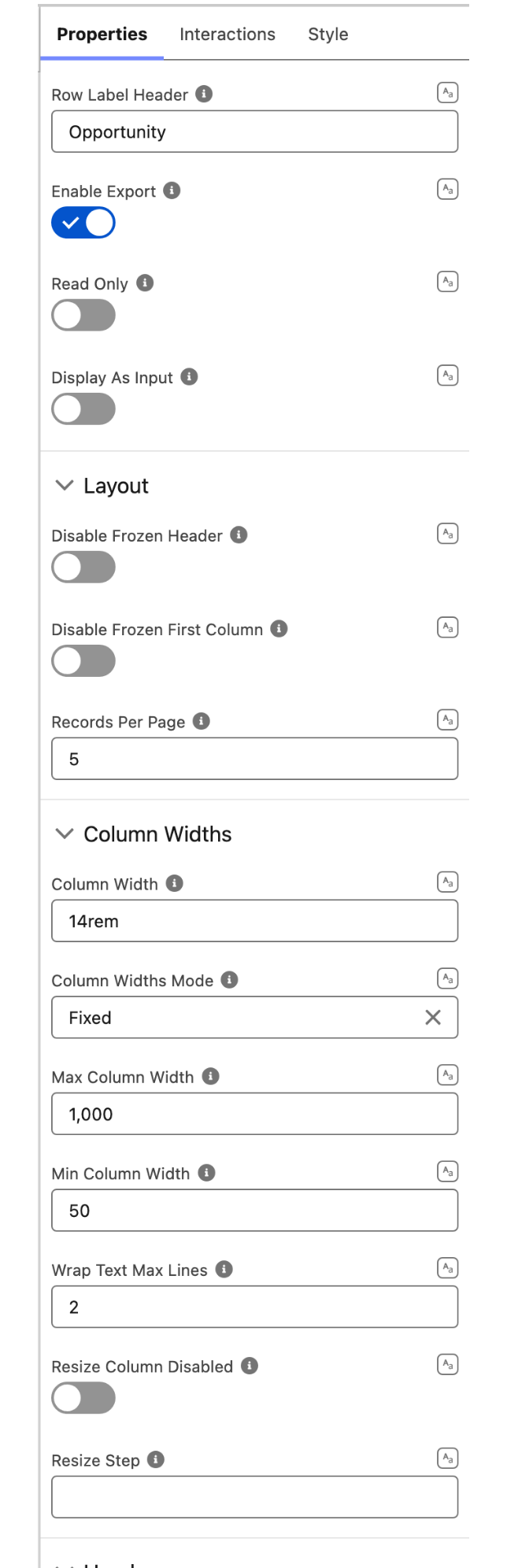
To configure it, click the component on the Flow screen. The **Edit Record Grid Component** panel opens on the right with three tabs: Properties, Interactions, and Style. The settings below open that Properties tab; the Data Source and Data Mappings sections above sit at the bottom of the same tab.

<figure><img src="https://27923732-files.gitbook.io/~/files/v0/b/gitbook-x-prod.appspot.com/o/spaces%2F1FUd4apB9YHgCEMUFbVb%2Fuploads%2FkaLNgT6efllMeUycP6Do%2Frecord-grid-builder-properties.png?alt=media" alt="The Properties tab of the property editor, showing Row Label Header, Enable Export, Read Only and Display As Input above the Layout and Column Widths groups" width="320"><figcaption><p>The top of the <strong>Properties</strong> tab, then the <strong>Layout</strong> and <strong>Column Widths</strong> groups.</p></figcaption></figure>

### General

These four settings sit at the top of the Properties tab, above the collapsible groups.

* **Row Label Header**: text displayed in the top-left corner cell, above the field labels.
* **Enable Export**: when enabled, a download action is displayed so users can export the underlying records.
* **Read Only**: when enabled, the grid is read-only even if some fields are marked editable.
* **Display As Input**: for editable fields, always render cells as inputs instead of leaving them read-only until clicked. Edits are held as drafts until saved from the Save/Cancel footer.

### Layout

* **Disable Frozen Header**: when enabled, the top header row is not pinned while scrolling.
* **Disable Frozen First Column**: when enabled, the leftmost column (the field labels) is not pinned while scrolling.
* **Records Per Page**: number of record columns shown per page (1 to 25, default 5). When there are more records, the header shows previous/next chevrons to page through them.

### Column Widths

* **Column Width**: initial width applied to every record column in fixed mode (e.g. 12rem or 200px).
* **Column Widths Mode**: how column widths are calculated: **Fixed** (default) honors the column width, **Auto** sizes columns to their content. Both modes respect the min/max bounds and user resize.
* **Max Column Width**: the maximum width (px) a column can be resized to (default 1000).
* **Min Column Width**: the minimum width (px) a column can be resized to (default 50).
* **Wrap Text Max Lines**: when set, cell text wraps up to this many lines and is clipped beyond it.
* **Resize Column Disabled**: when enabled, columns cannot be resized by dragging their right border.
* **Resize Step**: the width (px) a column resizes by when its handle is focused and the left/right arrow keys are pressed (default 10).

### Header

* **Title**: the title displayed in the header.
* **Caption**: caption displayed in the header, above the title.
* **Avatar**: an avatar shown in the header, configured with a fallback icon, image, initials, alternative text, size (X-Small through Xx-Large), and variant (Circle or Square).
* **Is Joined**: removes the bottom border and shadow so the header can sit flush with another component.

***

## Interactions

[Interactions](/flow/component-builder/interactions-panel.md) define what happens when users interact with the Record Grid. Configure them from the **Interactions** tab of the Edit Record Grid panel. Two are available, **Save** and **Cancel**, and each one runs the list of actions you add to it.

### Save

Fires when the user saves inline edits from the Save/Cancel footer.

To write those edits back to Salesforce, add the [**Update Record(s)**](/flow/component-builder/interactions-panel/update-records.md) action. It saves the changed records and confirms with a toast, so the flow needs no separate Update Records element. The action is offered only when the **Data Source** is **Variable**: manually entered rows have no Salesforce record behind them.

### Cancel

Fires when the user discards inline edits from the Save/Cancel footer.

***

## Output Variables

| Output variable            | Type              | What it returns                                                                     |
| -------------------------- | ----------------- | ----------------------------------------------------------------------------------- |
| **Edited Rows**            | Record Collection | The records the user edited, each carrying its Id and only the fields that changed. |
| **Edited Rows Full Data**  | Record Collection | The same records with all of their loaded values, not only the changed ones.        |
| **Edited Rows Serialized** | Text              | **Edited Rows** as a JSON string, for passing to Apex or an external call.          |

All three are set when the user saves from the Save/Cancel footer.

***

## Styling

The **Style** tab controls the spacing, dimensions, and appearance of the Record Grid on the Flow screen. Configure it from the **Style** tab of the Edit Record Grid panel.

{% tabs %}
{% tab title="Margin" %}
Controls outer spacing around the component.

* **Top / Right / Bottom / Left:** Space on each side of the component.
  {% endtab %}

{% tab title="Padding" %}
Controls inner spacing between the component's border and its content.

* **Top / Right / Bottom / Left:** Inner space on each side.
  {% endtab %}

{% tab title="Size" %}

* **Width / Height:** Set the dimensions of the grid.
  {% endtab %}

{% tab title="Border" %}
Customizes the border drawn around the component.

* **Color:** Border color.
* **Size:** Border thickness.
* **Style:** Border style (solid, dashed, dotted, etc.).
* **Radius:** Corner rounding of the border.
  {% endtab %}

{% tab title="Header" %}
Styles the header section above the grid.

* **Background Color:** Header background.
* **Padding Top / Right / Bottom / Left:** Inner space on each side of the header.
* **Margin Bottom:** Space between the header and the grid.
  {% endtab %}

{% tab title="Record Grid Cell" %}
Controls the individual cells of the grid.

* **Row Height:** Height of each field row.
* **Cell Padding:** Inner spacing within each cell.
  {% endtab %}

{% tab title="Footer" %}
Styles the Save/Cancel footer shown during inline editing.

* **Background Color:** Footer background.
* **Border Color:** Footer border color.
* **Border Size:** Footer border thickness.
* **Border Style:** Footer border style.
* **Border Radius:** Footer border corner rounding.
  {% endtab %}
  {% endtabs %}

***

## Troubleshooting

* **No columns appear**: confirm the data source is set. In **Variable** mode, check that **Records Collection** is bound and that **Column Header Field** names a field on those records. In **Manual** mode, check that **Column Header Field** matches the **Name** of one of the row fields you defined.
* **Cells won't edit**: check that **Read Only** is off and that the rows you want to edit are marked **Editable** in **Row Fields**.


---

# Agent Instructions
This documentation is published with GitBook. GitBook is the documentation platform designed so that both humans and AI agents can read, navigate, and reason over technical content effectively. Learn more at gitbook.com.

## Querying This Documentation
If you need additional information that is not directly available in this page, you can query the documentation dynamically by asking a question.

Perform an HTTP GET request on the current page URL with the `ask` query parameter, and the optional `goal` query parameter:

```
GET https://docs.avonnicomponents.com/flow/flow-components/record-grid.md?ask=<question>&goal=<endgoal>
```

`ask` is the immediate question: it should be specific, self-contained, and written in natural language.
`goal` is optional and describes the broader end goal you are ultimately trying to accomplish on behalf of the user. GitBook uses it to tailor the answer towards what is most useful for that goal.

The response will contain a direct answer to the question and relevant excerpts and sources from the documentation.

Use this mechanism when the answer is not explicitly present in the current page, you need clarification or additional context, or you want to retrieve related documentation sections.