> For the complete documentation index, see [llms.txt](https://docs.avonnicomponents.com/llms.txt). Markdown versions of documentation pages are available by appending `.md` to page URLs; this page is available as [Markdown](https://docs.avonnicomponents.com/flow/flow-components/pivot-table.md).

# Pivot Table

The Pivot Table summarizes and cross-tabulates records into grouped rows and columns with totals, subtotals, and optional detail rows, on a Flow screen.

The **Pivot Table** summarizes records into a cross-tabulated grid: grouped rows and columns with aggregated values, directly on a Flow screen. It runs its own aggregate query and can show grand totals, subtotals, and expandable detail rows.

## Overview

Use the Pivot Table to turn a set of records into a summary matrix: choose how the data is grouped and aggregated, then control which totals appear, whether users can drill into detail rows, and how the table can be filtered.

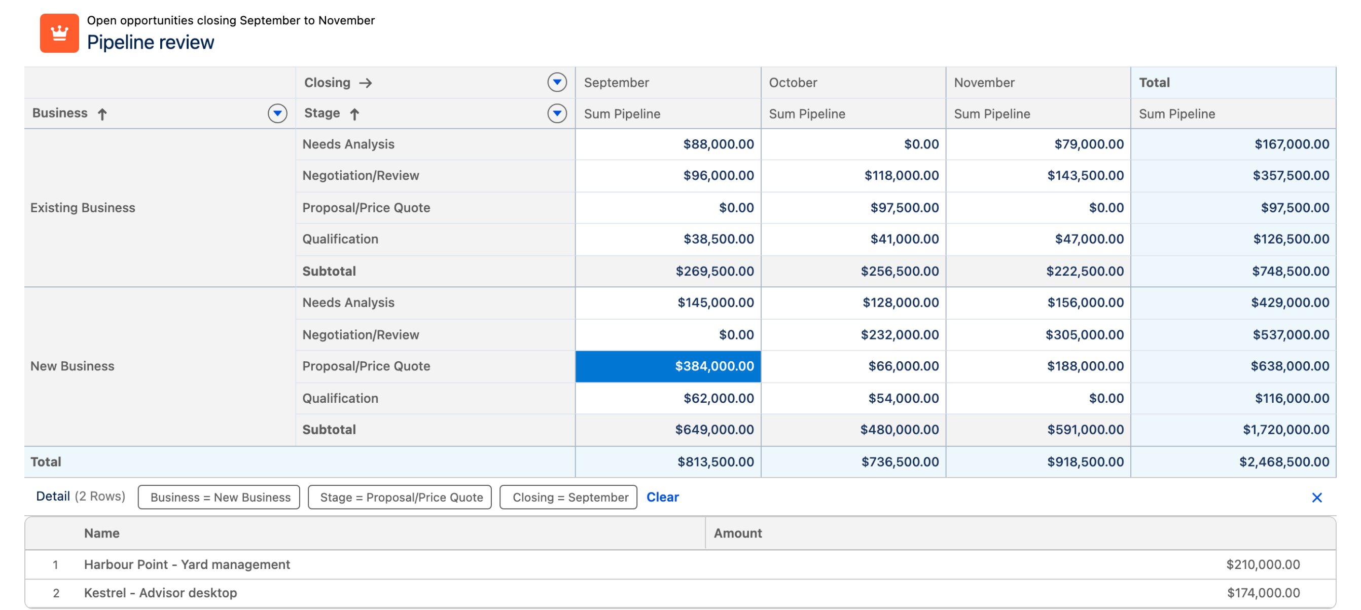
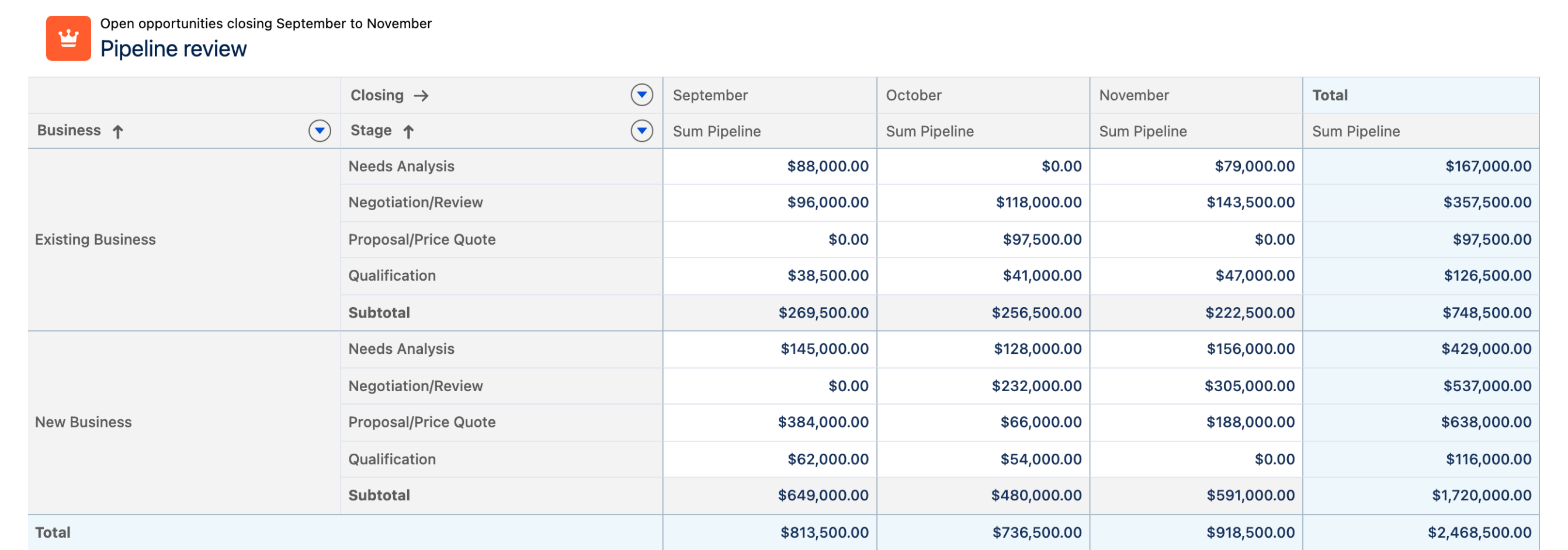
<figure><img src="https://27923732-files.gitbook.io/~/files/v0/b/gitbook-x-prod.appspot.com/o/spaces%2F1FUd4apB9YHgCEMUFbVb%2Fuploads%2Fz9DlKl4UvK71Alt20UWH%2Fpivot-table-grid.png?alt=media" alt="A Pivot Table on a flow screen, with opportunities grouped by business and stage down the side, by closing month across the top, and a sum of pipeline in each cell"><figcaption><p>Rows grouped by business and stage, columns grouped by closing month, and a sum in each cell, with a <strong>Subtotal</strong> per group and a grand <strong>Total</strong>.</p></figcaption></figure>

{% hint style="info" %}
**See it in a real project**

[Revenue cube without a report](https://docs.avonnicomponents.com/projects/use-cases/reporting/revenue-cube-without-a-report): Closed won revenue by region and quarter, totals on both axes.
{% endhint %}

## Data Source

The Pivot Table builds its grid from a **Query** data source. It runs its own aggregate (CUBE) query over the selected object, and it is the only data source offered: there is no manual or variable source for this component. The query editor also hides **Limit** and **Order By**.

Set the **Object API Name** in the Data Source section, and use the query **Filters** there to narrow which records the query returns.

### Data Mappings

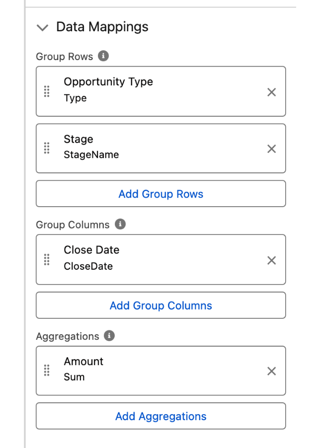
The Data Mappings section is where the grid takes shape. Three settings define it:

* **Group Rows**: the fields whose values are listed down the side of the table.
* **Group Columns**: the fields whose values are spread across the top of the table.
* **Aggregations**: the object fields aggregated in the body of the table. Each one takes a **Field** and an **Aggregation** function: **Sum** (the default), **Average**, **Count**, **Count Distinct**, **Maximum**, or **Minimum**.

A grouping on a date field offers a **Date Grouping** as well: Year, Quarter, Month, Week, Day, Year-Quarter, Year-Month, or Year-Week. Any grouping or aggregation can carry a **Custom Label** to display a **Label** of your own instead of the field label.

<figure><img src="https://27923732-files.gitbook.io/~/files/v0/b/gitbook-x-prod.appspot.com/o/spaces%2F1FUd4apB9YHgCEMUFbVb%2Fuploads%2FjciUimxi20n7to9OLizA%2Fpivot-table-builder-data-mappings.png?alt=media" alt="The Data Mappings section of the property editor, with two Group Rows, one Group Column and one Sum aggregation" width="320"><figcaption><p><strong>Data Mappings</strong>: two fields grouped down the side, one across the top, and <strong>Amount</strong> aggregated as a <strong>Sum</strong>.</p></figcaption></figure>

**Filters**, in the same section, is a different setting from the query filters above it: it lists the fields users can filter the table by, from the header filter menu. The **Filter** settings under Configuration control how that menu behaves and have no effect until at least one field is listed here.

## Configuration

Select the component on the screen and press **Open Component Builder**. The panel has three tabs: **Properties**, **Interactions**, and **Style**. The sections below mirror the Properties tab.

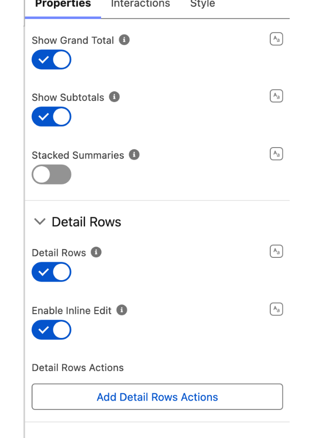
<figure><img src="https://27923732-files.gitbook.io/~/files/v0/b/gitbook-x-prod.appspot.com/o/spaces%2F1FUd4apB9YHgCEMUFbVb%2Fuploads%2FTO5JSmJA4TKKeqoClb5s%2Ftips-editor-tabs.png?alt=media" alt="The Properties tab of the property editor showing the Show Grand Total, Show Subtotals and Stacked Summaries toggles above the Detail Rows group" width="320"><figcaption><p>The top of the <strong>Properties</strong> tab: the summary toggles, then the <strong>Detail Rows</strong> group.</p></figcaption></figure>

### Summaries

* **Show Grand Total** displays an overall total across all rows and columns.
* **Show Subtotals** displays subtotals for each group. *Only available when more than one groupable row or column is defined.*
* **Stacked Summaries** stacks the values of a cell in the same row or column instead of separating them.

### Detail Rows

* **Detail Rows** displays the records behind an aggregation when its cell is clicked.
* **Enable Inline Edit** allows editing values directly in the detail rows. *Requires: **Detail Rows** = on.*
* **Detail Rows Actions** defines row-level actions; each action has a **Label**, **Name**, **Icon Name**, and **Disabled** / **Hidden** flags. *Requires: **Detail Rows** = on.*

<figure><img src="https://27923732-files.gitbook.io/~/files/v0/b/gitbook-x-prod.appspot.com/o/spaces%2F1FUd4apB9YHgCEMUFbVb%2Fuploads%2Fa8oup39iiIoGnFnJH6ip%2Fpivot-table-detail-rows.png?alt=media" alt="A Pivot Table with one aggregation cell selected and a detail panel open below it, listing the two records behind that number"><figcaption><p>A cell clicked open. The detail panel lists the records behind the number and states the grouping it came from.</p></figcaption></figure>

### Filter

These settings control the header filter menu, and apply to the fields listed in **Filters**, in the Data Mappings section.

* **Display As Popover** shows the filter menu as a popover instead of a dropdown.
* **Use Record Picklist Values** derives picklist filter options from the values present in the records instead of the full defined picklist.
* **Use Cascading Filter Values** narrows the options offered in the other filters to match the current selection. When it is on, **Use Record Picklist Values** is ignored.

### Header

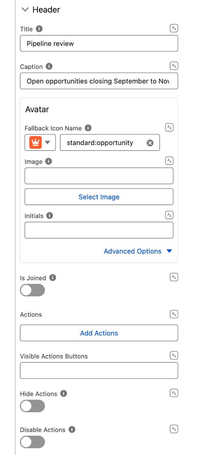
* **Title** and **Caption** label the table. The caption is displayed above the title.
* **Avatar** shows an avatar in the header, from a **Fallback Icon Name**, an **Image**, or **Initials**.
* **Is Joined** squares the bottom border and removes its shadow, so the header sits flush onto the component below it.
* **Actions** defines the header actions. Each one has a **Label**, a **Name**, an **Icon Name**, a **Title** shown on hover, and **Disabled** / **Hidden** flags.
* **Visible Actions Buttons** sets how many actions show as buttons before the rest overflow into a menu. **Hide Actions** and **Disable Actions** hide or disable the actions menu.

<figure><img src="https://27923732-files.gitbook.io/~/files/v0/b/gitbook-x-prod.appspot.com/o/spaces%2F1FUd4apB9YHgCEMUFbVb%2Fuploads%2FThHMachJiiJV2lu5fYBM%2Ftips-header-two-names.png?alt=media" alt="The Header group of the property editor, showing Title, Caption, Avatar, Is Joined, Actions, Visible Actions Buttons, Hide Actions and Disable Actions" width="320"><figcaption><p>The <strong>Header</strong> group, from <strong>Title</strong> down to <strong>Disable Actions</strong>.</p></figcaption></figure>

## Interactions

Two interactions are available: **Header Action Click** and **Detail Rows Action Click**. Each one binds to a single action through its **Target Name**, which is the **Name** given to that action in the **Actions** or **Detail Rows Actions** collection, so define the action first and bind it here.

An interaction can run **Refresh**, or [**Export To**](/flow/component-builder/interactions-panel/export-to.md) to let users download the table's data as an Excel or CSV file. Export To offers a **Default Export View** that is specific to this component: **Formatted Report** exports the grid as it appears, and **Details Only** exports the underlying records.

## Styling

The Style tab exposes **Margin**, **Padding**, **Size** (width and height), **Border**, and **Header**. A **Flow Dialog Header** and a **Flow Dialog Footer** group are added as well, but only when the component carries an **Open Flow Dialog** interaction, and they style that dialog.

## Output Variables

| Output variable                                                   | Type                                | What it returns                                                        |
| ----------------------------------------------------------------- | ----------------------------------- | ---------------------------------------------------------------------- |
| **Number of Items**                                               | Integer                             | The number of records summarized by the table.                         |
| **Title** / **Caption**                                           | Text                                | The current header title and caption.                                  |
| **Show Grand Total** / **Show Subtotals** / **Stacked Summaries** | Boolean                             | The current summary display settings.                                  |
| **Filters**                                                       | Text Collection                     | The active filter values.                                              |
| **Detail Rows Actions**                                           | Apex-defined (`DetailRowsAction[]`) | The configured detail-row actions (also available serialized as text). |
| **Clicked Header Action Name**                                    | Text                                | The **Name** of the header action the user clicked.                    |
| **Clicked Detail Rows Action Name**                               | Text                                | The **Name** of the detail-row action the user clicked.                |

### Flow Interaction Output Variables

**Clicked Header Action Name** and **Clicked Detail Rows Action Name** are transient. Each is set when its action fires, is readable by the interaction that runs in response, and is cleared once that interaction is done. Read them from inside the interaction rather than later in the flow.

## Troubleshooting

* **No rows appear**: verify the Query data source returns records, and that **Group Rows**, **Group Columns**, and **Aggregations** are set.
* **Subtotals don't appear**: **Show Subtotals** needs more than one groupable row or column.
* **Detail rows can't be edited**: enable both **Detail Rows** and **Enable Inline Edit**, and confirm the underlying fields are editable.
* **Totals look wrong**: check whether **Show Subtotals** / **Show Grand Total** match the grouping.
* **The filter menu is empty**: list the fields users can filter by in **Filters**, in the Data Mappings section.


---

# Agent Instructions
This documentation is published with GitBook. GitBook is the documentation platform designed so that both humans and AI agents can read, navigate, and reason over technical content effectively. Learn more at gitbook.com.

## Querying This Documentation
If you need additional information that is not directly available in this page, you can query the documentation dynamically by asking a question.

Perform an HTTP GET request on the current page URL with the `ask` query parameter, and the optional `goal` query parameter:

```
GET https://docs.avonnicomponents.com/flow/flow-components/pivot-table.md?ask=<question>&goal=<endgoal>
```

`ask` is the immediate question: it should be specific, self-contained, and written in natural language.
`goal` is optional and describes the broader end goal you are ultimately trying to accomplish on behalf of the user. GitBook uses it to tailor the answer towards what is most useful for that goal.

The response will contain a direct answer to the question and relevant excerpts and sources from the documentation.

Use this mechanism when the answer is not explicitly present in the current page, you need clarification or additional context, or you want to retrieve related documentation sections.