> For the complete documentation index, see [llms.txt](https://docs.avonnicomponents.com/llms.txt). Markdown versions of documentation pages are available by appending `.md` to page URLs; this page is available as [Markdown](https://docs.avonnicomponents.com/flow/flow-components/image-list.md).

# Image List

## Overview

The Avonni Image List displays a collection of images in a configurable grid layout. Each image can include a label, a description, and item-level actions. Use it to build product galleries, photo libraries, asset pickers, or any flow screen that benefits from a visual grid of records.

***

## Configuration

Configure the Image List from the **Properties** tab of the Edit Image List Component panel. The sub-sections below mirror the Properties tab.

### Data Source

Decide where the image data comes from. Open the Component Builder and look at the **Data** tab. You have three options:

|                  | Manual                                  | Variable                                                                    | Query                                                                                    |
| ---------------- | --------------------------------------- | --------------------------------------------------------------------------- | ---------------------------------------------------------------------------------------- |
| **Best for**     | Small, static lists you define yourself | Records already loaded in the flow via a Get Records or collection variable | Pulling records directly from a Salesforce object without a separate Get Records element |
| **Setup effort** | Add each item by hand                   | Map fields from your flow variable to the component                         | Select the object and map fields — the component queries Salesforce for you              |
| **Record limit** | As many as you add                      | Depends on your flow collection                                             | Controlled by the **Query Limit** setting                                                |

#### Manual

Add items one at a time directly in the Component Builder. For each item, fill in:

| Field                      | What it does                                                                                                             |
| -------------------------- | ------------------------------------------------------------------------------------------------------------------------ |
| **Label**                  | The text displayed on the image (e.g., the product name)                                                                 |
| **Description**            | Additional text below or overlaid on the image. Supports rich text                                                       |
| **Image**                  | The image URL or a static resource. Accepted formats: `.png`, `.jpg`, `.jpeg`, `.gif`, `.svg`, `.webp`, `.apng`, `.avif` |
| **Key Field**              | A unique identifier for the item. Used to track which item a user clicks                                                 |
| **Image Alternative Text** | Accessibility text describing the image                                                                                  |

> **Example:** A simple "Meet the Team" screen with 6 manually entered headshots, each with the team member's name as the label and their role as the description.

#### Variable

Connect the component to a flow collection variable that already holds records (from a Get Records element, for instance). Configure field mappings in the **Data Mapping** section below.

#### Query

The component queries Salesforce directly — no Get Records element needed. Select the Salesforce object, apply the same field mappings as Variable, and configure query settings:

| Setting            | What it does                                                   |
| ------------------ | -------------------------------------------------------------- |
| **Query Limit**    | Maximum number of records to return                            |
| **Query Order By** | Sort results by one or more fields                             |
| **Query Filters**  | Filter which records are returned (e.g., only active products) |

{% hint style="success" %}
**Tip**

Query is the fastest way to get records on screen without building extra flow elements. Use it when you need a simple "show all records of type X" and don't need to transform the data firs
{% endhint %}

### Data Mapping

When using Variable or Query, map Salesforce fields to the component's item properties in the **Data Mappings** section of the Properties tab:

| Data Mapping               | What to map                                                                                                        |
| -------------------------- | ------------------------------------------------------------------------------------------------------------------ |
| **Label** (required)       | The field to display as the item title. Auto-fills with `Name` for Account, Contact, Opportunity, and User objects |
| **Description**            | The field to show as secondary text                                                                                |
| **Image Source**           | A URL field or rich text field containing the image path                                                           |
| **Key Field**              | A unique identifier — defaults to `Id`                                                                             |
| **Image Alternative Text** | A field to use as the image's alt text                                                                             |

> **Example:** A Get Records element loads all Products with images. You map `Product Name` → **Label**, `Product_Image_URL__c` → **Image Source**, and `Description` → **Description**.

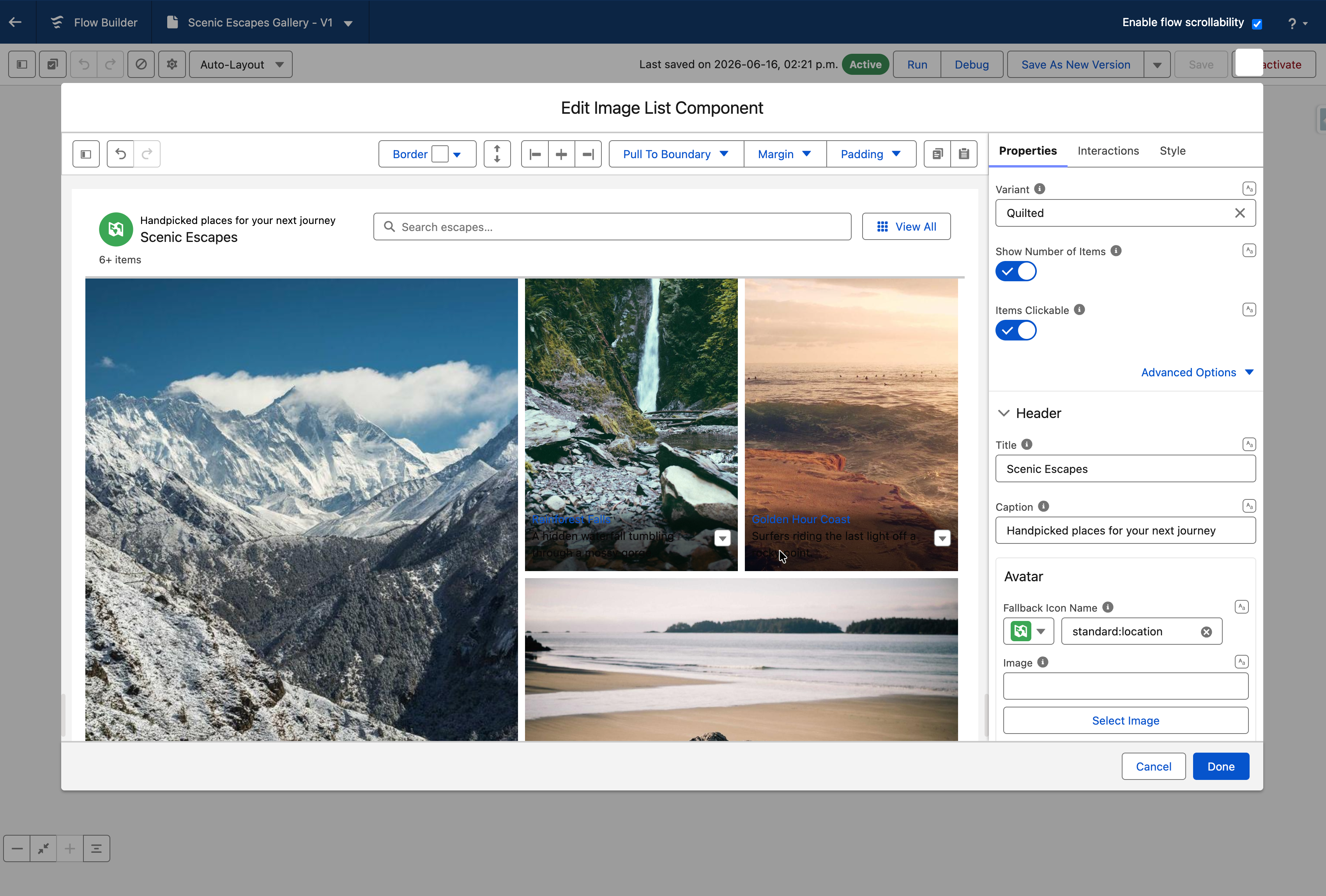
### Variant

The **Variant** controls how images are arranged in the grid. In the **Properties** tab, open the **Variant** dropdown.

| Variant     | How it looks                                                     | Best for                                                                |
| ----------- | ---------------------------------------------------------------- | ----------------------------------------------------------------------- |
| **Base**    | Uniform grid — all images the same size                          | Product catalogs, team directories, any list where consistency matters  |
| **Quilted** | Alternating large and small tiles in a pattern                   | Hero-style galleries where you want certain images to stand out         |
| **Woven**   | Alternating tall and short rows                                  | Editorial or magazine-style layouts                                     |
| **Masonry** | Pinterest-style columns — images keep their natural aspect ratio | Photo galleries, portfolios, or any set of images with mixed dimensions |

<figure><img src="/files/RgQnWrCgAEfvNq5tuDSE" alt=""><figcaption></figcaption></figure>

{% hint style="success" %}
**Tip**

If your images have very different aspect ratios (landscape vs. portrait), **Masonry** avoids awkward cropping. If you want a clean, uniform look, stick with **Base**
{% endhint %}

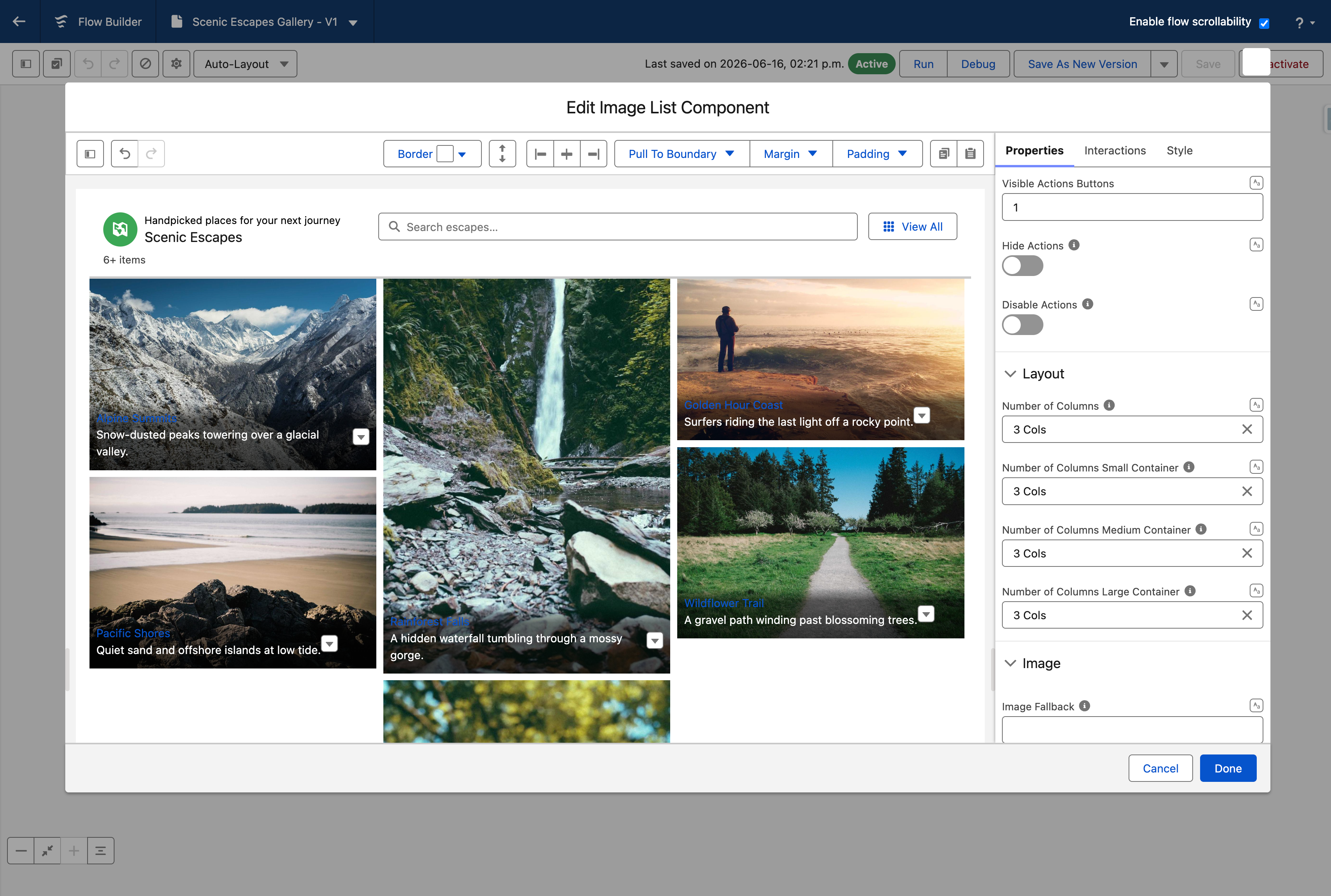
### Columns & Responsive Layout

Control how many columns the grid displays at different screen sizes. Open the **Layout** section in the **Properties** tab.

| Setting                      | What it controls                                  | Accepted values   | Default                                 |
| ---------------------------- | ------------------------------------------------- | ----------------- | --------------------------------------- |
| **Number of Columns**        | Columns at the smallest (default) container width | 1, 2, 3, 4, 6, 12 | 1                                       |
| **Small Container Columns**  | Columns when the container is 480px+ wide         | 1, 2, 3, 4, 6, 12 | Falls back to default                   |
| **Medium Container Columns** | Columns when the container is 768px+ wide         | 1, 2, 3, 4, 6, 12 | Falls back to small or default          |
| **Large Container Columns**  | Columns when the container is 1024px+ wide        | 1, 2, 3, 4, 6, 12 | Falls back to medium, small, or default |

<figure><img src="/files/HpO7LLQkV2BGzH3WnQZ6" alt=""><figcaption></figcaption></figure>

The component detects its own container width (not the browser window) and picks the appropriate column count. If you set only the default, that value applies to all sizes.

> **Example:** A product catalog that shows 1 column on phones, 2 on tablets, and 4 on desktop:
>
> * **Number of Columns** = `1`
> * **Small Container Columns** = `2`
> * **Large Container Columns** = `4`

### Image Display

Open the **Image** section in the **Properties** tab to control how images are rendered inside each tile.

#### Title Position

The **Position** setting controls where the label and description appear relative to the image:

| Position   | What it looks like                                                         |
| ---------- | -------------------------------------------------------------------------- |
| **Top**    | Label and description appear above the image                               |
| **Bottom** | Label and description appear overlaid at the bottom of the image (default) |
| **Below**  | Label and description appear underneath the image, outside the image area  |

{% hint style="success" %}
**Tip**

Use **Below** when you want the full image visible without any overlay text. Use **Bottom** for a more compact card-like look
{% endhint %}

#### Crop Fit

Controls how the image fills its container:

| Crop Fit    | Behavior                                                                    |
| ----------- | --------------------------------------------------------------------------- |
| **Cover**   | Image fills the entire container, cropping edges if needed (default)        |
| **Contain** | Entire image is visible, with empty space if the aspect ratio doesn't match |
| **Fill**    | Image stretches to fill the container — may distort                         |
| **None**    | Image displays at its natural size                                          |

#### Crop Position

When using **Cover** crop fit, the image is cropped from the center by default. Adjust the focal point with:

| Setting             | What it does                                                         | Default |
| ------------------- | -------------------------------------------------------------------- | ------- |
| **Crop Position X** | Horizontal focal point, in percent (0 = left edge, 100 = right edge) | 50      |
| **Crop Position Y** | Vertical focal point, in percent (0 = top edge, 100 = bottom edge)   | 50      |

> **Example:** For headshots where faces are in the upper third, set **Crop Position Y** to `30` so the crop focuses on the face rather than the chest.

#### Fallback Image

Set the **Image Fallback** to a URL or static resource. When an item's image fails to load (broken URL, missing file), the fallback image is shown instead of a broken-image icon.

### Header

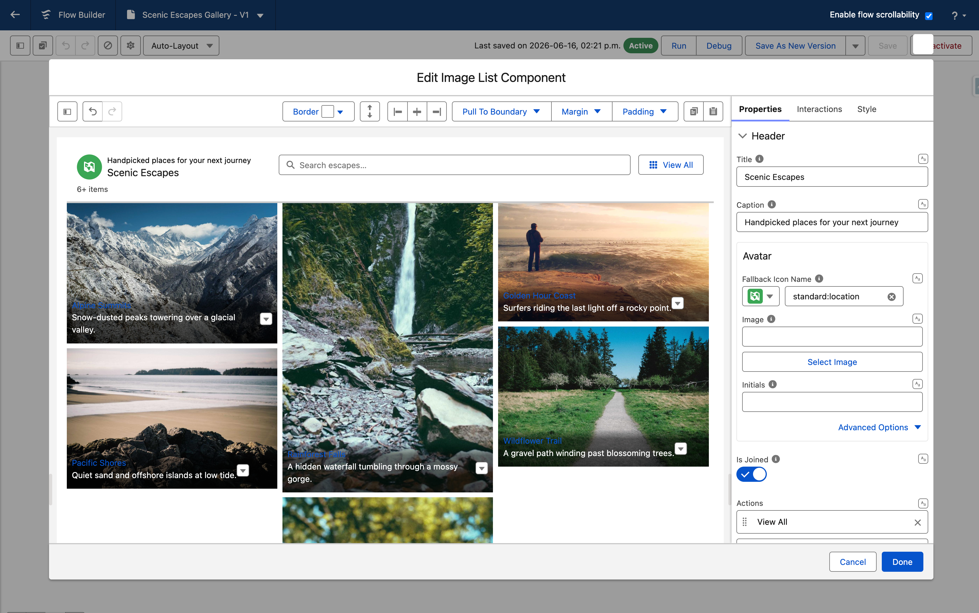
The Image List includes a configurable header bar. In the **Header** section of the **Properties** tab, you can set:

<table><thead><tr><th width="194.087890625">Setting</th><th>What it does</th></tr></thead><tbody><tr><td><strong>Title</strong></td><td>The main heading text above the image grid</td></tr><tr><td><strong>Caption</strong></td><td>Secondary text displayed below the title</td></tr><tr><td><strong>Icon Name</strong></td><td>A Salesforce icon shown next to the title (e.g., <code>standard:product</code>)</td></tr><tr><td><strong>Icon Size</strong></td><td>Size of the header icon</td></tr><tr><td><strong>Header Avatar</strong></td><td>An avatar image in the header</td></tr><tr><td><strong>Is Joined</strong></td><td>Visually joins the header to the grid below it (removes the gap)</td></tr></tbody></table>

#### Header Actions

Add buttons to the header bar for global actions (actions that apply to the entire list, not a single item). Each header action has:

<table><thead><tr><th width="155.2890625">Property</th><th>What it does</th></tr></thead><tbody><tr><td><strong>Label</strong></td><td>Button text</td></tr><tr><td><strong>Name</strong></td><td>Unique identifier — used in interactions to detect which button was clicked</td></tr><tr><td><strong>Icon Name</strong></td><td>Optional icon on the button</td></tr><tr><td><strong>Disabled</strong></td><td>Grays out the button</td></tr></tbody></table>

Use the **Visible Header Actions Buttons** setting to control how many action buttons are visible before the rest collapse into an overflow menu.

> **Example:** A product gallery with a header action called "Add New Product" that opens a subflow to create a new record.

<figure><img src="/files/TNrgOwxUplF1Vlr96VPg" alt=""><figcaption></figcaption></figure>

### Item Actions

Add actions to individual items — they appear as buttons or icons on each image tile. Open the **Actions** section in the **Properties** tab.

Each action has:

<table><thead><tr><th width="187.486328125">Property</th><th>What it does</th></tr></thead><tbody><tr><td><strong>Label</strong></td><td>Text shown on the action button</td></tr><tr><td><strong>Name</strong></td><td>Unique identifier — used in interactions to know which action was clicked</td></tr><tr><td><strong>Icon Name</strong></td><td>Icon displayed on the button (e.g., <code>utility:edit</code>)</td></tr><tr><td><strong>Disabled</strong></td><td>Grays out the action</td></tr><tr><td><strong>Title</strong></td><td>Tooltip text on hover</td></tr><tr><td><strong>Alternative Text</strong></td><td>Accessibility label for the action</td></tr></tbody></table>

> **Example:** Each product image has a "View Details" action and a "Add to Cart" action. When a user clicks "View Details," an interaction navigates to the product record screen.

### Items Clickable

Toggle **Items Clickable** in the **Properties** tab to make the entire image tile clickable (not just the actions). When enabled, clicking anywhere on an item fires the **Item Click** interaction.

{% hint style="warning" %}
**Important**

When **Items Clickable** is on, make sure you set up an **Item Click** interaction — otherwise, the user sees a clickable cursor, but nothing happens
{% endhint %}

### Search

Enable a search bar above the image grid. Open the **Search** section and toggle **Show Search** on.

The search bar filters items by matching the search term against each item's **Label** and **Description** fields. For Query data sources, you can also configure:

| Setting                | What it does                                                                         |
| ---------------------- | ------------------------------------------------------------------------------------ |
| **Search Fields**      | Restrict which Salesforce fields are searched (only filterable fields are available) |
| **Search Placeholder** | Custom placeholder text in the search input                                          |
| **Search Position**    | Where the search bar appears — in the **Header** or in a **Side Panel**              |

> **Example:** A photo asset library with 200+ images. Users type a keyword and instantly see only matching images.

### Filters

Add filter controls that let users narrow down the displayed items without typing. In the **Data Mappings** section, select which fields to expose as filters using the **Filters** combobox.

Filters can appear in a dropdown menu in the header or in a dedicated side panel, depending on the **Filter Panel** configuration.

> **Example:** A real estate listing image grid filtered by property type (House, Apartment, Land) and price range.

### Pagination

Control how users navigate through large sets of images. Open the **Pagination** section.

| Setting                      | What it does                                    |
| ---------------------------- | ----------------------------------------------- |
| **Show Pagination**          | Displays page navigation buttons below the grid |
| **Number of Items Per Page** | How many images to show per page                |

When pagination is off, and the number of items exceeds the page size, a **Show More** button appears at the bottom of the grid. Users click it to load the next batch.

For Query data sources, when pagination is off, the component uses infinite scrolling — it automatically loads more records as the user scrolls toward the bottom of the list.

{% hint style="success" %}
**Tip**

Use pagination for structured browsing (e.g., a catalog the user pages through). Use Show More / infinite scrolling for feeds and exploratory browsing.
{% endhint %}

### Side Panel

Open the **Side Panel** section to add a collapsible panel beside the image grid. The side panel can hold filters and the search bar, freeing up header space.

| Setting                    | What it does                                                          |
| -------------------------- | --------------------------------------------------------------------- |
| **Position**               | Which side the panel appears on — left or right                       |
| **Show Side Panel Toggle** | Adds a button to the header that lets users collapse/expand the panel |

### Show Number of Items

Toggle **Show Number of Items** in the **Properties** tab to display a count above the grid (e.g., "12 items"). When the user searches or filters, the count updates to show "X items found."

### No Results State

When no items match the current search or filter, the component shows an empty-state illustration with a message. You can customize this:

| Setting                     | What it does                                                       |
| --------------------------- | ------------------------------------------------------------------ |
| **No Results Message**      | Custom text shown when there are no results (set in Data Mappings) |
| **Hide No Results Image**   | Hides the empty-state illustration                                 |
| **Hide No Results Message** | Hides the text message                                             |

## Interactions

[Interactions](/flow/component-builder/interactions-panel.md) define what happens when users interact with the Image List. Configure them from the **Interactions** tab of the Edit Image List panel.

### Item Click

Fires when a user clicks an image tile. Requires **Items Clickable** to be enabled. Use this to navigate to a record detail screen, open a side panel, or set a flow variable based on the selected item.

### Action Click

Fires when a user clicks an action button on an image tile. Use the **Target Name** field to configure different interactions for different actions — only the interaction whose target name matches the clicked action's name will run.

### Header Action Click

Fires when a user clicks a header action button. Use the **Target Name** field to configure different interactions for different header actions — only the interaction whose target name matches the clicked header action's name will run.

***

## Styling

The **Style** tab gives you control over the Image List's spacing, the header, each image tile, and the pagination controls. Configure it from the **Style** tab of the Edit panel.

{% tabs %}
{% tab title="Margin" %}
Controls the *outer* spacing around the component, creating space between it and other elements on the screen.

* **Top / Right / Bottom / Left:** Adjust the space on each side.
  {% endtab %}

{% tab title="Padding" %}
Controls the *inner* spacing between the component's content and its border.

* **Top / Right / Bottom / Left:** Adjust the inner spacing on each side.
  {% endtab %}

{% tab title="Size" %}
Controls the component's dimensions.

* **Width / Height:** Set fixed dimensions for the component.
* **Min Width / Max Width / Min Height / Max Height:** Constrain the size within bounds.
  {% endtab %}

{% tab title="Border" %}
Customizes the border surrounding the component.

* **Color:** Set the border color.
* **Size:** Adjust the border thickness.
* **Style:** Choose a border style (e.g. solid, dashed, dotted).
* **Radius:** Control the roundness of the corners.
  {% endtab %}

{% tab title="Header" %}
Styles the header region above the list, broken into sub-sections.

* **Header:** Background color, padding (top/right/bottom/left), and bottom margin.
* **Header Border:** Color, size, style, and radius — plus a separate bottom border (color/size/style) for the joined state.
* **Header Title / Header Caption:** Color, font size, font style, and font weight.
* **Header Actions:** Text color, background color, and border color — each with active and hover states.
* **Header Avatar:** Background color, foreground color, and border radius.
  {% endtab %}

{% tab title="Item Spacing" %}
Controls the spacing around and between image tiles.

* **Top / Bottom / Left / Right:** Space around each individual tile.
* **Block Between:** Vertical gap between rows of tiles.
* **Inline Between:** Horizontal gap between columns of tiles.
  {% endtab %}

{% tab title="Item Label" %}
Styles the label text of each tile.

* **Text Color:** Color of the item label text.
* **Link Color / Link Color Hover:** Label color when items are clickable, with a hover state.
* **Font Size / Font Style / Font Weight:** Control the label typography.
  {% endtab %}

{% tab title="Item Description" %}
Styles the description text of each tile.

* **Color:** Color of the description text.
* **Font Size / Font Style / Font Weight:** Control the description typography.
* **Line Clamp:** Maximum number of lines before the description is truncated.
  {% endtab %}

{% tab title="Item Background" %}
Sets the background of each image tile.

* **Color:** Background color of each tile.
* **Color Hover:** Background color when the user hovers over a tile.
  {% endtab %}

{% tab title="Pagination Buttons" %}
Styles the pagination navigation buttons.

* **Background Color / Text/Icon Color / Color Border:** Each with default, active, hover, and disabled states.
* **Border Size / Border Style:** Customize the button border.
* **Active Button Background Color / Text/Icon Color / Color Border:** A separate set for the current page button, each with active and hover states.
  {% endtab %}

{% tab title="Footer" %}
Styles the footer area where pagination or the Show More button appears.

* **Background Color:** Background of the footer area.
* **Border Color / Size / Style:** Border around the footer.
* **Border Radius:** Rounded corners on the footer.
  {% endtab %}

{% tab title="Show More Button" %}
Styles the Show More button.

* **Block Start / Block End / Inline Start / Inline End:** Adjust the button spacing.
* **Background Color / Text Color / Border Color:** Each with default, active, and hover states.
* **Border Size / Border Radius:** Customize the button border.
  {% endtab %}
  {% endtabs %}

***

## Output Variables

The Image List exposes output variables you can reference in your flow after the screen. To use them, select the screen element in Flow Builder, then the Image List component, and pick the output variable.

| Output variable                   | Type    | What it returns                                                                              |
| --------------------------------- | ------- | -------------------------------------------------------------------------------------------- |
| **Number of Items**               | Integer | The total count of items currently displayed                                                 |
| **Clicked Item**                  | SObject | The full record of the item the user clicked (only populated when **Items Clickable** is on) |
| **Clicked Item Name**             | String  | The key field value of the clicked item                                                      |
| **Clicked Header Action Name**    | String  | The name of the header action button the user clicked                                        |
| **Clicked Item Action Item**      | SObject | The full record of the item whose action was clicked                                         |
| **Clicked Item Action Name**      | String  | The name of the action that was clicked on an item                                           |
| **Clicked Item Action Item Name** | String  | The key field value of the item whose action was clicked                                     |

> **Example:** A product catalog flow. The user clicks an image. After the screen, a Decision element checks **Clicked Item Name** and routes to the correct product detail screen. Or use **Clicked Item** directly in an Update Records element to modify the selected record.

{% hint style="warning" %}
**Important**

**Clicked Item** and **Clicked Item Action Item** return SObject records only when the data source is **Variable** or **Query**. For Manual items, use **Clicked Item Name** to identify which item was selected
{% endhint %}

## Troubleshooting Common Issues

* **Images don't appear** — The image URL is broken or the Image Source field isn't mapped. Check the Image Source mapping, make sure the field contains a valid URL, and set a Fallback Image as a safety net.
* **Grid shows 1 column on desktop** — Responsive column settings aren't configured. Set Large Container Columns and Medium Container Columns in the Layout section.
* **Clicking an item does nothing** — Items Clickable is off, or no interaction is wired. Toggle Items Clickable on and add an Item Click interaction in the Interactions tab.
* **"No results" shows unexpectedly** — Filters or search are active and no items match. Check active filters, clear the search bar, and verify that the Query returns results.
* **Quilted layout looks broken** — The column count doesn't work well with the quilted pattern. Quilted works best with 2, 3, or 4 columns — adjust the column count accordingly.
* **Output variable is empty after click** — You are using a Manual data source with an SObject output variable. Use Clicked Item Name (String) instead of Clicked Item (SObject) for Manual data sources.


---

# Agent Instructions
This documentation is published with GitBook. GitBook is the documentation platform designed so that both humans and AI agents can read, navigate, and reason over technical content effectively. Learn more at gitbook.com.

## Querying This Documentation
If you need additional information that is not directly available in this page, you can query the documentation dynamically by asking a question.

Perform an HTTP GET request on the current page URL with the `ask` query parameter, and the optional `goal` query parameter:

```
GET https://docs.avonnicomponents.com/flow/flow-components/image-list.md?ask=<question>&goal=<endgoal>
```

`ask` is the immediate question: it should be specific, self-contained, and written in natural language.
`goal` is optional and describes the broader end goal you are ultimately trying to accomplish on behalf of the user. GitBook uses it to tailor the answer towards what is most useful for that goal.

The response will contain a direct answer to the question and relevant excerpts and sources from the documentation.

Use this mechanism when the answer is not explicitly present in the current page, you need clarification or additional context, or you want to retrieve related documentation sections.