For the complete documentation index, see llms.txt. This page is also available as Markdown.

Animation

The Animation component displays animated content such as Lottie animations, with configurable animation type, frame rate, and playback behavior.

The Animation component plays animated content — typically a Lottie animation — on a Flow screen. Use it to add motion to loading states, success confirmations, empty states, or illustrative content, without embedding video files.

Overview

Point the component at a hosted animation file and it renders the animation inline on the screen. You control how the animation loops and how fast it plays, and you can size and space it like any other Flow component through the Style tab.

Configuration

To configure it, click the component on the Flow screen. The Edit Animation Component panel opens on the right with two tabs: Properties and Style. The section below mirrors the Properties tab.

Properties

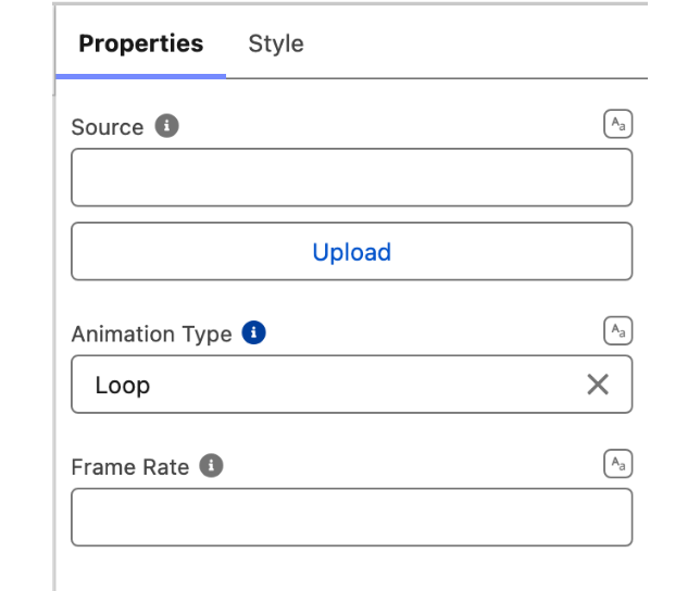
  • Source — the URL of the animation file to play. Point this at a hosted animation (for example a Lottie JSON file). You can bind it to a Flow variable or record field to switch the animation dynamically.

  • Animation Type — how the animation plays back:

    • Loop (default) — plays continuously from start to finish, over and over.

    • Once — plays a single time and then stops on the final frame.

    • Boomerang — plays forward, then reverses back to the start, repeating.

  • Frame Rate — the frame rate (frames per second) at which the animation plays. Lower it to slow the animation down, raise it to speed it up.

The Properties tab. In the Flow Builder palette the component is listed as Avonni Lottie, and Source carries an Upload button beside it as well as accepting a URL.

Styling

The Style tab gives you control over the Animation's spacing, size, and framing. Configure it from the Style tab of the Edit Animation panel.

Controls the outer spacing around the component, creating space between it and other elements on the screen.

  • Top / Right / Bottom / Left: Adjust the space on each side.

Controls the inner spacing between the animation and the component's edges.

  • Top / Right / Bottom / Left: Adjust the inner spacing on each side.

Controls the component's dimensions.

  • Width / Height: Set the component's width and height.

  • Min / Max Width / Height: Constrain how small or large the component can grow.

  • Overflow: Determine how content behaves when it exceeds the component's bounds.

Customizes the border around the component.

  • Color: Border color.

  • Size: Border thickness.

  • Style: Border style (solid, dashed, etc.).

  • Radius: Corner rounding.

Controls the component's background.

  • Color: Background color shown behind the animation.

Troubleshooting Common Issues

  • Nothing appears where the animation should be — The Source URL is empty, unreachable, or points to a file the browser can't load. Confirm the URL opens directly in a browser and that the host allows cross-origin requests (CORS) from your Salesforce domain.

  • The animation plays once and freezesAnimation Type is set to Once, which stops on the final frame by design. Switch to Loop or Boomerang if you want continuous motion.

  • The animation runs too fast or too slow — Adjust Frame Rate; the default rate comes from the animation file itself, and overriding it changes the playback speed.

Last updated

Was this helpful?