> For the complete documentation index, see [llms.txt](https://docs.avonnicomponents.com/llms.txt). Markdown versions of documentation pages are available by appending `.md` to page URLs; this page is available as [Markdown](https://docs.avonnicomponents.com/experience-cloud/experience-components/ax-list.md).

# AX - List

## Overview

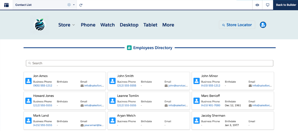
**AX - List** is an Experience Cloud component that displays Salesforce records as customizable cards in grid or list layouts on Experience Sites pages.

Use it to show portal users filtered record sets—like their orders, cases, contracts, or any related data—with full control over which fields appear on each card. Users can search, filter, paginate through results, and click cards to navigate to records. Pull data from any standard or custom object in Experience Builder.

Perfect for customer order history, case lists, document libraries, product catalogs, or anywhere portal users need to browse and search through their Salesforce records.

{% hint style="success" %}
The Avonni List is a [Reactive Data Component](/experience-cloud/getting-started/reactive-components.md)
{% endhint %}

<figure><img src="https://2929066058-files.gitbook.io/~/files/v0/b/gitbook-x-prod.appspot.com/o/spaces%2FDL6JQuZArjJeQvX2ot4y%2Fuploads%2Fgit-blob-129e7edb5009d5f0435a6c929250aedf0a0560a5%2FAvonni%20Components%204.2.webp?alt=media" alt=""><figcaption></figcaption></figure>

## Configuration

Understanding the configuration process, particularly the Data Source and Mappings sections, is crucial to use the List effectively.

### Data Source

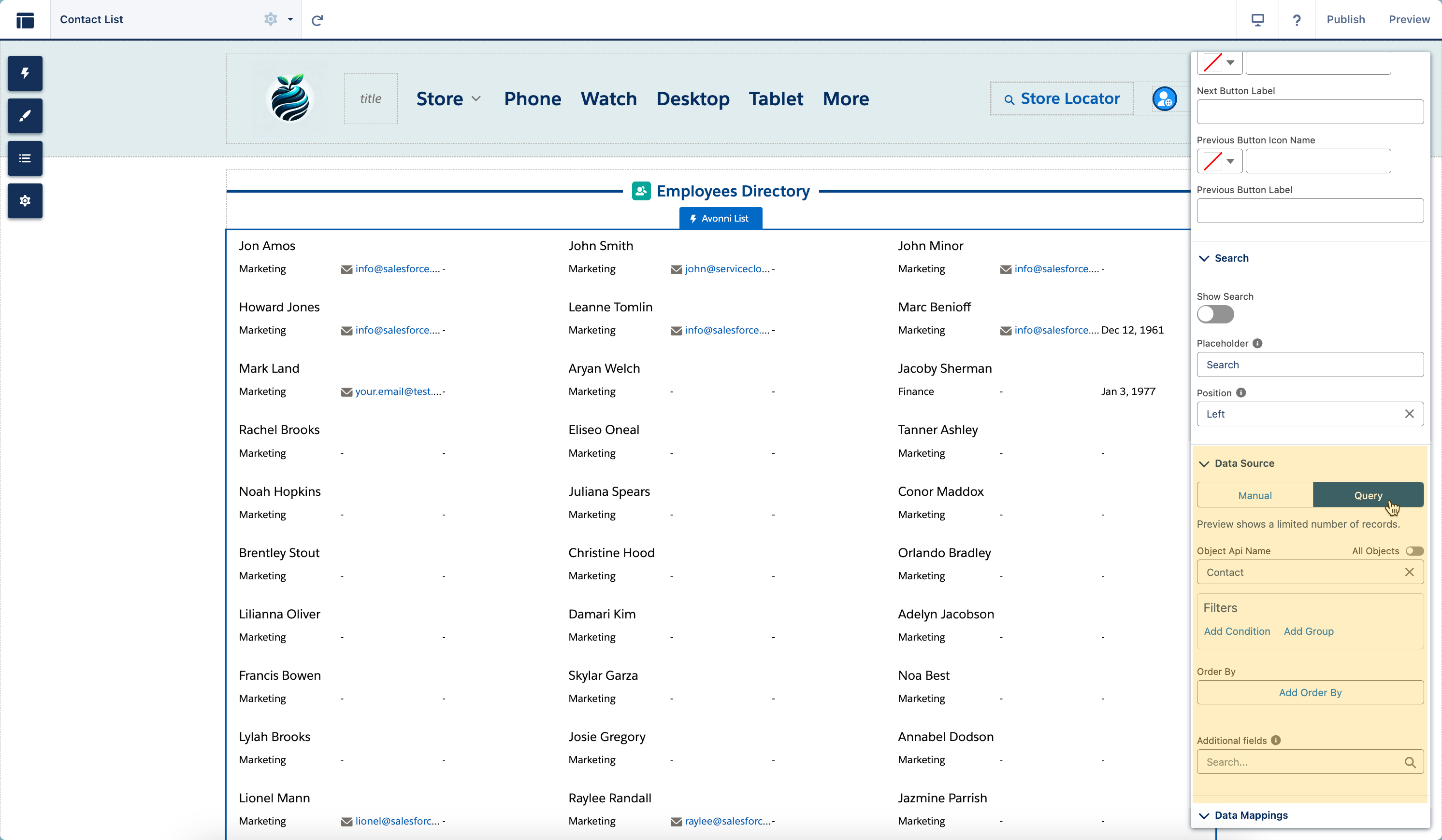
The Data Source section is where you connect the Avonni List with your Salesforce data. You have two Data Source options.

<figure><img src="https://2929066058-files.gitbook.io/~/files/v0/b/gitbook-x-prod.appspot.com/o/spaces%2FDL6JQuZArjJeQvX2ot4y%2Fuploads%2Fgit-blob-4b5f03164847513a8260fc000c24e2af481134d2%2F2024-02-04_15-01-30.png?alt=media" alt=""><figcaption></figcaption></figure>

| Data Source Type | Description                                                    | Use Case                                           |
| ---------------- | -------------------------------------------------------------- | -------------------------------------------------- |
| **Manual**       | Manually enter list items.                                     | Ideal for non-dynamic data, testing, and demos.    |
| **Query**        | Create a query to auto-populate the List with Salesforce data. | Suited for dynamic, real-time, and large datasets. |

### Data Mapping

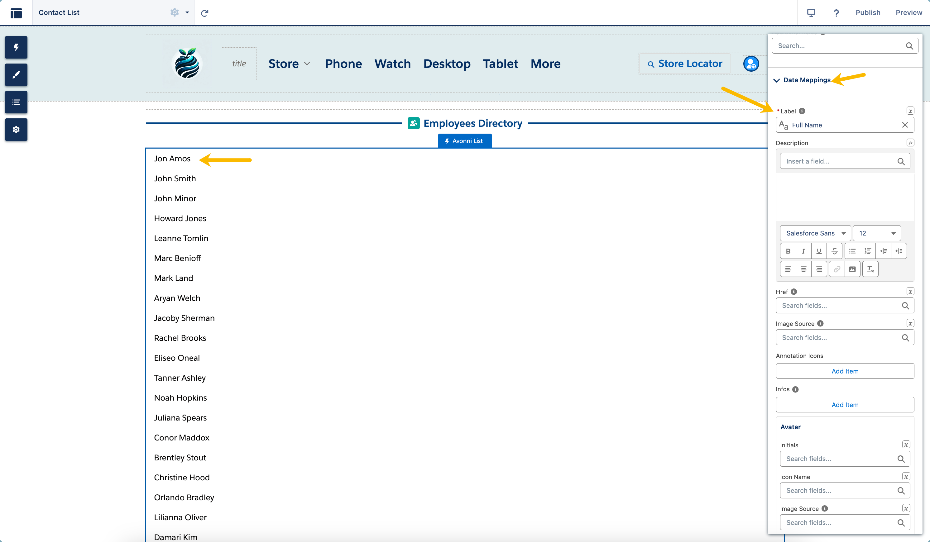
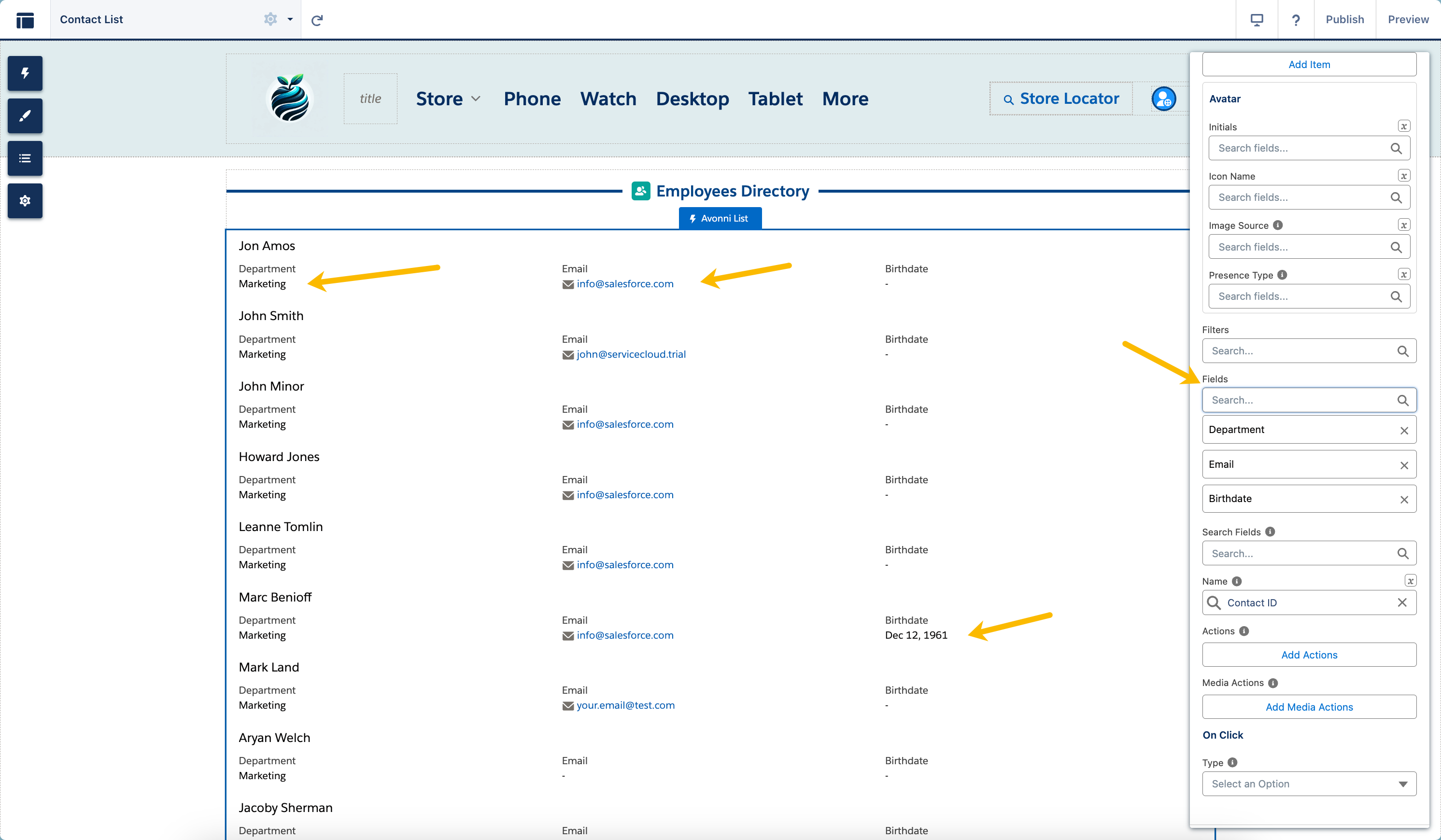
You bring your list to life in the Data Mappings section by defining and customizing it.

* Click on the '**Add Columns**' button to select the field you want to display as a label on the List.

<figure><img src="https://2929066058-files.gitbook.io/~/files/v0/b/gitbook-x-prod.appspot.com/o/spaces%2FDL6JQuZArjJeQvX2ot4y%2Fuploads%2Fgit-blob-e7372ae6827e9b93aa58582cbbe516f2bb7bdf78%2F2024-02-04_14-49-35.png?alt=media" alt=""><figcaption></figcaption></figure>

* Then, you can incorporate additional elements alongside your primary data. This could include visual components like images, avatars, or even additional fields to provide more context or detail to each item on the list.

<figure><img src="https://2929066058-files.gitbook.io/~/files/v0/b/gitbook-x-prod.appspot.com/o/spaces%2FDL6JQuZArjJeQvX2ot4y%2Fuploads%2Fgit-blob-fb365c5cb47037e83eb40f56a020fc71d8d35a0e%2F2024-02-04_14-52-53.png?alt=media" alt=""><figcaption></figcaption></figure>

### Item Divider

The Item Divider feature is designed to enhance the visual structure of your list by introducing dividers between items. This attribute allows you to customize how each item in the list is separated from the others.

<table><thead><tr><th width="125.33333333333331">Divider</th><th>Description</th></tr></thead><tbody><tr><td><strong>Top</strong></td><td>Allows you to place a divider at the top of each item in the list.</td></tr><tr><td><strong>Bottom</strong></td><td>Adds a divider line at the bottom of each list item.</td></tr><tr><td><strong>Around</strong></td><td>Places divider lines both above and below each item in the list.</td></tr><tr><td><strong>Card</strong></td><td>Sets each list item within its own card-like container, separated by dividers.</td></tr></tbody></table>

### Variant

The **Variant** sets the list style: `base` (a standard vertical list), `single-line` (a horizontal row of items), or `check-list` (each item gets a checkbox). **Highlight On Click** visually highlights the clicked item, and **Api Name** gives the component a unique identifier for referencing.

### Header

Configure the list header with a **Title** and **Caption** (and their text styles), a header **Icon Name** and **Icon Size**, **Show Number of Items** to display a count beside the title, **Header Is Joined** to sit the header flush with the content below, and **Header Actions** to add action buttons to the header.

### Avatar

**Avatar Attributes** customize the avatar shown on each item — its **Variant** (circle/square), **Size**, **Position**, **Fallback Icon Name**, **Presence** indicator and its position, and automatic initials formatting.

### Check List

When the **Variant** is `check-list`, **Check List Attributes** add a **Show Check Counter** (a checked/total count) and **Strike-Through on Check** (strikes out completed items).

### Layout

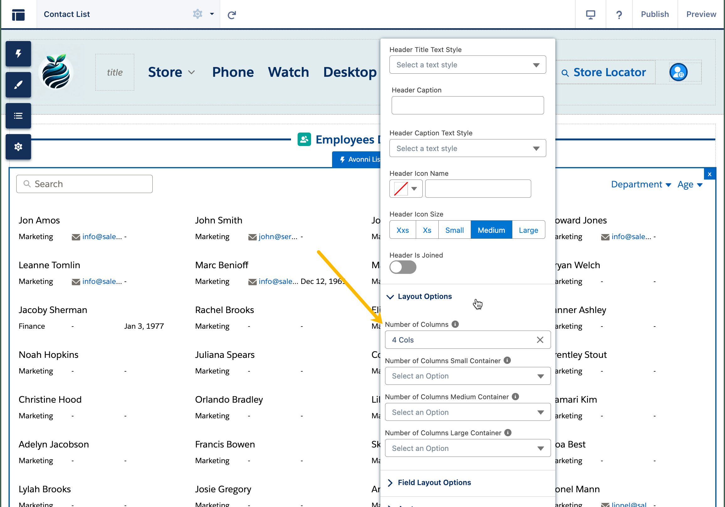
The Layout Options feature within the Avonni List Component grants the capability to define the presentation of data within the list. This is achieved by selecting the desired number of columns in which the data should be organized, with options available from one to twelve columns.

<figure><img src="https://2929066058-files.gitbook.io/~/files/v0/b/gitbook-x-prod.appspot.com/o/spaces%2FDL6JQuZArjJeQvX2ot4y%2Fuploads%2Fgit-blob-91f0e8d9034a1775939b90cb3fbc70222eaa56a7%2F2024-02-07_21-24-47.png?alt=media" alt=""><figcaption></figcaption></figure>

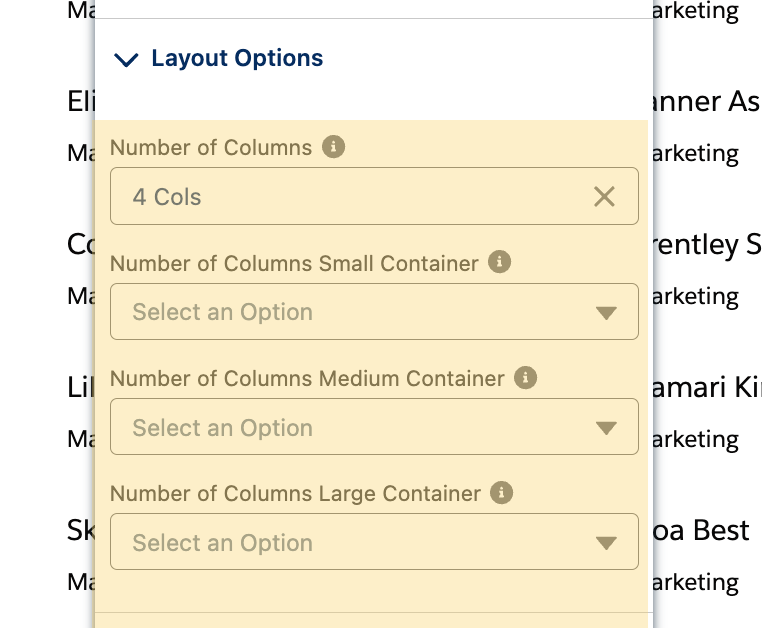
Furthermore, the Avonni List Component provides advanced customization through the ability to specify column configurations contingent upon the container's screen size. This feature allows for precisely adjusting the list's appearance across various devices, ensuring a consistent and user-friendly display on small, medium, and large screens.

<figure><img src="https://2929066058-files.gitbook.io/~/files/v0/b/gitbook-x-prod.appspot.com/o/spaces%2FDL6JQuZArjJeQvX2ot4y%2Fuploads%2Fgit-blob-5197234c25a03a25d3fa660a9cd5d3943d983a31%2F2024-02-07_21-25-19.png?alt=media" alt="" width="375"><figcaption></figcaption></figure>

### Field Layout

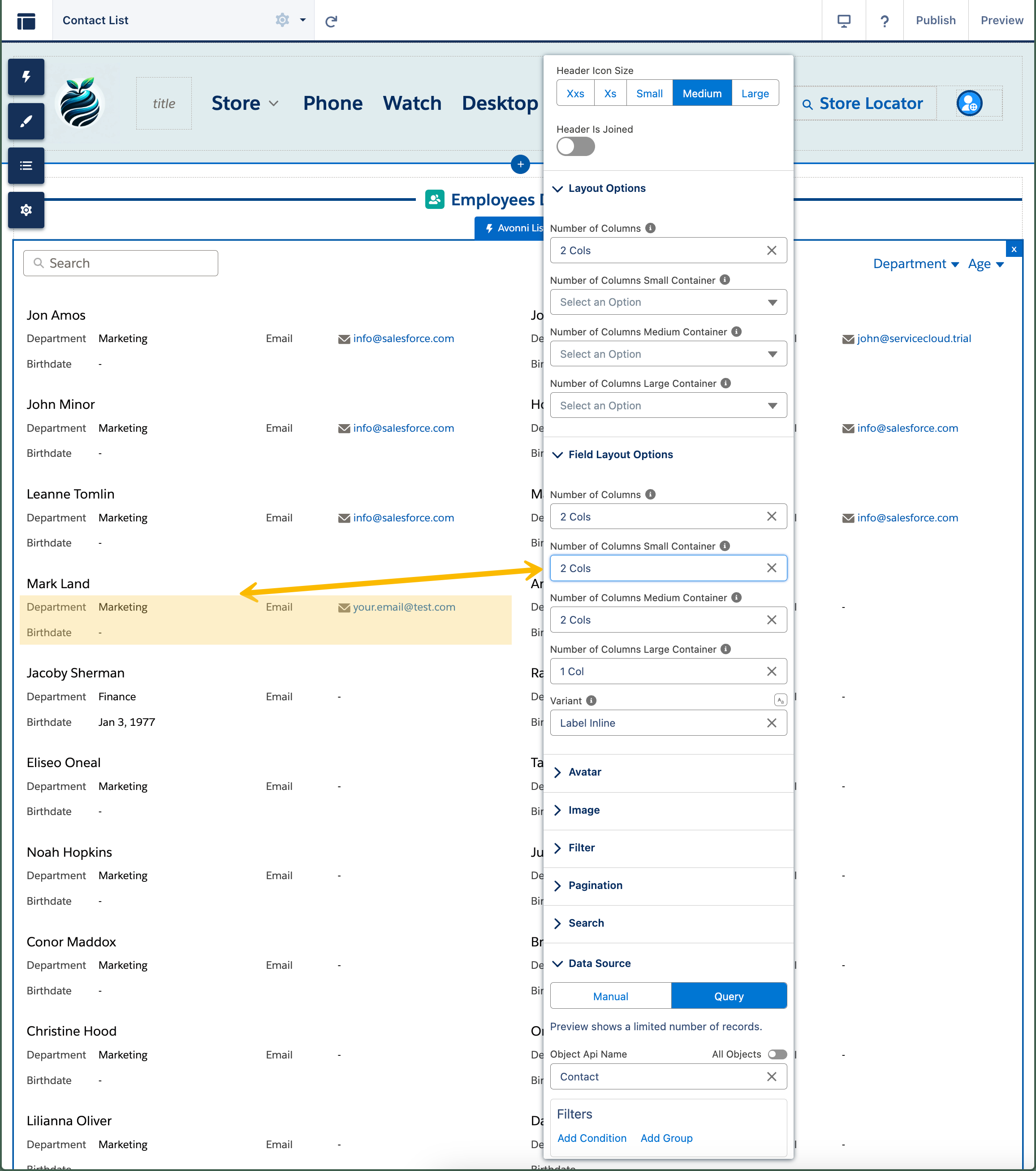
The Field Attributes section allows you to define the number of columns each field will occupy within the container, giving you granular control over the layout and appearance of your list content.

<figure><img src="https://2929066058-files.gitbook.io/~/files/v0/b/gitbook-x-prod.appspot.com/o/spaces%2FDL6JQuZArjJeQvX2ot4y%2Fuploads%2Fgit-blob-2a1d8a6e39d786d58621bd74eb4f4e1ce11879ed%2F2024-02-07_21-27-15.png?alt=media" alt=""><figcaption></figcaption></figure>

**Adjust the variant**

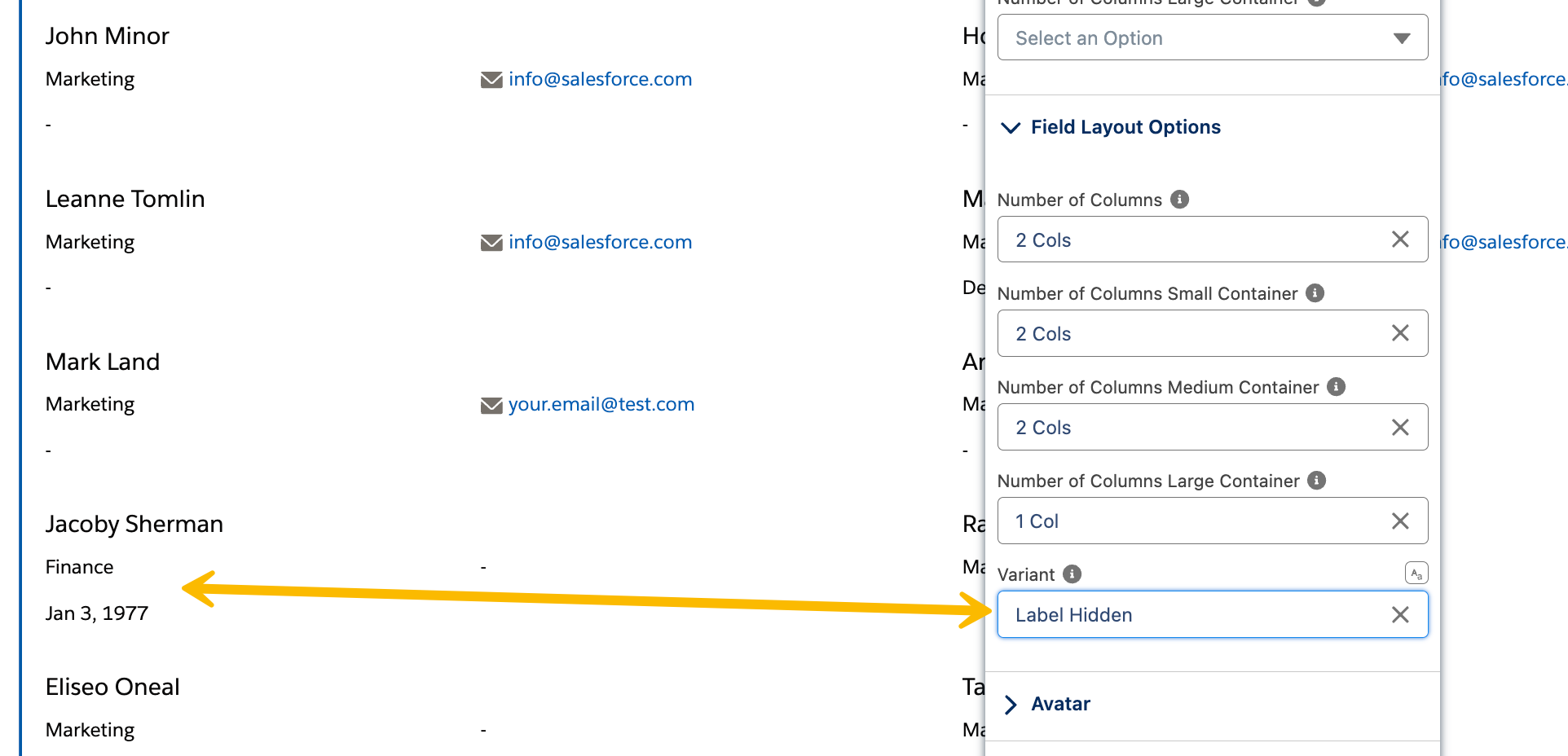
The "variant" property in the Avonni list component is used to modify the appearance of how field information is displayed. The following are the available values for the "variant" property, each with its unique style.

1. **Standard**: This is the default setting where the label is displayed above the field. It's a classic and widely used layout, providing a clear separation between the label and the field content.
2. **Label Hidden**: Opt for this variant when you want a minimalist design. The label is not displayed, offering a cleaner look. This is ideal for forms where the context or placeholder text makes the purpose of the field obvious or when space is limited.
3. **Label Inline**: In this variant, the label is positioned in line with the field, typically to the left. This space-efficient layout works well in forms where horizontal space is more plentiful than vertical space. It's also useful when you want to achieve a more compact form design.
4. **Label Stacked**: This variant places the label directly over the field. When the field is focused or filled, the label moves up. It's a modern design often used in mobile interfaces and web applications, where it helps to save vertical space and maintain a clean, uncluttered aesthetic.

<figure><img src="https://2929066058-files.gitbook.io/~/files/v0/b/gitbook-x-prod.appspot.com/o/spaces%2FDL6JQuZArjJeQvX2ot4y%2Fuploads%2Fgit-blob-c015afb19a1e9e8069d04700a8e8863d292c5292%2F2024-02-07_21-28-52.png?alt=media" alt=""><figcaption></figcaption></figure>

### Image

An image can be added to any item. The Image Attributes section customizes its position, size, crop fit, and a fallback source.

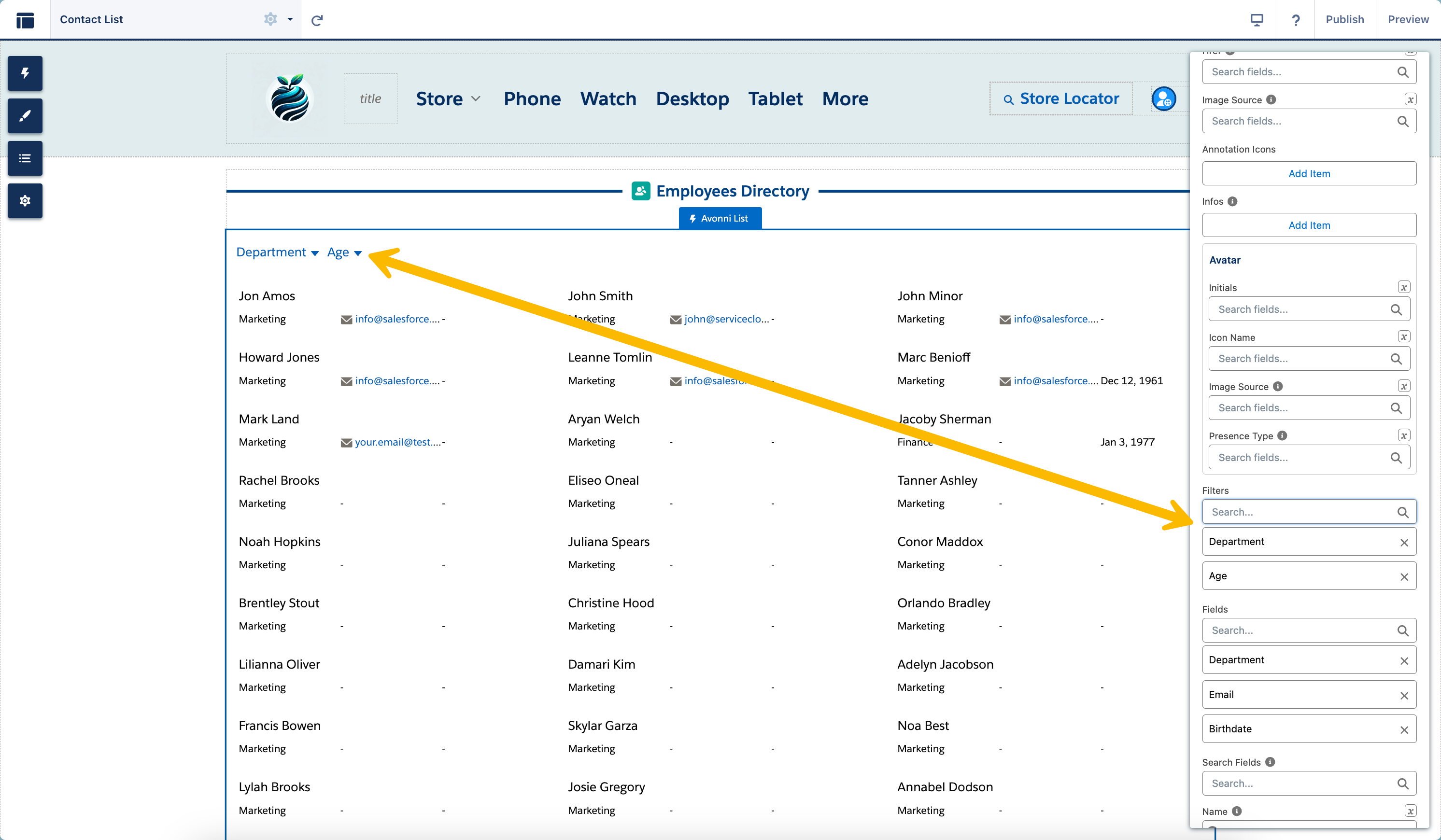
### Filters

The "**`Filtering Option`**" allows you to add a filter menu. When this feature is enabled, all the fields designated as filters will be displayed in this popover, keeping the list uncluttered and focused.

<figure><img src="https://2929066058-files.gitbook.io/~/files/v0/b/gitbook-x-prod.appspot.com/o/spaces%2FDL6JQuZArjJeQvX2ot4y%2Fuploads%2Fgit-blob-87a878b9fdb176b1e17531115e5a8d44e96717b0%2F2024-02-04_16-32-15.png?alt=media" alt=""><figcaption></figcaption></figure>

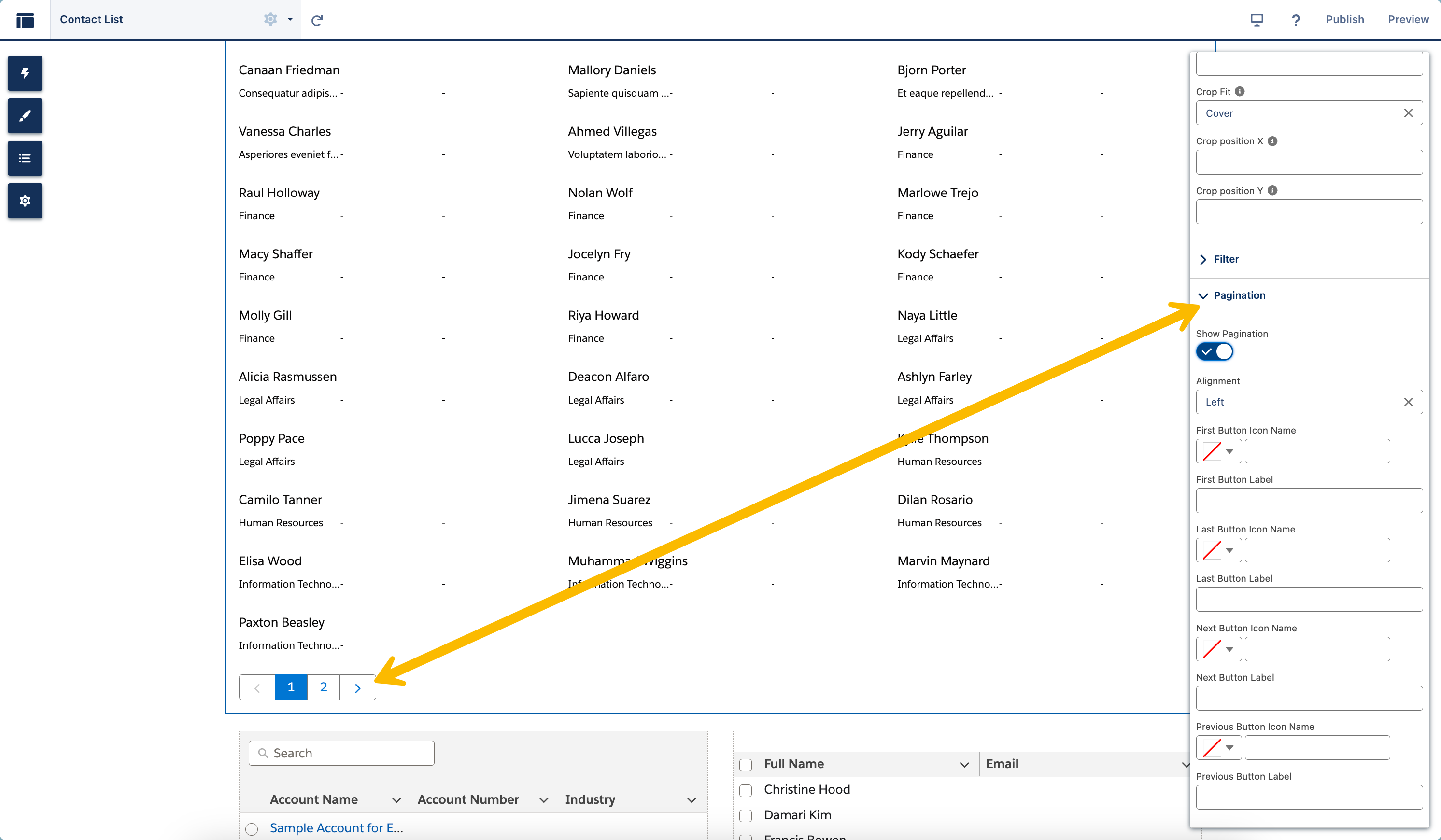
### Pagination

The "Pagination Options" area lets you split long lists into smaller parts in the Avonni List Component. You can choose how many items are shown on each page and how the controls look. This makes it easier to handle extensive lists.

<figure><img src="https://2929066058-files.gitbook.io/~/files/v0/b/gitbook-x-prod.appspot.com/o/spaces%2FDL6JQuZArjJeQvX2ot4y%2Fuploads%2Fgit-blob-16c0039db05e1631881c743560d2674fc042d7e5%2F2024-02-04_16-33-26.png?alt=media" alt=""><figcaption></figcaption></figure>

{% hint style="info" %}
**Items loading.** With **Pagination** off, the List loads **Number of Items per Page** items at a time behind a **Show More** button—or, if you set a fixed **Height** (Size style), it switches to **infinite scroll** (loading the next batch as you reach the bottom). With **Pagination** on, it shows one page of **Number of Items per Page** items with pagination controls.
{% endhint %}

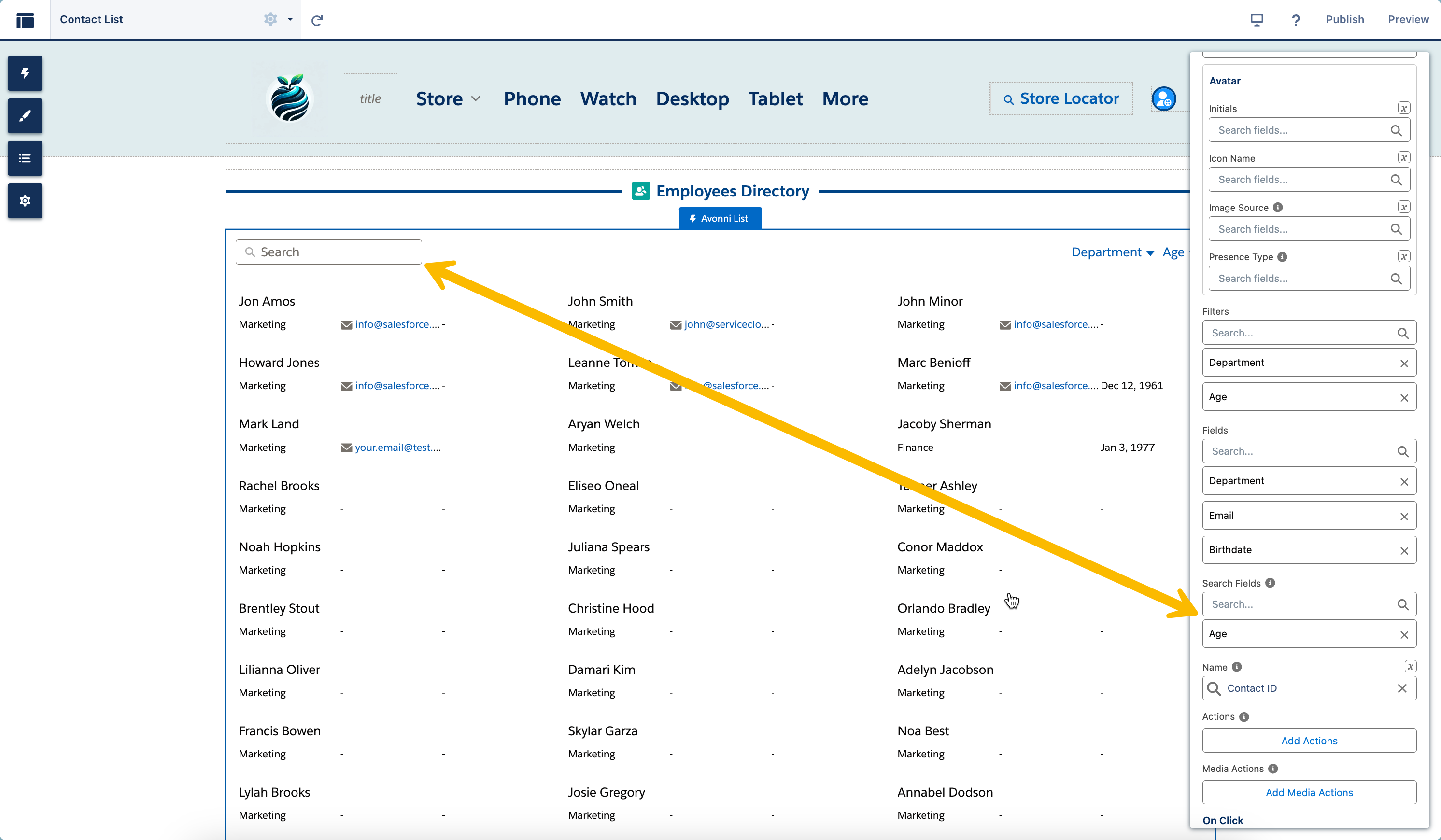
### Search

Utilize the 'Search Fields' attribute to define which fields within the List component should be searchable, allowing users to quickly locate the needed information.

<figure><img src="https://2929066058-files.gitbook.io/~/files/v0/b/gitbook-x-prod.appspot.com/o/spaces%2FDL6JQuZArjJeQvX2ot4y%2Fuploads%2Fgit-blob-33aae961f323f2a9def80985090e123bdc413935%2F2024-02-04_16-37-32.png?alt=media" alt=""><figcaption></figcaption></figure>

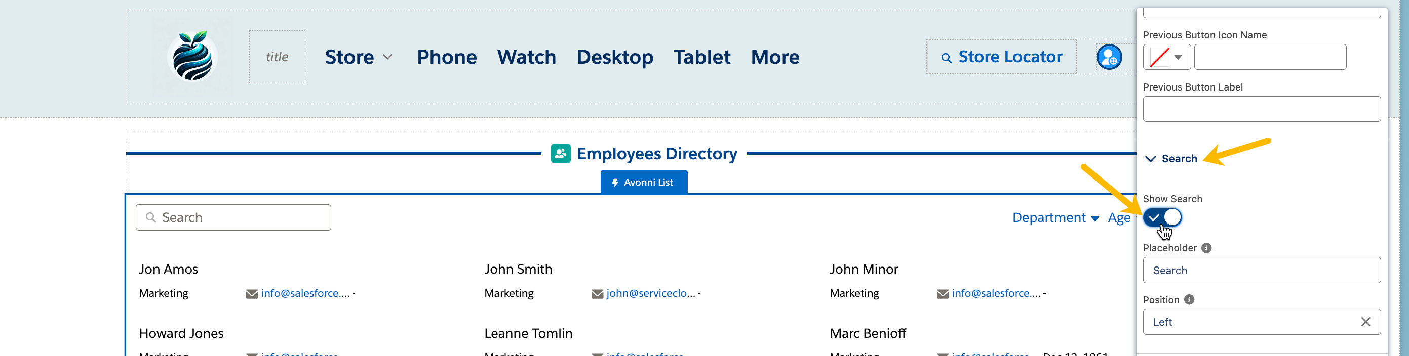
**Activating Search**: GoTo activate the search feature, navigate to the Search section and turn on the 'Show Search' toggle. This action will introduce a search box within the List component. You can customize this feature by modifying the placeholder text and adjusting the search box's position as required.

<figure><img src="https://2929066058-files.gitbook.io/~/files/v0/b/gitbook-x-prod.appspot.com/o/spaces%2FDL6JQuZArjJeQvX2ot4y%2Fuploads%2Fgit-blob-0d14763d43a0356f3fa2af20510633221d0fe5a7%2F2024-02-04_16-38-23.png?alt=media" alt=""><figcaption></figcaption></figure>

**Setting Placeholder Text**: Customize the search bar by adding placeholder text to guide users.

**Positioning the Search Bar**: Use the position attribute to set the location of the search bar. Options include: left, right, center, and fill.

## Interactions

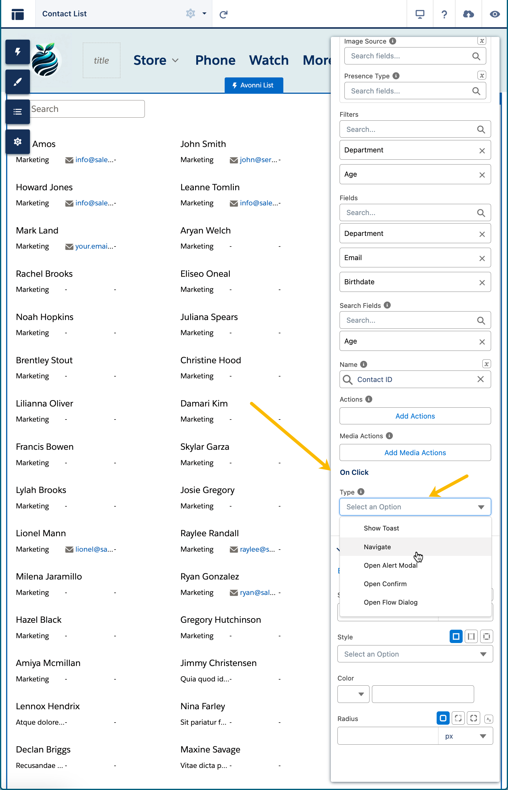
The "**On Click section**" lets you define what will happen when users interact with the list component by clicking on an item.

<figure><img src="https://2929066058-files.gitbook.io/~/files/v0/b/gitbook-x-prod.appspot.com/o/spaces%2FDL6JQuZArjJeQvX2ot4y%2Fuploads%2Fgit-blob-636ae845c1135e2af7fd51abb2f2ccd09729e126%2F2024-02-04_20-37-16.png?alt=media" alt=""><figcaption></figcaption></figure>

Here are the available interactions for the List component:

* [Show Toast](/experience-cloud/properties-panel/interactions/show-toast.md)
* [Navigate](/experience-cloud/properties-panel/interactions/navigate.md)
* [Open Alert Modal](/experience-cloud/properties-panel/interactions/open-alert-modal.md)
* [Open Confirm](/experience-cloud/properties-panel/interactions/open-confirm.md)
* [Open Flow Dialog](/experience-cloud/properties-panel/interactions/open-flow-dialog.md)

Explore each section to gain insights on configuring these features and enhancing interactivity for your end-users within the Avonni List component.

## Styling

The Avonni List component for Experience Cloud Sites offers comprehensive customization options for its appearance, allowing you to align it perfectly with your site's aesthetic.

{% tabs %}
{% tab title="Border" %}
Adjust the border thickness, style, and color to define or highlight the list's boundaries.
{% endtab %}

{% tab title="Size" %}
Customize the overall size of the list, including width and height, to fit your layout.
{% endtab %}

{% tab title="Spacing" %}
Control the space between list items, headers, and the list body to improve readability and visual appeal.
{% endtab %}

{% tab title="Header" %}
Style the header section, including title, caption, and avatars, to make it visually distinct and informative.
{% endtab %}

{% tab title="Header Title" %}
Customize the title's font, size, and color to make it stand out or align with your site's theme.
{% endtab %}

{% tab title="Header Caption" %}
Style the caption under the header title for a concise description or context about the list.
{% endtab %}

{% tab title="Header Avatar" %}
Include and style an avatar or image in the header for visual representation or branding.
{% endtab %}

{% tab title="Item" %}
Adjust the appearance of individual list items, including background, alignment, and spacing.
{% endtab %}

{% tab title="Item Vertical Alignment" %}
Control the alignment of list items vertically for a consistent and polished look.
{% endtab %}

{% tab title="Item Header" %}
Customize the appearance of item headers within the list for clear segmentation and readability.
{% endtab %}

{% tab title="Item Description" %}
Style the item description text to provide detailed information in a visually appealing manner.
{% endtab %}

{% tab title="Item Background" %}
Set the background color or image for list items to differentiate or highlight individual entries.
{% endtab %}

{% tab title="Item Fields" %}
Style the fields within each item, such as changing font or color, for clarity and visual hierarchy.
{% endtab %}

{% tab title="Item Fields Value" %}
Customize the presentation of the field values for clear data representation.
{% endtab %}

{% tab title="Item Fields Label" %}
Style the labels of the fields to distinguish them from the values and enhance readability.
{% endtab %}

{% tab title="Pagination Buttons" %}
Style the pagination buttons for navigating the list, ensuring they are user-friendly and match your site's aesthetics.
{% endtab %}

{% tab title="Footer" %}
Customize the footer section for additional information or actions related to the list, ensuring it complements the overall design.
{% endtab %}
{% endtabs %}


---

# Agent Instructions
This documentation is published with GitBook. GitBook is the documentation platform designed so that both humans and AI agents can read, navigate, and reason over technical content effectively. Learn more at gitbook.com.

## Querying This Documentation
If you need additional information that is not directly available in this page, you can query the documentation dynamically by asking a question.

Perform an HTTP GET request on the current page URL with the `ask` query parameter, and the optional `goal` query parameter:

```
GET https://docs.avonnicomponents.com/experience-cloud/experience-components/ax-list.md?ask=<question>&goal=<endgoal>
```

`ask` is the immediate question: it should be specific, self-contained, and written in natural language.
`goal` is optional and describes the broader end goal you are ultimately trying to accomplish on behalf of the user. GitBook uses it to tailor the answer towards what is most useful for that goal.

The response will contain a direct answer to the question and relevant excerpts and sources from the documentation.

Use this mechanism when the answer is not explicitly present in the current page, you need clarification or additional context, or you want to retrieve related documentation sections.