> For the complete documentation index, see [llms.txt](https://docs.avonnicomponents.com/llms.txt). Markdown versions of documentation pages are available by appending `.md` to page URLs; this page is available as [Markdown](https://docs.avonnicomponents.com/experience-cloud/experience-components/ax-avatar-group.md).
# AX - Avatar Group
## Overview
**AX - Avatar Group** is an Experience Cloud component that displays multiple profile pictures, initials, or icons in a compact row on Experience Sites pages.
Use it to show team members, project contributors, account contacts, or any group of related users or records. The component stacks avatars horizontally and shows a "+X" indicator when there are more avatars than can fit in the display area.
Perfect for team rosters, collaboration groups, case assignment displays, or showing who has access to shared records in customer or partner portals.
## Configuration
### Data Source
Tell it where to find the information to make your Avatar Group display the right people. This is where **Data Sources** come in. Think of it as connecting your avatars to the heart of your Salesforce data.
#### **Manual**
This option is a great fit for smaller teams or situations where you only need to display avatars for a specific event or project.
1. **Add Each Person:** You'll enter their details directly into the Avatar Group settings for each individual you want to include.
2. **Provide Key Information:** This includes:
* **Avatar Image:** If you have a picture, you can upload it here.
* **Initials:** These will be displayed if no image is available.
* **Other Details:** You can include additional information like the person's title or department.
While the Manual option requires more hands-on effort, it gives you complete control over who is displayed in your Avatar Group.
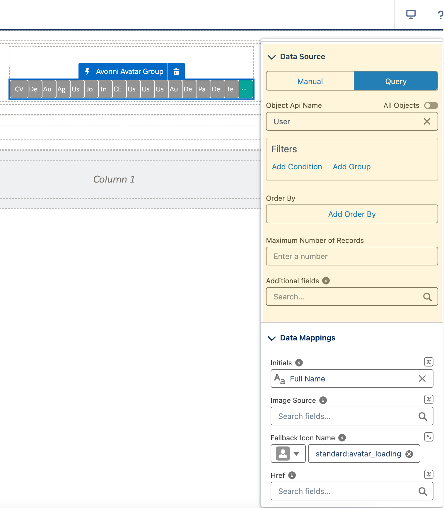
#### **Query**
This option is your go-to choice if your team changes frequently or you want the avatars always to match the latest information in your Salesforce org.
Here's how it works:
1. **Choose your Object:** Select the Salesforce object (like User, Contact, or a custom object) where your avatar information lives.
2. **Map the Data:** Connect the dots between your avatar group attributes (like Name, Title, Profile Picture) and the corresponding fields in your chosen object. This tells the Avatar Group exactly where to find the correct details for each person.
Using the Query option, your Avatar Group becomes a dynamic reflection of your Salesforce data, always showing the most accurate and up-to-date information.
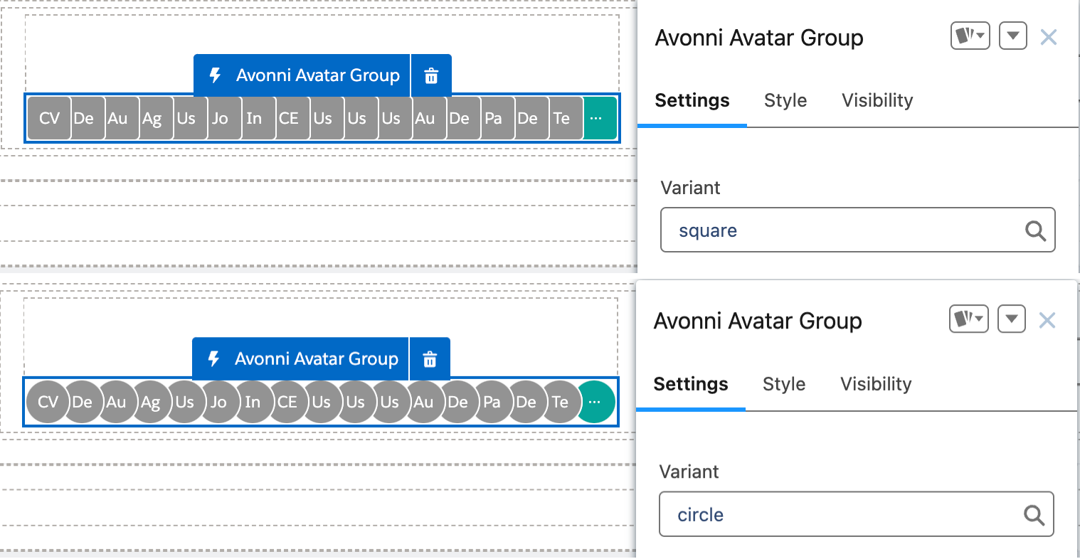
### Variant
* **Square:** Avatars are displayed as squares, with a classic and clean look. This is the default.
* **Circle:** Avatars are displayed as more modern and friendly circles.
* **Empty:** Avatars are displayed as rounded squares, exactly as with **Square** — only **Circle** changes the shape.
### Size
* Control the dimensions of each avatar: **X-Small**, **Small**, **Medium** (the default), **Large**, **X-Large** or **XX-Large**.
### Layout
* **Stack:** The default — avatars sit on one line and overlap each other, so a group takes up very little width.
* **Grid:** Avatars are laid out side by side without overlapping, and wrap onto further lines, which suits a larger group.
* **List:** One avatar per line, stacked vertically — useful in a narrow region or a sidebar, and the only layout that scrolls to load more avatars.
### Max Count
* Limit the number of avatars displayed in the group. This helps maintain a clean layout and prevents overwhelming the user with too many visuals.
### Initials Auto Formatted
* Turn this on to have the initials shown on each avatar formatted automatically: when the value holds more than one word, the first letter of each word is used; when it is a single word, the first two letters are used. Off by default.
### Icon Position
* **Icon Position** places the icon inside each avatar — **Start**, **Center** (the default) or **End**.
### No Results Message
* **No Results Message** replaces the default empty state with your own text when the data source returns no items. **No Results Message Attributes** then controls what the empty state shows: **Hide No Results Image** drops the illustration, and **Hide No Results Message** drops the text. Both are off by default.
## Interactions
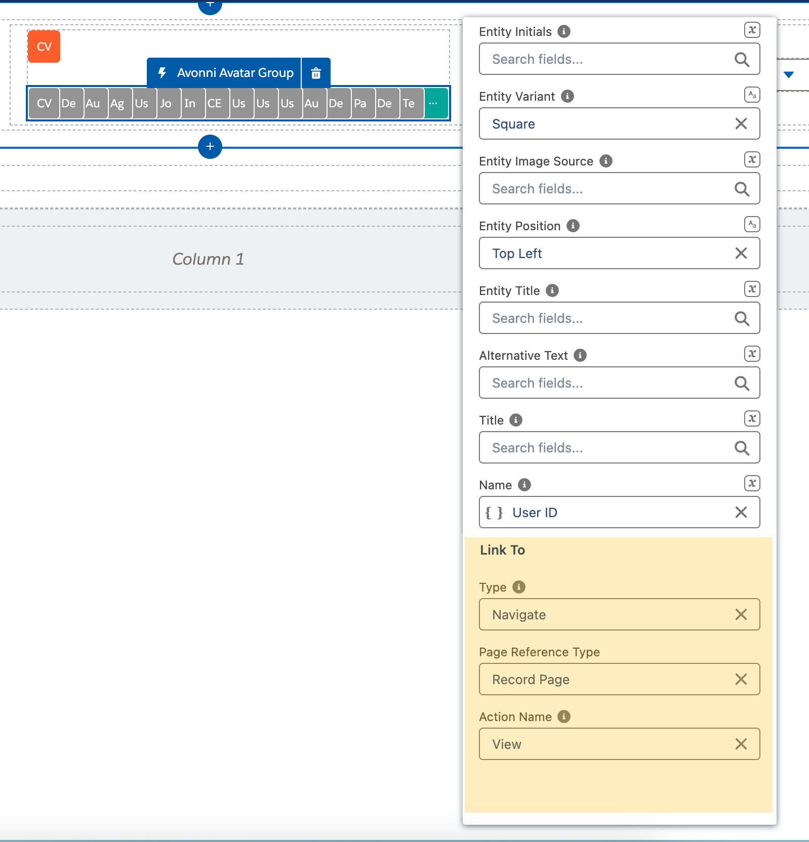
### Link To (Make Your Avatars Interactive)
Think of this section as giving your avatars a superpower – taking your users somewhere new when clicked!
#### Why is this useful?
* **User Profiles:** Imagine displaying a team of experts. By setting up a link to action, clicking on an avatar could open their full profile page.
* **Custom Actions:** Maybe you want a click to trigger a specific Flow or even redirect to an external website.
#### How it works
1. **Choose your Type:** Select where you want the click to take your users. This could be to a record page, a custom page, a Flow, or an external URL.
2. **Customize the Action name:** When using a navigate interaction, choose the action name to invoke.
Using the Link To feature, your Avatar Group becomes more than just a display of faces; it becomes a gateway to additional information or actions.
## Use Cases
These configuration options allow you to tailor the Avonni Avatar Group component to meet your needs. For example, you can showcase team members on a project page, display customer avatars on account pages, or create visually engaging lists of community members.
Remember, the Avonni Avatar Group component is highly adaptable. You can customize its appearance further with styling appareance and even add interactive elements to make the avatars clickable or link them to user profiles.
By leveraging the Avonni Avatar Group component, you can create a more personalized and informative experience for your Experience Cloud site users, fostering connections and highlighting the human element within your online community.
## Styling
Customize the group's appearance from the **Style** section of the property editor.
{% tabs %}
{% tab title="Margin" %}
Controls the outer spacing around the group (Top / Right / Bottom / Left).
{% endtab %}
{% tab title="Padding" %}
Controls the inner spacing of the group (Top / Right / Bottom / Left).
{% endtab %}
{% tab title="Size" %}
Controls the group's overall dimensions.
{% endtab %}
{% tab title="Border" %}
Controls the border around the group (Color / Size / Style / Radius).
{% endtab %}
{% tab title="Stack Border" %}
Styles the border between stacked avatars.
* **Color / Size / Style:** Control the stack border appearance.
{% endtab %}
{% tab title="Show More Button" %}
Styles the "+X" show-more button.
* **Background / Text / Border Colors:** Set the colors for the default, active, and hover states.
* **Border Size / Border Radius:** Control the button border.
* **Block Start / Block End / Inline Start / Inline End:** Set the spacing around the button.
{% endtab %}
{% endtabs %}
---
# Agent Instructions
This documentation is published with GitBook. GitBook is the documentation platform designed so that both humans and AI agents can read, navigate, and reason over technical content effectively. Learn more at gitbook.com.
## Querying This Documentation
If you need additional information that is not directly available in this page, you can query the documentation by asking a question.
Perform an HTTP GET request on the following URL with the `ask` and `goal` query parameters:
```
GET https://docs.avonnicomponents.com/experience-cloud/experience-components/ax-avatar-group.md?ask=&goal=
```
`ask` is the immediate question: it should be specific, self-contained, and written in natural language.
`goal` is what the user is ultimately trying to achieve, the reason they need the answer. Sharing it helps GitBook give you a better, more relevant answer. A goal is most helpful when it describes the outcome the user wants rather than restating the question. For example, with `ask=how do I create an API token`, a goal like `automate deployments from our CI pipeline` lets GitBook tailor the answer to that use case.
The response will contain a direct answer to the question and relevant excerpts and sources from the documentation.
Use this mechanism when the answer is not explicitly present in the current page, you need clarification or additional context, or you want to retrieve related documentation sections.