> For the complete documentation index, see [llms.txt](https://docs.avonnicomponents.com/llms.txt). Markdown versions of documentation pages are available by appending `.md` to page URLs; this page is available as [Markdown](https://docs.avonnicomponents.com/experience-cloud/experience-cloud-ja/experience-components/ax-button-dialog.md).
# AX - ボタンダイアログ
## 概要
**AX - ボタン ダイアログ** クリックすると Experience Sites のページ上でモーダルのポップアップを開き、ユーザーを現在のページから移動させずにコンテンツを表示する Experience Cloud コンポーネントです。
オーバーレイで表示される追加の詳細、動画コンテンツ、確認メッセージ、フォーム、警告の表示に使用します。Experience Builder でポップアップのコンテンツを作成するには、モーダル内に任意の Experience Cloud コンポーネントを配置します。
"もっと詳しく" の詳細、動画デモ、利用規約、確認プロンプト、またはポータル内の現在のページの上に一時的に表示する必要があるあらゆるコンテンツに最適です。
## 設定
### **ボタン ダイアログを魅力的にする**
1. **コンポーネントを追加する:** Avonni Button Dialog コンポーネントを見つけ、Web サイトにドラッグします。
2. **見た目を整える:** ボタンのテキスト(ラベル)、配色スタイル(バリアント)、その他お好みの視覚的な詳細を変更できます。
3. **クリックして作成:** ボタンをクリックすると、ポップアップ बॉックス(モーダル)が表示されます。Avonni Video コンポーネントや他の便利なものなど、さまざまなものをこの बॉックスにドラッグできます。
### ボタン設定
**ラベル** はボタンに表示されるテキストです。
**アイコン名** はボタンに表示される Lightning Design System のアイコンです。 **アイコンの位置** を `左` または `右` に配置します。
**バリアント** ボタンの外観(`brand`, `neutral`など)を、あらかじめ定義された Salesforce Design System スタイルに従って決定します。
**水平方向の配置** コンテナ内でボタンを整列します — `左`, `中央`、または `右`.
**ストレッチ** ボタンを拡張してコンテナの幅いっぱいに広げます。
**無効化** ボタンを無効にし、ユーザー操作を防ぎます。
**代替テキスト** アイコンのみを表示する場合に、ボタンを説明するアクセシブルなテキストを提供します。
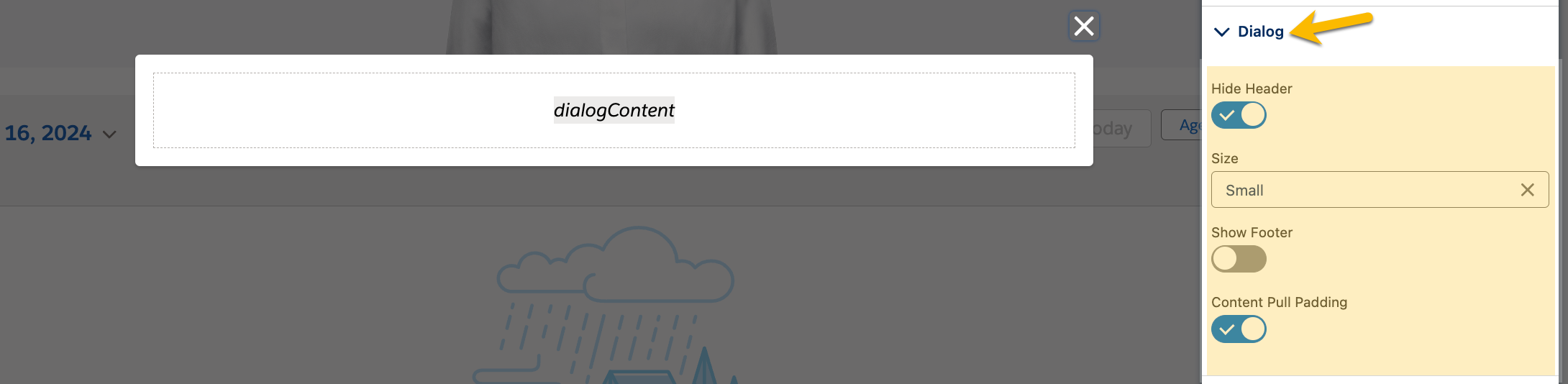
### ダイアログ設定
**ヘッダーを非表示** ポップアップ बॉックス上部のタイトルバーを削除します。
**ヘッダー** そのタイトルバーに表示されるテキストを設定します。表示されるのは、 **ヘッダーを非表示** オフのときのみです。
**サイズ** ポップアップ बॉックスのサイズを設定します: `極小`, `小`, `中`、または `大`。既定値は `中`.
**フッターを表示** ポップアップ下部にセクションを追加します。"OK" や "Cancel" のようなボタンに最適です。
**コンテンツの引き込み余白** ボックス内のコンテンツとボックスの端の間のスペースを制御します。ダイアログでは既定でオンになっているため、オフにするまではコンテンツが端にぴったり配置されます。
## スタイル
{% tabs %}
{% tab title="余白" %}
ボタンの周囲のスペース(上 / 下 / 左 / 右)を制御します。
{% endtab %}
{% tab title="背景" %}
* **色 / アクティブ時の色 / ホバー時の色:** デフォルト、アクティブ、ホバー時のボタン背景色を設定します。
{% endtab %}
{% tab title="ラベル / アイコン" %}
* **色 / アクティブ時の色 / ホバー時の色:** デフォルト、アクティブ、ホバー時のラベルとアイコンの色を設定します。
* **フォントサイズ / フォントスタイル / フォントウェイト / フォントファミリー / 行の高さ:** ラベルのタイポグラフィを制御します。
* **水平方向の配置:** ラベルとアイコンを整列します。
{% endtab %}
{% tab title="ボーダー" %}
* **色 / アクティブ時の色 / ホバー時の色:** デフォルト、アクティブ、ホバー時のボーダー色を設定します。
* **サイズ / スタイル / 角丸:** ボタンのボーダーを制御します。
{% endtab %}
{% tab title="ダイアログの背景色" %}
| 名前 | 説明 |
| ------------- | --------------------------- |
| **ヘッダー** | ダイアログのヘッダーの背景色を指定します。 |
| **コンテンツ** | ダイアログのメインコンテンツ領域の背景色を設定します。 |
| **フッター** | フッター領域の背景色を定義します。 |
| {% endtab %} | |
| {% endtabs %} | |
---
# Agent Instructions
This documentation is published with GitBook. GitBook is the documentation platform designed so that both humans and AI agents can read, navigate, and reason over technical content effectively. Learn more at gitbook.com.
## Querying This Documentation
If you need additional information that is not directly available in this page, you can query the documentation dynamically by asking a question.
Perform an HTTP GET request on the current page URL with the `ask` query parameter, and the optional `goal` query parameter:
```
GET https://docs.avonnicomponents.com/experience-cloud/experience-cloud-ja/experience-components/ax-button-dialog.md?ask=&goal=
```
`ask` is the immediate question: it should be specific, self-contained, and written in natural language.
`goal` is optional and describes the broader end goal you are ultimately trying to accomplish on behalf of the user. GitBook uses it to tailor the answer towards what is most useful for that goal.
The response will contain a direct answer to the question and relevant excerpts and sources from the documentation.
Use this mechanism when the answer is not explicitly present in the current page, you need clarification or additional context, or you want to retrieve related documentation sections.
.gif?alt=media)