> For the complete documentation index, see [llms.txt](https://docs.avonnicomponents.com/llms.txt). Markdown versions of documentation pages are available by appending `.md` to page URLs; this page is available as [Markdown](https://docs.avonnicomponents.com/dynamic-components/components/profile-card.md).

# Profile Card

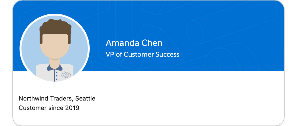
The Avonni Profile Card displays a user or entity profile in a visually rich card layout. It combines a title and subtitle, a customizable background image, and an optional avatar with flexible positioning so you can highlight profile information in a structured, engaging way.

## Overview

The Profile Card is built around a few visual choices: the text shown at the top of the card, an optional background image behind it, and an avatar you can place anywhere around the card and reposition as the container grows. Because it has no data source of its own, configuration is quick — you mostly decide what the card says, what it looks like, and where the avatar sits. The sections below follow the configuration panel from top to bottom, so you can read along as you build.

## Configuration

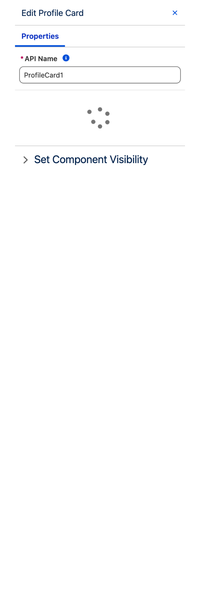
To configure the Profile Card, select it on the canvas. The **Edit Profile Card** panel opens on the right with three tabs: **Properties**, **Interactions**, and **Style**. The sections below mirror the Properties tab.

### Card

The first group controls the card's main content and its overall framing.

#### Title

The **Title** setting defines the heading shown at the top of the card. When you provide a title, the card's title slot will not appear directly in the canvas.

#### Subtitle

The **Subtitle** setting adds a line of text displayed under the title, useful for a role, location, or any secondary detail that supports the title.

#### Background Image

The **Background Image** setting lets you choose an image to display behind the card content. Use **Select Image** to pick a file; supported formats include APNG, AVIF, GIF, JPG, JPEG, PNG, SVG, and WEBP.

#### Content Pull Padding

The **Content Pull Padding** toggle, when enabled, adjusts the card's internal padding to visually pull the content closer to the edges of the card. It is off by default.

### Avatar

The **Avatar** group is collapsible and controls the optional avatar shown on the card, including its image, shape, size, and position.

#### Image URL

The **Image URL** setting points to the image used as the avatar. Use **Select Image** to choose a file; supported formats include APNG, AVIF, GIF, JPG, JPEG, PNG, SVG, and WEBP.

#### Fallback Icon Name

The **Fallback Icon Name** setting defines the Lightning Design System icon shown in place of the avatar when the image fails to load.

#### Variant

The **Variant** setting controls the shape of the avatar:

* **Circle** (default) — a rounded avatar.
* **Square** — a square avatar.

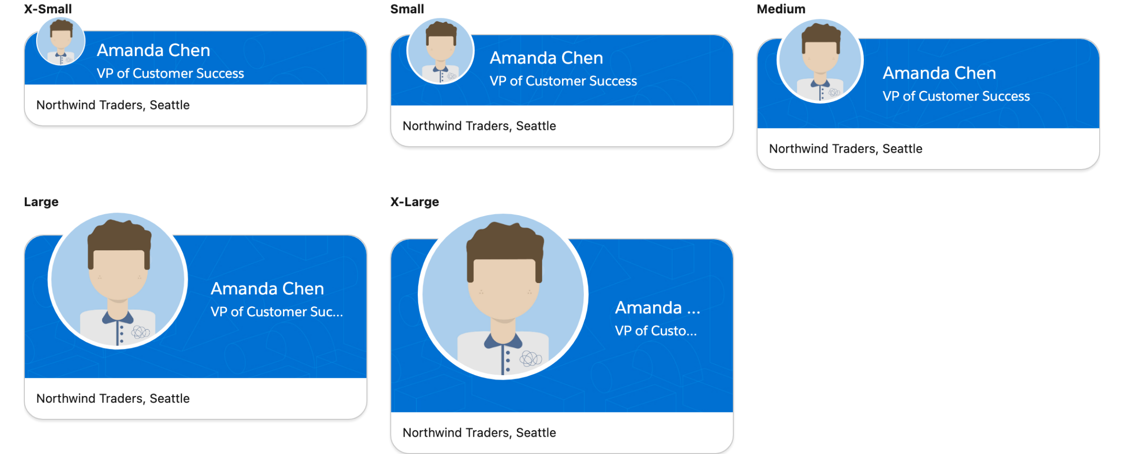
#### Size

The **Size** setting controls how large the avatar appears. Choose the option that best fits your card layout:

* **X-Small** — the smallest avatar.
* **Small** — a compact avatar.
* **Medium** (default) — the standard size, suitable for most cards.
* **Large** — a more prominent avatar.
* **X-Large** — the largest avatar.

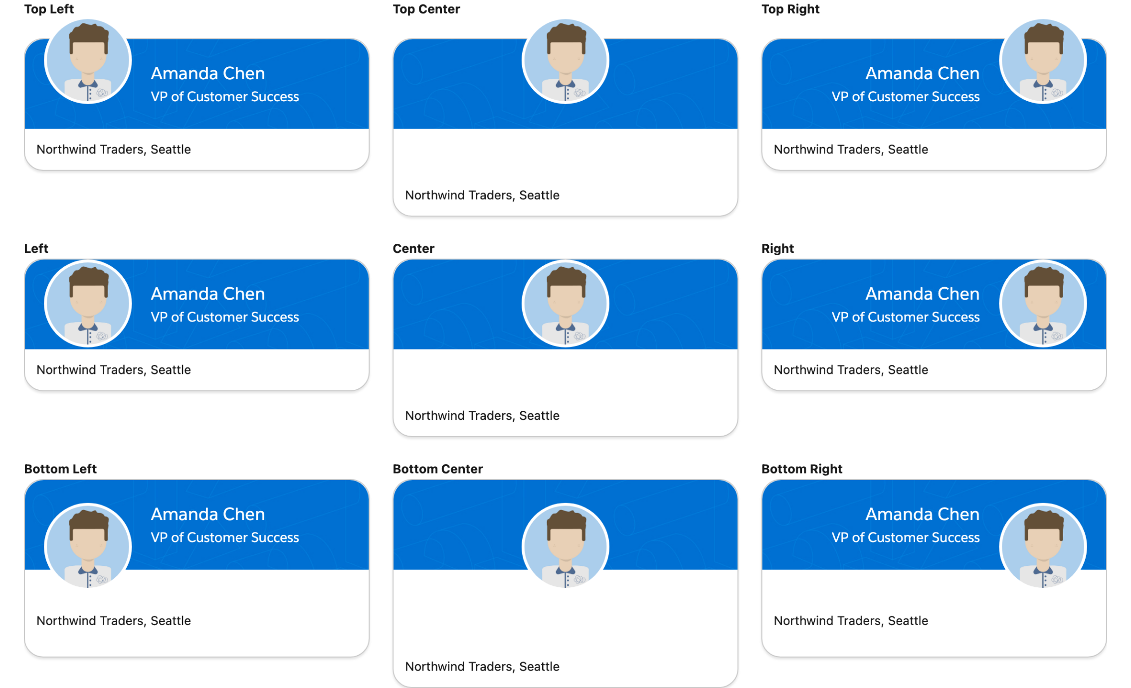
#### Position

The **Position** setting places the avatar relative to the card. Choose from:

* **Top Left** (default), **Top Center**, **Top Right**
* **Bottom Left**, **Bottom Center**, **Bottom Right**
* **Left**, **Center**, **Right**

#### Position on Small / Medium / Large Container

The three responsive position settings let the avatar move as the card's container grows wider, so the layout adapts to different screen sizes. They share the same options as **Position** and apply at progressively larger widths:

* **Position on Small Container** — applies when the component is 480px wide or more.
* **Position on Medium Container** — applies when the screen width is 768px or more.
* **Position on Large Container** — applies when the screen width is 1024px or more.

Leave a responsive position empty to keep the avatar where the base **Position** setting placed it.

### Set Component Visibility

All components support conditional visibility — see [Component Visibility](/dynamic-components/core-concepts/component-visibility.md).


---

# Agent Instructions
This documentation is published with GitBook. GitBook is the documentation platform designed so that both humans and AI agents can read, navigate, and reason over technical content effectively. Learn more at gitbook.com.

## Querying This Documentation
If you need additional information that is not directly available in this page, you can query the documentation dynamically by asking a question.

Perform an HTTP GET request on the current page URL with the `ask` query parameter, and the optional `goal` query parameter:

```
GET https://docs.avonnicomponents.com/dynamic-components/components/profile-card.md?ask=<question>&goal=<endgoal>
```

`ask` is the immediate question: it should be specific, self-contained, and written in natural language.
`goal` is optional and describes the broader end goal you are ultimately trying to accomplish on behalf of the user. GitBook uses it to tailor the answer towards what is most useful for that goal.

The response will contain a direct answer to the question and relevant excerpts and sources from the documentation.

Use this mechanism when the answer is not explicitly present in the current page, you need clarification or additional context, or you want to retrieve related documentation sections.