> For the complete documentation index, see [llms.txt](https://docs.avonnicomponents.com/llms.txt). Markdown versions of documentation pages are available by appending `.md` to page URLs; this page is available as [Markdown](https://docs.avonnicomponents.com/dynamic-components/components/date-time-picker.md).

# Date Time Picker

The Avonni Date/Time Picker lets users select one or more date/time slots from a calendar view. It supports five display variants (daily, weekly, monthly, inline, and timeline) and can be configured for single-select (radio) or multi-select (checkbox) mode, with optional availability and disabled-date constraints.

## Overview

Use the Date/Time Picker wherever you need users to pick a specific date and time — appointment scheduling, event registration, resource booking, or any scenario where a full datetime selection is required. The component adapts from a simple inline calendar to a rich time-slotted weekly or daily view depending on the variant you choose.

## Configuration

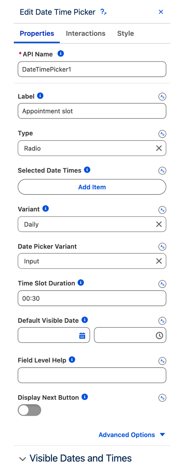
To configure the Date/Time Picker, select it on the canvas. The **Edit Date/Time Picker** panel opens on the right with two tabs: **Properties** and **Interactions**. The sections below mirror the Properties tab.

### Properties

#### Label

The text label displayed above the picker. Use it to describe what the user is selecting (e.g. "Appointment Date").

#### Type

Controls the selection mode:

* **Radio** (default) — only one time slot can be selected at a time.
* **Checkbox** — multiple time slots can be selected simultaneously.

#### Selected Date Times

Pre-selected date/time values when the component loads. Each entry must be an ISO 8601 datetime string (e.g. `2025-06-20T10:00:00`).

#### Variant

Controls the calendar view style:

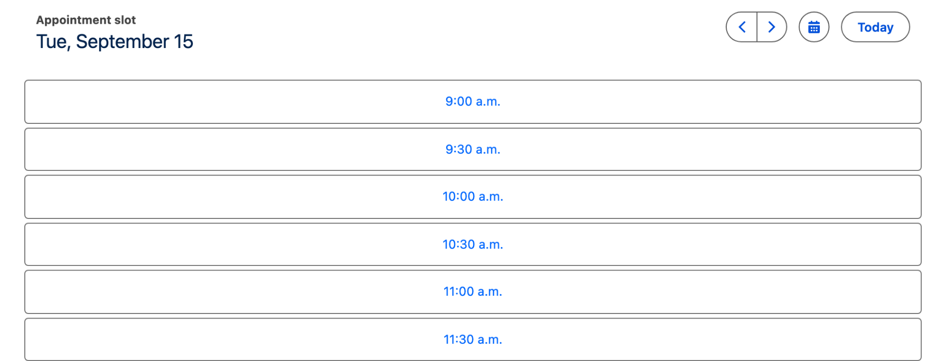
* **Daily** (default) — shows a single day with its time slots.
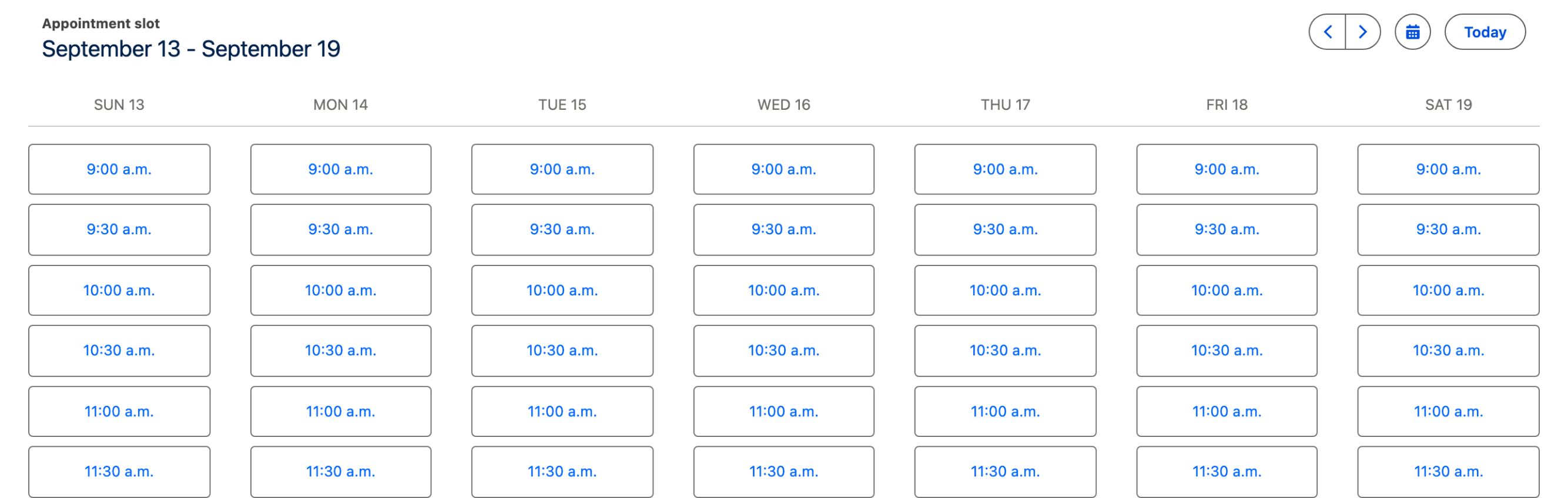
* **Weekly** — shows the full week with time slots for each day.
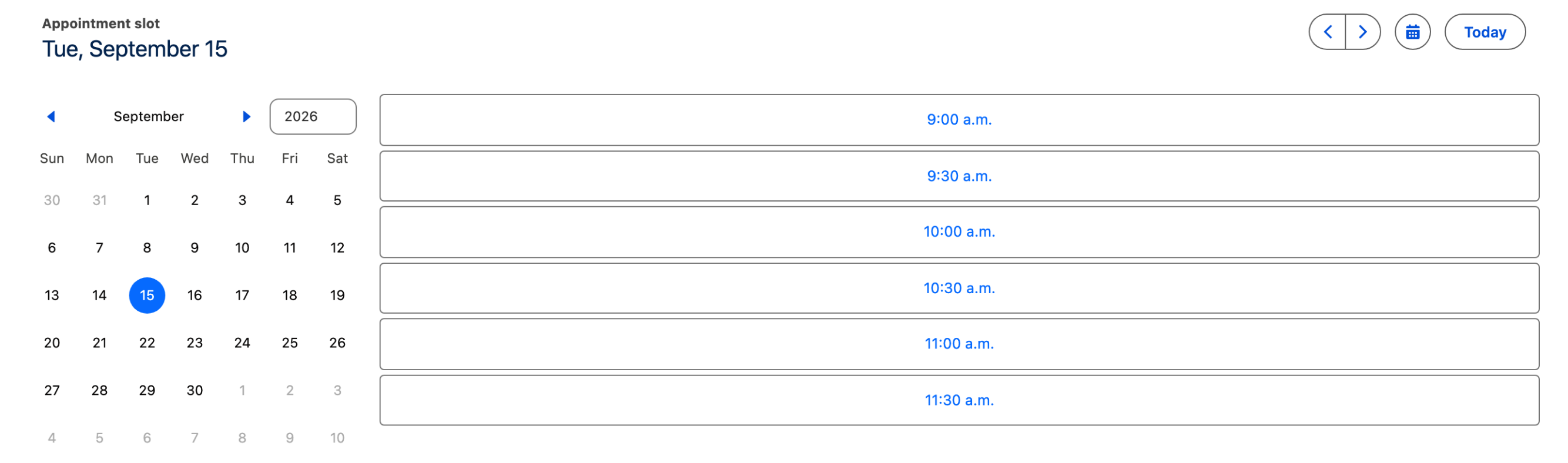
* **Monthly** — shows a month grid; users click a day to see its slots.
* **Inline** — embeds the calendar inline without a navigation header.
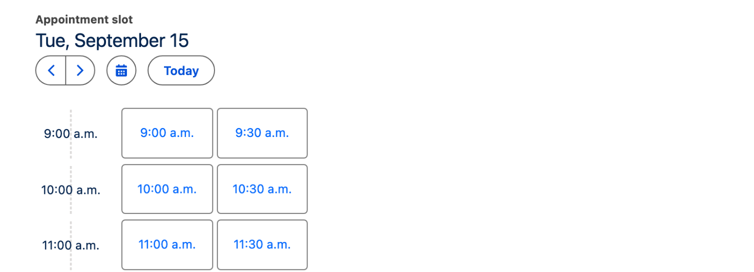
* **Timeline** — shows a vertical timeline of time slots.

#### Date Picker Variant

Controls how the date navigation control is rendered:

* **Input** (default) — the date selector appears as a text input field.
* **Inline** — the date selector is always expanded inline.

#### Time Slot Duration

The length of each selectable time slot. Must be an ISO 8601 time string (e.g. `00:30` for 30-minute slots, `01:00` for one-hour slots). Defaults to `00:30`.

#### Default Visible Date

The date the picker opens to on first load. If left blank, the picker opens to today. Must be a datetime value.

#### Field Level Help

Help text displayed in a tooltip next to the label, explaining the purpose of the input to users.

#### Display Next Button

When **Type** is set to **Radio**, enabling this toggle adds a **Next** button after the user selects a time slot. Use this to guide users through a step-by-step flow. Requires: **Type** = **Radio**.

#### Next Button Label

The label shown on the Next button. Defaults to `Next`. Requires: **Display Next Button** enabled.

#### Week Start Day

The day of the week displayed first in the calendar. Defaults to the user's locale setting. Options: Default, Sunday, Monday, Tuesday, Wednesday, Thursday, Friday, Saturday.

#### Show End Time

When enabled, each time slot displays both its start and end time.

#### Show Time Zone

When enabled, the user's time zone is shown alongside the time slots.

#### Hide Navigation

When enabled, the previous, next, and today navigation buttons are hidden. Useful when you control the visible date range programmatically.

#### Hide Date Picker

When enabled, the date picker button (the calendar icon that opens the date selector) is hidden.

#### Hide Label

When enabled, the label above the picker is hidden.

#### Required

When enabled, the user must select a value before the flow can proceed.

#### Disabled

When enabled, the picker is visible but cannot be interacted with.

#### Read Only

When enabled, the picker displays the selected value but users cannot change it.

### Visible Dates and Times

Use this section to constrain which dates and times are visible or selectable in the picker.

#### Start Date

The earliest date the calendar can display. Users cannot navigate before this date.

#### End Date

The latest date the calendar can display. Users cannot navigate past this date.

#### Start Time

The beginning of the selectable time range for each day. Must be an ISO 8601 time string (e.g. `08:00`). Defaults to `08:00`.

#### End Time

The end of the selectable time range for each day. Must be an ISO 8601 time string (e.g. `18:00`). Defaults to `18:00`.

#### Available Date Times

An explicit list of selectable datetimes. When set, only the listed slots can be selected — all others are unavailable. Each entry must be an ISO 8601 datetime string.

#### Available Intervals

Intervals of selectable datetimes defined by a **Start** and **End** datetime. Only slots falling within these intervals can be selected. When set, slots outside all intervals are unavailable.

#### Disabled Date Times

Specific datetimes that users cannot select. Each entry must be an ISO 8601 datetime string.

#### Disabled Intervals

Ranges of datetimes that are disabled, defined by a **Start** and **End** datetime. Any slot falling within a disabled interval cannot be selected.

#### Show Disabled Dates

When enabled, disabled dates remain visible in the picker UI (grayed out) rather than being hidden entirely.

### Date Format

Control how date labels are formatted in the calendar header and navigation.

| Setting                 | Options                               | Default |
| ----------------------- | ------------------------------------- | ------- |
| **Date Format Year**    | Numeric, 2 Digit                      | Numeric |
| **Date Format Month**   | Numeric, 2 Digit, Long, Narrow, Short | Numeric |
| **Date Format Weekday** | Long, Narrow, Short                   | Short   |
| **Date Format Day**     | Numeric, 2 Digit                      | Numeric |

### Time Format

Control how time labels are formatted on the time slots.

| Setting                 | Options          | Default        |
| ----------------------- | ---------------- | -------------- |
| **Time Format Hour**    | Numeric, 2 Digit | Numeric        |
| **Time Format Minute**  | Numeric, 2 Digit | Numeric        |
| **Time Format Second**  | Numeric, 2 Digit | Numeric        |
| **Time Format Hour 12** | On / Off         | Locale default |

When **Time Format Hour 12** is on, time displays in 12-hour format (e.g. 2:00 PM). When off, it uses 24-hour format (e.g. 14:00). The default follows the user's locale.

### Set Component Visibility

All components support conditional visibility — see [Component Visibility](/dynamic-components/core-concepts/component-visibility.md).

## Interactions

[Interactions](/dynamic-components/component-builder/interactions.md) define what happens when users interact with the Date/Time Picker. Configure them from the **Interactions** tab of the Edit Date/Time Picker panel.

### Change

Fires when the user selects or changes a date/time slot. Use this to pass the selected value to another component, update a record, or advance to the next step in a flow.

### Next Button Click

Fires when the user clicks the **Next** button. Only available when **Display Next Button** is enabled and **Type** is set to **Radio**. Use this to proceed to the next screen or step in a multi-stage flow.

## Output Variables

The Date/Time Picker exposes these output variables you can reference elsewhere on the page after the user interacts with it.

### Date/Time Selection

When a user selects or changes a time slot, this variable updates with the chosen value.

| Output variable | Type     | What it returns                                                                                                                                |
| --------------- | -------- | ---------------------------------------------------------------------------------------------------------------------------------------------- |
| **Value**       | DateTime | The selected date/time as an ISO 8601 string. When **Type** is set to **Checkbox** (multi-select), this contains the first selected slot only. |

> **Example:** When a user picks an appointment slot, bind **Value** to a record-create component's date field to pre-fill the appointment time.


---

# Agent Instructions
This documentation is published with GitBook. GitBook is the documentation platform designed so that both humans and AI agents can read, navigate, and reason over technical content effectively. Learn more at gitbook.com.

## Querying This Documentation
If you need additional information that is not directly available in this page, you can query the documentation dynamically by asking a question.

Perform an HTTP GET request on the current page URL with the `ask` query parameter, and the optional `goal` query parameter:

```
GET https://docs.avonnicomponents.com/dynamic-components/components/date-time-picker.md?ask=<question>&goal=<endgoal>
```

`ask` is the immediate question: it should be specific, self-contained, and written in natural language.
`goal` is optional and describes the broader end goal you are ultimately trying to accomplish on behalf of the user. GitBook uses it to tailor the answer towards what is most useful for that goal.

The response will contain a direct answer to the question and relevant excerpts and sources from the documentation.

Use this mechanism when the answer is not explicitly present in the current page, you need clarification or additional context, or you want to retrieve related documentation sections.